Links Accessibility
Learn how to create prominent and straightforward hyperlinks that are clear of any ambiguity
We click on links countless times each day, often without a second thought. But for many users, poorly designed links create frustrating barriers. When links blend into surrounding text or rely solely on color differences, they become invisible traps for users with visual impairments. Keyboard-only users struggle when links don't show focus indicators, while screen reader users get confused by vague "click here" or "read more" links that offer no context. These frustrations aren't limited to users with disabilities; everyone benefits from clear, predictable links.
Assistive technology users often navigate web pages by jumping from link to link, similar to how visual users scan pages. When screen reader users press the Tab key, they only hear the link text without any surrounding context.
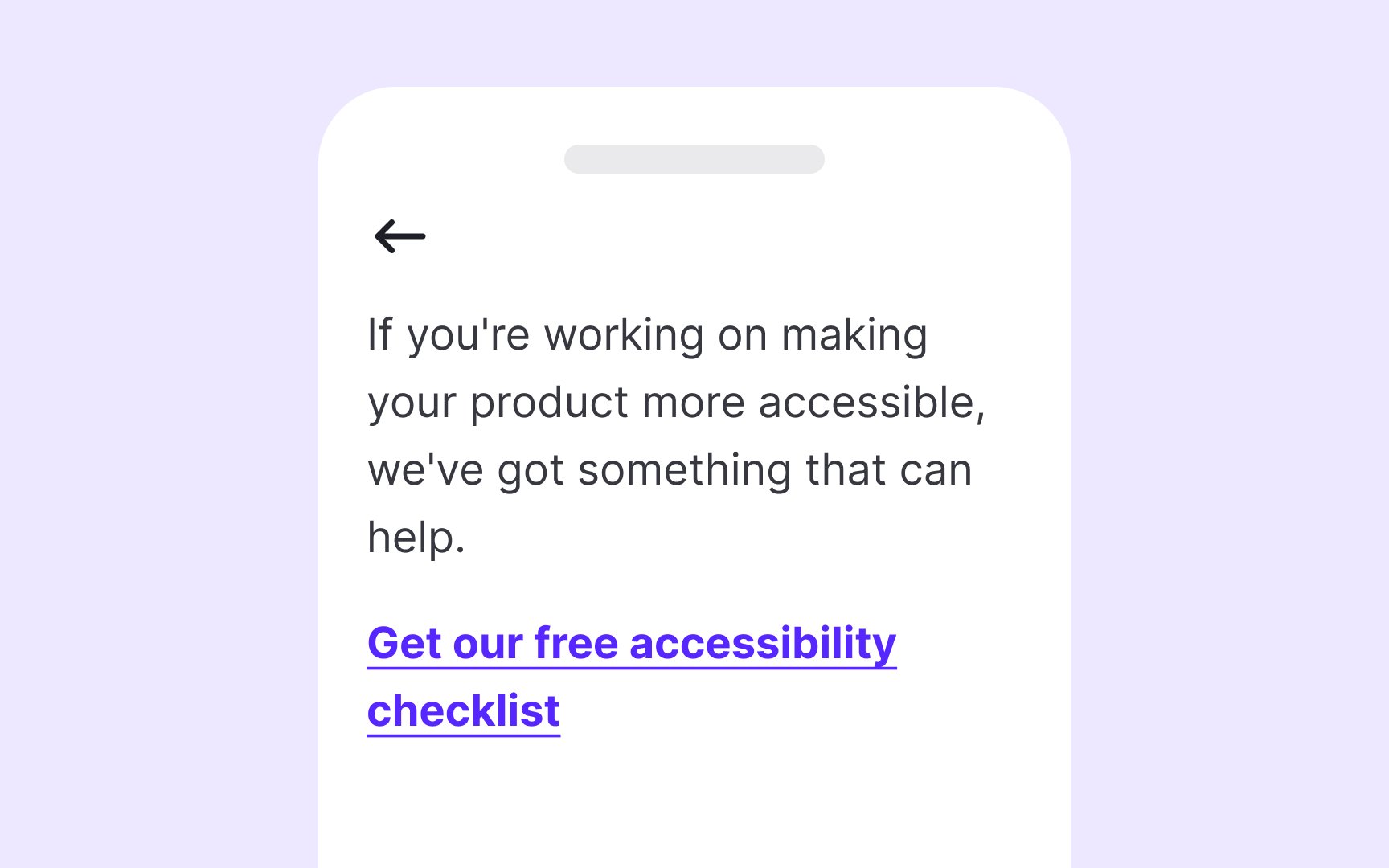
Descriptive link text immediately communicates where a link leads and what users can expect after clicking. Good link text is specific but concise. For example, instead of "Click here," use "Download pricing guide" or "View product specifications."
The ideal link text should:
- Make sense when read in isolation
- Clearly indicate the destination
- Be unique from other links on the page
- Avoid starting with phrases like "click here" or "link to"
Balance is important. Keep the link text descriptive yet reasonably brief. "Read full report" is much better than "click here," while "Read the full comprehensive report about designing better links for usability and web accessibility published January 2023" is unnecessarily long.
Pro Tip: Test your links by reading only the link text aloud in sequence. If you can understand where each link leads without context, you've created accessible link labels.
The best practice is to avoid opening links in new windows unless absolutely necessary. When you must use this behavior, such as for external links on banking sites or when users might lose unsaved form data, always clearly indicate this behavior beforehand.
There are several effective methods to communicate when links open new windows:
- Add "(opens in new window)" or "(new tab)" at the end of the
link text - Use appropriate ARIA attributes (aria-label="Link name (opens in new window)")
- Add a distinctive icon with proper alternative text
When including this information, place it at the end of the link text to avoid repetition by screen readers. For example, use "
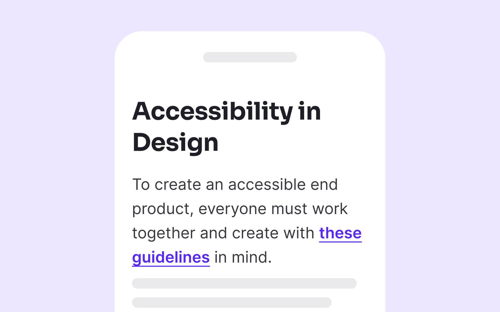
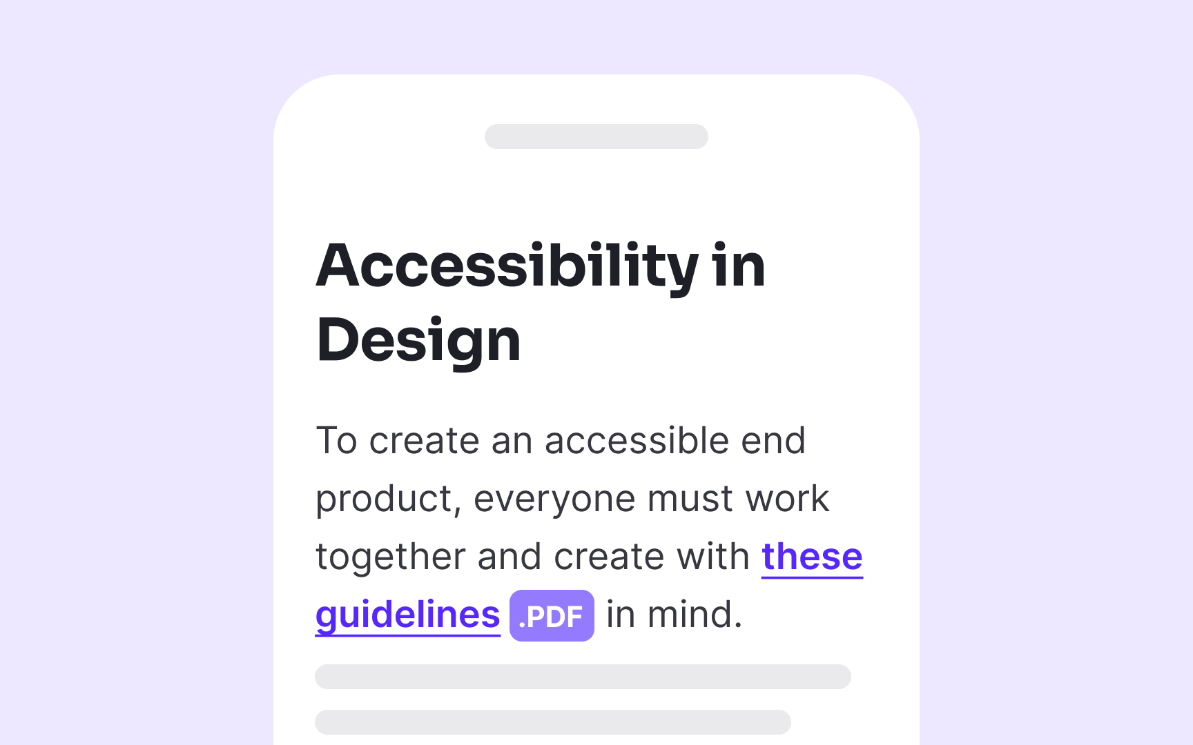
When linking to non-HTML content like documents or media files, explicitly indicate the file type and size in the
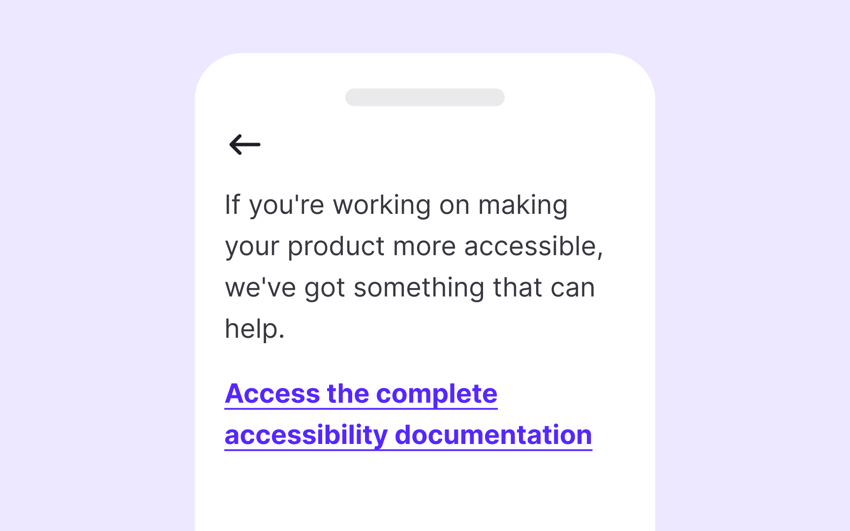
Never use raw URLs as link text, even if they seem self-explanatory. Screen readers read URLs character by character, turning www.example.com into a tedious "double-u double-u double-u dot example dot com." This creates a frustrating experience for screen reader users. Instead, use descriptive text that explains the destination, such as "Example Company Website" or "Product Documentation."
When your
Pro Tip: If you're using image-based icons to indicate file extension, add alt text to make it accessible to screen reader users.
If
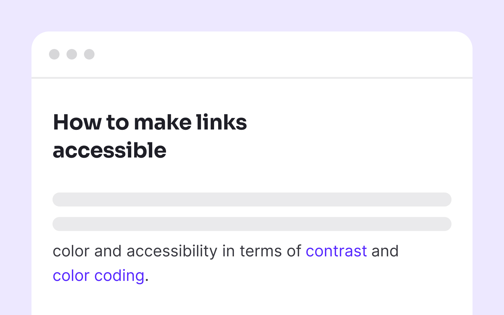
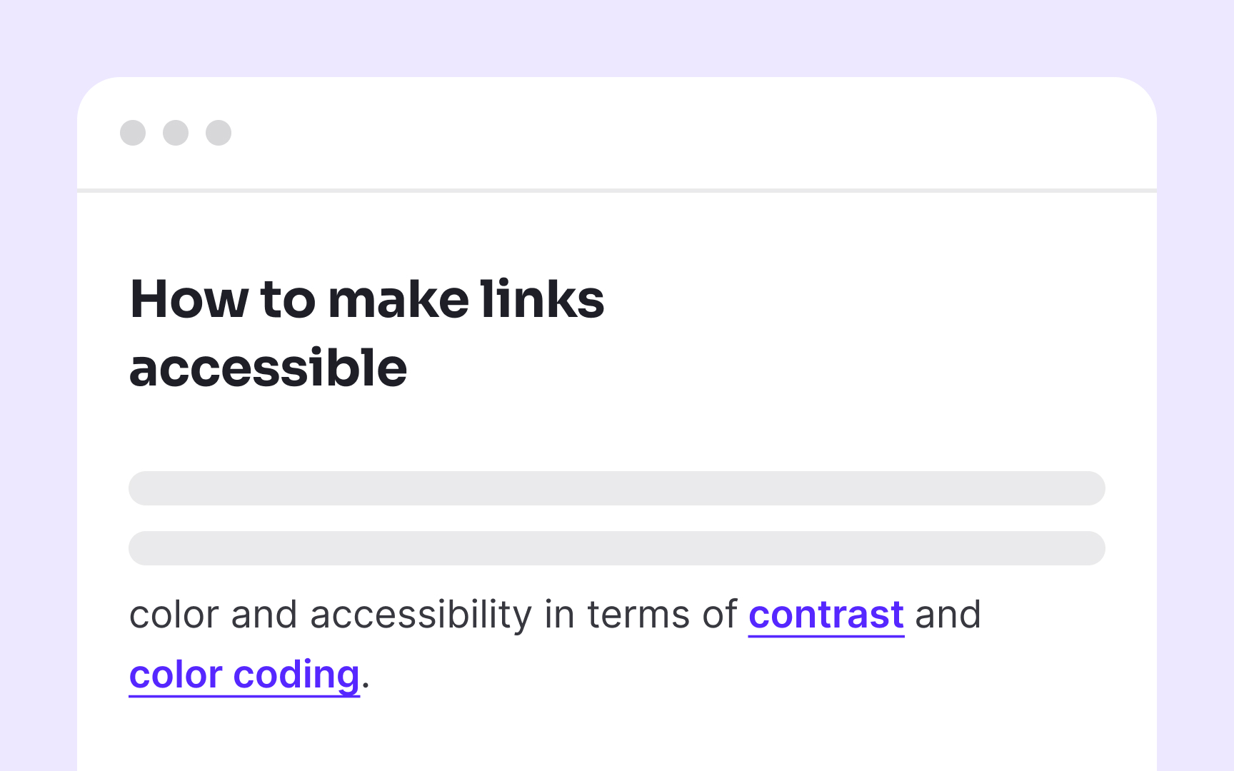
To ensure links are easy to identify, use multiple visual cues. Underlining is one of the most effective and universally recognized ways to signal a
Your chosen brand voice should extend to every interactive element, including
While maintaining brand consistency, link text must still prioritize clarity and descriptiveness. Replace generic phrases like "Learn more" or "Click here" with specific, action-oriented text that communicates both destination and purpose while reflecting your brand voice. For example, a playful brand might use "Dive into our color theory guide" while a more professional one could use "Explore our comprehensive color theory guide."
Pro Tip: Create voice and tone guidelines specifically for interactive elements like links, buttons, and form labels to ensure consistency while maintaining accessibility.
Focus indicators serve as the visual equivalent of a mouse pointer for keyboard users. Without clear focus states, keyboard-only users face an impossible challenge, they can't see which element they're currently interacting with, making navigation essentially invisible.
Every interactive element, including
Design focus states with intention rather than relying on browser defaults. The WCAG 2.2 requirements specify that focus indicators must have a minimum contrast ratio of 3:1 against adjacent
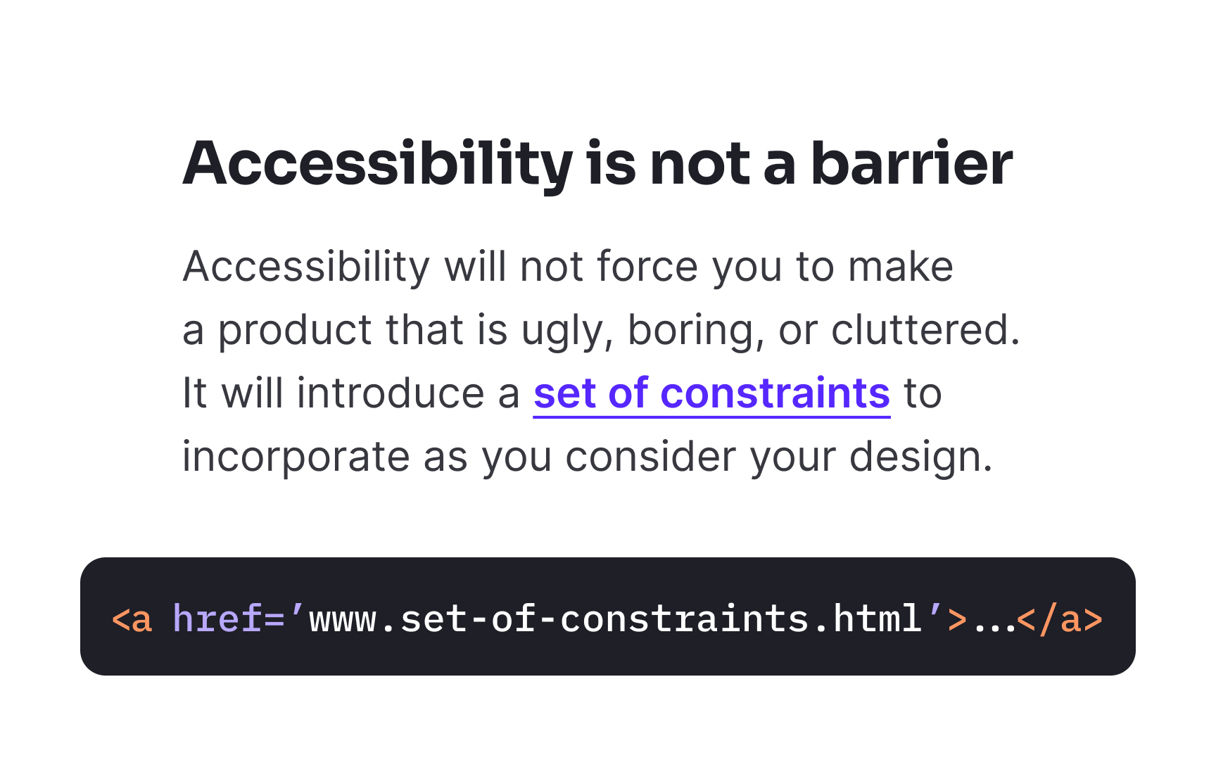
For a href attribute. Screen readers and other assistive technologies specifically look for this attribute to identify and announce elements as
Many developers create "fake" links using non-link elements like <div> or <span> with click handlers or by using anchor tags without href attributes. These approaches create major href attribute, screen readers will not announce the element as a link, keyboard users cannot
Pro Tip: There's no need to use the words "link" or "links to" in your link text, as screen readers tell users when they encounter a link.
Help
Common placement patterns include:
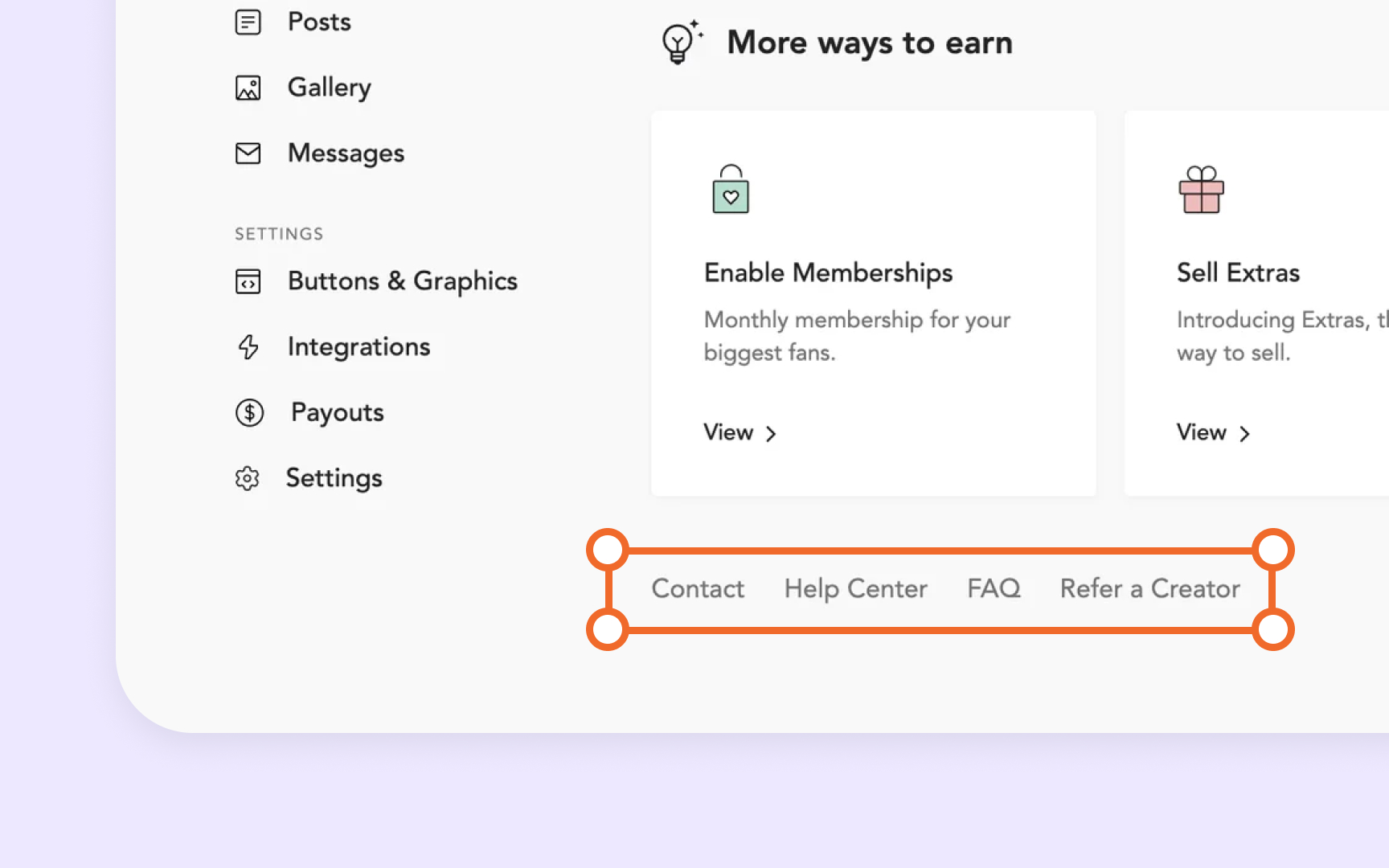
- Persistent footer links to support resources
- Help sections within the primary navigation
- Utility navigation areas in the header
- Consistent help
icons in fixed positions (like bottom-right corners)
Whatever pattern you choose, maintain it across all pages within your product. When users learn where to find help on one
References
Top contributors

Topics
From Course

Images provided by

Share


Similar lessons

Intro to Accessibility

Inclusive Design Basics
