Sidebar Menu

👋 Hi folks,
✨ I have designed a concept-based sidebar for Design Vault - a design resource management platform.
Simple, clean navigation with a touch of glass effect.
👀 Which of the themes do you like?
________
Update: changes have been made based on reviews.
- Increased title font size.
- The title 'Main' changed to 'Menu'.

Tools used
Topics
Share
Reviews
5 reviews

Clean spacing and great compositions of UI elements reflect thoughtful attention to detail.
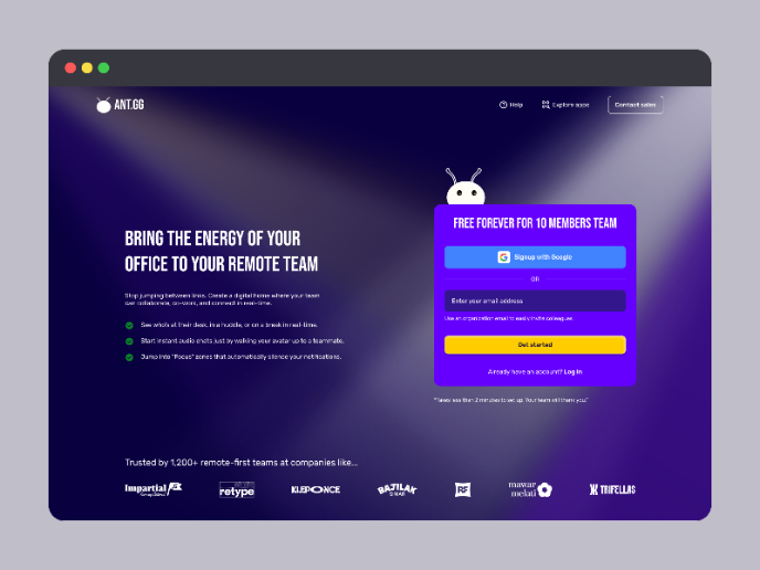
I noticed that the navigation bar is divided into multiple sections, each with its own title: "Main," "Resources," "Team," and "Other." I’m curious about the reasoning behind naming the section “Main.” Was it to ensure consistency by having a title for every section, or is there a specific intent behind the naming choice? Can this section exist without a title?

Amazing job! My favorite definitely is the glass effect!
Your design of the glassy effect of the highlight is awesome. The blueish background color look more sophisticated. Nevertheless, would need to look into the overall theme of the application before one could say which theme of your design is a better fit.
Regarding the label "Main", I would leave it away because of conventions of such sidebar menu design.
All in all, your design is awesome.

Hi Anna,
The sidebar menu design strikes a nice balance between simplicity and functionality. Its clean structure makes navigation feel effortless, while the subtle visual touches add personality without overwhelming. A well-executed and user-friendly component—great job!

Hey Anna, I love what you’ve done here!
The design feels fresh and perfectly aligned with modern trends. One small improvement to consider might be the size of the section titles. Adjusting the font size slightly larger could enhance readability and ensure key sections stand out clearly.
It would be fantastic to see this transformed into an interactive prototype—your work is already so engaging, and bringing it to life would amplify its impact even further. Amazing job, and I’m excited to see more of your work.
You might also like
SaaS Signup Design


Events Managment App


Customer Journey Map — Offsite Co-Working Experience


Mobile Onboarding: Casa di Pasta


Accessible Signup & Login Experience — Brainex


Accessible Signup Form

Popular Courses

UX Design Foundations


Introduction to Figma

Design Terminology
