SaaS Signup Design

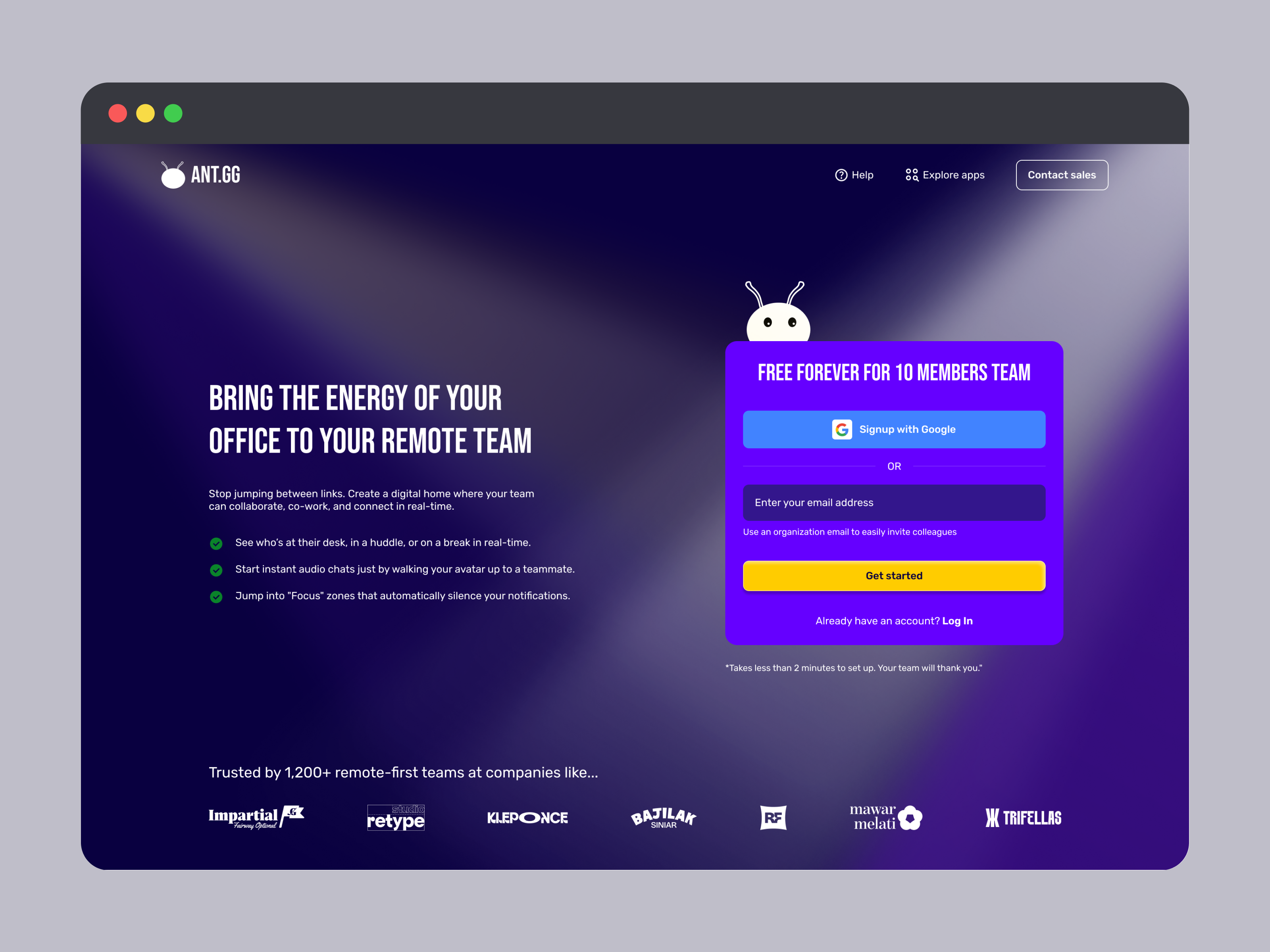
This is an exciting task, designing a SaaS sign-up page, and this time I chose my own app, ANT.gg, which offers a digital workspace/office for a remote team. This app is just my personal project tho, not published yet, but I built it seriously just in case :)
On this assignment, I had some concern to the most of the general SaaS and remote work apps out there:
- Only allows "work/company/organization email", not personal email.
- Too much manual data entry e.g company/org name, their role, and so on. If it's for their internal market research, so it's up to them, but I disagree with it since remote worker mostly just freelancers, whose used personal email.
- Only show the sign-up form, and that's it! for the sake of simplicity and guiding users' focus on the sign-up task.
With the above list of problems I found, I learned and applied the solutions to my app, ANT.gg:
- Work email is optional; I add the SSO(Single Sign On) option and allow personal email, give the user a hint below the email input field for work email, and it's beneficial to easily invited collegues to ANT.gg
- Add encouragement copywriting telling the benefits of the product. We can repeat the copy we already had on the hero section of the landing page.
- List the most beneficial features the app offers for users. Here, I pick the top 3 features that my users love the most.
- Last but not least, instead of just showing a sign-up form to the user, I copied the trusted company that been using my app from the landing page, just to remind potential users(who currently want to sign up): "ANT.gg has been used by so many trusted companies out there, so what are you looking for?"
To explain it further, perhaps you can give it a try on this prototype and let me know what you think about the accessibility, usability, visual design, or my presentation.
Thank you!
Tools used
From brief

Topics
Share
Reviews
4 reviews

Hey Rizky 😊
You’ve built a really nice prototype. The animations and all the different states you included show a lot of care and effort, and it really comes through.
On the first screen with the sign up form, the background of the form feels a bit too close to the main background. I’d love to see it stand out a little more, especially since this is where you want to encourage people to actually sign up.
For the longer loading state where it says “Wait 10 secs”, I think a progressive loader could work much better. That way users can see that something is happening and how far along it is. If someone has a slow connection and it takes longer than 10 seconds, they might think something is broken, so giving them clearer feedback could really improve the experience.

Hey Rizky 😊
This SaaS signup design feels sharp and focused right away 🚀✨ It doesn’t feel cluttered, which is super important for something that can easily scare users off.
I like how the layout seems structured and calm it guides the user instead of overwhelming them with too many fields. That kind of friction reduction is exactly what good SaaS onboarding needs 👌📩
If I’d push it a bit further, maybe add stronger value reminders near the form like quick benefits or trust badges to reinforce why someone should complete it 💡🔒 But overall, clean, conversion-aware, and nicely executed.

Hi Rizky, great job putting this together, a prototype always helps getting a good experience of the functionality.
Let me share a few things that I've noticed and might improve your work:
From a visual perspective:
- things like line-height (for the paragraph starting with "stop jumping...") and font size for that and the bullet points might improve readability and impact
- button states (active, hover, default) is advised to have visual consistency, even if you use different colours for different actions. I can see one button is flat, while the other uses a slight drop shadow.
- the pixel art office that you are showing is really nice. If that's not just an example or a theme, you could strengthen the brand by using a similar styling for your landing page - think colors, logo, buttons or mascot.
From a usability point of view:
- I've noticed the password inputs and mascot move a few pixels when interacting with them - while it's not super noticeable, it can be annoying for the user and make the interface look unpolished
- if there is just one landing page for both logging in and signing in, keep into account what users tend to need to do more frequently - if session is ended when they leave the page and they always need to log in, having one extra click to reach the login page might slow them down.
Hope this helps!

Hey Rizky 😊
Nice project and I can see you approached it thoughtfully. I like that you identified real problems with SaaS forms and proposed concrete solutions. SSO + optional work email is a good call, and adding social proof at the bottom is a solid move.
I agree with Petar. The form visually blends into the background. Purple on purple doesn't give it enough distinction, and this is the key element of the page. A bit more contrast or a subtle border/shadow would do the job.
The left side with benefits works OK, but the three bullet points with green checkmarks look quite generic. It might be worth strengthening them visually e.g. icons or shorter, punchier copy.
Overall this is quite good work for a personal project. You've got good instincts when it comes to UX and strategic thinking. Polish up the form contrast and it'll be great! 💪
You might also like

eWallet App Development Project


🖥 Desktop Checkout Flow Design


Website CRM Dashboard


Helpful 404 Error Page for a Fintech Mobile App

TaskFlow Authentication Flow


Pebble Accessible SAAS Signup Flow

Visual Design Courses

UX Design Foundations


Introduction to Figma

Design Terminology
