Common Patterns
Strategically transform routine product moments into opportunities for clarity, guidance, and user trust
Common patterns are the recurring content moments that appear in every product. Error messages, empty states, modals, and loading screens might feel like small details, but they’re some of the most important moments in a product. When your payment fails, when your search returns no results, or when you're waiting for content to load: these moments test whether a product truly understands its users. Smart teams recognize that these patterns do heavy lifting across the entire product experience. A well-crafted error message prevents support tickets. A thoughtful empty state converts new users. A clear permission request builds trust. These patterns work harder than any marketing effort because they appear exactly when users need guidance most. Teams that treat them as reusable components not only create better experiences but also ensure quality scales as the product grows.
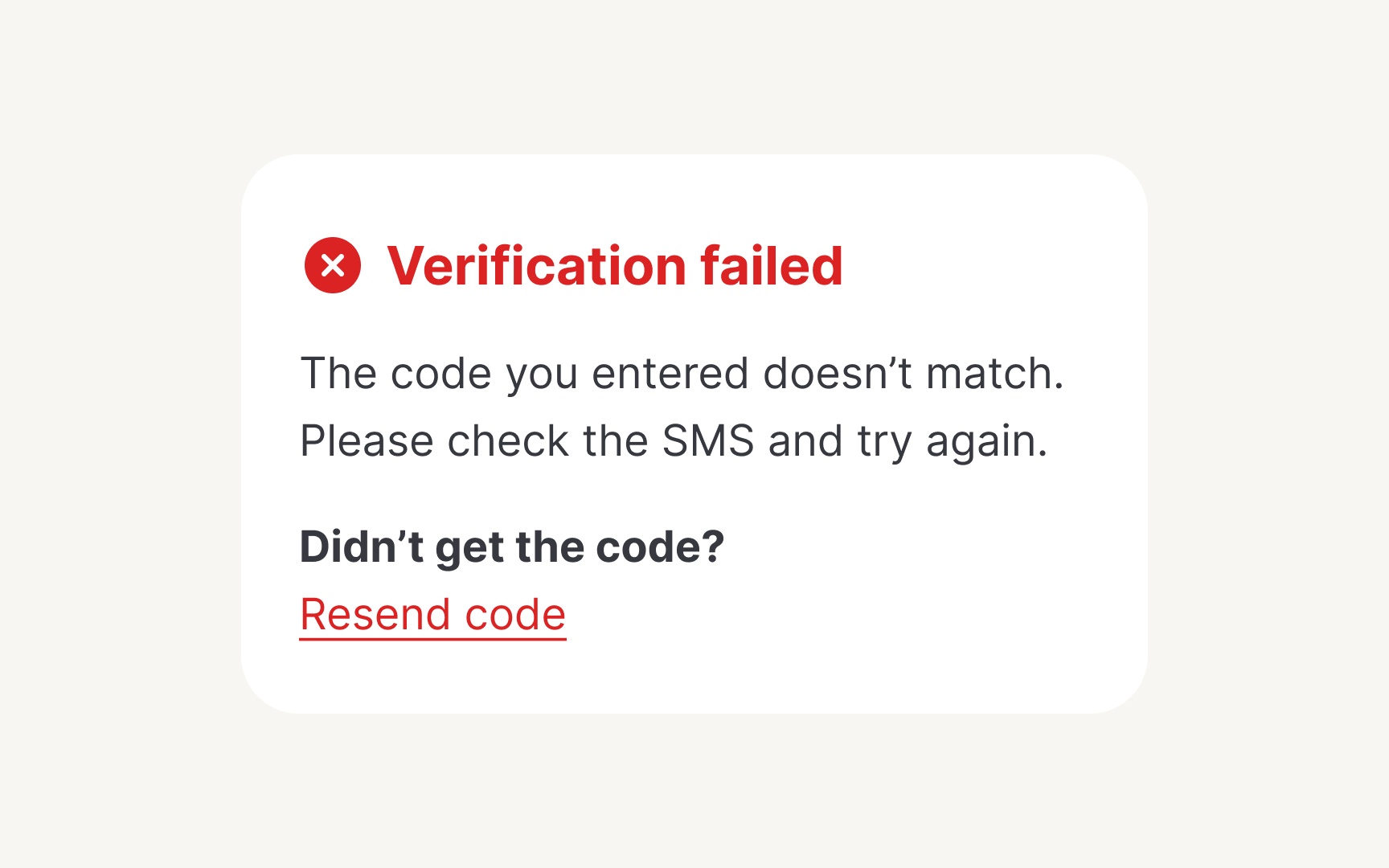
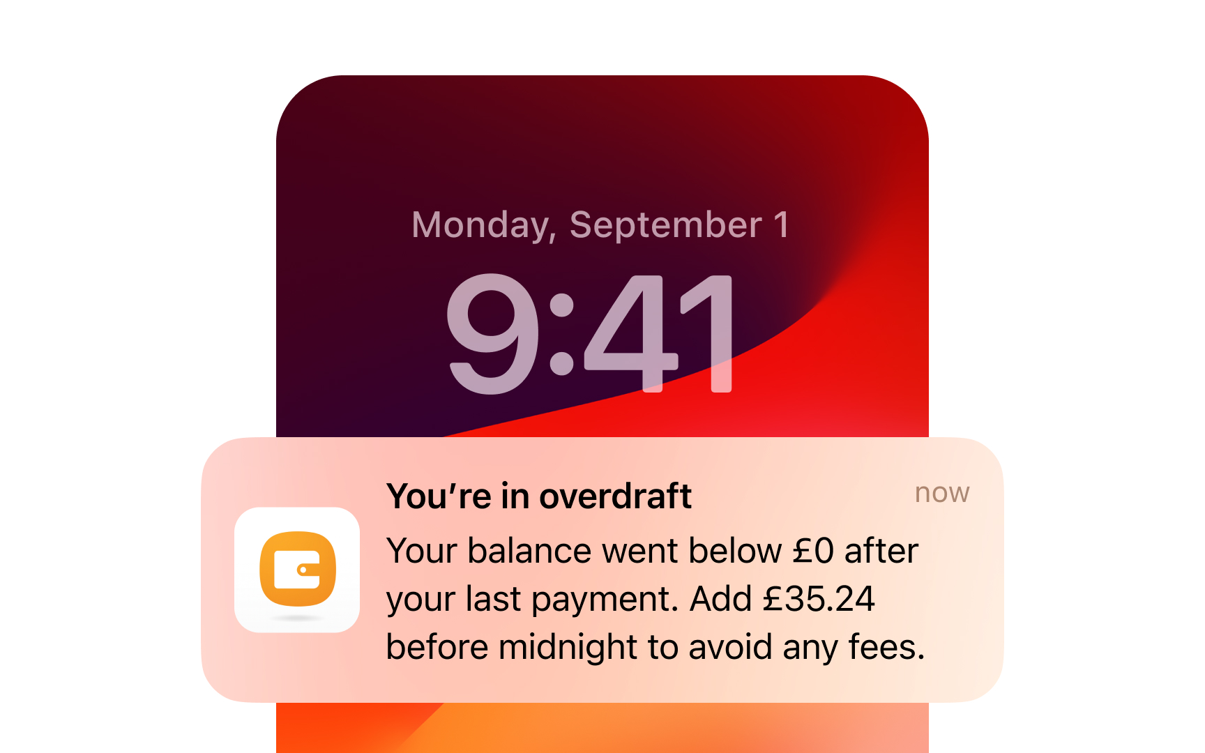
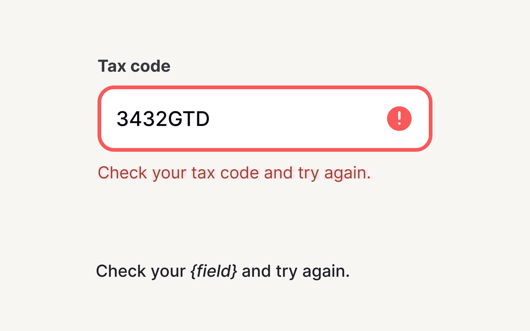
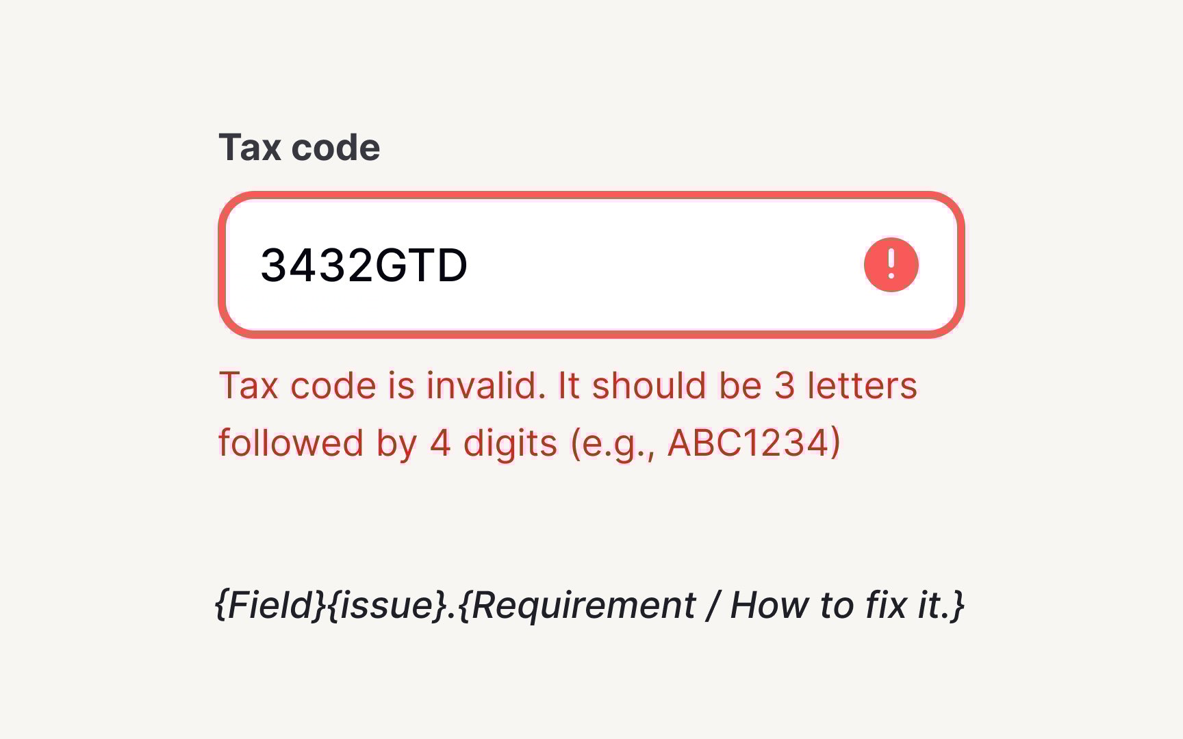
Build your error message framework around 3 components: what happened, why it matters, and what to do next. Create templates like "[Problem]. [Impact]. [Solution]." For example: "The code you entered doesn’t match. Didn’t get the code? [Resend code].”Document variations for different severity levels and contexts.
Define structure requirements: headline, body text, CTA, along with character limits, and the tone options. This prep means teams don’t spend too much time during development, and users get consistent, clear guidance.
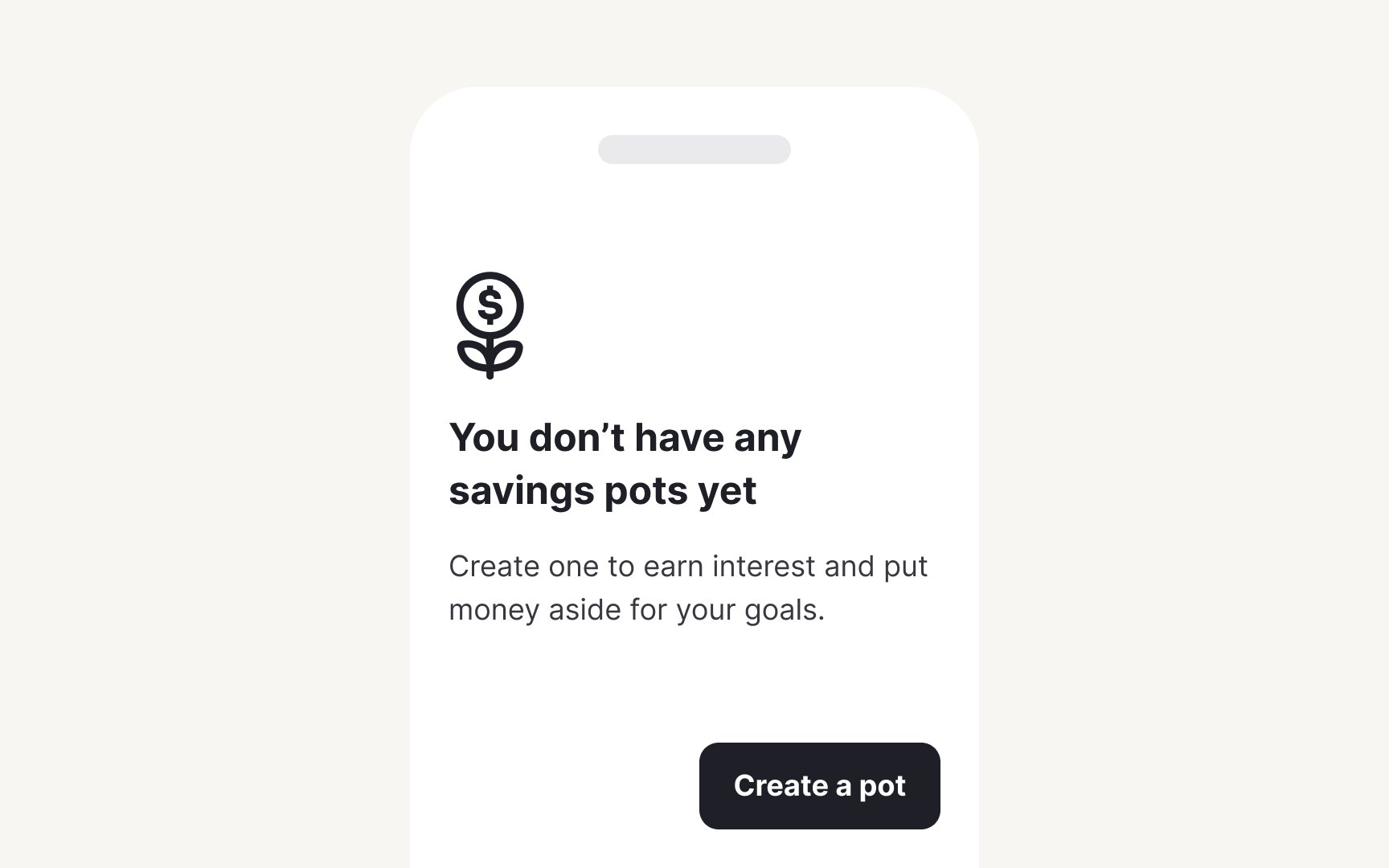
Empty states are your first opportunities to impress as a product. When users encounter blank screens, a new dashboard, empty inbox, or no
Create empty state templates that answer 3 questions: why is this empty, what value awaits, and how to get started. Build variations for different contexts: first-time empty (onboarding), no results empty (search/filters), and cleared empty (user deleted everything). Each needs its own messaging that matches the user goals and mental model.
Document your empty state hierarchy. For example, primary empty states get illustrations and detailed guidance. Secondary states stay lighter with just text and actions. Define length limitations, image specifications, and tone variations. Include accessibility guidelines for screen readers.
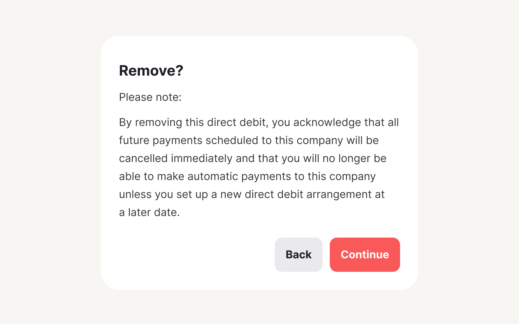
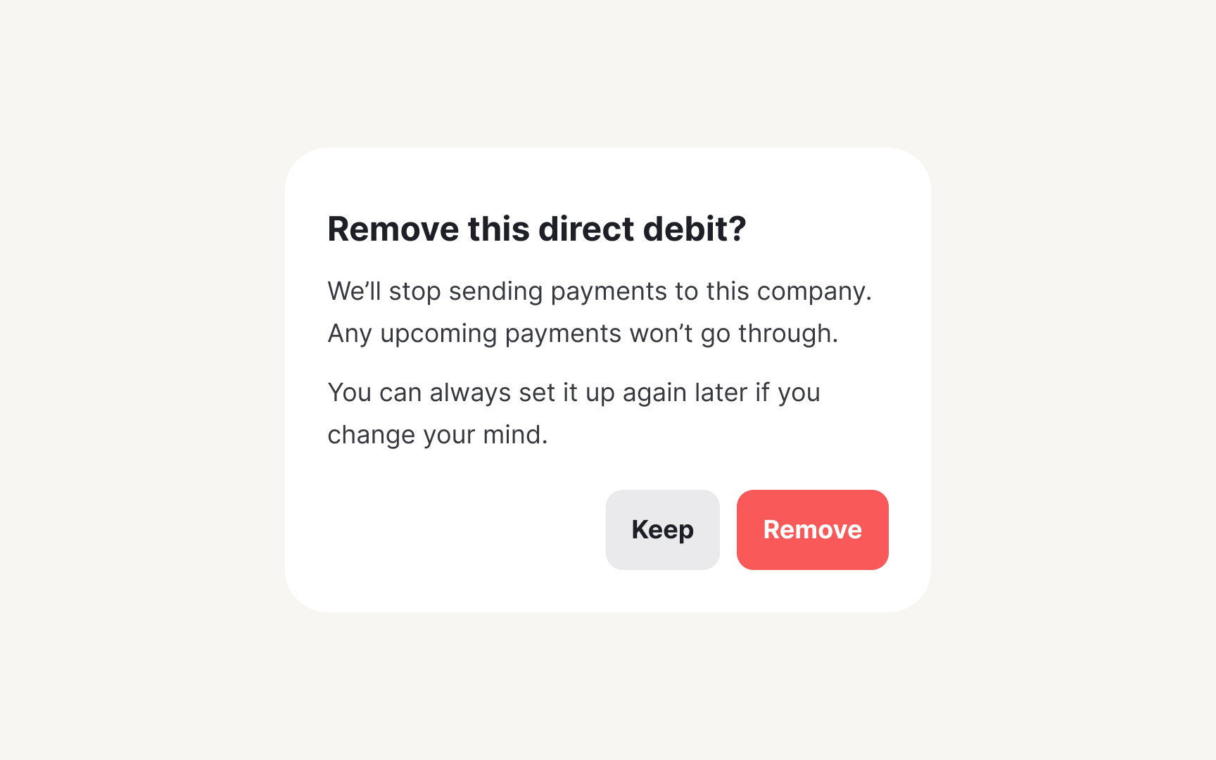
Confirmation dialogs protect users from costly mistakes. When someone clicks delete, cancels a subscription, or discards unsaved work, these patterns create a critical pause. Without standards, products develop inconsistent friction. Some actions are too easy to reverse while others provide unnecessary warnings. With a systematic approach, you can safeguard important actions without frustrating users.
Make confirmation messages based on the severity of the consequence of the action. Low-impact actions need minimal friction: "Discard draft? You can start over anytime." High-impact actions require clear consequences: "Delete account? This permanently removes all data, projects, and access. This cannot be undone." Match the interruption level to the potential regret level.
Document button labeling standards. Instead of vague "Yes" and "No" buttons, use specific action labels that match the user’s intent and the context of the dialog.[2] Create
Every product sends notifications, success confirmations, system updates, new messages, but without standards, users face a chaotic mix of popups, banners, and badges. A systematic approach creates predictable patterns that users can quickly scan and dismiss.
Define notification levels based on urgency and user action required. Success notifications confirm completed actions: "Changes saved." Info notifications share updates: "New feature available." Warnings prevent problems: "Storage almost full."
Create templates that scale across channels. In-app notifications stay contextual and brief. Push notifications hook attention with value. Email notifications provide detailed records. Document character limits for each channel, timing rules (immediate vs. grouped, and frequency limits. Include guidelines for notification grouping and summary patterns. Having a system prevents notification fatigue while ensuring critical information reaches users.
Pro Tip: Test notification templates with real data: names, numbers, and edge cases that break your character limits.
Form validation messages make or break the user experience. Without
Create validation templates that prevent and resolve
Document validation timing and placement. Real-time validation helps for formats (
Focus on moments of value, not comprehensive tours. Users learn by doing, not reading. Map your onboarding flow to user milestones. First session: core value. First week: key habits. First month: advanced features. Define when to educate (during relevant actions) versus when to stay quiet (when users are flowing). Document character limits for tooltips and progress indicators.
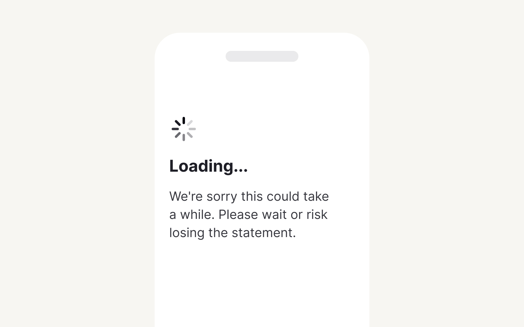
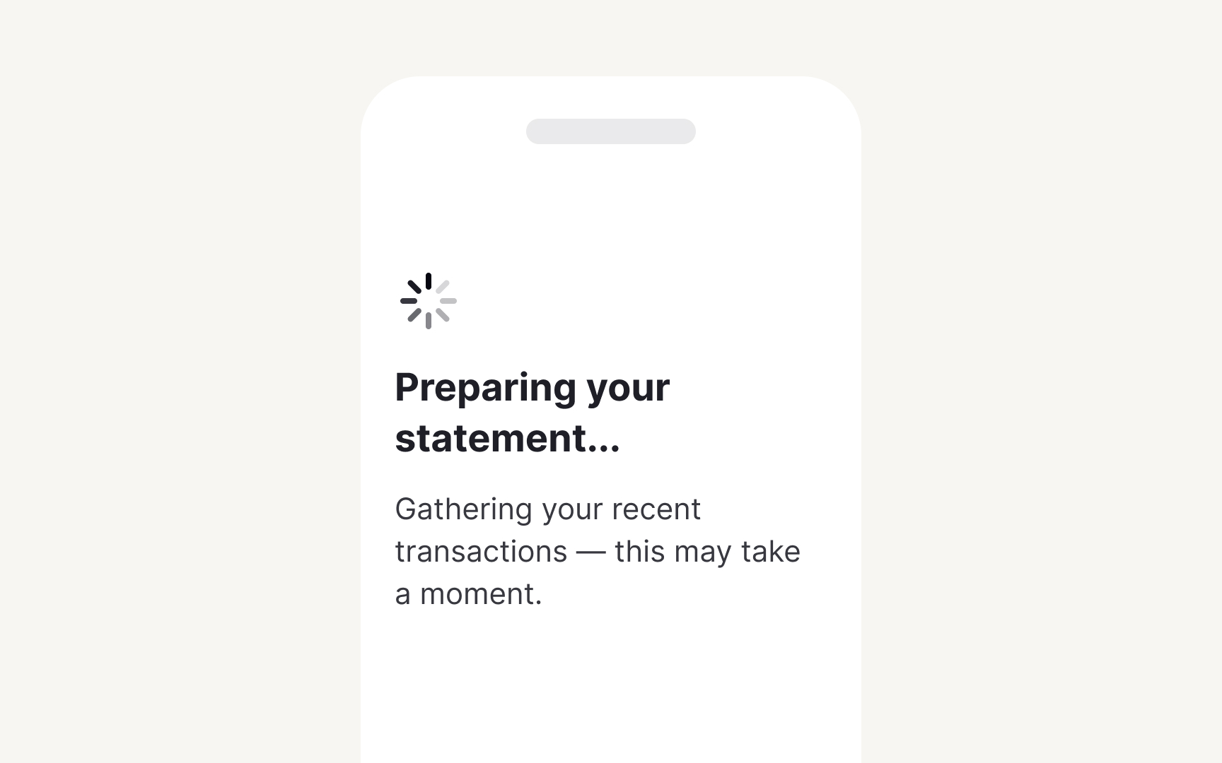
Create loading templates that inform and reassure. Build formulas based on what's happening: "Loading your {content type}..." for retrieval, "Processing {number} {items}..." for batch operations, "Almost there—{specific step}..." for multi-stage processes. Add context that helps users understand the wait is worthwhile.
Define loading patterns by duration. Under 1 second: no message needed. 1-3 seconds: simple status. 3-10 seconds: explain what's happening. Over 10 seconds: show progress and value. Include fallback messages for when things take longer than expected. This systematic can make waiting feel more purposeful.
Pro Tip: Front-load value in loading messages. "Preparing your personalized dashboard" beats "Loading...”
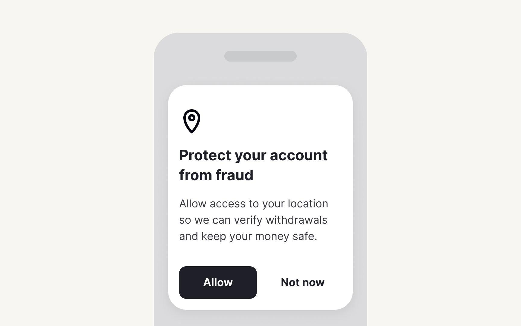
Permission requests determine feature adoption and trust. Without
Build permission templates that explain value before asking. Create context formulas: "{Feature} needs {permission} to {specific benefit}." For example: "Video calls need camera access to let teammates see you." Never request
Map permissions to user benefits, not technical requirements. Document pre-permission screens that prepare users before triggering system dialogs. Define fallback experiences for denied permissions with gentle re-engagement prompts. Include character limits that work within system constraints. This framework maximizes opt-ins while respecting user choice.
References
Top contributors
Topics
From Course

Share


Similar lessons

Text & Media as Layers

Why Gamify?
