Dialogs
There are two types of dialogs in interfaces: non-modal and modal. Non-modal dialogs appear without disabling content, letting users continue their workflow and sometimes even move or minimize the window.
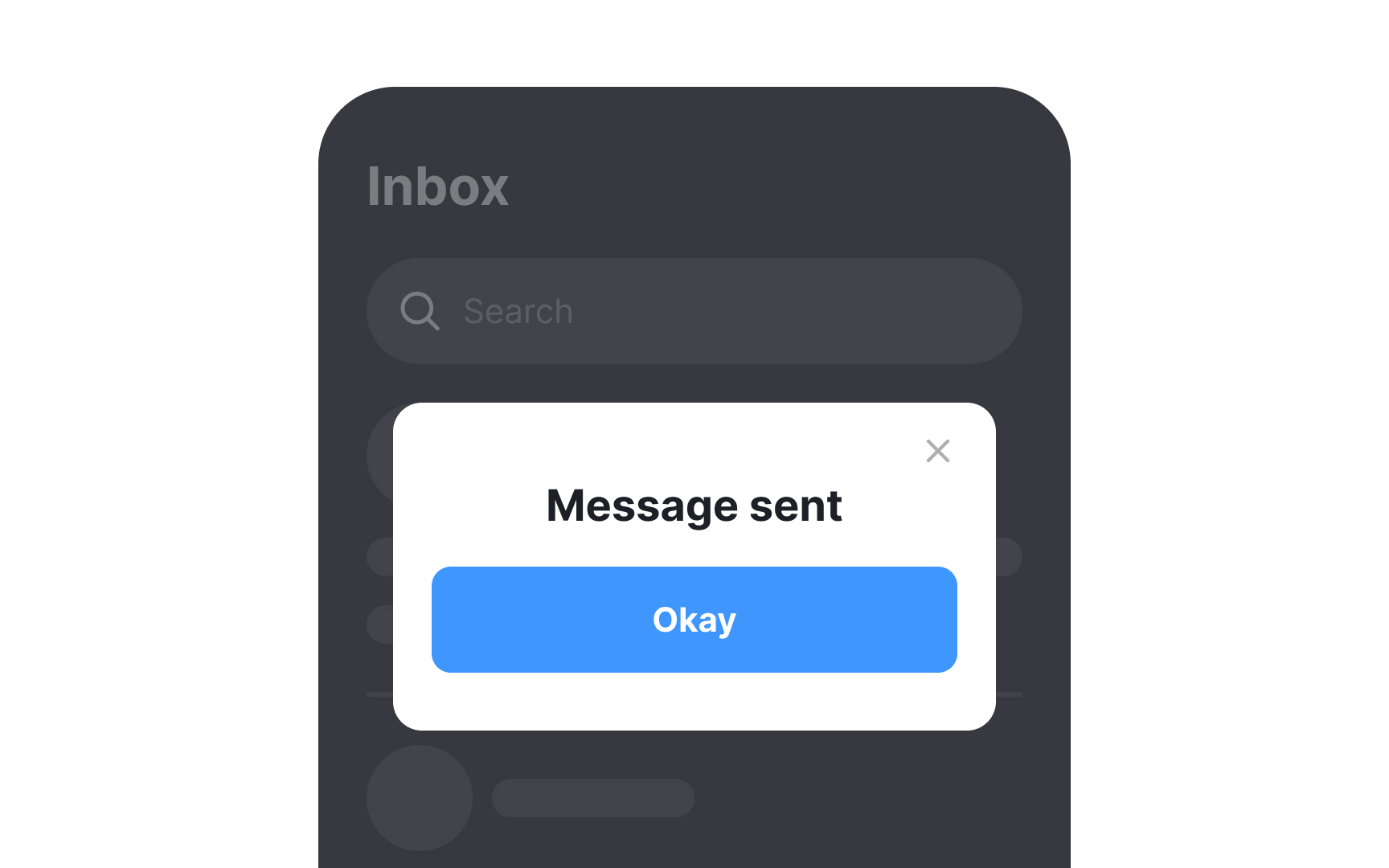
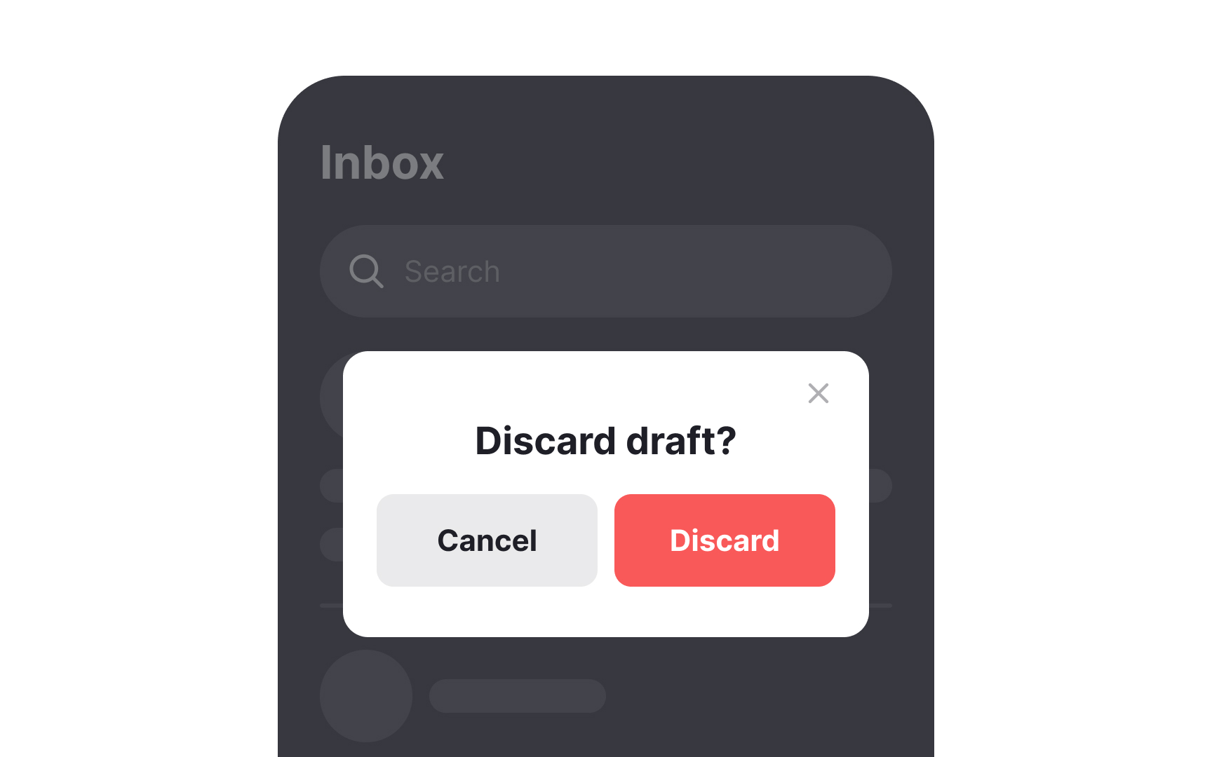
Modal dialogs, however, demand immediate attention like a traffic stop — blocking the main content until users take action. They interrupt tasks and increase cognitive load, potentially making users forget their previous context. On mobile, modals can appear as:
- Pop-ups
- Partial screen overlays
- Full-screen dialogs
Though intrusive, modals are often necessary to prevent disasters. They're particularly useful for warning users about potential data loss or irreversible actions.[1]
For less critical information, consider gentler alternatives. Snackbars automatically disappear, while banners stay visible until dismissed or until their triggering issue resolves.[2]
Pro Tip: When a modal dialog is the only solution, make sure its action buttons are within the thumb zone and are easy to reach.
References
- Modal & Nonmodal Dialogs: When (& When Not) to Use Them | Nielsen Norman Group
- Material Design | Material Design
