Snackbars
Snackbars are brief, non-intrusive messages that appear at the bottom of an interface, used to inform users of actions or events without disrupting workflow.


TL;DR
- Temporary notifications in digital interfaces.
- Provide feedback on user actions.
- Appear briefly at the bottom of the screen.
- Minimize interruption while maintaining clarity.
Definition
A snackbar is a lightweight UI element that delivers short, informative messages about actions or system events, typically appearing at the bottom of the screen for a limited time.
Detailed Overview
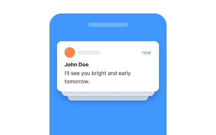
Snackbars are an important part of feedback systems in digital products. They serve to confirm or notify users of actions without requiring them to leave their current context. For example, when a file is saved or an email is archived, a snackbar may briefly appear to confirm success. Unlike modals or alerts, snackbars are intentionally unobtrusive.
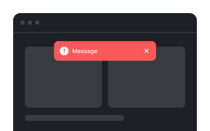
A frequent question is how snackbars differ from notifications or dialogs. Notifications are often persistent and may live outside the product itself, such as in a device’s system tray. Dialogs, on the other hand, interrupt workflows and require user action to dismiss. Snackbars occupy a middle ground; they are visible and informative but fade automatically, demanding little effort from the user.
Another common query involves duration. Snackbars must stay long enough for users to notice and read, but disappear quickly enough to avoid clutter. Standard timing ranges between three to six seconds. Many designs also allow users to dismiss them early if desired.
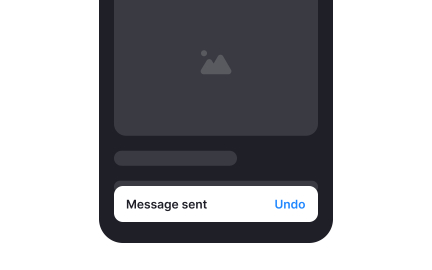
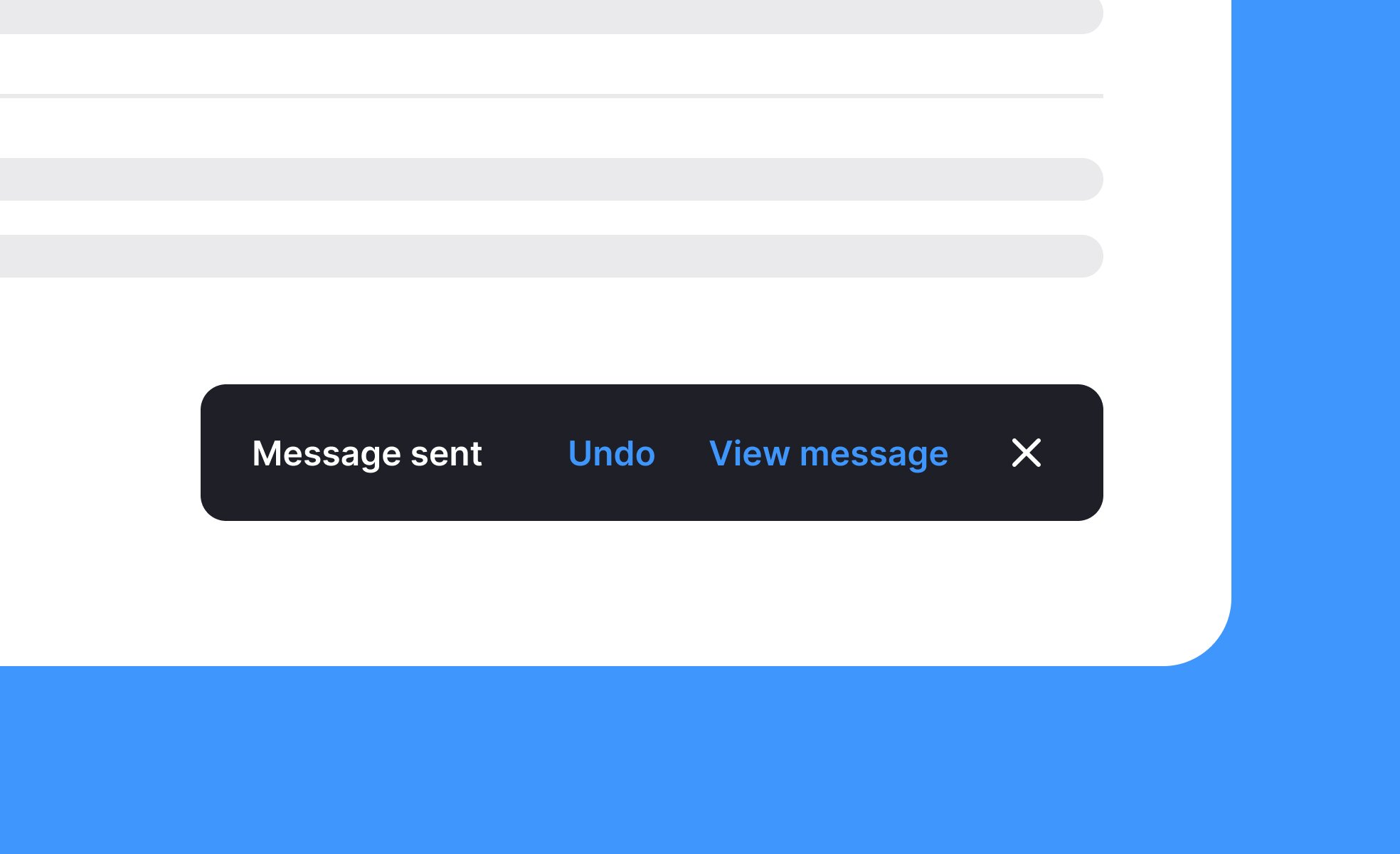
Teams often ask about interactivity. Snackbars can include actions, such as an “Undo” button after deleting an item. This gives users reassurance and control without requiring a full alert. However, designers must avoid overloading snackbars with too many actions, as their purpose is to remain simple.
Accessibility is another important topic. Snackbars must be coded so screen readers can announce them, ensuring that users with visual impairments receive the same feedback. Designers should also test placement and timing carefully to avoid excluding slower readers or users with attention challenges.
Finally, snackbars are part of building user trust. By providing clear, timely confirmations, they reassure users that the system has recognized their actions. This reduces uncertainty and improves overall experience, making snackbars an essential but understated design tool.
Learn more about this in the Snackbars Exercise, taken from the Intro to UI Notifications Lesson, a part of the UI Components II Course.
Snackbars appear within the product interface and vanish after a short duration, while system notifications live outside the app, often persisting until dismissed. Snackbars confirm immediate actions without cluttering the system.
This distinction makes snackbars ideal for contextual feedback directly tied to user input.
Snackbars are best for minor confirmations or non-critical events, such as “Message sent” or “Item deleted.” Dialogs are appropriate when user action is required, like confirming a purchase or deleting an account.
Choosing the right tool depends on the severity and importance of the action.
They typically stay for three to six seconds, giving users time to read without overstaying. Some snackbars pause on hover or allow dismissal. Timing must balance visibility with unobtrusiveness.
If a message is too complex for that duration, a more persistent component may be appropriate.
Yes, many include a single quick action like “Undo.” This allows users to reverse actions easily without leaving context.
Too many actions, however, defeat their purpose, so restraint is key.
Snackbars must be announced by screen readers and allow sufficient time for users to read. Designers should ensure clear contrast, adequate text size, and logical placement.
Accessible snackbars ensure inclusivity and prevent critical feedback from being missed.
Recommended resources
Courses

UX Design Foundations


UI Components I


Design Terminology