Notification Types & When to Use Them
Choose the right notification type to inform users without overwhelming them
Notifications keep users informed about what's happening in a system. But there's a tension at the heart of notification design: every notification competes for attention, and attention is finite. Send too many or use the wrong format, and users start ignoring them entirely. Send too few or bury important messages, and users miss critical information.
The challenge is matching notification types to their purpose. Some messages need to interrupt. Others should wait quietly until users are ready to engage. Some require action. Others just need acknowledgment. The format you choose signals urgency and importance before users even read the content.
Color, placement, persistence, and dismissibility all shape how users perceive and respond to notifications. A message that lingers demands more attention than one that fades. A notification at the top of the screen feels different from one anchored to the bottom.
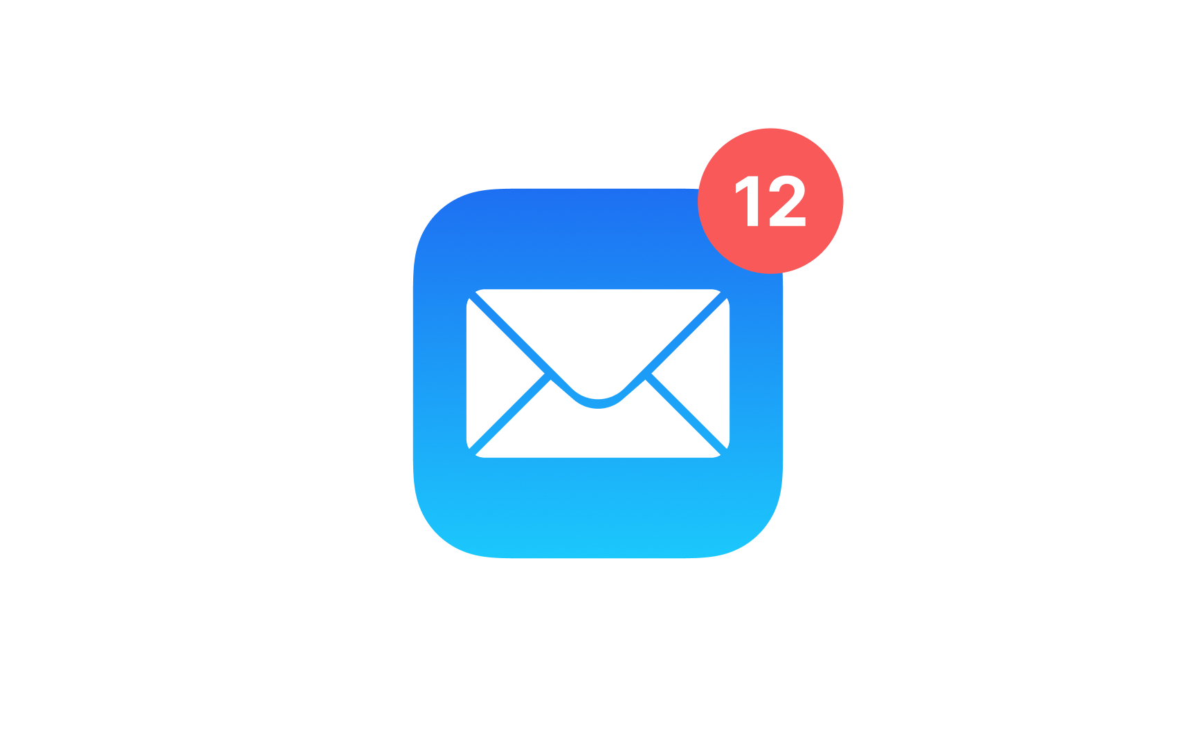
A badge notification is a small circular visual indicator that informs users about unread messages,
There are two main types of badge notifications:
- Count badges display a numerical value indicating the quantity of new items or notifications, such as unread messages or pending tasks.
- Dot badges use a simple dot to signify the presence of new
content without specifying the exact count.
The best way to style a badge notification is to make it noticeable yet harmonious with the overall design. Consider using contrasting
Pro Tip: Badge notifications should stand out — bright contrasting colors come in handy here.
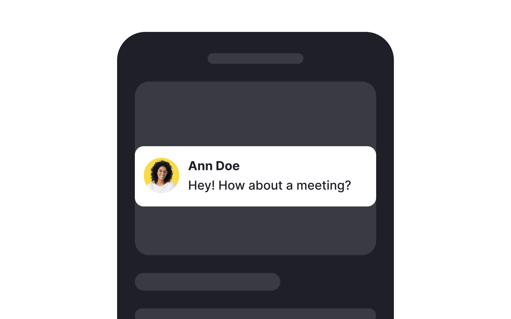
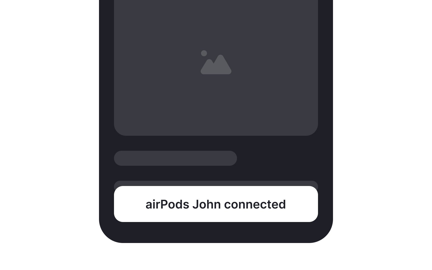
A banner notification is a temporary and unobtrusive message that appears at the top or bottom of a user's screen, informing them about specific events or updates within an application. It typically includes brief text, an icon, and sometimes interactive elements like buttons. For example, when you receive a new message in a messaging app, a banner notification might appear at the top of your screen, displaying the sender's name and a snippet of the message.
These
When styling banner notifications, use
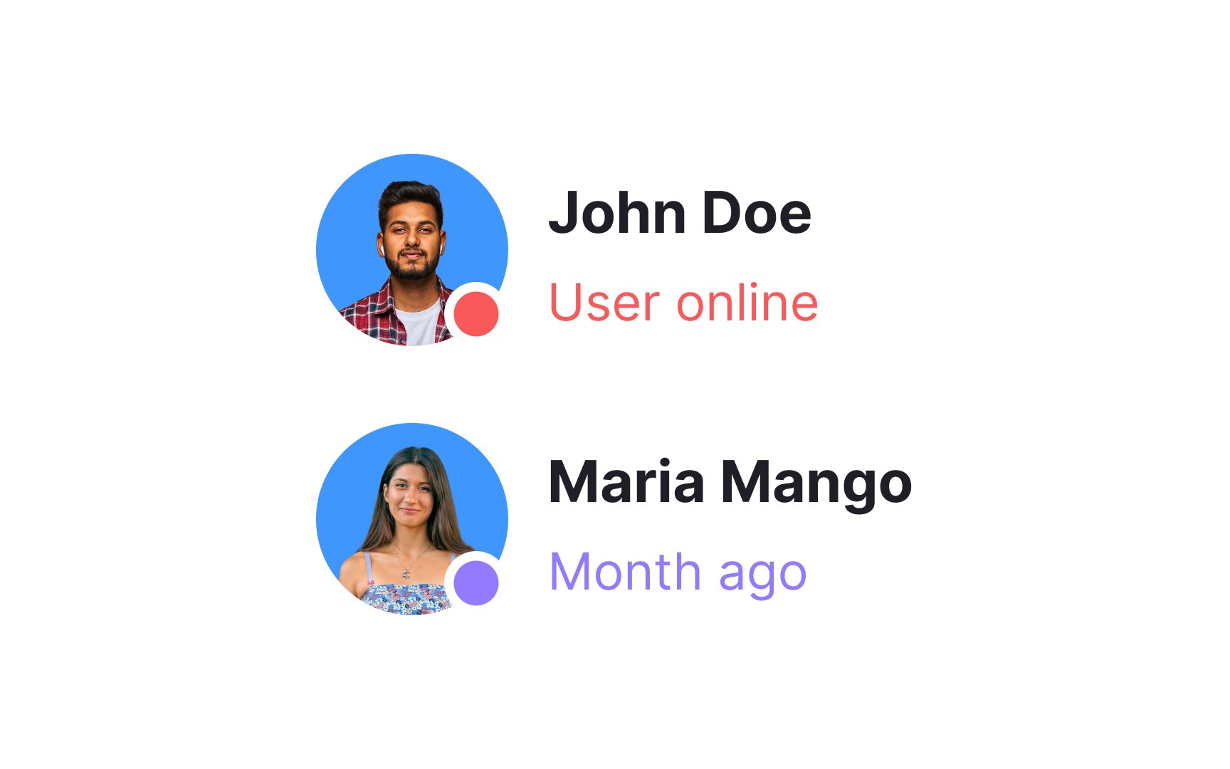
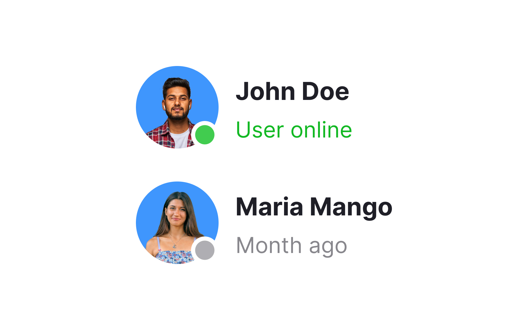
A status badge is a visual indicator used to represent the status or condition of a particular item, process, or element within an application or system. These
Choose distinct and easily recognizable symbols or colors for each status to ensure clarity. Consider incorporating tooltips or a legend to provide additional information, especially if there are multiple status options.
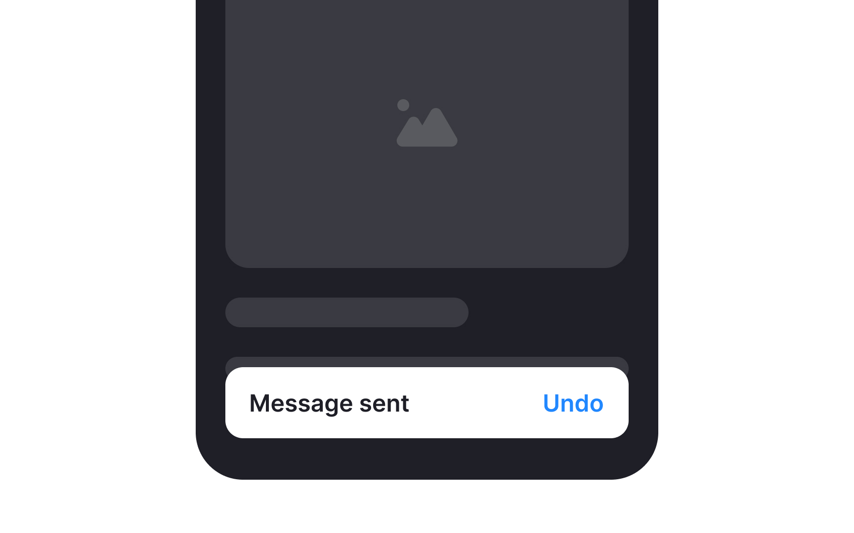
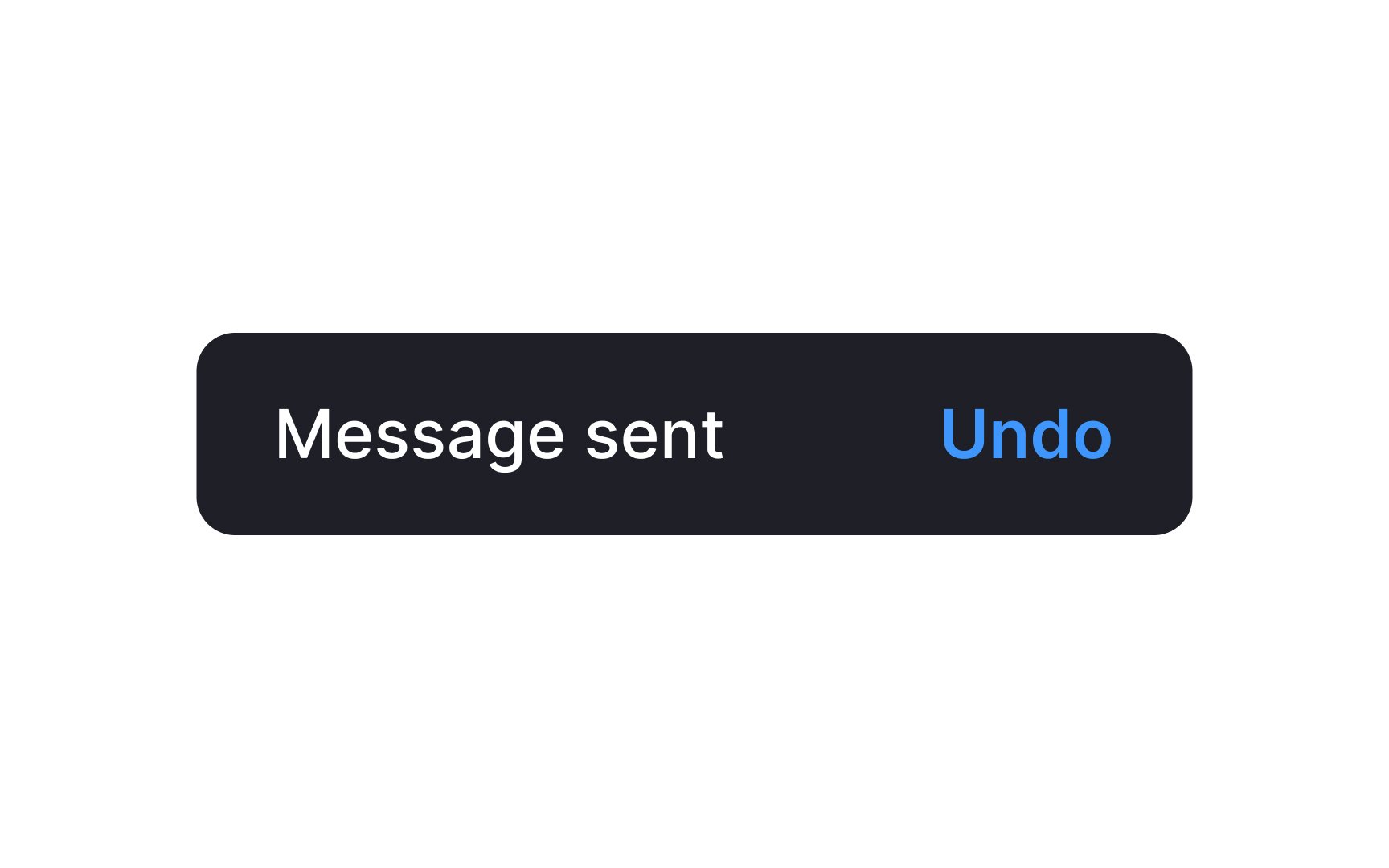
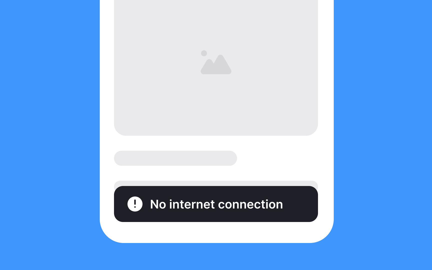
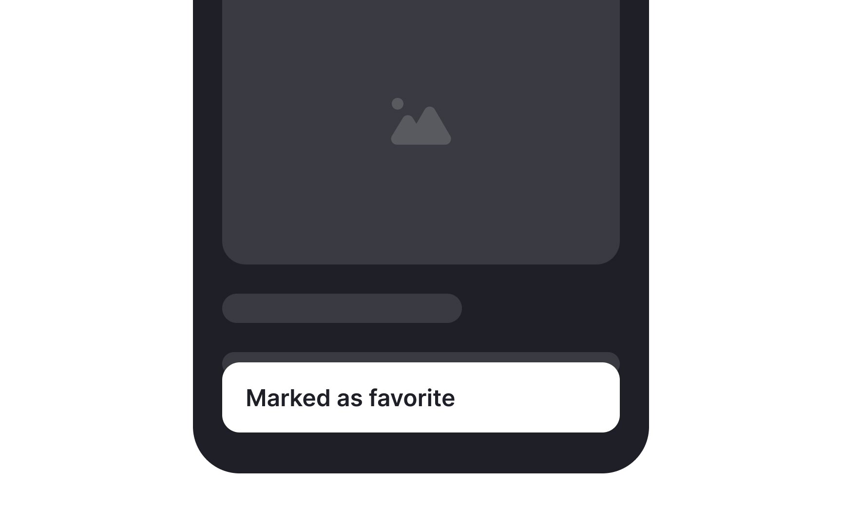
A snackbar is typically a small, rectangular container that appears near the bottom of the screen. It often contains a short message and may include an action
Pro Tip: Some users may be unaware that snackbars can be swiped off the screen. Help them learn about this option faster by adding a Dismiss button or a cross icon.
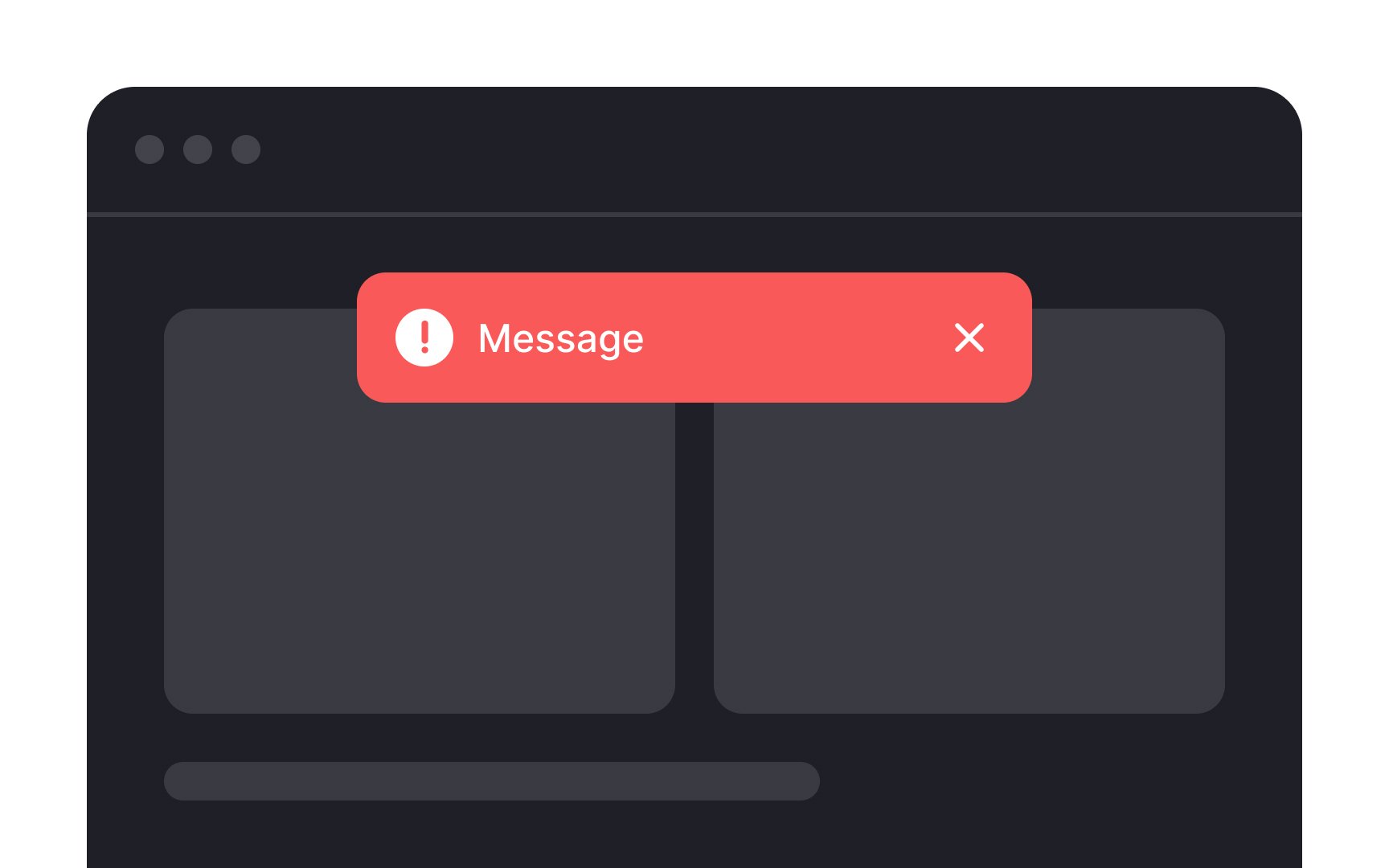
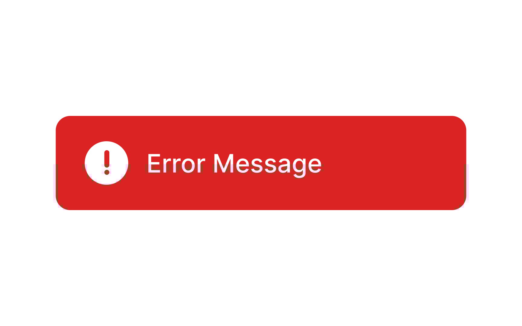
Alert notifications contain important messages that demand immediate user attention.[3] They typically appear at the top or in the bottom-left corner of the screen and are triggered by users' actions. Alert notifications persist on the screen until users choose to close them or resolve the underlying issue. For instance, in a financial app, an alert
Alerts commonly signify an error or issue by delivering a warning, and therefore, they should be noticeable enough to capture users' attention. It is advisable to refrain from relying solely on the
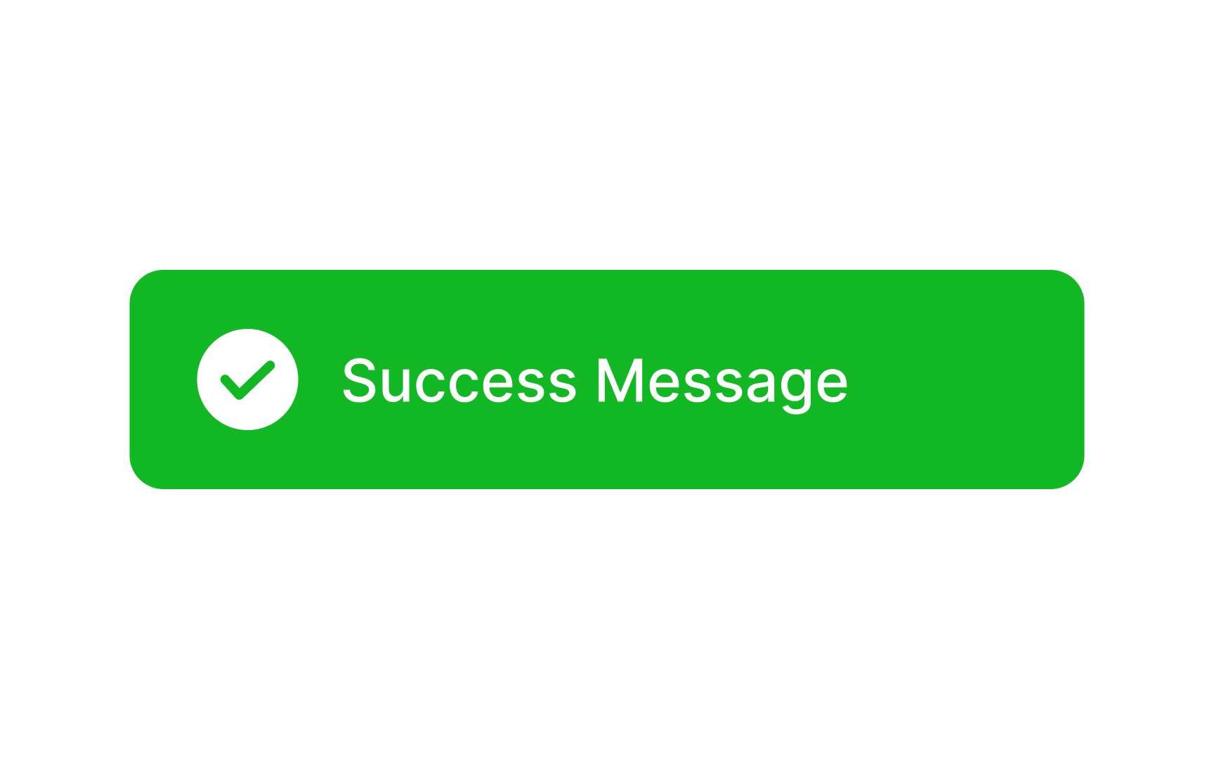
A success alert is a message delivering positive news — confirming that a message has been sent, updates are saved, or an image is successfully uploaded. It serves as a reassuring confirmation that all is well, allowing users to proceed with their tasks confidently. The use of green in the alert signifies a positive and successful system message and a check mark further reinforces the confirmation that everything is functioning properly.
Remember that success alerts are designed not to be intrusive. Typically, they either vanish automatically or can be dismissed by a simple swipe.
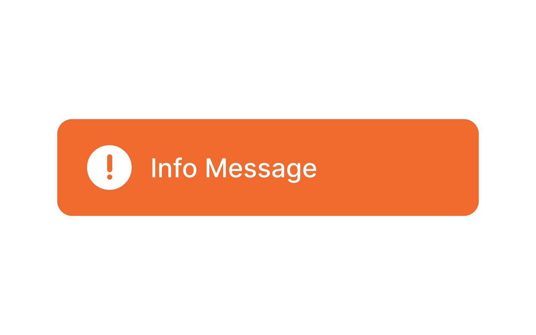
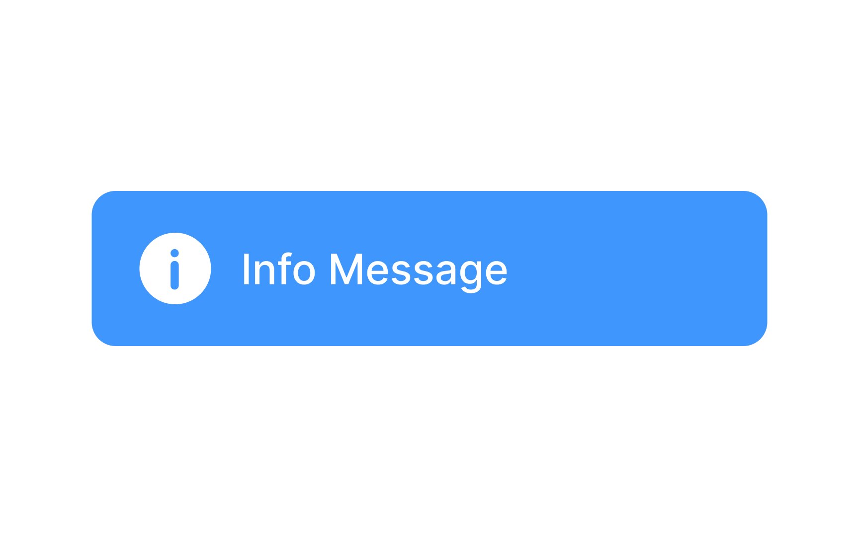
Info alerts serve to succinctly and informatively notify users about relevant matters. An info
You can use either
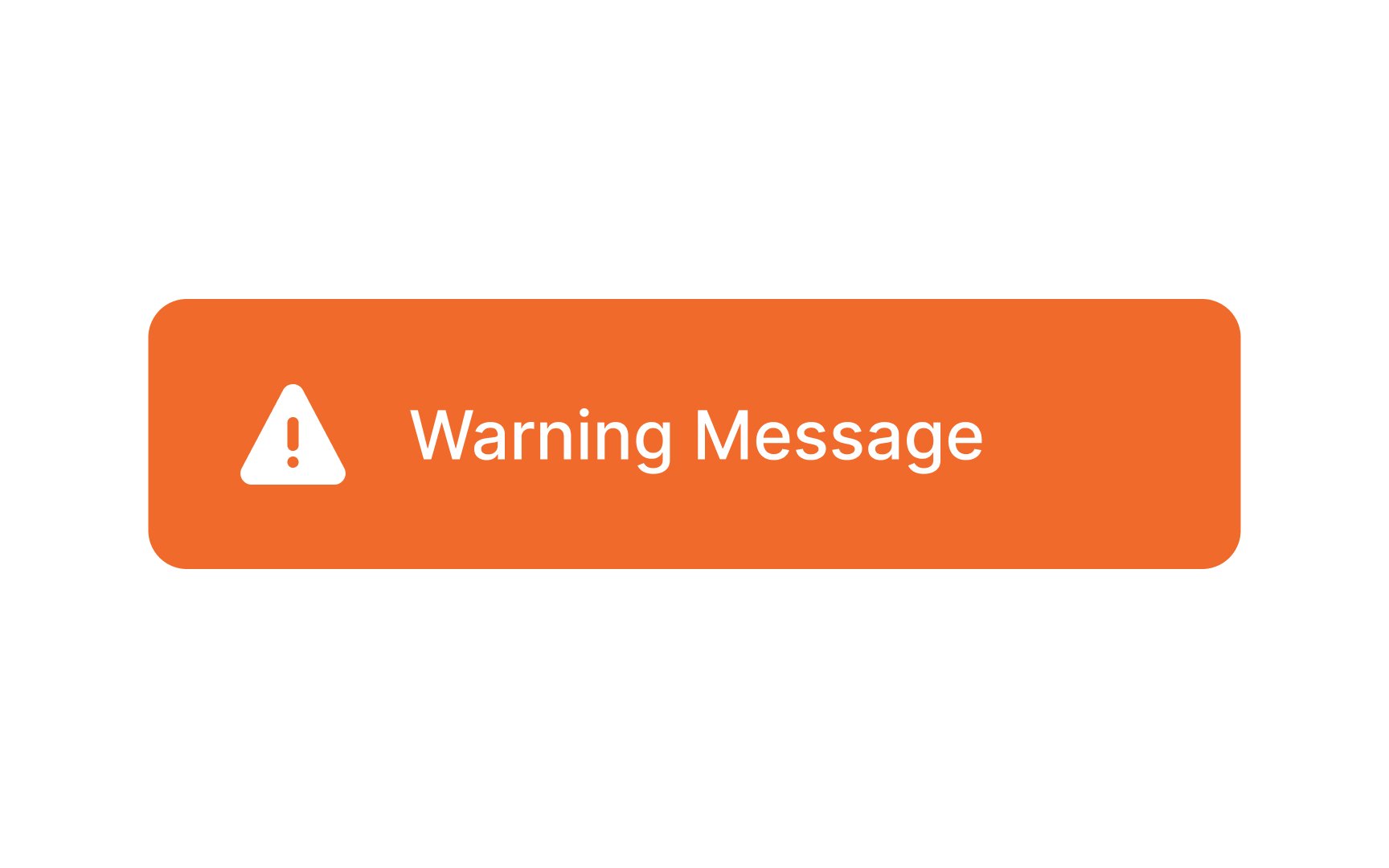
Warning alerts serve as signals indicating that there's an issue, but there is still a window of time to address and rectify the potential problem. Unlike
These alerts are designed to convey a sense of urgency without inducing panic. For example, in a file-sharing application, a warning alert might notify the user that their storage is nearing capacity, urging them to manage their files to avoid reaching the limit. Make sure you style warning messages to appear less urgent than error messages.
It's important to note that the inability to dismiss toasts by swiping can be annoying to users. So, always consider the frequency and relevance of using toasts to avoid overwhelming users with too many overlapping notifications.
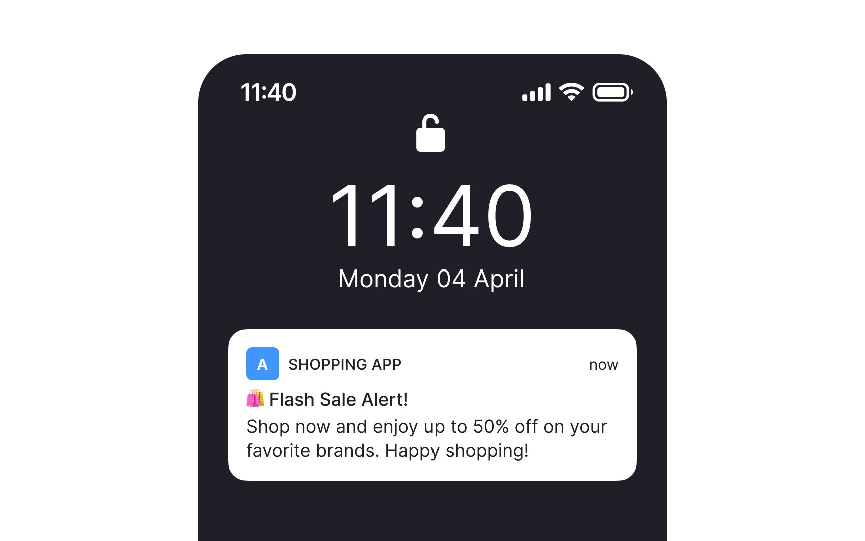
Push notifications are messages or alerts sent directly to users' mobile devices or desktops, reaching them even when the app is not actively in use. The primary purpose is to engage and re-engage users by delivering timely, relevant, and personalized information or updates.
It's crucial to respect user privacy and preferences by offering clear opt-in and opt-out choices for push notifications. Also consider providing users with customization options, allowing them to control the types and frequency of push notifications they receive.
References
- Designing Notifications for Apps | UX Magazine
- Material Design | Material Design
- Material Design | Material Design
Top contributors
Topics
From Course

Share


Similar lessons

Common UI Components Part I

Image Terminology
