Best Practices for Designing UI Modals
Learn the best practices for designing helpful and non-intrusive modals
Modals, also known as dialogs, are crucial when sharing information with users. They allow you to give users reminders, offer more options, and provide extra information without cluttering up the main content.
The key to a successful modal is threefold – it must have a clear purpose and content that is easy to understand, while also being easily dismissable. Ensure your modal design has these covered to ensure an effortless user experience.
As a rule of thumb, use
Use modals to:
- Display important warnings — for example, notifying users that their system is about to restart
- Prevent or correct critical errors like failing to save changes
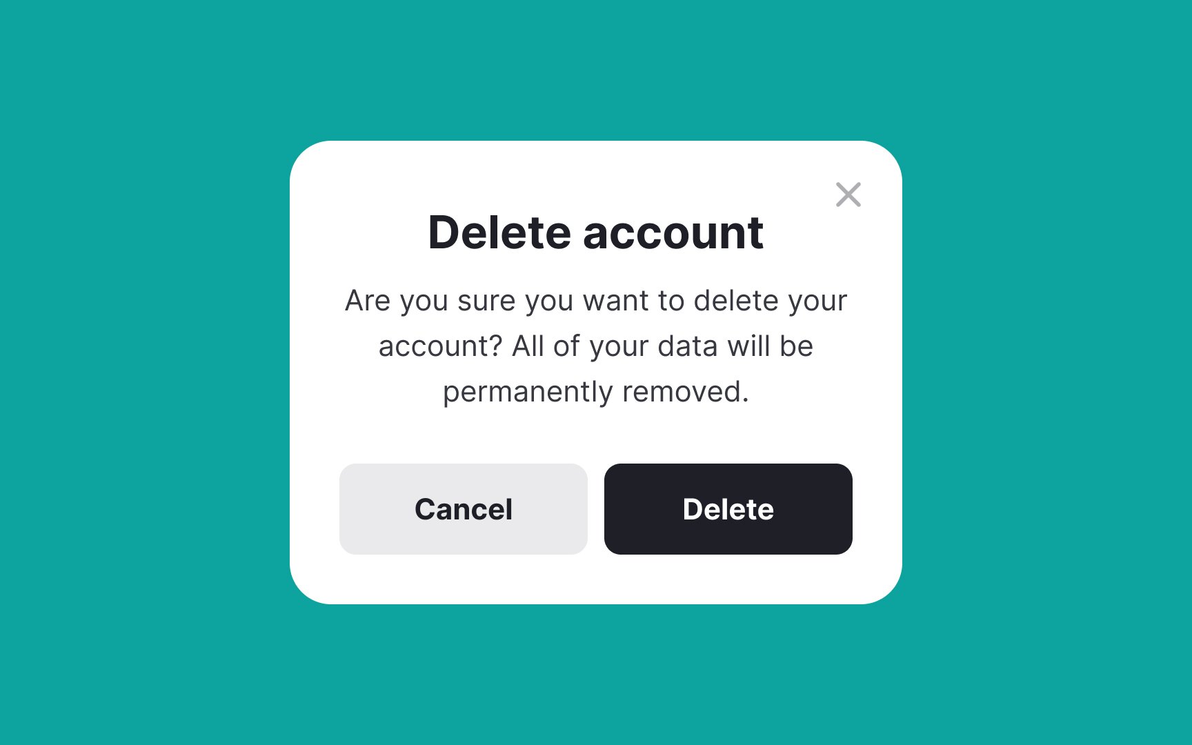
- Confirm destructive or irreversible actions like account deletion
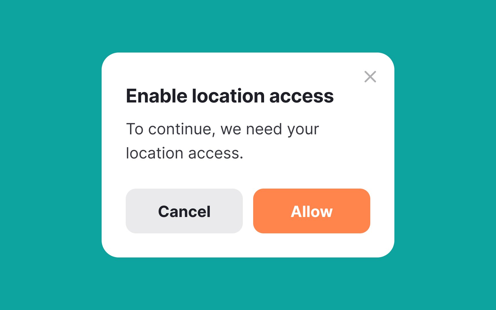
- Request information critical to continuing the current process — for example, requesting login credentials for users to be able to save items to their wishlists
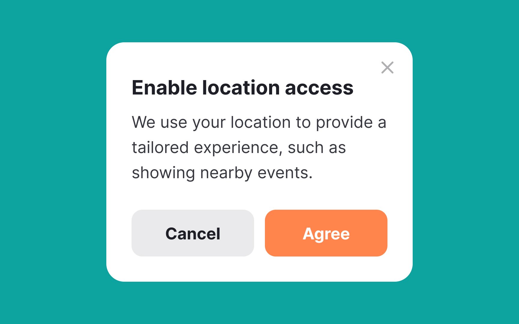
- Request information that will make the
user experience better in the long run, such as users' skill level, goals, interests, etc. - To simplify complex workflows for users — for example, collecting user information step by step with an onboarding/sign-up wizard.[1]
Depending on the trigger,
- User-initiated modals appear on the screen after an action from users (e.g., tapping or clicking on a button). Users know that these modals become visible as a result of their actions.
- System-initiated modals appear after a system trigger, like a timed subscription form or reminder to update. They interrupt users' tasks, and users might have no idea why they appeared. Avoid this type of modal unless absolutely necessary and urgent — for example, letting users know that their system is about to restart.[2]
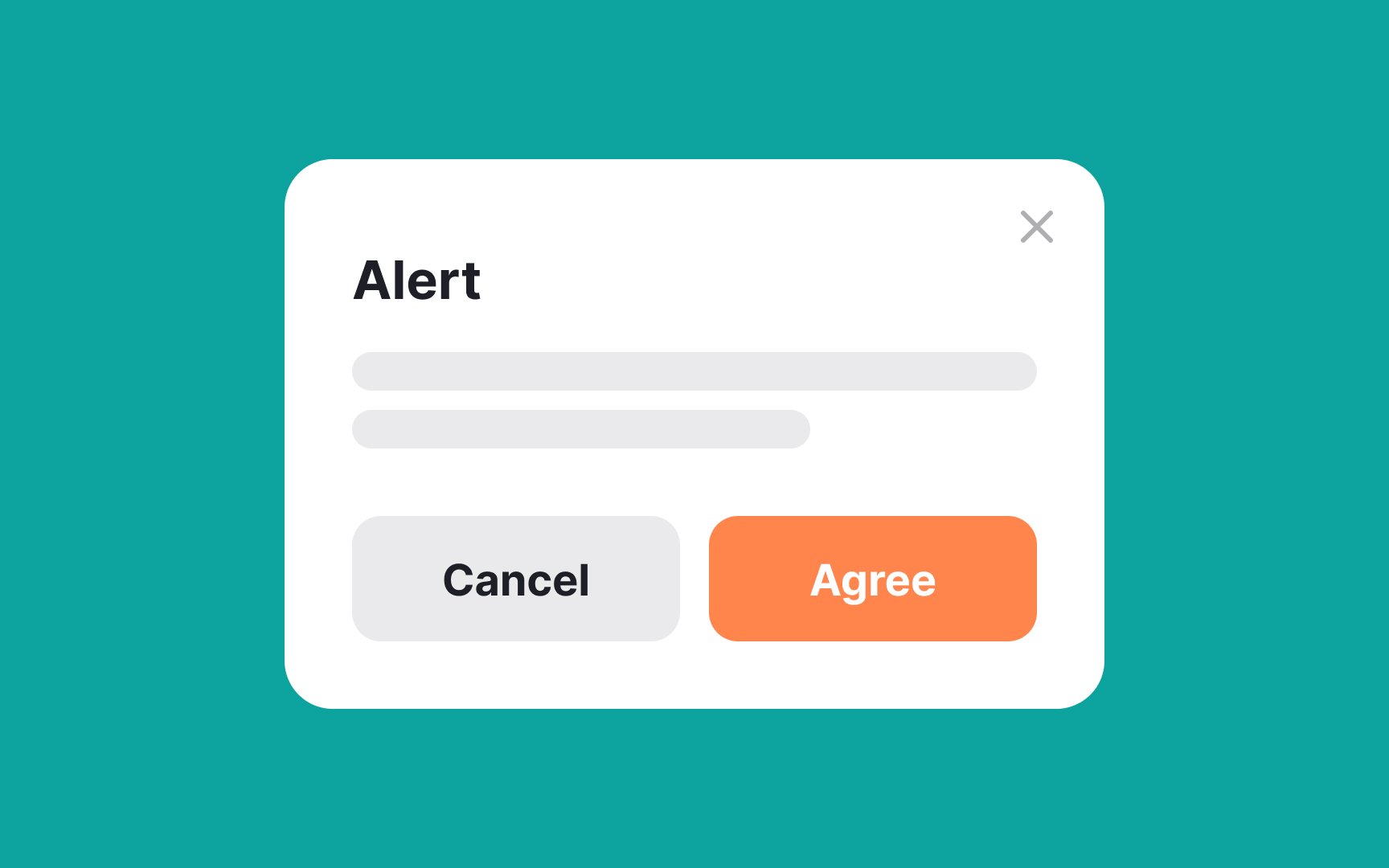
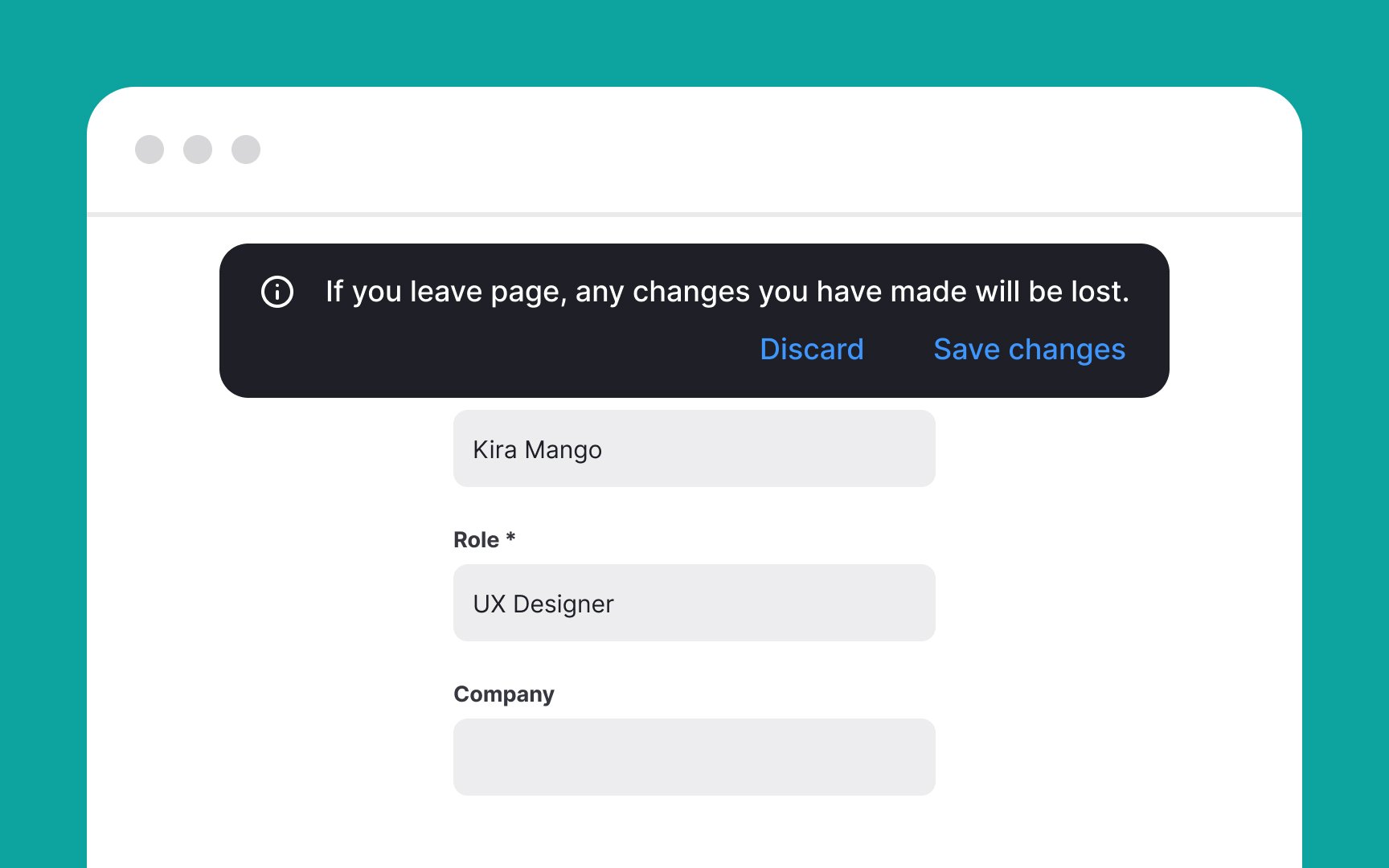
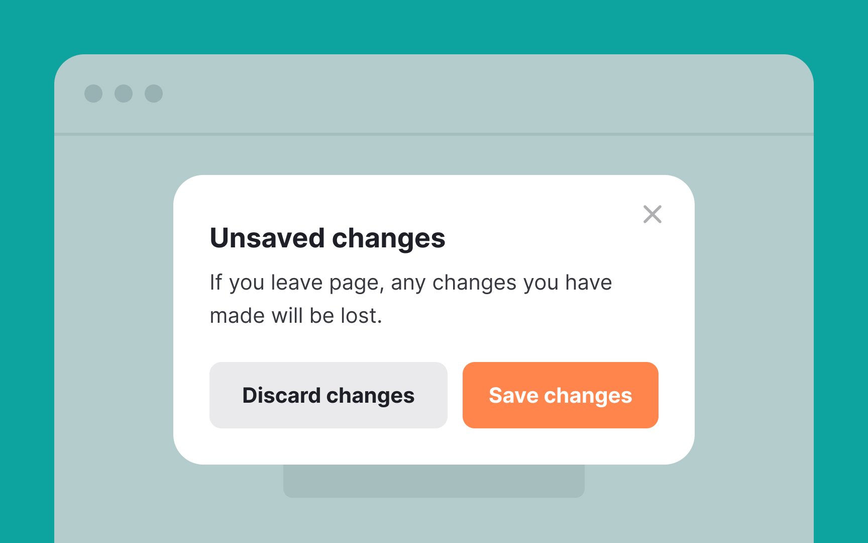
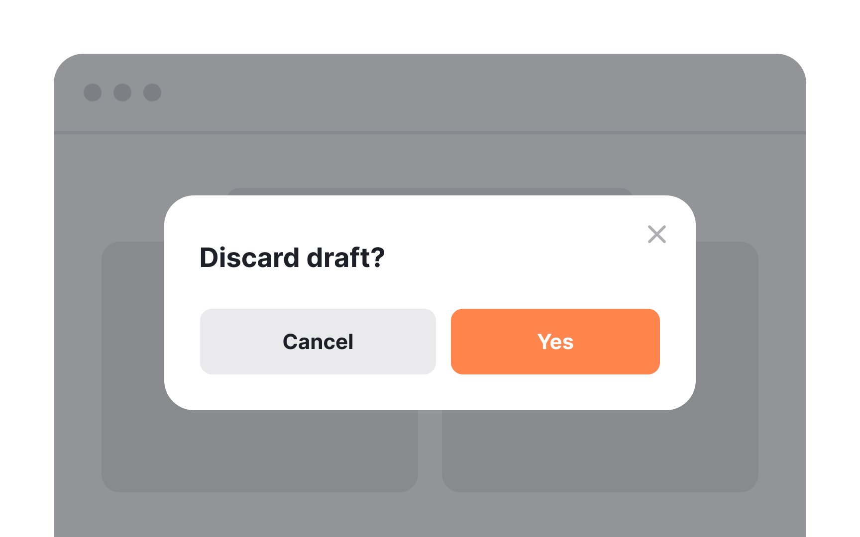
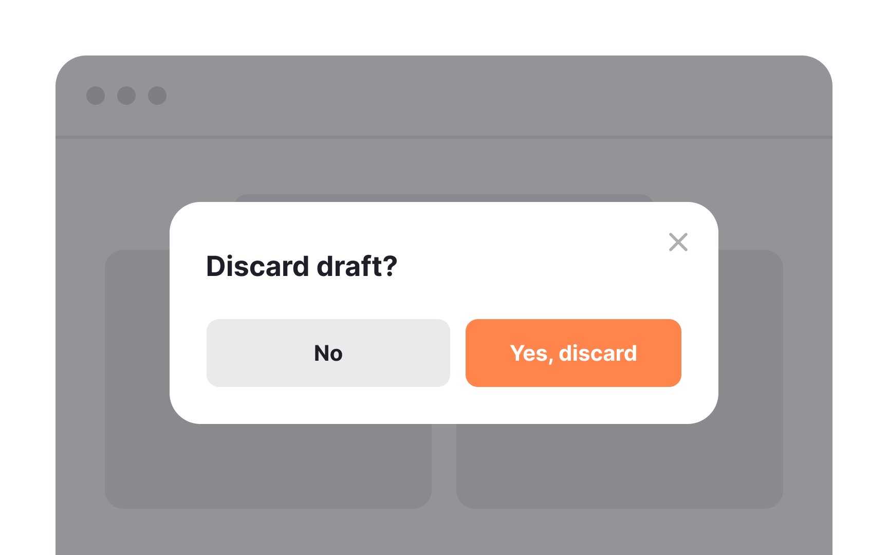
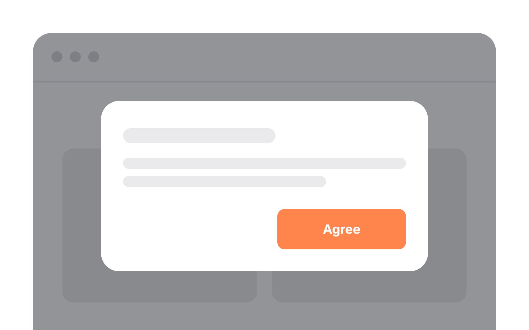
Make the modal's title clear and to the point, as it sets the stage for what users are expected to do next. Since users often skim or skip the body text, the title should be self-explanatory.
Additionally, ensure that your call-to-action (CTA)
Keep the modal's
Essentially, your title should capture attention and convey urgency, while the body text offers supplementary insights, without relying on users to read it thoroughly.
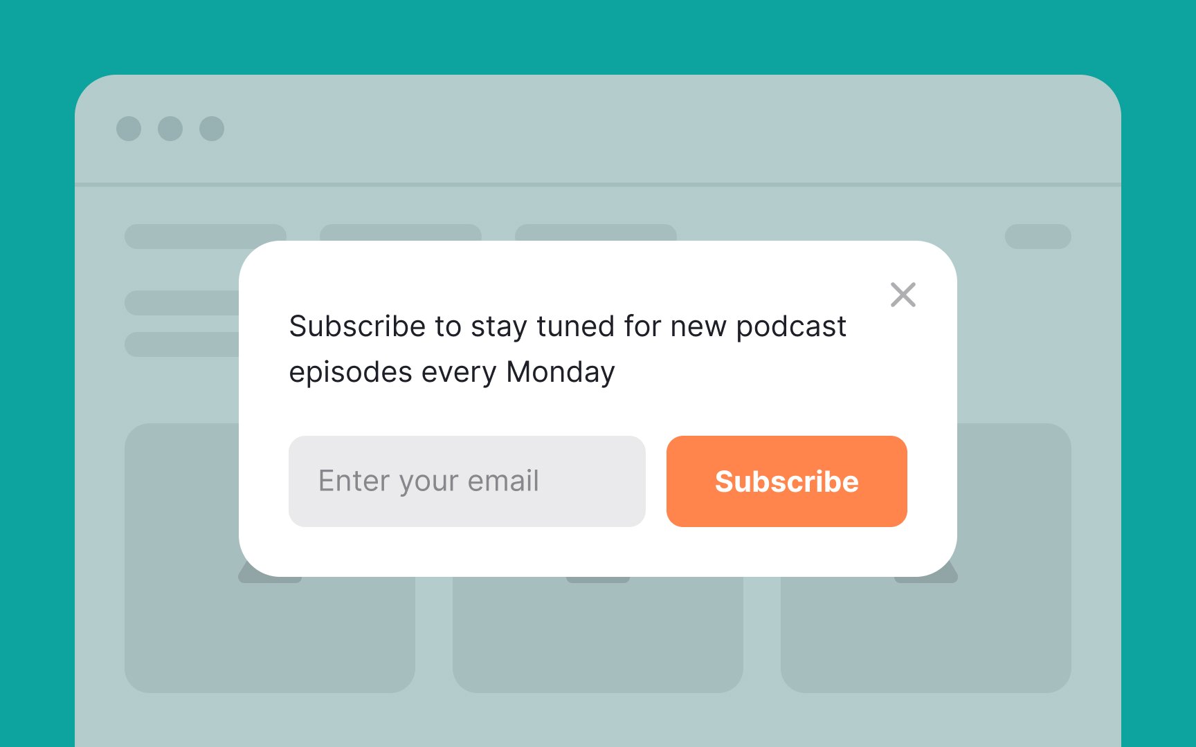
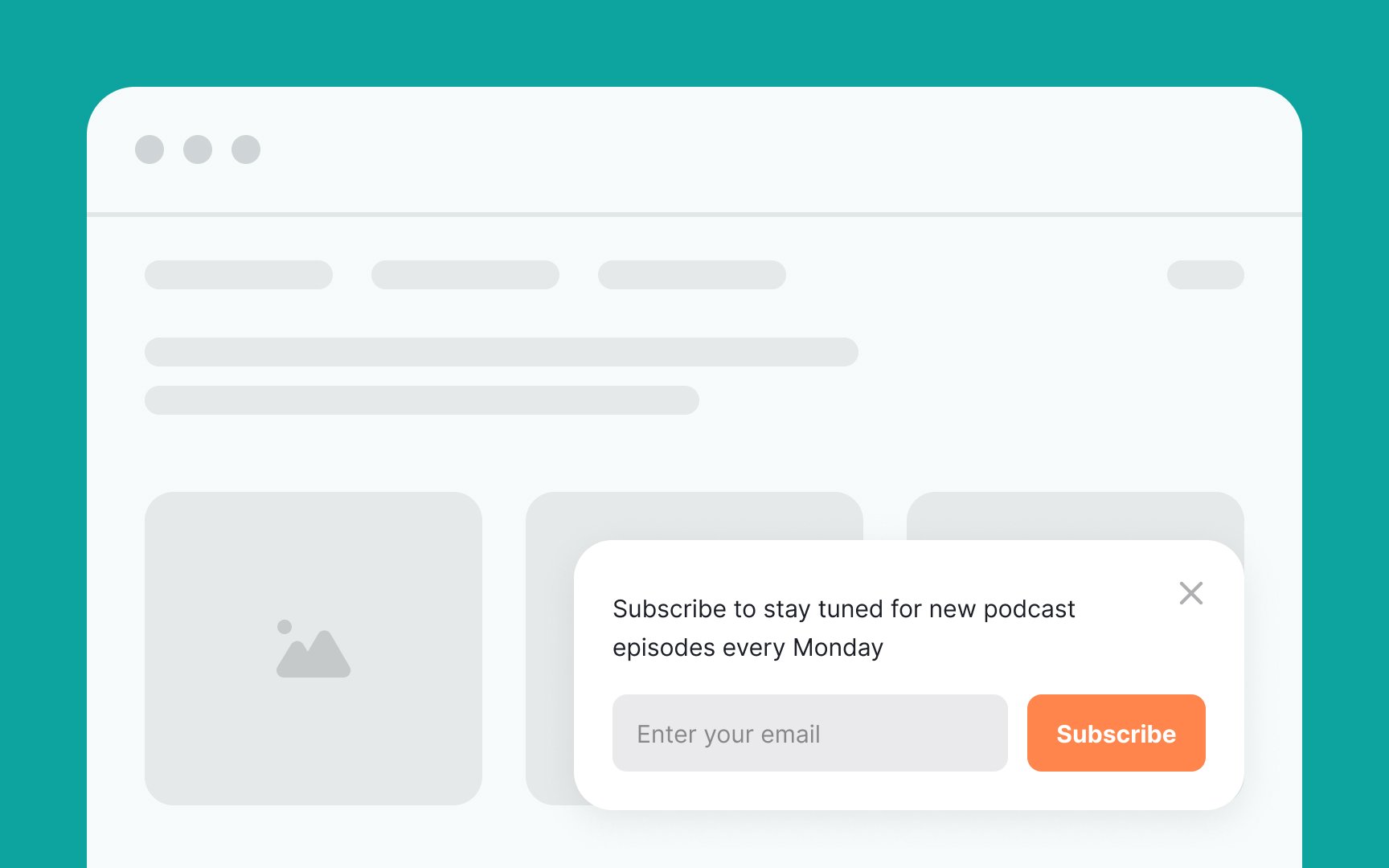
When designing
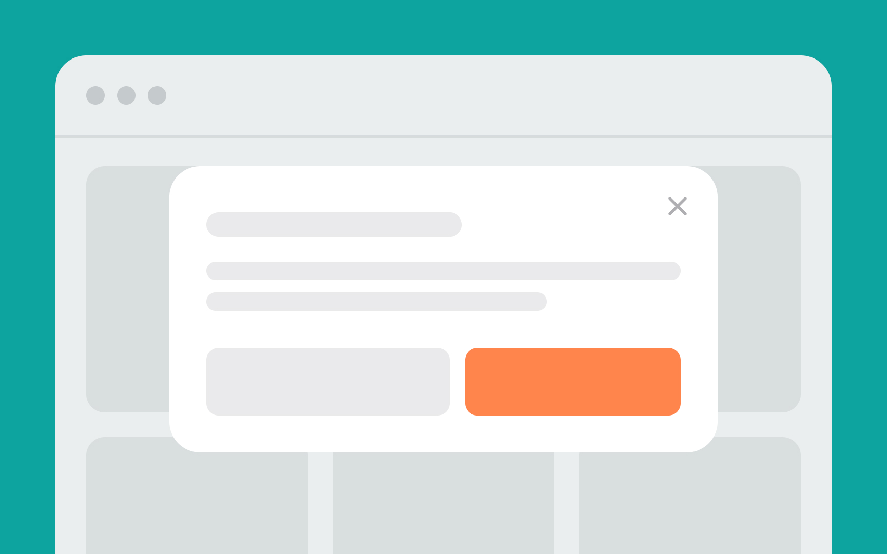
Add a dark overlay to the
- It obscures the rest of the screen, allowing users to focus on the
content at hand - It prevents interactions with elements outside the modal
- It acts as a Close/Cancel button[3]
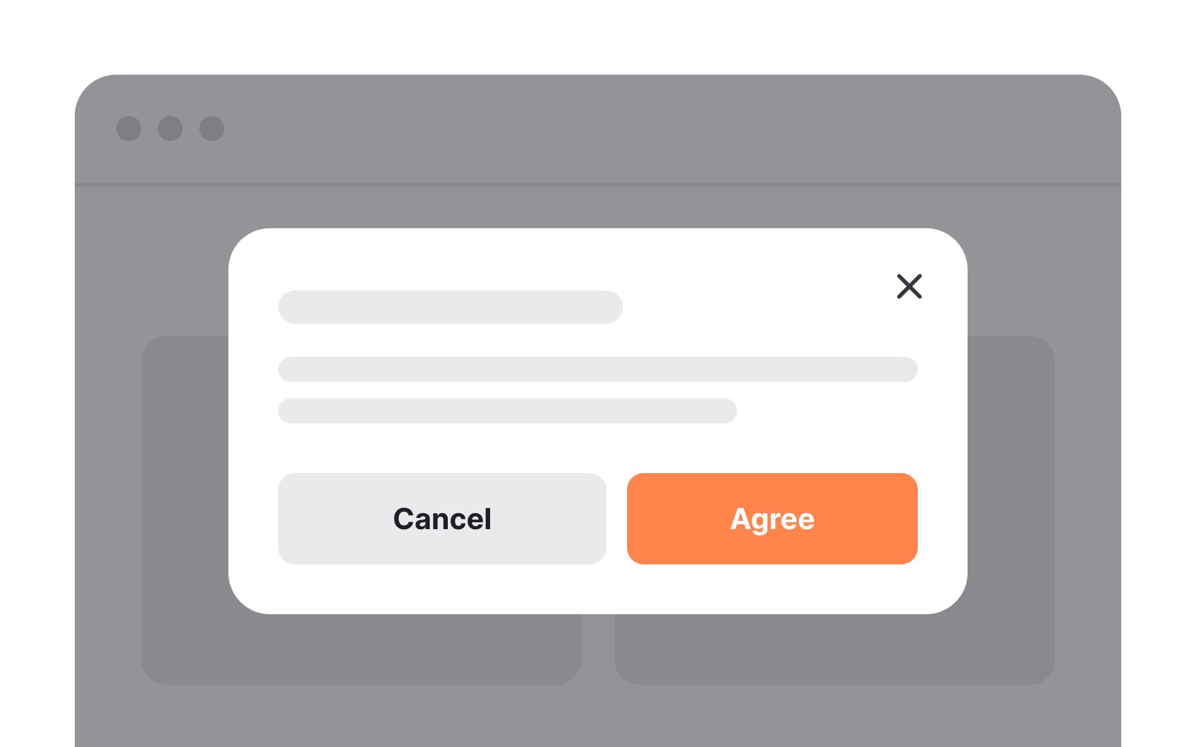
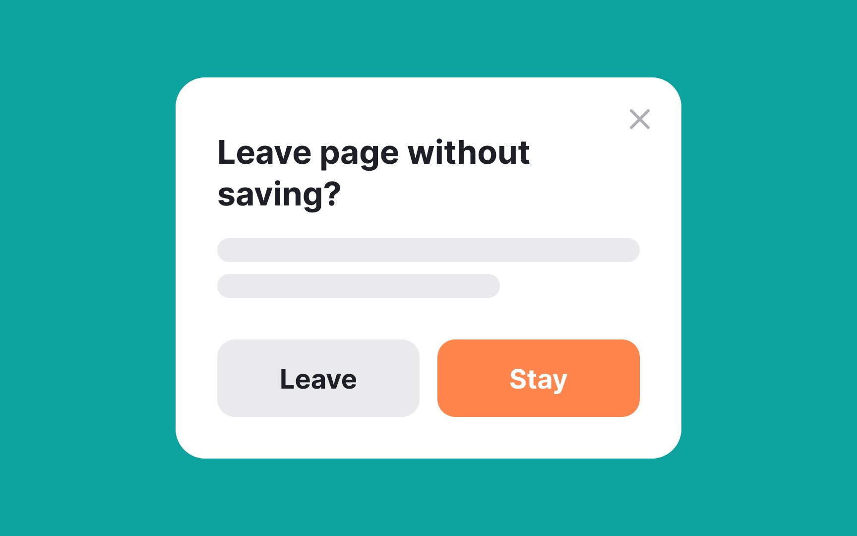
- A Cancel
button - A Close button
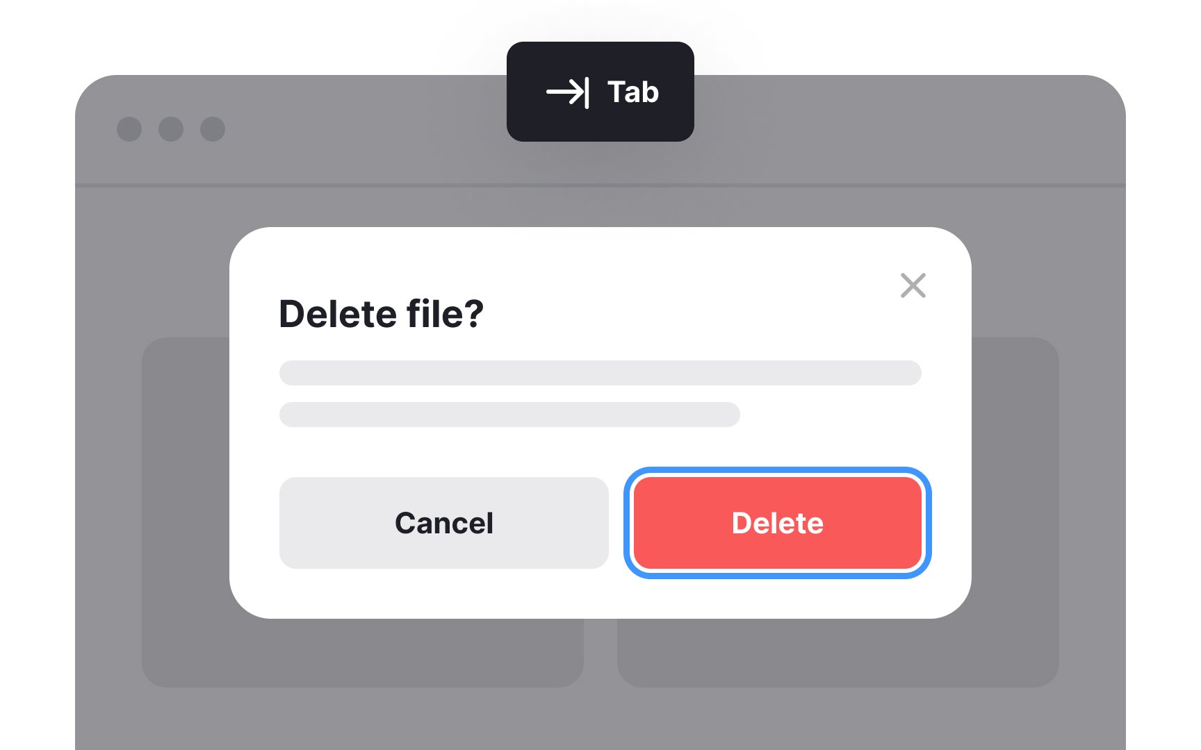
- A keyboard accessible control: the Escape key on desktop and the Back button on mobile[4]
In designing
Many users instinctively click on the main window to return to it, so enabling this functionality aligns with common user behavior. However, be cautious when implementing this; ensure it's appropriate for the situation and doesn't disrupt the task at hand.
When a
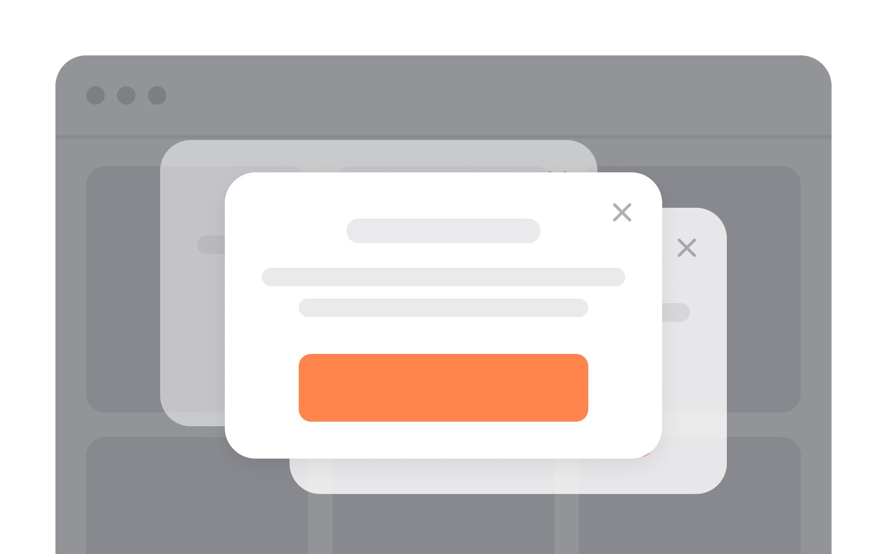
Avoid using multiple
This not only interrupts their workflow but also distracts from the content or tasks they were initially focused on. Simply put, multiple modals are more likely to frustrate users than facilitate their experience. Stick to a single, well-designed modal to keep things clean and user-friendly.
Pro Tip: If the modal requires several steps, you can allow forward/back navigation within the modal experience.
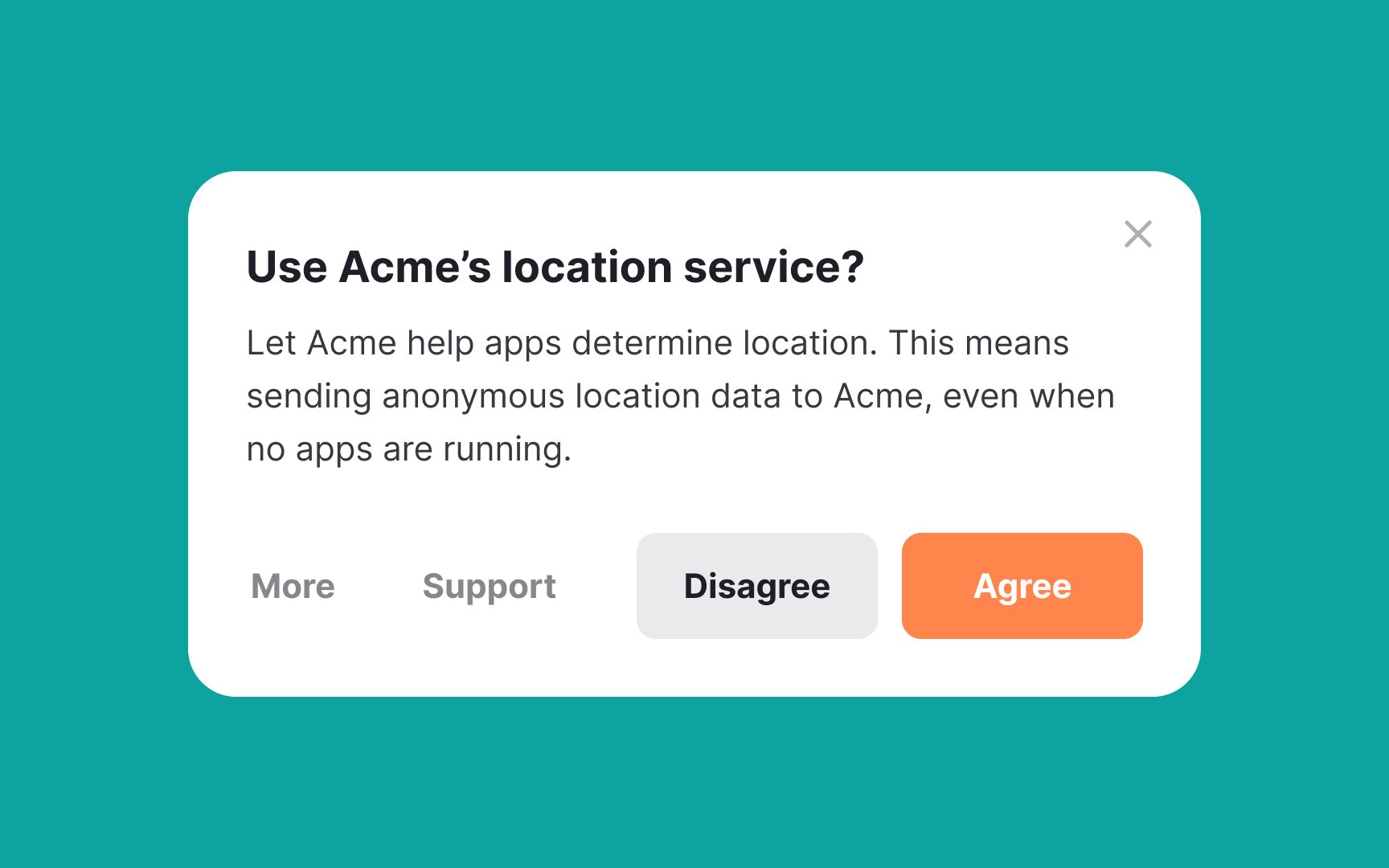
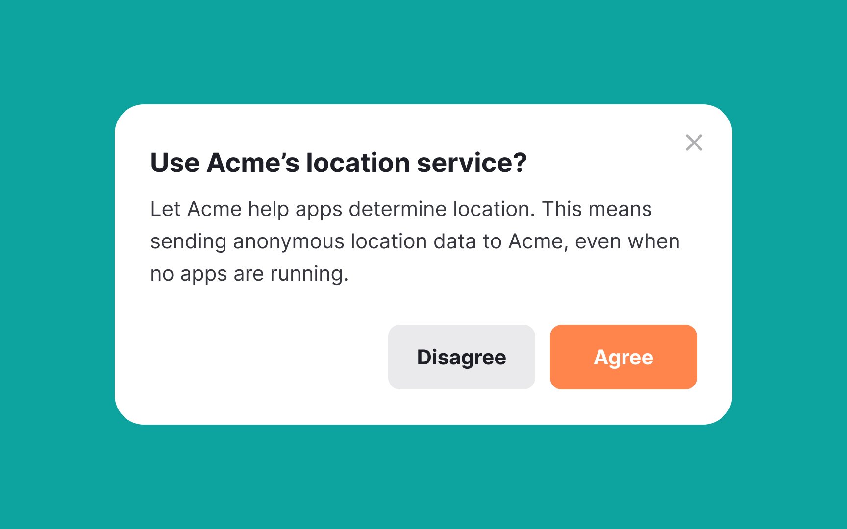
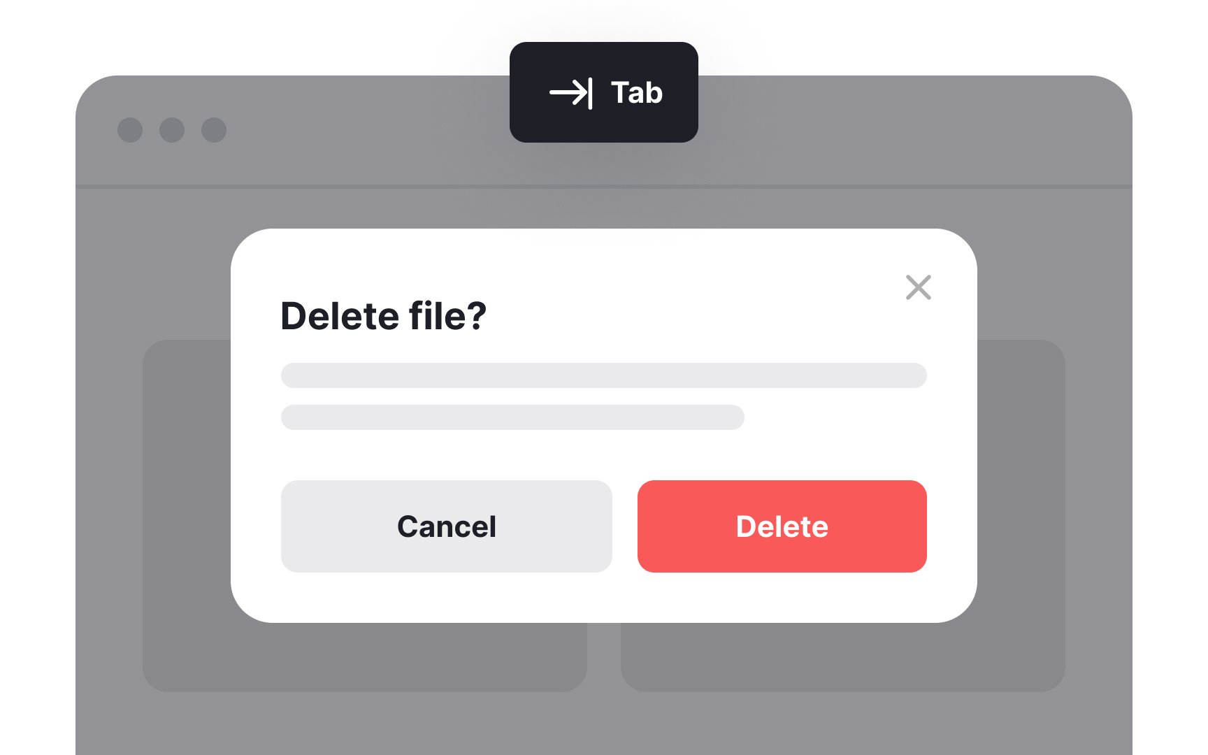
Limit the number of actions in a
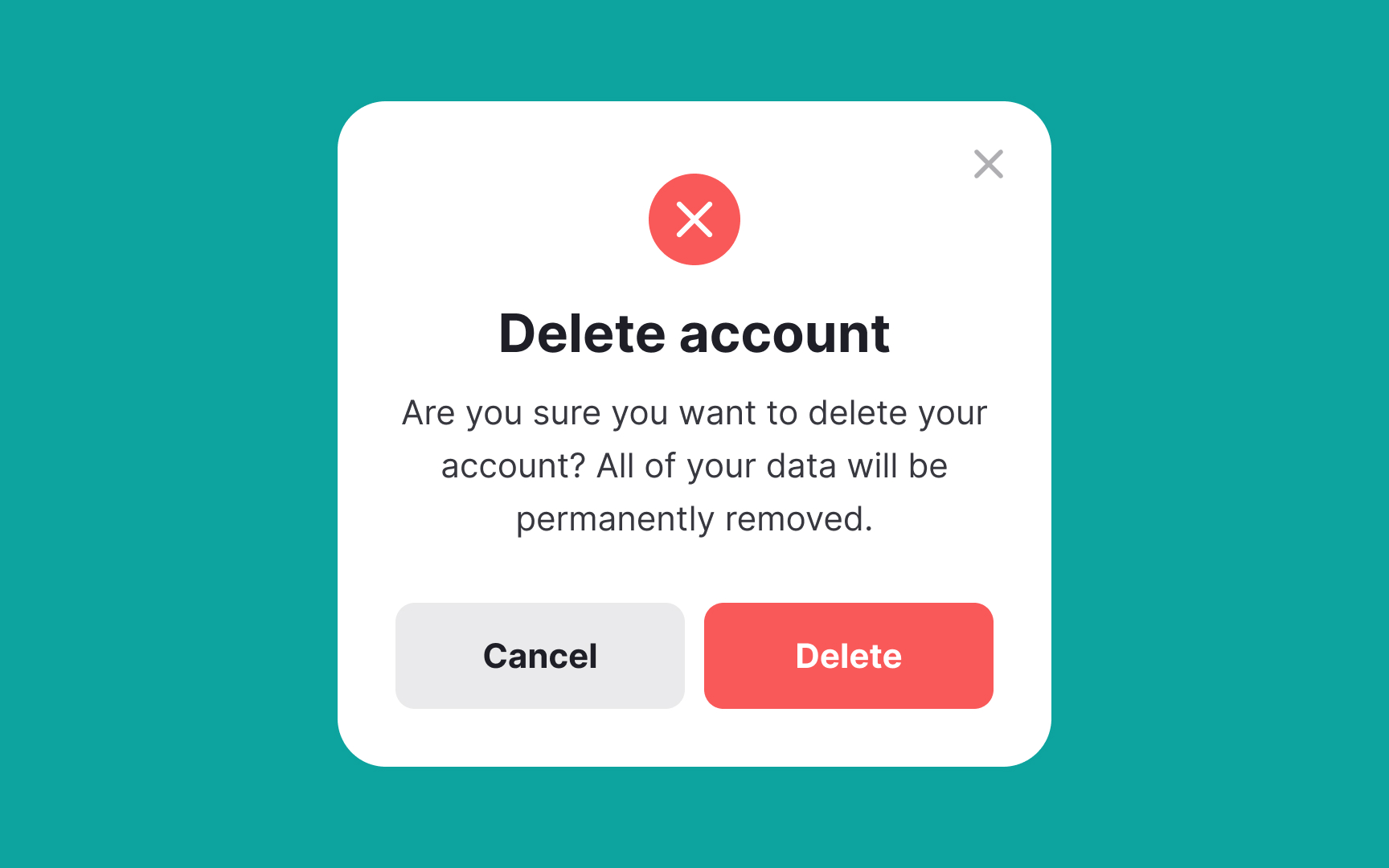
Make alert
The color red is often used in UI to grab users' attention and convey importance and urgency. It immediately stands out to us because of the ways our eyes work — about 64% of the cones in our eyes are sensitive to red light wavelengths. So, use red to convey the importance of critical or urgent alerts.
Another way to reinforce the importance of the message is by adding icons like the circle X mark, the exclamation point, or the sad emoji.
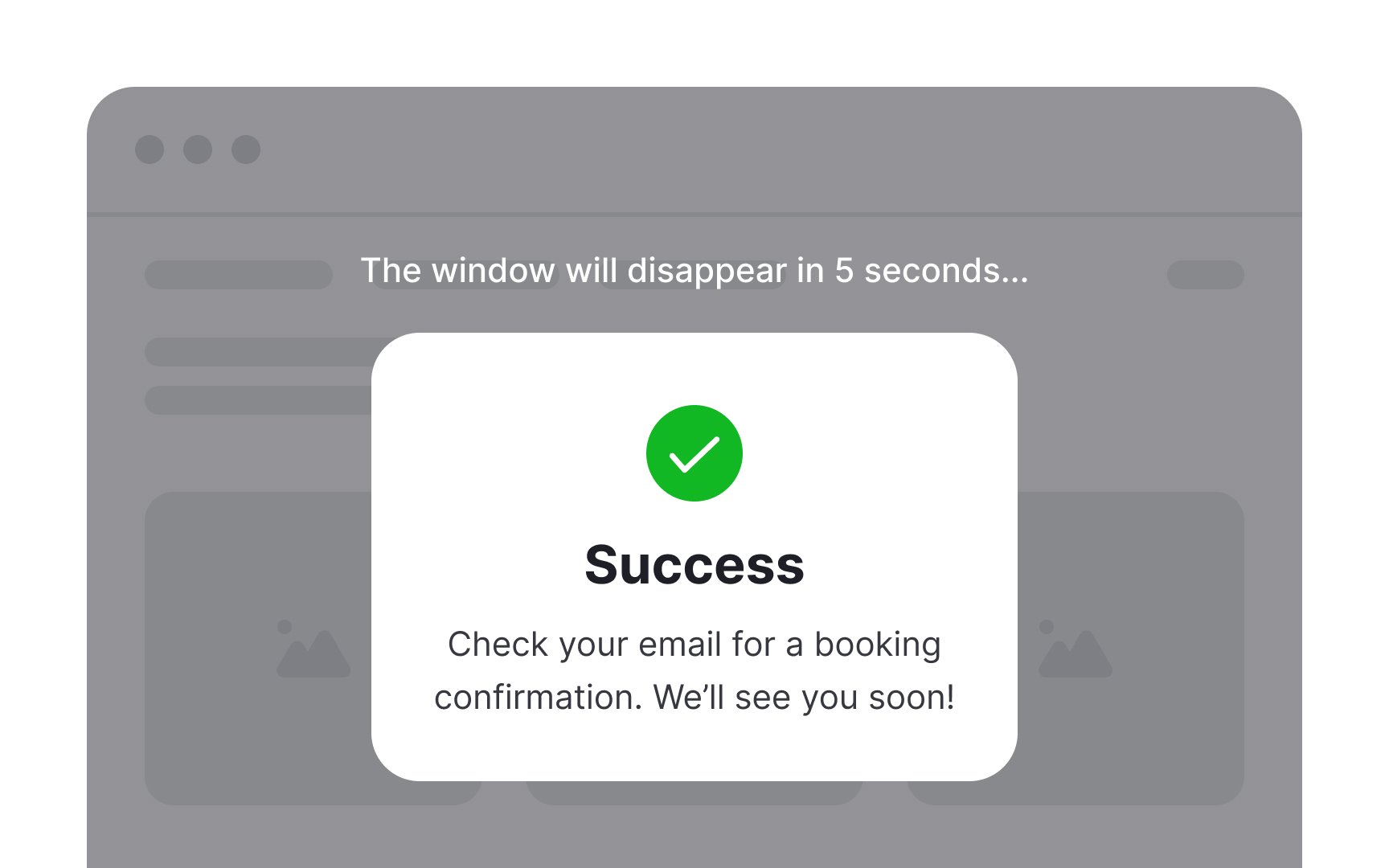
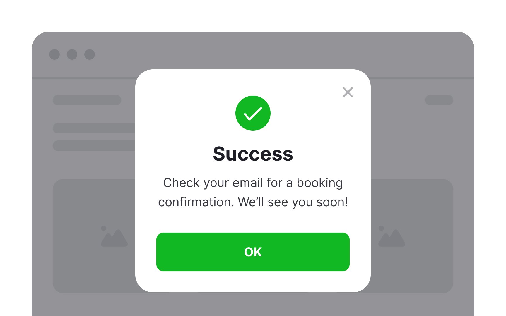
A success message is like a pat on the shoulder saying, "Great job! You're doing everything right." But it doesn't necessarily have to take the form of a
If, for some reason, you do decide to use a success modal, remember to add a supportive text clearly explaining what the congratulations are all about and a distinct
References
- Modal & Nonmodal Dialogs: When (& When Not) to Use Them | Nielsen Norman Group
- Considerations for Styling a Modal | CSS-Tricks | CSS-Tricks
Top contributors


Topics
From Course

Share


Similar lessons

Login & Signup Flows

User Onboarding
