Cinemora - Ultimate Movie Companion (UIX Documentation)
Project Summary
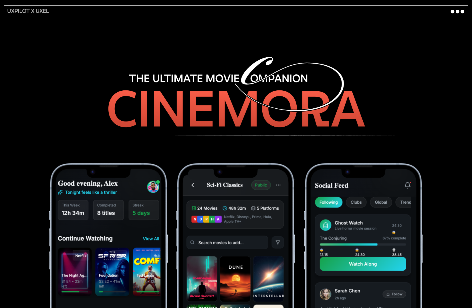
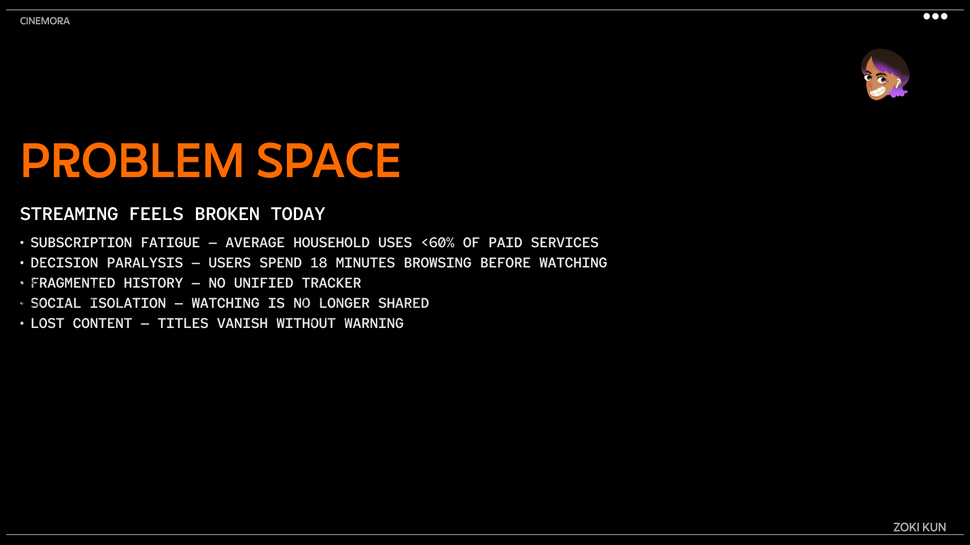
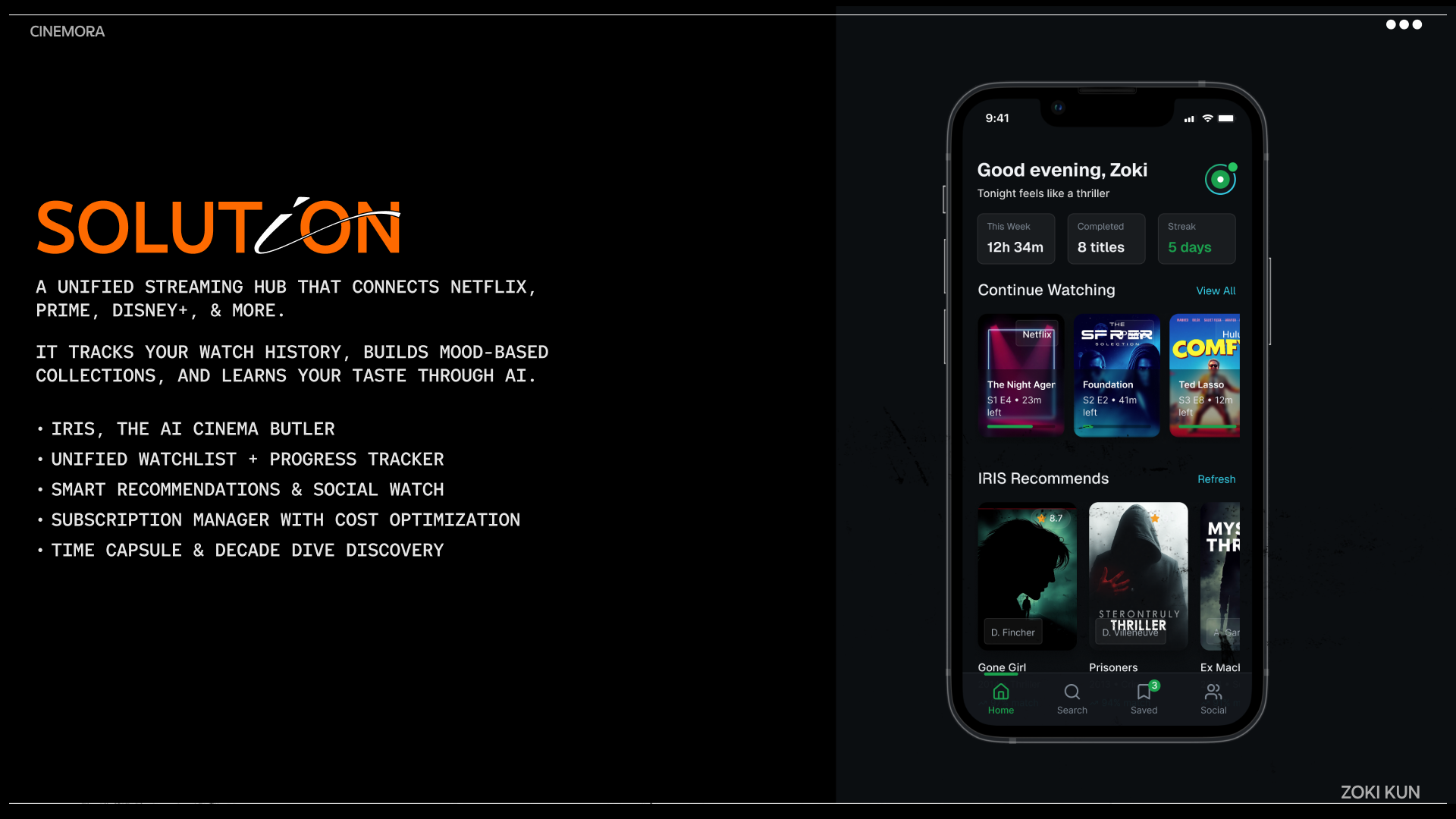
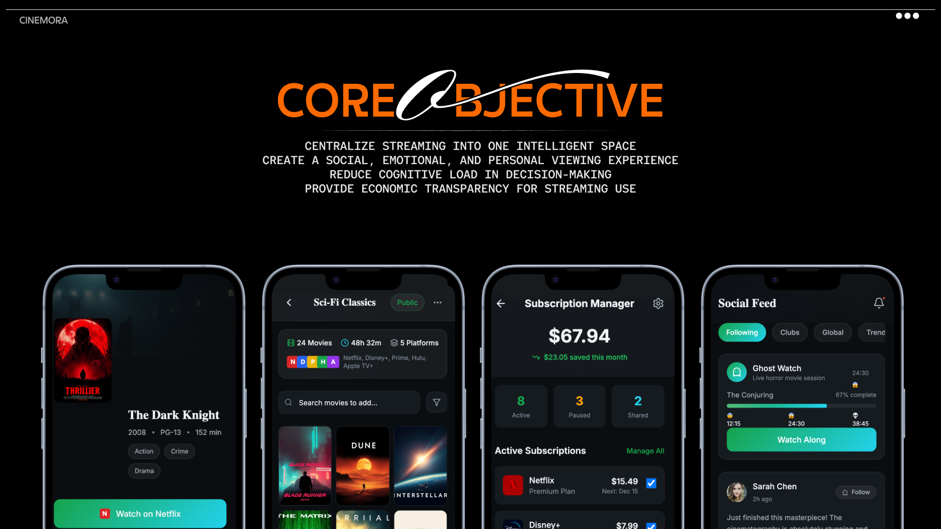
For this UXPilot project, I reimagined Cinemora, a movie companion app that helps users discover and organise films more intentionally.
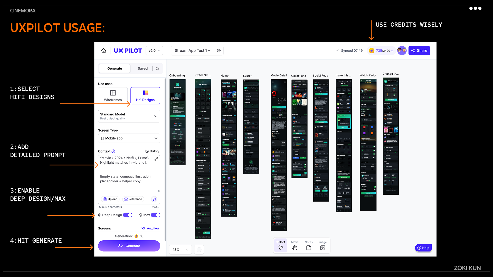
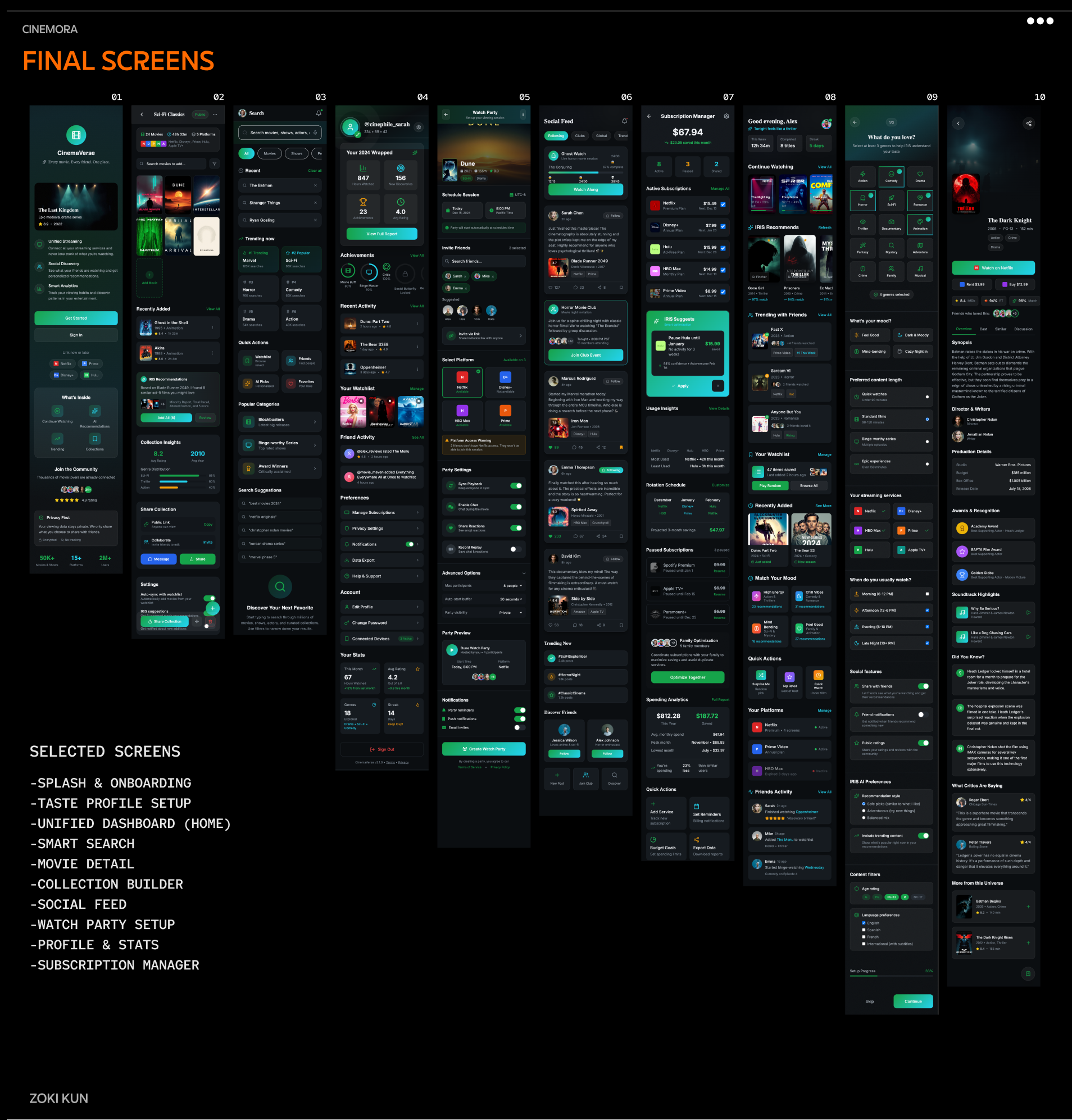
The goal was to test how much of a real-world design problem AI could handle, from ideation to UI - while keeping the human creative direction intact. Using UXPilot, I built over ten core screens, focusing on structure, flow, and usability.
I documented the entire process publicly on X (Twitter) and created a video walkthrough to explain my workflow, design reasoning, and AI integration.
Video Walkthrough: Watch Here
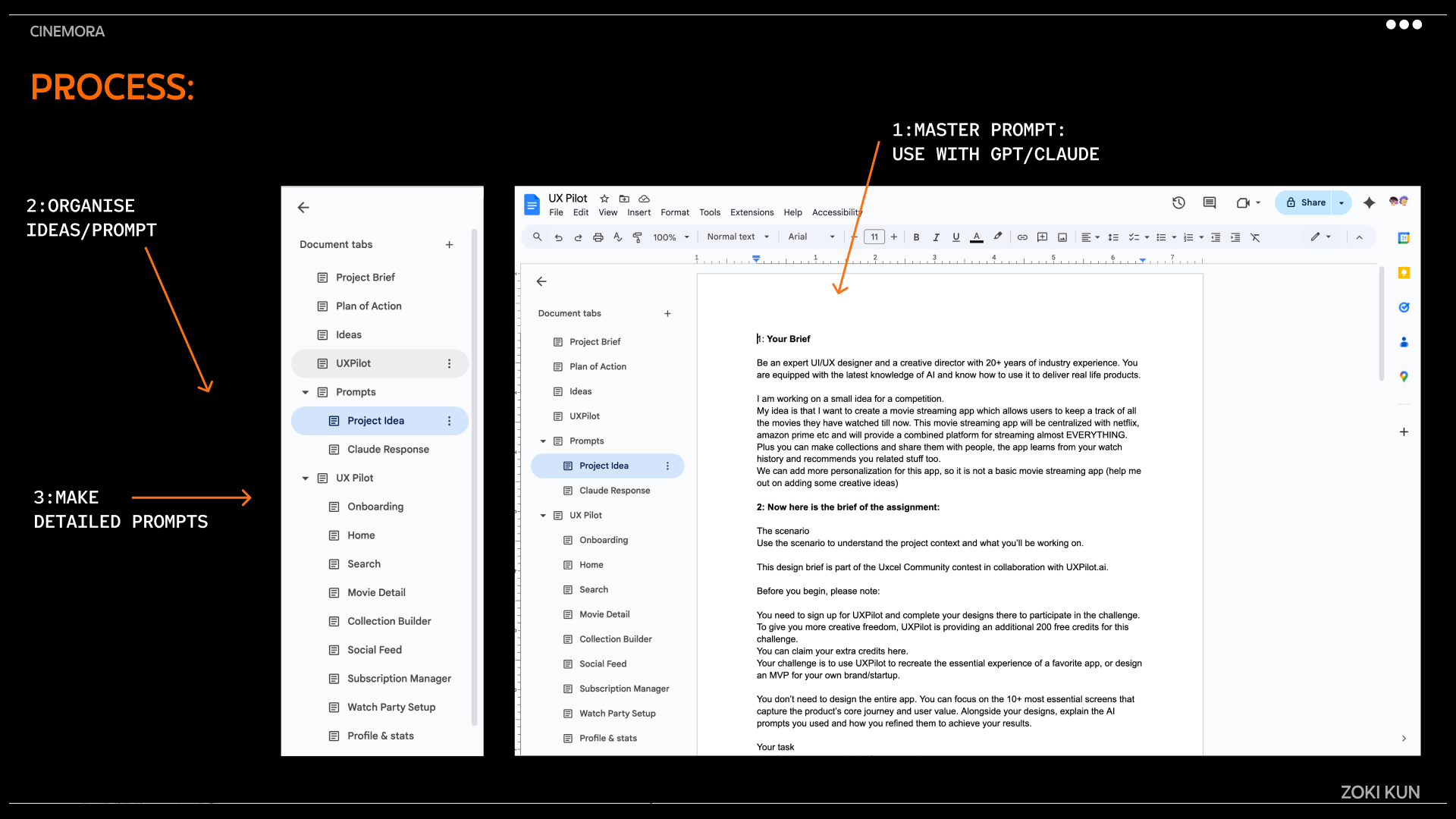
The attached document includes every prompt and iteration used. Project documentation: Read Document
Built in Public (X)
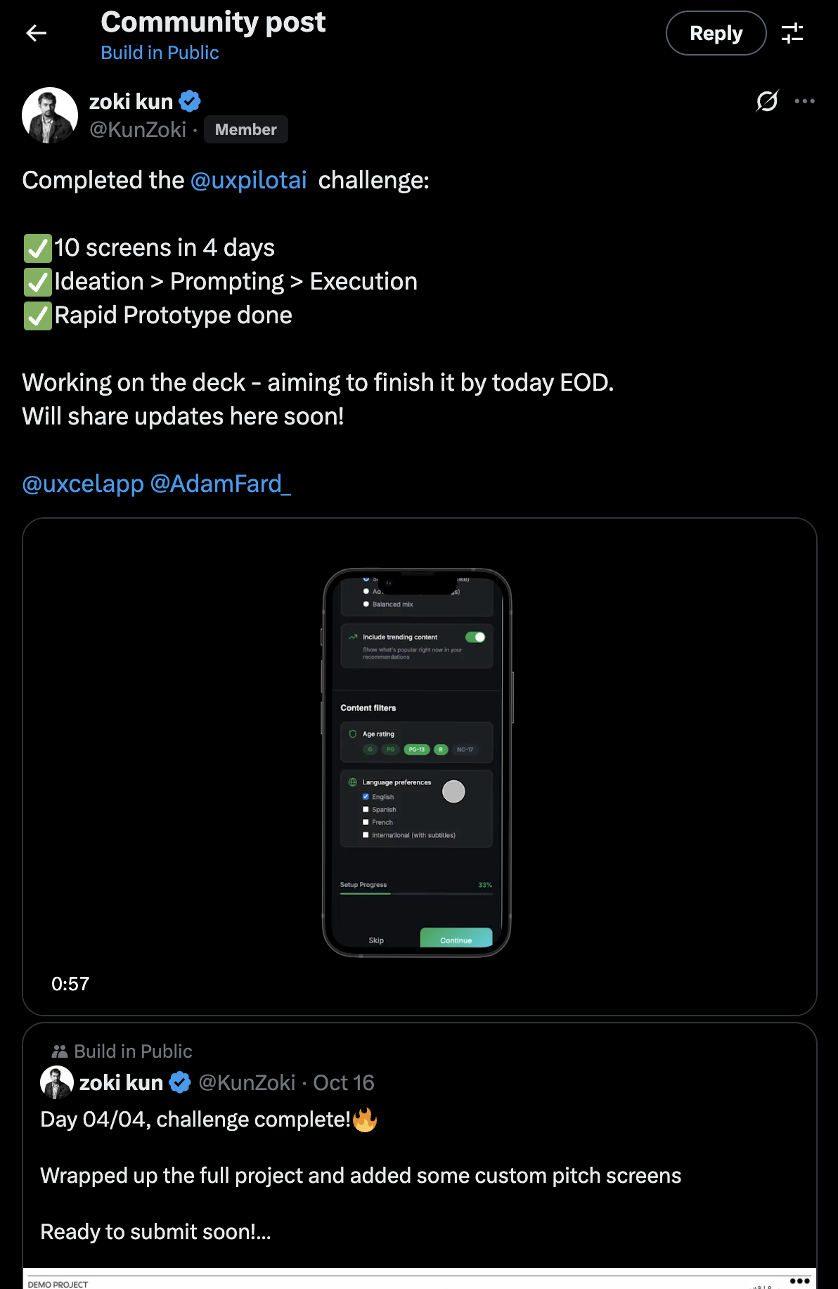
To make the process open and transparent, I built everything in public on X (Twitter), documenting my daily progress, experiments, and key takeaways.
Check it out: View Post
Learnings and Key Takeaways
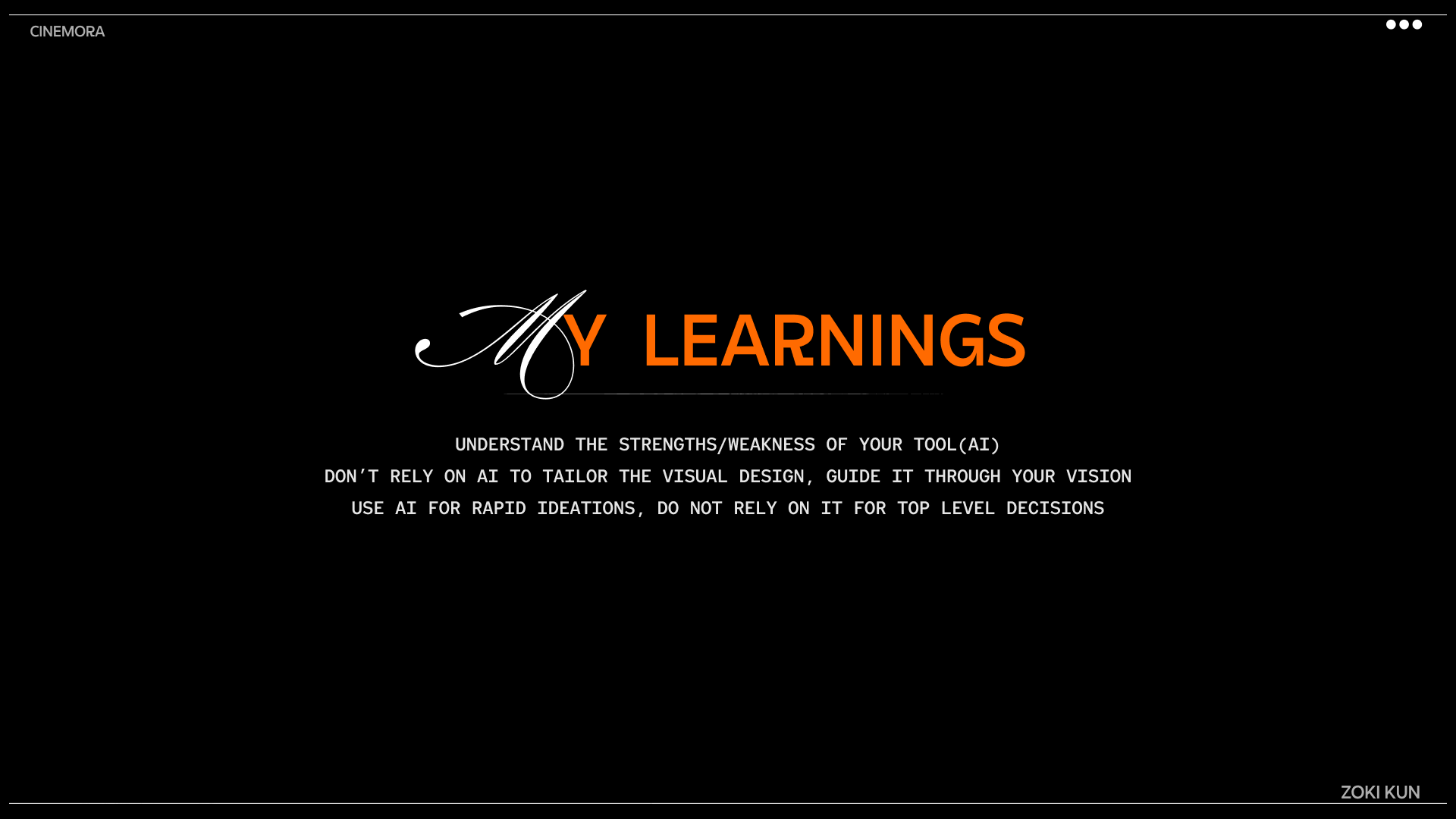
Through this project, I discovered several practical insights while designing with AI tools like UXPilot:
- Clarity before creation: Start with a clear design direction. AI performs best when layouts are simple and purpose-driven.
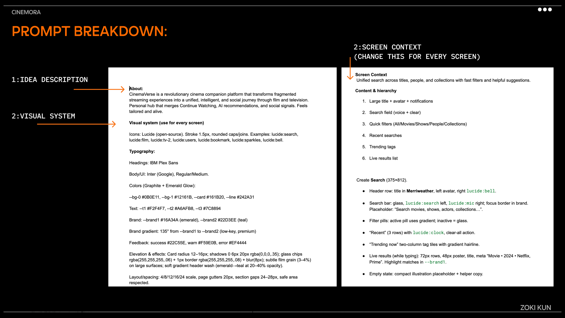
- Structured prompting: Break large projects into smaller, screen-specific prompts - it helps maintain organisation and context.
- Context as a parent layer: Each flow works independently; define context early to unify visuals, tone, and rules.
- Repetition matters: If a component or layout repeats, mention it explicitly - AI treats each screen separately unless told otherwise.
- Consistent styling: Keep design language uniform across all screens to preserve a cohesive look.
- Reference > Reinvention: The standard UXPilot engine with detailed references gives more stable results than forcing custom design systems.
- Don’t chase pixel perfection: Focus on clarity and usability :AI design tools are better for flow and structure than for micro-adjustments.
Behind the Scenes
Throughout the process, I experimented with multiple permutations and combinations of design directions to understand what worked best with UXPilot’s AI workflow.
I tested different visual approaches, prompts, and interaction patterns before finally arriving at a direction that felt cohesive, functional, and true to the app’s intent.
This exploration helped me better understand how to guide AI tools creatively rather than just rely on them.
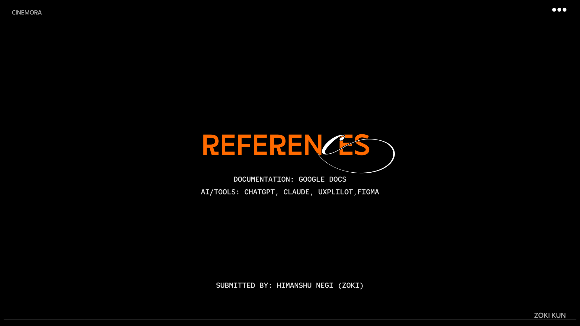
Tools used
From brief
Topics
Share
Reviews
21 reviews
Hey Zoki, I just went through your Demo 1 project and it feels like a solid starting point.
It’s clean and easy to follow. Nothing feels confusing or overcomplicated. I can tell you focused on getting the structure right first, which is always a good move. Sometimes keeping things simple is harder than adding more stuff.
If I’d nudge you a bit, I’d say try to push one area further. Either make the visual style more distinctive or deepen the UX thinking behind it. Right now it works, but it could use one strong “hook” to make it more memorable.
Overall though, nice foundation. It feels intentional, not random and that’s always a good sign.
Love the way you thought about this project and the video is also appreciated.
Very interesting presentation and deep thinking into the prompts, I like the video too. Nice efforts
Your Cinemora presentation looks polished and professional. The video clearly walks through your process, and your public documentation on X shows real thought and care.
What stands out: Your documentation throughout the process, separating the brief from Claude’s outputs. A smart, helpful way to show your thinking, not just the result.
Overall: clear, well-documented, and impressive work.
I really admire the dedication and serious effort you've put into this competition. As a huge movie fan myself, I'm genuinely excited about your app—I can easily see it becoming a new favorite of mine. Fantastic work!
I’m really impressed with the final results ... the prompt engineering and documentation behind this project were spot on. I’ve got to give you credit; I actually used your prompt as a foundation for my own project and made a few tweaks just to see if I could replicate the same quality. Also, props for including the video walkthrough ... it really tied everything together. And … is that Brawl Stars I see in the “Test 1” variation? Haha, good stuff!
Love the time you invested in prompting and bringing structure to this.
I went through X and saw your progress too, good to see you explored a lot of ideas and finalised with one in the end

Joshua T Kim
I love the fonts in the presentation!!
Looked at the video too, it's a good start, keep at it
Pari Shah
I love your documentation throughout the process, enjoyed the video too

Samuel Daniel
Great presentation, I can see you worked hard on each slide.
App idea is great too.
You might also like

HealthFlow: Designing a Simple and Insightful Wellness Dashboard

Improving Dating App Onboarding: A/B Test Design

FORM Checkout Flow - Mobile

A/B Test for Hinge's Onboarding Flow

Accessibility Asse

The Fitness Growth Engine
Product Thinking Courses
Product Vision & Strategy

Product Management Foundations


