TaskFlow Accessible Login & Signup

WCAG 2.1 Level AA Compliance
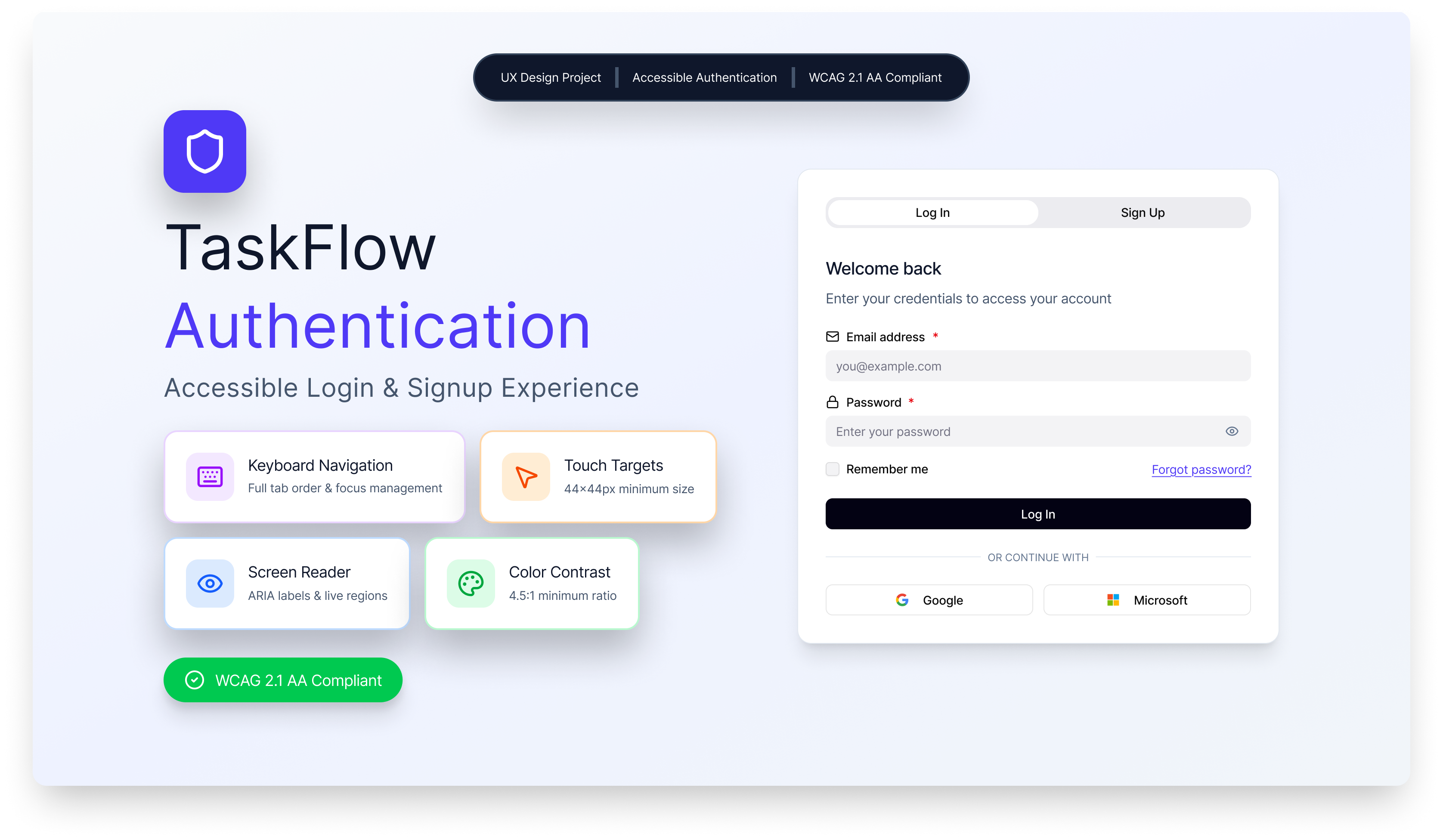
- 1.3.1 Info and Relationships (Level A): Semantic HTML5 form elements with proper label associations using htmlFor/id attributes. ARIA roles and landmarks ensure screen readers understand form structure.
- 1.4.1 Use of Color (Level A): Password requirements use icons (✓/✗), text labels, and color together—never color alone. Error states include red borders, error icons, and descriptive text messages.
- 1.4.3 Contrast (Minimum) (Level AA): All text meets 4.5:1 contrast ratio minimum. Body text (slate-900 on white): 7.2:1, Primary buttons (white on indigo-600): 8.5:1, Error text (red-700): 6.8:1.
- 1.4.10 Reflow (Level AA): Responsive design from 320px to desktop. No horizontal scrolling required at 200% zoom. Content reflows naturally across all viewport sizes.
- 2.1.1 Keyboard (Level A): Complete keyboard navigation with Tab/Shift+Tab. Enter submits forms, Space toggles checkboxes and password visibility. No keyboard traps.
- 2.4.7 Focus Visible (Level AA): 2px indigo focus ring with 2px offset on all interactive elements. 4.5:1+ contrast against all backgrounds, clearly distinguishable from element borders.
- 2.5.5 Target Size (Level AAA - Exceeded): All interactive elements meet minimum 44×44px touch target size, exceeding WCAG Level AA requirements for improved mobile accessibility.
- 3.3.1 Error Identification (Level A): Errors identified with icons, red borders, and descriptive text. Field-specific messages appear inline. ARIA attributes ensure screen reader announcements.
- 3.3.2 Labels or Instructions (Level A): Persistent visible labels with icon affordances. Required field indicators (*) with screen reader text. Password requirements shown proactively with real-time validation.
- 4.1.2 Name, Role, Value (Level A): All form controls have accessible names via labels. ARIA attributes (aria-invalid, aria-describedby, aria-live) communicate state changes to assistive technologies.
Design Rationale
- Password Visibility Toggle: Allows users to verify their password entry, reducing errors. Button clearly labeled for screen readers.
- Real-time Password Strength Indicator: Provides immediate feedback on password requirements without waiting for form submission. Uses visual and text indicators.
- Skip to Main Content Link: Keyboard users can bypass navigation and go directly to the form, improving efficiency.
- Required Field Indicators: Visual (*) and screen reader-friendly indication of required fields helps users complete forms correctly.
- Inline Validation: Error messages appear directly below fields they relate to, making it clear what needs to be fixed.
- Clear Focus States: Prominent focus rings on all interactive elements help keyboard users track their position.
- Tab Accessibility: Login/Signup tabs use proper ARIA roles (tablist, tab, tabpanel) for screen reader navigation.

Reviews
7 reviews

Nice one, Sathwik. From design, you actually nailed it, I liked the simplicity of it and the color you choose when displaying error and other interaction is align with the best practice. I think, you can improve the Figma's prototype, because the first interaction when I tap the form is error interaction instead of typing interaction. Otherwise, it's a nice showcase, keep it up!

Awesome stuff Sathwik! Your project is nicely executed and I love the thought and rationale behind each decision.

good job

Great work Sathwik on the accessible Log in/sign up form!
Though the minimal design looks perfect, you can try making this form more interesting with the help of Visual design on left.

Great job, Sathwik!
I really like that you displayed the password validation upfront so users immediately know what’s required. It’s also great that the validation happens while the user types, helping to avoid unnecessary error states.

Well done Sathwik. The application benefits on the left side are a good addition to the page and I appreciate how you added the password requirements upfront. Accessibility wise, good work on contrast ratios, labels, and error states but I wasn't able to use the Tab key to navigate, maybe a mistake on my side.

Perfect Sathwik Jella
You might also like

SONZ - Entertainment platform


Camp & Travel Explorer - App Design


Solar system Dashboard Utility

Uxcel Halloween Icon Pack


Color System

Duolingo Halloween Icon Pack

Visual Design Courses

UX Design Foundations


Introduction to Figma

Design Terminology
