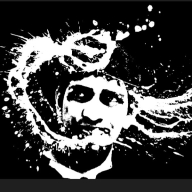
Pride Month Celebration at MORHOVER
Introduction
Discover how Morhover celebrates LGBTQ+ pride through a dedicated landing page, showcasing the company's commitment to diversity, inclusion, and community support.
Overview
This project involves the design and implementation of Morhover's LGBTQ+ Celebration Landing Page, featuring various sections that highlight pride stories, educational events, and support initiatives.
The Objectives
The Morhover LGBTQ+ Celebration Landing Page is designed to celebrate and support the LGBTQ+ community. It highlights pride stories, educational events, and resources, showcasing Morhover’s commitment to diversity and inclusion.
The problems
While the Morhover LGBTQ Celebration Landing Page aims to celebrate pride and offer support, users may encounter issues such as accessibility barriers, hindering their ability to fully engage with the content.
Tools used
From brief
Topics
Share
Reviews
8 reviews
Great work, Urvik, on taking the project from a simple idea and covering it through the entire design process. Nothing to add from my side.
The overall design is fantastic, and it effectively conveys the intended message. Here are a few actionable tips to enhance your design further, based on best practices:
- Utilize White Space: The page is quite text-heavy. To ensure that the design "breathes" better, increase the spacing between sections, paragraphs, images, and other elements. This will make the content more digestible and improve the overall readability.
- Section Spacing: Consider adding more white space between different sections to create a clearer separation. This helps users to process one section at a time and reduces visual clutter.
- Paragraph Spacing: Increase the line height and spacing between paragraphs to enhance readability. This small change can make a big difference in how comfortable it is for users to read through the text.
- Image Padding: Ensure that images have adequate padding around them. This not only makes the images stand out more but also prevents the design from feeling cramped.
Overall, you're doing an amazing job! These tweaks will make your landing page even more inclusive and user-friendly. Keep up the excellent work, and continue to create impactful designs!
This is a good start for a case study. Visually, the page is appealing, the images are very relatable, and the inclusion of stories from LGBTQ+ representatives is very thoughtful. It’s commendable that the company dedicates the entire landing page to offer support and community for their users.
However, I agree with the previous comment that it would be beneficial for the case study to introduce the company, Morhover, and its offerings more clearly.
One of the issues raised in the problem statement was a focus on accessibility. Here, I have some concerns, as some fonts are too thin or too pale, which may be challenging for some users. As accessibility is a focus, it would be helpful to see more evidence that the landing page meets WCAG standards, including features like keyboard navigation, sufficient color contrast, and the inclusion of alt text for images.
Your copy is well-organized, and you have made significant efforts to address user needs and problems. However, these efforts could be articulated more clearly.
Best of luck with further progress on this project!
Hi Urvik,
The Pride Month celebration design for Morhover is vibrant, inclusive, and full of energy. It beautifully captures the spirit of the event, with colors and visuals that celebrate diversity. Fantastic and heartwarming design—well done!
Urvik case study on the Morhover LGBTQ Celebration Landing Page is truly impressive. The visual layout is stunning, showcasing a keen eye for design and attention to detail. The UX research is thorough and well-documented, providing deep insights into the needs of the LGBTQ+ community. Each design decision is meticulously explained, resulting in a clean and visually appealing interface that enhances user experience. This case study is not only inspiring but also sets a high standard for inclusive and accessible design. Well done, Urvik!
The case study is very detailed and the images are very appealing.
All Good Performance Urvikbhai
Very nice ui design. i like it
In general it is a very good start with the brand and idea. Would be great to add more context about the company itself in the project description.
The style overall feels a bit simple with a “fit everything” black colour as a background and colourful visual. Brand elements are popping up on a bottom (FAQ), which aren’t used on other sections. You can definitely expand on this visual idea to make the landing page unified.
For some components, like icons, the contrast can be improved. It’s not always necessary to use “pride” gradients.
well done urvik
Exceptional Design
The landing page has a clean, modern aesthetic that is visually appealing and immediately conveys a sense of inclusivity.clean and simple design
You might also like
🖥 Desktop Checkout Flow Design
Website CRM Dashboard
Helpful 404 Error Page for a Fintech Mobile App
Pebble Accessible SAAS Signup Flow
Music Player UI - Light & Dark Mode
Create a UX Research Survey
Content Strategy Courses

UX Writing

Common UX/UI Design Patterns & Flows


