Empty State design for Educational App
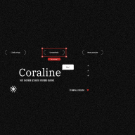

My objective is to create engaging empty state pages that users might encounter within the English learning platform.
To ensure the brand consistency, I use the same colors, typefaces, and messages for both website and mobile app.
I design for 3 empty states:
- No results
- First use
- Server error
I use appealing visuals to engage users and meaningful CTAs to encourage users to continue their learning journey with suggested courses.

Reviews
8 reviews

Clean, has a way out, take the blame instead of the user and has a nice image to it. You nailed it! keep it up

I love the empty state designs overall! They’re minimalistic, get the point across, and the cute illustrations add a nice touch. The copy is straightforward and helpful, which is exactly what users want in these situations. Just one small thing: the "No Progress Saved" heading feels a bit ambiguous. You might want to consider rewriting it for clarity. Other than that, great job!

Looks great and fun!
I wonder if you can elaborate more on the chosen imagery and the message it's trying to convey:
• 404 Astrodog vs. lost in the hike?
• No saved course: Spidershelf.
I want to share some thoughts on my experience with the design of the 404 error page. The shapes are great, and the interface is intuitive and user-friendly. I really love how you created the adorable dog character, but there’s a small point to consider. The constant presence of the dog makes me a bit confused and anxious about potential server issues.
Replacing this character with another image could help alleviate unnecessary thoughts and create a more comfortable feeling for users. Perhaps a simple, cute image would provide a more positive experience during an error.
Nonetheless, your error page is still very impressive, and I feel satisfied with this creativity. Thank you for paying attention to every detail, and I hope this helps improve the design in the future!

Quynh Anh — 🌿 Really nice job keeping your empty states simple, clear, and consistent across web + mobile. The CTAs feel meaningful and help turn a “dead end” moment into motivation to continue learning. ✨ A small suggestion: try refining the copy so every heading feels action-oriented (like your update from “No progress saved” → “Start your progress today” 👍). That extra positivity makes the experience even more encouraging. Great direction overall — keep exploring how visuals + words reinforce each other, you’re on the right path! 🚀

Hi Coraline! I just came across your project here as well, so I decided to use the feedback I left on Discord as my first comment on a shared project. :)
I really like what you've created. The color palette is stunning, and it perfectly complements the illustrations you've selected. However, there are a few areas that could use some fine-tuning, such as the spacing and the buttons. For instance, the 'no progress saved' page seems to have slightly smaller spacing between the title, body, and button when compared to the other pages. The course cards' time section and divider line need to be more consistent throughout all the cards as it seems closer to the right on some cards compared to others. Small details like this can make your design more solid.
There needs to be more consistency on the buttons. The default state for some is pastel purple but for the 'go to homepage' buttons it's a stroke with no fill. However, it seems like the purpose of all of them is to bring the user onto a different page than the one they are on. I suggest keeping buttons consistent and removing the arrow for a cleaner look, especially if they all have the same goal! How about using the stroke only design for input fields instead?
I noticed the hover state changes the buttons into rectangles with sharp corners, drop shadows, and no fill. Though it looks cool, it might seem unnatural when considering the rest of the design details having rounded edges. I don't see any other pages employing sharp corners, so I think that might seem out of place and too strong. After all, sharpness is associated with certainty, but the hover state represents more of a questionable act. I'm trying to say that when we hover over something, we're questioning whether the button or component presented to us is clickable or brings us elsewhere and whether we would like to proceed or not. I suggest changing your approach to this hover state into a gentler, unified design. If you decide to keep the default buttons with the semi-rounded corner and pastel fill, how about making the hover state a darker shade of that color? For instance, a greyish lilac could maintain the consistency of the design while providing a clear indication of the button's clickability. Try this HEX code and play with the opacity #9794A6.
Overall, I thoroughly enjoyed navigating through your design. The effort and thought you've put into it are truly commendable, and if I were learning English for a second time, I would definitely choose this platform over others! (PS: sorry for this long msg)
Great job.

You did a great job. the isometric illustrations and key words were playful. It gave me a feeling that i am safe and i did nothing wrong.

Simple, clean and shows good hierarchy! Also a nice use of illustrations. Great work keep it up!
You might also like

SONZ - Entertainment platform


Camp & Travel Explorer - App Design


Solar system Dashboard Utility

Uxcel Halloween Icon Pack


Color System

Duolingo Halloween Icon Pack

Content Strategy Courses

UX Writing


Common UX/UI Design Patterns & Flows


Go-to-Market Strategy Fundamentals
