Joblet Hire - Profile Page


Joblet is a hiring web platform where companies who need to hire people and individuals looking for jobs come together like a marketplace. The platform acts as a middleman, connecting these companies with potential candidates based on their needs and preferences, making the process more efficient for both parties.

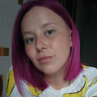
My task as the UI/UX designer was to improve the Profile Page of users and make it visually clear and straight forward for potential hiring managers.
- The UI design was structured in a way that the most important information and details about a potential employee are visible at a glance.
- The buttons created numerous options for the hiring manger on how they would like to reach out to the potential employee. Whether they want message them, add them to a list for later, follow them, or to hire them right away.
- There's an indicator icon beside every user's name to show if they're currently ready for work or not.
- Immediately after the information about a potential employee, there's a section where hiring managers can easily navigate through the user's portfolio and resume.
The main objective for this design layout in simple terms is simplicity, straightforward and satisfactory.
Tools used
From brief

Topics
Share
Reviews
20 reviews

Other than the fact that there are two styles for links (About me section and the website link), I believe the design looks and feels great!
What stands out:
- The CTAs are crystal clear and consistent.
- The structure is appropriate for proper HTML syntax.
- This design can be fairly easily implemented in a Flex layout, therefore easier for developers.
- At first glance, it feels like the WCAG AA standard is likely to pass, though perhaps not AAA.
- Padding and margins seem consistent.
- Clear font hierarchy.
- Simple language and no jargon.
- Familiar elements like the "online" status and skill chips (aka pills).
Important note: it's critical to test your designs with variable data, longer names, huge links, many skill chips, extremely long About Me section, etc. How would it affect the design in that case?
Food for thought. :)

Your design for the profile page is really neat and well thought out. It gives a clear picture of the candidate — their role, experience, skills, and background. Just a couple of tweaks I think it could use — the "Add to list" button feels a bit ambiguous, so maybe change it to something like "Shortlist" to clarify the action. Also, adding a count badge for the number of followers and following would provide quick insight into the candidate’s network. Overall, fantastic job!

Hi Chibuzo!
I like how the information seems structured and easy to scan. Recruiters don’t have time to dig around, so the clarity and hierarchy here really matter. It looks like you kept things clean instead of cramming everything in, and that’s a smart move 📄👌
If I’d suggest one thing, maybe add a stronger standout element like a visual highlight for key skills or achievements 🚀 That could help profiles feel more dynamic.
But overall, this feels solid, practical, and ready for real-world use.
The design is clean and visually appealing, and the page is easy to navigate and interact with.
However, I noticed a lack of information about the current problems you solved with the new design. An analysis of the previous design from a user perspective, if any, would have been helpful as well. Including these details would have provided a deeper understanding of the improvements and justification for your design choices.
Good luck!

great job!

This design brief covers all the key points needed for hiring managers, recruiters, and freelance projects. It highlights these important aspects to help Anthony get hired quickly:
- The "Hire Me" button stands out.
- The experience is shown in a clear order.
- The tabs include all the necessary details.
- There are links for features like online visibility and skill tags.
- The layout follows web design standards like Bootstrap.
Now, let’s look at some improvements for both UI and UX:
UI Improvements:
- The left padding for the Follow button is more than the right. Try to balance it.
- The heading and subheading should have a small size difference, like 2-4px. For example, if "Experience" is 18px, the body text should be 14px or 16px.
- The "Read more" link looks more noticeable than the heading. Since the font size is similar, consider using a different color for the heading.
- The arrow icon next to "Read more" should be slightly smaller than the text.
- Font weights for Skills, Location, and Website should be consistent (all bold or semi-bold).
UX Improvements:
- Add a "Download CV" or "View CV" button near the Follow button.
- Include a "New Window" icon to show that links will open in a new tab.
- Moving the Message button closer to the Follow button will group communication actions better.
- Explain what the "Add to List" feature does.
- Showing the number of followers and following will add credibility to your profile.
If you need more help, feel free to reach out anytime. Keep designing and keep learning!
Take care!
The information architecture makes for smooth navigation. Everything is well labeled and navigation paths are easy to follow.

This is certainly a good design so my feedback is going to be "nit-picky" stuff and about details etc:)
On the UX side, and job seekers perspective, It would be nice to see how many hiring managers have added the candidate to the list as it would be helpful for the candidates (It would be better to use a clearer copy for this button though).
Moreover, I think the green icon you're using as an indicator beside the user's name to show if they're currently ready for work or not could be misinterpreted with a different meaning like the user is online. So I would suggest to use a clearer indicator which could be either a tag or a text that delivers the message more intuitively. Also, the icon indicator is not properly aligned with the user name.
On the visual side, the current color palette is decent but I think you could have experimented slightly more with the color palette to make it a bit more attractive for the potential hiring managers, I only can't be sure about it.
As I said, these are just nit-picking and I liked your approach for the design of this page. The candidates experience, skills, and about me are readily available for the hiring managers at first glance. Keep up the good work!
Nice layout

Great job. It is a very clean and informative way to represent profile data
You might also like

SONZ - Entertainment platform


Camp & Travel Explorer - App Design


Solar system Dashboard Utility

Uxcel Halloween Icon Pack


Color System

Duolingo Halloween Icon Pack

Content Strategy Courses

UX Writing


Common UX/UI Design Patterns & Flows


Go-to-Market Strategy Fundamentals
