Redesigning KickBrain: Trivia Mobile Game
Overview — The Thirty Second Challenge
The Thirty Second Challenge began as a YouTube football trivia show and quickly became a cultural hit. It turned football knowledge into fast-paced entertainment, capturing millions of fans across the Arab world. What made it special wasn’t just the questions — it was the thrill, rivalry, and shared passion for the game.
KickBrain: Bringing the Game to Everyone
KickBrain was born from that same excitement. The vision was simple — take the energy of the YouTube challenge and turn it into a global, interactive experience. A mobile platform where fans everywhere could compete, learn, and relive the same 30-second adrenaline rush anytime, anywhere.
How It Started — From Player to Designer
My journey with KickBrain began as a fan. I was obsessed with The Thirty Second Challenge on YouTube and always wished I could play it myself. When a friend introduced me to KickBrain, I instantly loved the idea — it captured the same competitive spirit and adrenaline I had been looking for.
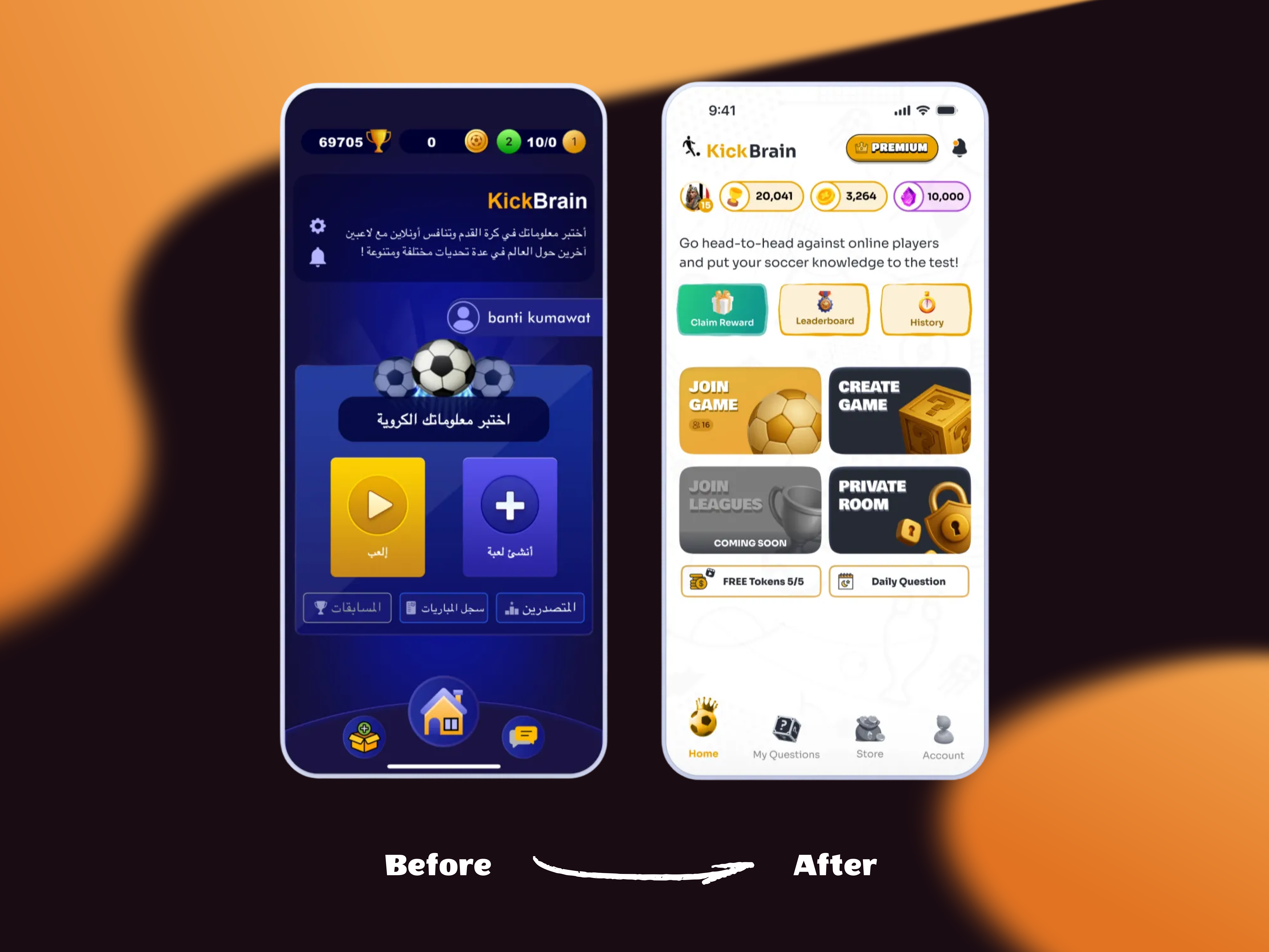
As a product designer, I couldn’t ignore the UX challenges and outdated visuals that held the app back. Out of passion, I spent a day auditing the entire experience and crafting a new visual direction and sent it to them. Shortly after, the founder reached out — and that’s how I joined the team. What started as a fan’s enthusiasm turned into a design mission to elevate KickBrain into the ultimate football trivia experience.
Problem:
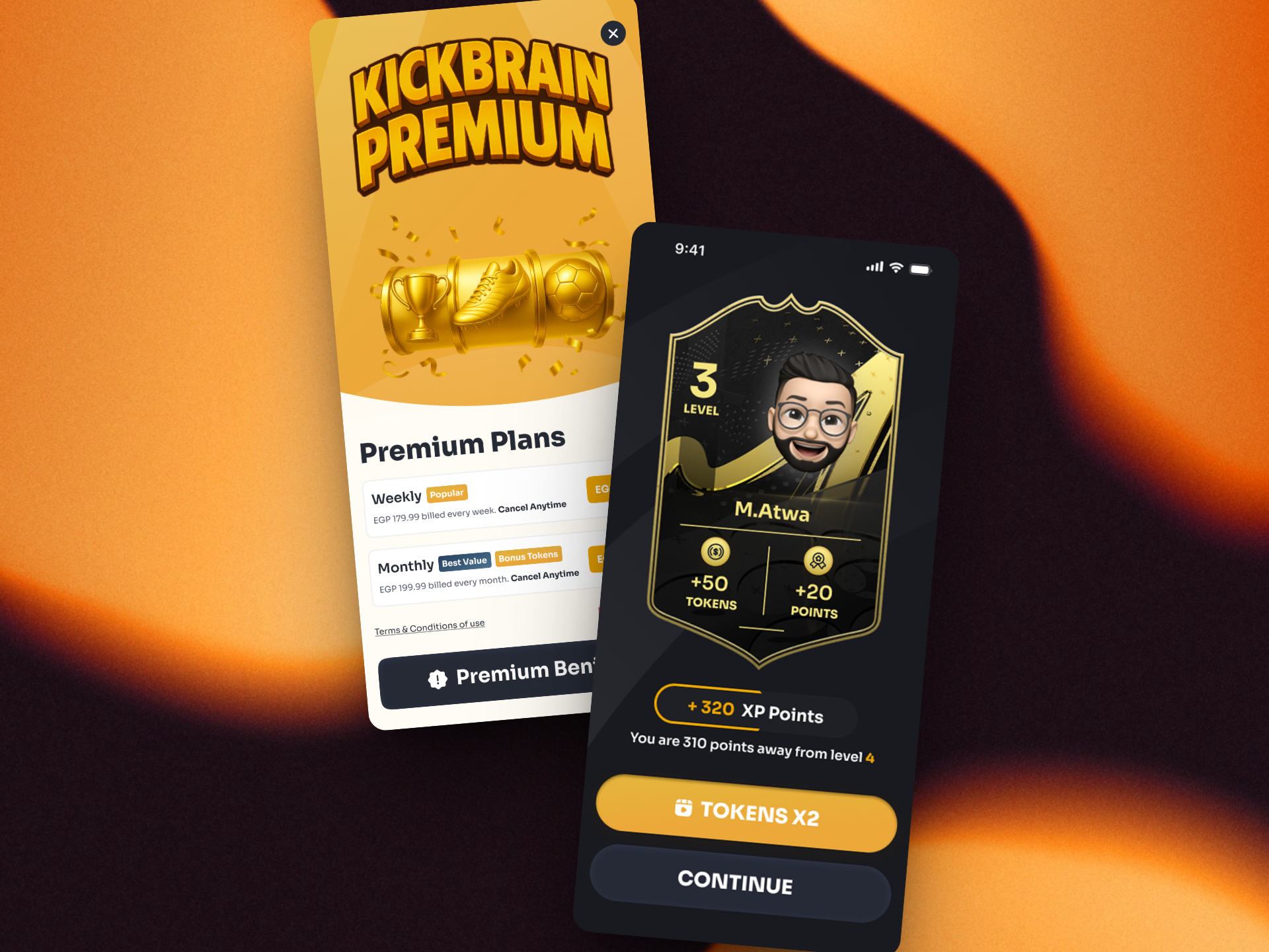
KickBrain’s user experience suffered from inconsistent design patterns, unclear navigation, and weak information hierarchy, limiting user engagement and retention. A strategic redesign was needed to establish visual consistency, streamline core interactions, and align the product experience with its competitive and gamified vision.
Outcome
- Drove app growth from 40K to +500K downloads through a strategic redesign of core game flows and onboarding experience.
- Elevated user satisfaction, boosting app ratings to 4.0+ stars on both Google Play and the App Store.
- Introduced new revenue generation streams through in game consumables and a new currency.
Tools used
Topics
Share
Reviews
7 reviews
The redesigned screens look much more organized with better hierarchy, cleaner spacing, and stronger icon consistency.
The outcomes section adds real credibility, though you could strengthen it even more by briefly connecting each visual improvement to the business impact it drove. Overall, the presentation is polished, confident, and very well-structured
@Mohamed Atwa keep pushing like this, you’re clearly on a great path as a designer.
Great work!!
Redesign looks great, Mohamed! A real difference from the little I can see from the past version of the app.
Awesome to read that this started with work out of passion, that you did an audit and sent results to app founders and it's very nice that you also included numbers in your presentation, of the impact you had by joining the team.
To be honest, maybe it's just me, but I would change the name of your section "Output" to "Outcome", because the numbers you presented there are really outcome related. Your output was for example the screens redesign, but you managed to grow the business and also the user's app ratings, so I understand you made your users happier too.
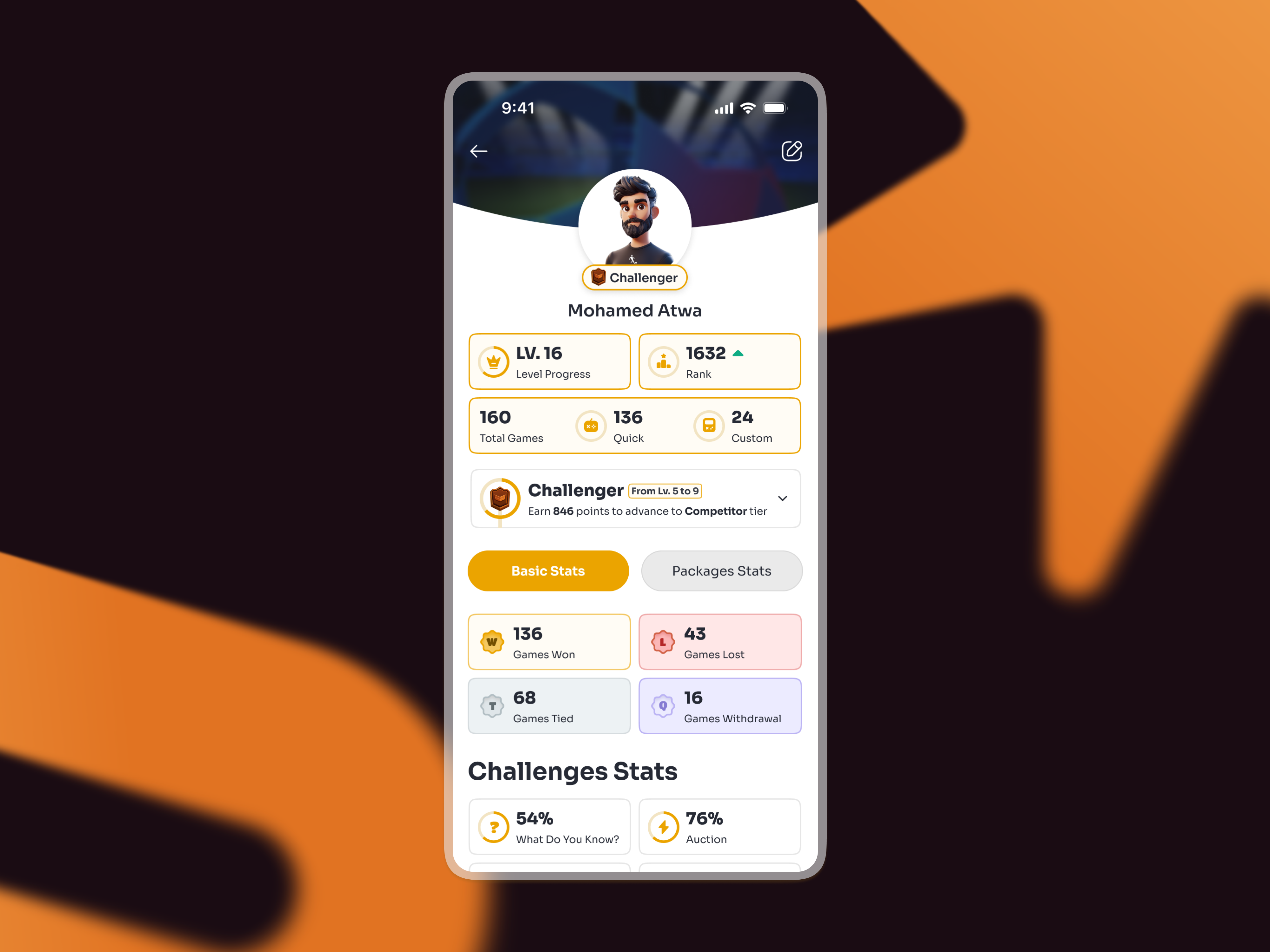
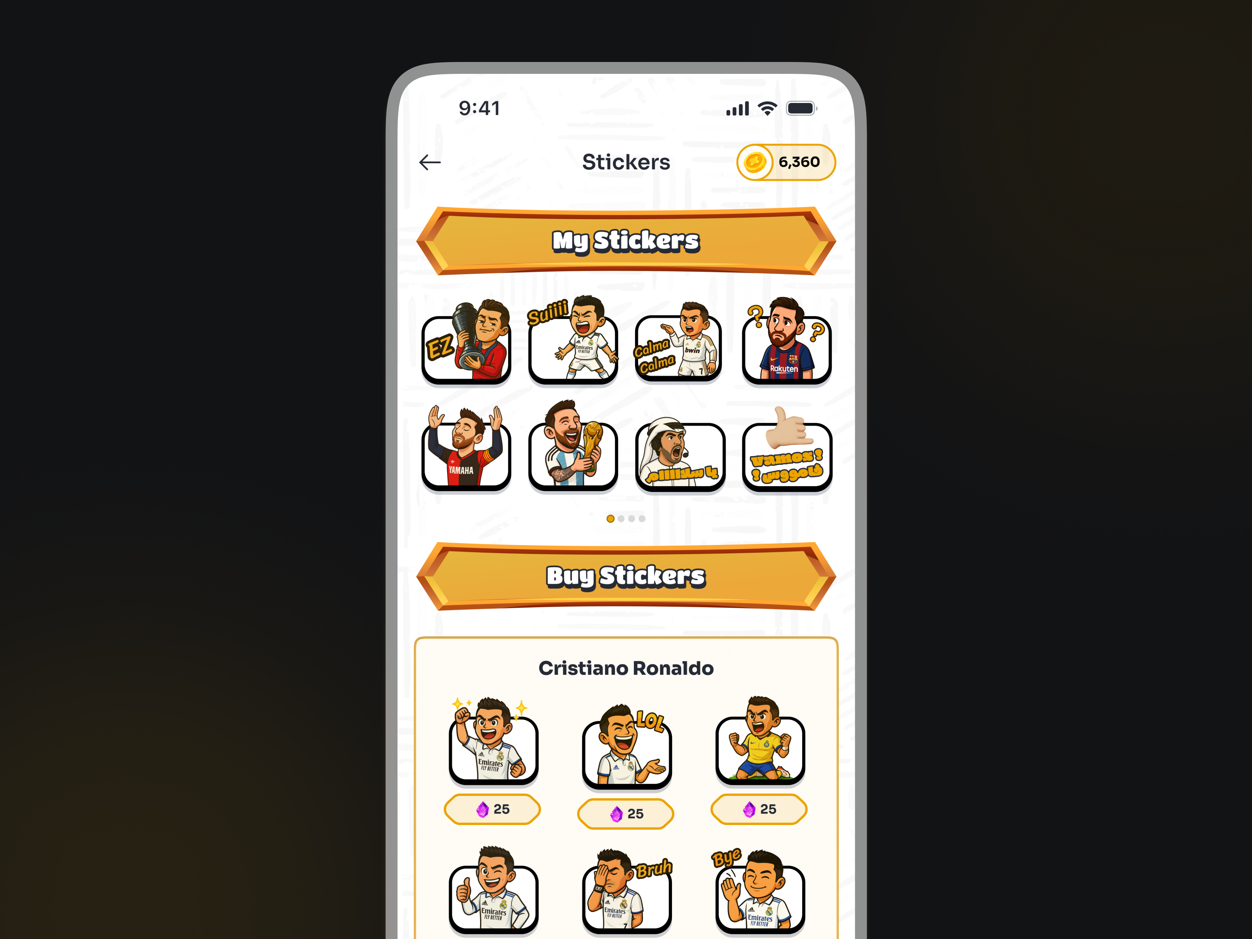
Also it was interesting for me, as a FIFA game fan myself to recognize the style of cards borrowed from there, to be used a little different here to show your account details and stats.
Congrats, well done!
This was a really interesting read! I love that your passion led you to a role with KickBrain, and it’s clearly paid off. The redesign looks great and app rating and growth speaks for itself.
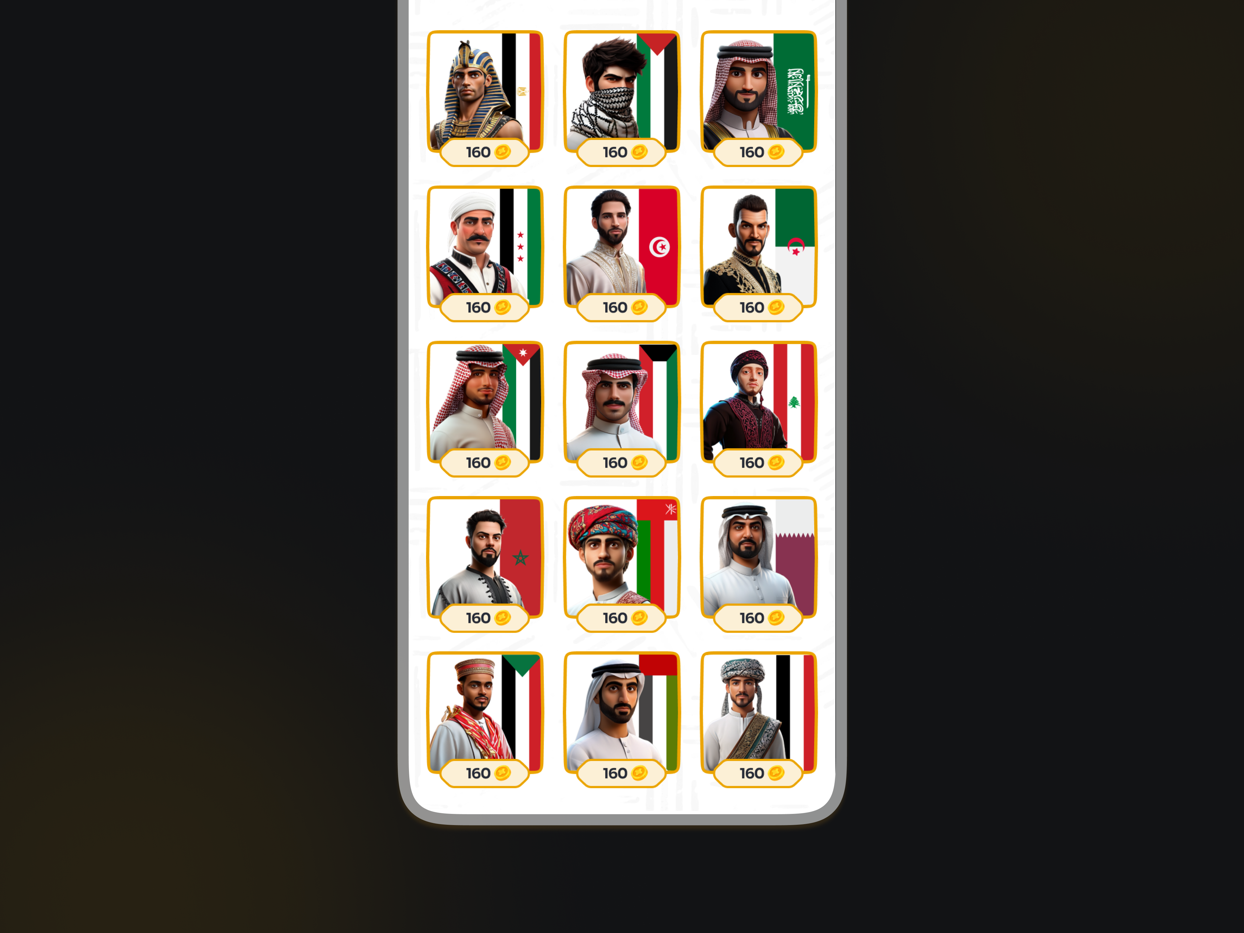
The redesign is much cleaner, more modern, and the 3d elements really suit the app. Awesome job! :)
Amazing job. Wow!!!
Great job improving the app’s consistency and navigation, which clearly boosted user engagement and ratings.
The impressive growth and new monetization strategies highlight the impact of your work. Consider renaming 'Output' to 'Outcome' to better reflect results and adding a bit more about your design process for fuller context
Well Done Mohamed 😍👏🏽
Great Atwa, it made me click your thumbnail image – very, very professional crafted.
Your visual and your 3-D selections as well as the colour combinations and the background mergence - is note worry
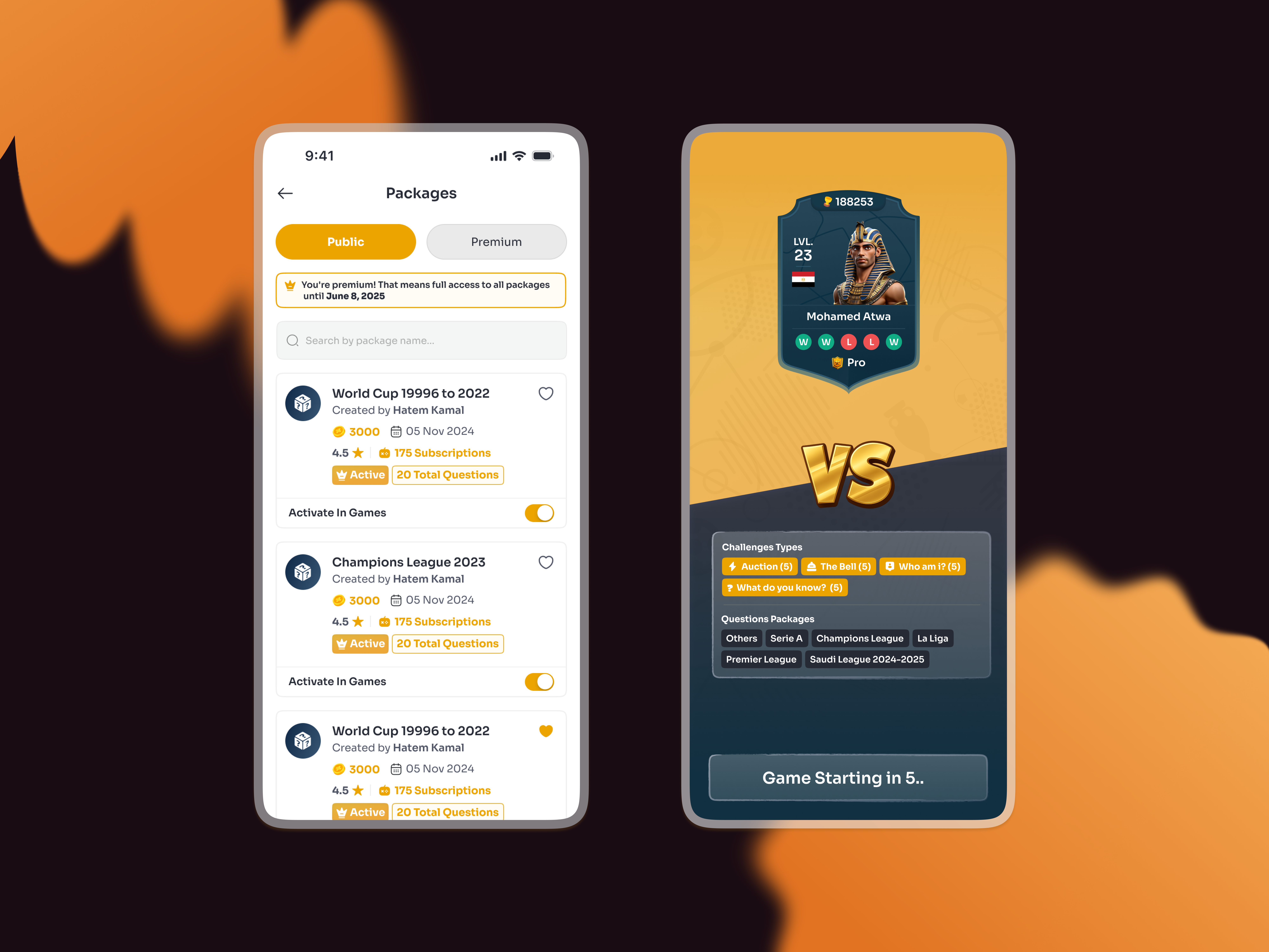
One thing that I saw is, there are square button as well as all kind of rounded buttons inside of it, and sometimes Clash Royale feeling is also embedded.
Package have public and premium. I think that could be a toggle while that screen is too much of the yellow losing the Royal feeling of yellow exclusivity.
Scrolling down again, too much of yellow in the profile needs to be reduced and add some background rather than just a top curve background– I would say Clash Royale would be that good example
Stickers is mind blowing, even the background also matches, but I say screen needs to be darker for a reason that it could focus on the image – this is one of that screen. Make it dark so that my eyes don't have to squint to look on it.
And this is so much better than many of the case studies, I am saying so kudos – you are more into give me for design rather than UX research side – and if you have any skills that you are lacking and need improvement ….and need any guide or help – check my Excel profile and we can get in touch from there for 1:1
You might also like

Improving Dating App Onboarding: A/B Test Design

FORM Checkout Flow - Mobile

A/B Test for Hinge's Onboarding Flow

Accessibility Asse

The Fitness Growth Engine
Uxcel Halloween Icon Pack
Popular Courses

UX Design Foundations

Design Terminology


