

Reviews
12 reviews

You've created a cohesive, well-branded catalog layout using familiar design patterns. Overall, your intent is well communicated!
However, the typeface choice may hinder accessibility for some users. Improving copy clarity and providing a stronger design rationale would enhance the overall user experience.
While the work is presented effectively, addressing these areas would demonstrate a deeper understanding of user-centered design principles and create a more inclusive experience.

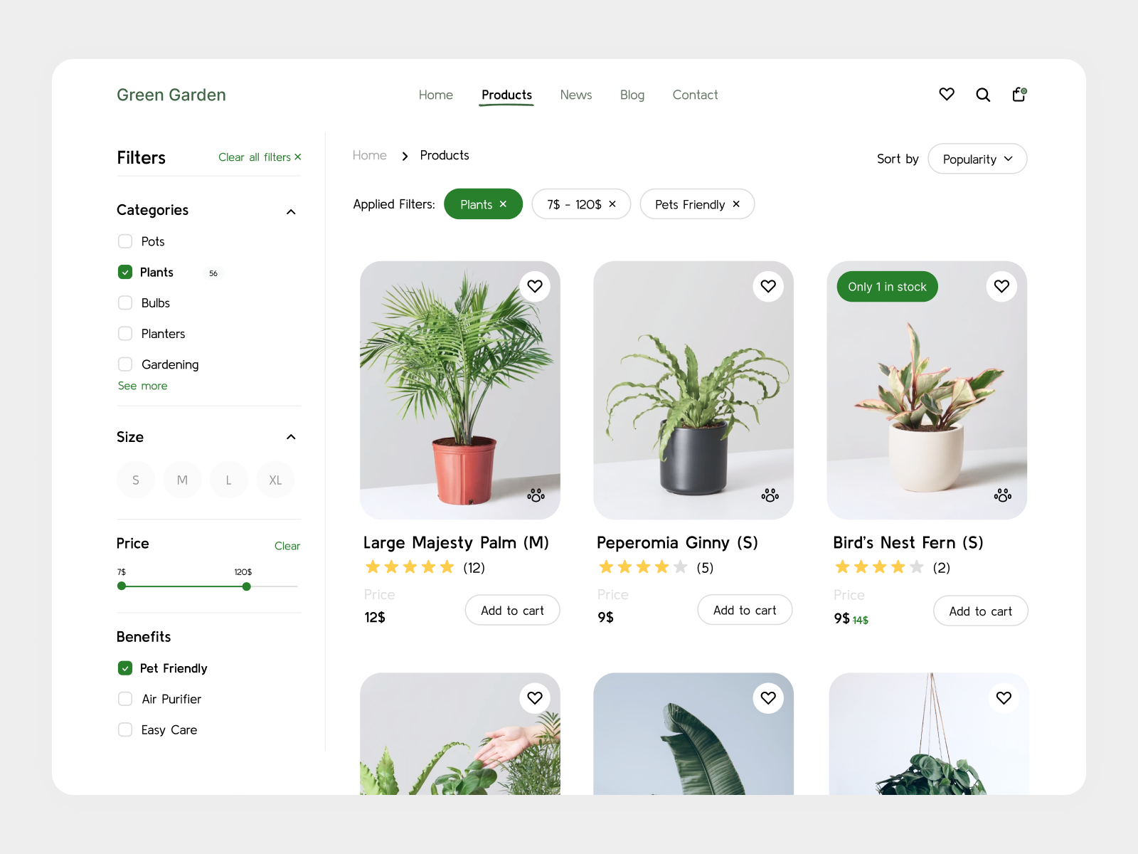
The catalog page is clean and well-organized. Sidebar filters with applied filter chips above the listing are a great solution for system status visibility. The user always knows what's active. Breadcrumbs, sorting, wishlist hearts, the "Only 1 in stock" badge, and the crossed-out old price are solid e-commerce standards, well implemented.
I agree with Iryna: the "Price" label above the amounts has too low contrast, hindering scannability. I'd add: the currency notation is non-standard (12$ instead of $12), which may cause confusion. The outline "Add to cart" buttons are quite subtle. In e-commerce, the primary CTA should be more prominent. The three-dot icon on product images isn't intuitive - its function requires guessing.
There's no design process description, which Iryna rightly pointed out. Still, the UX foundations are strong and the layout is clear. Refining visual details and contrast will take it to the next level. The direction is very solid! ✌️😊

Nice work! Clean and clear design.

Hello Yana, nice work on the Plant Shop catalog! The layout is clean and the product page design is well-organized. One suggestion: the "Price" label could be more visible — while the actual price numbers are clear, the label itself is quite subtle. Increasing its contrast would improve scannability. Also, consider adding more context about your design process and decisions. What problem were you solving? Why these specific layout choices? Adding that story would make your project even stronger!

Hi Yana, I just checked your Plant Shop Catalog and this one feels fresh 🌿✨
The vibe is really nice. It feels light, clean, and calming, which fits a plant shop perfectly. I like how the product cards don’t feel crowded, and the visuals let the plants breathe (which is kind of poetic, honestly 😄). The hierarchy feels clear, so browsing looks effortless.
If I’d suggest one thing, maybe add a bit more personality or emotional hook like small tags (“Easy Care”, “Pet Friendly”) or subtle interactions to make shopping more fun 🌱💚 Overall though, it’s clean, aesthetic, and very on-theme.
Nice work!

The colors and composition are well-executed, but there are opportunities for improvement:
While the design of the product cards is strong, the "Add to Cart" button doesn't stand out enough. Consider making it the primary focal point of the card to encourage user interaction. Additionally, although the pet-friendly tag is a nice touch, it might be better placed within the description rather than on the image.
Furthermore, the font choice could be reconsidered for better readability and accessibility; either opt for a different easy-to-read typeface or increase the size of the current font you're using.
You did a great job in the filters sidebar. However, there's an opportunity to optimize the white space between elements, especially within the different filter options. Currently, it appears slightly disorganized, so reducing the white space can enhance the overall organization and user experience.

Love the design's welcoming and friendly feel—well done!
Suggestions to refine:
- Boost the font size for discount amounts and filter labels (price slider label, category count label) to aid readability.
- Weigh the pros vs cons of the "price" label on all cards for a cleaner look—remember, simplicity is sophistication.
- Weigh the pros of a right vs left-aligned vs the current centre alignment of the top navigation menu for ease of use.
- The dog paw icon may not be instantly clear—seeing it in action via an interactive prototype could help.
- Keen to read the design explainer!
Nice work!

Nice design with enough white space and clearly interface. Good work!

Very neat, I like it a lot!

We can make some points:
- Positive Aspects:
- Clean and minimalist design, making it user-friendly.
- Clear categorization and filters for easy navigation.
- The product images are clear, and the information is concise.
----------------------------------------------------------
- Areas for improvement:
- Increase font size for prices to enhance visibility.
- Add a quick-view option for product details without leaving the page.
- Implement a more prominent visual indicator for low-stock items.
Thank your for your design⭐
You might also like

Improving Dating App Onboarding: A/B Test Design

FORM Checkout Flow - Mobile


A/B Test for Hinge's Onboarding Flow


Accessibility Asse


The Fitness Growth Engine

Uxcel Halloween Icon Pack

Visual Design Courses

UX Design Foundations


Introduction to Figma

Design Terminology
