FoodTime
Description: FoodTime is a food delivery service that connects users with local restaurants, emphasizing support for LGBTQ+ owned and friendly businesses. The project includes a website redesign aimed at enhancing user engagement and celebrating Pride Month by promoting inclusive dining experiences.
Project Background: FoodTime operates in the food delivery industry, targeting a diverse audience that values inclusivity and supports LGBTQ+ businesses. The primary problem addressed was the need for a more engaging, user-friendly website that promotes Pride Month and aligns with FoodTime’s mission of inclusivity.
Case Study Coverage: This case study will discuss the project’s objectives, research methods, audience definition, brainstorming solutions, design process, final solution presentation, testing insights, and final thoughts. It will provide a comprehensive look at the steps taken to redesign the FoodTime website, focusing on user needs and inclusive design principles.
Objectives
Primary Objectives:
- Enhance the user experience on the FoodTime website.
- Increase engagement and support for LGBTQ+ owned and friendly restaurants.
- Promote Pride Month through special features and content.
Success Metrics:
- User Engagement: Measured by time spent on the site and interaction rates.
- Conversion Rate: Number of users completing orders.
- User Feedback: Positive reviews and feedback from users regarding the new design and Pride Month features.
Research Goals & Methods
Research Goals:
- Understand the behaviors, preferences, and pain points of FoodTime users.
- Identify specific challenges faced by users when navigating the current website.
- Gather user feedback on the proposed design and features for Pride Month.
Research Methods:
- One-on-One Interviews: To gather in-depth insights into user experiences and preferences.
- Surveys: To collect quantitative data on user satisfaction and feature desirability.
- Competitive Analysis: To understand how similar platforms engage users and promote inclusivity.
- Analytics Review: To analyze user behavior patterns on the current website.
Findings:
- Users value quick and easy navigation.
- There is a strong preference for supporting local and LGBTQ+ owned businesses.
- Users appreciate visual and interactive elements that celebrate diversity and inclusion.
Define the Audience
Target Users:
- Primary Users: Diverse individuals who support LGBTQ+ communities and enjoy dining out or ordering food online.
- Demographics: Ages 18-45, tech-savvy, inclusive mindset, urban dwellers.
- Behaviors: Frequently order food online, value inclusivity and diversity, active on social media.
Personas:
- Persona 1:
- Name: Nigam Patel
- Age: 29
- Occupation: Marketing Specialist
- Marital Status: Single
- Education: Bachelor’s Degree
- Quote: “I love supporting businesses that align with my values. FoodTime makes it easy for me to find and support LGBTQ+ owned restaurants.”
- Personality Traits: Talkative, optimistic, friendly, empathetic
- Goals/Needs: Easy access to inclusive dining options, support for local businesses
- Pain Points: Difficulty finding LGBTQ+ friendly options on other platforms
- Frustrations: Clunky navigation on current websites, lack of visibility for inclusive businesses
- Motivation: Supporting diversity, enjoying good food, convenience
- Persona 2:
- Name: Rushi patel
- Age: 34
- Occupation: Software Engineer
- Marital Status: Married
- Education: Master’s Degree
- Quote: “FoodTime’s commitment to inclusivity is what keeps me coming back. Their Pride Month celebration is just the cherry on top.”
- Personality Traits: Analytical, thoughtful, supportive, driven
- Goals/Needs: Efficient ordering process, high-quality food options, inclusivity
- Pain Points: Limited options for inclusive restaurants on other apps
- Frustrations: Slow delivery times, poor customer service
- Motivation: Supporting inclusive communities, efficient service, quality food
Brainstorm Solutions
Ideation Techniques:
- Brainwriting: Team members wrote down their ideas for improving the website and promoting Pride Month.
- Mind Mapping: Visual diagrams were created to explore various aspects of the project.
- Sketching: Initial design sketches were made to visualize potential layouts and features.
Generated Ideas:
Group 1:
- Highlighting LGBTQ+ owned restaurants prominently.
- Creating interactive maps showing inclusive dining options.
Group 2:
- Introducing special Pride Month promotions and discounts.
- Featuring stories and interviews with restaurant owners.
Group 3:
- Enhancing the ordering process for ease of use.
- Adding vibrant, inclusive visual elements to the website design.
Initial Wireframes :
Provide Your Final Solution
Final Designs:
- The final website design features a vibrant, rainbow-themed color palette to celebrate Pride Month.
- User-friendly navigation and quick access to LGBTQ+ owned restaurants.
- Special sections highlighting Pride Month events, promotions, and community stories.
Color Palette:
- Primary Colors: Inclusive rainbow hues representing diversity.
- Accent Colors: Soft pastels for a welcoming feel.
- Neutral Colors: Light greys and whites for readability.
Typography:
- Header Font: Bold and modern for emphasis on key sections.
- Body Font: Clean and readable for general content.
Share Testing Insights
Testing Insights:
- Conducted user testing sessions to gather feedback on the new design.
- Used A/B testing to compare engagement rates between the old and new designs.
Changes Based on Feedback:
- Improved the loading speed of the website.
- Enhanced visual elements to make them more engaging.
- Refined navigation to make it even more intuitive.
Improvements:
- Increased user engagement and satisfaction.
- Higher conversion rates with more users completing orders.
- Positive feedback on the inclusive and celebratory design.
Conclusion and Final Thoughts
Conclusions:
- The redesigned FoodTime website successfully celebrates Pride Month while improving user experience.
- Emphasis on inclusivity and support for LGBTQ+ businesses resonated well with users.
- The project demonstrated the importance of user-centered design and continuous iteration based on feedback.
Lessons Learned:
- Understanding and empathizing with users is crucial for successful design.
- Inclusivity can be effectively integrated into digital experiences.
- Continuous testing and iteration lead to significant improvements in user satisfaction and engagement.
Tools used
From brief
Topics
Share
Reviews
5 reviews
The case study is thorough and logically explained. The idea is great too. However, I'd recommend paying more attention to accessibility issues. Honoring inclusivity shouldn't compromise accessibility, and some texts might have too low contrast.
P.S. The provided link to the Figma file doesn't grant access. Figma says I need to request access. Please review the permission settings.
Quite an original idea, however the UI looks too simple. Using rainbow gradients to the main components, like buttons and icons is a very junior thing to do.
To enhance and improve the project, I would suggest to use gradients sparingly and for bigger areas. Explore related to Pride colours but with the better contrast, which will make components more readable and accessible.
I like the concept of supporting LGBTQ businesses. In terms of visual design, I would mute some areas that have rainbows like the text, as it’s competing attention with the other elements. I would also play around with the text combinations, goodluck!
By celebrating Pride Month in a bright and welcoming way, the FoodTime website's inclusive and dynamic design successfully engages users. It is user-friendly because of the obvious call-to-action buttons, appealing graphics, and educational highlights on important aspects including a large range of restaurants and quick delivery. Higher contrast, however, might make the text easier to read, and a cleaner layout would result from using regular spacing and alignment. The background picture integration might be better integrated, and the navigation bar should be prominently displayed. I would suggest incorporating the rainbow colors in graphic elements rather than components (text, buttons, icons). Overall, the website may be made more engaging and user-friendly with a few small modifications.
I agree with the other feedback in terms that the idea may be interesting but the execution screams 'kindergartenish' to me. Some key areas I've noticed and think that needs improvement:
- Cluttered and Overlapping Elements.
- Inconsistent Use of Color: The variety of colors, especially the rainbow gradient, can be overwhelming and reduce readability. I can't really see whether this is part of the brand or just trying to stay true to pride month.
- Visual Hierarchy Issues: again, important information and CTAs don't stand out due to competing visual elements.
- Navigation and Button Placement: Distracting multi-colored login button and the "Explore" button lacks emphasis.
- Imagery and Text Alignment: Misalignment of images and text disrupts the flow.
- Readability Concerns: Rainbow-colored text is hard to read, especially for those with visual impairments.
- White Space Issues: Insufficient white space makes the design feel cramped.
- Contrast/Accessibility Issues: Lack of accessibility features and poor contrast ratios.
- Redundant Information: Repeated information in sections like FAQs is confusing.
- Icons and Imagery: Inconsistent visual elements give a disjointed appearance.
I found this website very attractive and creative. Great description of the project and all the usability testing.
The case study is well-detailed and logically presented, highlighting a compelling idea. However, to ensure inclusivity without compromising accessibility, it's crucial to address some key issues. Specifically, there are instances where text contrast is insufficient, impacting readability (Rainbow Colors for header), especially for users with visual impairments. Improving these contrast levels will significantly enhance usability for all users.
Additionally, regarding the Figma file accessibility, the provided link prompts a request for access rather than allowing immediate viewing. Please review the permission settings
When you click on the link to open the full project, there is a weird picture that doesn't make any sense and I can't see the design properly. I think the structure is nice and easy to scan, but colors of the CTA buttons could be different.
good design for pride month
The goal to promote Pride Month is definitely achieved through your content and your use of the common symbol of pride, the rainbow, but I would like to see the use of rainbow done more subtly and more integrated. Maybe as a background or as a flag image in certain areas, but the combination of the rainbow in buttons and headings makes them hard to read.
I like the effort you put into the case study and I appreciate the emphasis on the user needs and the persona. It shows that the research part is strong.
Also a small note of improvement since us designers like to look at the details 😊 when creating a project to show off you skills, try polishing it a bit, as under "Frequently asked questions" I do see duplicated text and lorem ipsum. You can use ChatGPT to generate some text for those places.
You might also like
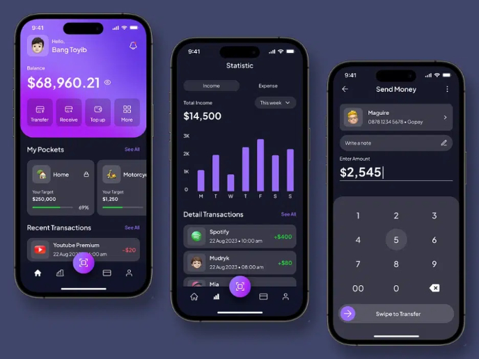
eWallet App Development Project
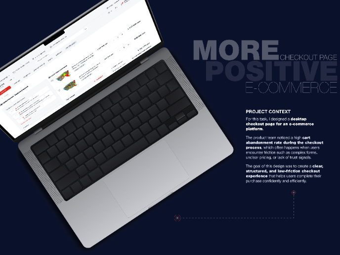
🖥 Desktop Checkout Flow Design
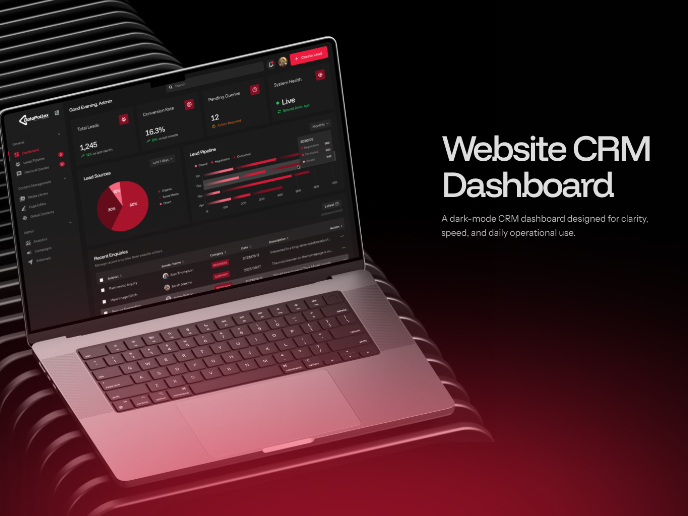
Website CRM Dashboard
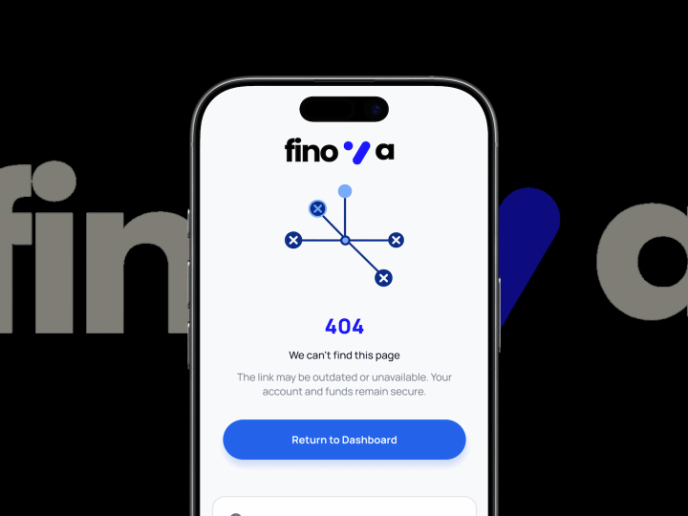
Helpful 404 Error Page for a Fintech Mobile App
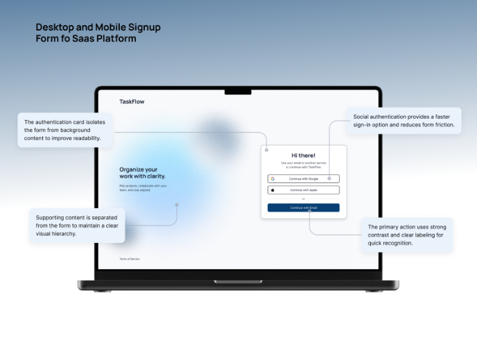
TaskFlow Authentication Flow
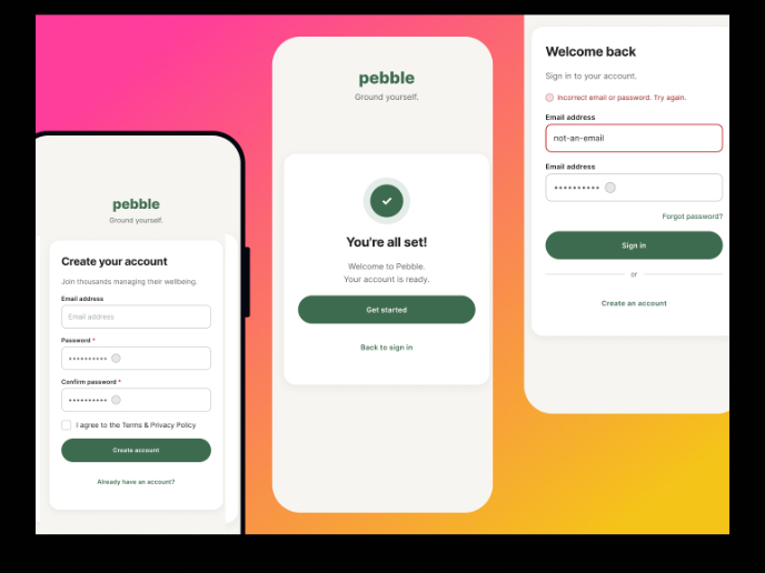
Pebble Accessible SAAS Signup Flow
Content Strategy Courses

UX Writing

Common UX/UI Design Patterns & Flows


