
Reviews
4 reviews

Interesting project, Ziad.
I really like the idea behind it, but it might be worth thinking about how the user would track the trajectory of their ball. Does the user need to constantly interact with their phone to record the data?
Also, what is the main goal of the app, and which specific problem does it aim to solve? Clarifying that could help strengthen the overall concept.
From a UI perspective, I’d suggest improving the text contrast, especially for darker text, since it might not meet accessibility standards.
Overall, I like the concept. It definitely has potential, but there are a few areas that could be refined further.

Hi Ziad Atef,
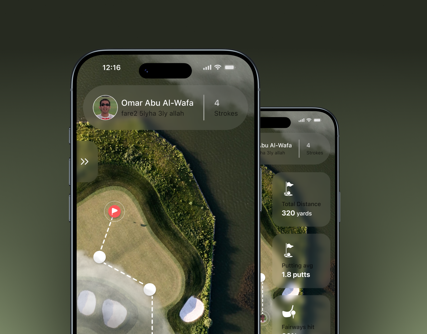
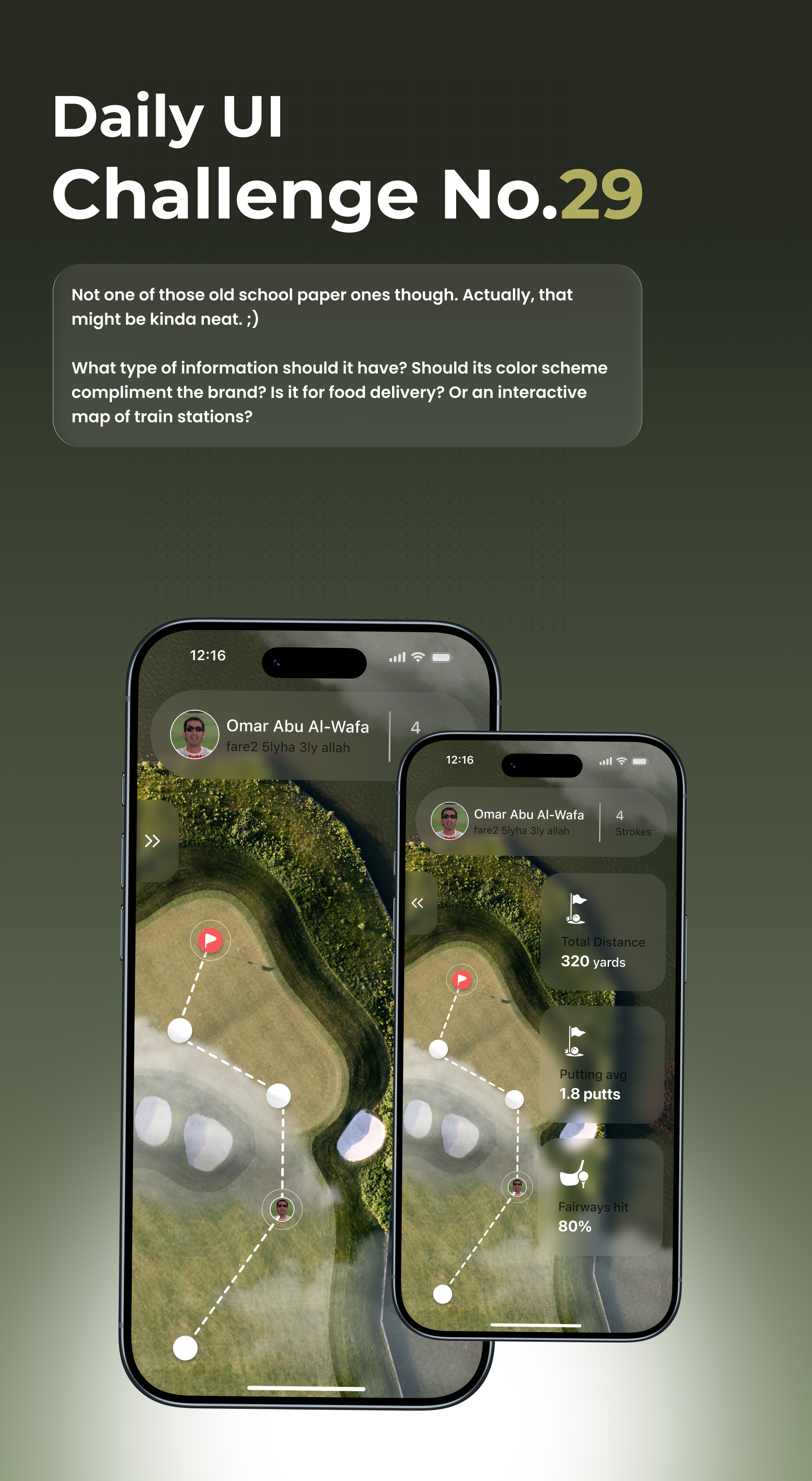
The design looks modern, clean, and professional. The data layers on the map are well-balanced, and the color palette fits the golf theme perfectly. Typography and icons are simple and consistent, while the dotted route line intuitively represents the player’s progress. The UI’s game-like digital style also adds an engaging, dynamic touch to the overall experience.
🚀Improvement
1- Readability: Using black text reduces contrast and makes reading harder; switching to a lighter gray tone would improve legibility and harmony with the background.
2- Interaction & Layout: Moving the menu arrow from the left to the right side would make it more finger-friendly and intuitive, as opening the menu from right to left aligns better with natural user interaction flow.
Overall, it’s a well-crafted and polished design with great visual direction. A few minor tweaks in readability and interaction flow would elevate the experience even further.
Good work, keep going!🔥
Visuals are great, but readability feels low. I’d suggest checking color contrast and text hierarchy against WCAG accessibility guidelines.

Need to improve contrast. Keep going!
You might also like

Pulse — Music Streaming App with Accessible Light & Dark Mode


Islamic E-Learning Platfrom Dashboard

SiteScope - Progress Tracking App


Mobile Button System


FlexPay


CJM for Co-Working Space - WeWork

Popular Courses

UX Design Foundations


Introduction to Figma

Design Terminology
