Lists & Tables
Master the art of presenting structured data through Apple's list and table patterns.
Lists and tables organize information in Apple's interfaces, transforming complex data sets into clear, scannable views that help users find what they need. Every list row and table cell acts as a container that presents content consistently while adapting to different data types and user interactions. Content layouts range from simple text lists to rich previews with images and actions. Tables expand this pattern with sortable columns and hierarchical data. Both components handle dynamic content elegantly — whether displaying a few items or thousands — through efficient scrolling and clear loading states. The marriage of clean typography, thoughtful spacing, and smooth animations creates an information hierarchy that feels natural to navigate while maintaining the visual clarity Apple interfaces are known for.
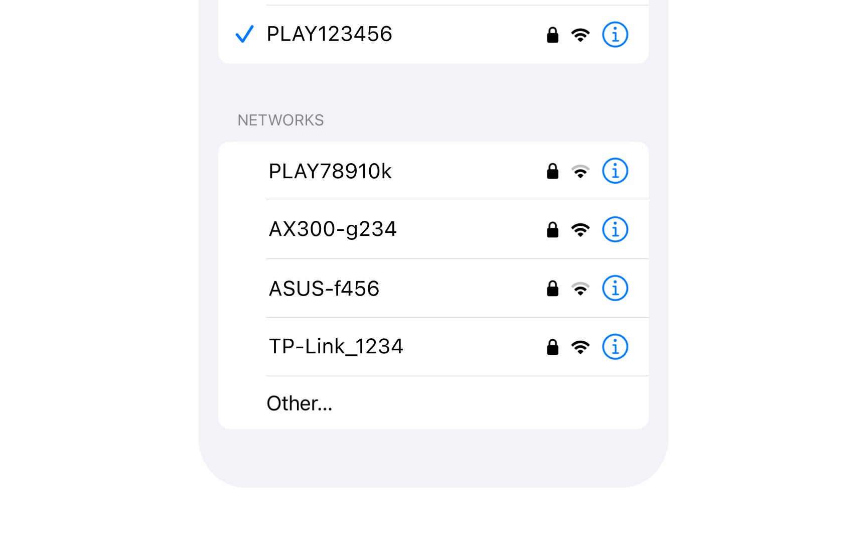
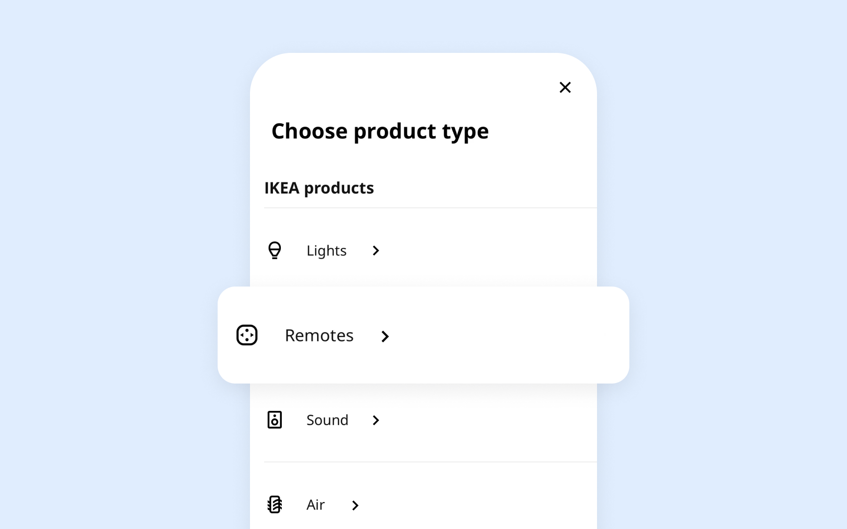
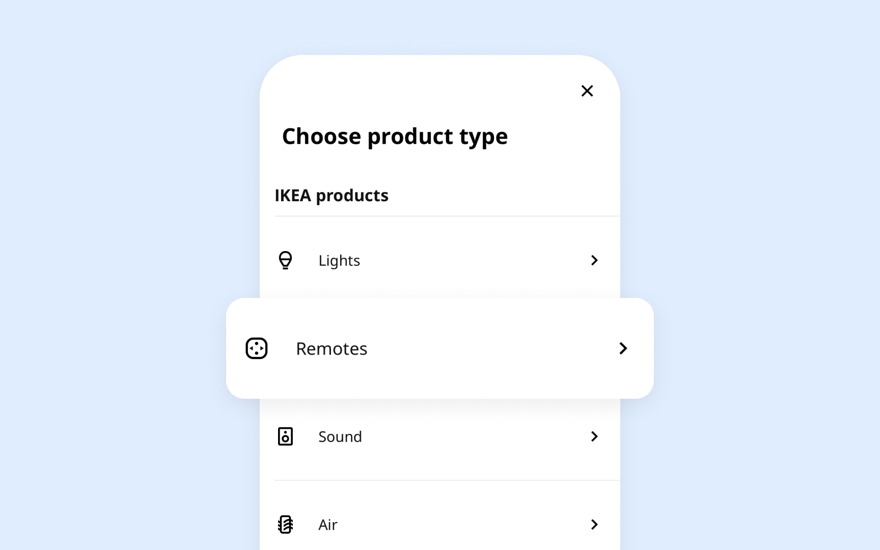
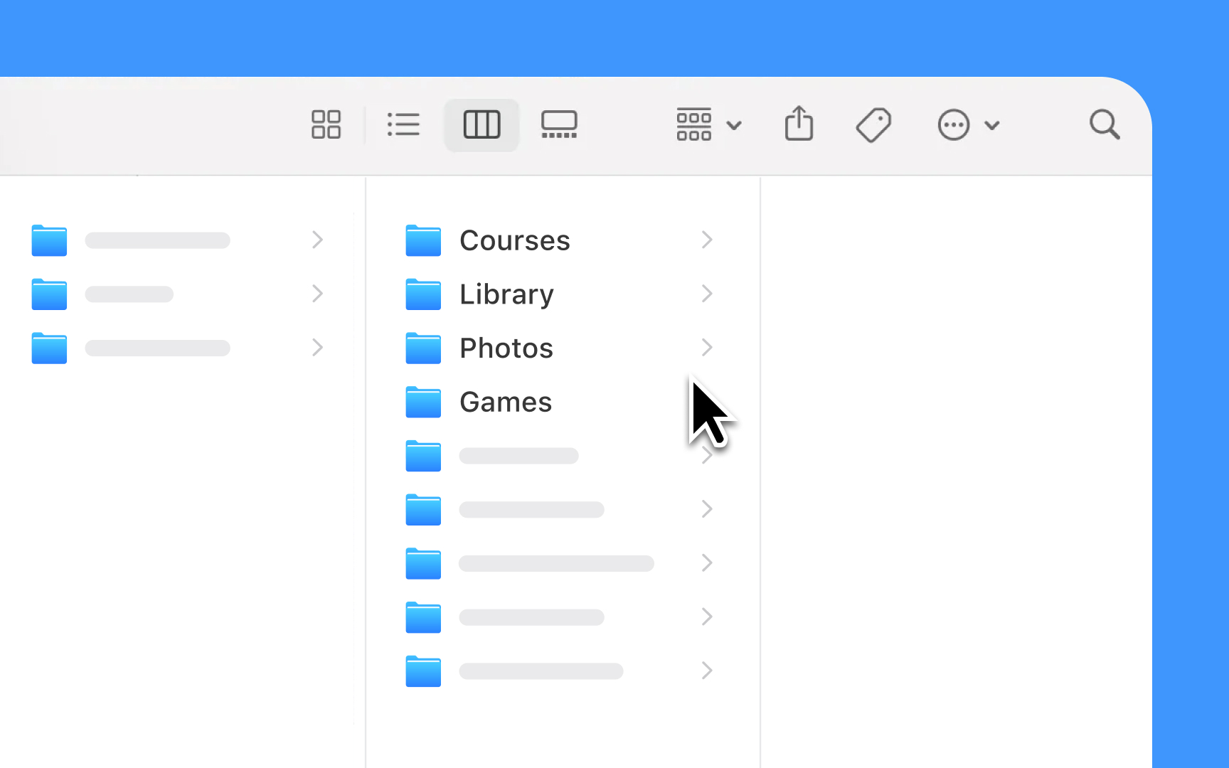
List views organize information in a scrollable format that makes text easy to scan and read. Their row-based
Key guidelines from Apple HIG:
- Text optimization: Keeps row
content brief to avoid truncation and wrapping — longer content belongs in detail views - Row styles: Matches built-in styles to content needs (
images , labels, or both) - Control placement: Uses info buttons only for revealing details, not for navigation
- Navigation patterns: Adds disclosure indicators (>) when
rows lead to subviews - Content hierarchy: Shows most relevant items first, with options to view more
- Length management: Balances comprehensive content with easy scanning[1]
Pro Tip: When lists get long, show the most relevant items first and add a "See All" option — this keeps the interface focused while preserving access to all content
Key guidelines from Apple
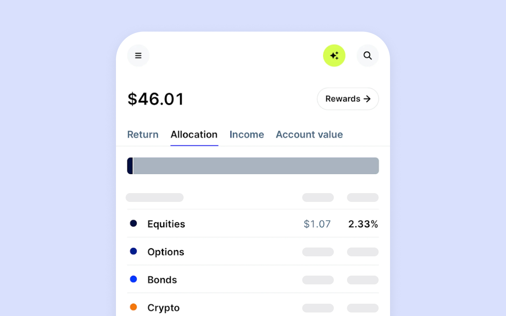
- Column headers: Makes each column's purpose clear and enables sorting
- Content rules: Aligns different data types consistently — text starts from left, numbers align right
- Column order: Puts most important information in leftmost columns
- Size flexibility: Sets minimum column widths that keep text readable when resizing
- Scroll behavior: Supports both up-down and side-to-side scrolling for large datasets
- Fixed headers: Keeps column titles visible when scrolling through a long table
Every list or
Key guidelines from Apple
- Content hierarchy: Places primary information at the start, supporting details follow
- Image sizing: Maintains consistent dimensions for icons and thumbnails across
rows - Text balance: Uses prominent text for main content, lighter weight for secondary details
- White space: Adds breathing room between elements without creating gaps
- Action placement: Positions common actions at the trailing edge of rows
- Vertical rhythm: Keeps consistent spacing between elements across all rows
Pro Tip: Use system-defined spacing constants to maintain consistent gaps between row elements across your entire interface.
Collection views display items in flexible, grid-based
Core requirements for collections:
- Grid structure: Arranges items in consistent
rows andcolumns with equal spacing - Cell sizing: Maintains proportional dimensions as layouts adapt to different screens
- Layout flow: Orders content logically for left-to-right readers (left-to-right, top-to-bottom)
- Content types: Ideal for image-heavy interfaces, visual browsing, and side-by-side comparison
- Scroll behavior: Maintains smooth performance with large numbers of items
- Dynamic updates: Animates changes when items are added, removed, or reordered
Pro Tip: Test collection layouts at different screen sizes to ensure content remains readable and properly spaced.
In lists and
Design requirements for data styles:
- Text content: Left-aligned with consistent line height and optional truncation
- Numerical data: Right-aligned with matching decimal places and proper grouping
- Dates and times: Adapts to user's region — showing as 12/31/23 in the US, 31/12/23 in Europe, or 2023年12月31日 in Japan
- Status values: Shows states like "active/inactive" or "in progress/completed" with consistent system colors and SF Symbols
- Mixed content: Maintains clear hierarchy when combining different data types
- Empty states: Shows meaningful placeholders when data is absent
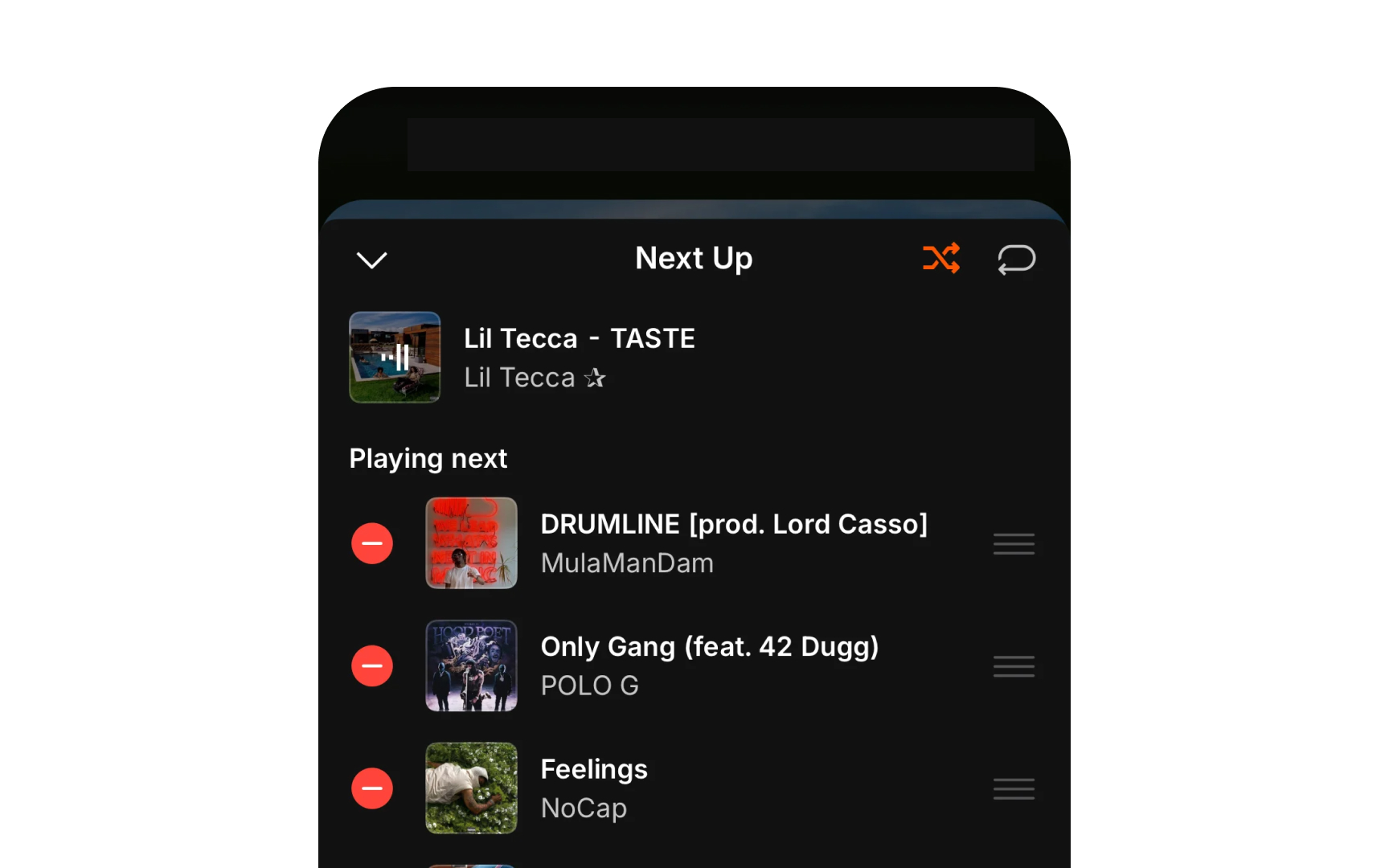
Lists and
Design principles for interactions:
- Touch feedback: Highlights
rows or cells briefly when tapped, using system-default gray - Selection states: Changes background
color and adds checkmarks for selected items - Swipe actions: Reveals contextual actions with smooth
animations and clear hit areas - Scroll indicators: Shows and hides scrollbars automatically while scrolling
- Loading states: Reduces row opacity and shows a spinner when refreshing
content orloading more items - Error states: Presents clear visual cues when actions fail or content can't load
Pro Tip: Always test interactive states with VoiceOver enabled. Every state change should be clear both visually and through audio feedback.
Lists and
- Edit mode: Reveals control
buttons in thenavigation bar, shows reorder handles when needed - Organize mode: Enables drag and drop between sections or lists
- Batch editing: Groups actions that can affect multiple items at once
- Reordering: Shows grab handles and live preview when items can be rearranged
- Delete mode: Uses red delete buttons with clear confirmation steps
- Mode switching: Provides clear transitions between different modes

Lists and
Core guidelines for content updates:
- Initial state: Shows
placeholder content or skeleton screens while data loads - Refresh behavior: Pulls to refresh at the top, infinite scroll at the bottom
- Update signals: Animates changes smoothly when content updates or reorders
- Load batching: Brings in new content in chunks to maintain performance
- Error handling: Shows clear feedback when content fails to load
- Progress indication: Uses activity indicators for longer operations
Pro Tip: Show skeleton screens instead of spinners for initial loads — they give users a better sense of the incoming content structure.
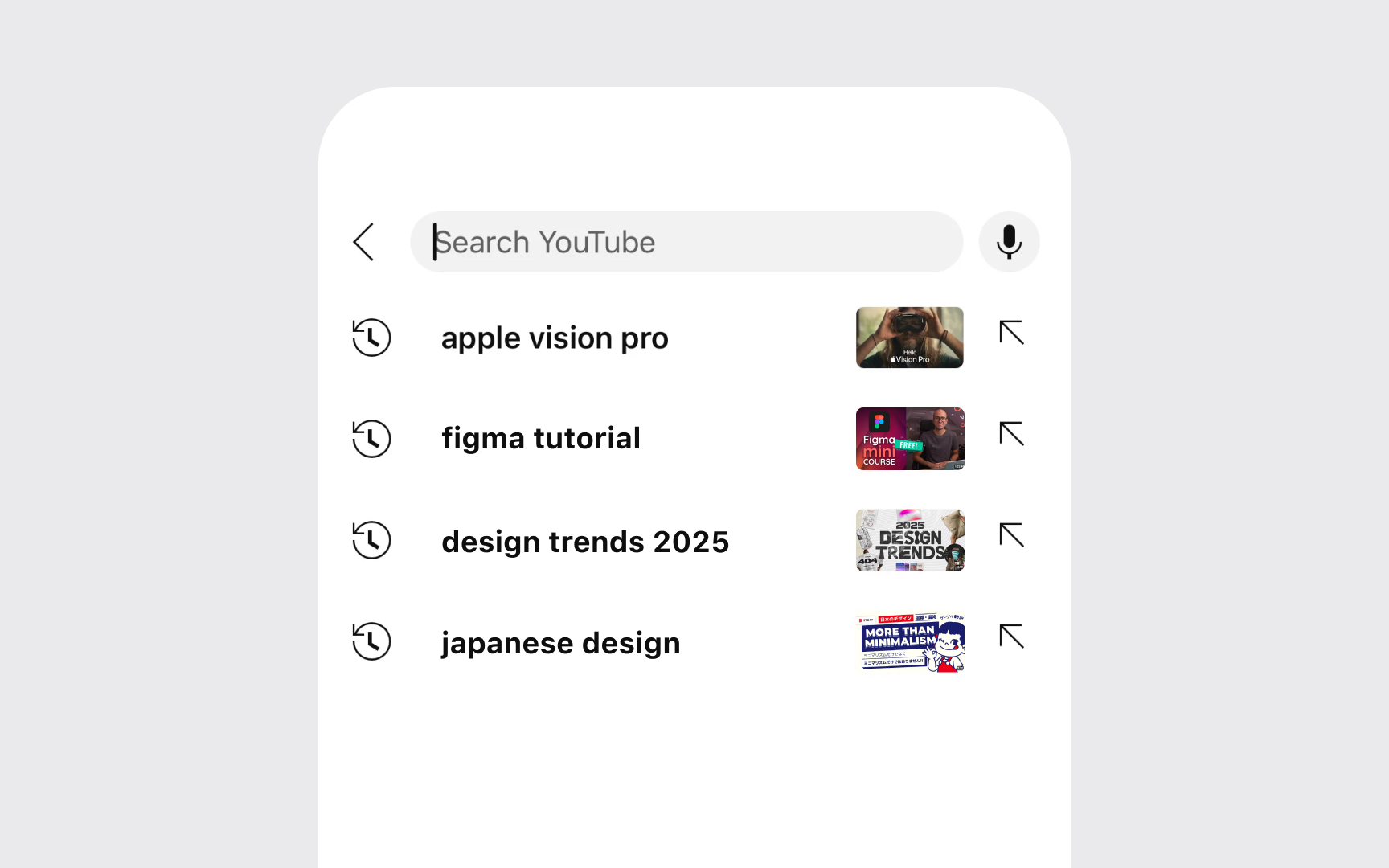
In lists and
Core guidelines for search:
- Search placement: Positions search bar prominently at the top of scrolling content
- Results display: Filters and highlights matching items in the list as each character is typed
- Empty states: Shows helpful suggestions when no results match
- Recent searches: Displays previous searches before users start typing
- Keyboard behavior: Shows search keyboard with appropriate return key action
Lists and
Core requirements for accessibility:
- Row labels: Provides clear spoken descriptions of each row's content and purpose
- Navigation order: Creates logical focus order when moving through items
- Action hints: Announces available actions like "double tap to open" or "swipe for more"
- State changes: Communicates updates when content is filtered, sorted, or modified
- Custom actions: Makes swipe and context menu actions available through VoiceOver
- Dynamic content: Announces new items when content updates automatically
References
- Lists and tables | Apple Developer Documentation | Apple Developer Documentation
Topics
From Course

Images provided by

Share


Similar lessons

Essential UI Controls

System Buttons & Actions
