Essential UI Controls
Master the core UI controls that power fluid interactions across Apple platforms.
UI controls guide every interaction in Apple's ecosystem. These basic building blocks — buttons, switches, text fields, segmented controls, and more — must follow clear rules that make them familiar across all Apple devices. These controls share common materials that add depth through clear backgrounds, smooth movement, and surfaces that respond to touch.
Like Apple's physical products, the controls stay consistent and readable whether you're using them in bright daylight or at night. The thoughtful mix of visual style, touch feedback, and smooth animations makes even complex tasks feel simple and natural. When implemented well, these controls make apps easier to navigate, prevent mistakes, speed up tasks, and help users feel confident. Together, they create a shared language that makes Apple interfaces powerful yet easy to use.
Every interface needs a clear hierarchy of actions. Apple's button system helps create this hierarchy through distinct attributes:
- Style elements: Buttons can use filled backgrounds, tinted outlines, or plain text styles. Each style signals different levels of importance — filled buttons grab attention for primary actions, while plain ones work well for secondary tasks
- Content options: Buttons display either text labels ("Add to Cart"), system icons (share symbol), or both together. The text starts with a verb and uses a title case. Icons work best for universally recognized actions
- Button roles: Each button serves a specific purpose — normal for standard actions, primary for default choices, cancel for dismissing views, and destructive for permanent changes. The system automatically applies appropriate colors and text weights based on these roles
Apple suggests using visible backgrounds only for key actions and keeping prominent buttons to a minimum. This thoughtful restraint helps users focus on what matters most in each view.[1]
Pro Tip: Never use a primary button style for destructive actions — even if they're the most likely choice. This helps prevent accidental data loss.
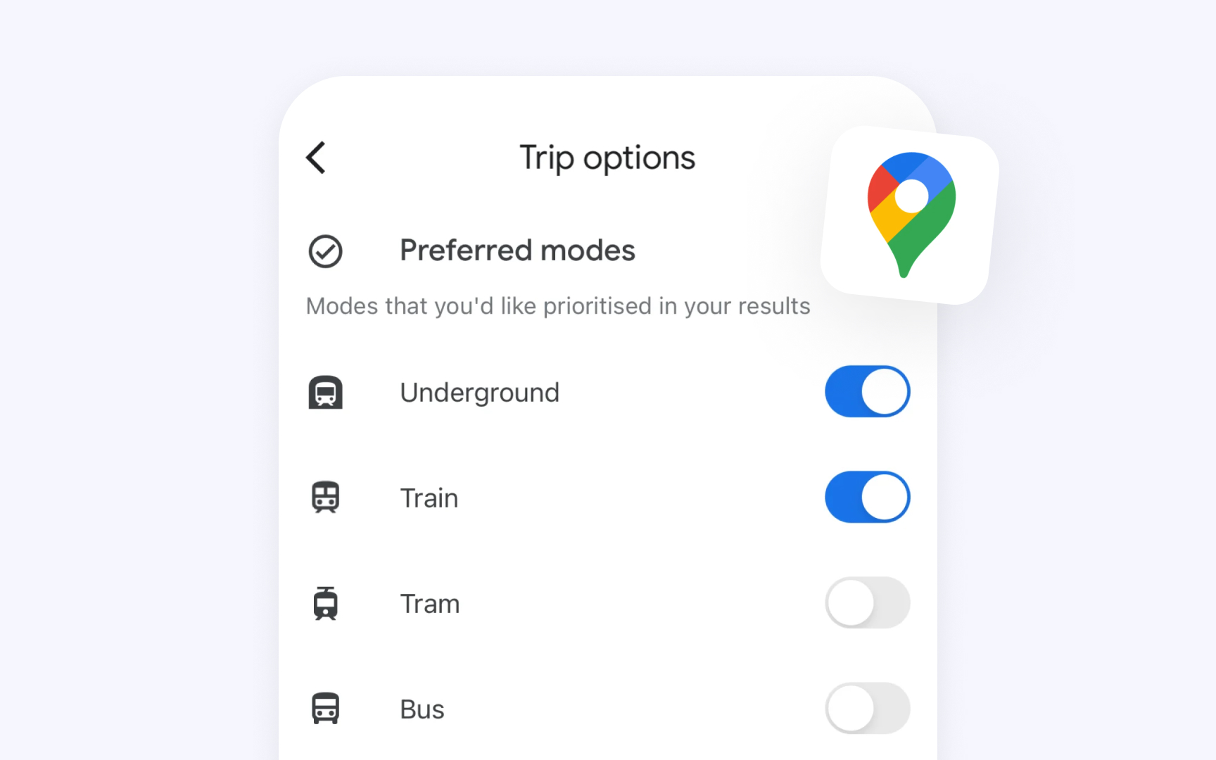
Every interface needs a clear way to manage settings and features. Apple's toggle switches serve this purpose by controlling functions that can be either active or inactive, such as enabling notifications or activating dark mode. Unlike
Key guidelines from Apple’s Human Interface Guidelines (HIG) include:
- Purpose: Toggles are exclusively for state management. They should help change settings or features but never trigger actions or present a list of choices.
- Visual feedback: The design should make it instantly clear whether a setting is on or off.
- Accessibility: Toggles should use multiple visual indicators beyond
color , such as shape changes, fills, and symbols, ensuring clarity for all users. - Interface context: They should be paired with clear
labels or listcontent that explicitly states what the toggle controls. - Alternative options: When used outside of lists in iOS and iPadOS, toggles should be able to transform into special buttons with toggle behavior.
Pro Tip: Use checkboxes when settings have parent-child relationships — their visual style makes hierarchical relationships clear through alignment.
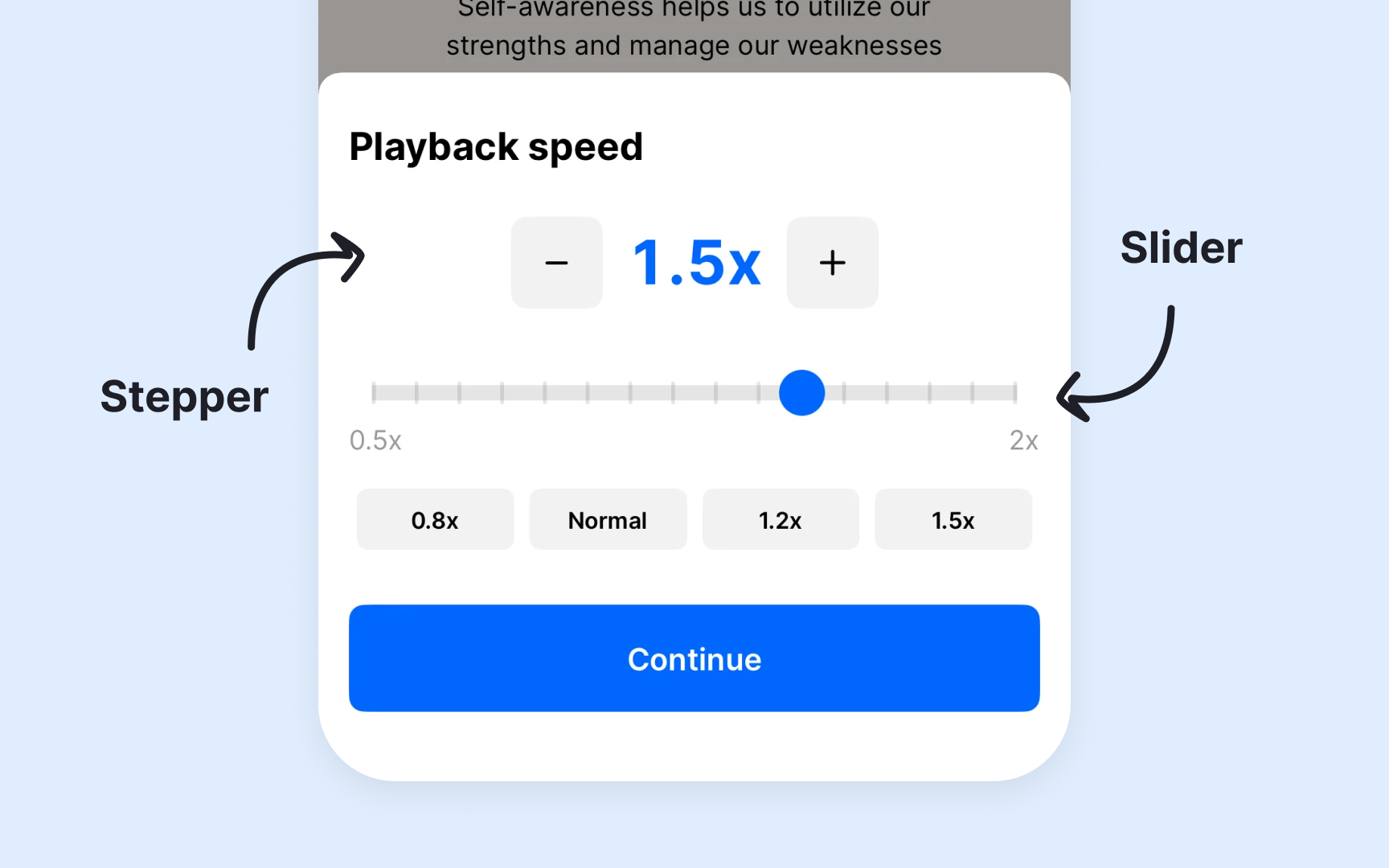
Sliders and steppers offer precise value control in Apple's interfaces, each best suited for specific adjustment needs. Sliders provide smooth, continuous control — perfect for things like volume or brightness. Steppers are great for making small, precise adjustments, like choosing quantities or sizes, by letting users tap to increase or decrease values step by step.[2]
Key guidelines from Apple
- Slider purpose: Offers continuous range control with optional value markers and
labels - Stepper purpose: Increases or decreases values in set increments
- Value feedback: Must show current value through position (slider) or adjacent label (stepper)
- Range indicators: Uses meaningful minimum and maximum values with optional tick marks
- Visual guidance: Shows which values are available through track appearance and control state
- Input methods: Adapts for touch, pointer, keyboard, and accessibility tools[3]
Pro Tip: Use a stepper when exact values matter, like setting a timer. Use a slider when the experience of fluid adjustment is more important
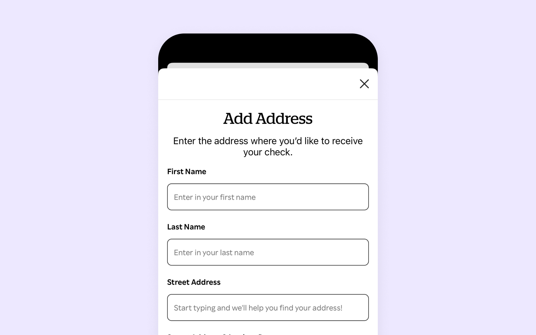
Text fields are essential input controls that let users enter and edit text within Apple's interface. Key guidelines from Apple
- Visual structure: Maintains clear boundaries between input area and surrounding
content - Placeholder text: Provides helpful context that naturally disappears during typing
- Input feedback: Shows users where they are through cursors and highlights
- State changes: Clearly indicates focus, selection, and validation states
- Field types: Adapts layout and behavior for single-line, multi-line, or specialized input
- Input support: Adds helpful features when needed — a clear
button (×) to remove all text, auto-correction suggestions, and keyboard shortcuts for faster editing
Pro Tip: When validation fails, show helpful error messages below the field — never just highlight in red.
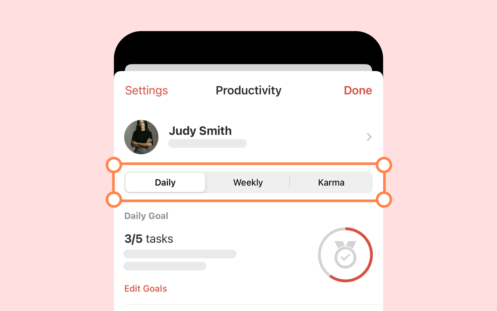
Segmented controls divide related choices into distinct sections that affect the same
Key guidelines from Apple
- Control purpose: Groups mutually exclusive choices that affect the same content
- Visual grouping: Shows related options in a single horizontal row
- Selection states: Uses smooth transitions to show active segment
- Content display: Supports text
labels ,icons , or both to explain each option - Segment behavior: Works in single or multiple selection modes
- Layout rules: Maintains consistent spacing and proportions between segments
Pro Tip: Keep segment labels short and clear — long text can make segments hard to read and the control too wide.
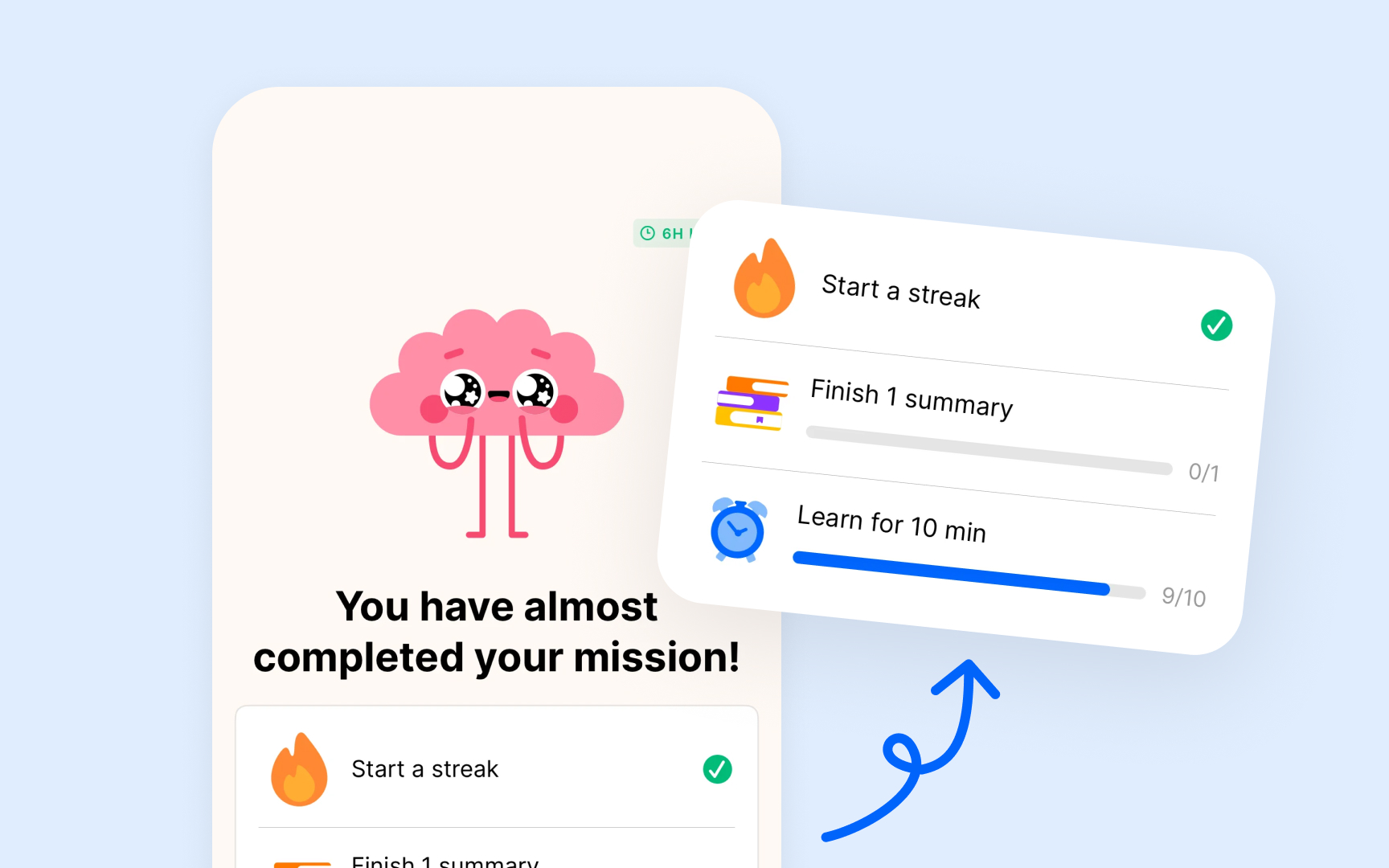
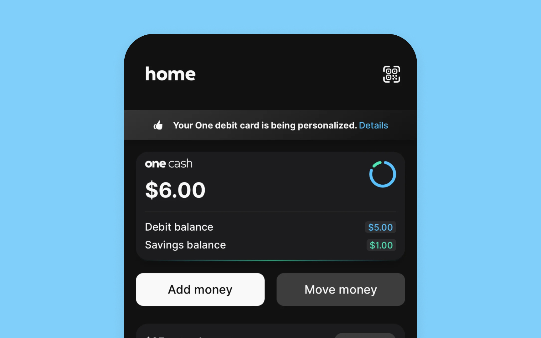
Progress indicators help users understand exactly where they are in a task or process. Like physical gauges that measure progress in the real world, Apple's indicators use a familiar circular or linear design to show status — whether it's a quick refresh or a lengthy download.
Key guidelines from Apple
- Indicator types: Determinate shows specific progress percentage, indeterminate shows ongoing activity
- Visual feedback: Uses clear
animation that helps users understand the current status - Progress display: Shows either definite progress (like 45% complete) or general activity state
- Size options: Adapts scale based on context — smaller for inline tasks, larger for main actions
- Color usage: Follows system
colors to maintain consistency with the interface - Placement rules: Appears near the
content or action it represents[4]
Pro Tip: For quick tasks under a second, avoid showing a progress indicator — it can make the action feel slower.
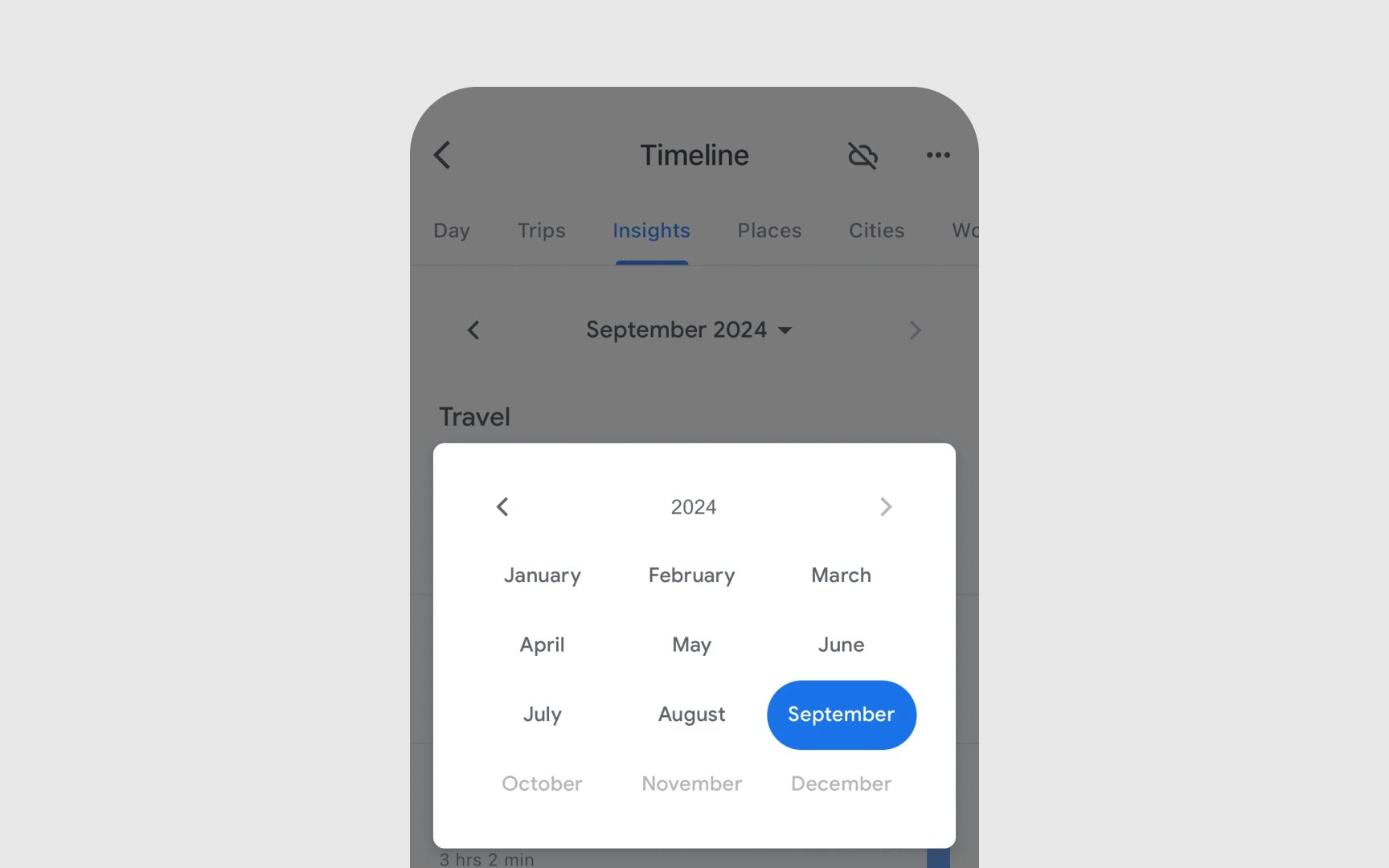
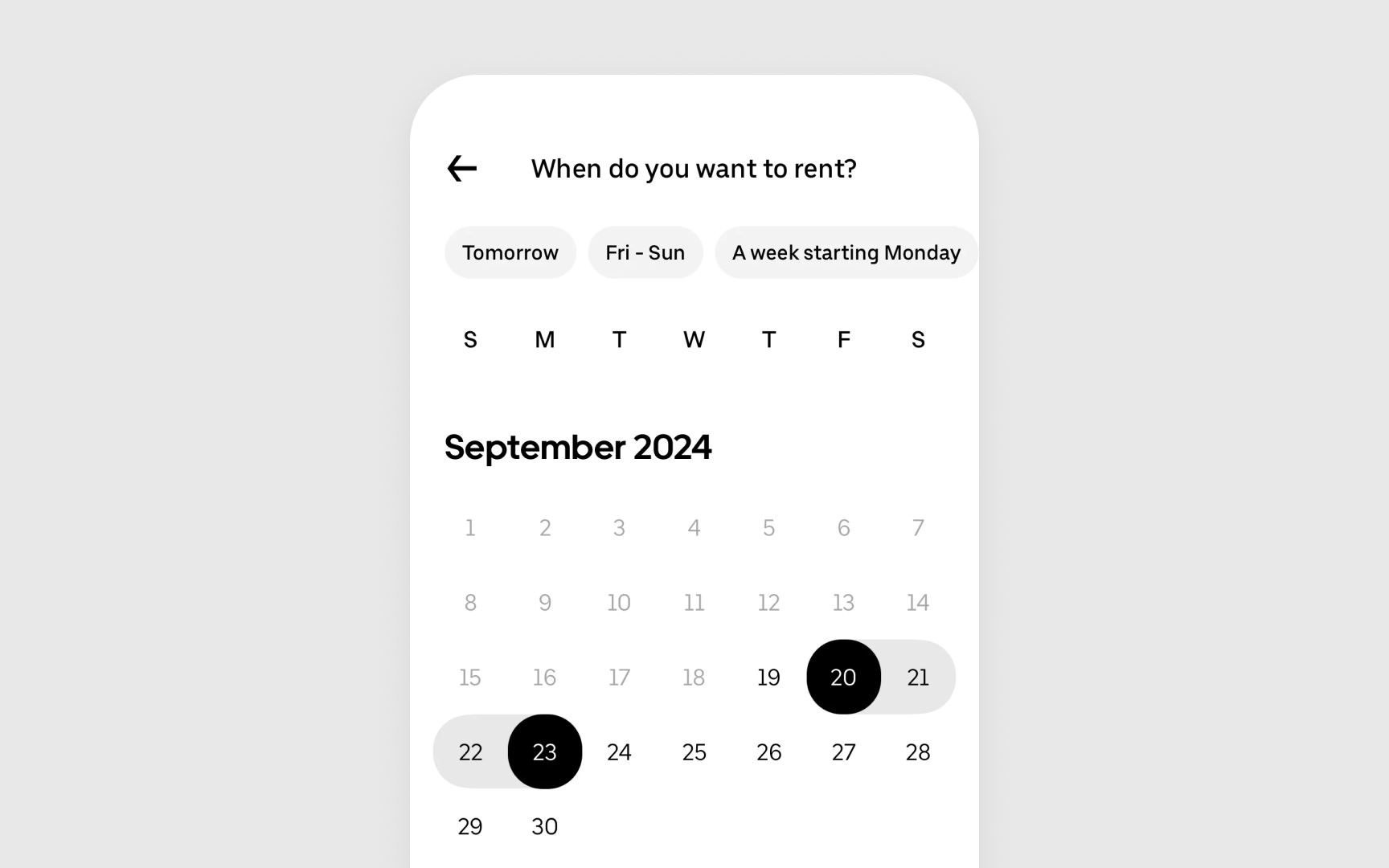
Date and time pickers help users select specific moments in time — whether it's setting a meeting for next week or choosing a birth date. Apple designs these controls to feel as natural as flipping through a paper calendar or turning clock hands, transformed into smooth digital
Key guidelines from Apple
- Style types: Calendar grid for dates, wheel interface for scrolling through times
- Input modes: Compact displays for quick picks, expanded views for detailed selection
- Default values: Shows current date/time when opened unless a different default makes sense
- Time format: Adapts to the user's regional
settings (12/24 hour format) - Range limits: Sets clear boundaries for allowable dates when needed
- Confirmation method: Requires explicit user action to confirm the selection[5]
Search bars help users quickly find what they need in an app. Like a magnifying glass focusing on details, a search bar narrows large amounts of
Search can appear in a tab bar, a toolbar (top or bottom), or inline with content. Placement depends on your app’s
Best practices for search include:
- Providing clear feedback by updating results in real time
- Offering scope
buttons to narrow results when helpful - Keeping track of recent searches for quick reuse
- Including a cancel option to exit search easily
Pro Tip: Show recent and suggested searches while the field is empty to help users get started quickly.

A page control helps users track their position when moving through a sequence of
Key guidelines from Apple
- Visual design: Creates a delicate row of dots using system materials that adapt to different backgrounds
- Current position: Highlights the active dot with a brighter, more solid appearance
- Animation style: Transitions smoothly as pages change to maintain context
- Optimal use: Best for brief, important content like onboarding or featured items
- Placement rules: Sits below the content it controls, centered horizontally
- Dot count: Keeps total pages between 2-10 for easy scanning[6]
Disclosure controls hint at more
Key guidelines from Apple
- Visual style: Uses a chevron that points in the reading direction (left-to-right or right-to-left)
- Placement rules: Appears at the trailing edge of list items or
buttons - Color scheme: Adapts automatically to the system's appearance
settings - Interactive cues: Shows users which items lead to more content
- Usage context: Only appears on elements that reveal new views
- System consistency: Maintains the same size and style across an app[7]
References
- Buttons | Apple Developer Documentation | Apple Developer Documentation
- Steppers | Apple Developer Documentation | Apple Developer Documentation
- Sliders | Apple Developer Documentation | Apple Developer Documentation
- Progress indicators | Apple Developer Documentation | Apple Developer Documentation
- Pickers | Apple Developer Documentation | Apple Developer Documentation
- Page controls | Apple Developer Documentation | Apple Developer Documentation
- Disclosure controls | Apple Developer Documentation | Apple Developer Documentation
Top contributors

Topics
From Course

Images provided by

Share


Similar lessons

Lists & Tables

System Buttons & Actions
