Selection & Input Methods
Master the implementation of Apple's selection and input patterns to create more intuitive interfaces.
Selection and input methods are at the heart of how people use Apple devices. Every interaction builds on natural human behaviors - pointing, touching, dragging, and speaking. These patterns go beyond simple clicks and taps. They create a connection between users and their content through carefully designed gestures, keyboard commands, and voice controls. Good selection and input design makes complex actions feel simple. It helps people edit documents, manipulate objects, and navigate apps without thinking about the technology behind it. When implemented well, these interaction methods fade into the background, letting users focus entirely on their tasks. Understanding these foundations helps create interfaces that feel natural and responsive across Apple platforms.
Touch selection must respond instantly and feel natural. When users tap items, the interface should clearly show what's selected and what actions are possible.
Users expect various touch
Avoid creating unique selection patterns. Using standard iOS behaviors helps users understand how selection works across all apps.
Different types of selection serve different needs:
- Quick selection. Elements respond briefly and return to normal
- Staying selected. Elements stay selected until tapped again
- Multiple choices. Users can select many items at once using standard gestures[1]
Pro Tip: Check if selected items are clearly visible in both light and dark modes.
Long-press
The timing of long-press gestures matters for usability.
Apps must show clear visual feedback during long-press
Different elements support various long-press behaviors:
- Preview and open. Shows
content preview on press, opens fully on swipe-up - Context menus. Reveals relevant actions for the pressed item
- Custom actions. Triggers specific features like rearranging or editing
Pro Tip: Add haptic feedback to long-press gestures — it helps users know exactly when they've held long enough.
Keyboard
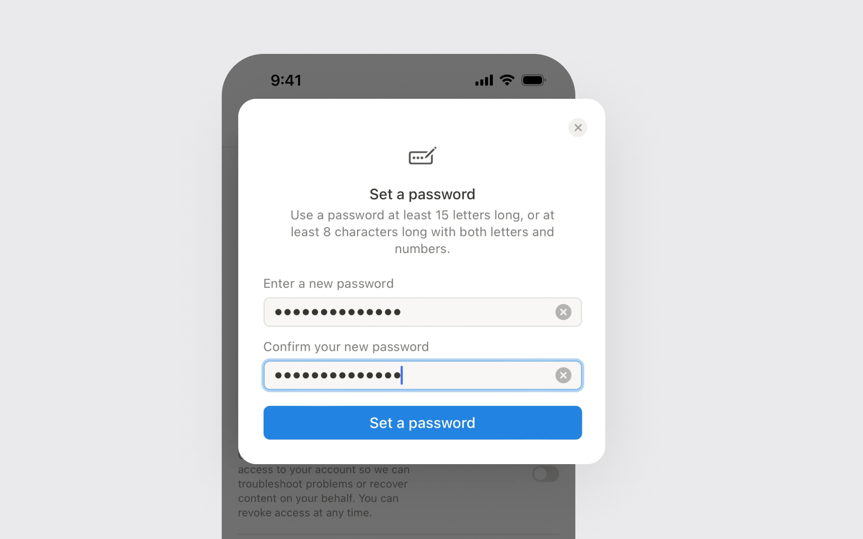
Input fields should clearly show their purpose and state. The keyboard type should match the expected input — showing number pads for numeric fields, email keyboards for email addresses, and adding return key actions that make sense for each context.
Text input needs proper validation and formatting. Apps should check input as users type, show clear error messages, and format text automatically when appropriate — like adding hyphens to phone numbers or validating email formats.
Common text input patterns include:
- Basic input. Single-line fields for names, search terms, and simple data
- Structured input. Fields that format text as users type, like phone numbers
- Rich text input. Multi-line fields with formatting options
Pro Tip: Always show what keyboard type will appear before users tap a text field — like using email or number icons.

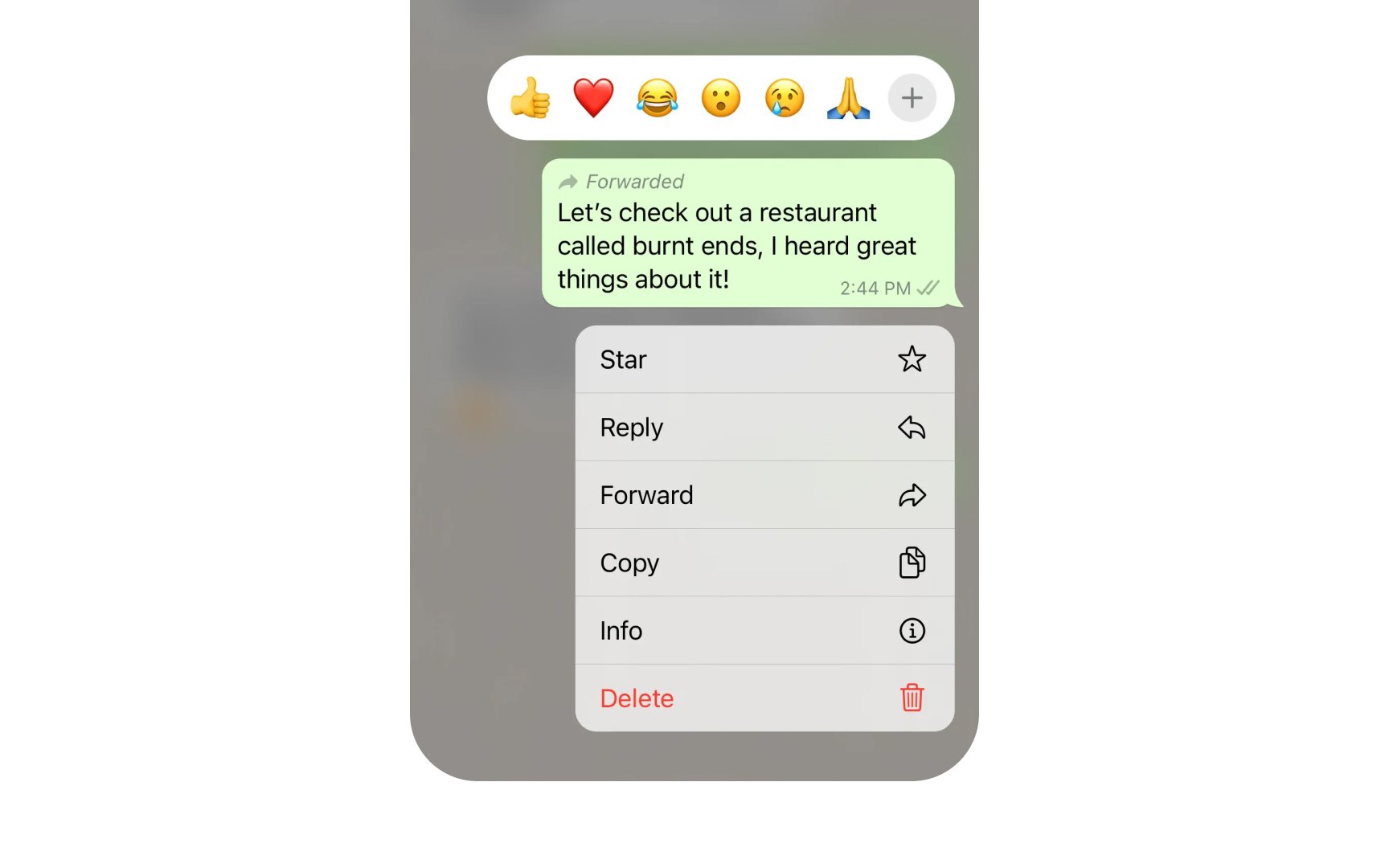
Context menus help users quickly access common actions. When users long-press an element,
Every action in a context menu needs a clear icon and brief label. Actions should follow a consistent order — most used options are at the top, and destructive actions like Delete are at the bottom in red.
Menu
Common context menu patterns include:
- Preview options. Show content previews with additional swipe actions
- Basic actions. Common commands like Share, Copy, Move
- Toggles. State-changing actions like Pin, Flag, Mark as Read
- Destructive actions. Delete or Remove options appear in red[2]
Pro Tip: Use action verbs for menu items — "Share" instead of "Sharing" and "Copy" instead of "Copy to.”
Selection feedback helps users understand what's happening on screen. Every tap, long-press, or keyboard
Apps must use standard iOS feedback styles. Common feedback patterns include:
- Highlight states. Selected items change color or add borders
- Press states. Buttons and controls darken while touched
- Focus indicators. Text fields show where input will appear
Feedback timing affects how responsive an app feels. Visual changes should appear instantly when users select something. Delayed or missing feedback makes users doubt if their action is registered.
Pro Tip: Test selection feedback with different screen color modes — what works in light mode might be hard to see in dark mode.
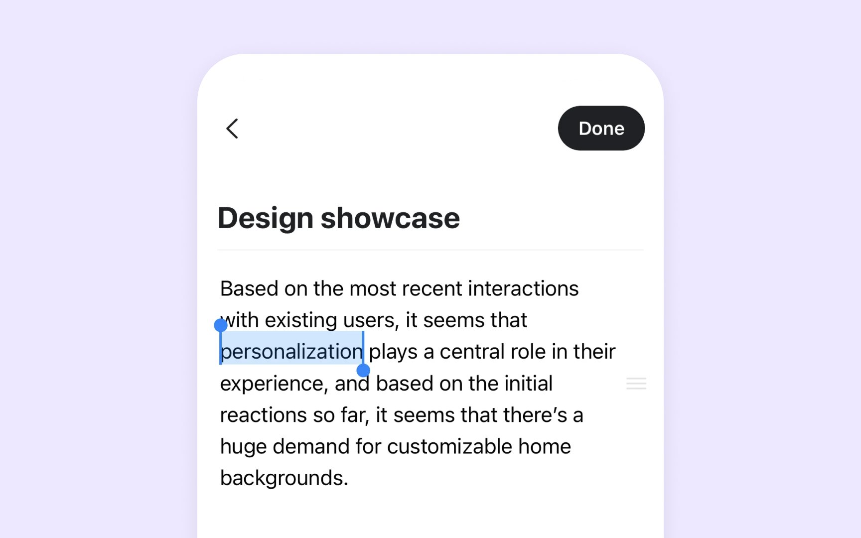
Text selection helps users precisely choose and manipulate written
Good text selection needs clear visual indicators. On native iOS apps, selected text appears highlighted with handles at both ends. Each app can use its highlight
Text selection offers instant editing options. Once the text is selected, a
Common text selection patterns include:
- Word selection. Double tap selects a single word
- Paragraph selection. Triple tap selects a whole paragraph
- Drag handles. Selection markers at each end adjust the selection range
Haptic feedback adds a physical response to selection and
Each haptic pattern needs a clear purpose. Light taps work for selection changes, while longer vibrations suit important alerts. Apps should use haptics to enhance the experience, not distract from it.
Common haptic patterns include:
- Selection feedback. Brief tap when items are selected or changed
- Action feedback. Distinct buzz when actions complete or fail
- Alert feedback. Notable vibration for important notifications
Pro Tip: Test haptics with sound off — feedback should feel natural and meaningful without audio cues.
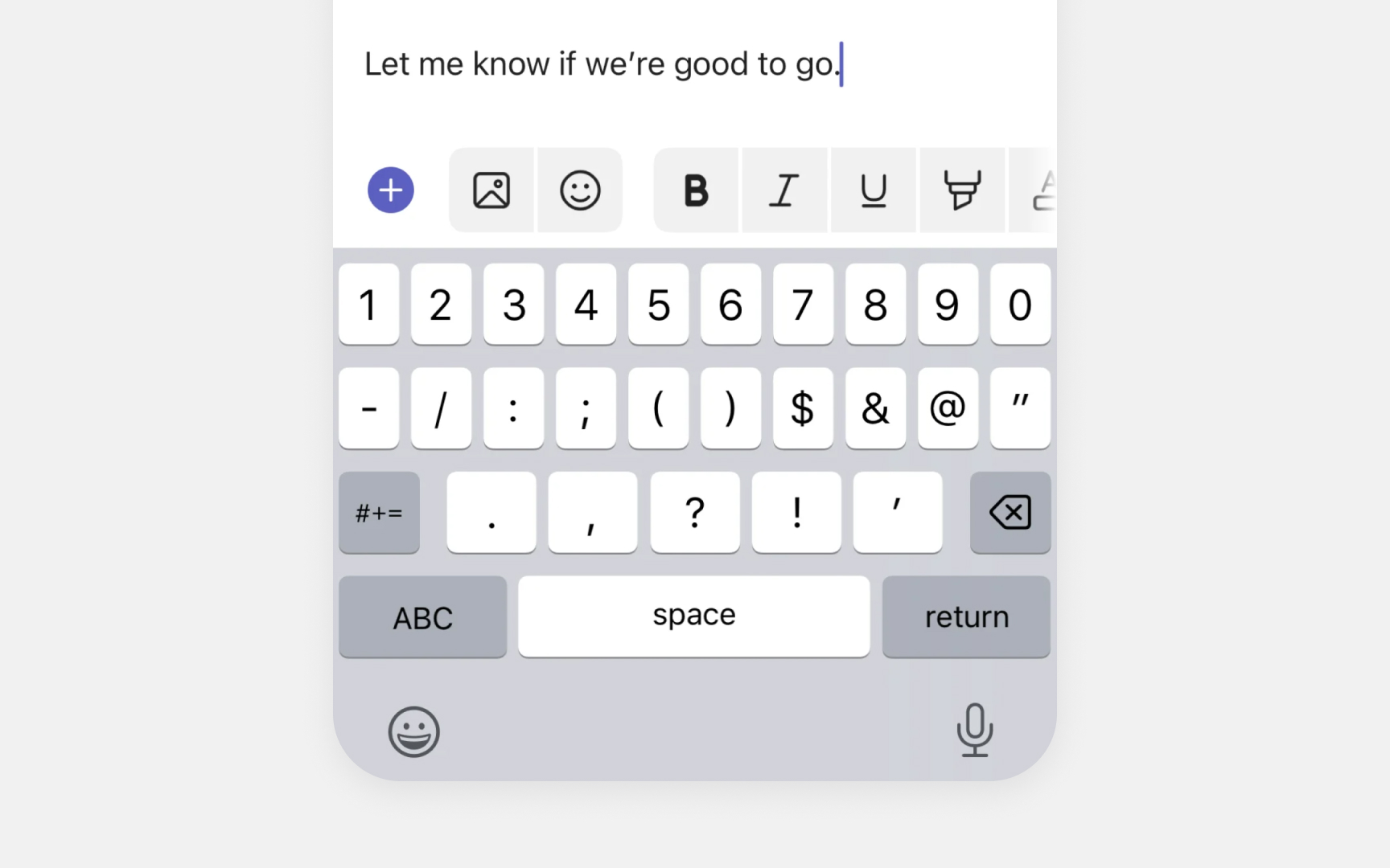
The most common input accessory is word prediction. iOS suggests up to three words that users might type next, based on what they're currently typing. These suggestions update in real-time and learn from typing patterns.
Apps can also show custom toolbars based on context. Text editors might display formatting options like bold and italics. Note-taking apps often include checklist and attachment tools. The accessory
Common input accessory patterns include:
- Word predictions. Shows likely next words as users type
- Quick corrections. Offers fixes for typos and common mistakes
- Formatting tools. Basic styling options for rich text editing
Pro Tip: Use iOS system fonts in input accessories — they match the keyboard's visual style.
Apps must handle all selection methods equally well. Whether users select with keyboard, mouse, or trackpad, the behavior and visual response should stay the same.
When users select with keyboard shortcuts,
Apps need to show what keyboard shortcuts are available. Common places for this are menus and tooltips, where users can discover shortcuts while they work. This is vital for selection actions that might be hidden in the interface.
Common keyboard selection patterns include:
- Same visuals. The selection looks identical across all
input methods - Clear discovery. Shortcuts appear in obvious places like menus
- Easy switching. Users can mix keyboard and mouse freely
Pro Tip: Test selection with both pointer and keyboard to ensure consistent behavior and feedback.
Mac apps need smooth selection support for the mouse and trackpad. While touch dominates on
Selection behaviors must stay consistent between
Apps should support basic and advanced selection methods. Simple clicks select single items, while drag operations or modifier keys help select multiple items. The pointer's appearance and behavior should make these options clear.
Common pointer selection patterns include:
- Pointer states. The cursor changes shape over selectable items
- Click feedback. Selected items are highlighted instantly
- Drag selection. Users can select multiple items by dragging
Pro Tip: Change the pointer style when hovering over selectable items — it helps users know what they can interact with.
Voice control makes apps more accessible. To support voice selection properly, apps need to follow key accessibility principles in their design.
Every selectable item must have a clear accessibility label. These
Voice selection should work like any other
Common voice selection patterns include:
- Clear labeling. Every interactive element needs an accessibility label
- Consistent feedback. Same visual response as other input methods
- Logical grouping. Related items should be near each other for easier selection
References
- Gestures | Apple Developer Documentation | Apple Developer Documentation
- Context menus | Apple Developer Documentation | Apple Developer Documentation
Topics
From Course

Images provided by

Share


Similar lessons

Essential UI Controls

Lists & Tables
