System Buttons & Actions
Master the implementation of Apple's system buttons to create more intuitive interfaces.
Buttons turn screen taps into actions. They help users do things in apps, from sending messages to sharing photos. Apple's system buttons have evolved over years of testing and refinement to become a core part of how people use their devices. When buttons look and work the same way across different apps, users don't have to think about how to use them — they just know.
Good button design means users can see what's important, understand what each button does, and trust that it will work as expected. A button's design tells users if it's the main action they should take or just one of several options. The feel of pressing a button, the way it highlights, and how quickly it responds all add up to make apps feel solid and trustworthy. When designers use system buttons properly, apps become more reliable tools that help users get things done.
System
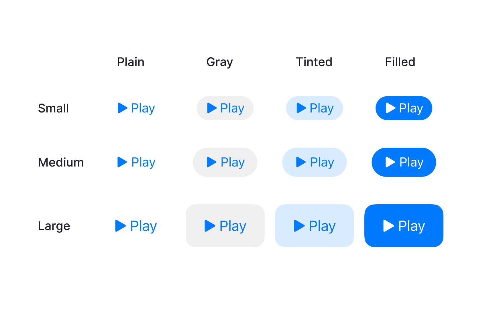
Button styles include size, color, and shape, while content can be text, symbols, or both. The system's role defines what each button means and can change how it looks.
Apple provides various button types beyond standard buttons. These include common controls like info and close buttons, plus specialized components like toggles, pop-up buttons, and segmented controls.
Common button attributes include:
Pro Tip: Use SF Symbols in buttons when possible — they automatically adapt to different contexts and accessibility settings.
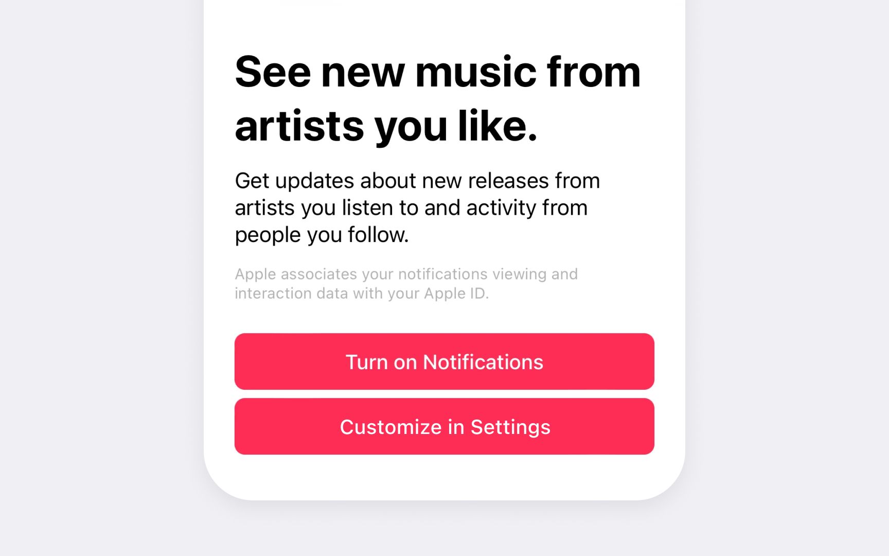
Primary action
HIG requires specific styling for primary buttons. They need solid background
Primary buttons must follow consistent patterns across an app. Main actions like Save, Continue, or Done use the same styling everywhere they appear. Different screens can have different primary actions, but each screen should have only one primary button.
Common primary button patterns include:
- Clear verbs. Action words that show what the button does
- High contrast. Filled style that stands out visually
- Consistent style. Same styling for primary actions across screens
Pro Tip: Use only one primary button per screen — multiple prominent buttons can confuse users.
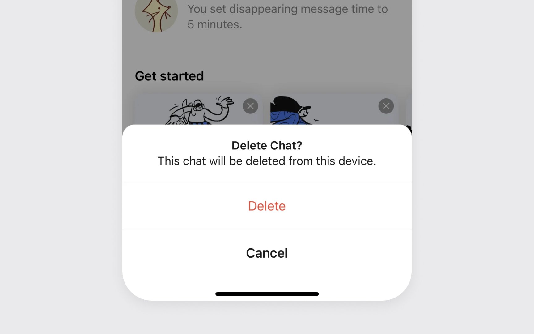
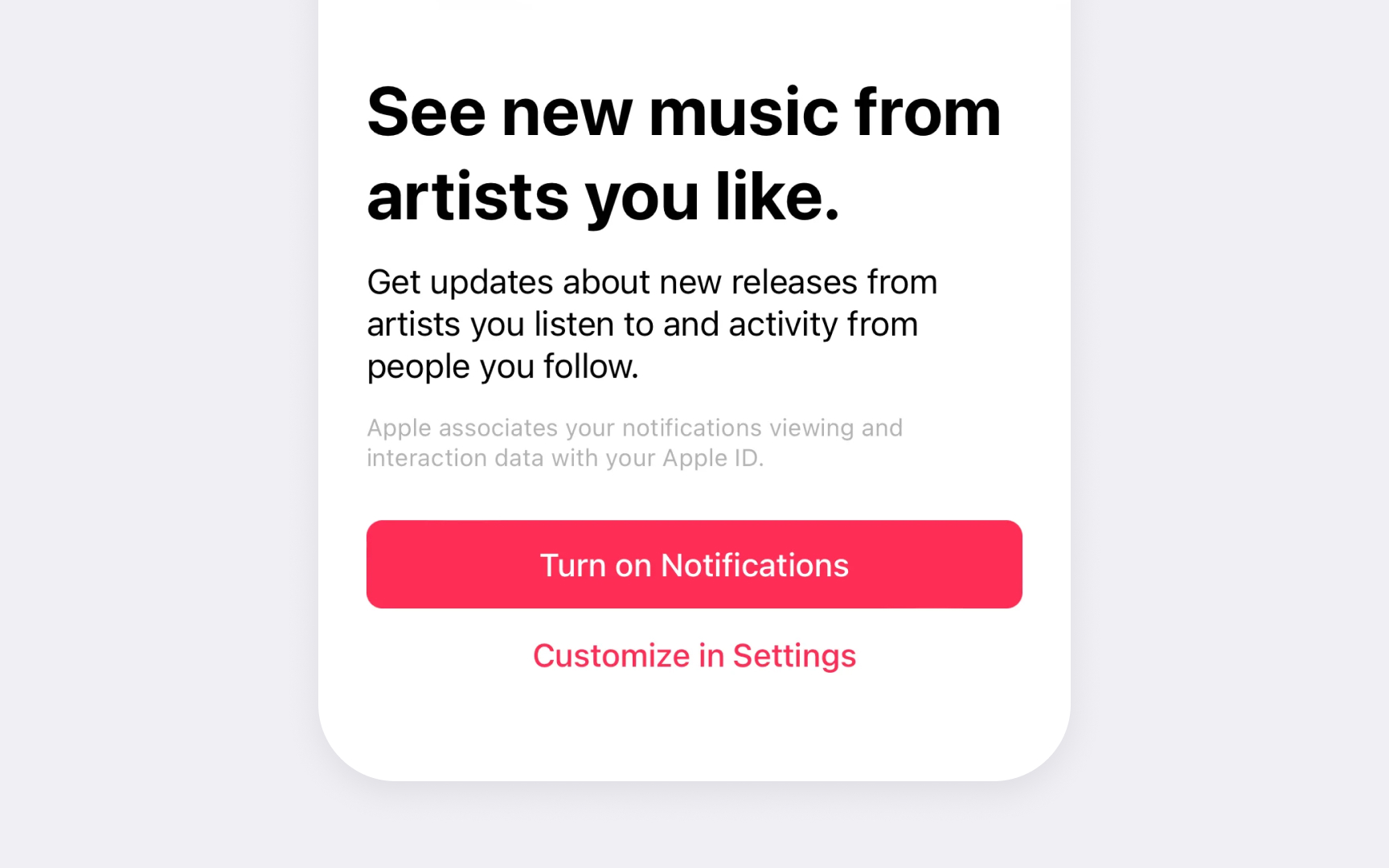
Destructive
These buttons use red text with a plain style for clear warning. The
Position and spacing matter for destructive buttons. They should be placed away from frequently used actions and include enough padding to prevent accidental triggers.
Common destructive button patterns include:
- Plain red style. Red text without background for initial actions
- Red filled. Used in confirmation dialogs for final actions
- Clear labels. Direct words like "Delete" or "Remove"
Pro Tip: Always ask for confirmation before completing destructive actions that can't be undone.
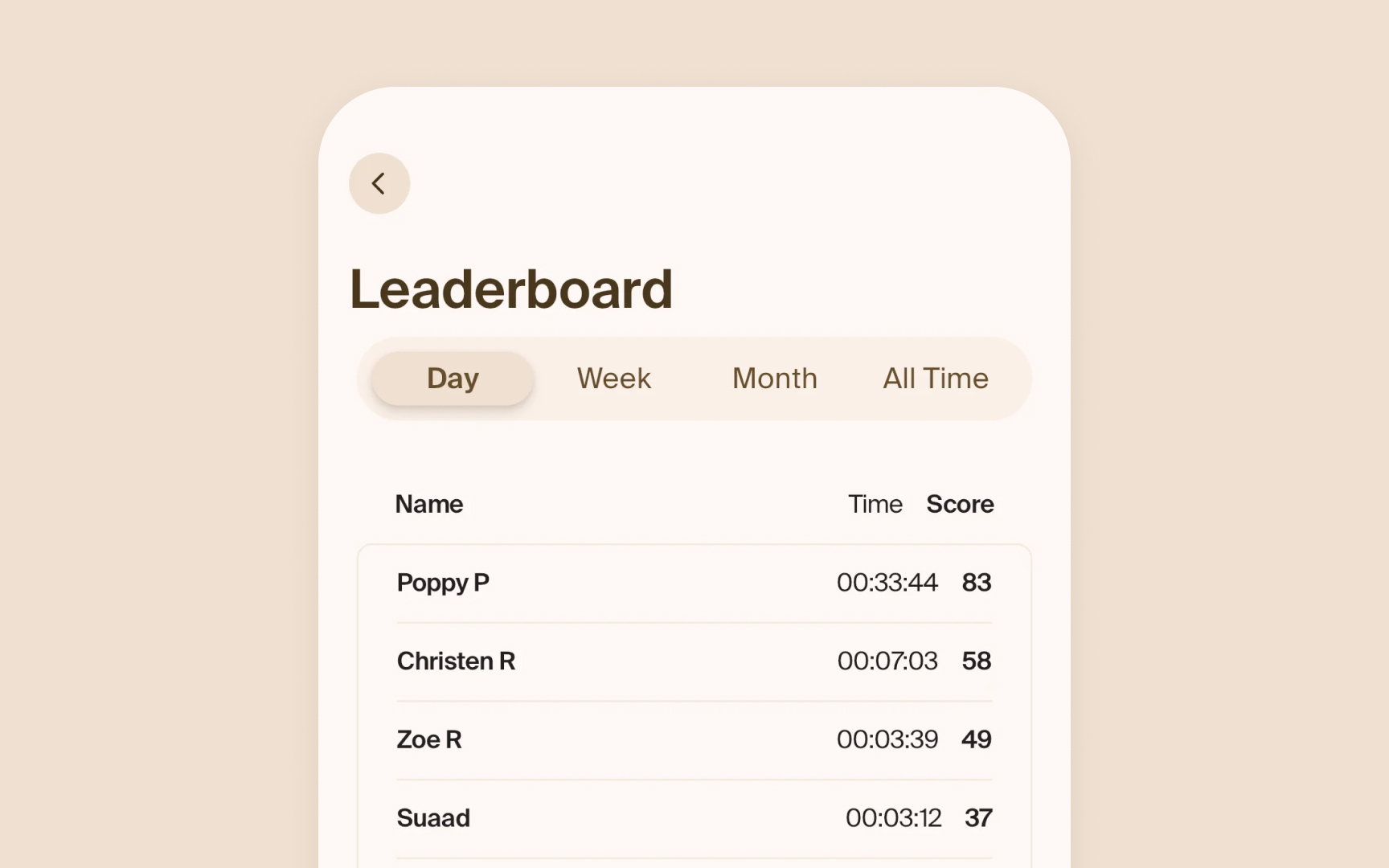
Segmented controls help users switch between related options. A common example is the grouping in the Photos app (All, Months, Years).
- Equal sizing. Each segment needs enough width for its
content , equal height across all segments, and clear active states - Clear states. The selected segment stands out visually. The selected segment uses a filled style while others remain plain
- Brief labels. Segments work best with similar-length options. Text
labels should be short and descriptive and fit without truncation. Having too many segments or uneven content makes controls harder to use
Pro Tip: Keep the number of segments between 2-5 — more options become hard to read and tap accurately.
Pop-up
- Menu content. Options should be mutually exclusive and presented in a flat list. For example, meeting admission options: People who were invited, Everyone, Only me
- Default selection. The button shows a useful default option before users make their first choice. For instance, Sidebar icon size defaults to Medium
- Clear labeling. Button
labels or nearby text should help users predict available options without opening the menu[2]
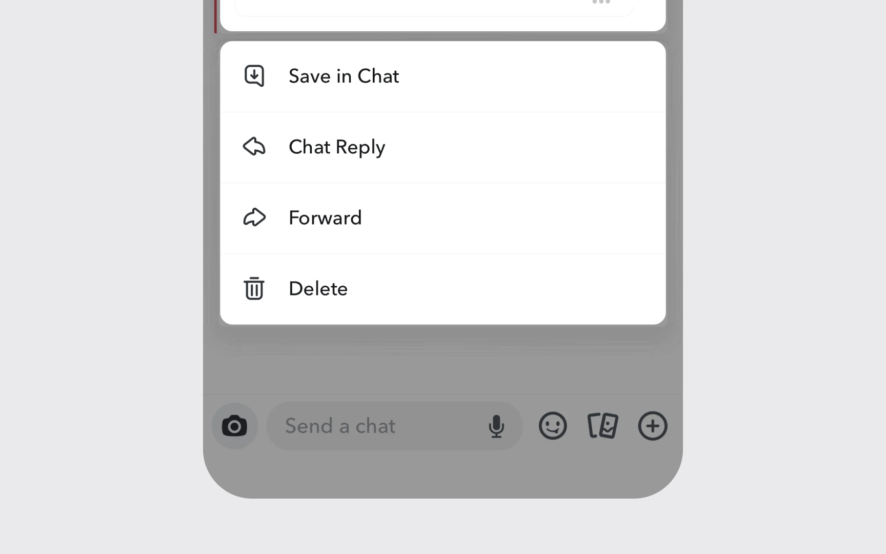
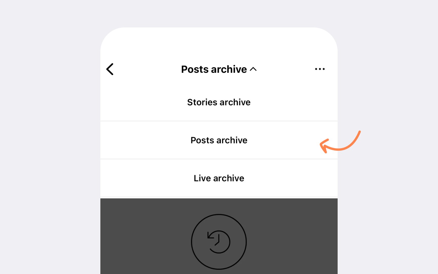
Pull-down
- Action focus. Menu items perform commands like Sort, Add, or Filter. For example, a Sort button shows options for sorting by date, name, or size
- Menu length. Include at least three items to make opening the menu worthwhile. Too many items make finding specific options harder
- Clear purpose. Button
content and menu items should explain available actions without needing extra titles - More actions. Use the More button (ellipsis.circle) to group secondary actions where space is limited, but consider that hidden items become harder to discover[3]
Pro Tip: If you have only one or two actions, use separate buttons instead of a pull-down menu.
Button states help users understand when and how they can interact with controls. iOS
Each button type shows these states differently. Primary buttons display prominent state changes through background
Common state patterns include:
- Visual clarity. Each state needs a distinct appearance
- Instant feedback. Immediate response to state changes
- State hierarchy. Clear progression between different states
Pro Tip: Test all 5 states in both light and dark mode to ensure they're distinct and visible.
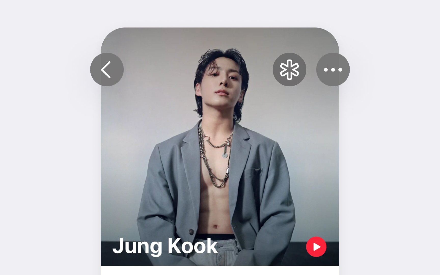
Icon
- Clear meaning. Icons should instantly communicate their purpose. Common actions like Add (+) or Share should use standard system symbols.
- Consistent styling. Icons need to match the iOS style, including weight, size, and
color . SF Symbols help maintain this consistency. - Touch targets. Despite small icons, buttons need a minimum tap area of 44x44 points on touchscreen devices. This ensures reliable touch interaction while maintaining visual compactness.
References
- Buttons | Apple Developer Documentation | Apple Developer Documentation
- Pop-up buttons | Apple Developer Documentation | Apple Developer Documentation
- Pull-down buttons | Apple Developer Documentation | Apple Developer Documentation
- Navigation bars | Apple Developer Documentation | Apple Developer Documentation
Topics
From Course

Images provided by

Share


Similar lessons

Essential UI Controls

Lists & Tables
