Basic Shapes in Figma
Learn how to create and use basic shapes in Figma.
Figma provides a set of basic shapes that designers can use as the foundation for their designs. These shapes include rectangles, circles, ellipses, lines, arrows, polygons, and stars. Each shape can be easily added to your canvas and then customized. You can adjust their size, color, border, and fill, among other properties. Additionally, these shapes can be combined, modified, or used as masks to create more complex designs and layouts. Learning how to create and use these shapes can make room for a wide range of design possibilities — from simple icons to complex illustrations and UI components.
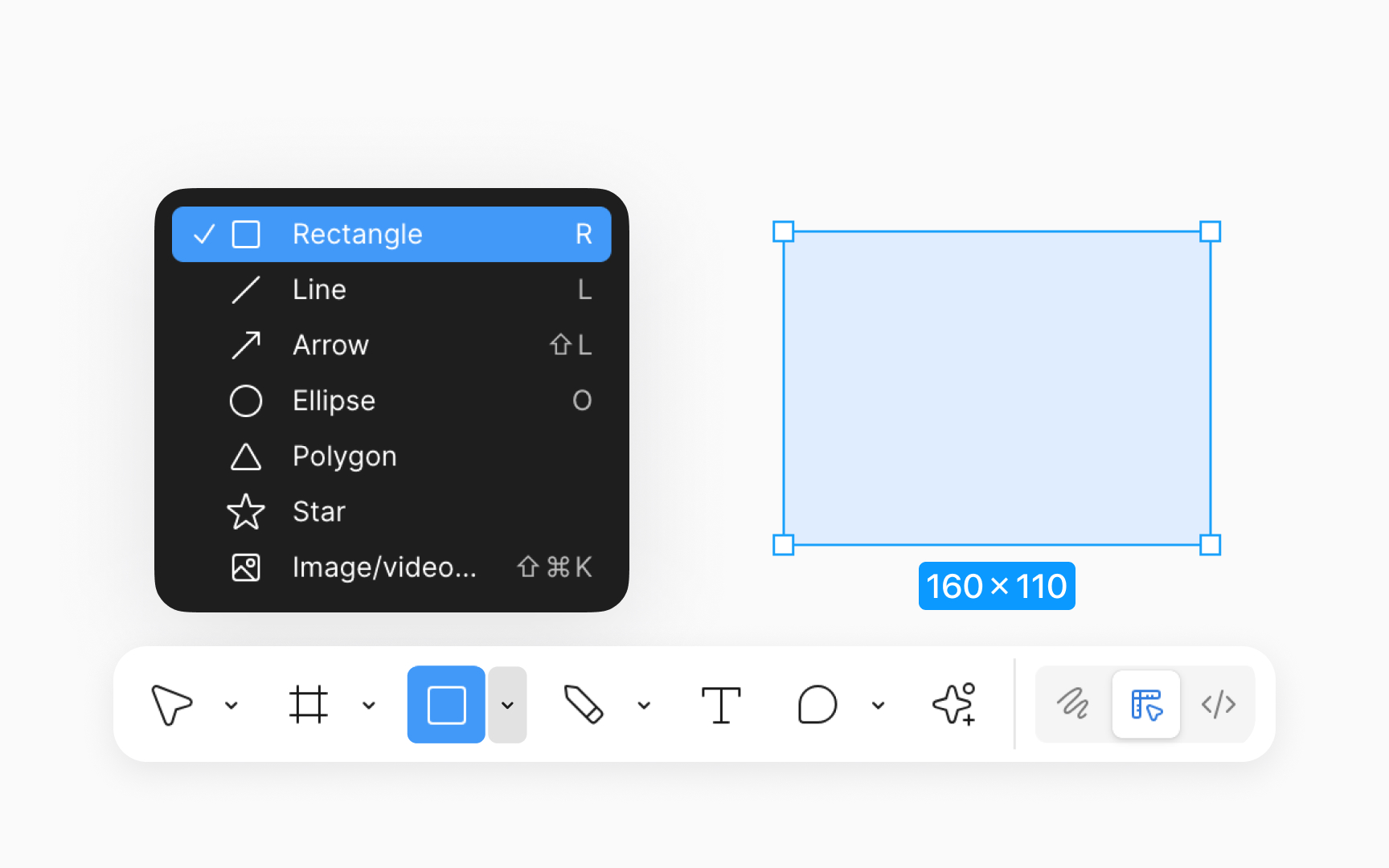
Rectangles are one of the most fundamental shapes used in design. To create a rectangle in Figma, select the rectangle tool under the Shape tool in the bottom toolbar (or press R on your keyboard), then click and drag on the canvas to draw the shape. Once drawn, you can resize the rectangle by clicking and dragging its edges or corners. You can customize them to create various design elements by changing their
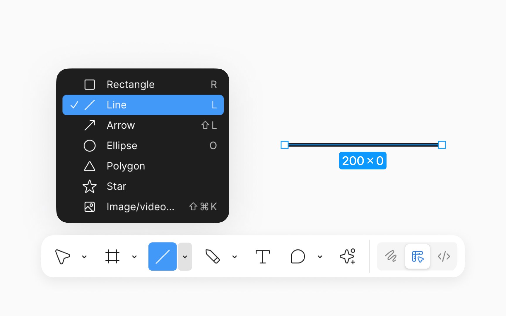
Lines are useful for a variety of purposes in design. They can be used to create borders, dividers, or to underline text. Lines are also essential for creating custom shapes or
To use it in Figma, select the Line tool from under the Shape tool in the bottom
Pro Tip: Holding the Shift key in Figma while drawing or resizing any shape constrains the proportions of the shape, ensuring it maintains its aspect ratio.
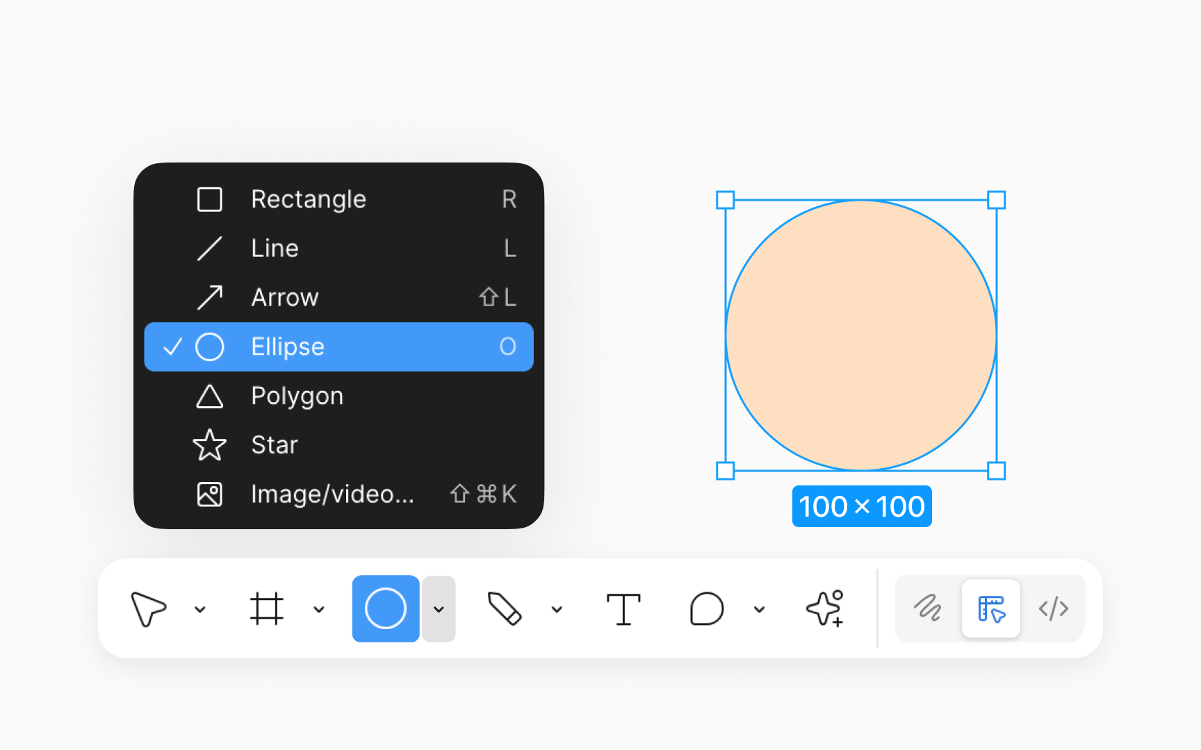
To create a circle or ellipse in Figma, select the ellipse tool from under the Shape tool in the
Circles and ellipses are ideal for creating buttons,
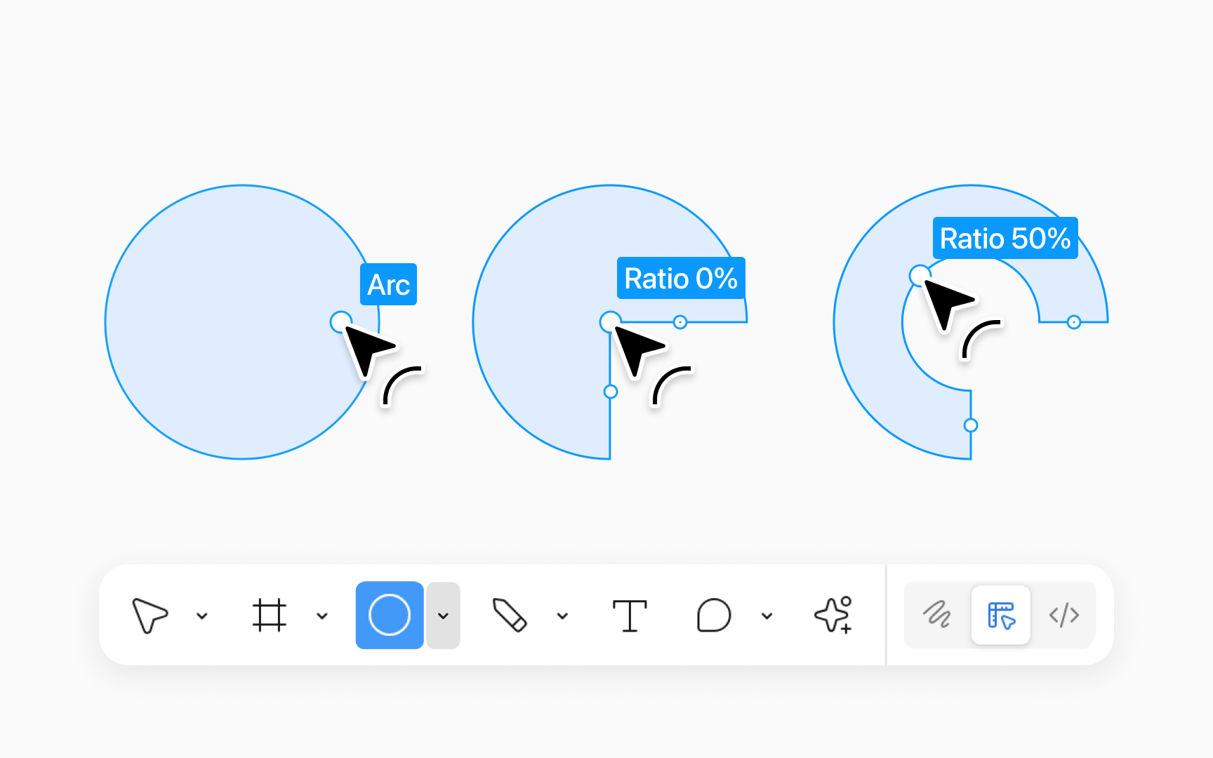
The Arc tool in Figma lets you manipulate curved shapes and is useful for creating pie charts, progress bars, custom loader animations, or simply adding a unique curved element to your design.
To use it, first draw a circle or an ellipse using the Ellipse tool. Once drawn, hover over the shape, and you'll see a handle appear on its right-hand side, starting at the point marked as 0. This handle controls the arc. To create an arc, click and drag this handle around the circle. The distance you drag the handle determines the extent of the arc. You can create anything from a small curve to a semi-circle, or even a near-complete circle.
Once you do this, two more handles will appear. Using the start handle (which has a dot inside it), you can decide where the arc begins, and using the ratio handle, you can change the circle to a ring.
Arrows are line shapes with added directional end caps, useful for indicating movement or direction. They are commonly used in UI designs,
To create an arrow in Figma, select the Arrow tool from the Shape tool in the bottom
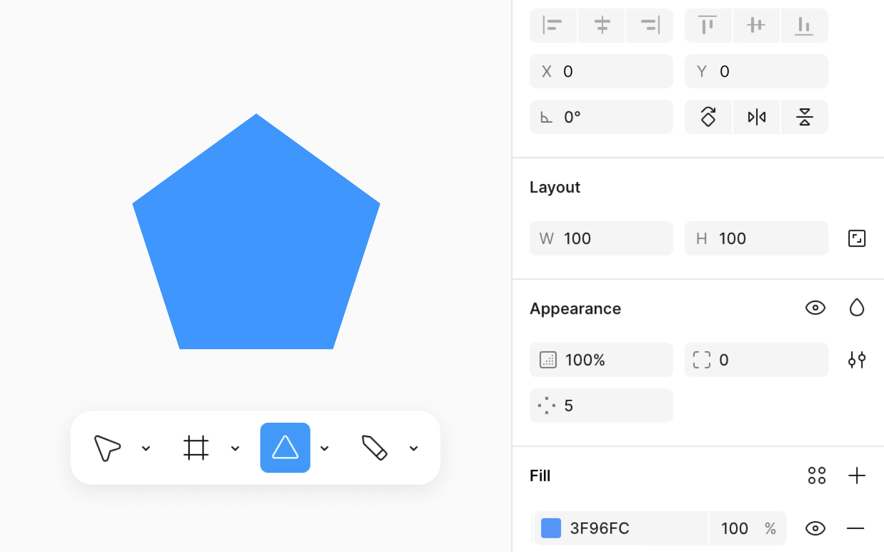
A polygon is any shape with multiple straight sides and can be used for various
You can easily change the number of polygon sides in the Design panel input by typing in a number or using the ↑ or ↓ keys in the Appearance block. Or, you could manipulate the small, round count handle next to the shape to create triangles, hexagons, octagons, and more. You can also customize polygons by changing their
To
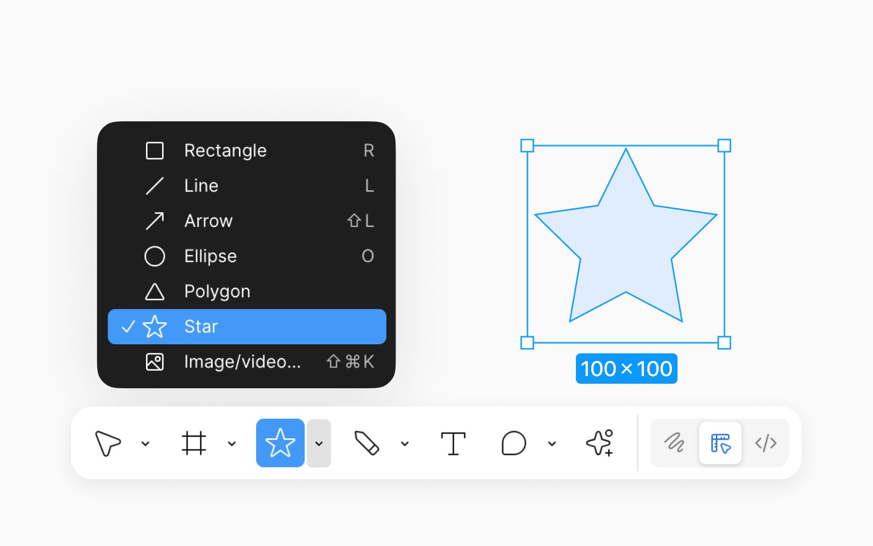
Stars are great for
You can manipulate a star using 3 handles that appear after you double-click the shape:
- Count (Number of points on the star ranging between 3-60)
- Ratio (Distance of inner points from the center, as a percentage of diameter)
- Radius (Rounds the points, like corner radius on rectangles)
You can also customize the star’s appearance by changing its
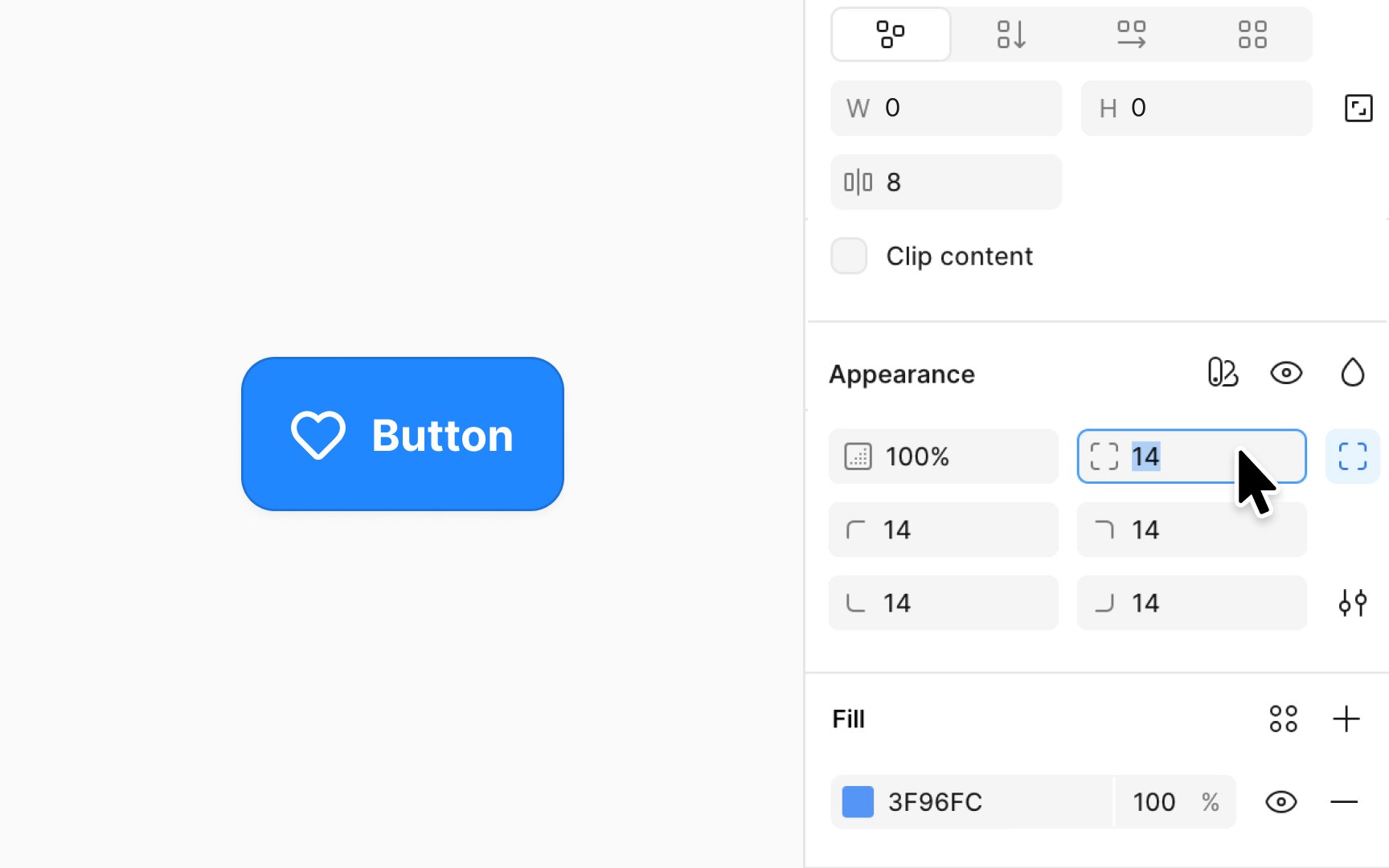
Adjusting the corner radius softens the edges of shapes, creating a more visually appealing and modern aesthetic. It enhances user experience by conveying a friendlier and more approachable interface, often used to improve readability and comfort in digital environments.
To adjust the corner radius of basic shapes in Figma, select your shape and look for the corner radius option in the Design panel on the right side. You can directly
To manually adjust the radius, you can simply manipulate the small circular radius handle that appears over the shape.
Pro Tip: Keep in mind that you cannot apply corner radius to lines, arrows, or vector designs with only a single stroke.
Top contributors


Topics
From Course

Share


Similar lessons

Common UI Component Definitions I

Image Terminology
