Wireframes in the UX Design Process
Explore how wireframing can be used in different stages and aspects of the UX design process
Great product development rarely follows a straight line. The most effective teams move through cycles of building, testing, learning, and refining. Wireframes fit naturally into this rhythm because they're fast to create and easy to change. After completing user research, start with low-fidelity wireframes that define primary interactions and content structure. Test these rough concepts early with users or stakeholders to validate your direction. Based on feedback, add more detail and fidelity in the next iteration.
Each round of testing informs the next version. Low-fidelity wireframes might evolve into mid-fidelity layouts with clearer component definitions, then into interactive prototypes for deeper usability testing. This progressive approach lets teams catch problems when they're cheapest to fix. The key is matching fidelity to your current questions. Testing basic navigation? Sketches work fine. Validating a complex checkout flow? You'll need clickable wireframes with realistic content.
Interaction design (IxD) refers to the practice of designing interactive digital products and services with a focus on improving the interactive experience between users and a product.[1] Generally, IxD relies on 5 dimensions: words, visuals (including icons, typography, images, etc.), physical objects (like computer, mouse, touchpad, etc.), time (relates to animations, videos, and sounds), and behavior.
At the wireframing stage, interactive designers don't focus on depicting graphical elements, though. Instead, they try to understand user needs and define
Consider asking the following questions when working on interactions:
Pro Tip: Annotate expected hover states and click behaviors directly on wireframes to communicate intent clearly.
Information architecture organizes
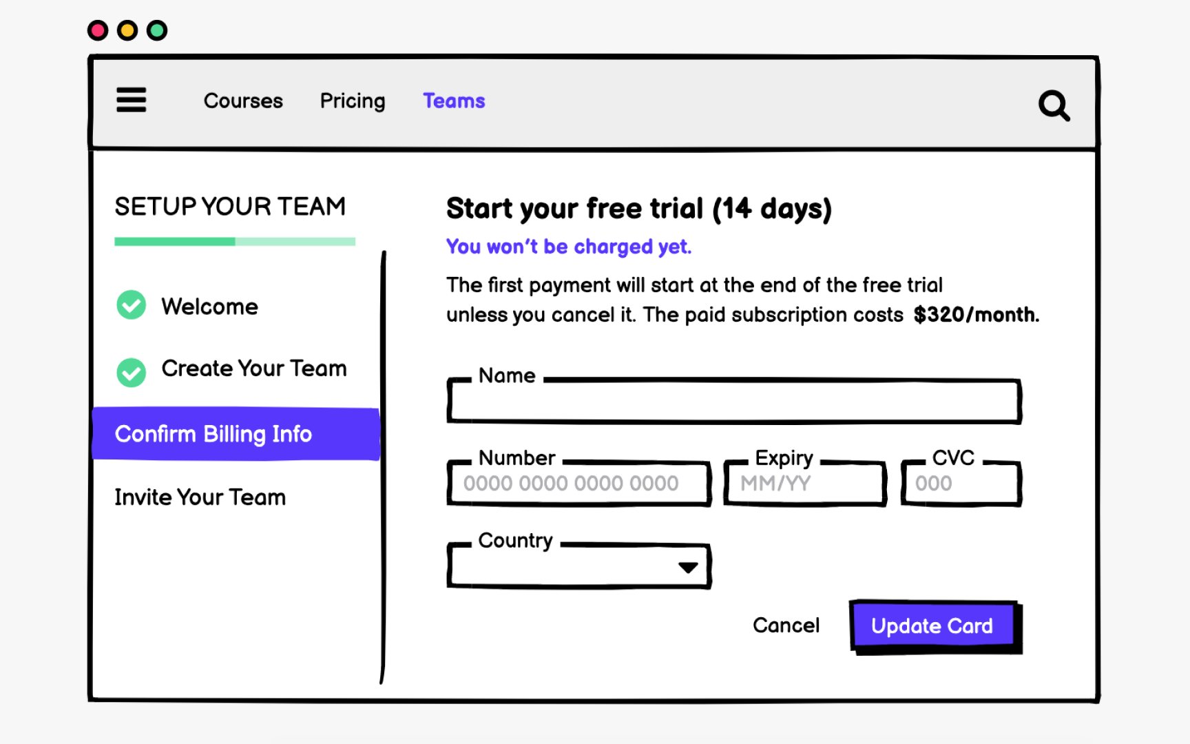
During wireframing, you make critical decisions about content hierarchy:
- What information appears first?
- How do you group related items?
- What deserves prominence, and what can be secondary?
These choices directly impact whether users succeed or struggle with your product.
Wireframes help you test organization strategies before visual design locks in decisions. You can quickly create multiple versions showing different groupings, label variations, or content prioritization approaches. Testing these alternatives with users reveals which structure matches their mental models.
Use wireframes to establish heading hierarchies early. Screen readers navigate primarily through headings, so planning semantic structure during wireframing ensures accessibility is built in rather than retrofitted. A clear heading outline in your wireframes translates directly to an accessible HTML structure.
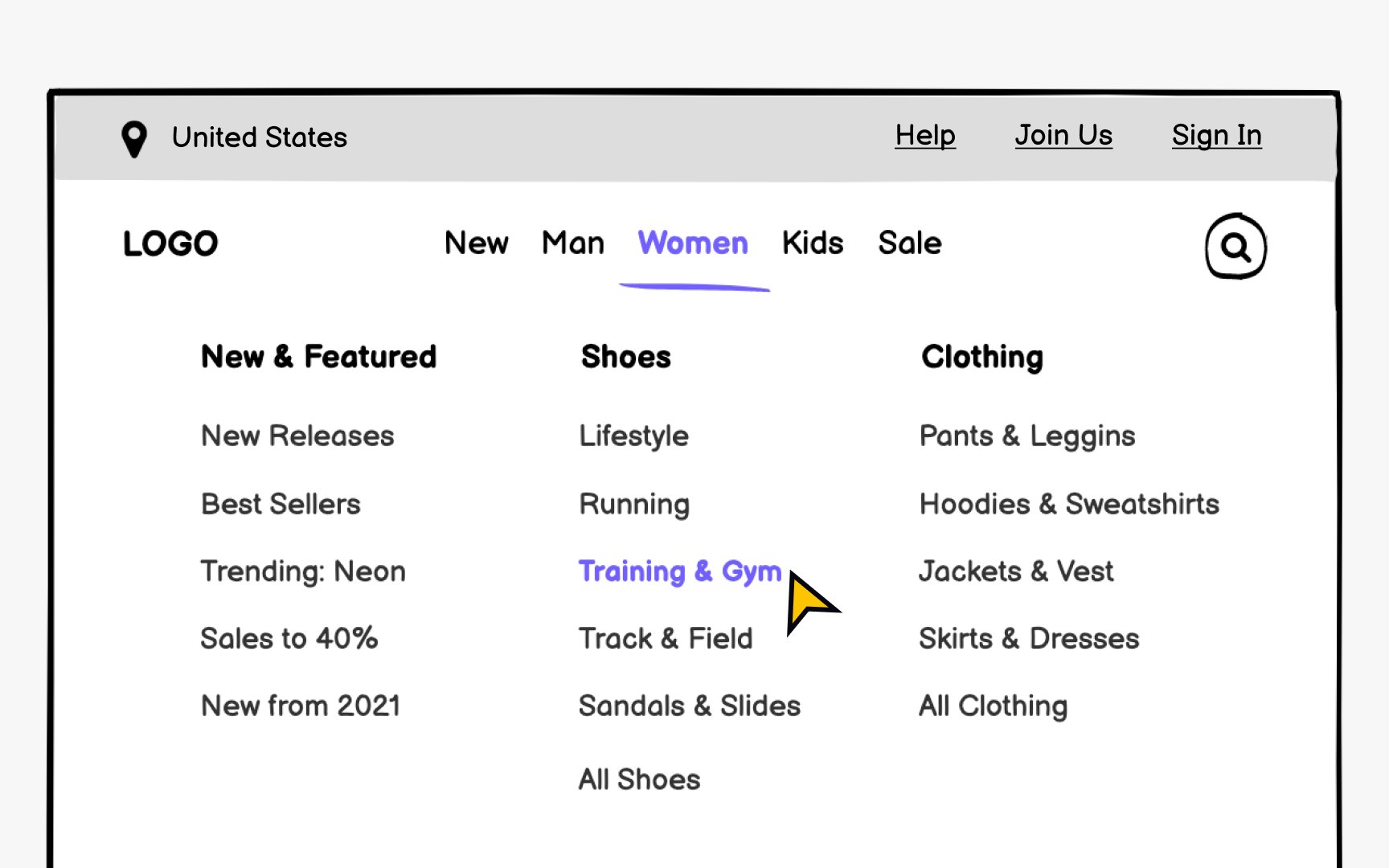
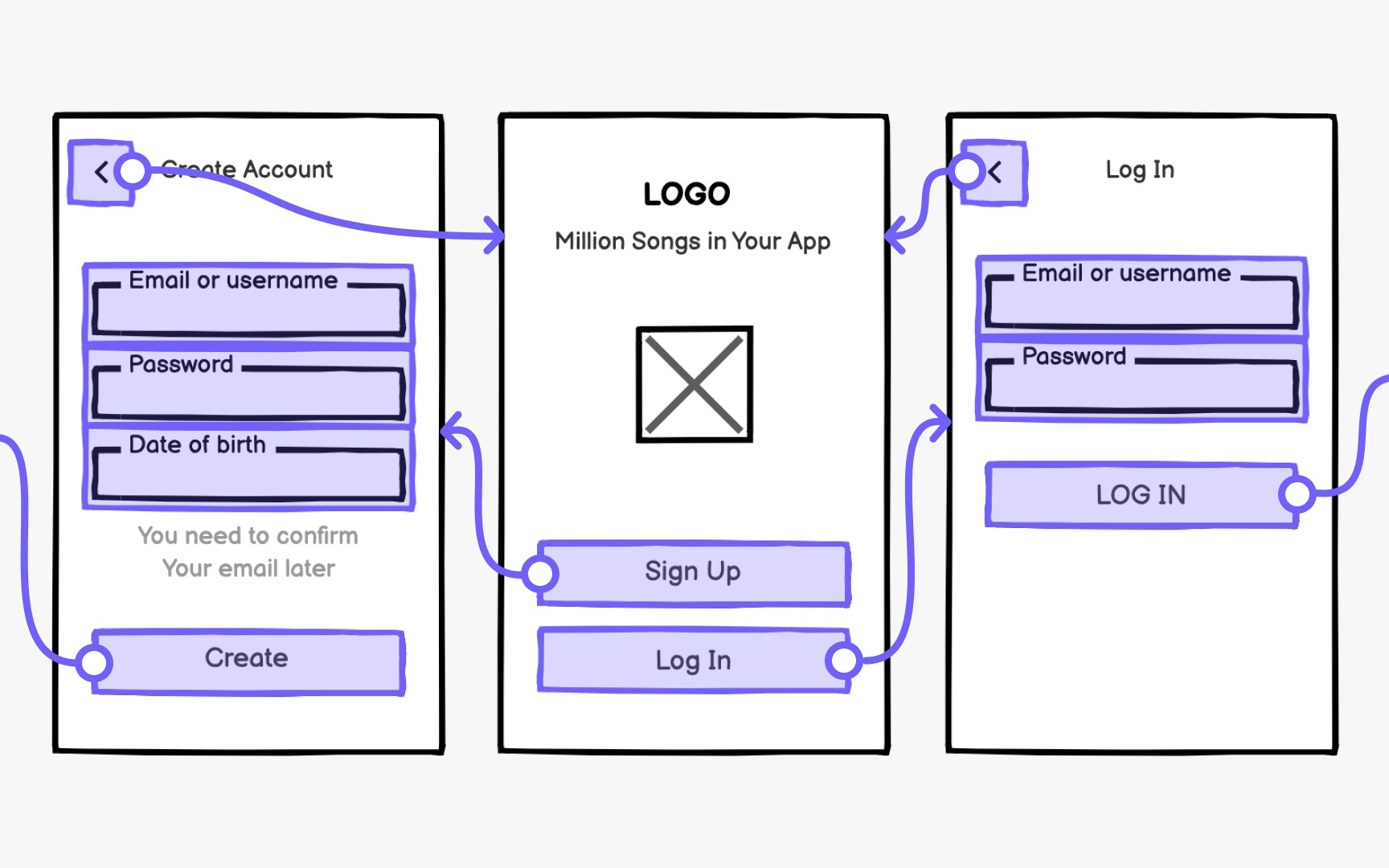
Consistency builds user confidence. The same elements should appear in the same locations across all screens. Users expect logos in headers, search in predictable spots, and navigation that responds as anticipated. When a menu opens, it should reveal options, not redirect unexpectedly.
Also consider mobile navigation patterns during wireframing, even for desktop-first projects. Bottom navigation, hamburger menus, and gesture-based
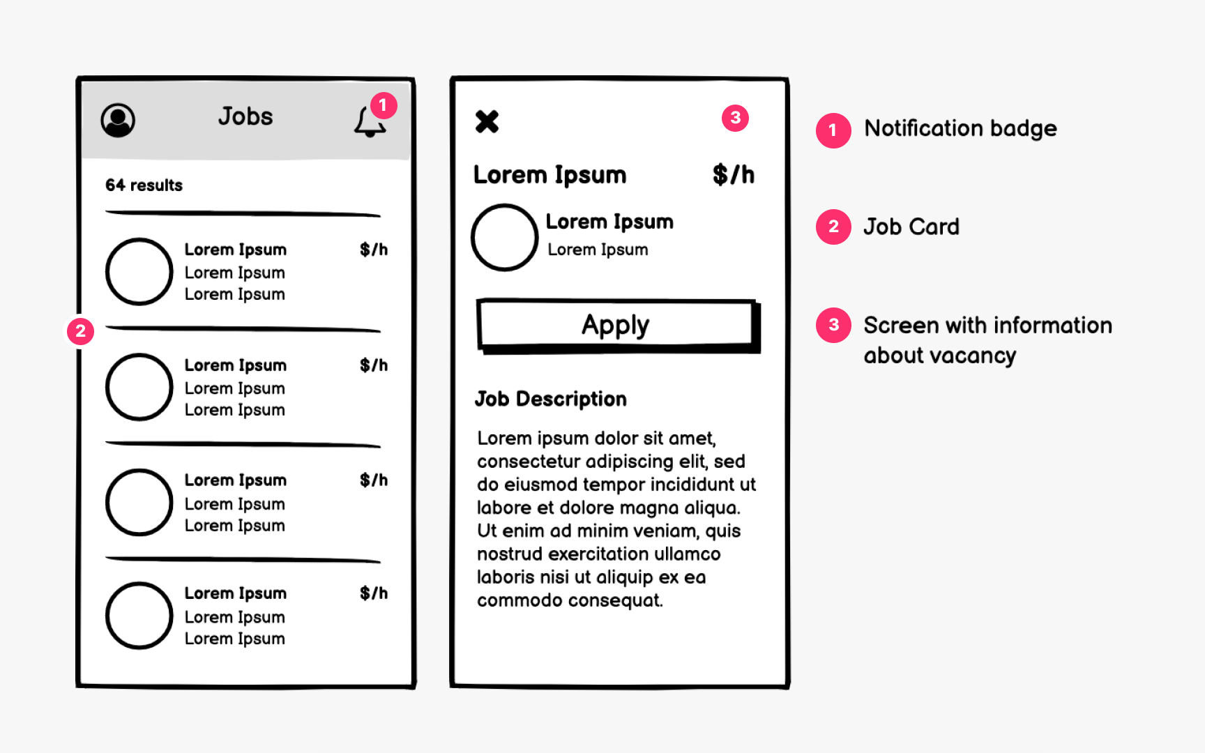
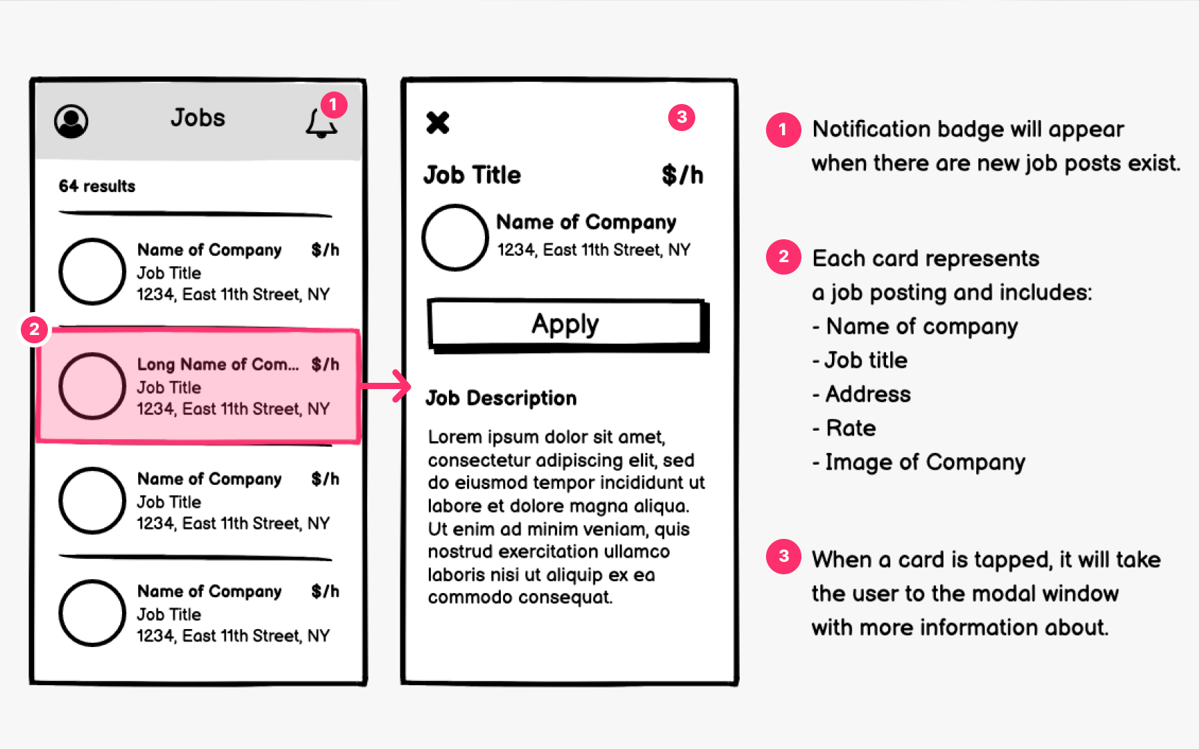
Modern UI design builds interfaces from reusable components. Wireframing with components in mind creates consistency and speeds up both design and development workflows.
Think of
Component thinking during wireframing pays dividends later. When you identify repeating patterns early, you create opportunities for design system alignment. A card component used across multiple wireframes becomes a single source of truth that designers and developers can reference and reuse.
Wireframes should focus on structure before aesthetics. Define how components behave, what
On the contrary,
The best approach is an iterative process, where each iteration includes a new level of fidelity. Start with low-cost wireframes, test assumptions, refine, and improve. Since it's more costly to make changes to prototypes, approach them only once you've already tested your ideas a couple of times.
Pro Tip: Match your prototype fidelity to your testing goals. Basic flows need basic fidelity.
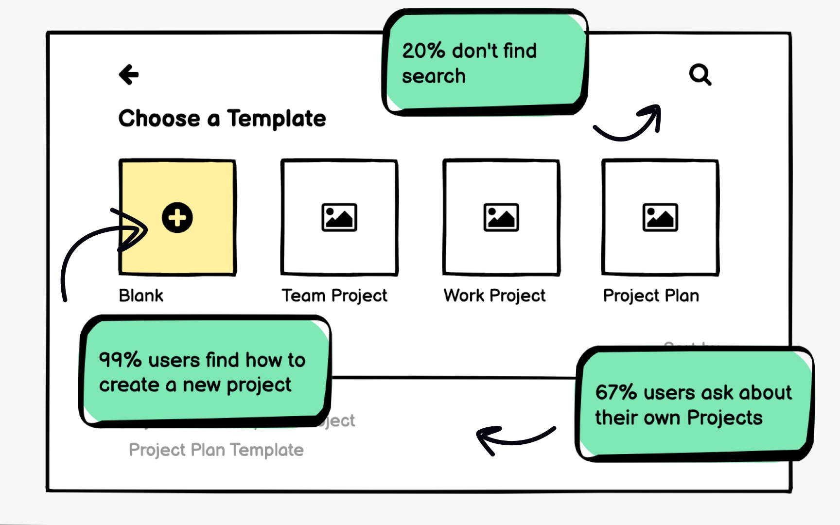
Remote testing has become standard practice. Platforms like Maze, UserTesting, and Lookback let you test wireframes with users globally without scheduling in-person sessions. Unmoderated tests collect quantitative data on task completion and
Different testing methods suit different questions. Guerrilla testing gives quick feedback on basic concepts. Surveys validate
The goal is rapid iteration. Test, learn, refine, and test again. Since wireframes are intentionally simple, you can move through multiple cycles quickly before committing to detailed design work.
Effective wireframing involves developers from the earliest stages, not just at handoff. When engineers participate in
Annotate wireframes with
Visual hierarchy in wireframes should translate to semantic structure in code. When designers and developers share understanding of heading levels, landmark regions, and focus management early, accessibility becomes a natural outcome rather than a remediation project.
Test wireframes with accessibility in mind. Can users complete tasks using only a keyboard? Does the reading order make sense when the visual
Pro Tip: Add heading level annotations (H1, H2, H3) directly on wireframes to ensure proper document structure.
AI tools are transforming how designers approach wireframing. Text-to-UI generators can produce
Tools like Figma's AI features, Uizard, Galileo, and Visily let you generate
AI shines at generating variations quickly. Need to explore multiple layout approaches? Generate several options in minutes rather than hours. This abundance of starting points lets designers focus energy on evaluation and refinement rather than production.
However, AI-generated wireframes require critical review. They may include patterns that don't match your users' needs or technical constraints. Use AI output as raw material to be shaped by research insights and domain knowledge, not as final solutions.
References
Top contributors


Topics
From Course

Share


Similar lessons

Intro to Wireframing

Wireframe Fidelity
