Common UI Component Definitions I
Discover the most common components you'll encounter on any given user interface
Regardless of how unique a website’s design is, there are certain common UI components you're likely to find on it. The most common UI components you’ll encounter include buttons, inputs, forms, cards, modals, menus, headers, and footers. When you understand how these UI components work and how to incorporate them into your designs, you’ll add to the positive experience your users have. And you can exercise your own creativity in exactly how they’re implemented and styled.
The origins of UI
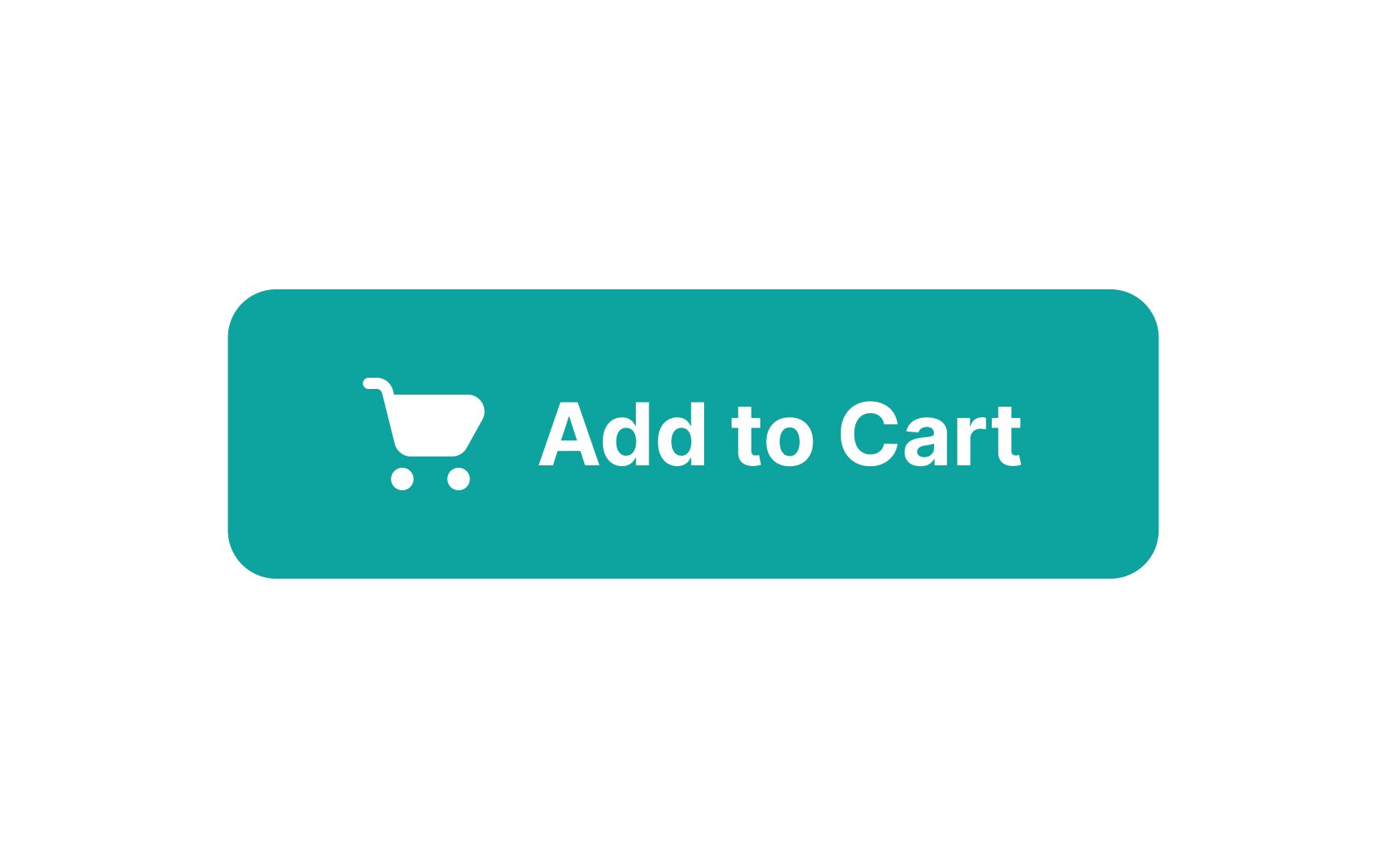
A button's role is to encourage users to act. Button labels are as important as their design. Use action verbs on button labels (like "Buy Now" or "Add to Cart") to tell users what the button does so they can act without reading supporting text.
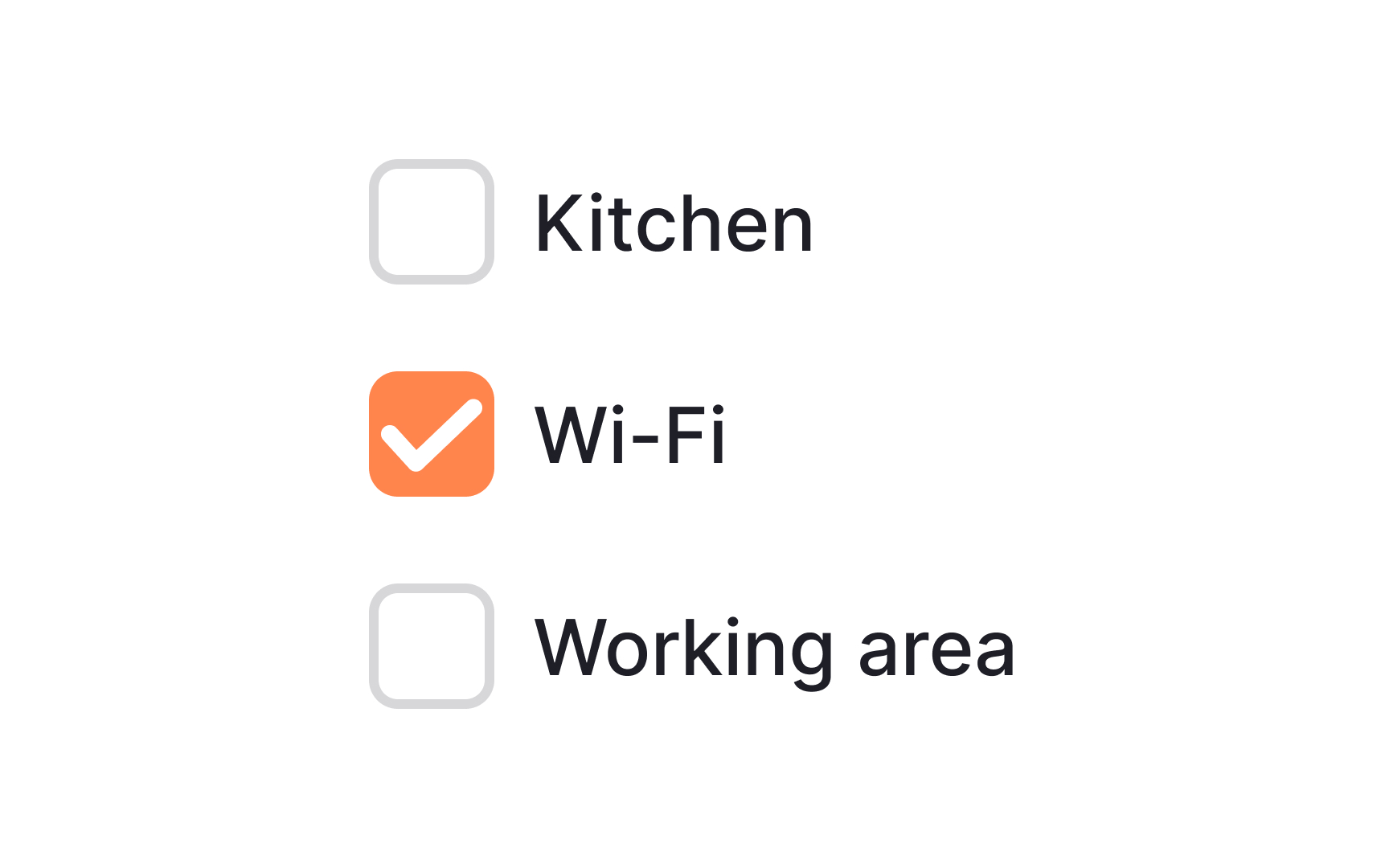
Checkboxes allow for multiple options to be selected by users simultaneously and also let them enable or disable an option. When enabled, the boxes display a checkmark inside. When disabled, they’re empty. Checkboxes have a
They are commonly used for multi-choice questions on forms, feature preferences, or selecting items for an action. They're clear and intuitive, giving users a visual confirmation of their selections.
While
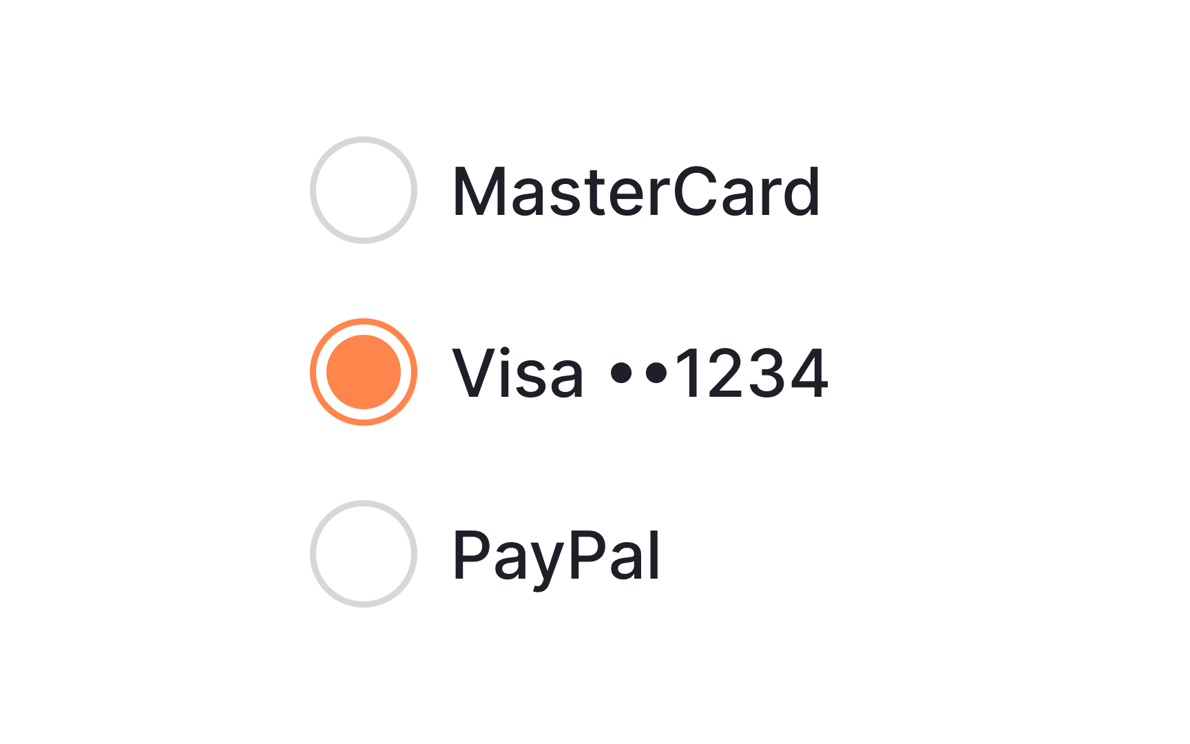
Radio buttons are often used for questions with mutually exclusive options, like selecting a gender or a preferred payment method. They provide clear decision-making and streamline user interactions by preventing conflicting choices.
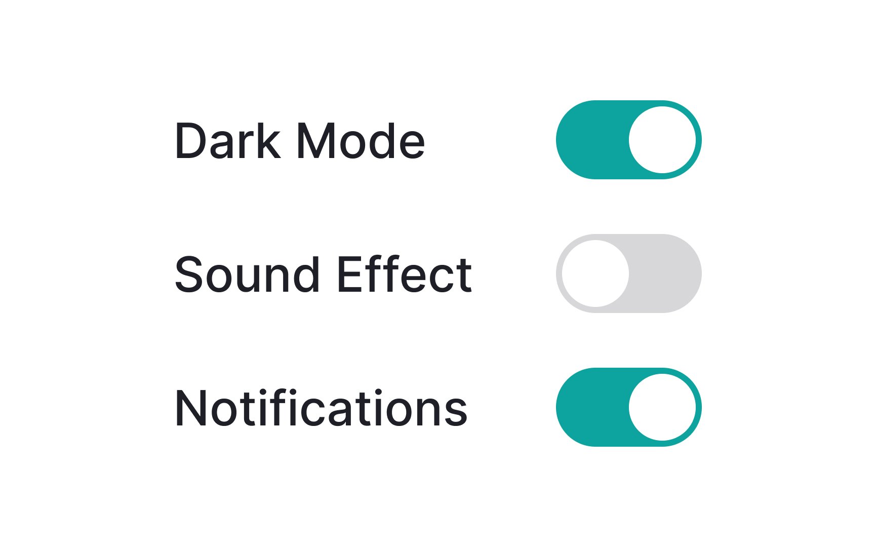
A toggle switch grants users the ability to alternate between two options that cannot coexist, usually representing states like "on" and "off" for a specific element or function.[1]
Toggle switches commonly appear in settings screens within applications. These switches are especially effective for tasks where the response is instantaneous, such as activating dark mode or airplane mode. Their straightforward nature ensures swift decision-making and direct control over specific functionalities, enhancing user experience.
Pro Tip: Make sure the on and off states for your toggle switches are immediately apparent.
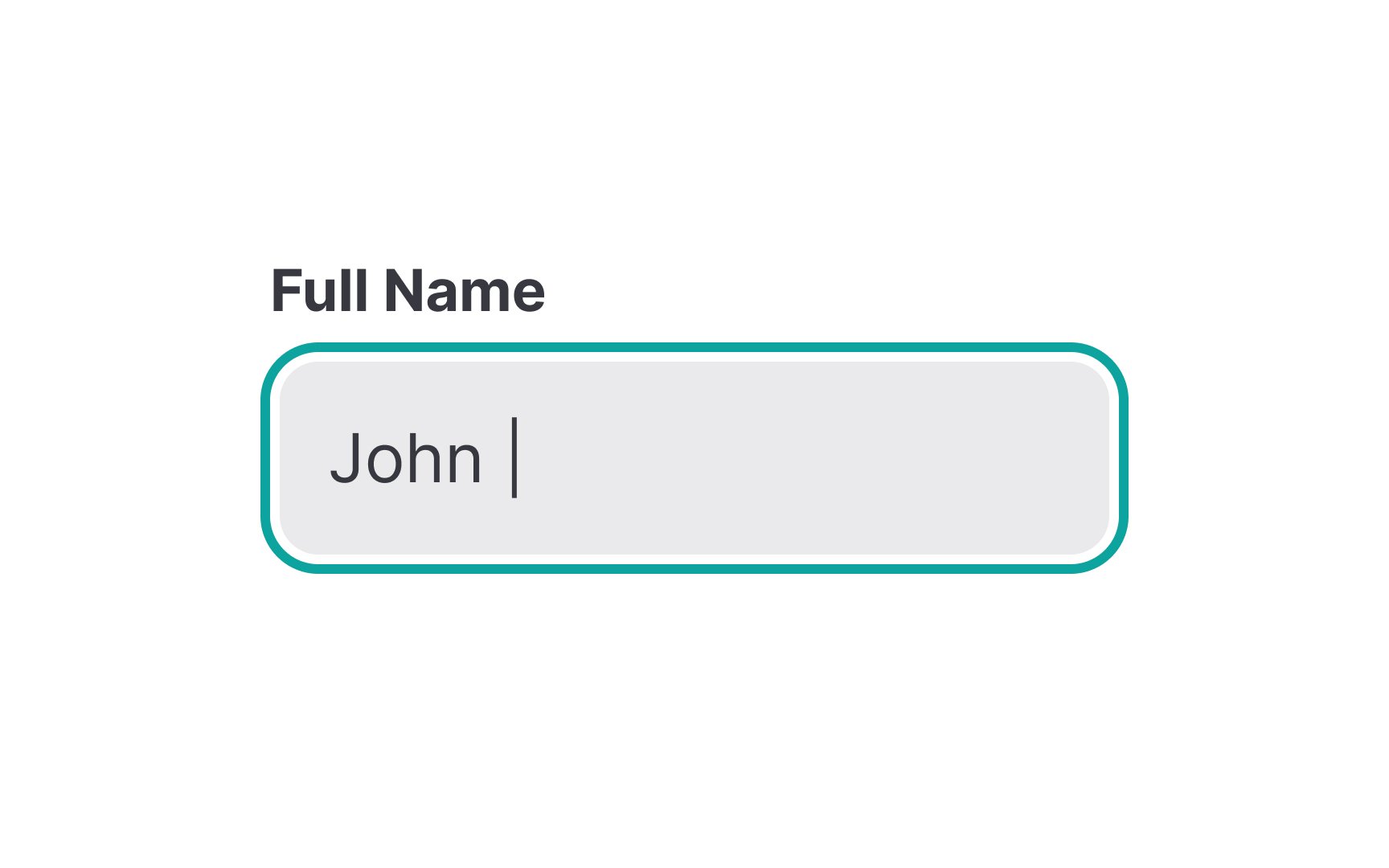
Text
Make sure you create text inputs that recognize different types of data. For instance, when users input a phone number, the input field could auto-format the digits into the expected pattern and switch the mobile keyboard to a numerical layout. Similarly, for email addresses, the input could enforce the correct structure and adjust the keyboard type accordingly. This can help reduce errors and ultimately improve the
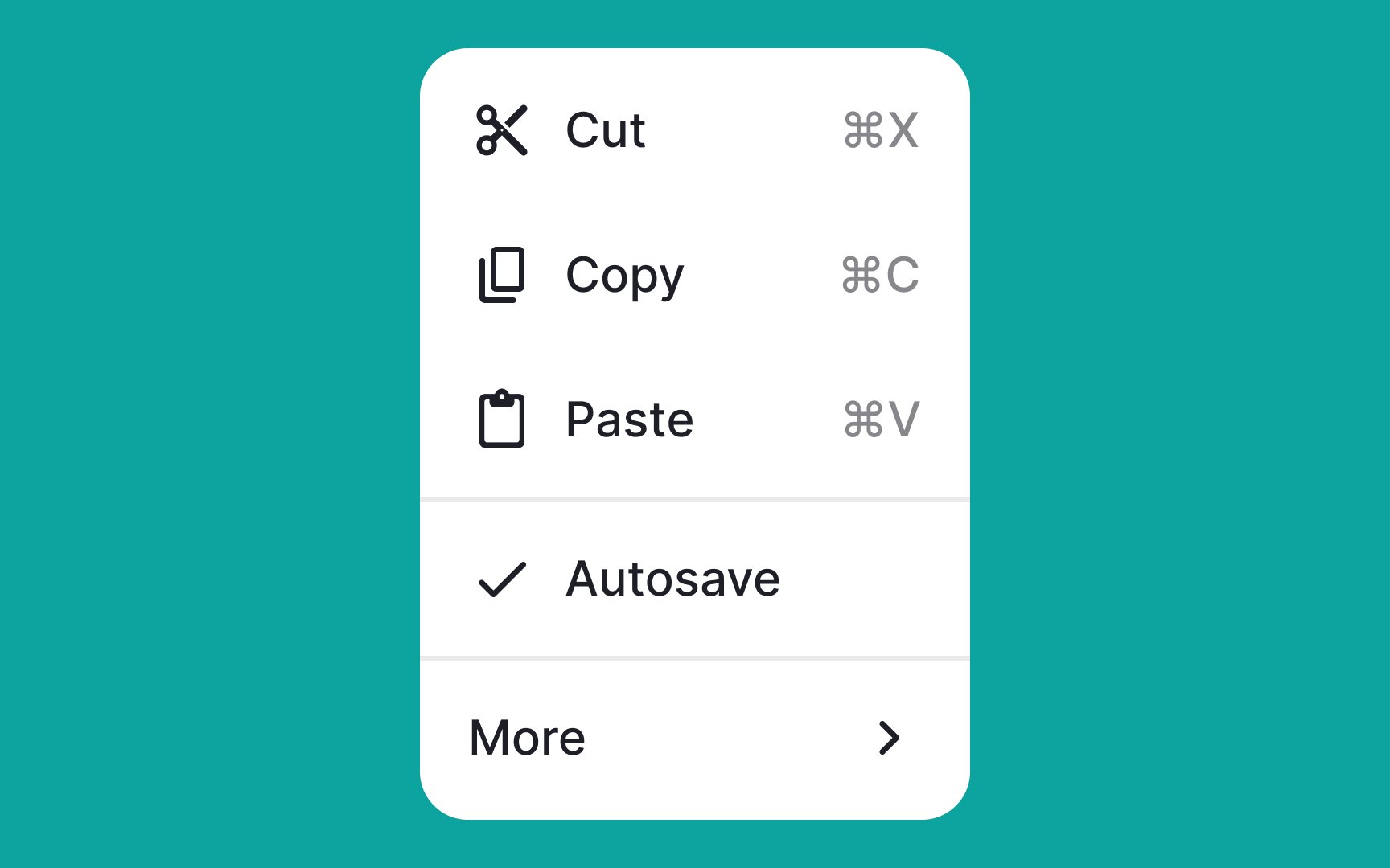
Menus are interactive lists of options that appear on a computer, phone, or app when you perform certain actions, like clicking on a specific
Menus help you access various functions or commands without cluttering your screen all the time. They appear when you need them and disappear when you don't, making it easy to perform different tasks without overwhelming the interface.
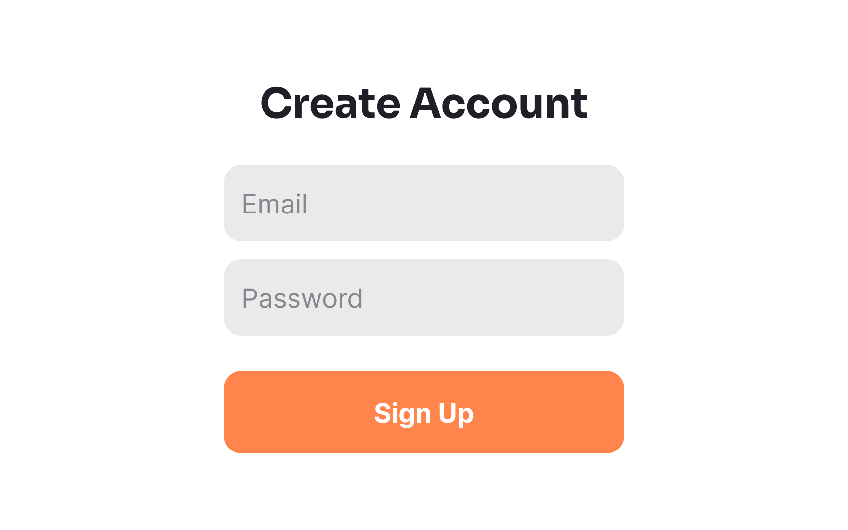
Forms are interactive
An effective form can increase conversions, while a poorly designed one can turn users away. Well-designed forms collect as little information as necessary to complete the user's action. For example, if creating a form for a newsletter signup, limiting the form fields to essentials like the email address and name (which can help with customizing messages sent to subscribers), and a
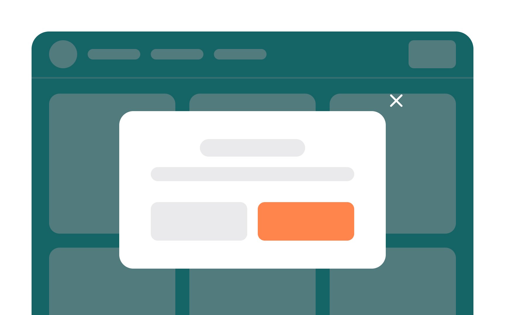
Modals should be used sparingly, either in response to an action users have taken or to warn them about something important. This is because any time a modal is triggered indirectly, it interrupts the flow of whatever the user was doing originally. So, only use them when the benefit outweighs that interruption.
Cards in
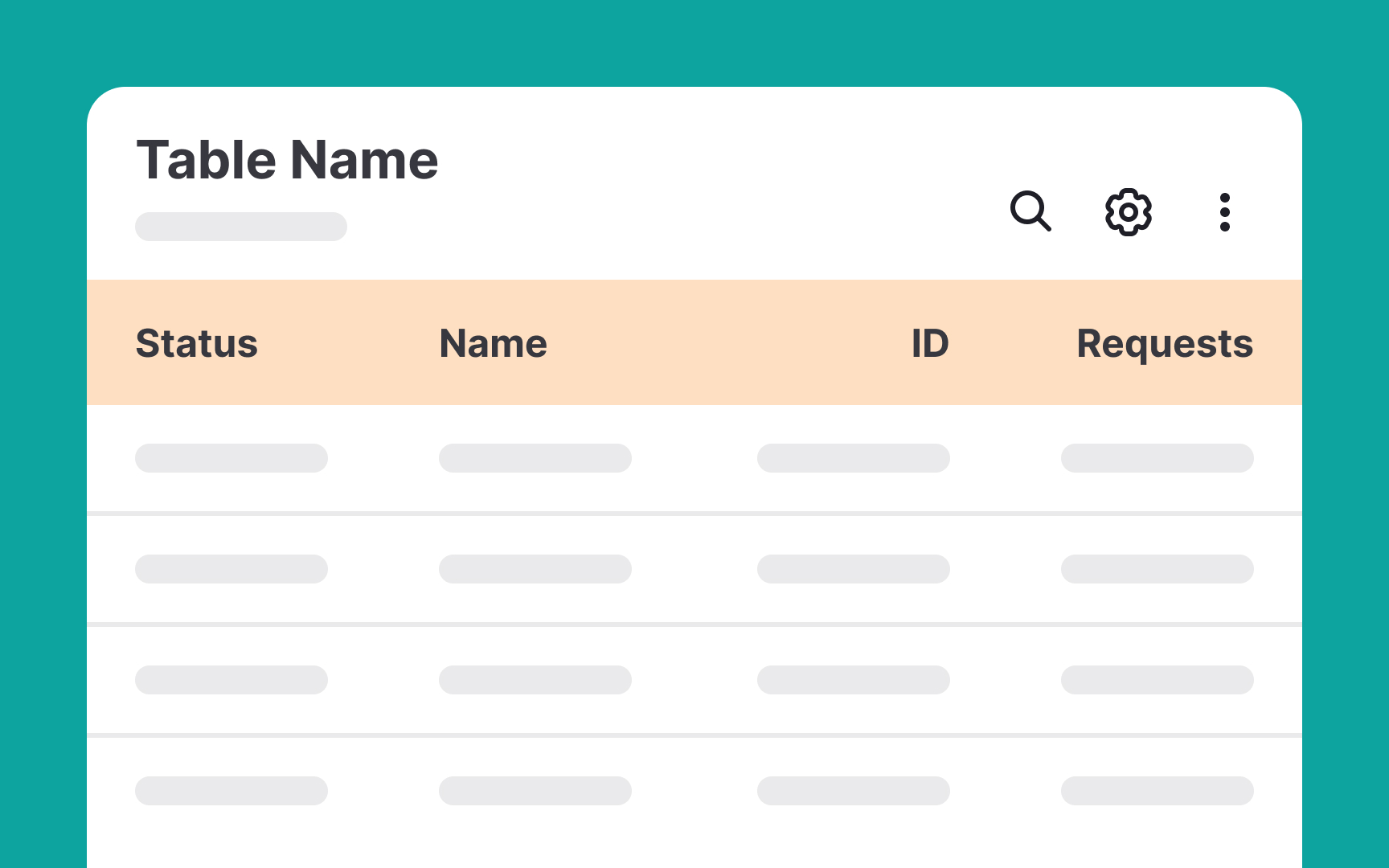
Tables in
Tables are often used to display data like product listings, financial figures, schedules, and more. They can include text, numbers, and even icons.
Pro Tip: Elevate your table's usability by incorporating filters to narrow down data, sorting functionality to arrange it logically, and search functionality to quickly find specific entries.
Headers often include navigation menus that help users move around the interface, search bars for finding
Pro Tip: Keep the design of your header uniform throughout your website or app.
While
Footers play a role in enhancing
References
- Cards: UI-Component Definition | Nielsen Norman Group
Top contributors


Topics
From Course

Share


Similar lessons

Image Terminology

Theory of Design Principles
