Accessibility and Standards
Evaluate designs against accessibility requirements and industry standards to create inclusive products.
Accessibility in design isn't just about checking boxes but making sure everyone can use your products, regardless of their abilities. Think of design standards like WCAG as your roadmap for creating truly inclusive experiences. When you build with accessibility in mind, you're not only avoiding potential legal headaches, but you're actually expanding your audience and making things better for everyone. Good documentation helps your team stay consistent with these standards across projects. The best designers today build accessibility into their process from day one rather than tacking it on at the end. Looking at elements like color contrast, keyboard navigation, and screen reader compatibility reveals how well your design works for all users. Teams often discover that meeting accessibility standards leads to cleaner, more intuitive designs overall. This lesson dives into how to evaluate your designs against established standards and document your findings in ways that drive real improvements. The goal isn't just compliance but creating better experiences through thoughtful, inclusive design.
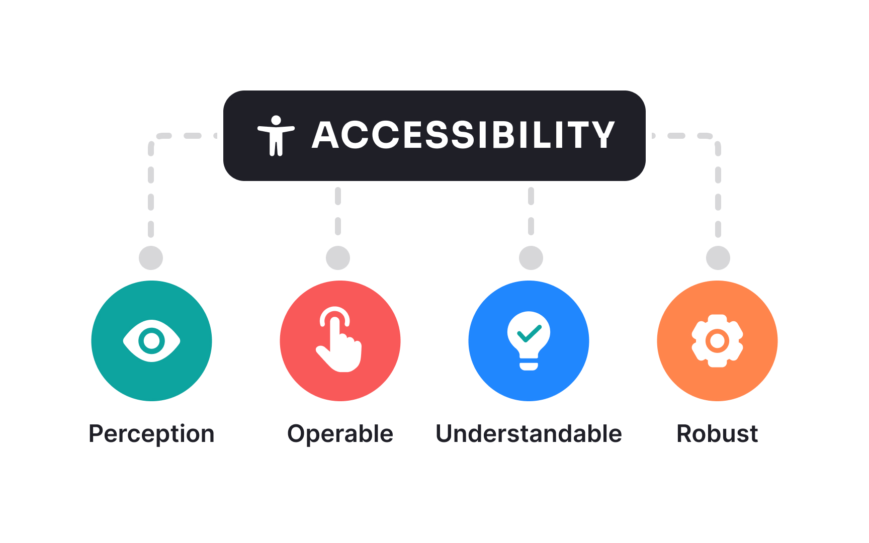
- The Perceivable principle ensures content can be detected through various senses
- The Operable principle focuses on interface functionality regardless of how users interact with devices
- The Understandable principle guides creating clear, predictable interfaces with helpful guidance
- The Robust principle ensures content remains accessible as technologies evolve.
Each principle contains specific success criteria across 3 compliance levels (A, AA, AAA), allowing teams to measure
Evaluating
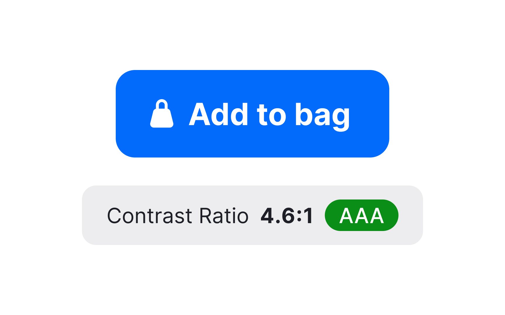
During color contrast audits, follow these steps:
- Examine all interface elements, including text, icons, form fields, and
navigation components - Use specialized tools like Contrast Checker, Stark, or WebAIM's contrast analyzer to measure these ratios objectively, rather than relying on visual judgment
- Pay special attention to hover states, error messages, and informational indicators, where color often communicates meaning
- Document instances where contrast falls below standards, noting the specific elements, their current ratios, and recommended color adjustments
Remember that sufficient contrast benefits all users, particularly in challenging lighting conditions or on low-quality displays.
Evaluating keyboard
When conducting keyboard navigation audits, follow these key steps:
- Test tab order to ensure it follows a logical flow through the interface that matches the visual layout
- Verify that the focus indicator is clearly visible at all times as users navigate
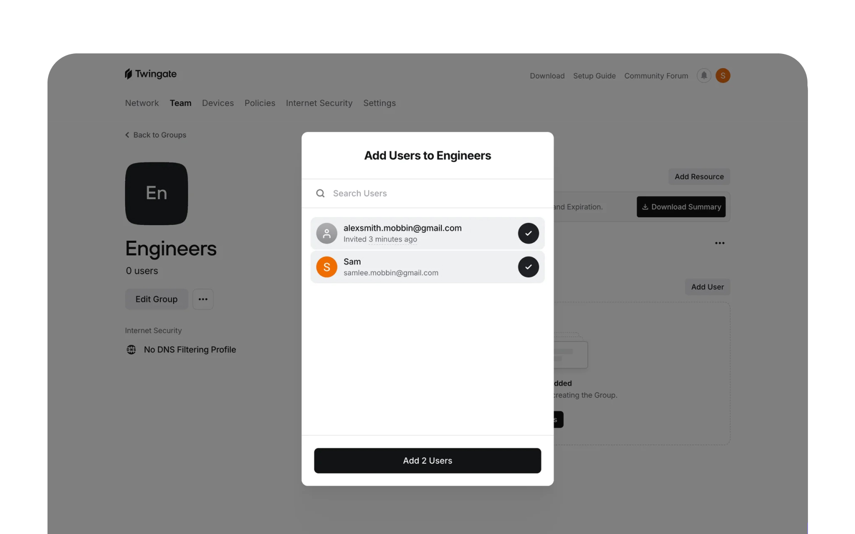
- Check that all interactive elements, such as buttons, links, form fields, dropdowns, are accessible via keyboard
- Ensure modal dialogs properly contain keyboard focus, preventing users from tabbing to background elements
- Confirm that keyboard shortcuts don't conflict with assistive technology commands
- Test that complex components like date pickers, sliders, and custom widgets have proper keyboard support
Document issues with specific recommendations for improvement, noting elements that can't be reached or operated via keyboard. Remember that keyboard accessibility benefits many users beyond those with mobility impairments, including power users and those with temporary limitations.[3]
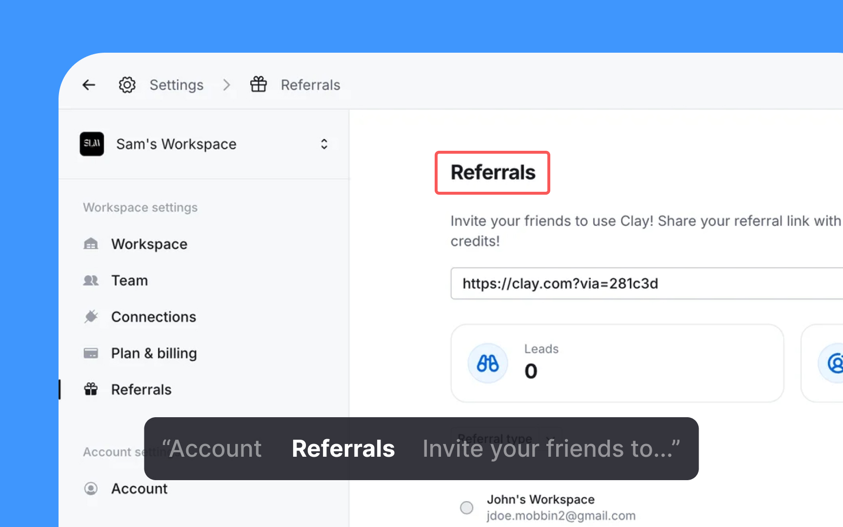
Screen reader compatibility is a key part of
When conducting screen reader compatibility audits, follow these steps:
- Test with multiple screen readers (like NVDA, JAWS, and VoiceOver) as they interpret code differently
- Verify that all images have appropriate alt text that conveys their purpose and content
- Check that headings are properly structured in a logical hierarchy (H1, H2, H3)
- Ensure form fields have explicit labels, and
error messages are announced programmatically - Test that dynamic content updates, such as page refresh, notifications, validation messages, or loading states, are properly announced through ARIA live regions
- Verify custom components, such as custom
dropdown menus or filterable selects that are built from scratch rather than using native HTML controls, and use appropriate ARIA roles, states, and properties - Confirm that the reading order matches the visual
layout and logical content flow
Document any problems you find. Note which screen reader you used, what element caused trouble, what you expected to happen, and what actually happened. Include specific suggestions to fix each issue, with code examples when possible. Improvements that help screen reader users often make the experience better for everyone by creating a clearer content structure.[4]
Pro Tip: Record screen reader output during testing sessions to share with developers, creating more empathy and understanding of the actual user experience.
Proper
When conducting semantic HTML evaluations, follow these steps:
- Check that headings use proper heading tags (H1-H6) rather than styled paragraphs
- Verify that lists use appropriate elements (ul for unordered lists, ol for ordered lists, dl for description/definition lists with term-description pairs)
- Ensure tables use table elements with proper headers and captions for data presentation
- Confirm that interactive elements use native controls (
buttons ,links , form elements) where possible - Examine landmark regions (header, footer, nav, main, aside) for proper structure
- Check that forms use fieldset (to group related form elements), legend (to provide a title for the fieldset), and
label elements correctly - Test that language attributes are properly set for the document and any content in different languages
Document issues by identifying elements using incorrect semantics and recommend proper tag replacements. Note that semantic HTML benefits not just
Forms often create
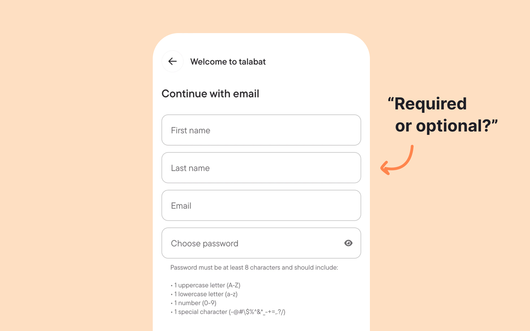
When conducting form accessibility checks, follow these steps:
- Verify that all form controls have properly associated
labels - Check that required fields are clearly indicated both visually and programmatically
- Ensure
error messages are clear, specific, and programmatically linked to their fields - Test that form validation provides feedback without relying solely on
color - Confirm that logical
tab order matches the visuallayout of the form - Verify that groups of related inputs (like radio buttons) are properly grouped with fieldset and legend
- Check that instructions and help text are programmatically associated with relevant fields
- Test timeout warnings and ensure users can request more time when needed
Document issues by specifying the form element, the accessibility problem, and recommended fixes. Note that accessible forms typically provide a better experience for all users through clearer instructions, better error handling, and more intuitive design patterns.
Pro Tip: Create a form accessibility checklist that developers can reference during implementation rather than waiting for QA to identify issues later in the process.

Web interfaces must function well across various screen sizes and devices.
When conducting responsive design standards evaluations, follow these steps:
- Test
content readability across different viewport sizes without horizontal scrolling - Verify that touch targets are sufficiently sized (at least 44x44 pixels) for mobile users
- Check that text remains legible when zoomed up to 200% without loss of content
- Ensure that interactive elements remain usable when screen orientation changes
- Verify that
layout shifts maintain logical reading order for screen readers - Test that
navigation menus are accessible in both expanded and collapsed states - Confirm that
images scale appropriately without losing essential details
Document issues by capturing screenshots at problem breakpoints and providing specific recommendations for improvement.
Pro Tip: Test responsive designs with both keyboard navigation and touch interaction at each breakpoint to identify issues that might affect users with limited dexterity.
After finding
When creating your implementation plan, follow these steps:
- Sort issues by how severely they affect users and how hard they are to fix
- Group similar problems that can be fixed with the same solution
- Create a realistic timeline with clear deadlines for each improvement
- Assign specific people to be responsible for different types of fixes
- Set clear goals so you know when each fix is successfully completed
- Make accessibility testing a regular part of your development process
- Plan training sessions to fill the knowledge gaps you discovered during the audit
- Schedule follow-up checks to make sure the improvements actually work
Write your plan in a format that's easy to track as work moves forward. Include extra time for unexpected problems that might come up. Remember that improving accessibility isn't a one-time project. Your plan should create lasting habits that keep your product accessible over time.
References
Top contributors
Topics
From Course

Share


Similar lessons

Intro to Accessibility

Inclusive Design Basics
