Paints & Gradients
Discover how to create smooth and appealing color gradients in Figma.
Color gradients, a design favorite since the late 1990s, add depth and visual interest to projects. In Figma, crafting gradients is straightforward, but there's a fine line between modern and outdated looks. Figma offers tools for creating smooth transitions and adjusting angles, ensuring your gradients enhance your designs without overpowering them. The key is subtlety and choosing the right color combinations to keep your work fresh and engaging.
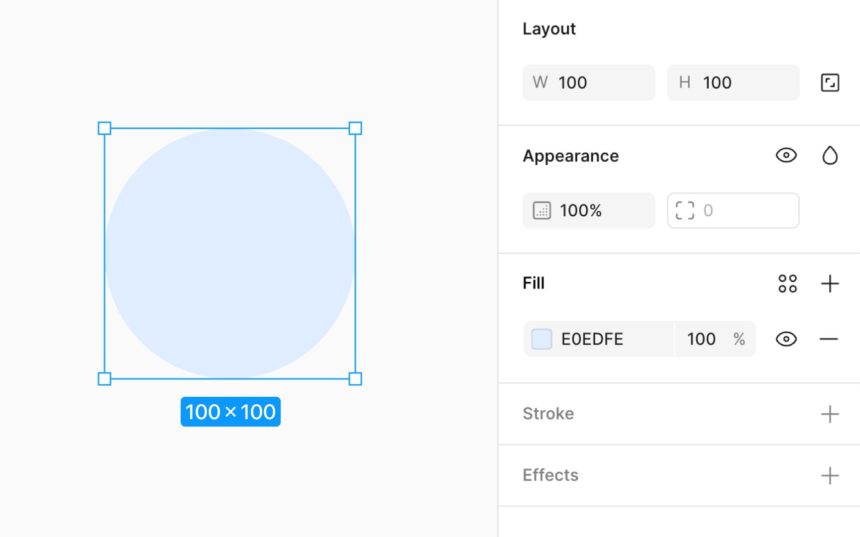
Applying fills to layers lets you add
Here's how to add a fill:
You have the option to use colors, gradients, or even image fills for your layers. First, make sure a fill or stroke is applied to your layer to access the
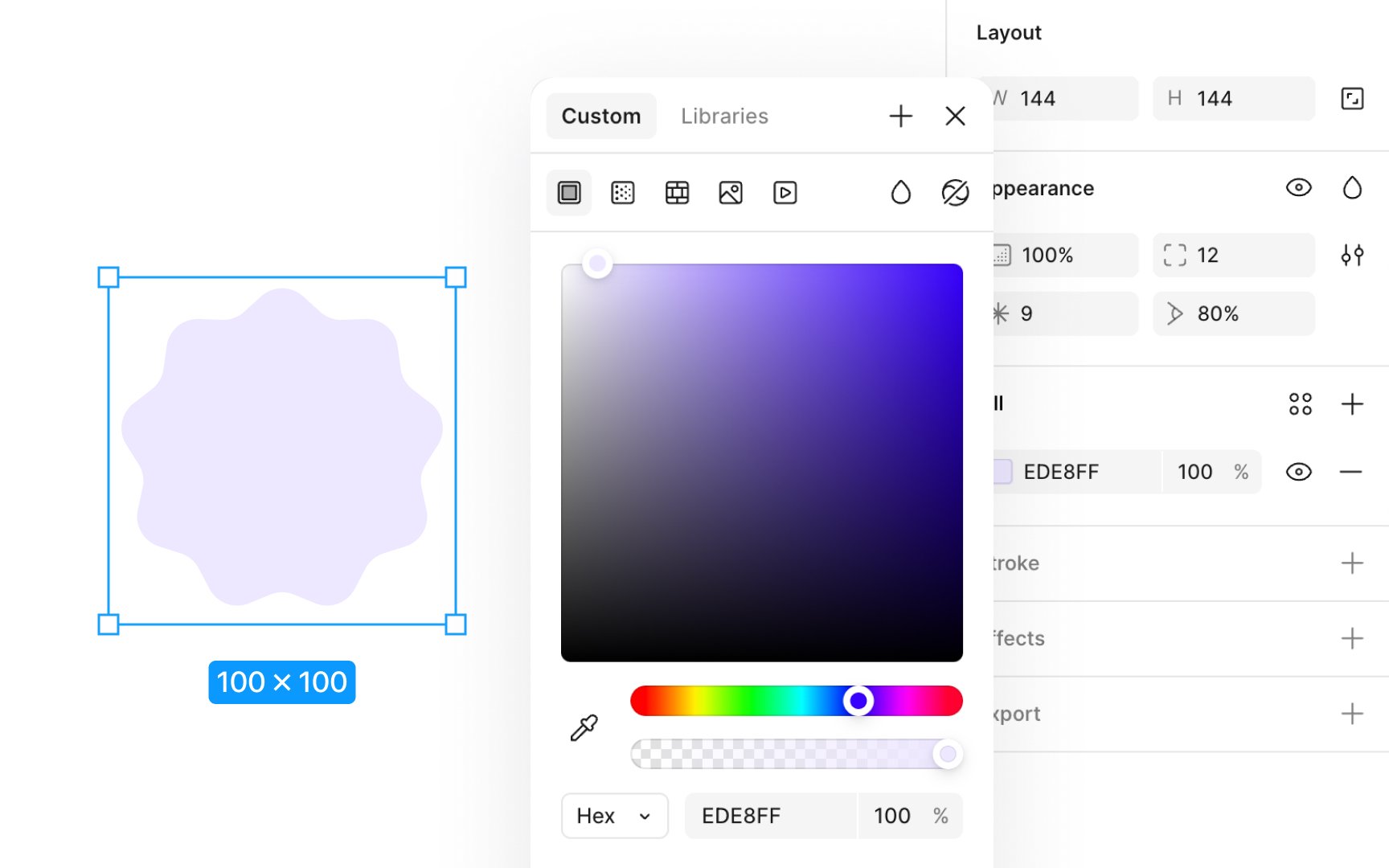
Here's how to use the color picker:
- Click on the current color swatch in the Fill section of the Design panel to open the color picker.
- Within the color picker, you can either create a custom color or select from predefined color styles and variables from your libraries.
- Choose your fill type from Solid, Gradient, Pattern, Image, or Video.
- Use the hue slider to fine-tune your color. Dragging left or right adjusts the hue.
- The second slider controls the color's opacity, enabling subtle transparency effects.
The color picker also provides options to preview and apply blend modes, allowing you to customize how your color interacts with layers beneath it.
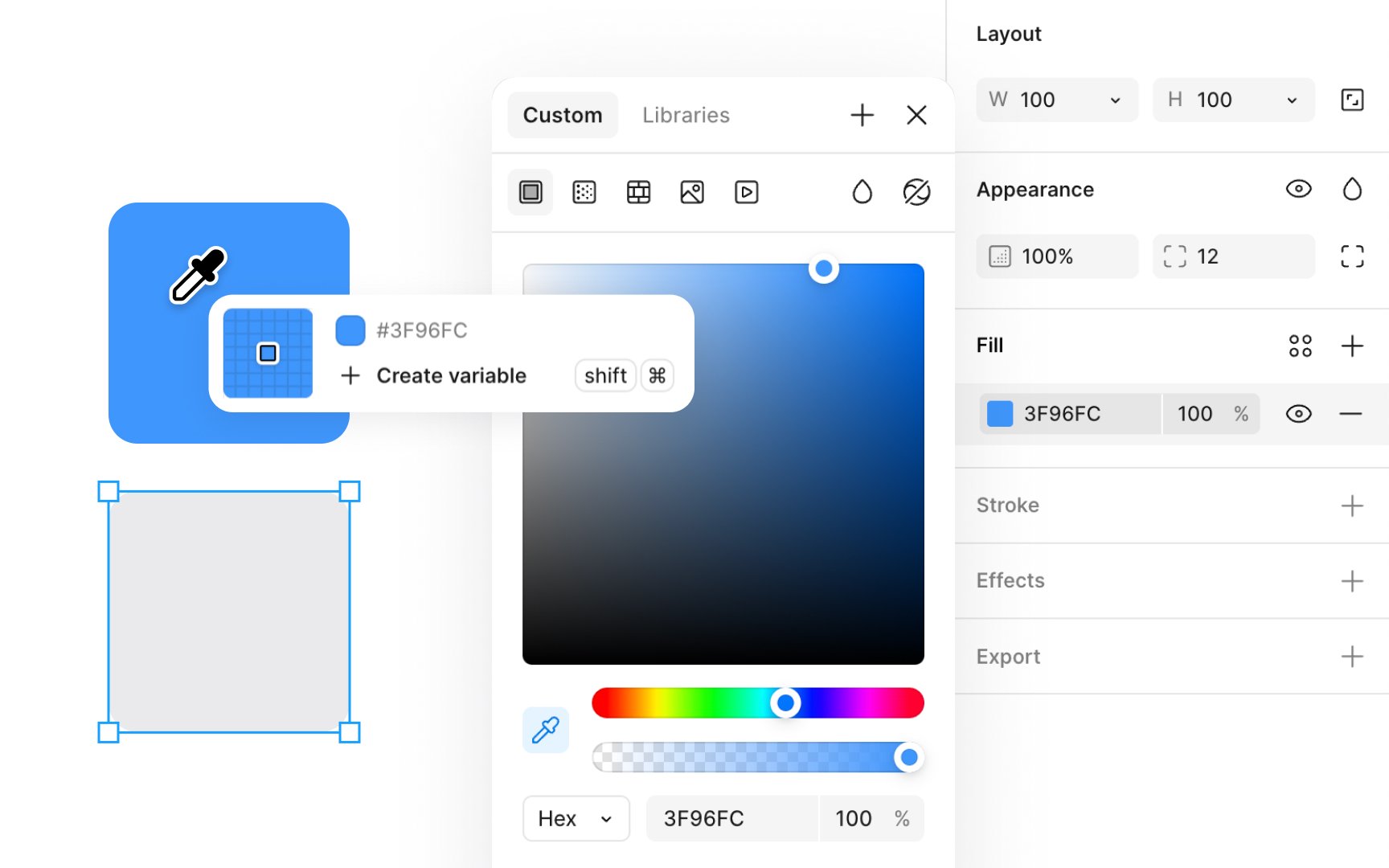
The eyedropper tool allows you to quickly sample and apply colors from any part of your project, ensuring your palette remains consistent.
Here's how to use the eyedropper tool effectively:
- Choose the layer you want to update with a new
color . - Press the I letter key to activate the eyedropper tool. You can also initiate the eyedropper from within the color
picker . Just click the eyedropper icon next to the color swatch in the Fill section of the Design panel. - Move your cursor over the desired color. A magnifying window pops up, displaying the color and its
hex code, giving you a precise view of what you're about to select. - Click to capture and apply this color to your selected layer.
- Alternatively, you can pick colors from your team's shared libraries by opening the Libraries tab in the Fill modal and clicking on the desired color with the eyedropper tool active. These library colors can also be accessed and selected under the Hex code section in the Custom tab of the Fill modal.
Pro Tip: You can also initiate the eyedropper from within the color picker. Just click the eyedropper icon next to the color swatch to select and sample colors anywhere on your canvas.
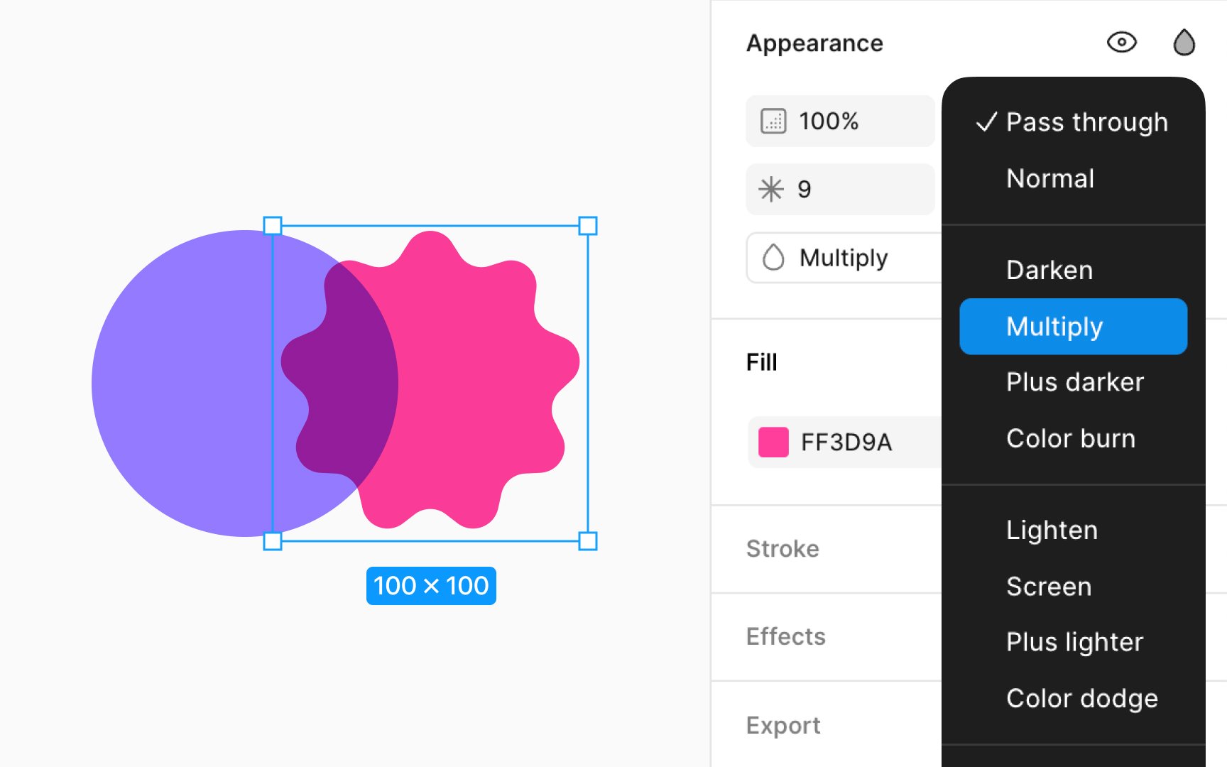
Blend mode allows you to control how two layers merge, affecting the pixels of each to produce various visual effects. You can find blend modes inside the Fill section. Open the Fill
These modes are categorized based on their effects:
- Default: Pass through and Normal modes that don’t apply alterations.
- Darker: Modes like Darken, Multiply,
Color burn, and Plus darker enhance shadows and deepen colors, perfect for adding depth or texture toimages . - Lighter: Modes like Lighten, Screen, Color dodge, and Plus lighter brighten areas and create highlights and are useful for achieving a lighter, airier feel in designs.
- Contrast: Overlay, Soft light, and Hard light adjust contrast by blending light and dark elements for a balanced effect, ideal for complex textures or photorealistic effects.
- Comparative: Difference and Exclusion modes provide creative, often unexpected results by contrasting colors and tones.
- Color: Modes like
Hue , Saturation, Color, and Luminosity focus on color adjustments, allowing for nuanced color manipulation across layers.
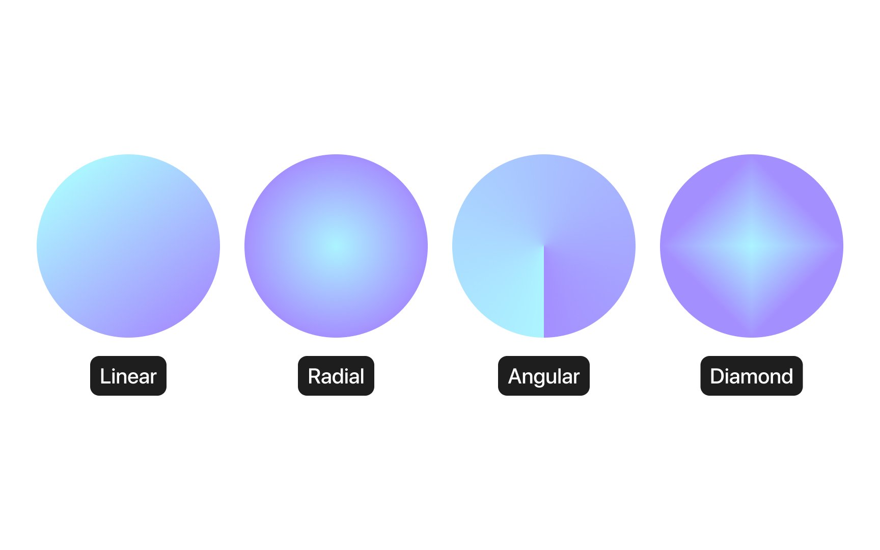
Gradients are a design technique that creates a smooth transition between two or more colors, adding depth,
- Linear gradients: These involves a
color transition along a straight line. You can adjust the angle if you need a directional flow, like mimicking sunsets or horizon lines. - Radial gradients: They originate from a central point and move outward in a circular pattern. Radial gradients are perfect for creating focal points or simulating light sources in designs.
- Diamond gradients: These gradients start from the center and extend out in four directions. They're great for highlighting central elements or adding a modern twist to
icons and buttons. - Angular gradients: Rotating around a starting point, angular gradients introduce a dynamic, circular transition effect. They help convey motion or energy, like in logos or dynamic backgrounds.
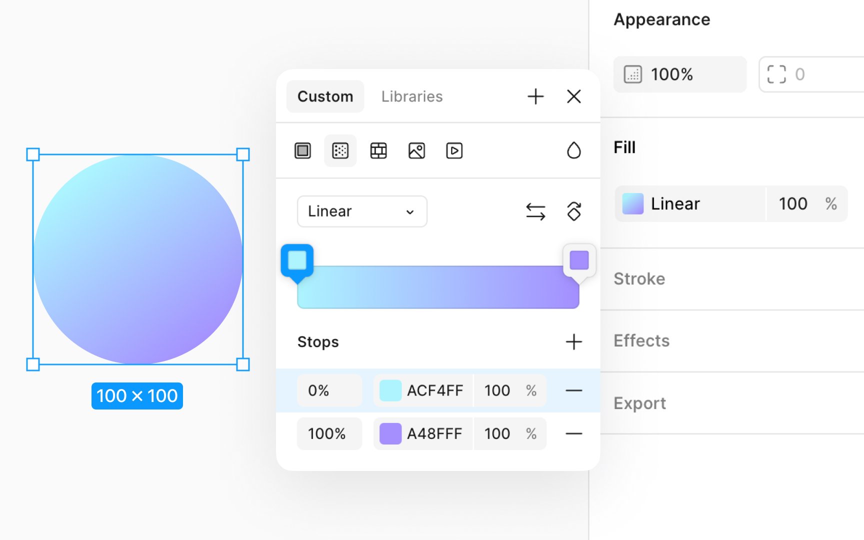
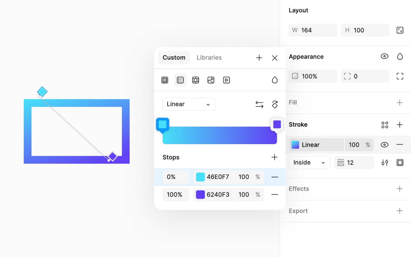
Applying a
- Choose the layer you want to apply the gradient to.
- In the Design panel, click on the Fill
color to open themodal . - Click on the Gradient
icon . - Select from linear, radial, or any other available gradient type.
- Gradients consist of stops that define the transition colors. Click on the gradient bar to add or select a stop, then use the color
picker to adjust its color. You can drag stops to change the transition's smoothness. - Adjust the
opacity of stops to create softer transitions or make certain colors stand out more, adding a sense of depth or light. - Adjust the angle directly on the canvas to set direction and spread.
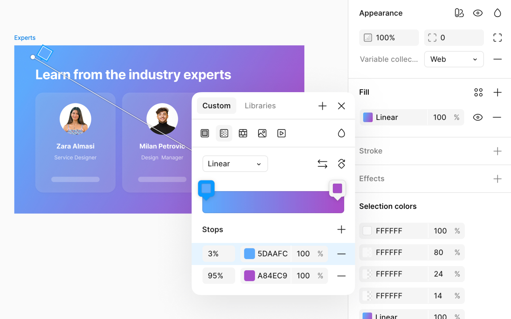
Applying gradients to the background of an interface can create a visually engaging space. However, it's crucial that gradients do not compromise the readability or navigability of your interface. Using analogous colors (the colors next to each other on the
Recommendations for building a
- Prioritizing legibility: Ensure text and UI elements remain readable against the gradient.
- Testing across devices: Gradients can display differently on various screens, so it's important to check their appearance across devices.
- Using gradients purposefully: Gradients should enhance your designs, not distract from the functionality.
Pro Tip: Opt for a 45° angle for the gradient. It's a nice middle ground that adds energy while keeping things balanced.
Applying gradients to a
- Aim for smooth transitions. Sharp
color changes can reduce visual appeal and affect accessibility. - Choose colors with similar hues for a soft and attractive
gradient . - Avoid greyish tones in the center, as they can create unattractive grey areas and clutter the design.
Pro Tip: While traditional linear gradients with a darker hue at the base are classic, adjust the gradient angle to create a modern and fresh look.
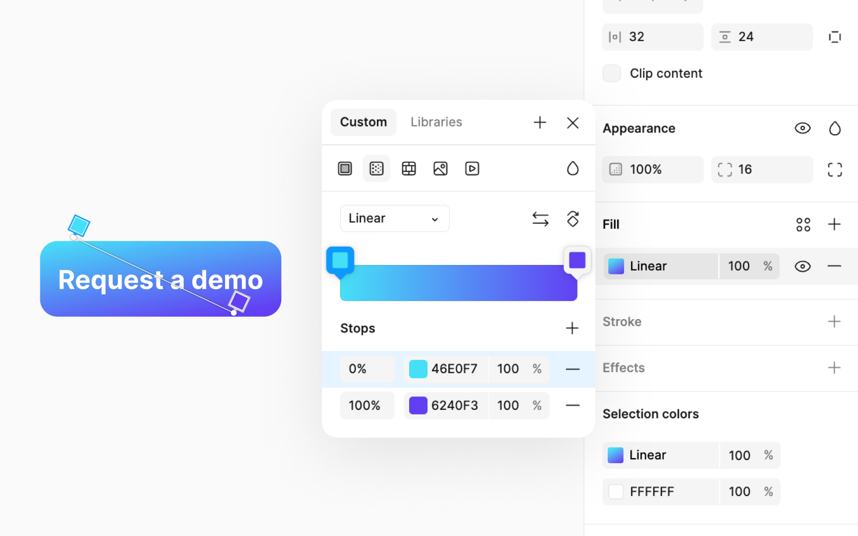
Using gradients on strokes might not be the first design choice many think of, but it can significantly enhance the appearance of text,
To apply a gradient to a stroke:
- Select the layer you wish to modify.
- Navigate to the Stroke section in the Design panel. By default, the stroke is black with a thickness of 1. Modify the thickness as you like. Adjust the stroke's thickness for a more pronounced effect.
- Next, navigate to the
color switcher and select theGradient icon. - Modify the gradient settings to achieve your desired effect.
Pro Tip: Ensure the gradient direction and color scheme match the overall design theme for a cohesive look.
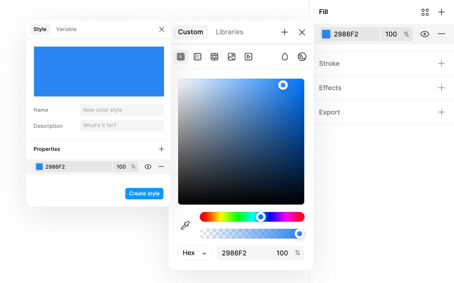
How to create:
- Click on the color swatch in Fill section of the Design panel.
- Select a color and click on the +
icon in top right corner of themodal . - Select the Style
tab and fill in the details for saving. - You can find these saved styles in the Libraries section of the color
picker modal.
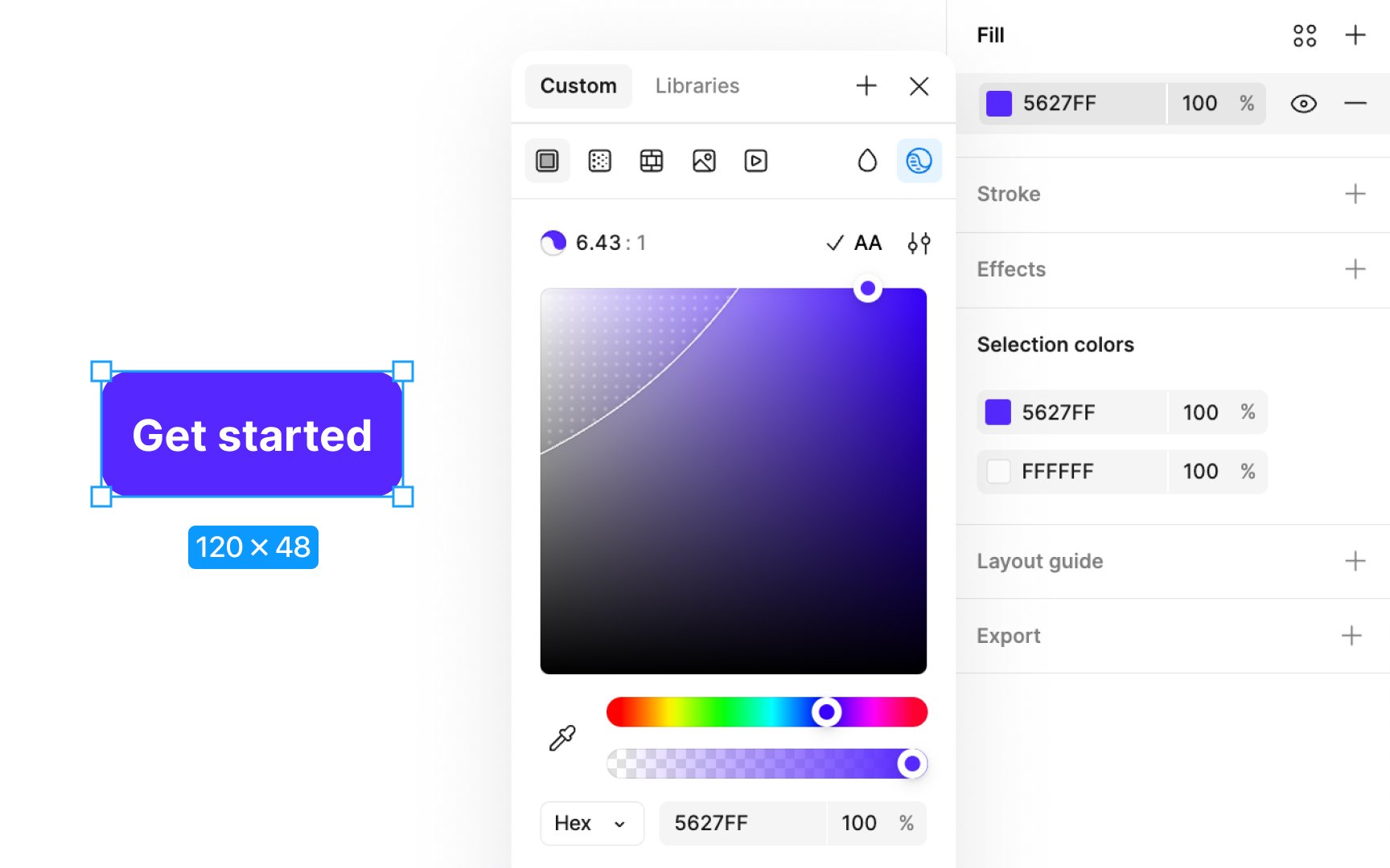
Figma’s
Here’s how to use it:
- Select a layer and go to the Fill section in the Design panel.
- Click the
color swatch to open the colorpicker modal . - In the color picker modal, click the Check color contrast
icon at the top-right corner. - In the popup modal, Figma automatically shows the contrast ratio between the text color and its background.
- It indicates if the contrast meets accessibility standards like WCAG AA or AAA for normal text, large text, or graphics.
- You can click the AA/AAA
button in the modal’s top-right corner to automatically adjust the colors to meet accessibility requirements.
References
Top contributors


Topics
From Course

Share


Similar lessons

Intro to Color Theory

Color Properties
