Designing for Visual Impairments
Understand the most common visual disabilities and how to design products that work for people with these impairments
Around 27.5% of the global population experiences some form of vision impairment, with approximately 2.5% living with moderate to severe low vision and 0.54% affected by blindness.[1]
Building inclusive products means ensuring accessibility for all users, regardless of their visual abilities. This lesson explores common visual disabilities and practical strategies for creating products that are clear, usable, and effective for everyone.
People with peripheral or tunnel vision problems lack a wide-angle field of vision, even though their central vision might be perfect. The most common cause of such vision impairments is glaucoma, which occurs when high pressure inside the retina damages the optic nerve, the carrier of images from your brain to your eyes. Patients often complain about their difficulties in seeing in dim light and navigating when moving.
When designing a website or an app, we should keep in mind that people with peripheral vision problems can only see central elements. Our main goal is to ensure they can access and use the main functionality without limits.
Pro Tip: With Web Disability Simulator, you can simulate how people with disabilities experience your website.

Diabetic retinopathy is a diabetes complication that affects the eyes. What may start as mild vision problems can often progress into severe blurred vision symptoms and eventually blindness. According to the stats, 80% of diabetic people are affected by this problem. Patients usually complain of seeing spots or floaters, losing their sharpness of vision, and having difficulty seeing in dim light and at night.[2]
Users usually struggle to read text and interact with elements on websites and products that don't comply with WCAG 2.0 requirements. For them, the content looks fuzzy as if viewed through dirty glass.

Visual acuity refers to the eye's ability to see details clearly and precisely. Generally, it depends on how far away the eye is from the object and its smallest features. However, some people with visual acuity impairment struggle with partial sight loss in one eye and color desaturation, in which colors, especially red, lose their intensity.
When developing interfaces, we should be particularly delicate about the text's type, size, weight, and font style. Users' ability to perceive details also depends on the contrast between the foreground and background which should fall within the

Ghost
For users experiencing ghosting, reading text and distinguishing small elements can be particularly challenging. Letters may blur together, and fine details may become difficult to perceive. To improve readability, ensure sufficient
For
Colorblind Web Page Filter is a web tool that simulates different types of color blindness so you can adjust your color palette and provide the best experience for everyone.
Pro Tip: When picking colors, designers should keep color blindness in mind and avoid relying on color alone for buttons, links, icons, or text to convey the message.
To make the
It allows screen-reading tools or other assistive technologies to quickly scan content and interpret it to users regardless of visual changes. Users may enlarge text,
To enjoy the
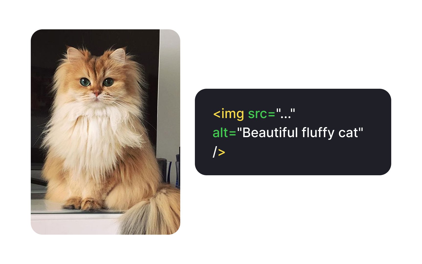
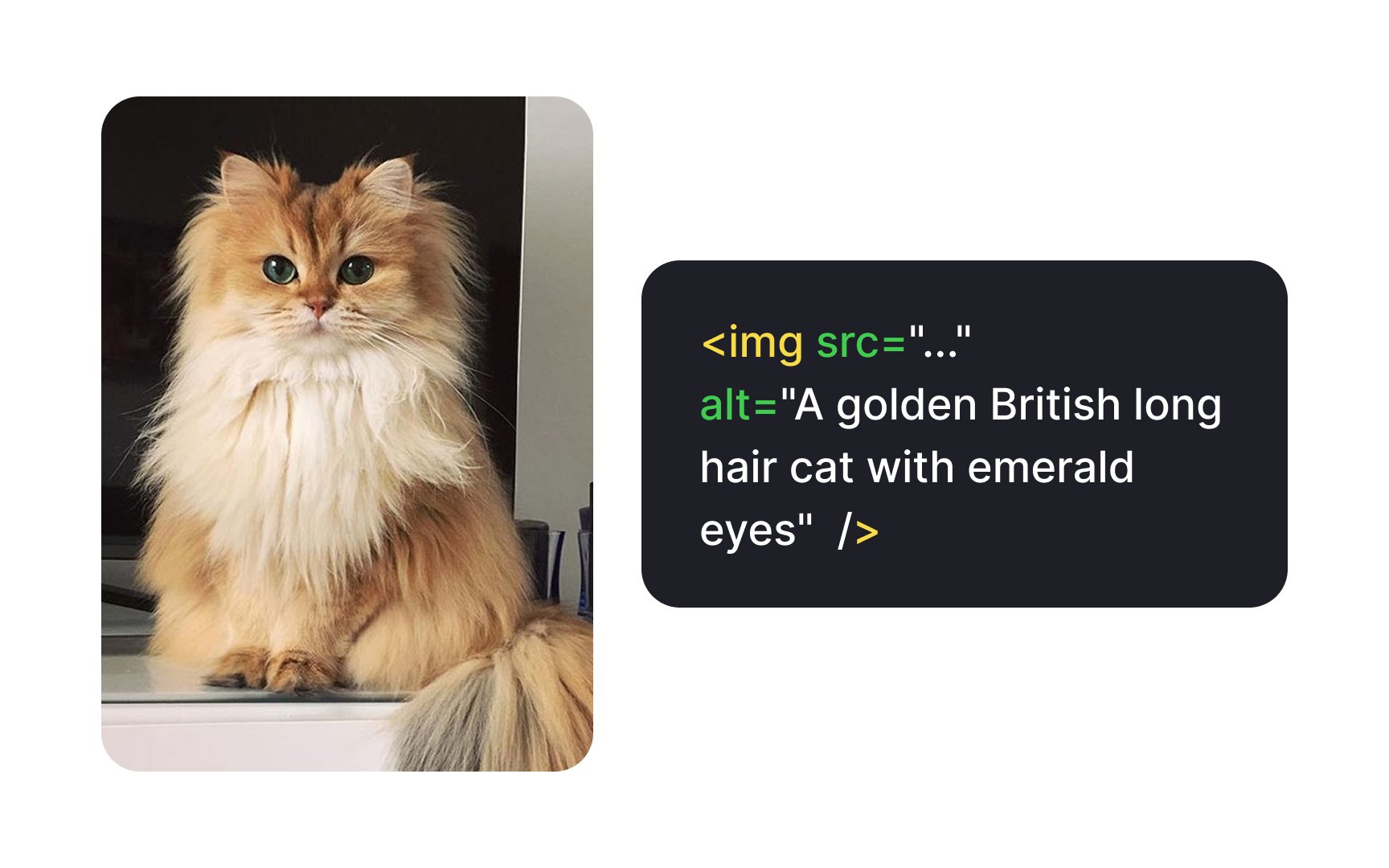
Providing concise and informative descriptions helps convey the meaning of an image effectively. Imagine explaining the image over the phone. You would focus on the idea rather than the
Alt text also benefits all users by providing context when images fail to load due to a slow internet connection, ensuring they still understand the content.
Pro Tip: There is no fixed limit for alt tags, but avoid exceeding 125 characters as screen-reading tools often cut off wordy descriptions.
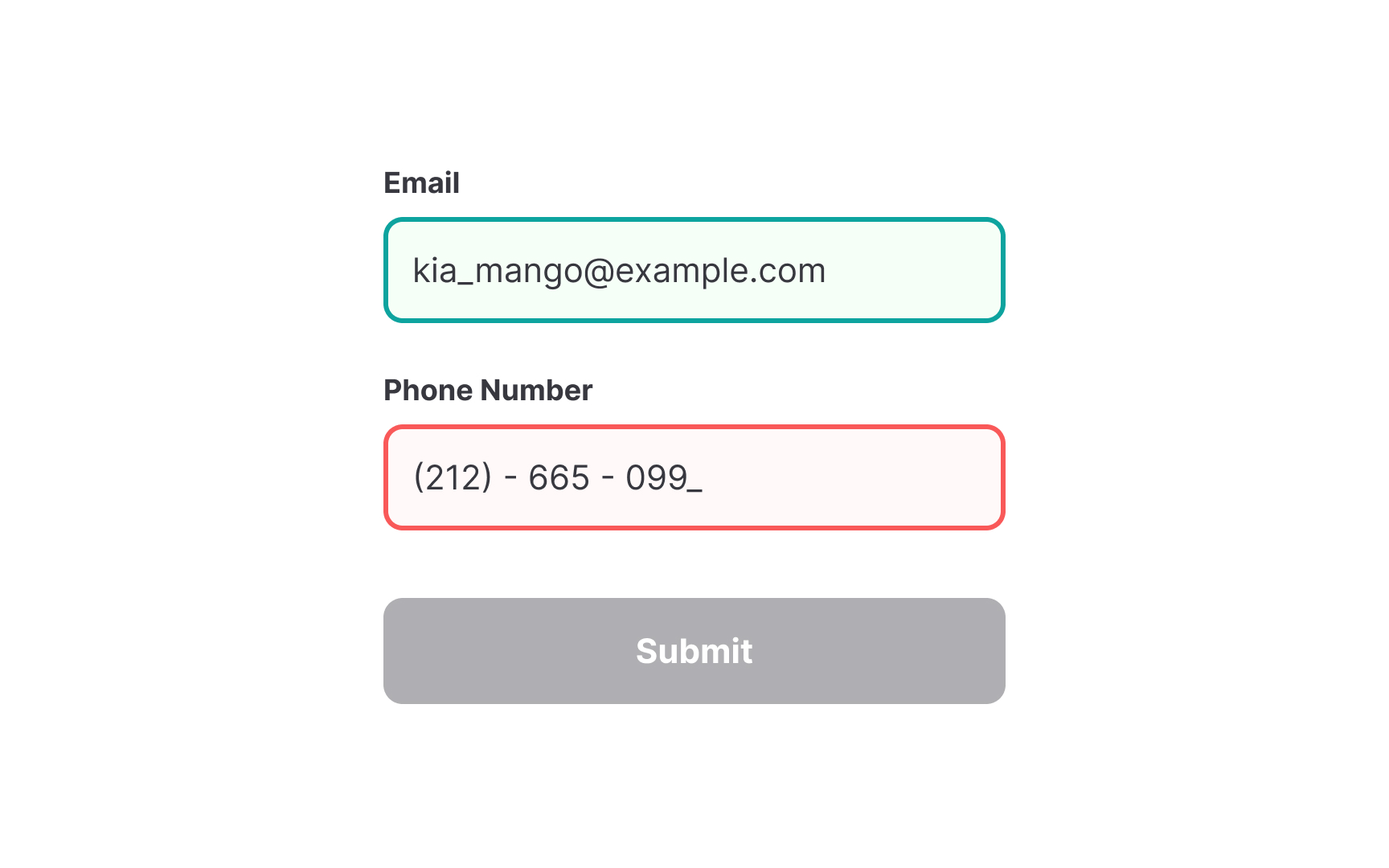
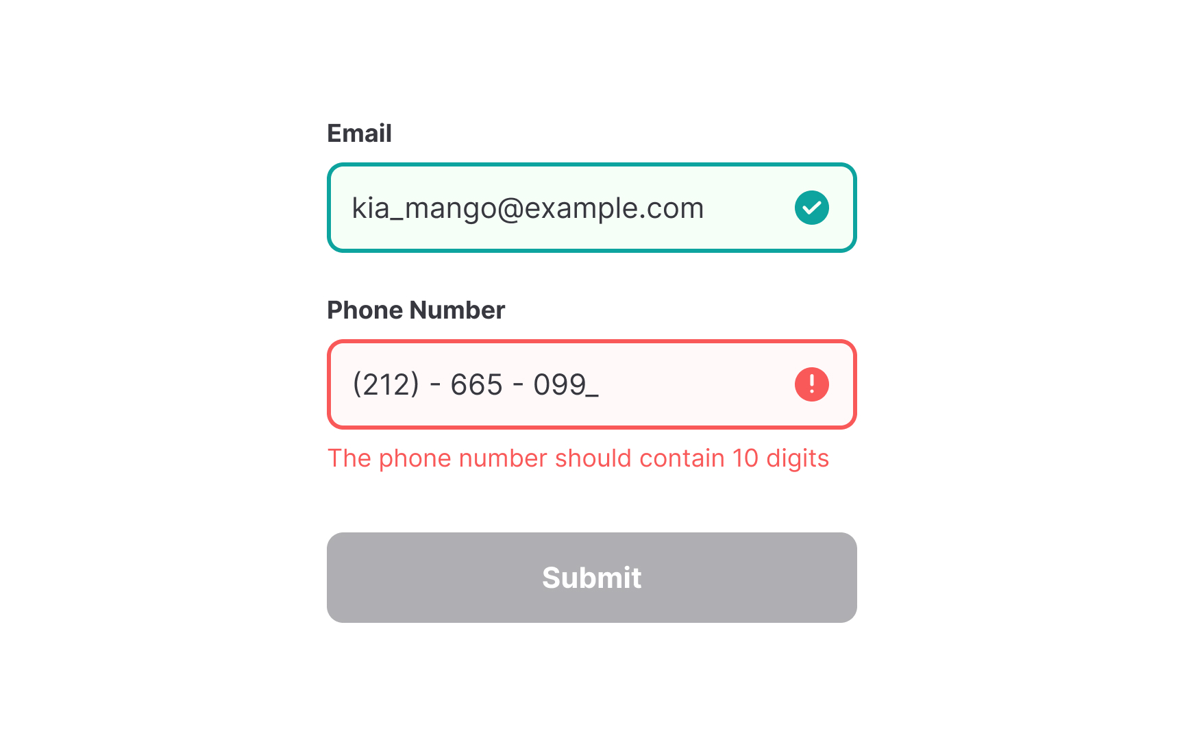
When designing interfaces, relying solely on
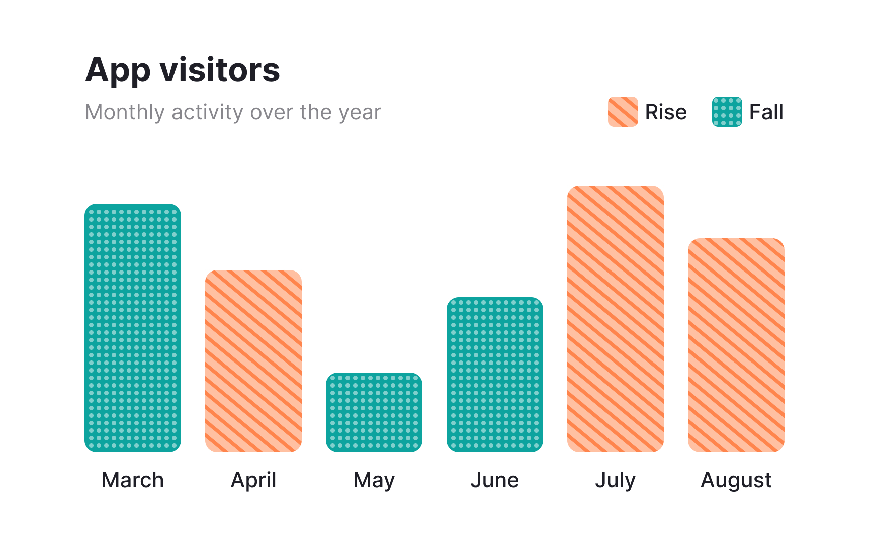
Distinguishing elements without relying on
Incorporating these elements benefits all users, not just those with color blindness. Patterns and textures improve readability in charts, infographics, and interactive elements by creating strong visual contrasts.
For people who live with visual impairments and can't fully rely on
Pro Tip: Using sans serif fonts, like Arial, Verdana, Tahoma, or Helvetica provides 100% legibility for all users, as they're generally simpler and easier to read.
The
Pro Tip: Skip this requirement for captions and image text.
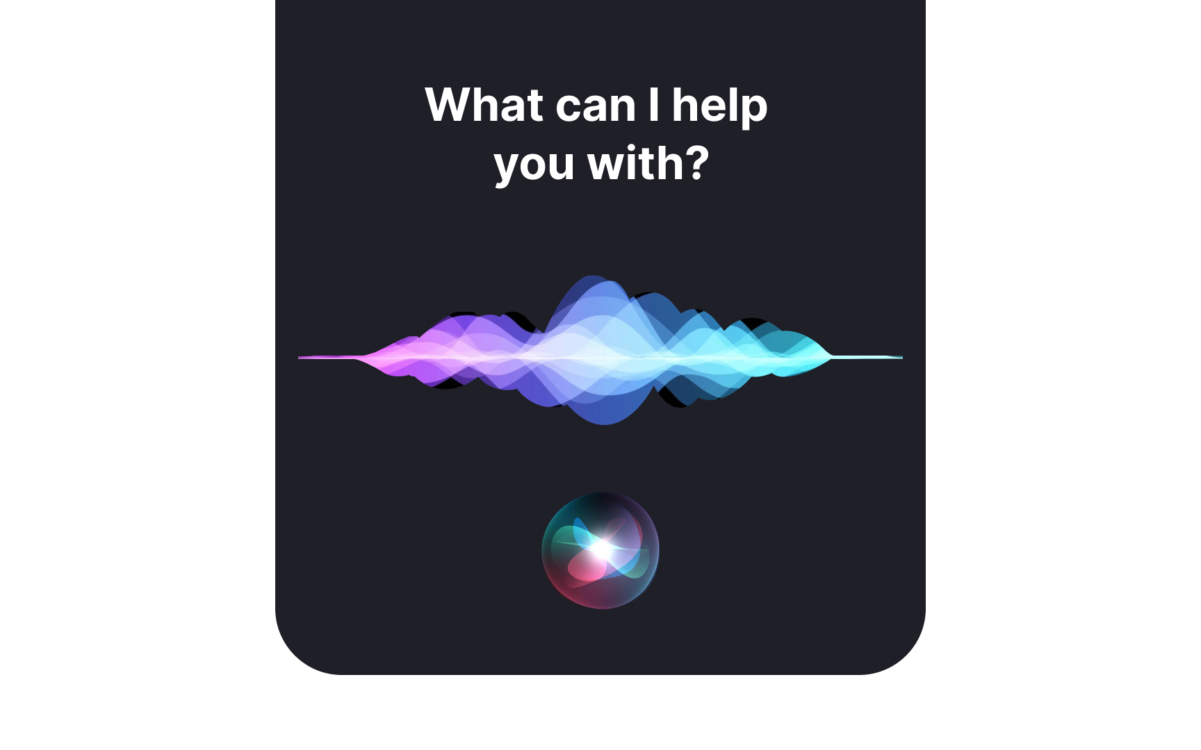
Voice User Interfaces (VUI) are among the latest advancements in
For conversational VUI, consider the following recommendations:
- Keep messages concise: Shorter audio responses improve comprehension and efficiency.
- Allow interruptions: Users should be able to stop or skip messages when needed.
- Provide speech rate control: Adjusting the speed ensures better usability for different preferences.
- Ensure easy discoverability: Users should quickly find and activate voice interaction features.
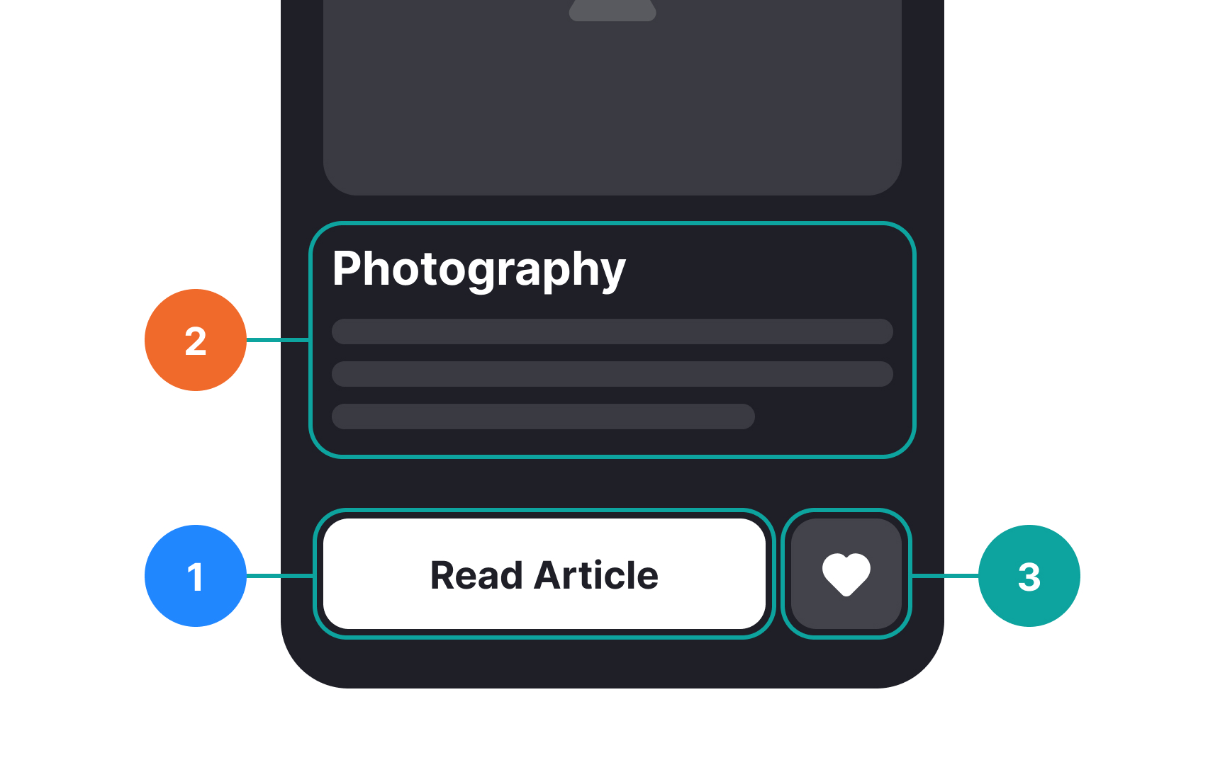
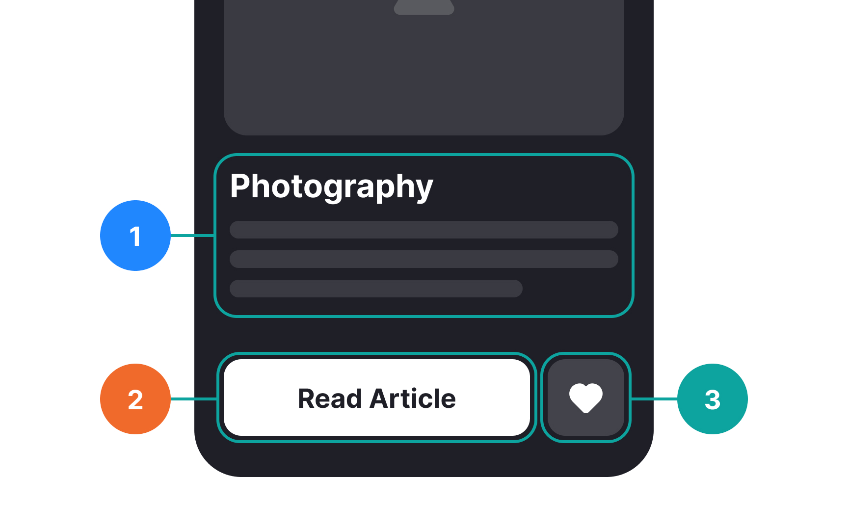
Keyboard navigation is essential for visually impaired users who rely on the Tab key or arrow keys to move through a website. To ensure a smooth experience, several key factors should be considered:
- Make keyboard focus visible. By default, browsers provide focus indicators, such as dotted or solid outlines, but these can be customized to align with brand
colors while maintaining highcontrast for visibility. - Follow a logical focus order. The focus should match the visual
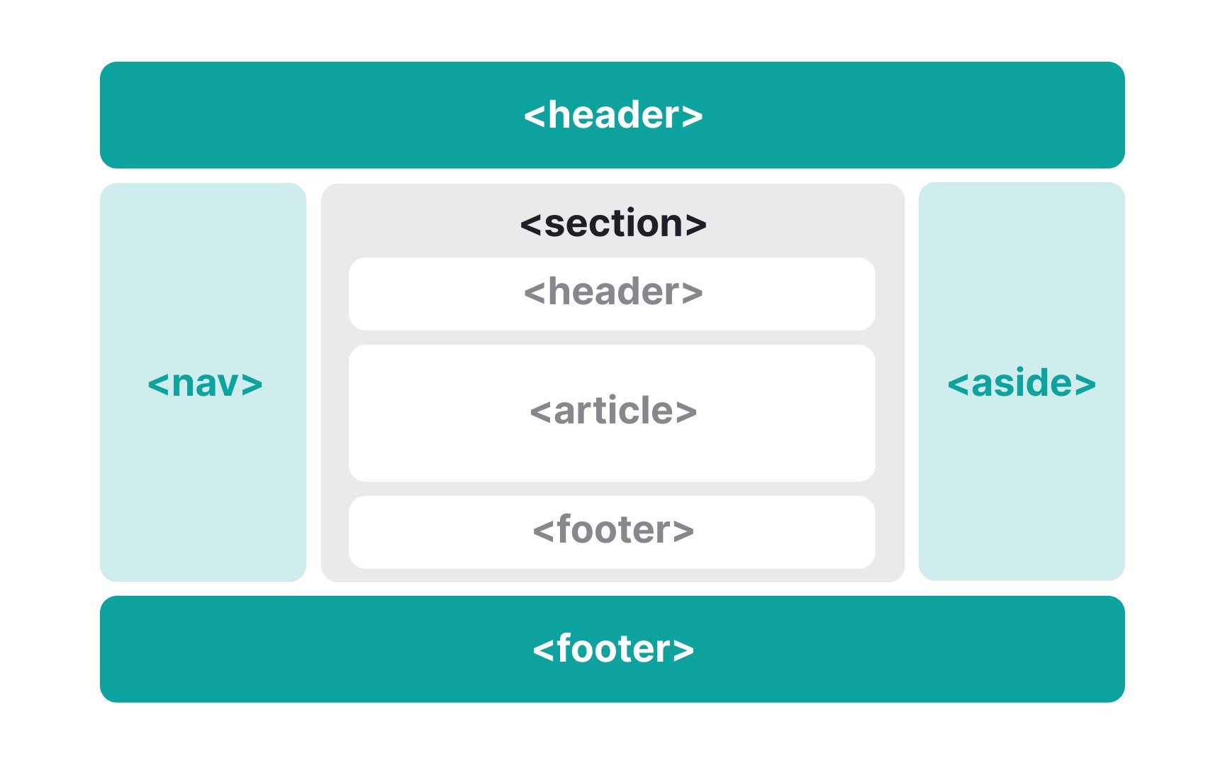
layout , typically moving left to right and top to bottom, prioritizing essentialcontent . All interactive elements—buttons, links, forms, dropdowns, and modal dialogs—must be accessible via the keyboard, just as they are for mouse users. - Use semantic HTML and ARIA roles. Elements like
<header>,<nav>,<main>,<section>, and<aside>help assistive technologies provide a clearpage structure. Screen readers use these landmarks to generate a navigational map, allowing users to jump directly to key sections. Adding ARIA roles and descriptivelabels enhances this experience, making navigation more intuitive.[4]
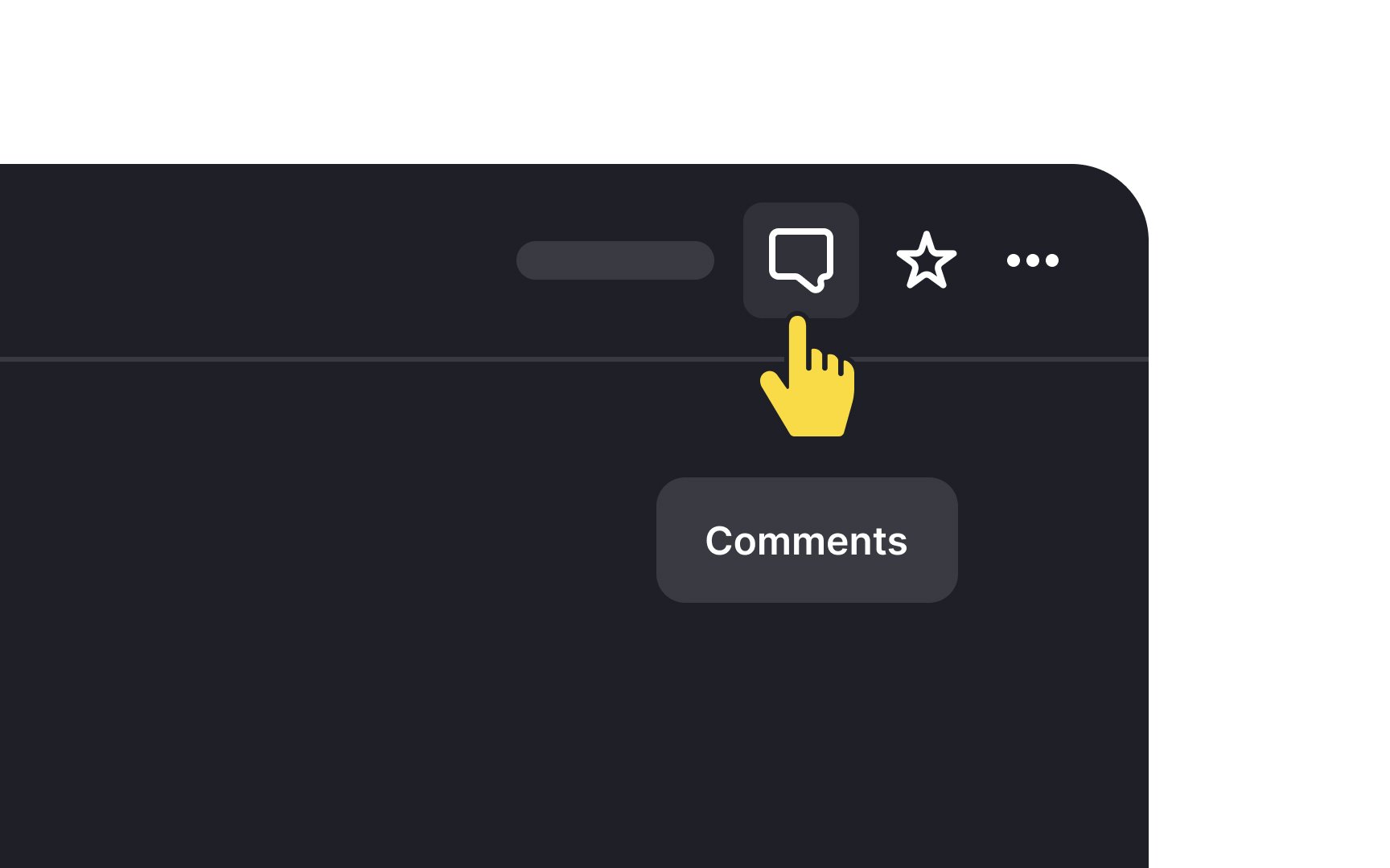
Tooltips are brief, informative elements that explain the function of a specific item on a website. They help users understand what an element does, providing guidance without overwhelming them. Tooltips can be accessed by various methods, such as a mouse, keyboard, pointer device, screen reader, or zoom software, ensuring
While tooltips typically appear on hover and disappear shortly after, they should not contain long instructions or detailed steps. Overloading users with this kind of information can strain their memory and eyes, particularly for visually impaired individuals. Tooltips should remain concise and only offer enough information to clarify the element's purpose, avoiding complexity that may lead to confusion or frustration.
Pro Tip: Don't offer a tooltip if you don't have any useful content. Otherwise, you create information pollution and waste users' time.
References
- How to design website layouts for screen readers | freeCodeCamp.org
Top contributors


Topics
From Course

Share


Similar lessons

Intro to Accessibility

Inclusive Design Basics
