Common UI Components
Discover the most basic building blocks that make up a user interface
Components are the building blocks of an interface. They include buttons, checkboxes, labels, inputs, cards, and many others. Each of them has unique anatomy and implements a specific role to help users achieve their goals.
What is the difference between radio buttons and checkboxes? Cards and containers? Links and hyperlinks? Understanding how each component works and where it should be applied is powerful knowledge. Not only will you feel more relaxed communicating with designers, but you'll also be more confident in your professional skills.
In digital products,
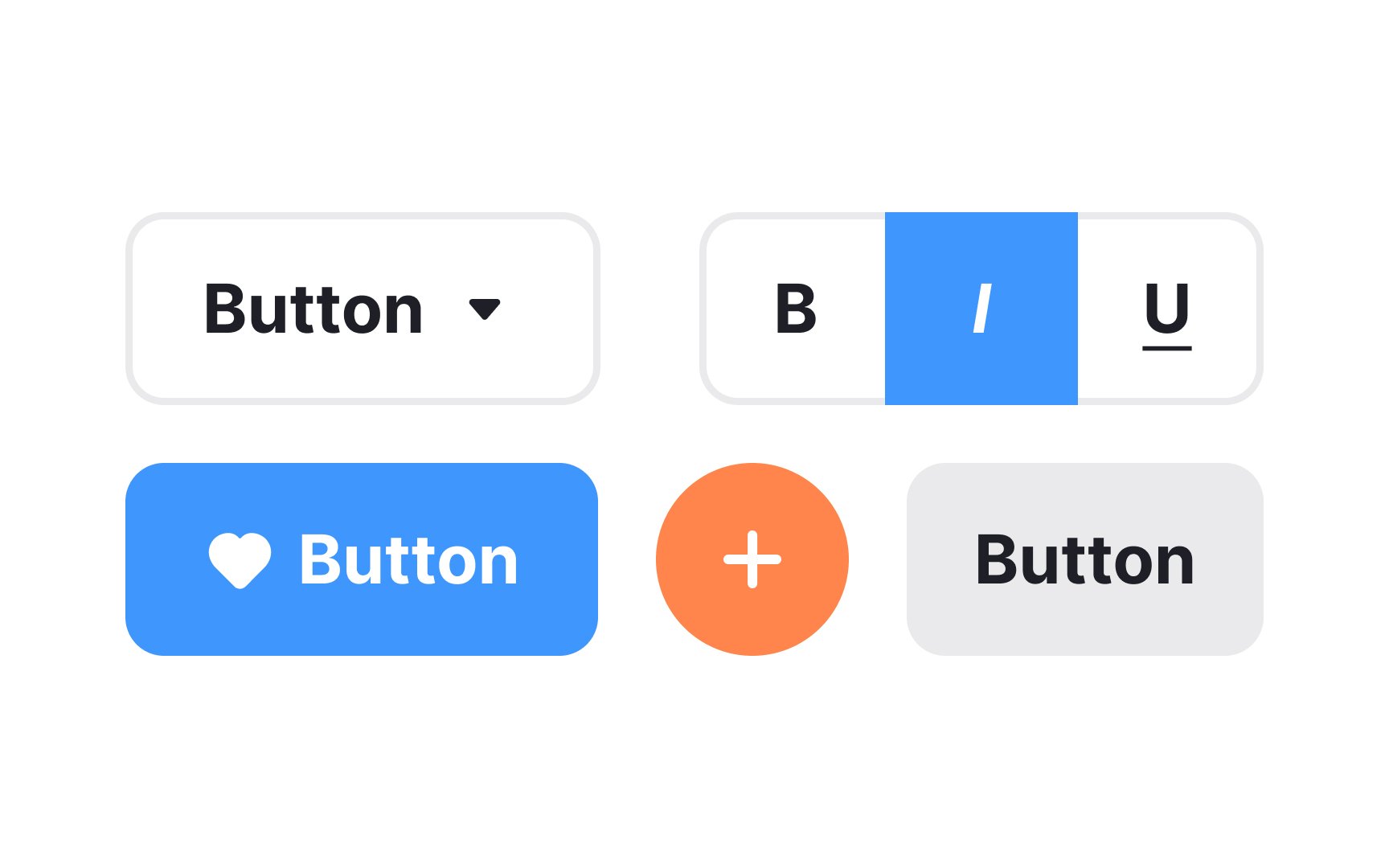
A button can also be represented solely by an icon or label. Text buttons and

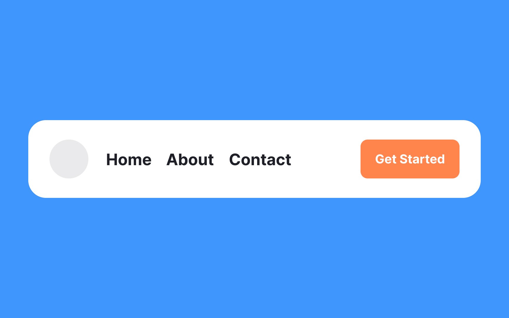
Navigation is the system of how users can move through an app or a website. A product's navigation should be consistent across all pages.
Navigation may include various navigational components, for example:
- Navigation bars
- Sidebars
- Breadcrumb trails
- Menus
- Other features that help users find what they need

The hamburger menu is a
The icon serves as a compact way to hide navigation
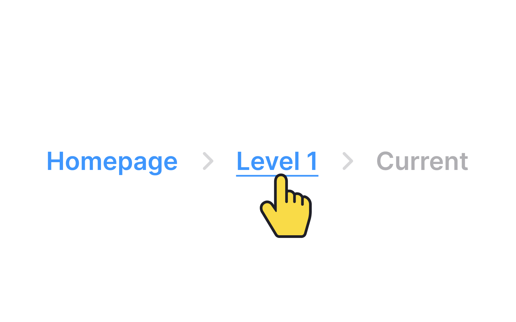
Breadcrumbs are a secondary
The last item in the breadcrumb should stand out from the rest because it marks the user’s current
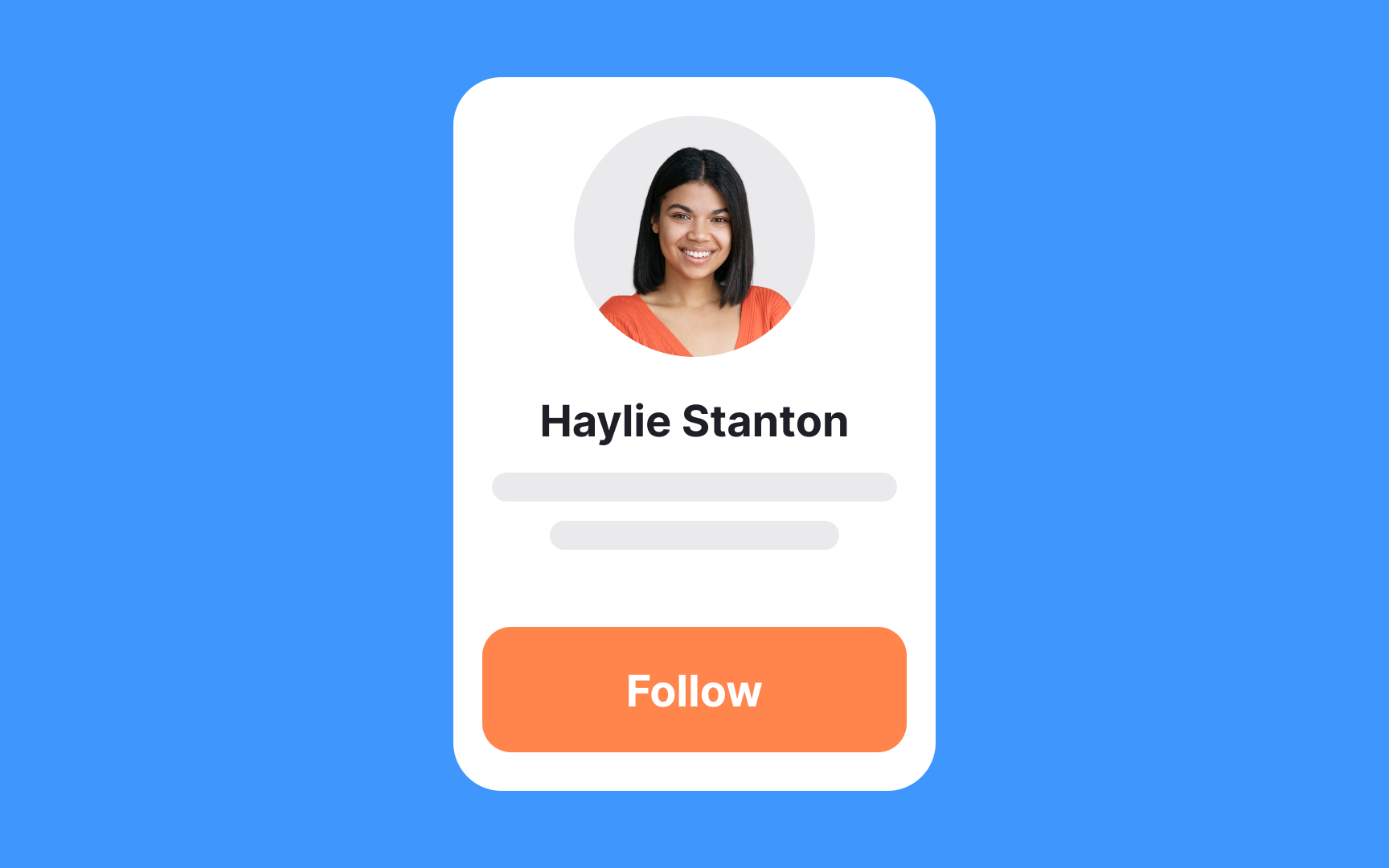
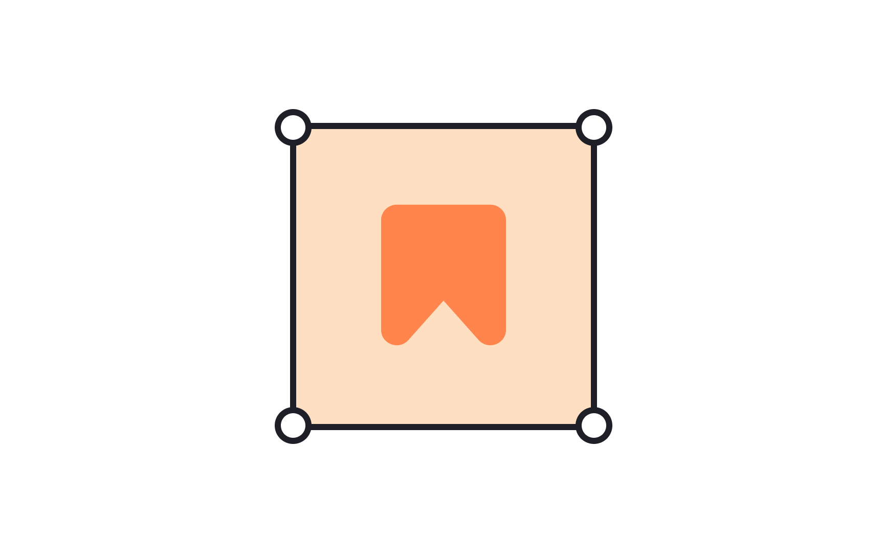
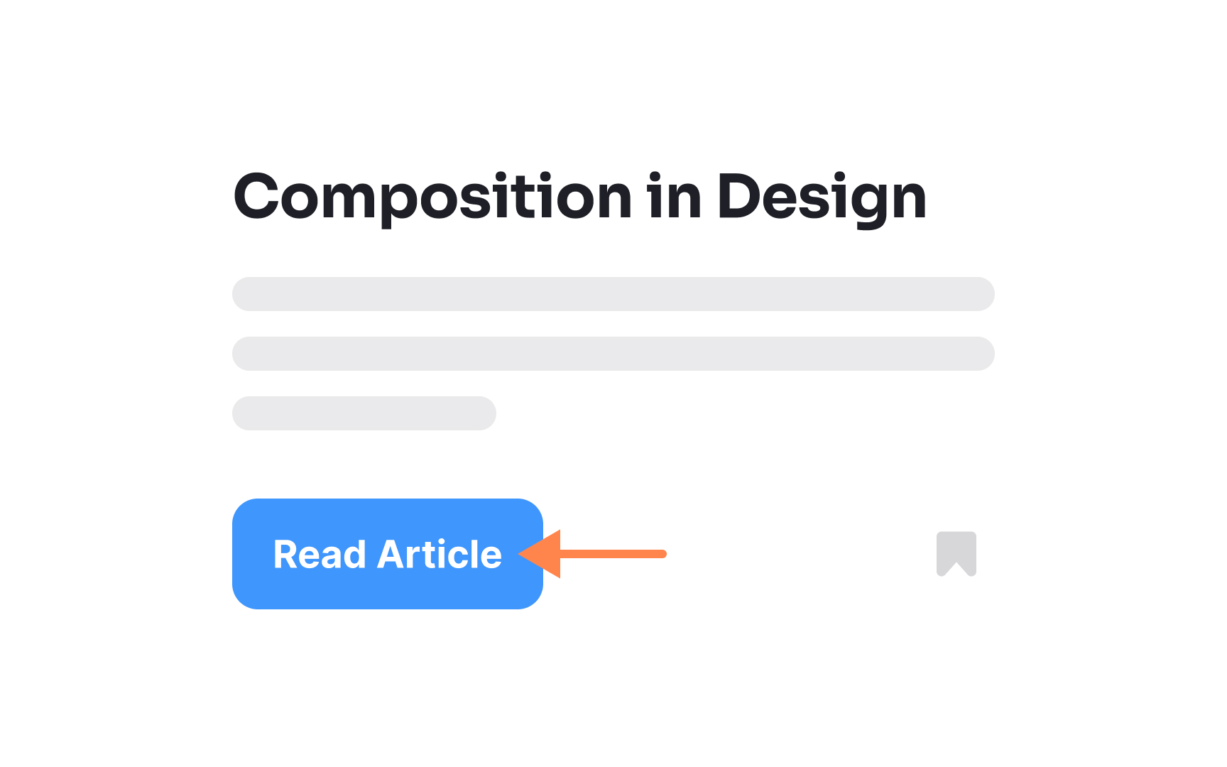
A card is a UI component that contains content and actions about a single subject. Cards in UI resemble trading cards in real life — they're rectangular and often include an image and some text. They may also contain interactive elements such as Learn More or Read More
Pinterest is an excellent example of a website leveraging cards to the fullest extent.
In contrast to
A
Containers can hold text,
A
The beauty of menus lies in their efficiency: they pack a multitude of options into a compact space, keeping the interface clean and easy to navigate. This makes them invaluable for both desktop and mobile designs where real estate is at a premium.
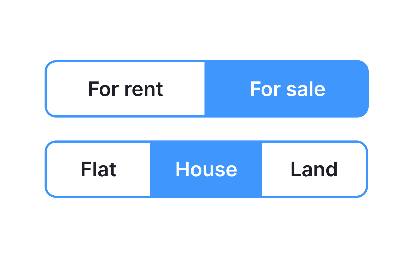
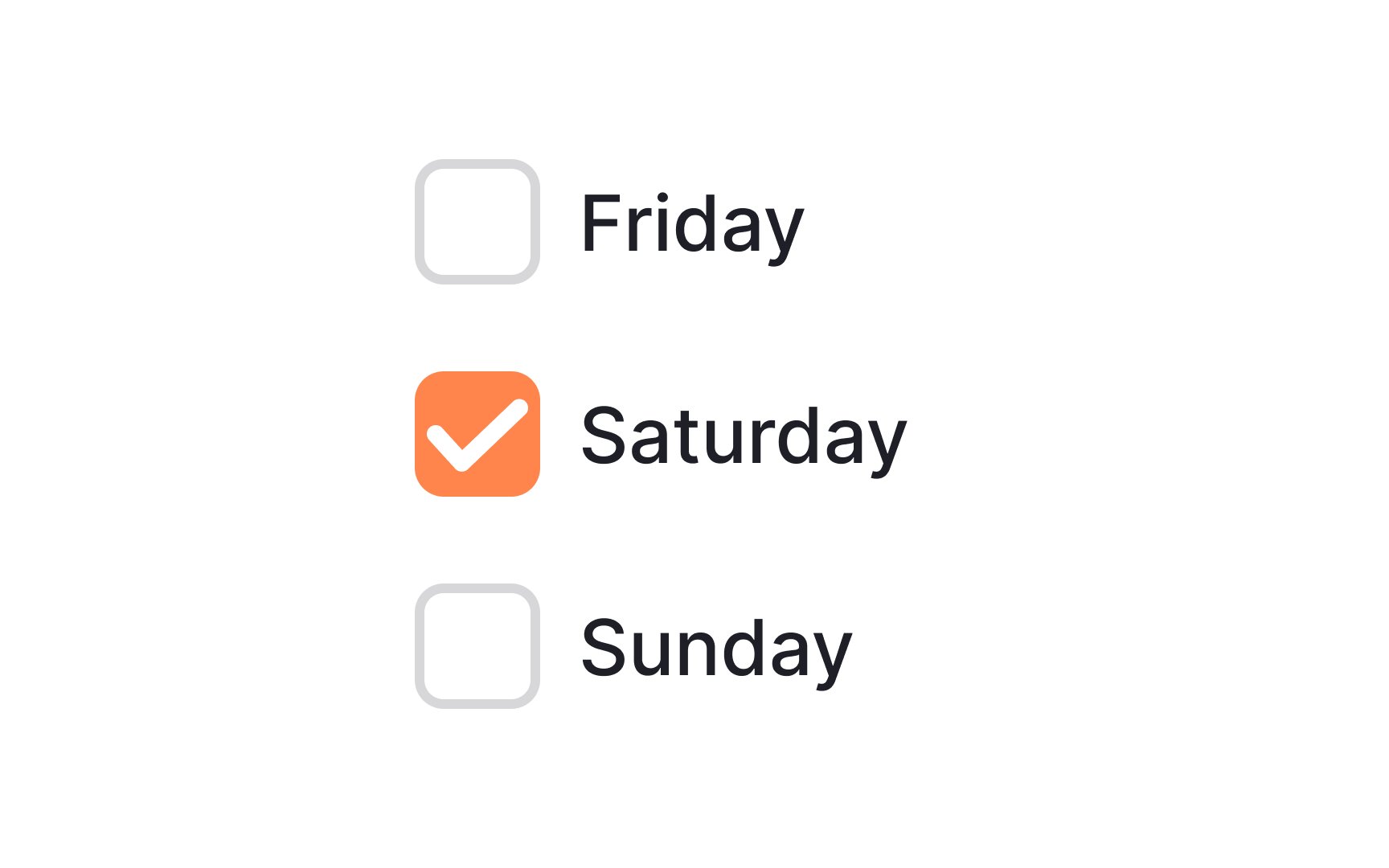
Toggle
All buttons are usually equal in width. They behave like
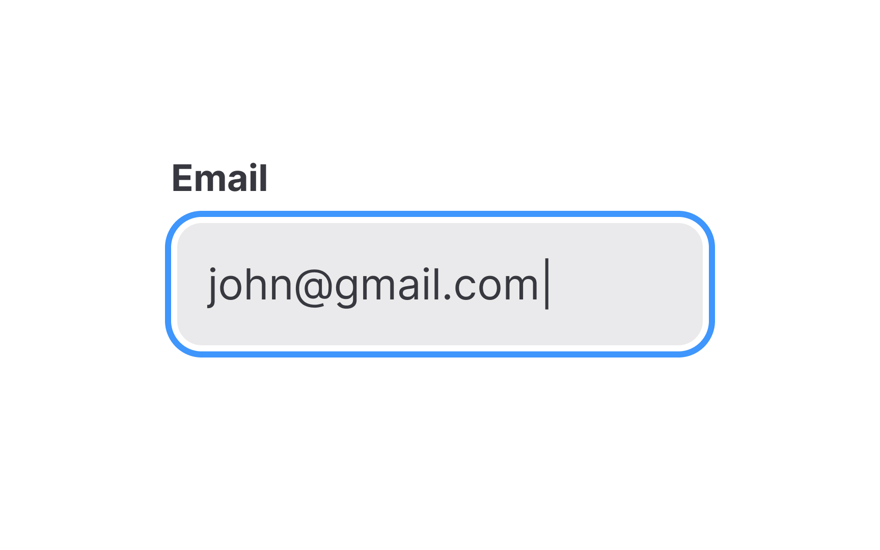
Input fields, commonly referred to as "
Their purpose is straightforward: to collect information in a way that's efficient and user-friendly. Inputs come in many flavors, catering to different data types and user needs. They can include text boxes for general information, password fields that obscure entered text, or specialized fields for dates and numbers.
The key to effective use of inputs is clarity and context;
A label is a static piece of text that people can read and copy but not edit.
Unlike
A


Similar lessons

Common UI Component Definitions I

Image Terminology
