<?xml version="1.0" encoding="utf-8"?>

Products accumulate layers of content over time, prepared by different teams with varying goals, creating a patchwork of inconsistent messaging that confuses users and dilutes UX impact. A systematic audit transforms this disorder into actionable intelligence, exposing duplicate content that wastes resources, contradictory instructions that frustrate users, and gaps where critical information is missing.

When done well, audits don’t just list content — they diagnose problems. They show which content helps users convert and which creates friction. This evidence forms the basis for smarter product strategy and better user experience decisions.

Exercise #1

What are content inventories and audits

Content inventories and audits serve different but complementary purposes in building content design systems. An inventory is a comprehensive catalog that documents what content exists, where it appears, and its basic attributes like format, owner, and last update date. Think of it as creating a map of your content landscape.

A content audit evaluates the quality and effectiveness of that content. It assesses whether content meets user needs, adheres to heuristic principles, aligns with brand voice, and achieves business objectives. An inventory tells you what’s there; an audit tells you how it’s performing.[1]

Both processes are essential for content design systems. Inventories reveal the scope of content that needs systematization, while audits help prioritize which content patterns deserve standardization first based on their impact and current performance.

Exercise #2

Define the scope

Start by identifying content that belongs in a system versus content that remains unique. System-worthy content appears multiple times across your product: button labels, error messages, form instructions, empty states, and confirmation dialogs. Create a simple rule: if content appears in 3 or more places or follows a predictable pattern, it belongs in your audit scope.

Choose specific product areas for your initial audit. Rather than attempting everything at once, select one complete user journey like checkout, onboarding, or account management. This focused approach provides quick wins and learnable insights. Document exactly which screens, features, and parts of your product you'll review, creating clear boundaries for your team.

Establish what's explicitly out of scope to prevent sprawling in every direction. Marketing copy, one-off announcements, and long-form help articles typically don't need systematization. Create a scope matrix with 3 columns: "In scope," "Out of scope," and "Revisit later." This keeps everyone aligned throughout the audit process.

Exercise #3

Choose your inventory methods

Select inventory methods based on your content's location and volume. When your team keeps Figma as the single source of truth, audits are much easier — you just copy flows into an audit file. But if stakeholders make live changes without updating Figma, discrepancies creep in and your audit quickly loses accuracy. For content in code repositories, export string files or localization documents that contain all interface text. Most modern frameworks store customer-facing UI content in JSON or XML files, making bulk extraction straightforward. For CMS-managed content, use database exports or API calls to pull content systematically.

When technical exports aren't possible, use systematic manual collection. Navigate through your defined scope, screenshotting each screen and documenting every piece of content on a whiteboard or in a spreadsheet, depending on whether you prefer a visual layout or a more structured database-style approach. Include the content string, its location, when it appears, and any relevant context. This manual method takes longer but ensures you capture everything that’s actually live and up to date, not left outdated in a file or buried in the wrong place in code..

Combine both approaches for comprehensive coverage. Export what you can, then manually verify and supplement with content that only appears under specific conditions. This hybrid method catches edge cases like error states, empty states, and conditional messaging that automated exports might overlook.

Exercise #4

Categorize your content

When organizing your content inventory, start by grouping items by touchpoints: notifications, the app, the website, or the admin side. Within each touchpoint, further categorize content by the part of the product it appears in — onboarding flows, payment processes, savings features, and so on. This helps you understand how content behaves in different contexts and identify areas that need closer attention. Finally, organize content by design elements such as modals, banners, empty states, tooltips, and buttons. For each element, document variations in how messages are expressed — for example, success banners might read “Saved successfully,” “Your changes have been saved,” or “Update complete.” Capturing these differences reveals inconsistencies and highlights which versions perform best.

Adding metadata like user journey stage, emotional tone, and technical complexity further enriches your analysis. These tags make it easier to spot patterns — like overly technical messages in beginner flows or inconsistent urgency across similar actions — giving your team the insight needed to improve consistency and effectiveness across the product.

Exercise #5

Identify patterns and inconsistencies

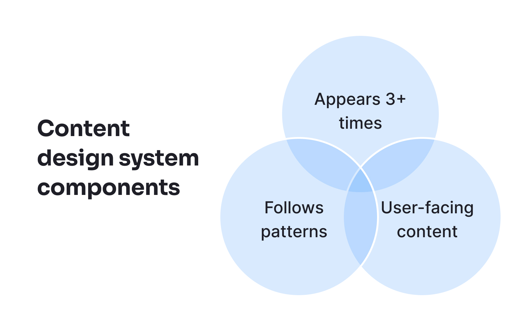
Analyze your categorized content to identify recurring structures and formulas. Look for patterns in how your product communicates similar concepts. Error messages might follow "Please [action] + [requirement]" while success messages use "[Item] + [past tense verb] + successfully." Document these implicit patterns that evolved organically across your product.

Compare pattern usage across different product areas. You might discover that onboarding messages are conversational (”Let's set up your first card") while account settings errors are formal ("Invalid input. Please review entry."). These inconsistencies often point toward different teams working on the same things or lack of guidance.

Extract the most effective patterns based on user comprehension and task completion data. If available, review support tickets, user feedback, and A/B testing to identify which patterns cause confusion versus those that work well. Create a pattern library showing the formula, good examples, contexts for where it works best, and metrics that prove its effectiveness.

For example:

  • Pattern found: Error messages using questions ("Did you forget your password?")
  • Performance: 40% more password reset completions than statements
  • New standard: Use questions for recoverable user errors

Exercise #6

Evaluate against standards

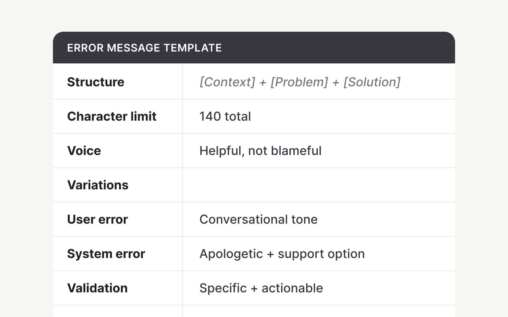
Establish clear criteria to measure content against your existing style and quality standards. Check each content piece against grammar, punctuation, capitalization, and formatting, as well as your voice and tone guidelines. Evaluate whether it supports the user experience: Does this error message help users recover from mistakes without being confusing or patronizing? Do button labels clearly communicate actions while reflecting your brand personality? Create a checklist mapping voice attributes (clear, confident, human) to measurable content qualities, and score each item not just on style, but also on clarity, usefulness, and consistency for the user.

Set technical criteria based on platform constraints and research. Define character limits for each component type like button labels, error messages, tooltips. These limits ensure content displays properly across devices and maintains scanability. Document where limits come from, iOS truncation, research on cognitive load, or accessibility requirements, so teams understand the rationale behind your decisions.

Align evaluation with broader content strategy goals. If your strategy prioritizes self-service support reduction, evaluate whether help content truly prevents errors. If internationalization matters, check for cultural idioms or text expansion issues.

Exercise #7

Design component structures

After completing your content audit, you can start creating templates for design components that designers can reuse across the product. These templates embed content hierarchy and requirements directly into the components, ensuring that content is applied consistently, clearly, and effectively. By defining rules for structure, tone, and usage up front, you make it easier for teams to deliver messages that are both clear and aligned with your content requirements. Take badges as an example. Identify the most common badge types — status indicators, category labels, or feature tags — and define guidance for each:

  • Length limit: Keep badges concise (1–3 words) for readability.
  • Capitalization: Title ****Case ****vs Sentence case.
  • Guidance: When a badge is appropriate versus using a tooltip or inline text for additional context.

For example, a status badge might read:

  • Text: “Active”
  • Tone: neutral and clear
  • Use case: Appears on dashboard items to show current status; if more detail is needed, provide it via a tooltip.

Document variations carefully. Contextual badges (“New,” “Beta”) differ from functional badges (“Error,” “Success”). Finally, clarify relationships with other components. Badges can appear inside cards, tables, or alongside buttons, but not all combinations work. Explicit guidance ensures templates remain consistent, scalable, and user-friendly across the product. These templates for design components can live in Figma right in the design system document, enriching it and raising its effectiveness.

Complete this lesson and move one step closer to your course certificate