Accessibility & Inclusion Standards
Design inclusive interfaces that empower all users to interact confidently with Apple devices.
Accessibility transforms Apple devices into powerful tools for everyone, regardless of their abilities or circumstances. These foundational principles ensure that every user can navigate, interact, and enjoy Apple's ecosystem with dignity and independence. From VoiceOver's sophisticated screen reading to Switch Control's precision, accessibility features show how thoughtful design removes barriers.
Dynamic Type adapts text for better readability, while AssistiveTouch makes complex gestures accessible through simpler alternatives. Every interface element can be adjusted to match user needs, creating experiences that adapt to different ways of seeing, hearing, and interacting. These adaptations happen seamlessly, maintaining the elegance of Apple's design language.
Color choices go beyond aesthetics to ensure critical information remains clear for users with different types of color vision. Every accessibility feature reflects a deep understanding of diverse human needs and capabilities. This thoughtful approach shows how inclusive design enhances the experience for all users, not just those with disabilities.
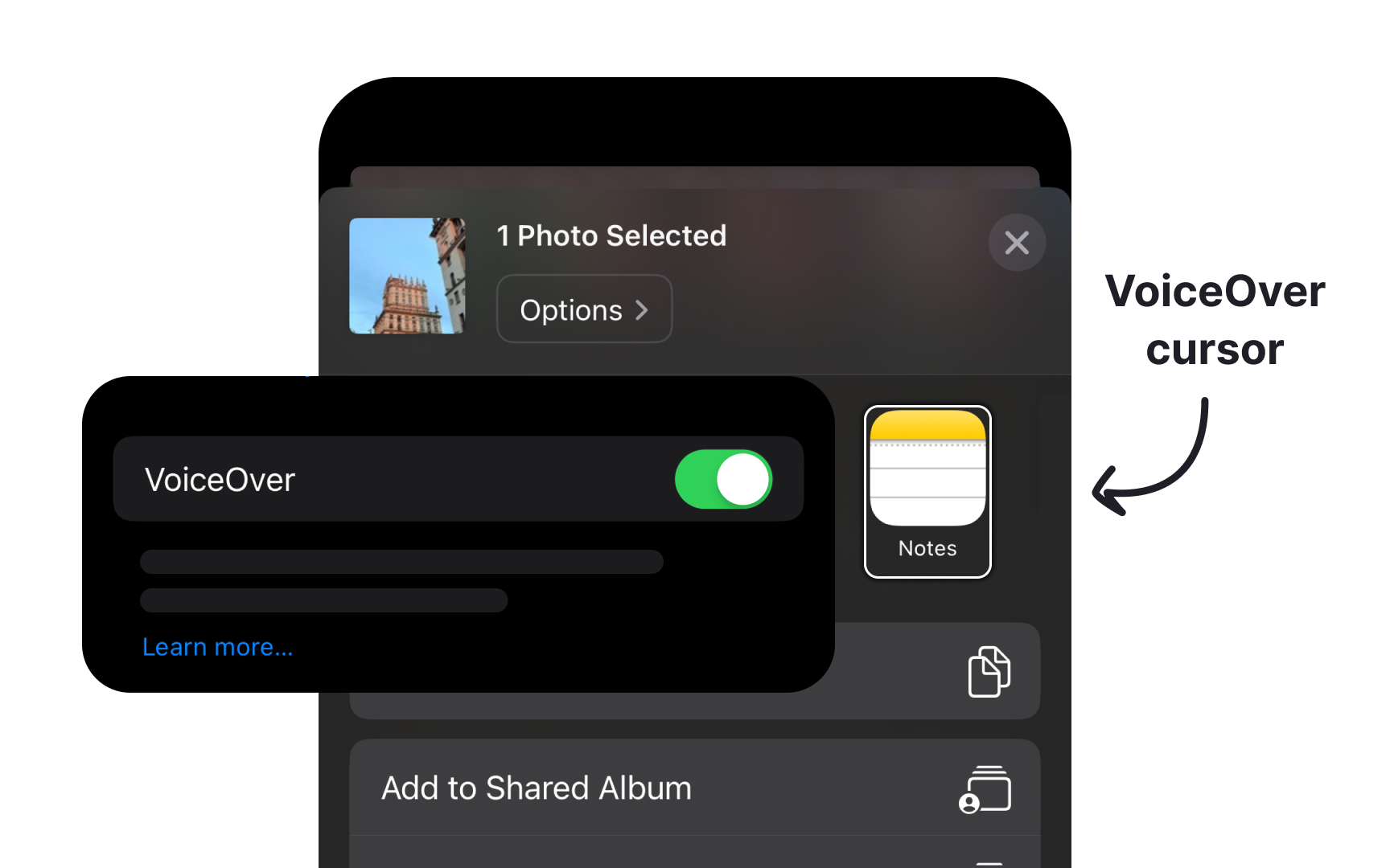
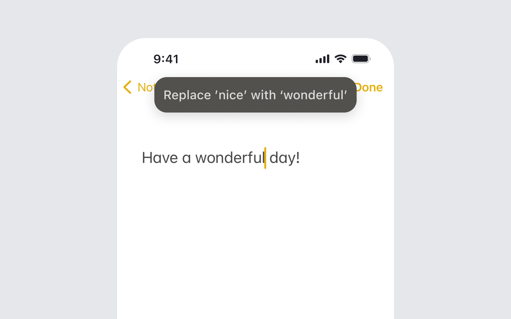
VoiceOver transforms visual interfaces into spoken descriptions, requiring proper content structure and
Follow the essential guidelines for VoiceOver support:
- Create concise labels that clearly identify each element's purpose, like "Add to cart" or "Search products"
- Provide enough context about interactions when needed, such as "Double tap to open shopping cart"
- Define element behaviors to indicate if it's a button, header, or another control type
- Communicate current states or data, like "3 of 5 stars" or "2 items selected"
- Provide clear navigation by arranging elements in a logical left-to-right, top-to-bottom pattern that matches the visual layout
- Group-related interface elements to help users build a clear mental model
- Announce error states and provide specific guidance for correction[1]
Dynamic Type adjusts text size across apps to match users' preferences. This feature ensures
Follow these essential guidelines for Dynamic Type implementation:
- Use system text styles like headline, body, or caption to maintain a consistent visual hierarchy
- Enable text scaling to automatically adjust font sizes based on user preferences
- Test different text sizes from smallest to largest
accessibility settings to ensure properlayout - Maintain proper spacing between UI elements as text size changes to prevent overlapping
- Set appropriate line heights to ensure comfortable reading at all text sizes
- Consider stack views for automatic layout adjustments when text size changes
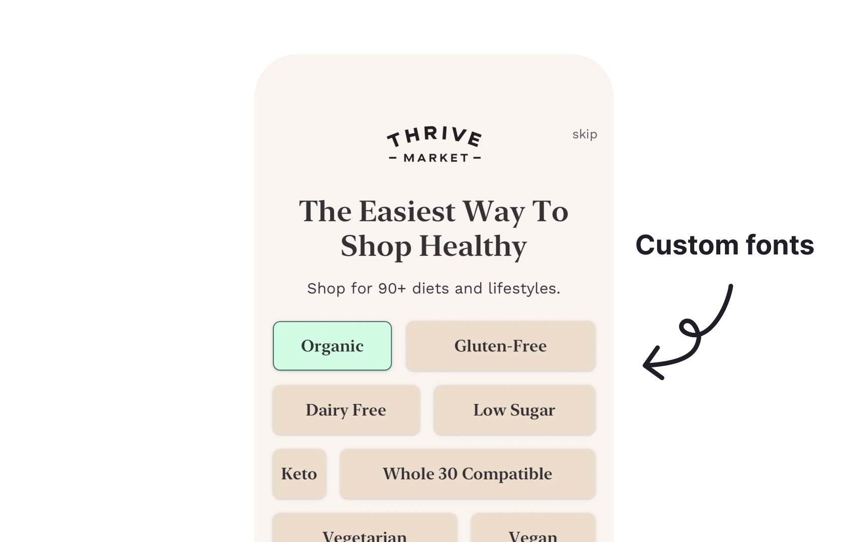
- Implement custom fonts with the appropriate scaling metrics to work seamlessly with Dynamic Type
- Preserve content hierarchy by maintaining relative size differences between text styles[2]
Pro Tip: Test your app with both minimum and maximum text sizes simultaneously using side-by-side comparison in the iOS Simulator.

Motion effects in interfaces can trigger discomfort or disorientation for some users. iOS provides a Reduce Motion setting that minimizes animations, parallax effects, and automatic media playback to create a more comfortable experience. When users enable Reduce Motion, apps should replace animations with simpler transitions. Instead of sliding or bouncing effects, use cross-fades or static transitions. Complex animations should transform into subtle visual changes that convey the same information without excessive movement.
Key interface elements like scroll indicators and progress bars should remain functional but with minimal motion. For video
Pro Tip: Test your app with Reduce Motion enabled to ensure all interface transitions remain clear and understandable.
Audio and haptic feedback create a natural, physical response to interface
Essential guidelines for implementing feedback:
- Use standard patterns purposefully: Success patterns for completed actions, error patterns for issues, selection patterns for interface changes
- Consider feedback types: Transient events feel like brief taps (
button presses), while continuous events create sustained vibrations (scrolling limits) - Match haptics with visuals: Sync the intensity of haptics with
animations and transitions for a cohesive experience - Combine with audio thoughtfully: Pair subtle vibrations with success sounds for completed tasks, sharp haptics with warning tones for critical errors
- Avoid overuse: Frequent vibrations become tiresome, while well-timed feedback enhances the experience without being noticeable
- Respect system settings: Ensure feedback remains optional and functions properly when sound is muted
- Test with users: Find the right balance of feedback that enhances rather than disrupts the experience[5]
Pro Tip: Test your app with sound off to ensure haptic feedback alone provides clear interaction cues.

AssistiveTouch helps users who have difficulty with physical
Consider how users with limited mobility will interact with your app through AssistiveTouch:
- Replace complex gestures: Provide single-tap alternatives for pinch, rotate, or multi-finger gestures
- Support custom actions: Ensure interface elements work with AssistiveTouch menu shortcuts
- Design clear targets: Make interactive elements large enough for comfortable tapping
- Avoid gesture dependencies: Offer alternative ways to access features that rely on specific gestures
- Test edge cases: Ensure custom gesture recognizers don't conflict with AssistiveTouch
Remember that users might combine AssistiveTouch with other accessibility features like VoiceOver or Switch Control for complete device access.[6]
Pro Tip: Test your app using AssistiveTouch to complete core tasks, ensuring all features remain accessible through single taps.
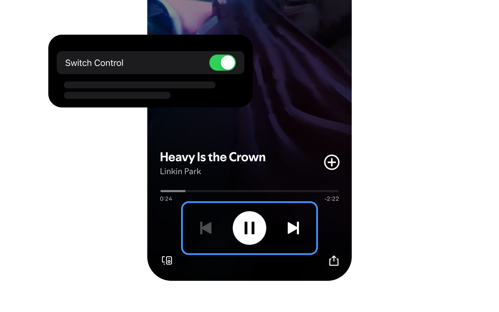
Switch Control helps people with severe physical disabilities or motor impairments navigate interfaces using adaptive switches, mouth sticks, external
Proper implementation ensures your app works seamlessly with Switch Control:
- Group-related elements: Create logical groups of interface elements to minimize the number of selections needed
- Define clear focus order: Establish a predictable
navigation path through interface elements - Optimize selection time: Place frequently used actions within easy reach to reduce navigation steps
- Support auto-scanning: Ensure all interactive elements work correctly when automatically highlighted
- Provide visual feedback: Make focus indicators clear and visible against any background
Remember that people using Switch Control rely on precise timing and clear visual indicators to navigate interfaces effectively.[7]
Pro Tip: Time yourself using Switch Control in your app; if basic tasks take too long, reconsider your interface grouping.
Media
Make your media content accessible:
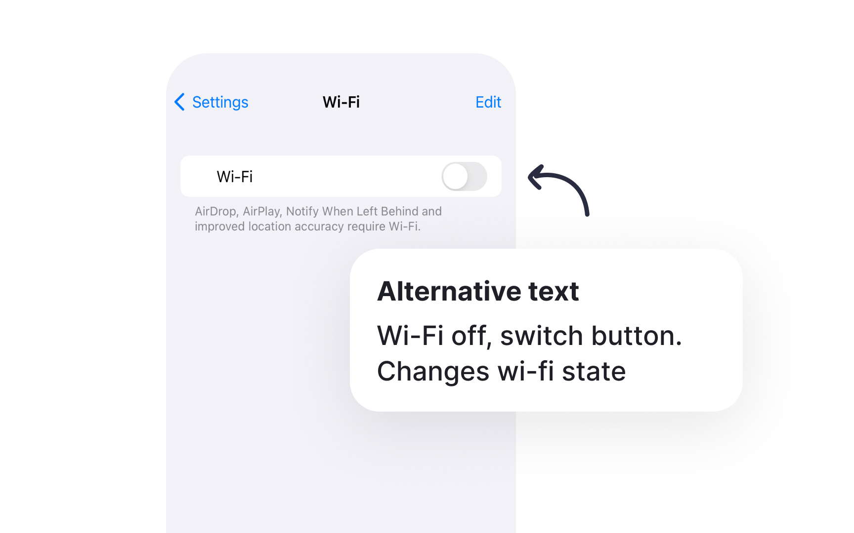
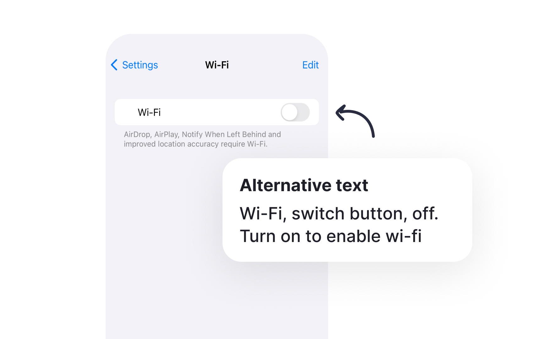
- Add text alternatives: Provide clear descriptions for images and
icons that convey their purpose and meaning - Include closed captions: Create accurate, synchronized captions for all video content, including speaker identification
- Offer audio descriptions: Narrate important visual information for people who are blind or have low vision
- Support transcripts: Provide text versions of audio content for people who are deaf or hard of hearing
- Control media playback: Include pause, rewind, and volume controls for time-based media
- Avoid autoplay: Let people choose when to start media playback to prevent unexpected sounds or motion[8]
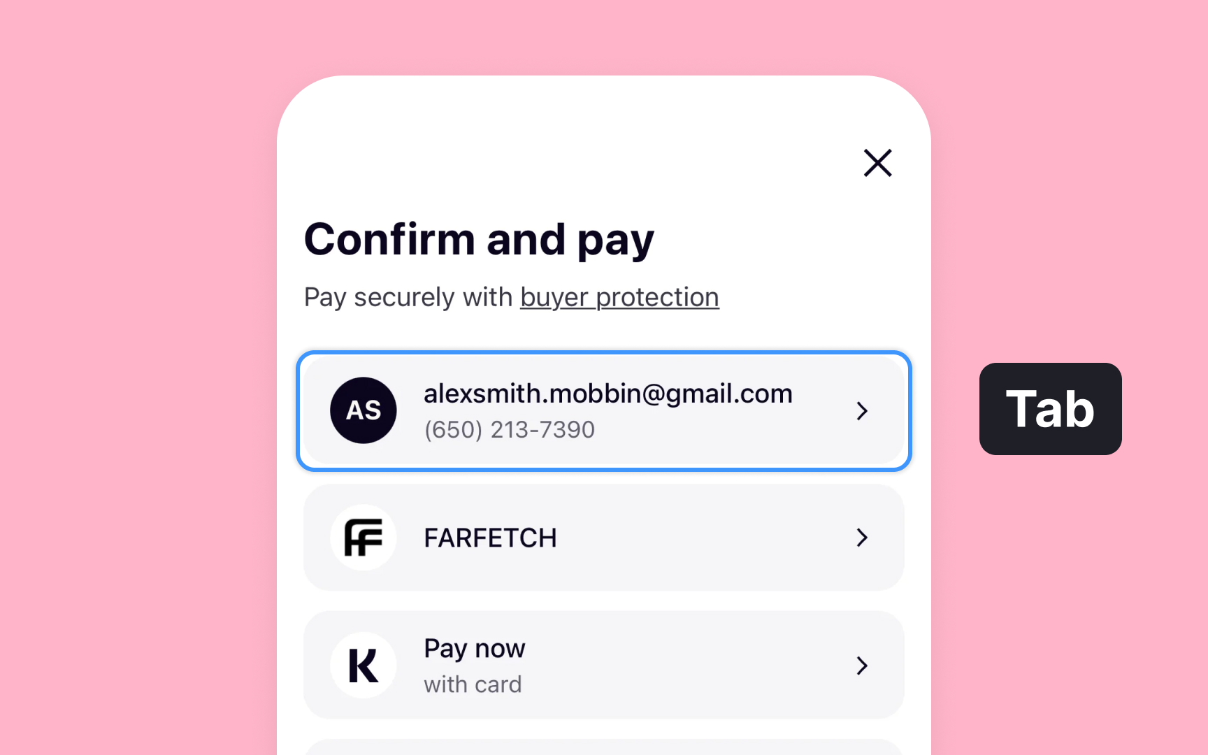
Keyboard
Support comprehensive keyboard interactions:
- Enable full navigation: Allow moving through all interactive elements using the Tab key
- Show focus indicators: Make the currently selected element clearly visible with a prominent outline
- Maintain logical order: Ensure tab order follows the visual
layout andcontent hierarchy - Support system shortcuts: Implement standard commands like Cmd+F for
search on iPad keyboards - Add custom shortcuts: Create intuitive keyboard commands for frequently used app features
- Preserve touch features: Keep touch interactions working alongside keyboard navigation
Remember that when an external keyboard is connected to an iPad or iPhone, holding the Cmd key displays an overlay with available keyboard shortcuts.[9]
Pro Tip: Test your app with an external keyboard to ensure all features remain accessible without touch input.
Voice Control transforms
Essential guidelines for Voice Control support:
- Label interface elements: Name
buttons and controls with clear, pronounceable terms that make sense when spoken - Avoid duplicate names: Give each interactive element a unique name to prevent confusion between similar commands
- Structure hierarchically: Organize
content with proper headings and regions for easynavigation by voice - Enable all actions: Ensure every tap, swipe, or
gesture has a voicecommand alternative - Provide feedback: Confirm voice commands through visual indicators or system sounds
- Test voice interactions: Verify that spoken commands match your interface
labels
Remember that Voice Control should provide complete access to your app's functionality without requiring touch input.[10]
Pro Tip: Test your app using Voice Control to complete common tasks, noting which commands feel natural to speak.
Cognitive
Follow these principles to enhance cognitive accessibility:
- Simplify interactions: Present one primary action at a time to help maintain focus and reduce overwhelm
- Maintain consistency: Keep interface patterns familiar for people who rely on routine and predictability
- Provide clear feedback: Help people with memory differences track their actions and current state
- Allow ample time: Support people who need more time to read, process information, or make decisions
- Minimize distractions: Remove unnecessary
motion that might disrupt focus or trigger sensory sensitivities - Support memory: Aid people with short-term memory differences through clear hints and visual cues
- Allow customization: Let people adjust the interface to match their cognitive processing needs
Remember that clear, focused interfaces benefit everyone, making apps more intuitive and less mentally taxing.[11]
References
- Supporting VoiceOver in your app | Apple Developer Documentation | Apple Developer Documentation
- Get started with Dynamic Type - WWDC24 - Videos - Apple Developer | Apple Developer
- Accessibility | Apple Developer Documentation | Apple Developer Documentation
- Accessibility | Apple Developer Documentation | Apple Developer Documentation
- Playing haptics | Apple Developer Documentation | Apple Developer Documentation
- Accessibility | Apple Developer Documentation | Apple Developer Documentation
- App accessibility for Switch Control - WWDC20 - Videos - Apple Developer | Apple Developer
- Accessibility | Apple Developer Documentation | Apple Developer Documentation
- Keyboards | Apple Developer Documentation | Apple Developer Documentation
- Voice Control | Apple Developer Documentation | Apple Developer Documentation
- Cognitive | Apple Developer Documentation | Apple Developer Documentation
Topics
From Course

Images provided by

Share


Similar lessons

Intro to Accessibility

Inclusive Design Basics
