Android App Design
Get familiar with the essential Material Design Guidelines you need to know while building an app for Android
Android's open-source ecosystem presents unique design opportunities and challenges for mobile designers. Material Design, Google's design language, establishes the foundation for creating intuitive and visually cohesive Android applications. The platform's flexibility enables designers to craft experiences across various device types while maintaining consistent interaction patterns and visual hierarchy.
Understanding Android-specific design principles helps create apps that feel native to the platform, from navigation patterns and typography to component behavior and motion design. Material Design's emphasis on physical surfaces, meaningful motion, and adaptive layouts guides designers in creating apps that delight users while maintaining platform consistency. Through thoughtful implementation of Android design patterns, designers can build applications that seamlessly integrate with the operating system's core functionalities and meet users' expectations for fluid, responsive interactions.
Device manufacturers customize Android's appearance and functionality through custom software overlays, called UI skins. Samsung's One UI, Sony's Xperia UI, and Google's Pixel UI represent distinct interpretations of the Android platform. These manufacturer-specific modifications create unique design considerations for each Android variant.
Designers must account for these different Android implementations when creating applications. Each app's interface should maintain consistency with the underlying system UI while adhering to Material
The
The versatility of Android extends far beyond mobile devices. Smart home systems, automotive interfaces, and entertainment devices leverage Android's adaptable architecture to create specialized experiences. This flexibility enables manufacturers to optimize the operating system for specific use cases, from voice-controlled displays to car infotainment systems.
Connected devices require robust mobile interfaces for control and monitoring. Android's widespread adoption has fostered a rich ecosystem of companion apps that bridge the gap between traditional mobile interfaces and emerging smart device categories. This interconnected environment demands thoughtful design considerations for seamless cross-device experiences.
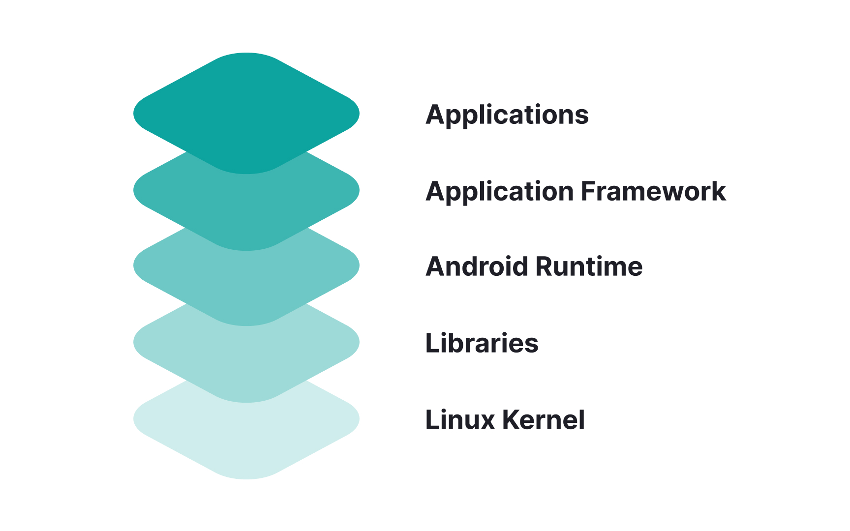
Android architecture, or the Android stack, consists of 5 layers:
- Linux Kernel exists at the root of
Android architecture. The kernel handles device drivers, power, memory, device management, and resource access. - Native Libraries like WebKit, OpenGL, FreeType, and others are on top of the Linux Kernel. They support browsers, fonts, databases, video, and audio.
- Android Runtime provides the base for the application framework and powers applications with the help of the core libraries.
- Application Framework includes Android
UI , telephony, resources, locations, data, and package managers. It provides a lot of classes and interfaces for android application development. - Applications form the top layer of the Android stack. Pre-installed apps like home, contacts, camera, and third-party apps like social networks will be installed on this layer.
Average Android users primarily interact with the Applications layer when using apps (making phone calls, surfing the internet, etc.). The layers further down are usually just accessed by developers.
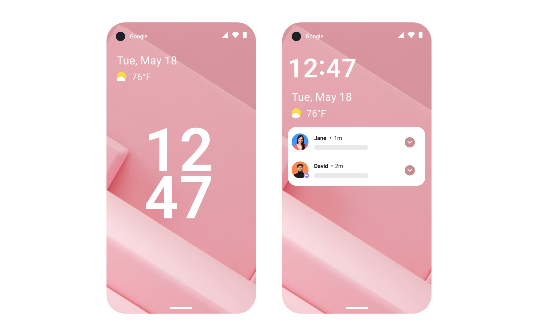
- Home screen: Android’s Home screen doesn't follow a rigid
layout , so users can arrange app icons in any chosen pattern. They can also add widgets, calendars, different time displays, and other features. - Launcher Apps: Apps like Nova and Niagara allow users to change the look of Android completely. For example, they allow users to add more icons to the dock, have wallpapers that change over time, or use custom
navigation gestures. - Default apps: Users can set a default app for many tasks: messaging, emailing, browsing, typing, and calling.
- Dual messaging: Samsung offers Dual messenger on their dual-SIM Android phones. It lets you use two different accounts with one chatting app like WhatsApp or Viber.
- Installing apps without the Play Store: Android allows users to install apps through third-party app stores like Amazon's App Store or manually by downloading APKs.
- Android rooting: Rooting an Android device gives users unrestricted access to the system files so that they can modify the software code. However, many apps (like banking apps, Google Pay, and some games) may not work on rooted devices due to security concerns. It also voids warranties on most devices and can lead to system instability if done incorrectly.
- Bottom navigation bars facilitate movement between 3-5 primary destinations within an app. They remain consistently visible at the screen's bottom, allowing users to switch between main sections like Home, Search, or Profile with a single tap. This pattern works well for apps with clearly distinct top-level sections.
- Tabs organize peer content or views within the same hierarchy level. Different tab implementations include fixed tabs (showing all options simultaneously) and scrolling tabs (for larger sets of options). Tabs work best when users need to switch frequently between related categories or views.
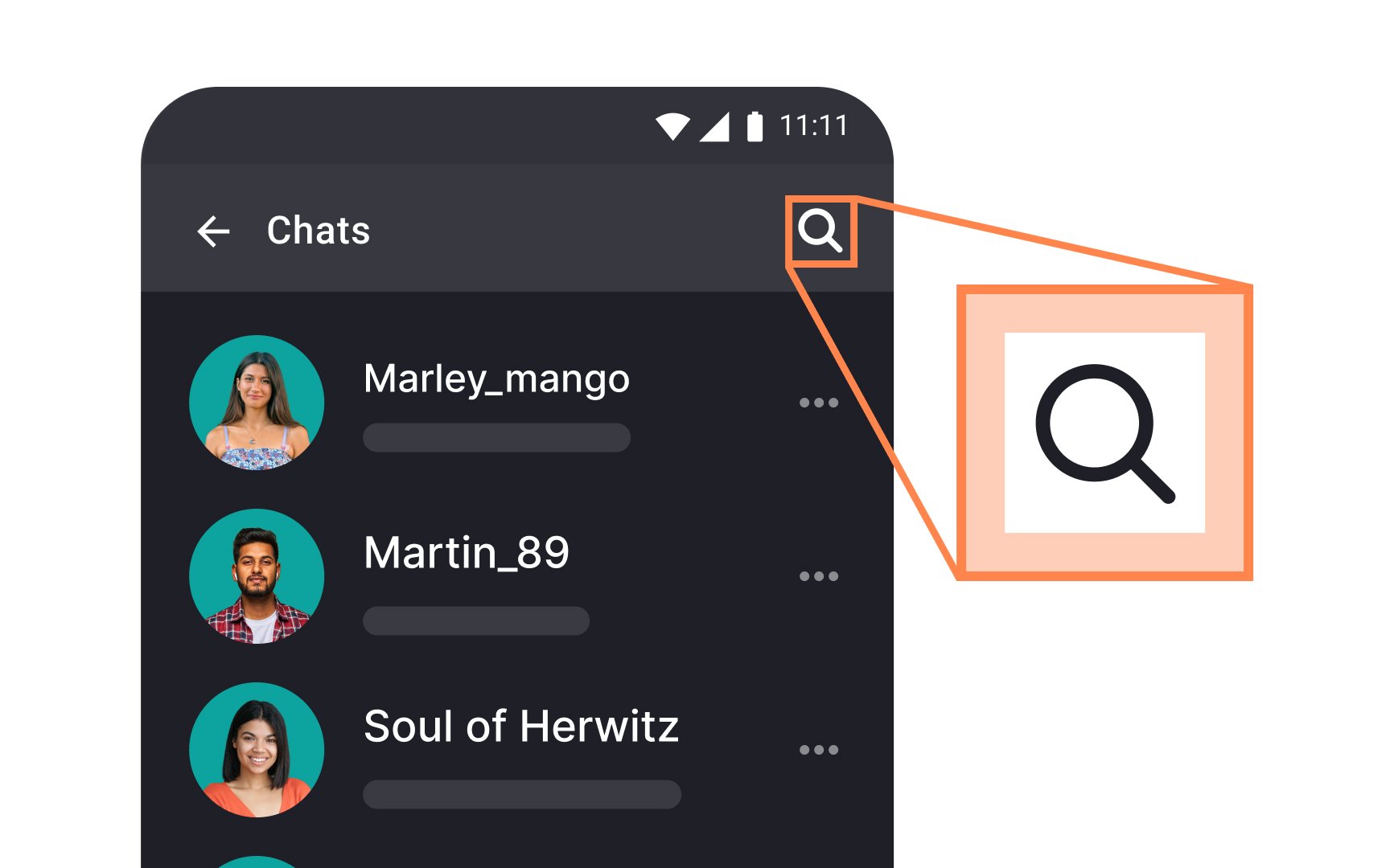
- The hamburger menu, or navigation drawer, contains supplementary navigation options that don't require constant visibility. This component typically slides in from the left edge, housing secondary features like Settings, Help, or Account Management. The menu
icon (☰) serves as a consistent access point across Android applications.
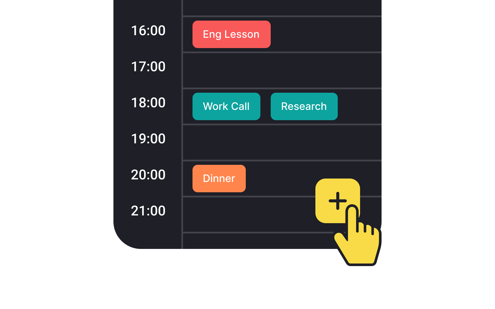
The floating action button (FAB) highlights the most important primary action on an
There are 3 FAB sizes to accommodate various
The button can be aligned left, center, or right, and positioned either above the
Note that touch targets extend beyond the visual bounds of an element. For example, an
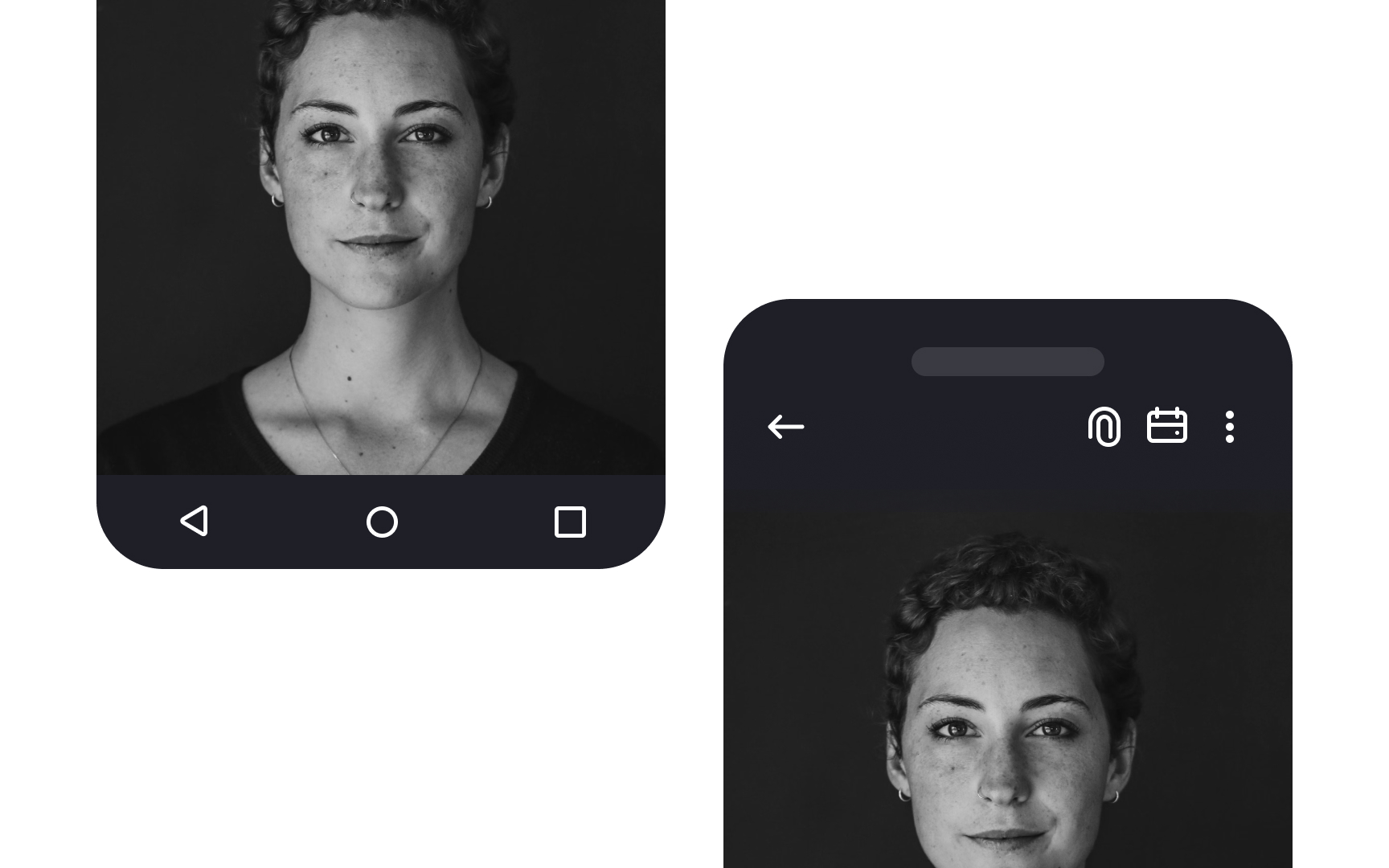
The Back
Back navigation follows a straightforward path through the user's recent screens. Each press of the Back button returns users to their previous screen, continuing until they reach the Home screen. This creates an intuitive way for users to retrace their steps through apps and system screens.
Some apps include an additional Back arrow in their top bar for specific navigation patterns. For example, Gmail uses this to help users return from a message to their inbox. This in-app back option works alongside the system Back button to provide clear navigation paths.
Tabs maintain a peer relationship, appearing side-by-side to show equal hierarchy level. While the interface can accommodate multiple tabs through horizontal scrolling, each tab should represent a distinct content category rather than sequential content. For example, music genres, product categories, or filter options work well as tabs.
Tab design focuses on clarity and scannability. Labels can combine

Roboto and Noto are the default typefaces on
Roboto has been refined extensively to work across a wider set of supported platforms. It's similar to iOS's San Francisco but has taller letterforms and a bit more breathing room. Noto's vertical metrics are compatible with Roboto.
Designers can also use custom
References
- FAB – Material Design 3 | Material Design
- Tabs – Material Design 3 | Material Design
- Typography – Material Design 3 | Material Design
Top contributors


Topics
From Course

Images provided by

Share


Similar lessons

Designing for Mobile Interfaces

Responsive vs. Adaptive Design
