Figma Right & Left Sidebars
Discover the functionalities present in Figma’s right and left sidebars.
Figma features two main sidebars that streamline the design process. The left sidebar, focused on organization, displays the Layers and Assets panels. On the right sidebar, functionality changes based on selected elements. It comprises the Design panel, which controls visual aspects like color and typography, the Prototype panel for adding interactivity and defining user interface behavior, and the Dev Mode/Inspect panel, useful for developers in extracting code snippets.
These sidebars are integral to designing using Figma's interface as they offer a blend of organizational tools, design customization, and collaboration features.
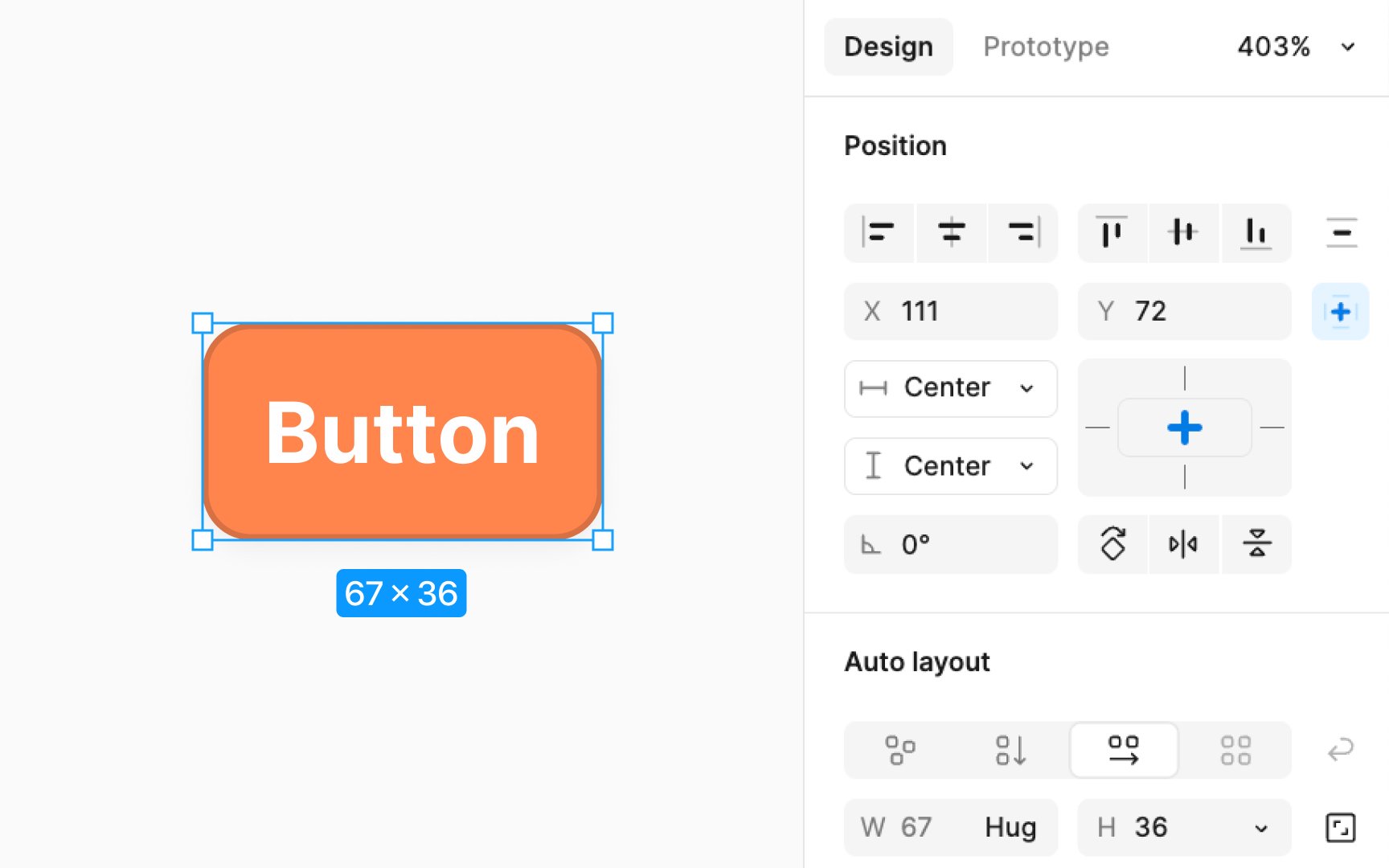
When nothing is selected on the canvas, the Design panel allows access to file-specific styles and variables, the ability to update the canvas's background
For selected layers, the Design panel offers a variety of settings, including but not limited to:
- Alignment and distribution: Adjusts the positioning of elements in relation to each other.
- Position and dimensions: Sets the location and size parameters, including rotation.
- Constraints and layout grid: Set responsive behavior and structure for layouts.
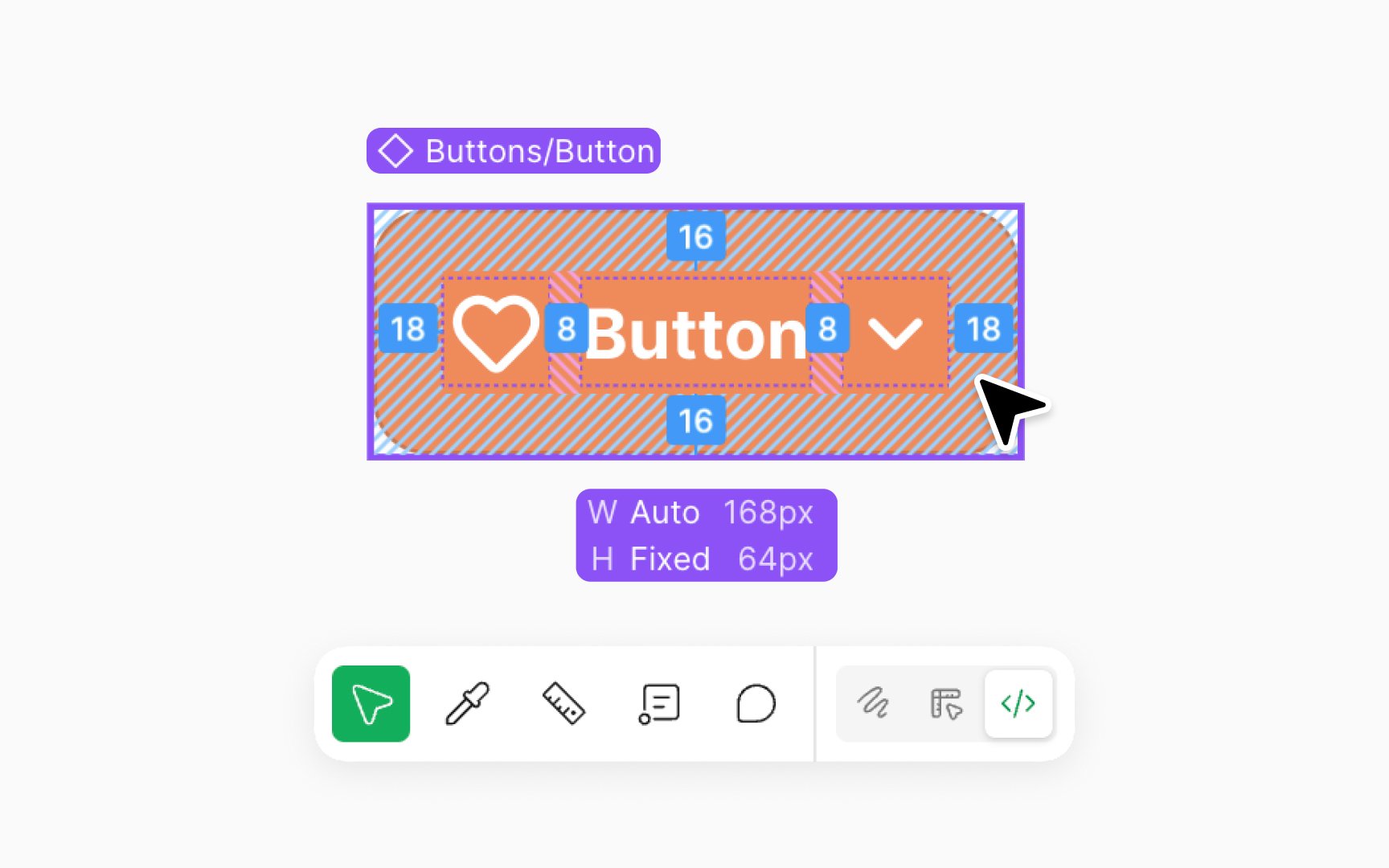
- Component properties and instances: Manages reusable components and their instances.
- Auto layout: Automates element spacing and alignment.
- Text, fill, stroke, and effects: Customizes visual attributes like
typography , color, borders, and shadows. - Individual export: Allows exporting selected elements separately with customizable settings.
In Figma, the
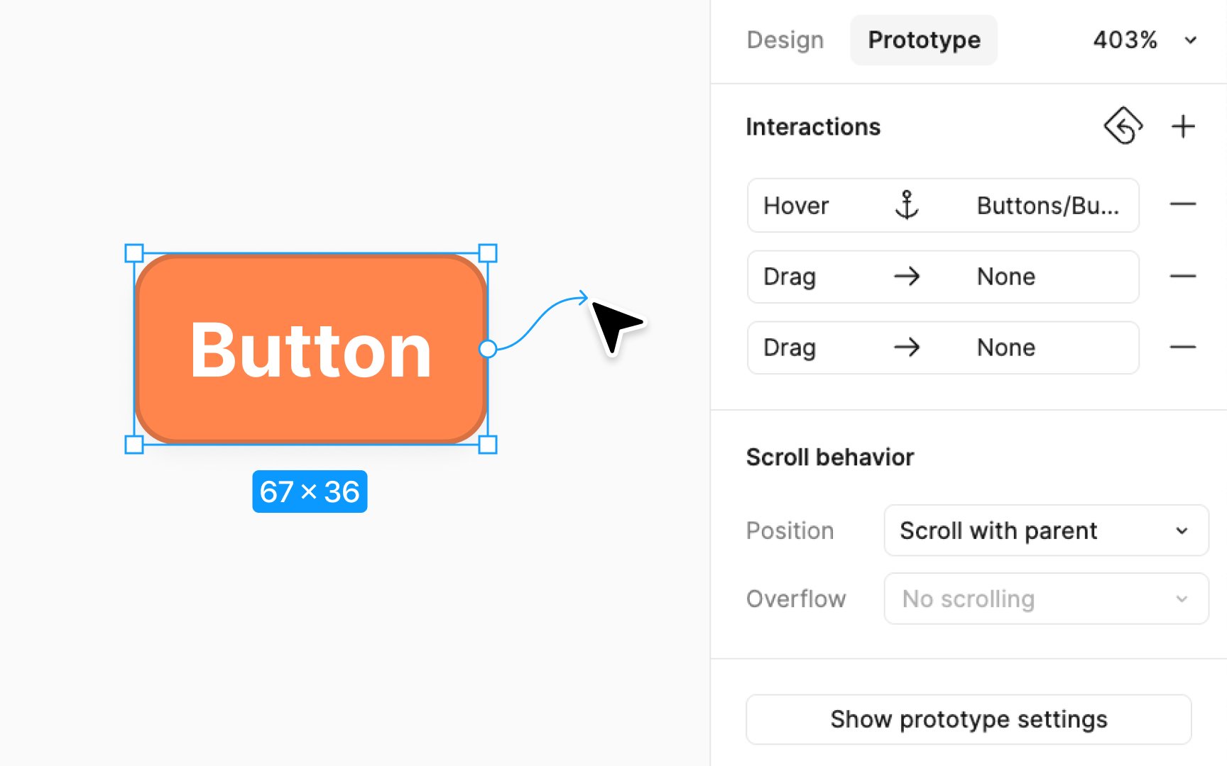
- Add a flow starting point: This sets the first frame from which users will start navigating your prototype.
- Add an interaction: By opening the Interactions modal, you can define how your prototype reacts to user inputs. This includes setting triggers (like a click or hover), actions (what happens when the trigger occurs), and animations for a smooth transition.
- Define scroll behavior: Choose how your prototype behaves when scrolled. This is essential for creating realistic interactions, particularly for long or scrolling
pages . - Show prototype settings: Adjust the
settings of your prototype, including the device frame and background.
Additionally, you can add interactions directly on the canvas in the Prototype panel by clicking and dragging to create connections between objects.
Accessed via the bottom toolbar, Dev Mode transforms Figma's interface, particularly the bottom toolbar, to display these developer-focused features:
- Viewing and copying properties: Developers can easily view and copy the properties, values, and even code snippets directly from design components, aiding in accurate code implementation.
- Frame version comparison: Developers can track changes by comparing different versions of a frame since their last view.
- Inspecting and navigating designs: Dev Mode highlights important layer information for easier navigation and inspection.
- Identifying designs ready for development: With section statuses, developers can quickly find which parts of the design are ready to be turned into code.
- Workflow integration: Dev Mode supports integrations with tools like Jira, Storybook, and GitHub, streamlining the development workflow.
- Adding links and resources: Developers can attach relevant links and resources to components for easy reference.
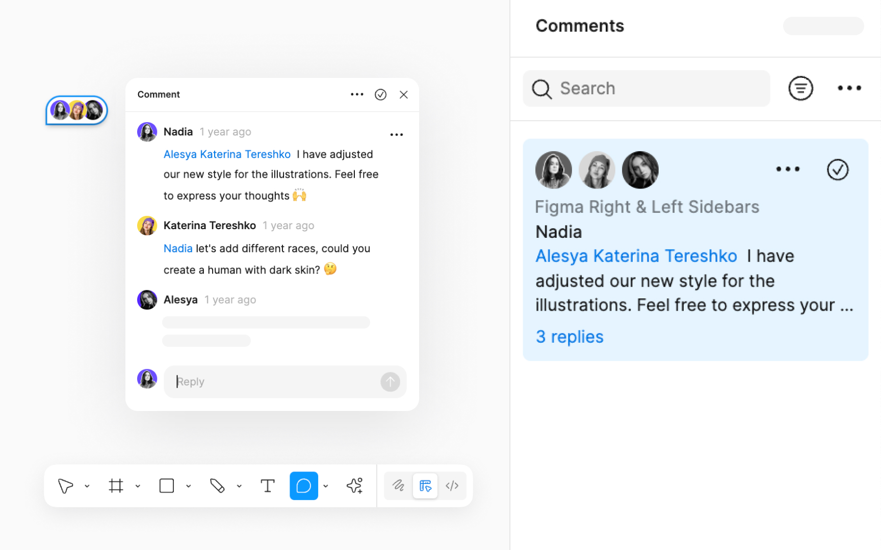
The Comment panel, accessible from the right sidebar, is a powerful tool for collaboration directly within the design file. It allows team members to add new comments or view existing ones, fostering a collaborative environment where feedback and ideas can be shared and responded to efficiently. From the Comment panel, you have a comprehensive view of all comments in the file.
To streamline the process:
- Search for comments: Use the search field to quickly find specific comments by typing relevant keywords.
- Filter comments: A filter option is available to sort comments based on the time they were posted or to display only unread comments.
- Manage settings and notifications: The 3-dot icon in the Comments panel allows you to hide comment icons for a cleaner view or manage notifications to stay informed about new comments or updates in the file.
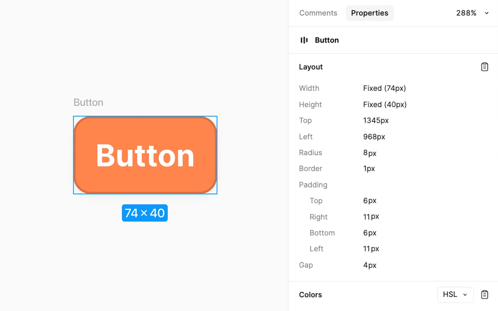
The Properties panel accessible as a tab in the right sidebar is available to those with view only access for inspecting and managing layers on the canvas. To use it, start by selecting a layer. This can be done directly on the canvas or through the Layers panel on the left sidebar. You can select any type of layer, including shapes, text, groups, or frames. Once a layer is selected, the Properties panel displays various details about it, such as its name,
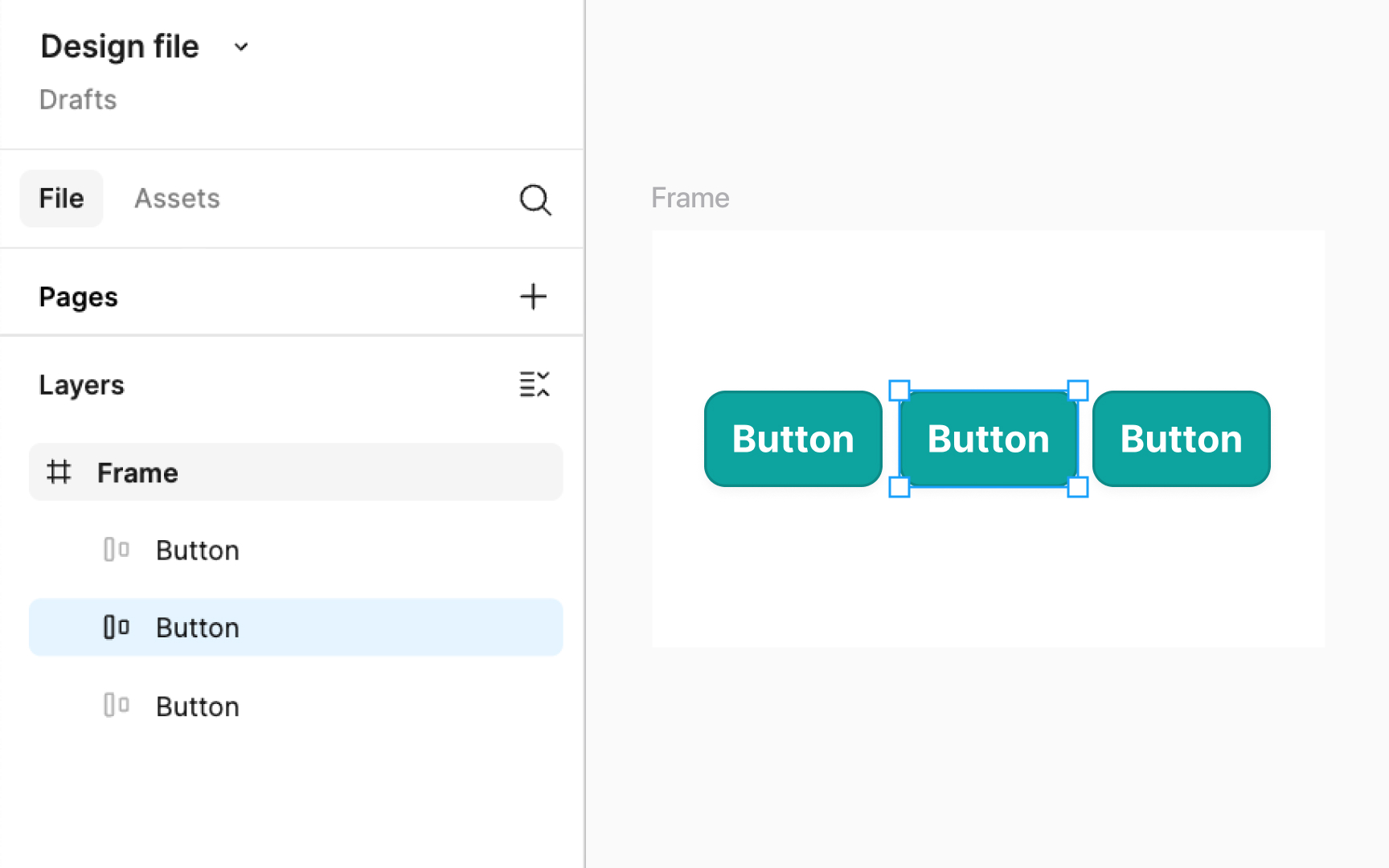
The Layers panel is crucial for organizing your design. It displays a list of all elements, like text, shapes, and images, in your project with specific
To select multiple layers, hold Shift or Command (Mac) and Ctrl (Windows). Double-click to rename an element for easy identification. Right-clicking on a layer provides more options like duplicating or deleting. There's also a setting to highlight layers when the corresponding elements are hovered over on the canvas. It can be enabled by clicking on the Figma main menu > Preferences.
Pro Tip: Press Command Shift \ (Mac) or Ctrl Shift \ (Windows) to toggle the visibility of the left sidebar.
The
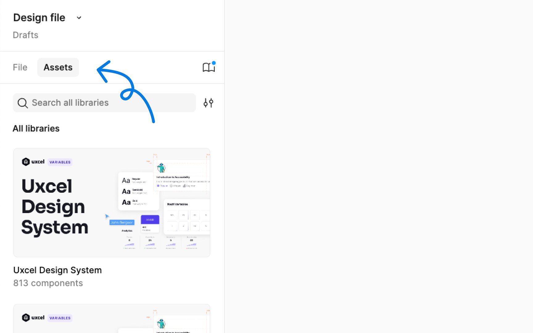
To open the Assets panel, click on the "Assets" heading in the Layers panel, or use the keyboard shortcut:
- Mac: Option 2
- Windows: Alt 2
To add an element from the canvas to the Assets panel, right-click on it and choose the Create component option. Once it’s converted to a component, it gets automatically added to the Assets panel and you can use it in any part of your project by dragging it from the panel.
In the Assets panel, you can also
Pro Tip: Figma organizes components in the Assets panel by file, page, and frame, presented as a path. You can expand each heading by clicking the arrow to explore a file, page, or frame.
Libraries in Figma let you share and standardize
To use these shared elements, access your libraries from the Assets panel. Here's how:
- Click the book icon in the
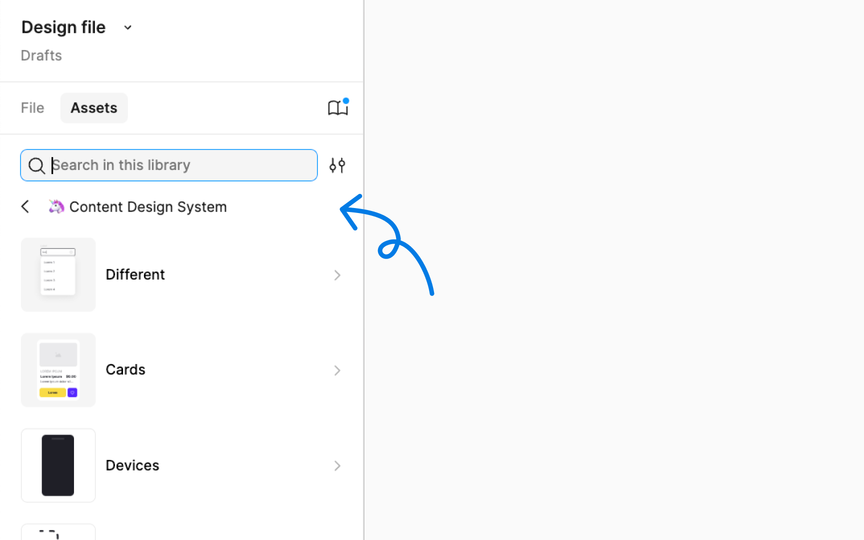
Assets panel to open the Librarymodal . - In the modal, you'll see a list of available libraries.
- Enable the ones you want to use by toggling them on.
- Once enabled, components and styles from these libraries will appear in your Assets panel.
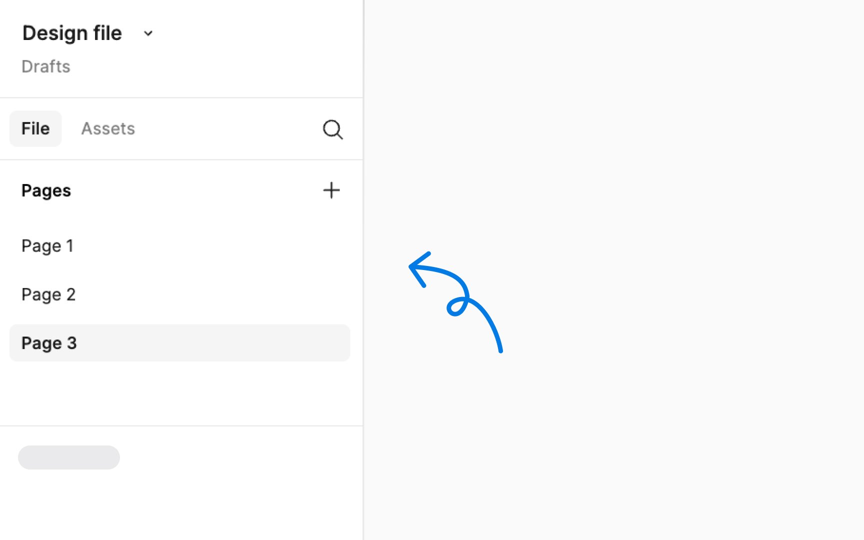
Pages in Figma function like distinct sheets within a design file, offering a structured way to organize various elements of your project. They are ideal for categorizing different stages of design, user flows, or specific components. Each
Managing pages is done through the Layers panel on the left sidebar:
- Access pages: Click on Pages in the left sidebar to see all pages
- Create new pages: Click the +
icon to create a new page - Duplicate pages: Right-click on the page name and choose Duplicate
- Rename pages: Right-click and select Rename, or double-click the name
- Delete pages: Right-click it and select Delete
- Reorder pages: Click and drag them to the desired position within the list
- Move layers between pages: Right-click and choose Move to page, then select your target page.
Pro Tip: Hover over the right edge of the left sidebar until a bidirectional arrow appears, then click and drag to adjust its width for ease of use.
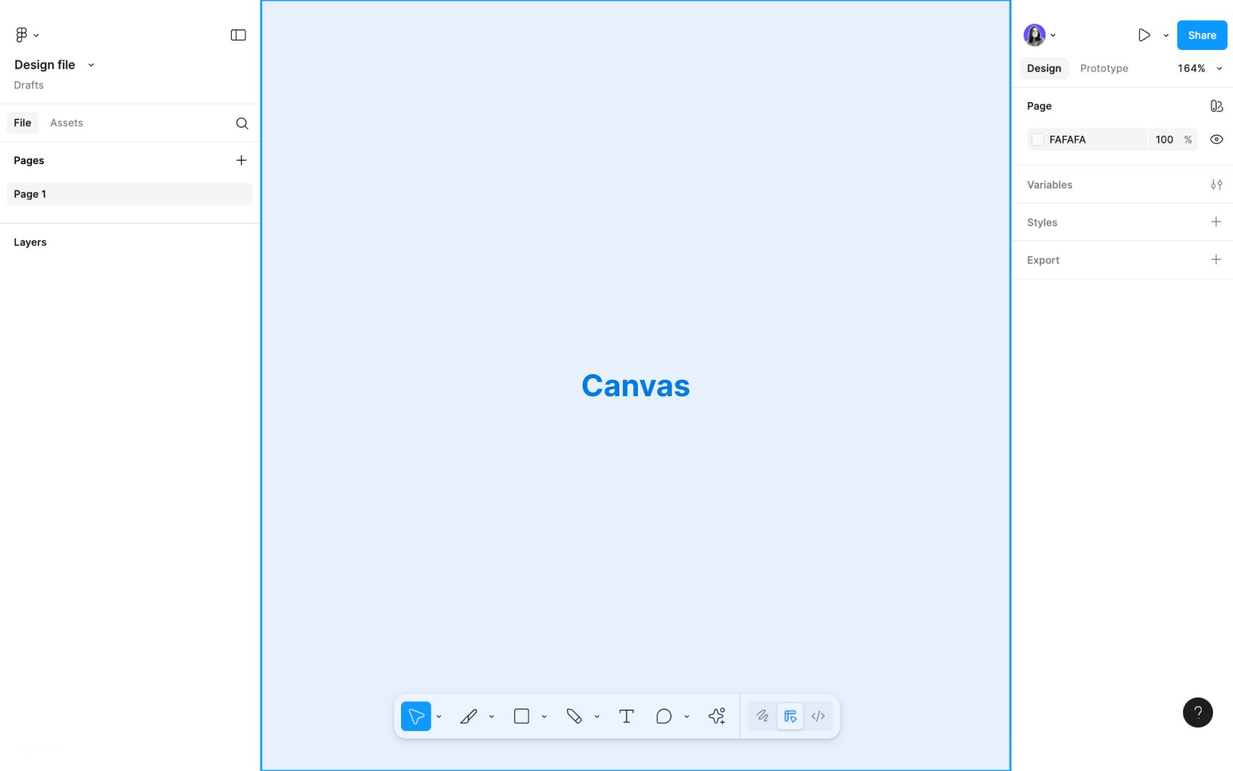
The canvas in Figma is your main working area: an infinite space where you arrange and edit
You can zoom in and out and pan across the canvas to move around your project. The coordinate system ranges from -65,000 to +65,000 on both axes, giving you plenty of space to work. To adjust the canvas background
When you select an element on the canvas, the right sidebar shows its
Pro Tip: By default, vectors are displayed as resolution-independent paths on the canvas. However, you can enable Pixel Preview at 1x and 2x resolutions for precise editing of raster assets.


Similar lessons

Figma Vocabulary

Figma Toolbar
