Wireframing Best Practices
Explore the best practices to create well-structured and user-centered wireframes for digital products.
Wireframes are to digital products what architectural blueprints are to buildings: a vital stage in the design process. They demonstrate how the final product will look and allow your team to test ideas and fix issues at early stages with minimum expenses. And just like there are best practices for creating blueprints to build a suitable building, there are best practices to follow when creating wireframes. Jot down a plan and formulate why you need wireframes in the first place and what goals you expect to achieve. It will help you stick to a schedule, so you won't skip important steps and dwell on unnecessary issues. This knowledge empowers your entire team to craft the best possible products that serve your users well.
Wireframing costs almost nothing compared to rebuilding features after development. A few hours of sketching screens can prevent weeks of rework when you discover fundamental flaws in your information architecture or user flow.
Even basic wireframes provide value. Hand-drawn sketches on paper can reveal navigation problems. Simple digital boxes can expose content hierarchy issues. The format matters less than the thinking process wireframing demands, which is the systematic consideration of every element's purpose and placement.
User research should inform your wireframing goals. Understanding user needs, current pain points, and desired outcomes shapes what you test. Business requirements add another layer — conversion targets, brand positioning, competitive advantages. Technical constraints from platforms or existing systems create boundaries for your solutions.
Document these goals before starting. "Validate that users can complete checkout in under 3 screens" beats "Design checkout flow." Specific goals enable meaningful evaluation. They also prevent scope creep when stakeholders suggest unrelated improvements. Clear goals turn wireframing from exploratory sketching into purposeful problem-solving.
Pro Tip: Write 3-5 specific, measurable goals for each wireframing session to maintain focus.
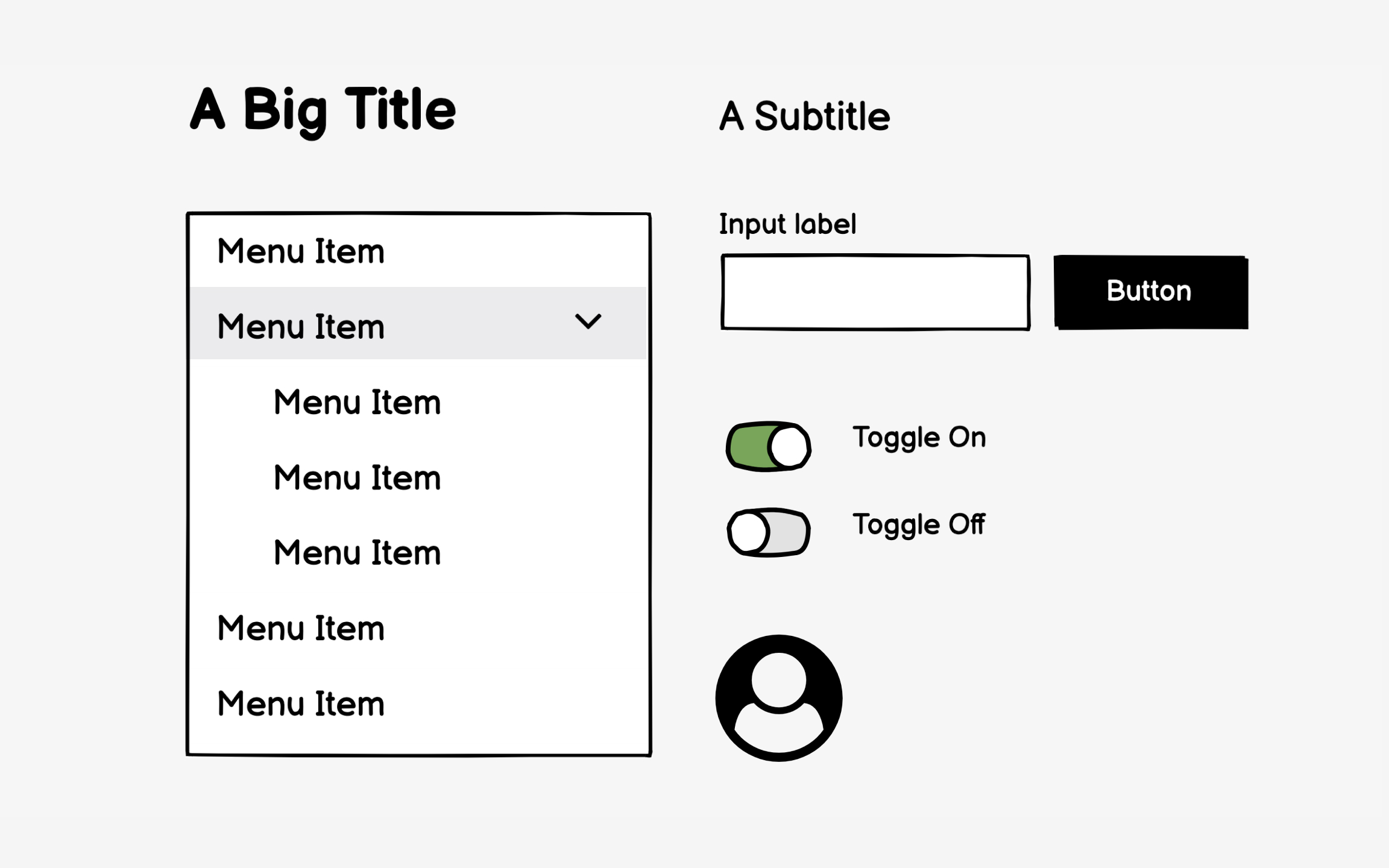
Grayscale
The unfinished appearance of grayscale wireframes encourages honest feedback. Stakeholders feel comfortable requesting major changes when wireframes look rough. Add color, and suddenly people hesitate to suggest improvements, assuming decisions are final. Gray boxes feel disposable; colored designs feel precious.
Limited color use has exceptions. Showing error states in red or highlighting critical CTAs can clarify functionality. Using
But default to grayscale unless color serves a specific communication purpose beyond decoration.
Over-detailed wireframes create false precision. That perfectly styled dropdown menu suggests final design when you're still testing
Consistency in your basic components improves comprehension. Use the same simple shapes throughout — for example, rectangles for images, squares for
Content-first wireframing also speeds development. Writers see exactly how much space they have. Developers understand data requirements early. Stakeholders give better feedback when they see their actual products represented. The extra effort gathering content pays off in fewer revisions and faster approval cycles.[2]
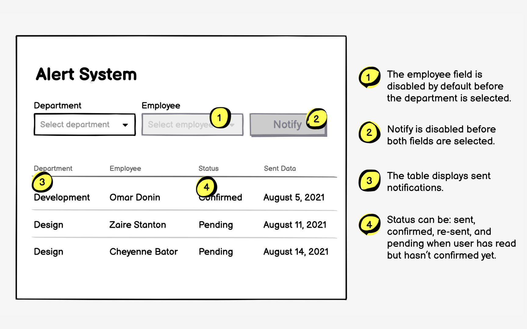
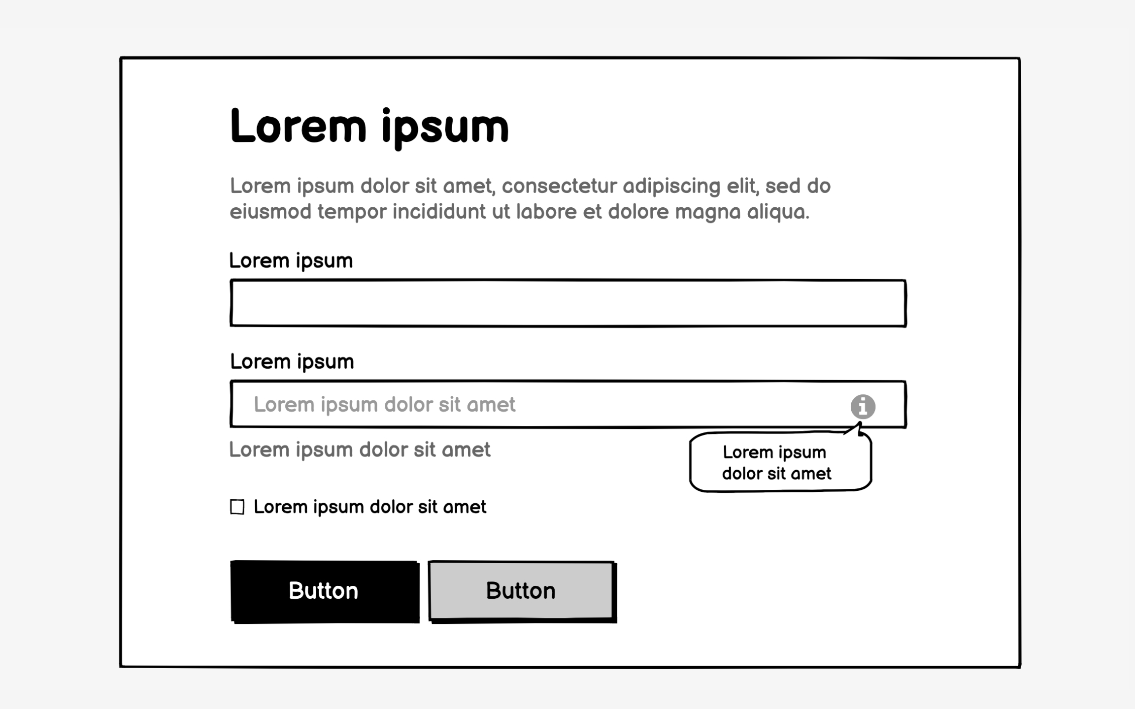
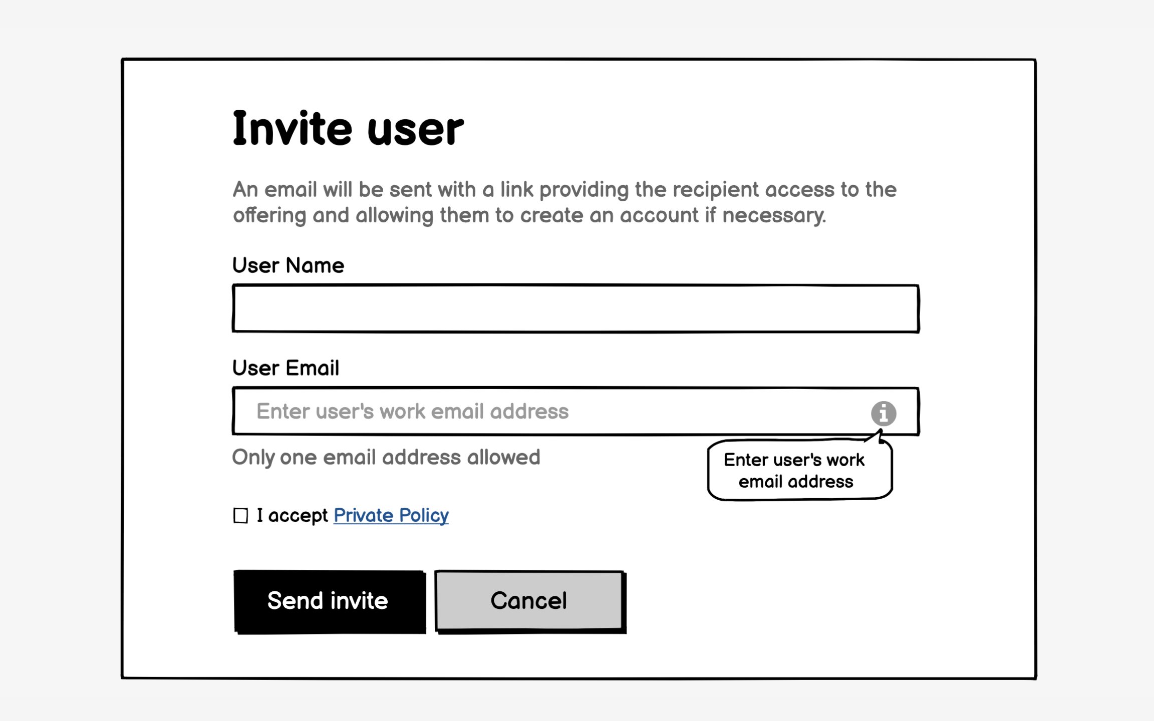
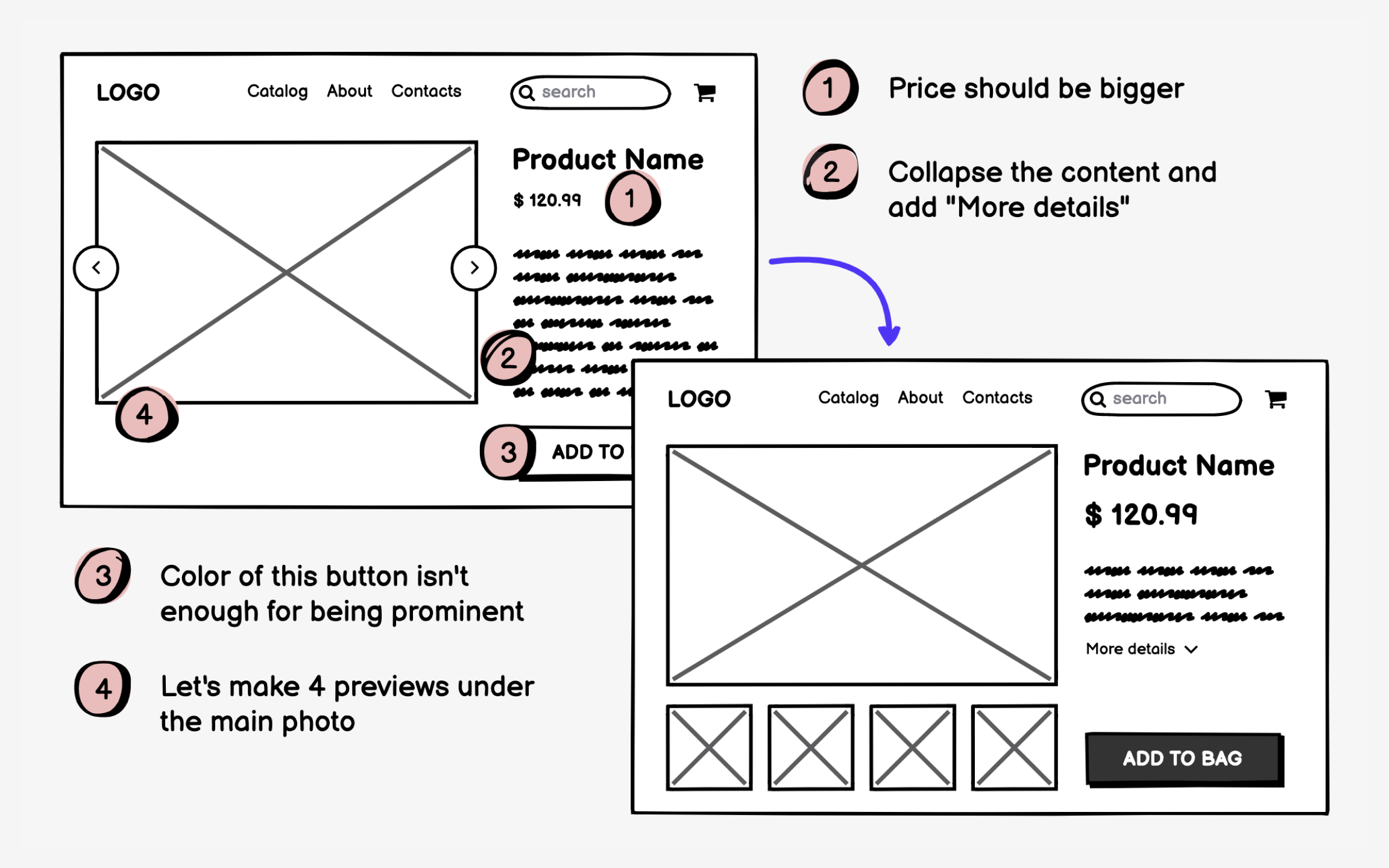
Wireframes show what; annotations explain why and how. Without annotations, viewers guess at interactions, assume behaviors, and misinterpret intentions. That
Effective annotations balance completeness with readability. Number each interactive element and explain its behavior concisely. "Clicking expands product details inline" beats lengthy technical specifications. Focus on user-facing functionality rather than implementation details. Developers need to know what happens, not how to code it.
Place annotations strategically to maintain
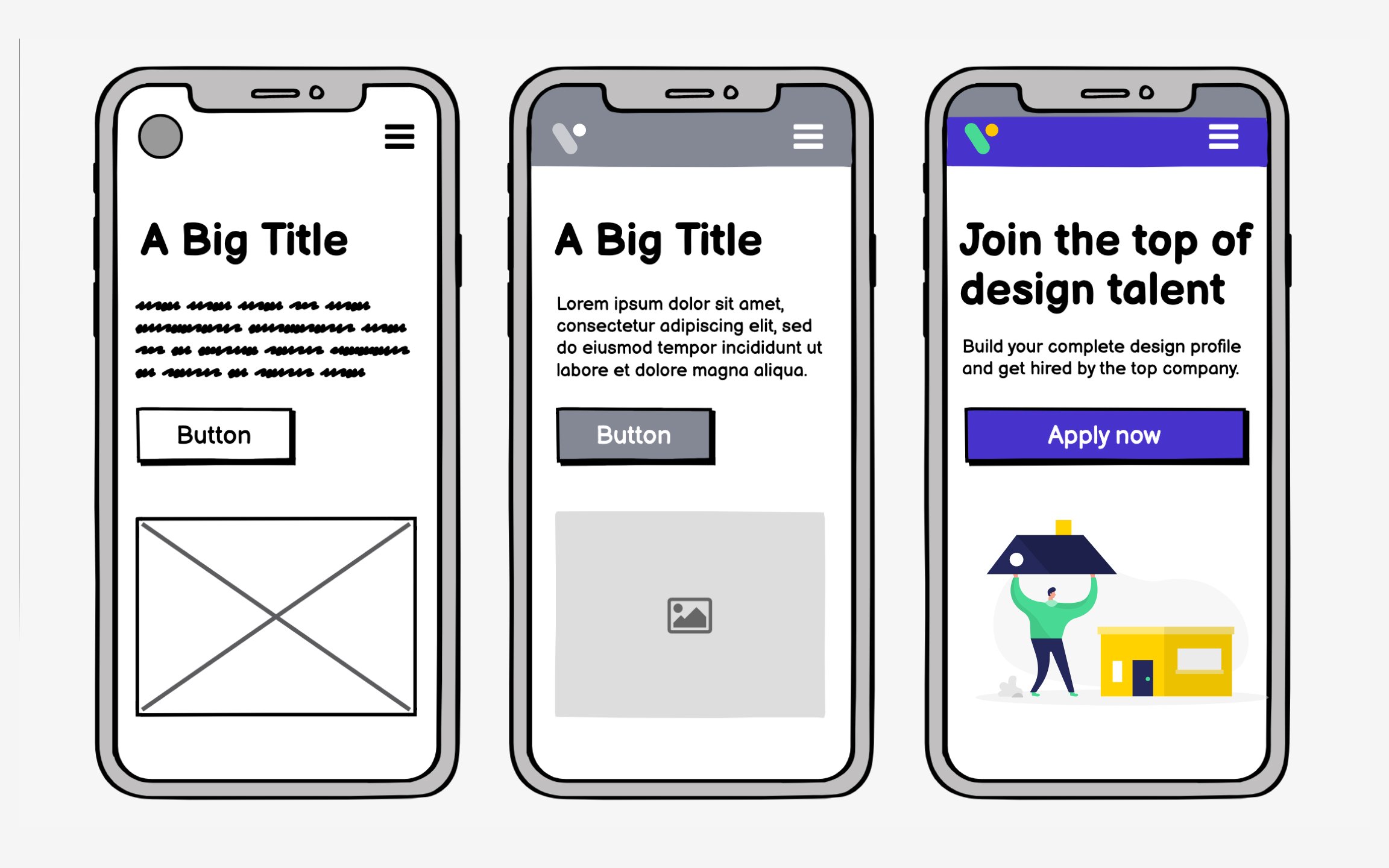
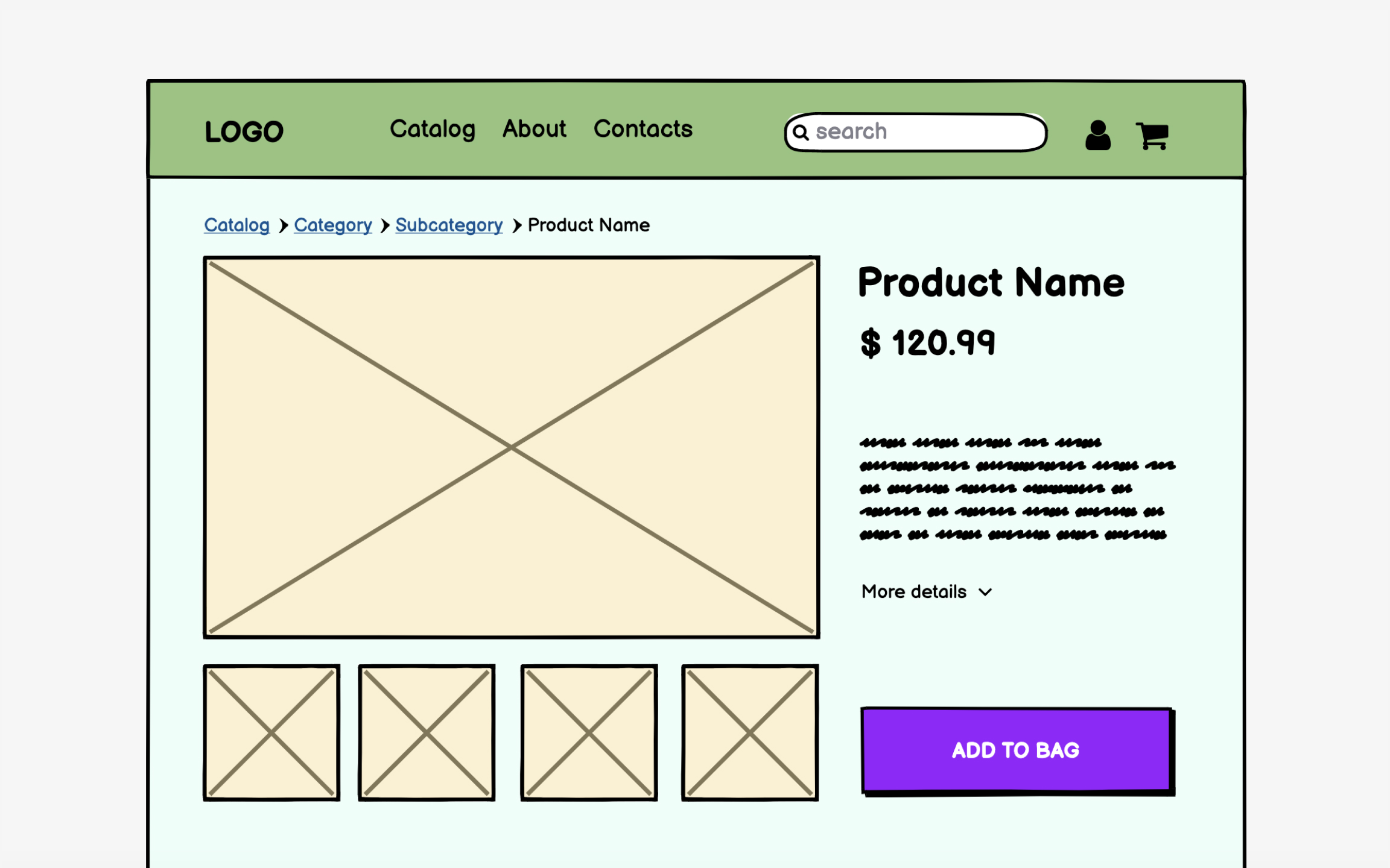
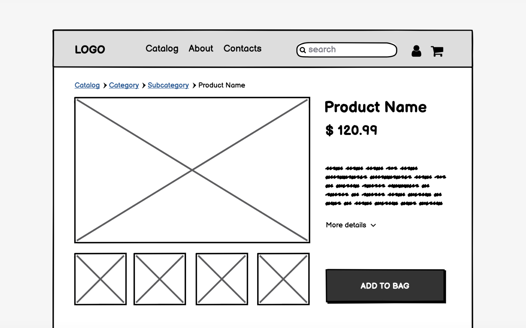
Wireframes vary a lot in terms of how complex they are. Low-fidelity wireframes can be nothing more than a series of labeled boxes scribbled on a sheet of paper. High-fidelity wireframes can be nearly as complex as a finished website or other digital product, complete with some
So, which is the right level of complexity? The answer, as with virtually any design question, is that it depends. If the
If the wireframe is for a more complex project and/or will be shown to clients or other stakeholders, you may need to create something more complex in order to get your ideas across. For many projects, the right level of complexity will likely fall somewhere in between.
Prototypes give you more of a sense of the actual functionality of your product, which is valuable in making sure that it meets both user needs and business requirements. It’s also an excellent opportunity to work out any kinks or potential roadblocks in your user journey before you start designing the final UI.
Many wireframing tools enable
Wireframing tool selection shapes your entire process. Choose tools that enhance thinking, not complicate it. The best wireframing tool might be pen and paper for early concepts, switching to digital for
Evaluate tools against actual workflow needs. Can you create basic
Learning curve matters more than capabilities. If mastering basics takes days, you'll skip wireframing under deadline pressure. Start with simple tools and add complexity only when current tools limit necessary communication. Many successful products began with marker sketches, not sophisticated software.
Wireframes exist to be changed. Their low investment enables rapid iteration that polished designs discourage. Each feedback round improves
Iteration requires killing beloved ideas. That clever
Structure iteration cycles purposefully. Test with users, gather feedback, identify patterns, implement changes, test again. Document what you learn, even failed approaches teach valuable lessons. Save versions to show evolution. This systematic approach transforms random changes into directed improvement.
References
Top contributors


Topics
From Course

Share


Similar lessons

Intro to Wireframing

Wireframe Fidelity
