Layout Grids
Leverage layout grids in Figma to create precise and responsive designs.
Layout grids offer a structured framework that enhances the consistency and coherence of designs. These grids help align elements precisely, ensuring a balanced and visually appealing composition. By understanding and utilizing layout grids, you can create interfaces that are not only aesthetically pleasing but also user-friendly.
Additionally, layout grids facilitate responsive design, enabling designs to adapt seamlessly across different screen sizes and devices. This adaptability is essential in today’s multi-device world, where users access content on a wide variety of platforms.
Layout grids go beyond the constraints of the pixel grid, meaning they are not tied to a specific resolution or dimensions. This is particularly useful when creating apps and websites that need to function on various devices and screen sizes, whether it's a phone, tablet, or computer.
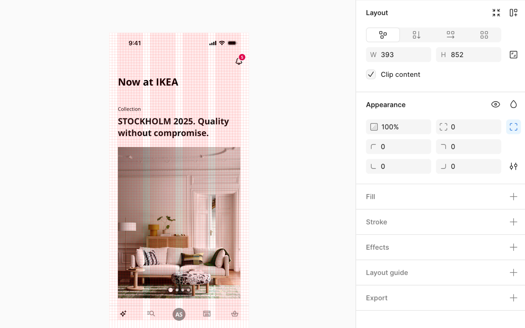
You can only apply layout grids to frames in Figma, whether it's a top-level frame or a frame nested within another.
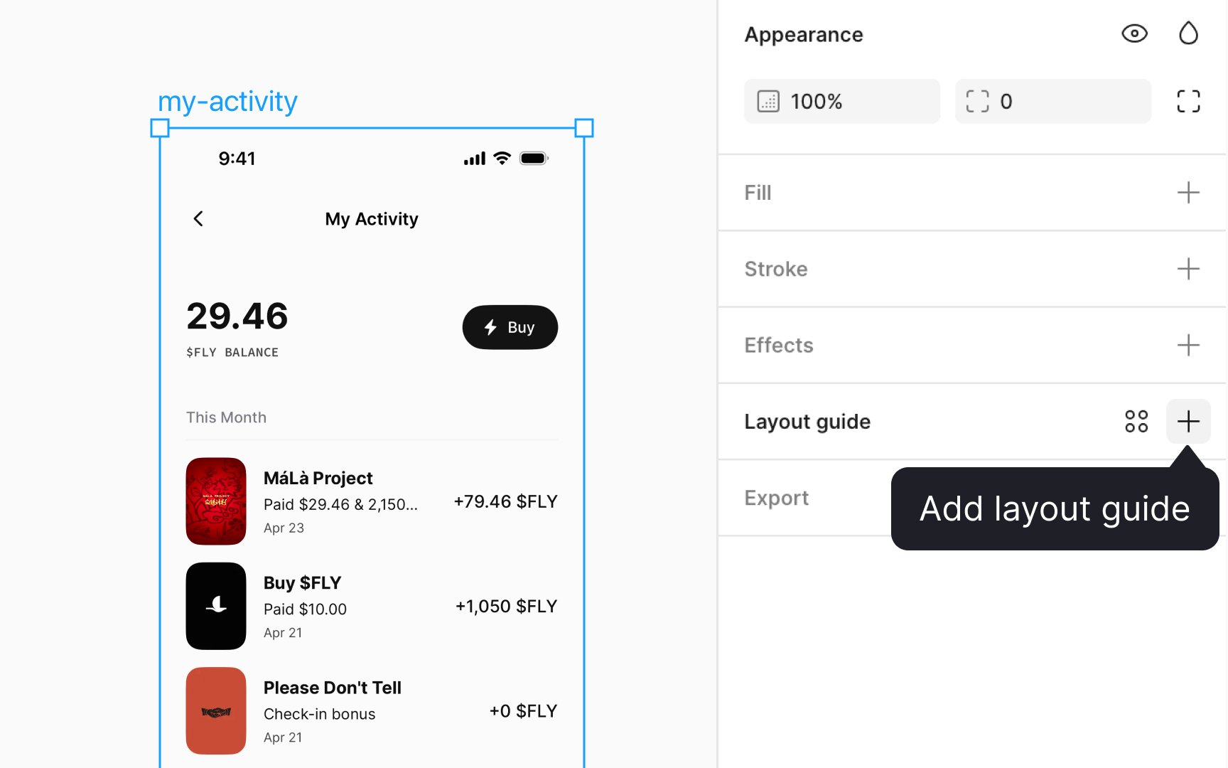
To apply a
To customize this grid, click on the Layout grid settings icon that appears. A small window will open up where you can adjust its properties to fit your needs. Figma offers 3 types of layout grids:
- Uniform square grids (the default option)
- Column grids
- Row grids
You can choose one of these options or combine them to create more complex layouts according to your design requirements.
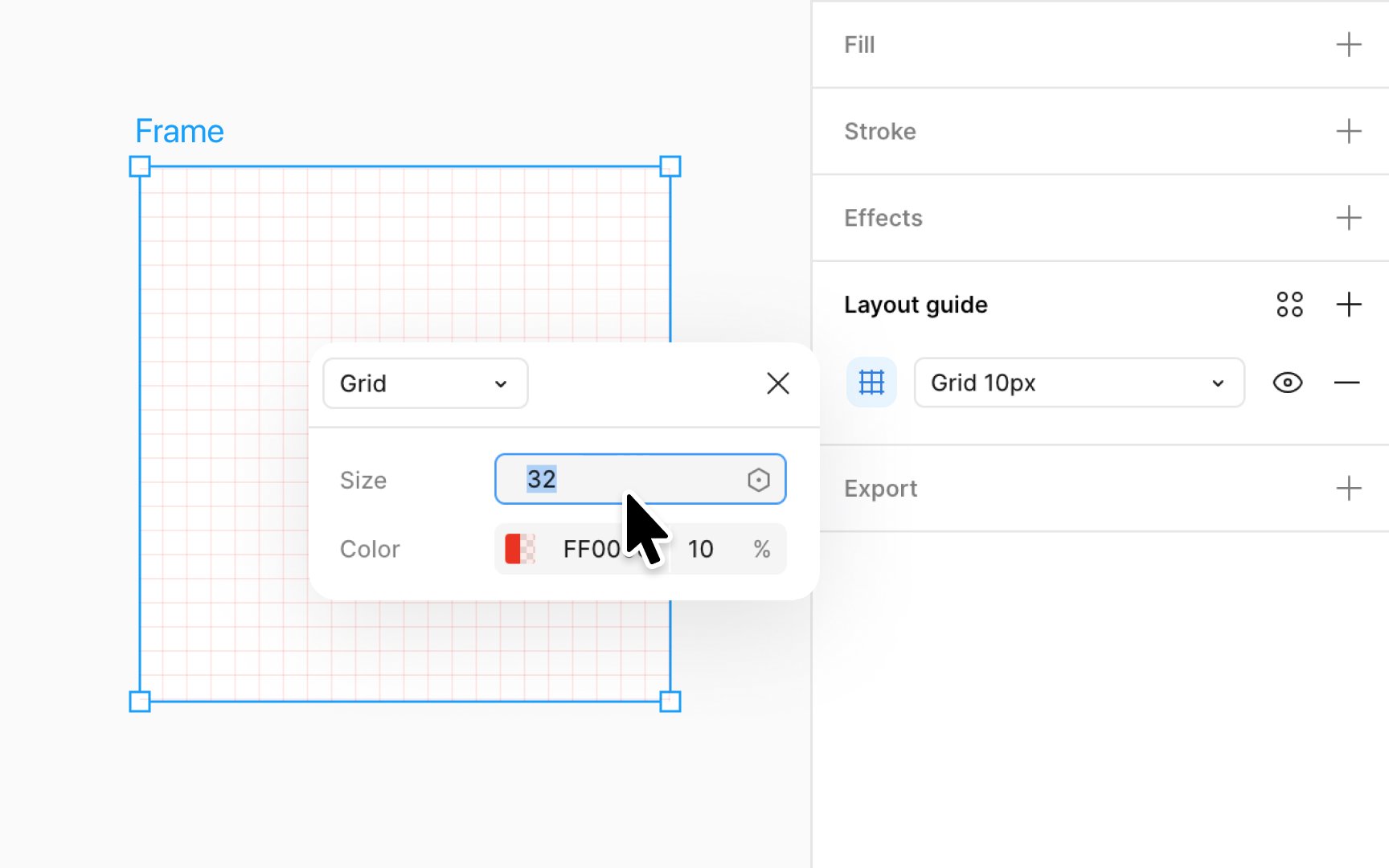
Uniform grids are great for situations requiring precision, like designing symbols or
If you change it from 10pt to 20pt, each square will grow bigger to adjust to your new setting. After you've set it to the size you like, just click X to close the window and see your changes on the canvas. A grid with larger squares can aid in broad layout structures, while a grid with smaller squares is perfect for minute and intricate adjustments.
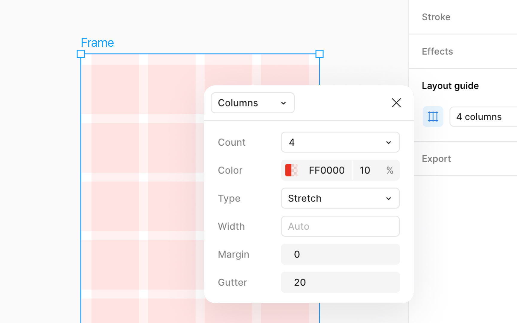
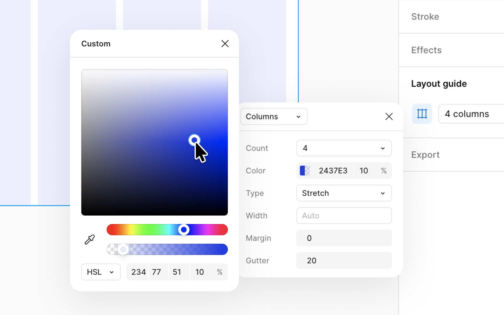
Column and row grids in Figma are great for making designs that look good on different screen sizes, like websites and mobile apps. They give you more control over how your design adjusts. To create a row or column
Once you apply a row or column grid, you will see options to modify the:
- Count: How many columns or rows you want
- Gutter: This is the space between each column or row
- Margin: For grids that stretch, this is how far from the edge your columns or rows start
- Offset: This determines where your columns or rows begin from the top or left side. It's used when rows are aligned to the top and columns to the left.
To change the color of a
- Click the Layout guide
settings icon next to the layout grid in the Design panel. - Click on the color swatch that appears in the settings window.
- This opens the color picker, where you can choose a new color for your grid.
- You can also adjust how see-through your grid is by changing the opacity.
This lets you customize the look of your grid to improve visibility against different backgrounds, enhancing your design workflow and accuracy.
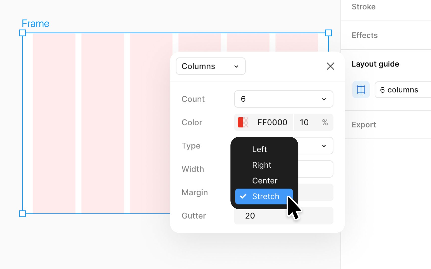
A stretchy
To use a stretchy grid:
- Select the frame you want to work on.
- Go to the Design panel and click the + next to Layout guide.
- By clicking on the Layout guide
settings icon , choose eitherColumns orRows , depending on what you need for your design. - In the settings that pop up, you can make your grid stretchy by choosing the Stretch option under the Type
dropdown .
This makes your columns or rows fill the entire width or height of your frame, adjusting automatically as the frame size changes.
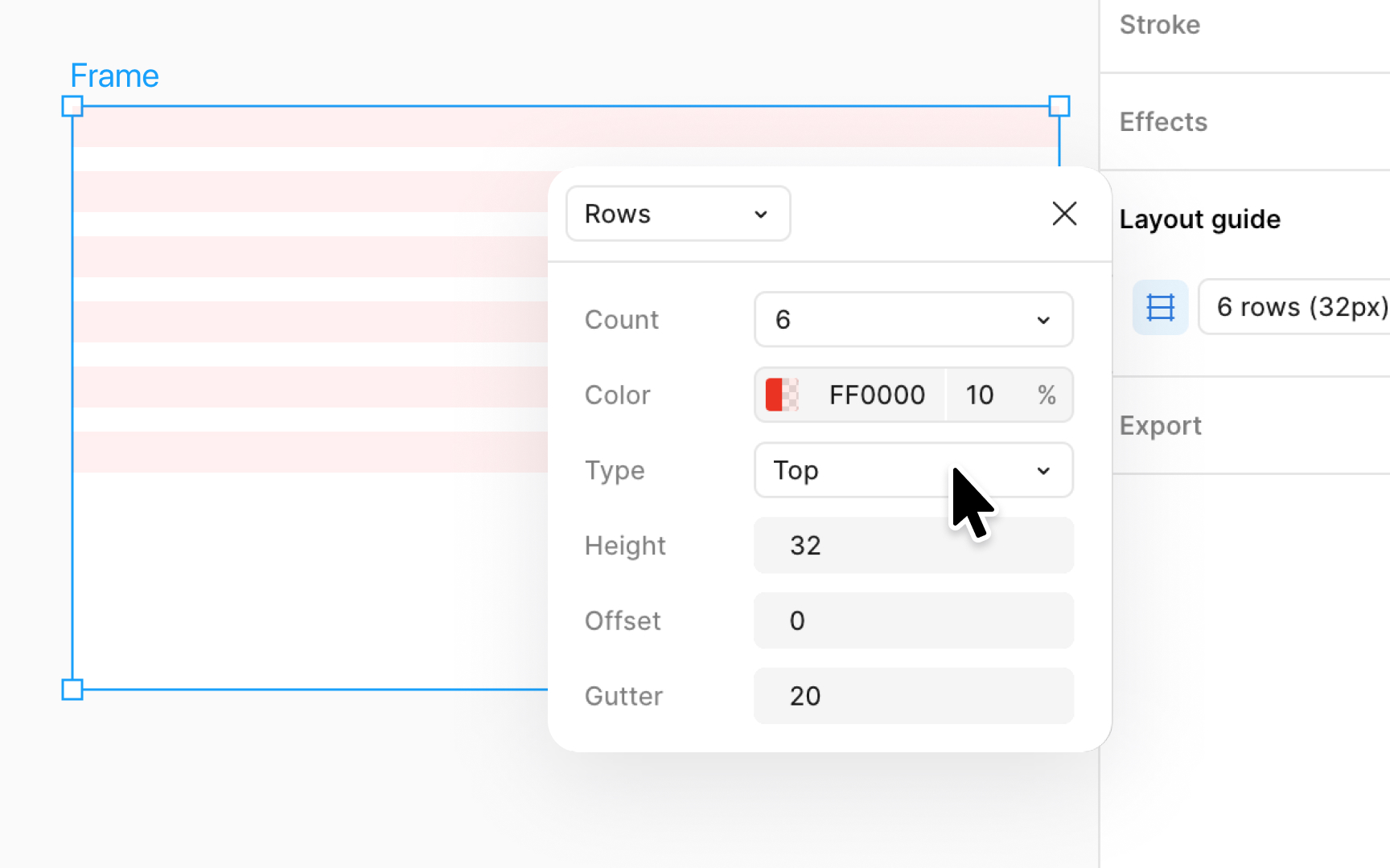
A fixed
To apply a fixed grid:
- Select your frame, then click the + next to Layout guide in the Design panel.
- Choose between Column or Rows by clicking on the Layout guide
settings icon . - Set your desired width or height and the number of columns or rows using the settings window that pops up.
- You can fix rows to the top, bottom, or center of the frame, and columns to the left, right, or center under the Type
dropdown .
This provides a structured, consistent layout that enhances usability and aesthetics in complex interfaces.
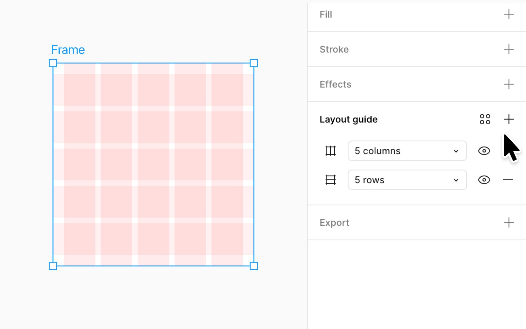
Combining
Here’s how to do it:
- First, pick the frame you want to add grids to.
- Then, click the + next to Layout guide in the Design panel.
- Choose the type of
grid you want by clicking on the Layout guidesettings icon . - Set any other
properties you need for your grid. - If you want to add more grids, just repeat these steps to add them.
This way, you can line up your design elements perfectly, making your project look neat and professional.
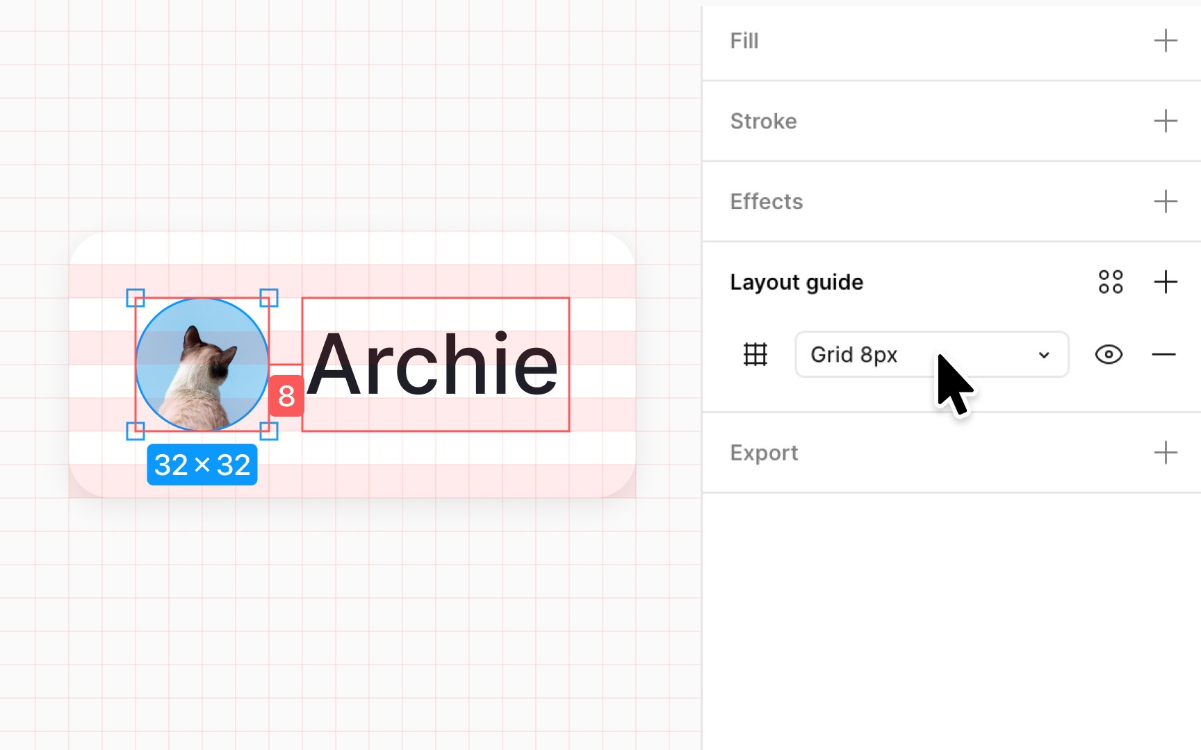
The 8-point
- Hard grid: Apply a uniform grid to your frame with each square set to 8pt in size. This method places objects directly on the grid, promoting consistency in element spacing and alignment.
- Soft grid: Use
row or columnlayout grids with spacing (gutter and margin) and size (width or height) divisible by 8. This approach offers flexibility, allowing objects to be positioned at distances from each other that are multiples of 8, without strictly sticking to the grid squares.
To show or hide
To toggle all grids in your file:
- Click the Zoom percentage at the top-right to open the View
Settings menu . - If the Layout guide setting has no check, click it to show the grids. If it's checked, clicking will hide them.
- Alternatively, press Control G (Mac) or Ctrl Shift 4 (Windows) to toggle grids on or off quickly.
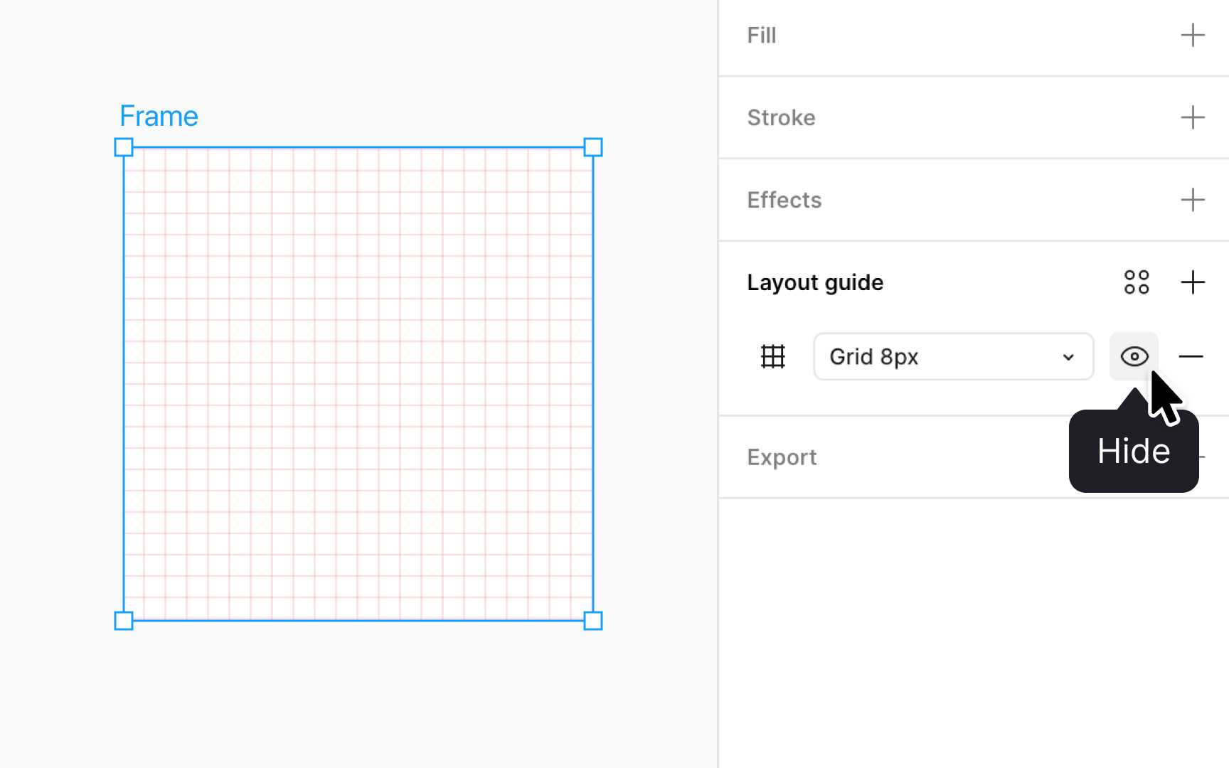
To toggle just one grid:
- Select the frame you're working on.
- In the Design panel, under the Layout guide settings, click the eye
icon next to thegrid of your choice to turn it on or off.
This way, you can control which grids are visible at any time, helping you focus on your design.
Top contributors
Topics
From Course

Share


Similar lessons

Intro to Design Layouts

Intro to Design Grids
