Checkout
Learn how to create a well-designed, intuitive checkout page that converts
The checkout page is the final step in the process of making a purchase on an e-commerce website. It's where users enter their shipping and payment information and confirm their order.
A well-designed, intuitive checkout page can help increase conversions. A poorly designed and complicated checkout page, however, can have the opposite effect — users could abandon their carts and perhaps even your product. You can prevent this by employing a few simple best practices, all aimed at reducing friction and cognitive load for your users.
It doesn’t matter if your process spans one
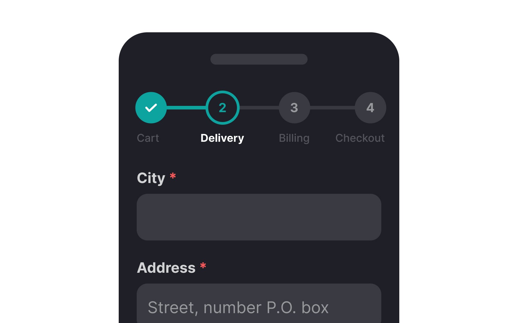
Moreover, breaking down forms into multiple steps or pages makes them more digestible and reduces the
Another single-page alternative to progress trackers is fitting all the steps of the
The point of any
Keep these pointers in mind:
- Minimize links to keep users on the page. Include essentials only, like a link for live customer support.
- Enable item modification directly on the checkout page.
- Eliminate ads and pop-ups for a seamless experience.
- Instead of promo links, use copy-paste promo codes that don't redirect users to another page.
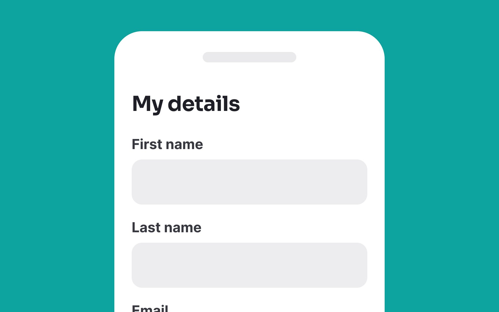
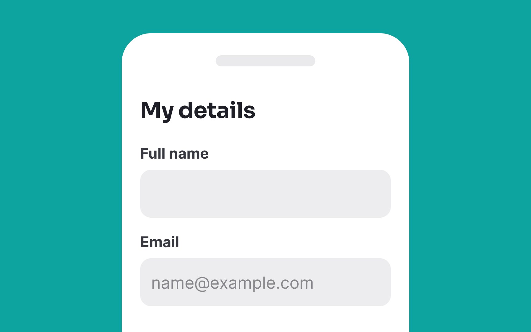
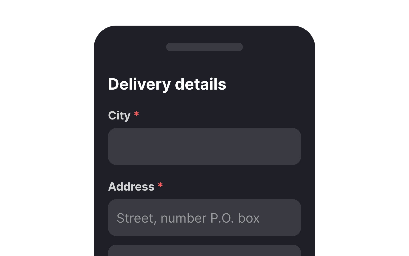
Should you use a single “Full Name” field or separate "First Name" and "Last Name" fields in the
However, using separate fields for first and last names can facilitate more personalized communication in marketing, like emails or push notifications. For example, addressing someone as "Hey John" feels more personal than "Hi John Connor." Also, certain industries with strong identification requirements, such as medical, government, or financial sectors, may require names to be stored separately. Some technical systems or APIs might necessitate first and last names to be distinct for functionality purposes.
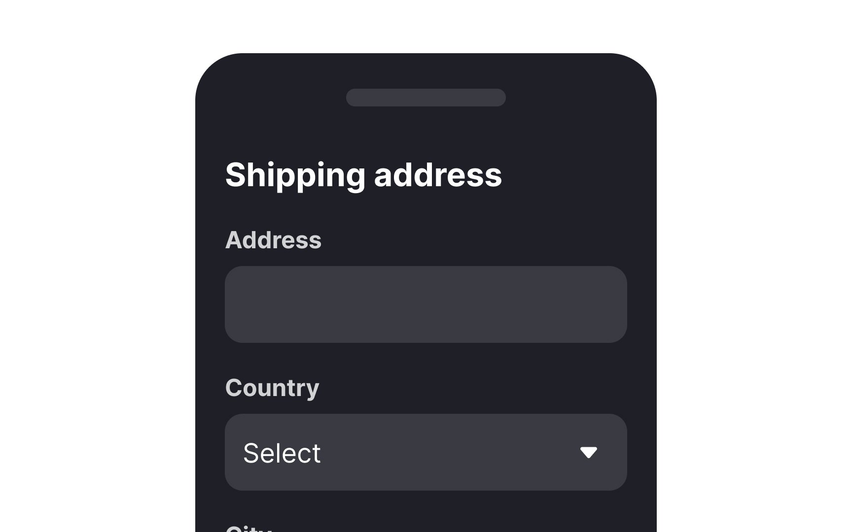

When dealing with international or even national shipping, it makes sense to put the country/state name first for
Since address formats could be different in different regions, provide users with tools to speed up the process. Indicate the meaning of each required input with a label and example placeholder text, such as street name or apartment number.
Pro Tip: Make sure to display the correct currencies, units of measurement, and formats for phone numbers and addresses for different countries.
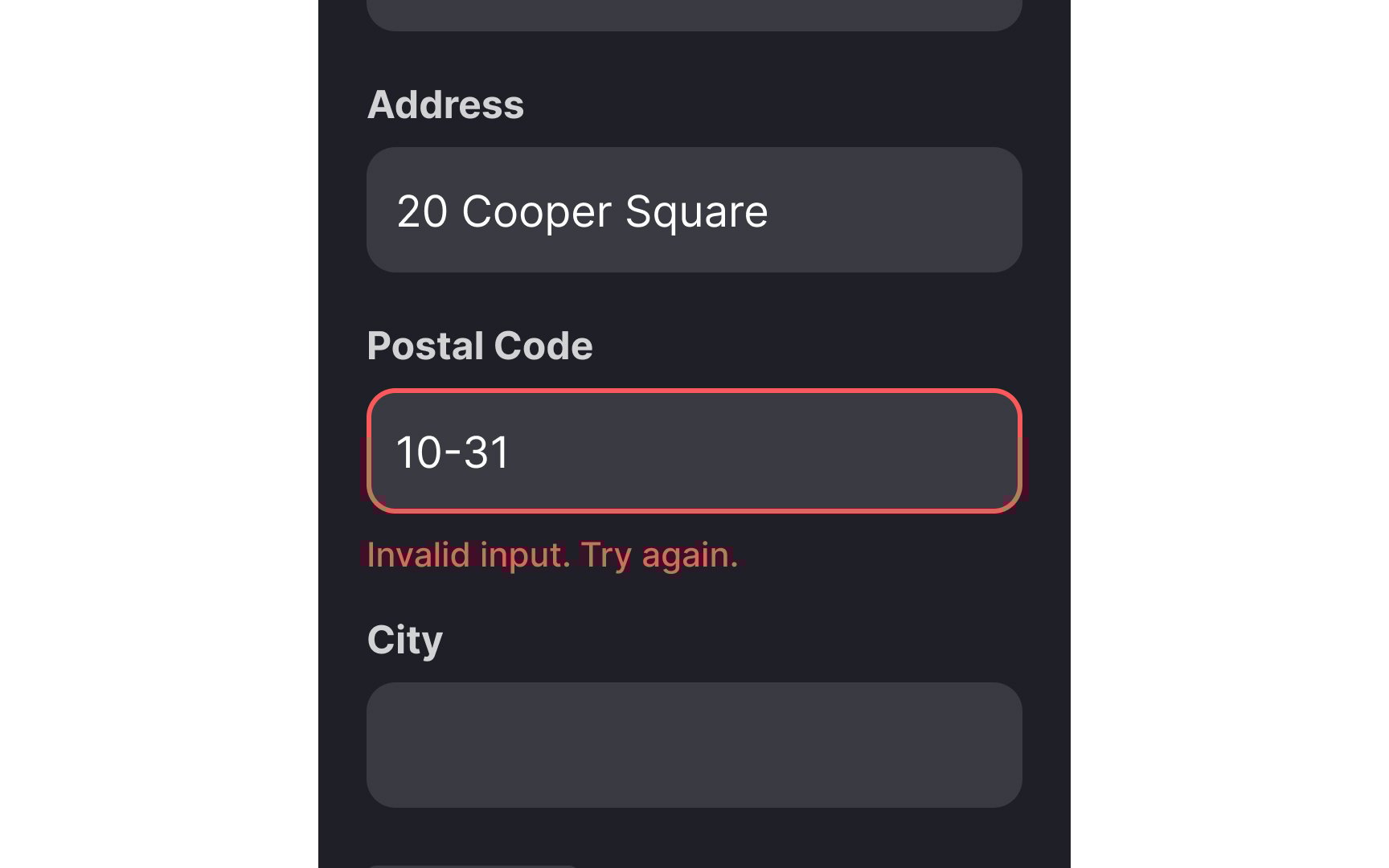
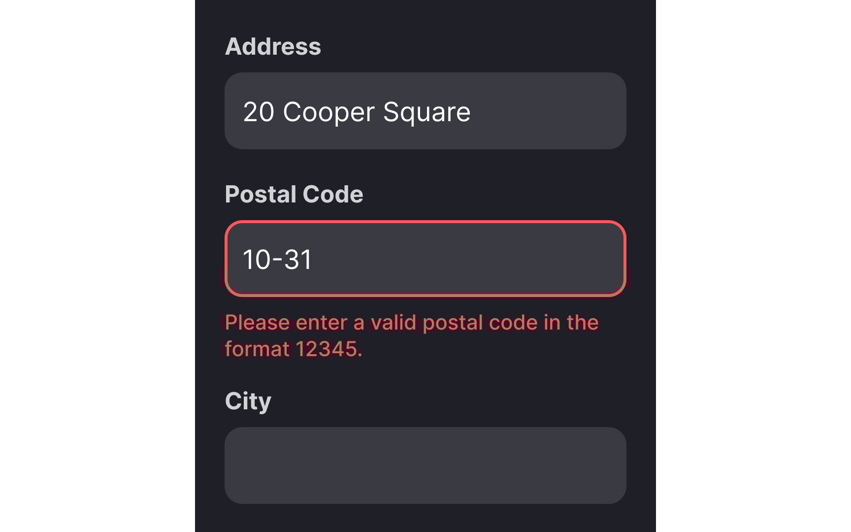
Errors can also occur on the part of users — for example, a mistyped postal code or a non-existent
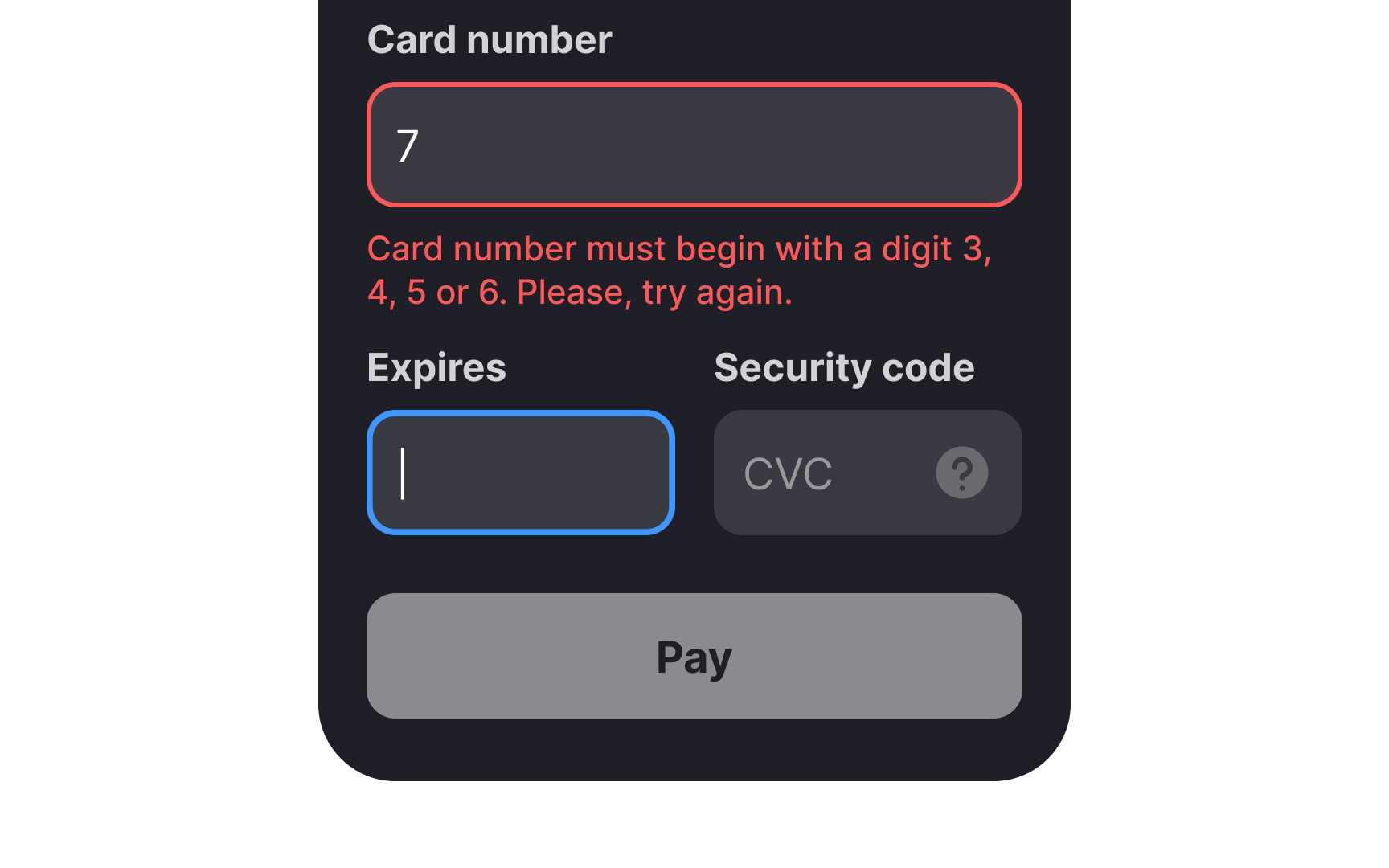
Any form that waits until after a user clicks on Submit to point out any
Delay inline validation until the user completes their input and shifts the cursor out of the input field. Immediate validation, triggered as users start typing, may be perceived as intrusive or disruptive, potentially causing annoyance.
Pro Tip: Indicate erroneous and successful inputs using prominent, contrasting colors (usually red and green) and a relevant icon.

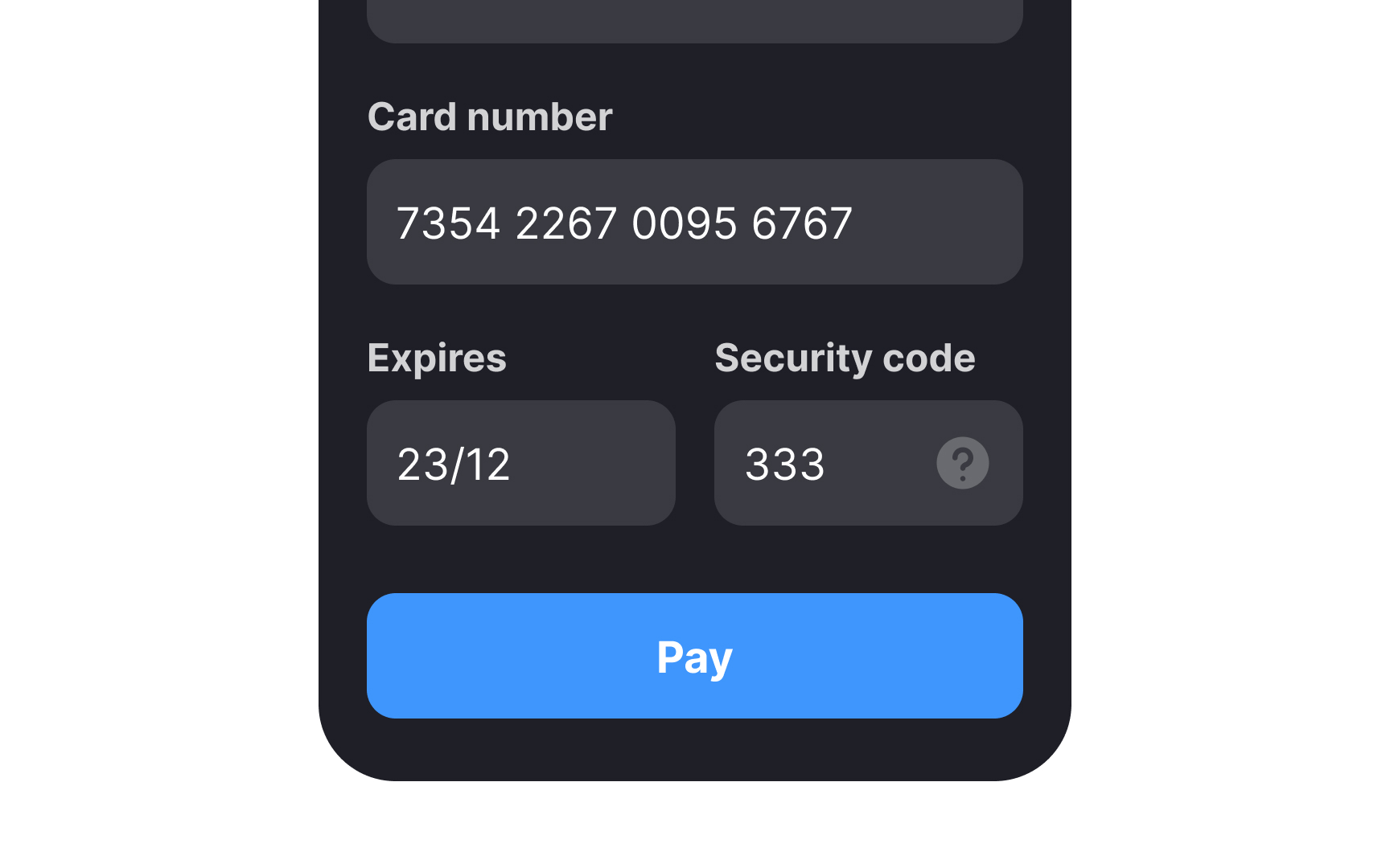
Whenever possible, allow users to autofill payment details. Use browser autofill for common form fields such as name, address,
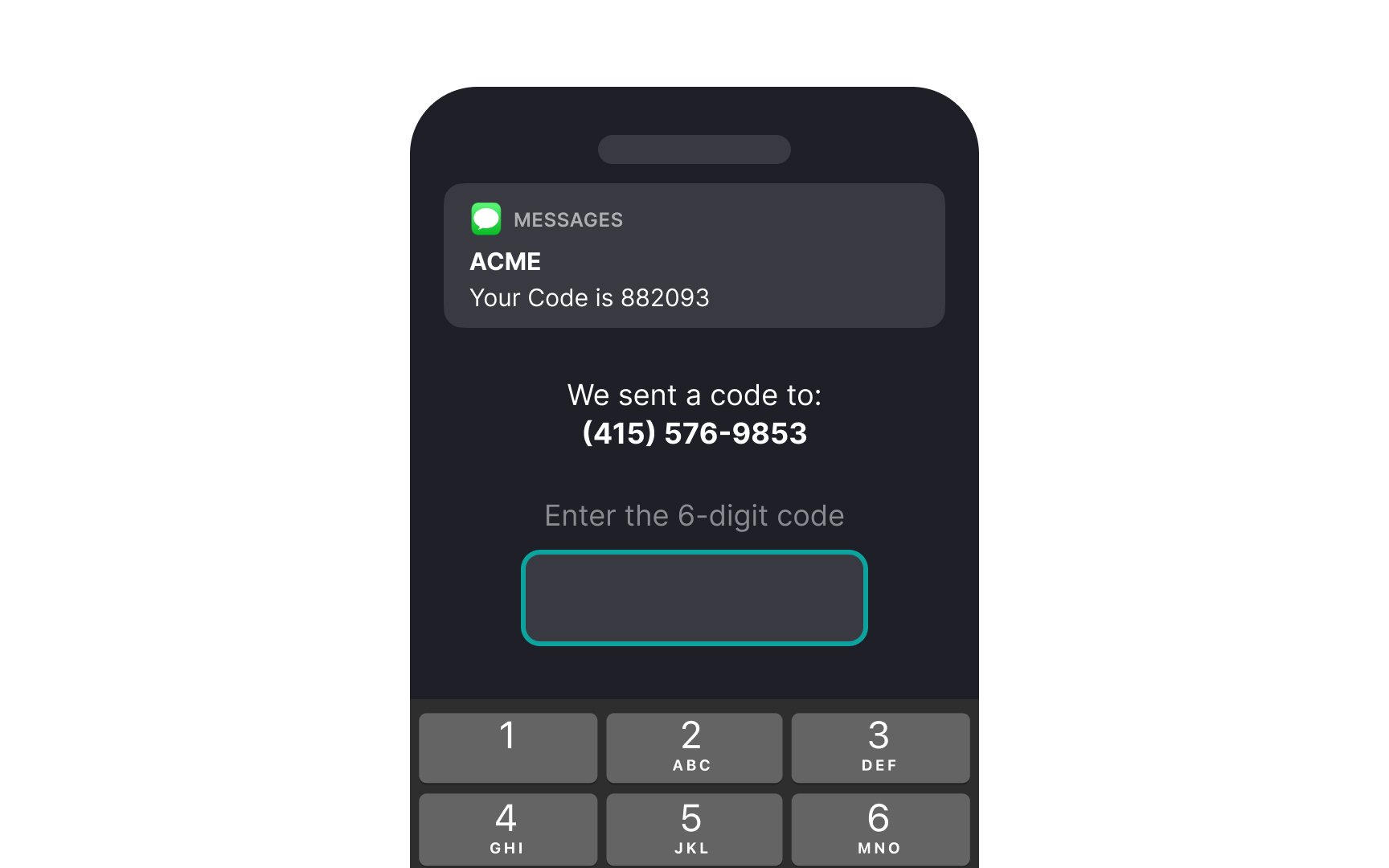
Make it easier for users by enabling autofill for one-time passwords (OTPs) received during payment processes. This reduces interaction costs and prevents the hassle of toggling between
While autofill enhances user convenience, ensure robust security measures are in place to protect sensitive information. Regularly update your security protocols to guard against data breaches, and consider multi-factor authentication for additional safety.
Pro Tip: On mobile, make sure user data is safe by encrypting it and using fingerprint or face scan for sensitive info like payment details.
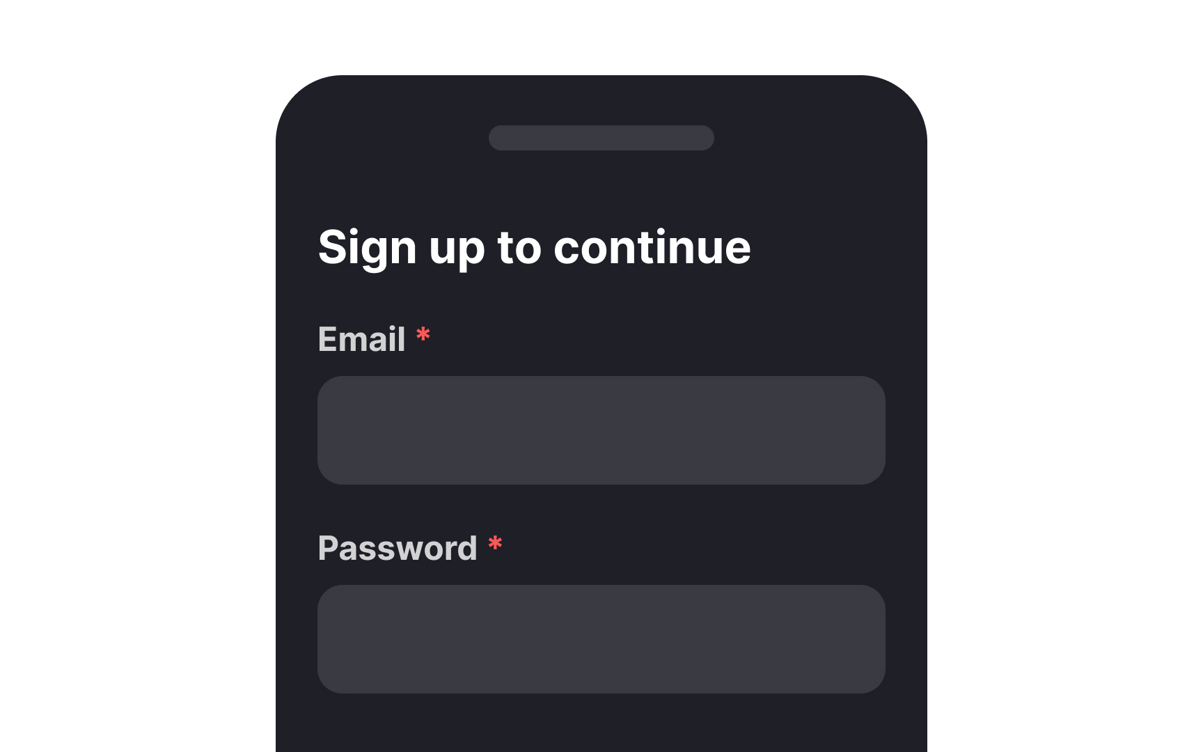
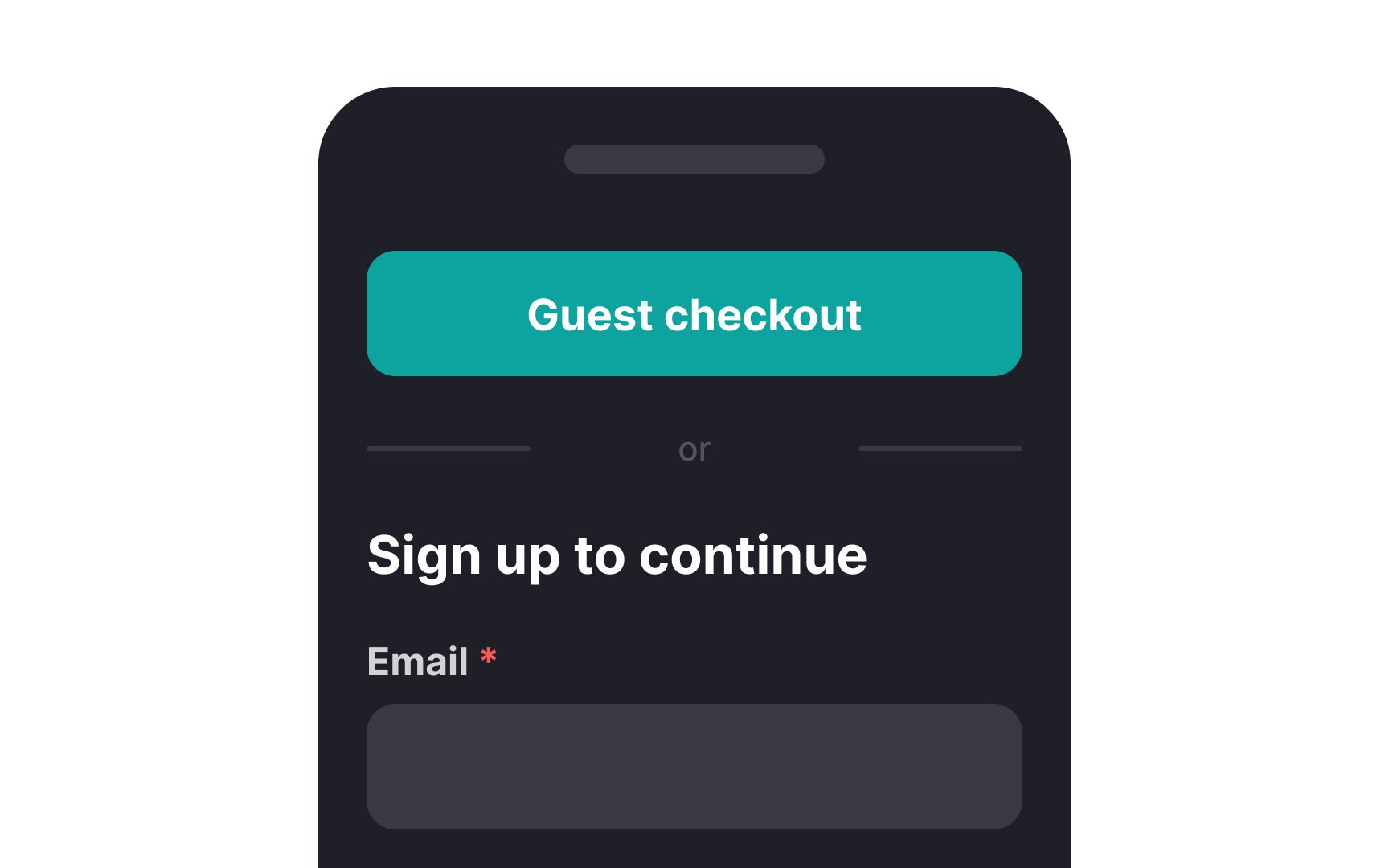
Studies suggest that delaying account creation for users is in your best interest. Immediately pushing users to sign up can be intimidating and put them off.[3] To speed up purchases, allow them to
Pro Tip: Enable one-click social sign-up and sign-in to make registration and logging in hassle-free.
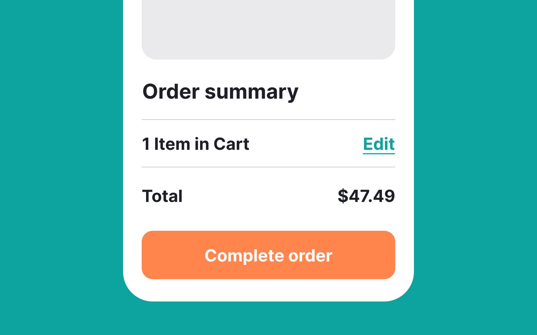
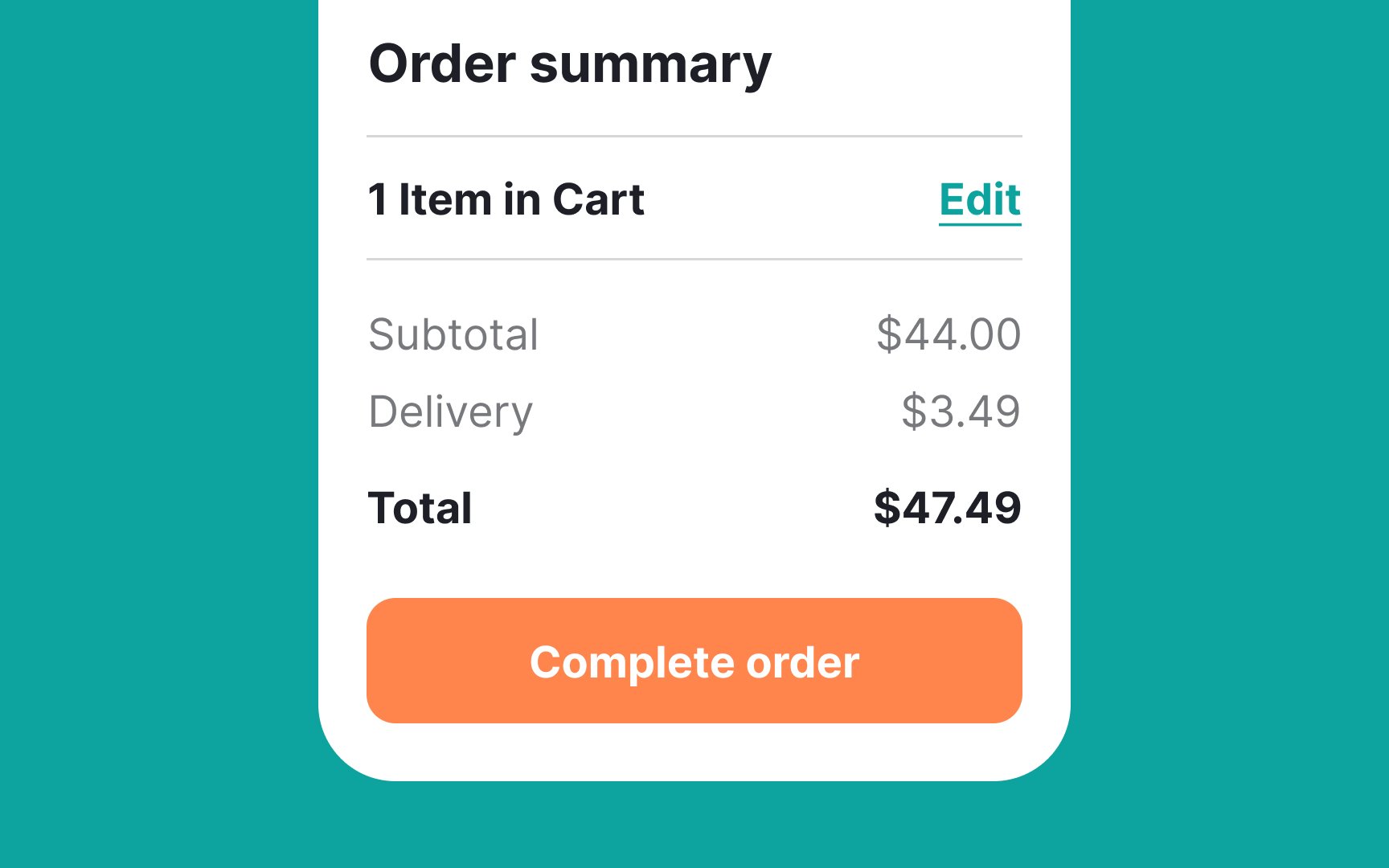
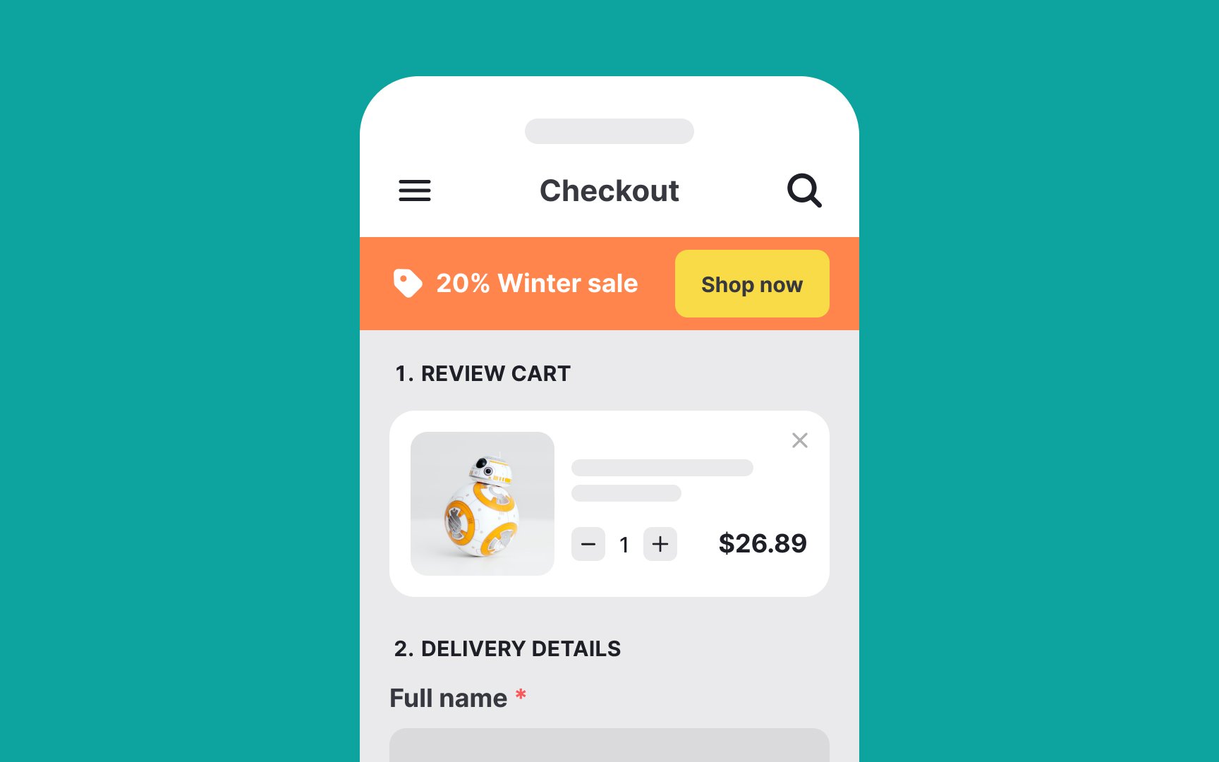
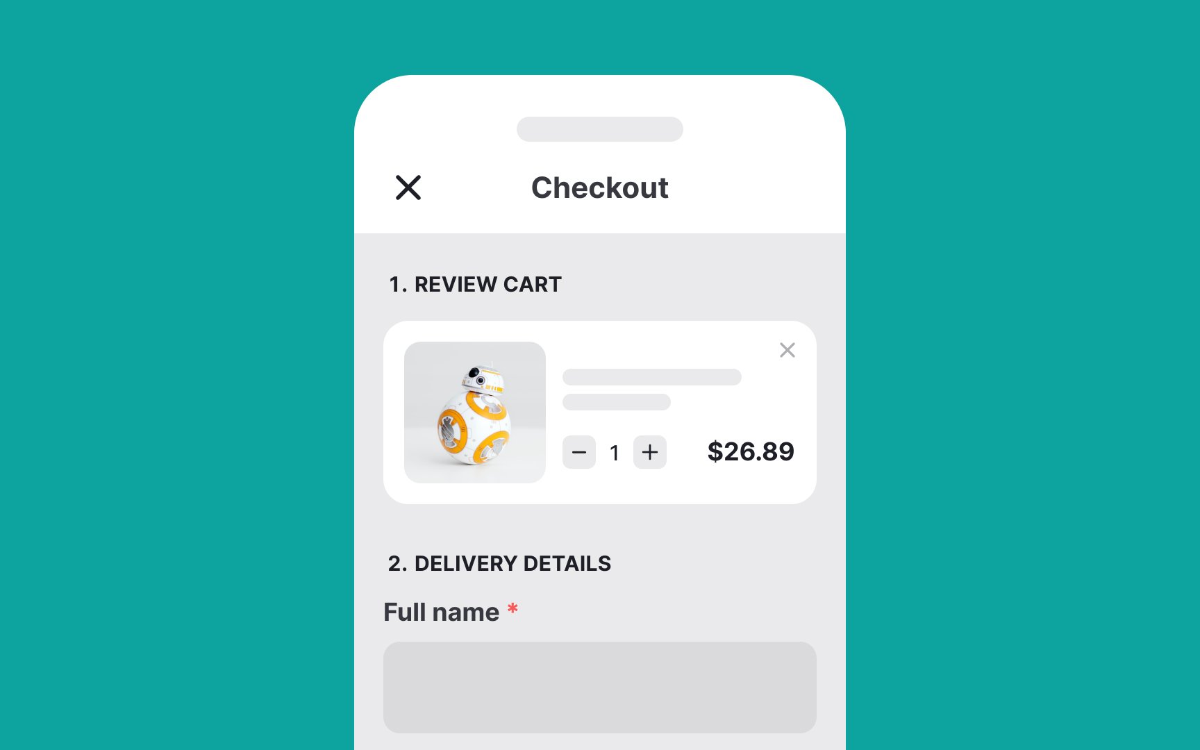
Add a summary section to your
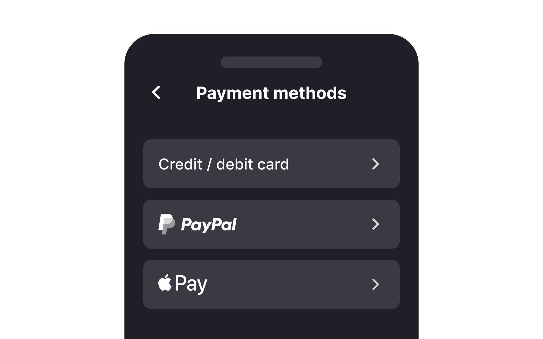
According to Baymard Institute studies, 9% of users abandon a website due to the lack of convenient payment methods.[4] When users trust your website enough to share their payment details and make a purchase, reward them by making it easy, trustworthy, and seamless.
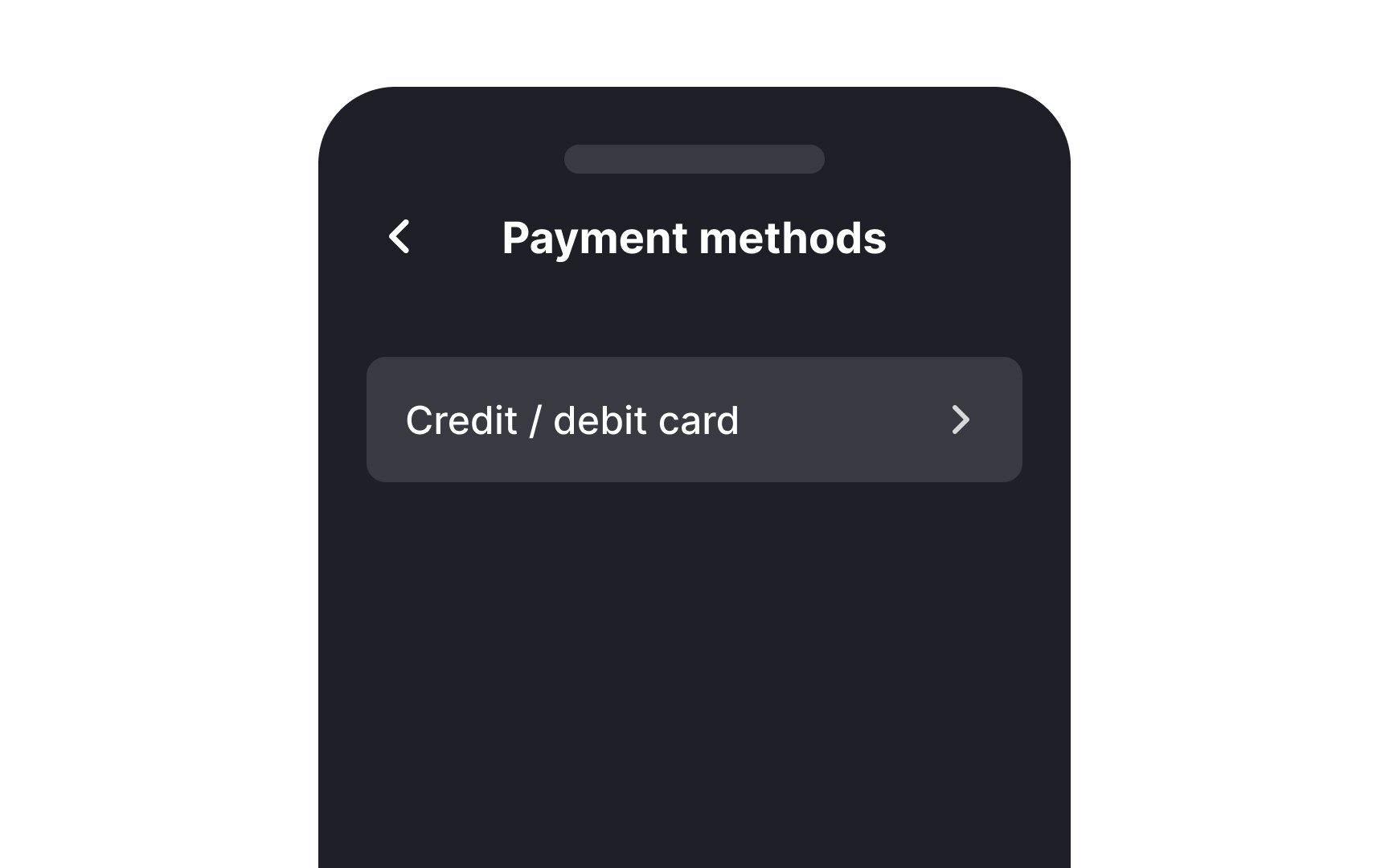
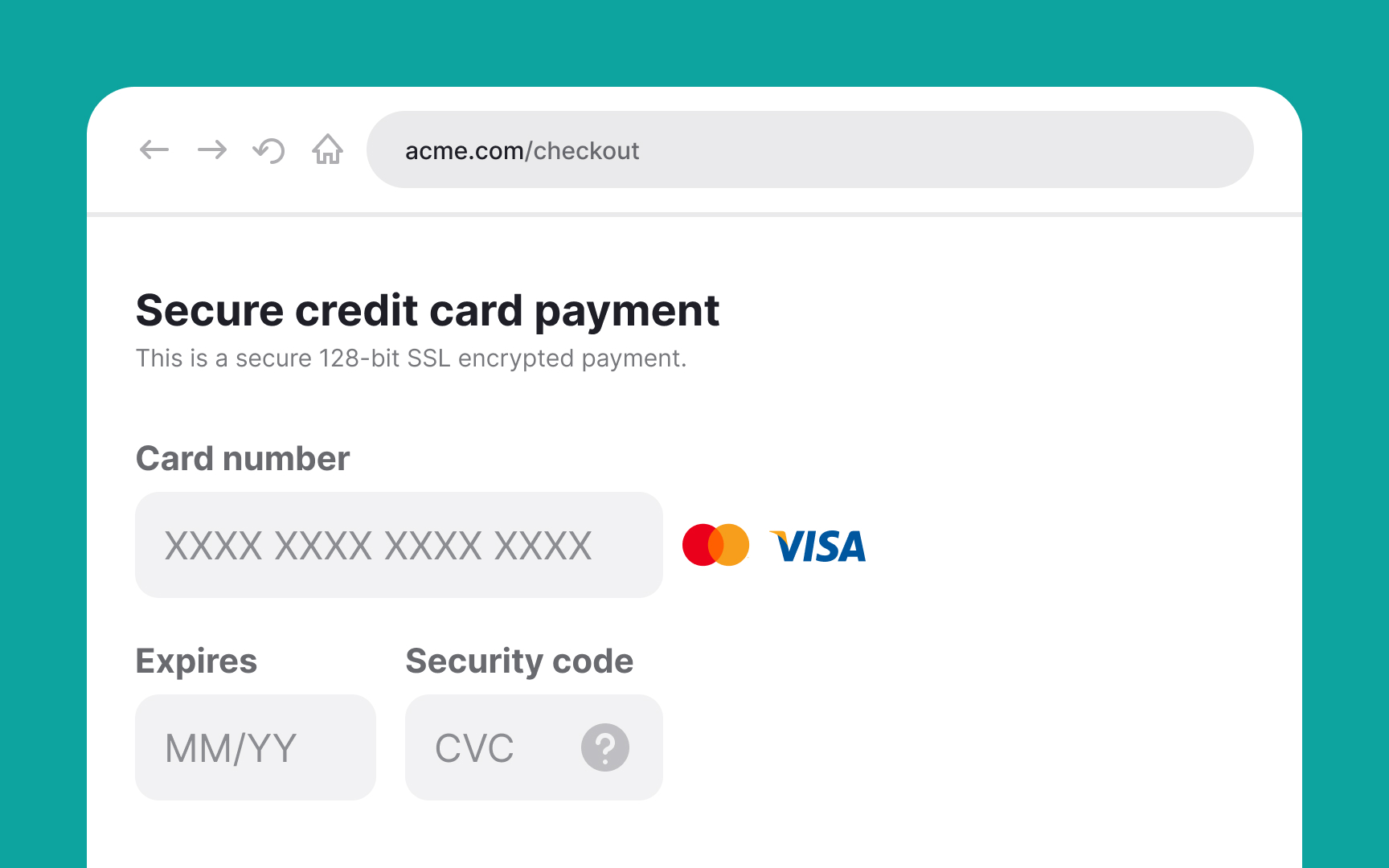
Provide as many payment
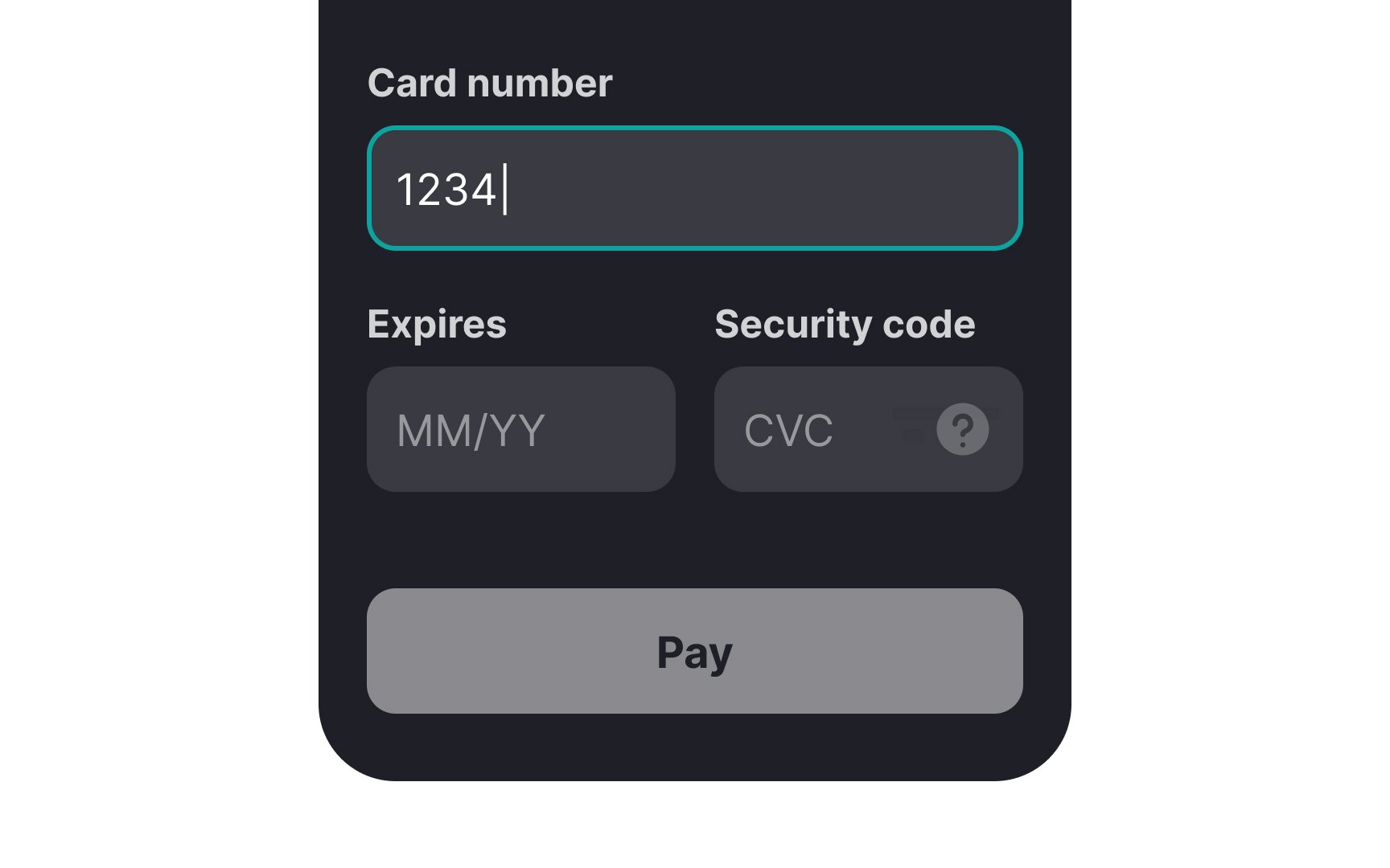
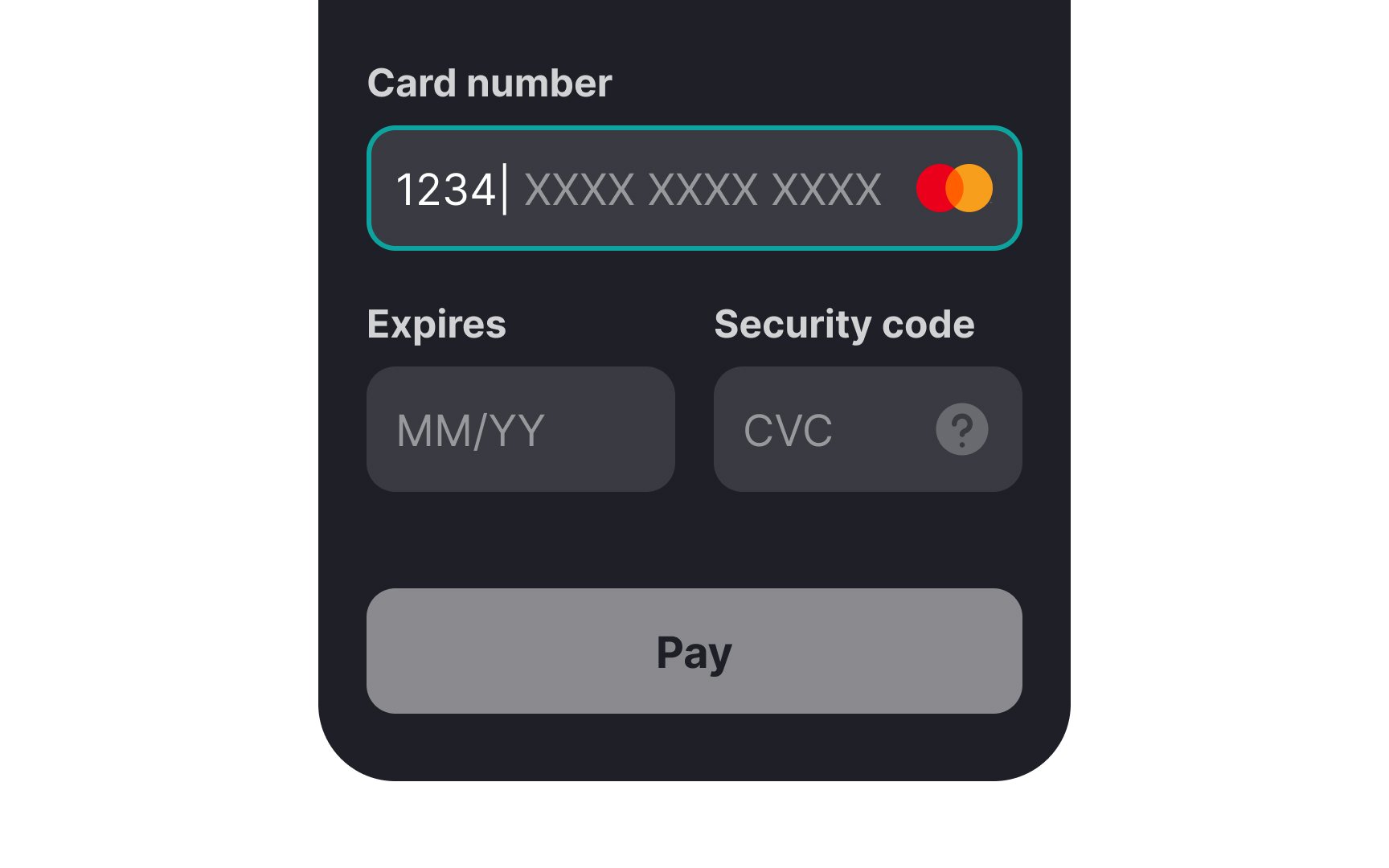
When collecting card details from users for payment, use smart defaults and foresee potential
Once users select their country, make the system fetch the corresponding currency — it saves time and effort and helps prevent mistakes. By not confusing users with
Another
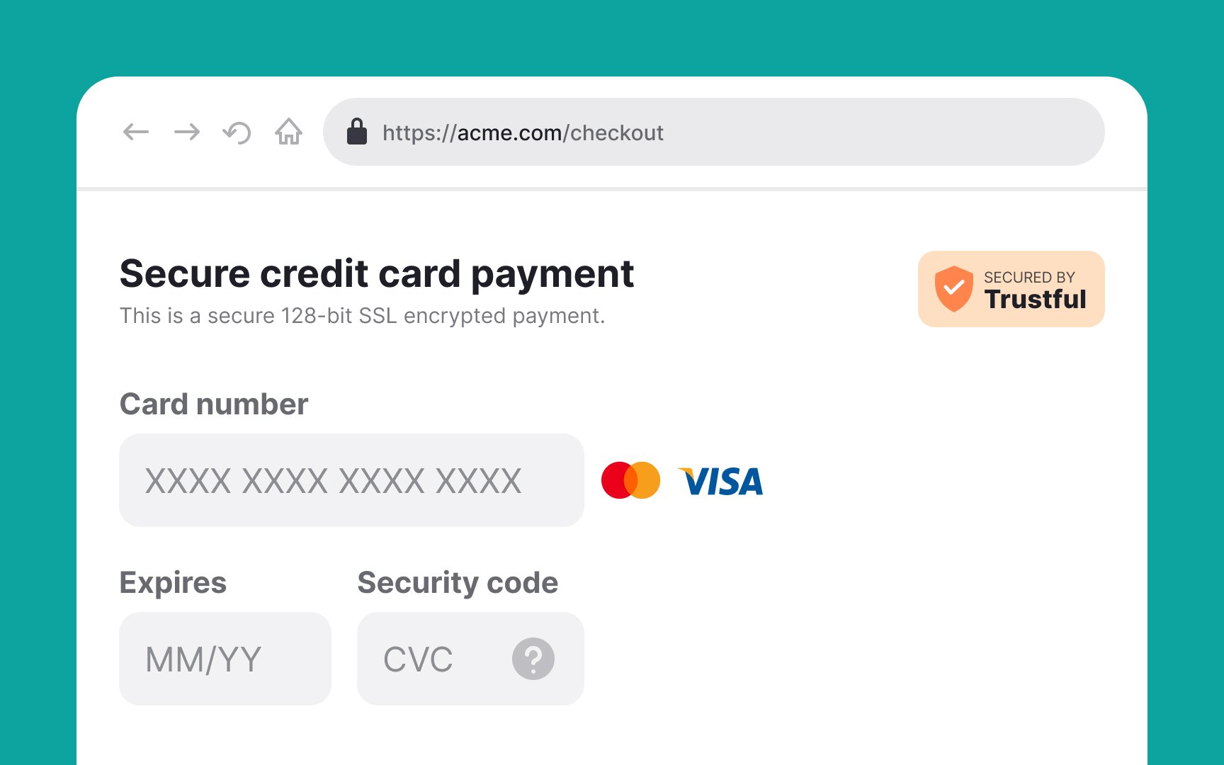
Although most users form an opinion about a site's security based on their gut feeling, designers can reinforce this feeling of trust by ensuring the website has the following:
- Security badges or trust seals: "SSL seals" issued by SSL certificate vendors like Norton, Thawte, Trustwave, Geotrust, or Comodo denote secure communication between a browser and a site. Furthermore, trust seals like Google Trusted Store, BBB Accredited, and TRUSTe indicate to users the business is legit and that they can trust it.
- A padlock icon and HTTPS protocol: The HTTPS protocol provides a layer of encryption that can help ensure the confidentiality and integrity of data exchanged between a web browser of users and a website. A tiny detail such as a padlock icon can also provide enough visual security cues to increase users' perception of security.
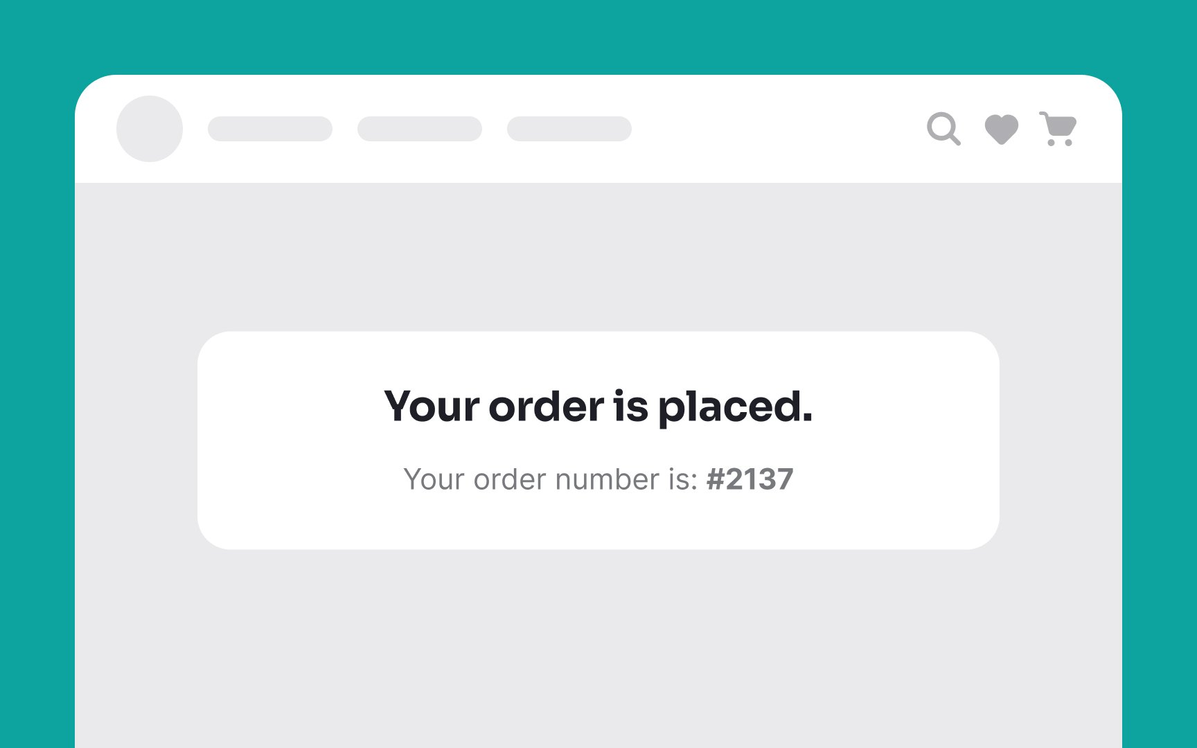
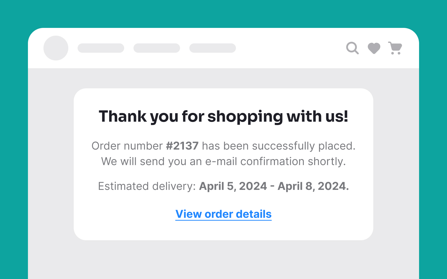
Don’t leave your users hanging after they’ve placed their order and made the payment. Let them know you’ve received it and are processing it with a confirmation screen.[5]
Don’t forget to send out a detailed confirmation email that covers the:
- Order summary
- Final
price and cost breakdown - Estimated date of delivery
- Order tracking details (if applicable)
Customer support details- Registration option for guest checkouts
Pro Tip: Making the checkout experience better is a long and ongoing process, and these best practices are only a first step. Don’t forget to test your page with your target audience and iterate until you arrive at a design that works best for your product.
References
- Error Message Guidelines | Nielsen Norman Group
- How to Report Errors in Forms: 10 Design Guidelines | Nielsen Norman Group
- Checkout Optimization: 5 Ways to Minimize Form Fields in Checkout | Baymard Institute
Top contributors


Topics
From Course

Share


Similar lessons

Login & Signup Flows

User Onboarding
