Ensuring Mobile Accessibility
Understand how to create mobile apps that are accessible and inclusive to all users
Due to the rapidly growing popularity of mobile devices and their unique characteristics, accessibility for mobile web apps, native apps, and hybrid apps is vital.
You may know the ropes of web accessibility, but mobile accessibility requires your attention due to small screen sizes, touchscreen gestures, and other issues typical for mobile devices.
Mobile apps that meet the WCAG's criteria have larger audiences and are more usable. Notably, addressing accessibility issues benefits all of your users. When a button is placed outside of the thumb zone, not only users with motor disabilities will have trouble accessing the button. People who operate their mobile phones with one hand (while shopping and pushing the cart or holding a child's hand) are likely to fail to press the button too.
First, let's take a look at some numbers. 15% of the worldwide population (~1 billion people) experience some form of disability (visual, cognitive, auditory, motor, etc.). And the disability numbers grow as the population ages.[1]
At the same time, the number of mobile users and the amount of web traffic coming from mobile devices increases annually by 2.1%. According to the latest data from GSMA Intelligence, there are 5.75 billion unique mobile phone users worldwide as of 2024. Plus, around 96% of internet users use a mobile phone to go online.[2]
Mobile
Mobile interfaces face unique accessibility challenges:
Touchscreen interaction- Limited screen space
- Multiple input methods
- Variable usage conditions (sunlight, internet connection)
Mobile accessibility ensures users with disabilities can consume content on not just phones and tablets but also:
- Smart TVs
- Car dashboards
- Smartwatches and other wearables
- Seatback screens in taxis and airplanes
- Household appliances and other smart home technologies
Unfortunately, mobile apps don’t yet have a comprehensive
Understanding how people with disabilities interact with interfaces helps designers create accessible solutions. It’s important to recognize that impairments can be both permanent and contextual, affecting anyone, at any time, depending on their environment or situation. Let's define key impairment categories:
- Visual: Ranges from mild (needing reading glasses) to severe (total blindness). Visual challenges can also be contextual, such as trying to read a screen in very bright sunlight or in a dark room. Color blindness affects color perception, requiring interfaces to convey information beyond color alone.
- Auditory: Varies from mild age-related hearing loss to complete deafness. Auditory impairments can also occur in noisy environments where it’s difficult to hear audio cues or video content. This makes transcripts and captions essential for
accessibility . - Mobility: Affects body movement and fine motor skills. Impairments can be temporary (broken arm) or permanent (paralysis). but can also arise contextually, such as when someone’s hands are full and they can’t easily interact with a device. Assistive technologies and adaptable interfaces help address these needs.
- Neurological/Cognitive: Includes inherited or acquired conditions (epilepsy, dyslexia, autism) affecting learning, memory, or concentration. Cognitive challenges may also be influenced by factors like fatigue or stress, impacting how users process content and making clear spacing and typography crucial.


While
Since many UI components appear across platforms, WCAG 2.1 guidelines apply to both web and non-web interfaces.[4]
WCAG's four core principles help organize accessibility requirements:
- Perceivable:
Content must be accessible and processable through various assistive technologies - Operable: Key features should work through multiple methods. For example, users should be able to
input text not only with a keyboard but also by using voice recognition tools like speech-to-text. - Understandable: Users must comprehend content and tasks through clear labels and instructions
- Robust: Systems should support various platforms and assistive technologies used by the target audience
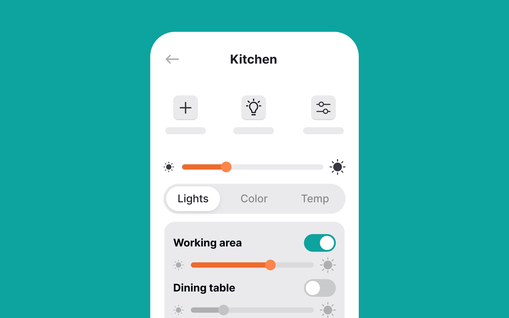
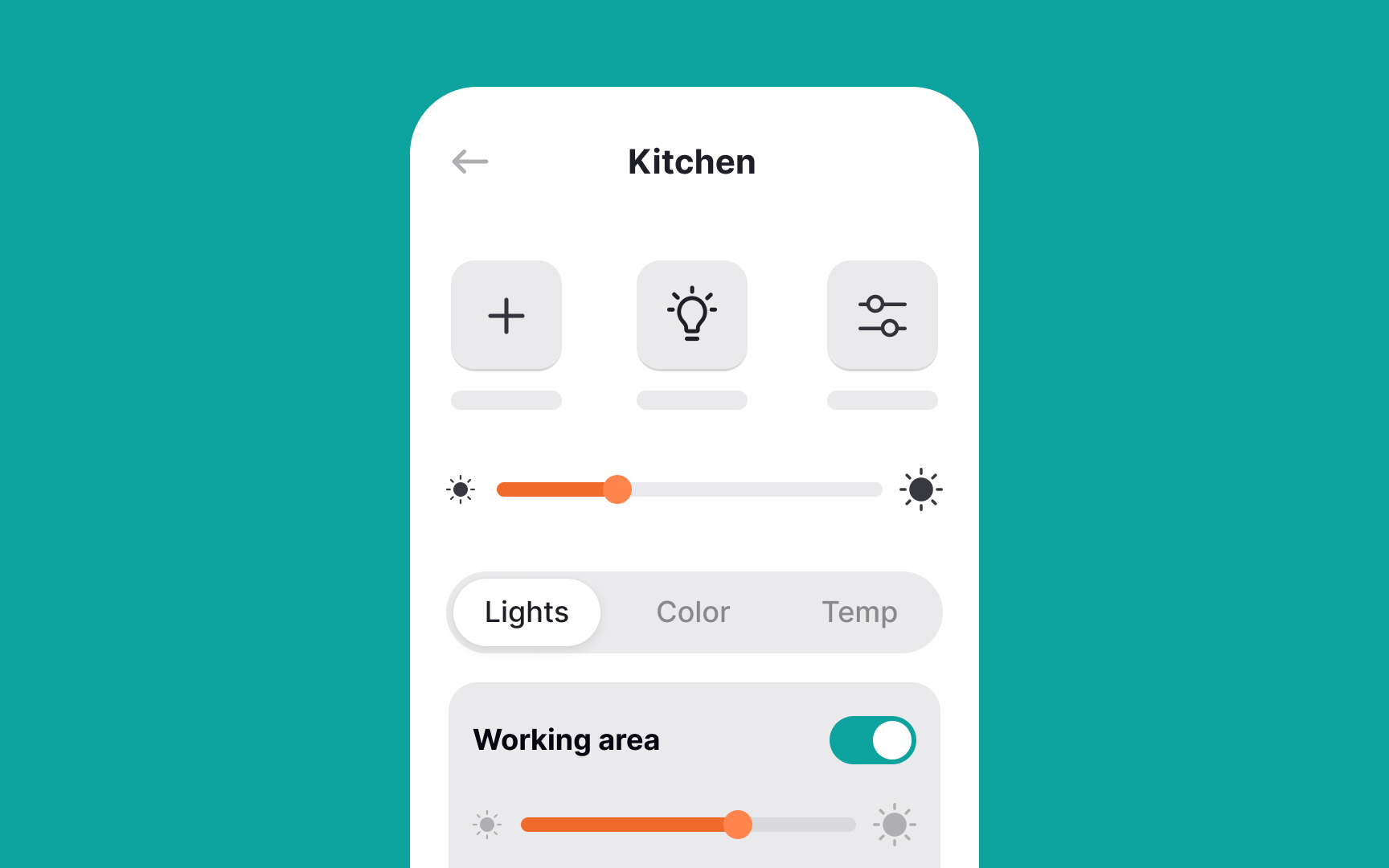
Screen size is a primary mobile design challenge. Whether choosing responsive, adaptive, or native app design, you must optimize
Best practices for small-screen
- Prioritize content hierarchy: Rather than simply reducing content, adapt it for mobile use cases. Focus on key features and place popular functions where users see them first
- Use UI components wisely: While space-saving elements (tabs, modals, dropdowns) help organize content, they can challenge impaired users. Ensure adequate font sizes and touch targets
- Stack elements vertically: Horizontal layouts are harder to scan and waste limited screen width. Arrange form fields and controls in columns
Mobile interfaces contain various interactive elements (
Touch target guidelines vary by platform:
WCAG minimum: 24×24 CSS px[5]- Material Design: 48x48dp
- iOS: 44x44pt
- Increase sizes further for apps used while moving, allowing room for error
Key design considerations:
- Keep at least 8dp/16px spacing between interactive elements
- Add inactive space around elements with minimum-sized touch targets
- Position primary buttons within thumb's reach, as users often operate phones one-handed
Pro Tip: Test your touch targets by navigating one-handed. If you struggle to tap accurately, increase target sizes or reposition key elements.
Mobile interfaces rely on
For accessibility, designers should:
- Prioritize simple gestures that most users can perform
- Provide alternatives for complex gestures that challenge users with visual, motor, or dexterity impairments
- Help users avoid accidental interactions
Key touch behaviors:
- Elements should activate only when finger touch starts and ends within the same target
- If a user's finger moves away after the initial touch, the element shouldn't activate
Many gesture-based features lack clear indicators. For example, users often struggle to discover edge-swipe menus. Use clear
Pro Tip: Some mobile apps involve device manipulation gestures like shaking or tilting. Make sure to provide alternative touch and keyboard control options that simulate device motions.
Consistency and standards constitute the fourth of Jakob Nielsen's ten heuristics.[7] A good system should use the same patterns everywhere and follow platform- and domain-specific conventions.
Consistency is not about limiting designers' creativity and making all products look alike. Instead, applications that follow standards are more predictable to users, are easier to learn, and cause less cognitive load.
Placing a logo in the same top-left corner on each page, using a house
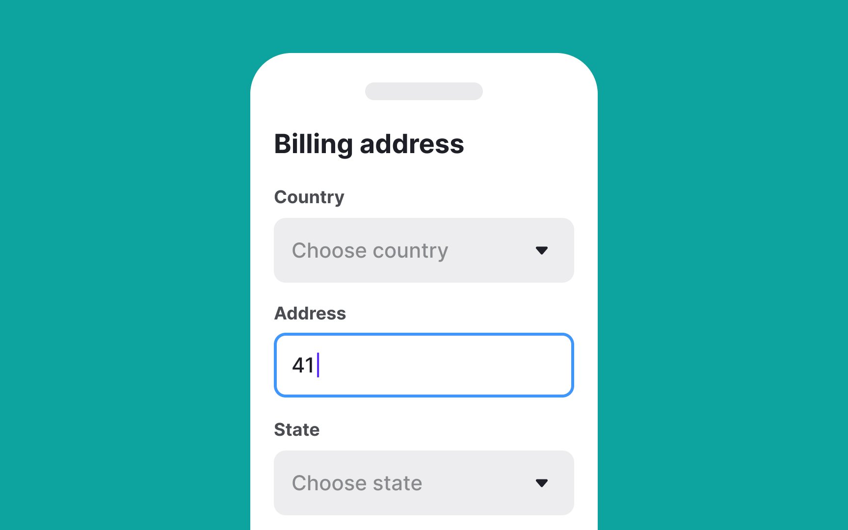
Data entry can be time-consuming and challenging for all types of audiences, especially those with motor, visual, or cognitive disabilities.
Try to minimize the need for entry by:
- Providing smart defaults based on the most common answers
- Offering users' last entries and the most popular answers and selections
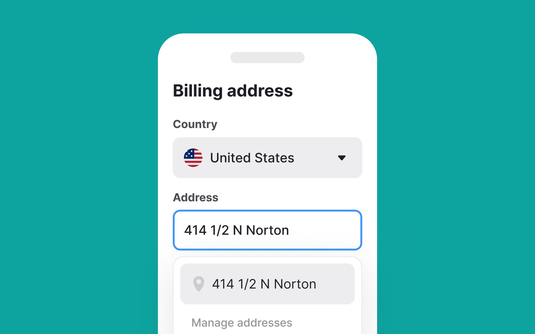
- Autofilling the data based on users' location (like time, country, city, etc.) and previously saved information (email, phone number, credit card number, etc.)
- Replacing
inputs with selection controls like checkboxes, radio buttons, toggle switches, or menus
Pro Tip: Consider adding other ways of data entry alternative to onscreen typing, like voice input.
One of the
- Set the default text size and allow users to adjust it using on-page controls for text resizing. The minimum recommended size for body text is 16px.
- Allow users to use pinch-zoom to magnify the entire screen.
- Use short, simple sentences (5-8 words) and break long text into digestible chunks using white space.
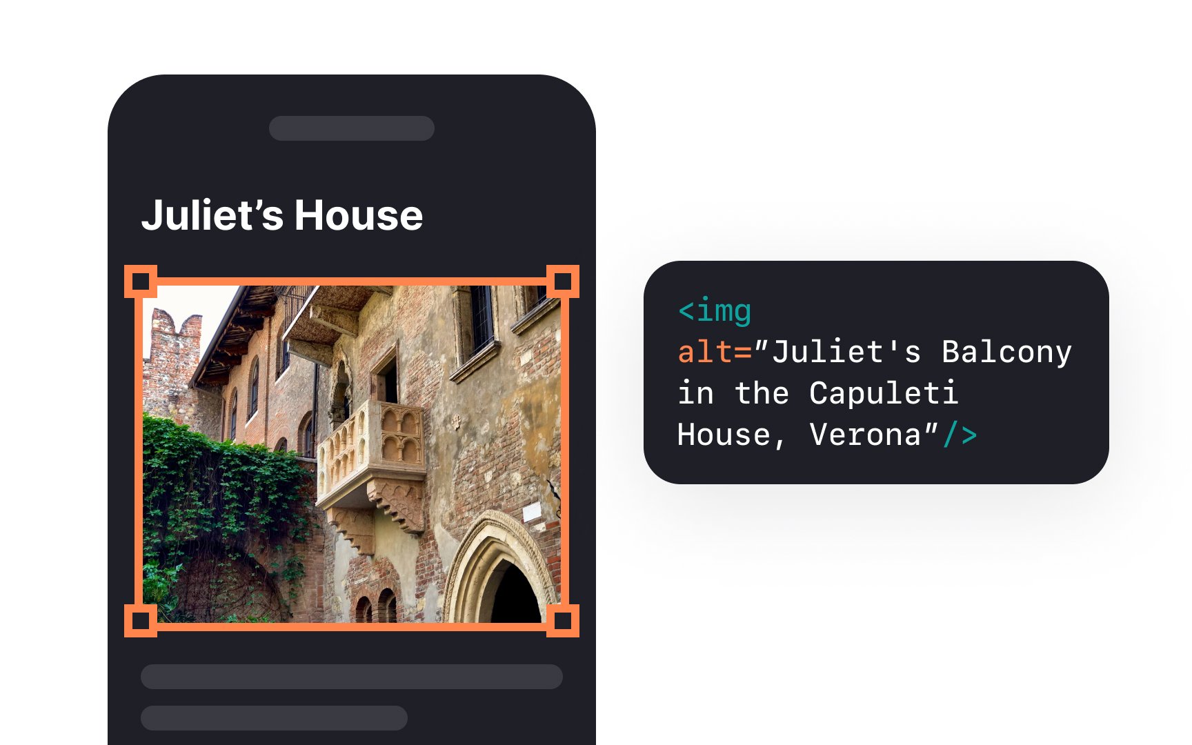
- Use accurate alternative text. Users with visual impairments can't access images, videos, GIFs, and illustrations without screen readers. Make sure to accompany imagery with alt text — informative descriptions that convey the meaning of an image.
- Provide captions and transcripts of video content to allow people with hearing impairments to read content they can't hear.
That's why it is so crucial to maintain a sufficient color contrast ratio. It's especially relevant for mobile devices that people often use outside under extreme sunlight where they may not be able to see interface elements well.
Web Aim Contrast Checker is one of the most popular tools for checking the contrast ratio between your background and text.
References
- Disability Inclusion Overview | World Bank
- Digital Around the World — DataReportal – Global Digital Insights | DataReportal – Global Digital Insights
- Maintain Consistency and Adhere to Standards (Usability Heuristic #4) | Nielsen Norman Group
Top contributors


Topics
From Course

Share


Similar lessons

Designing for Mobile Interfaces

Responsive vs. Adaptive Design
