Designing Mobile Layout
Dive into the key principles of mobile layout design
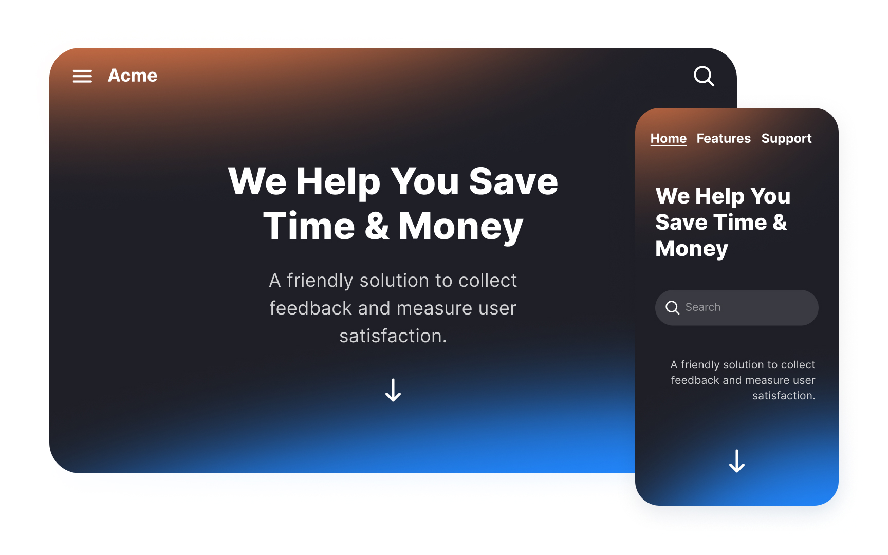
Why are layouts for mobile and desktop different? There are several reasons. The most obvious is, of course, the size. What looks good on a large screen doesn't often translate the same way on a smaller-sized screen.
Another reason is the way people use their devices, which differs a lot between desktop and mobile. Most people use desktops indoors and for more prolonged interactions. On the other hand, smartphones are used everywhere and often on the go. Mobile users also prefer quick sessions. Tasks like setting the alarm, checking email, or replying to messages don't usually take more than a few seconds.
And finally, input mechanisms are different. With touchscreens, people use their fingers and thumbs — they take up more space than cursors and obscure content. These 3 factors determine the key principles of the mobile layout design
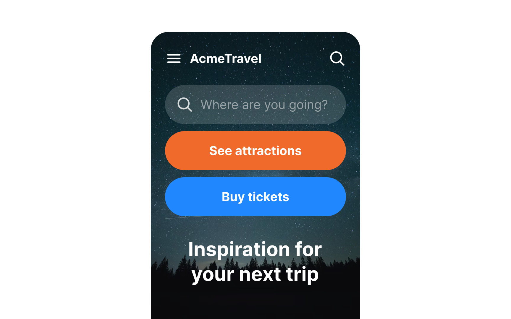
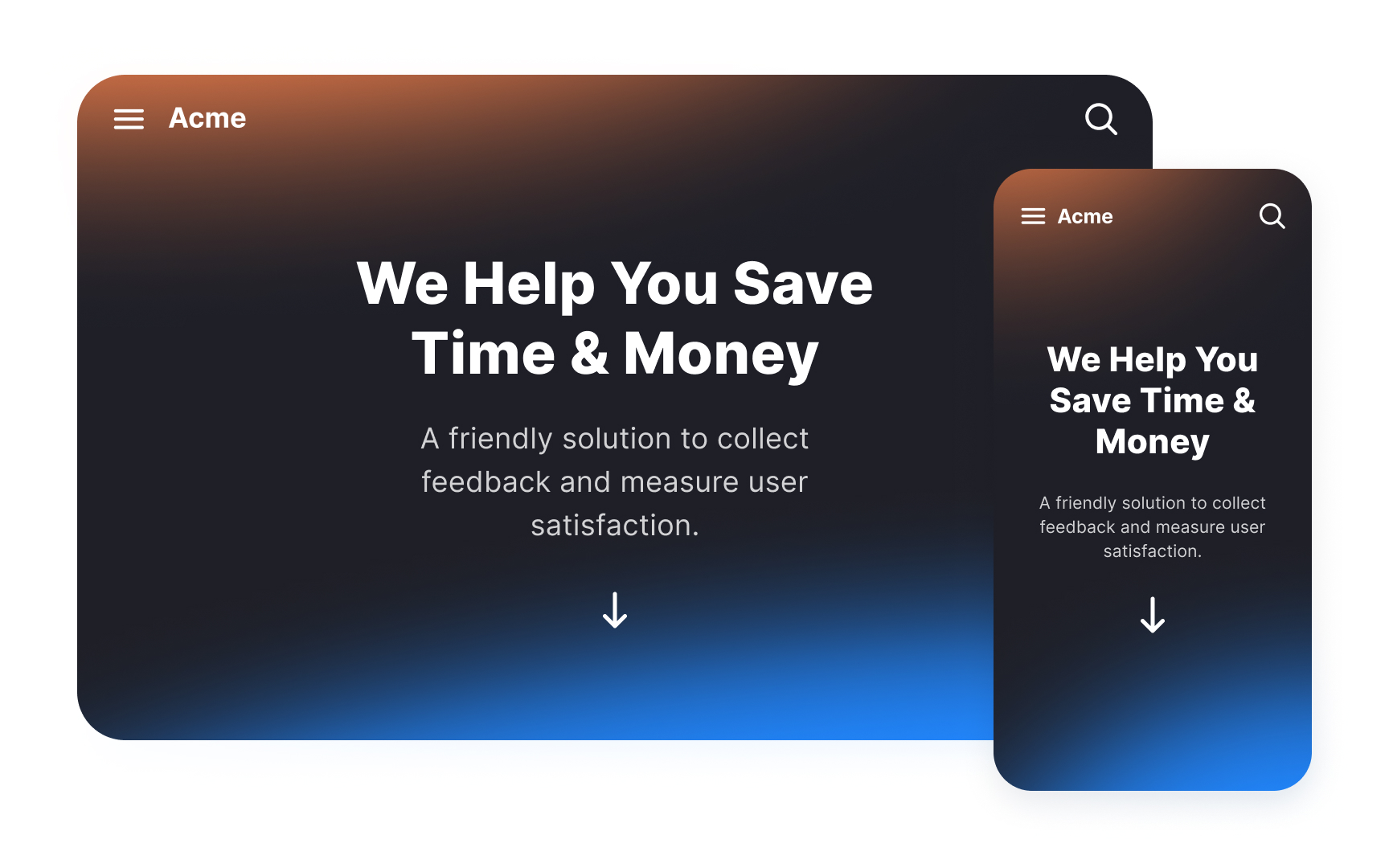
Minimizing clutter in mobile interfaces allows users to concentrate on completing the task they are on. Prove your app's value by giving users what they want right away. Avoid distracting them with unnecessary buttons, images, or text.
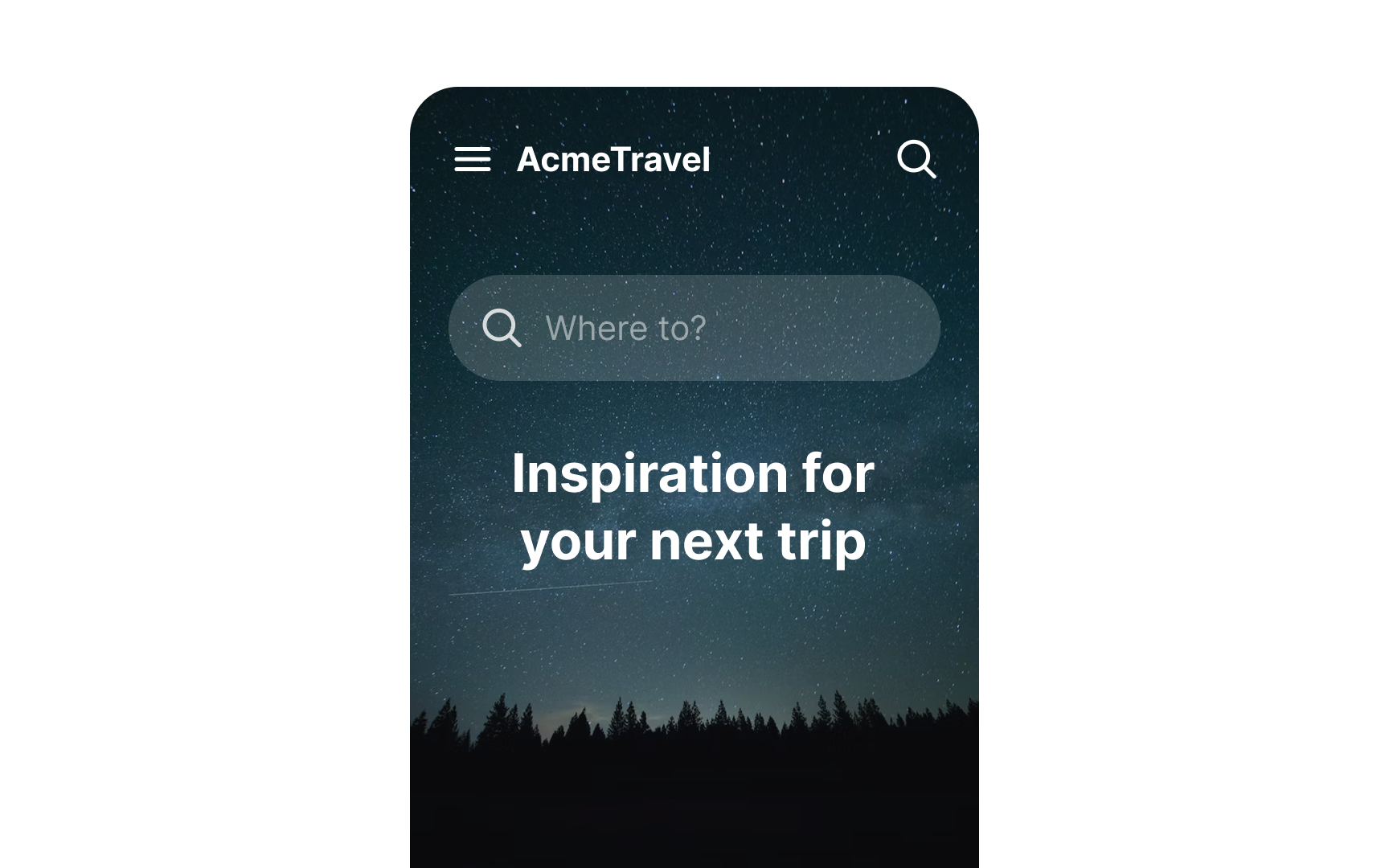
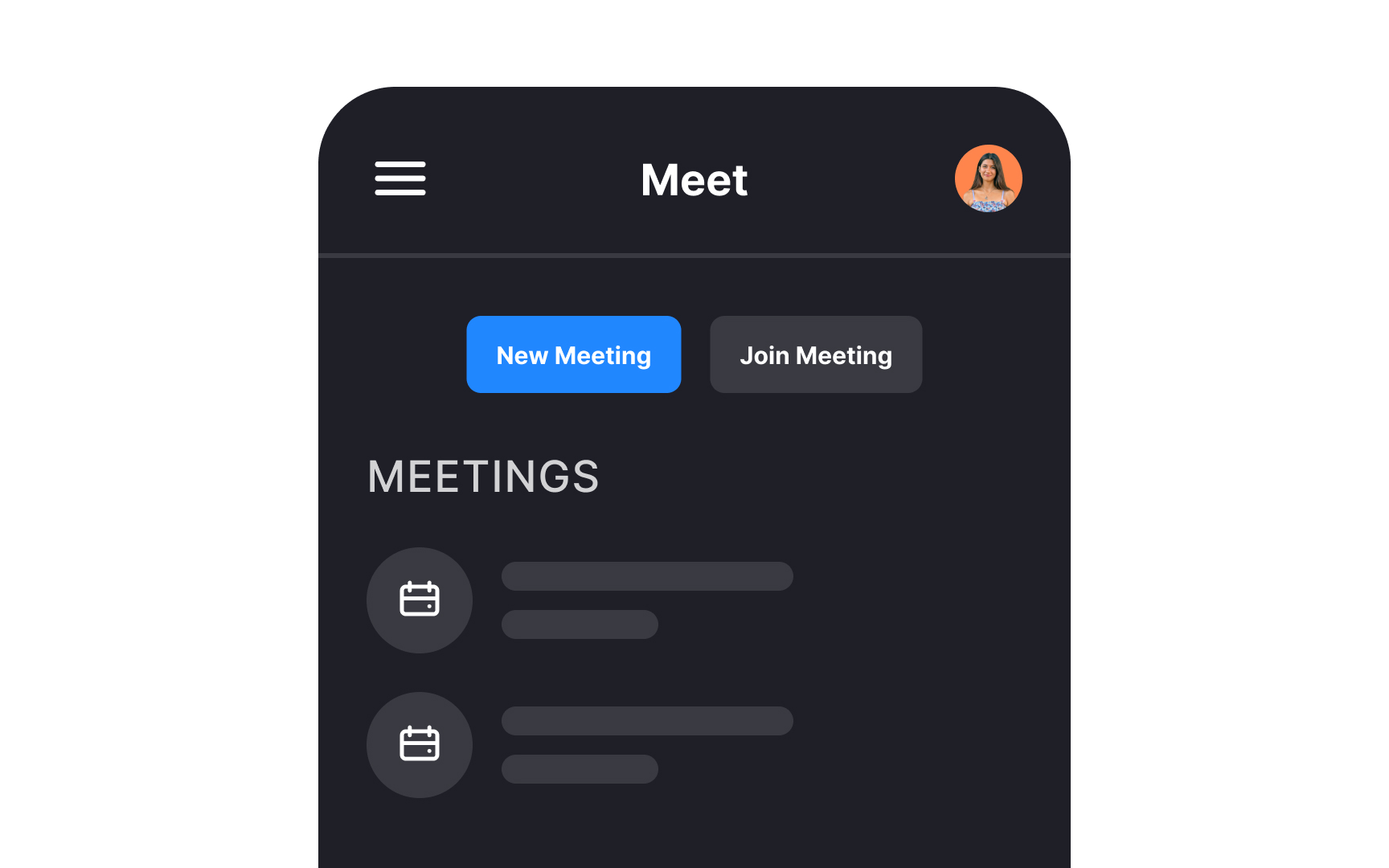
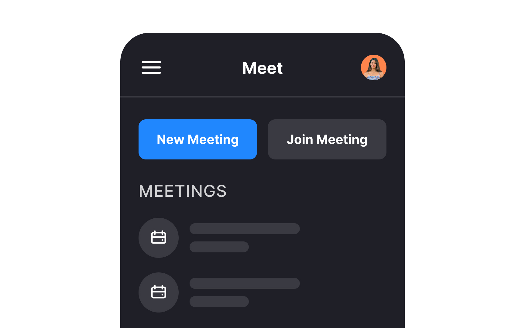
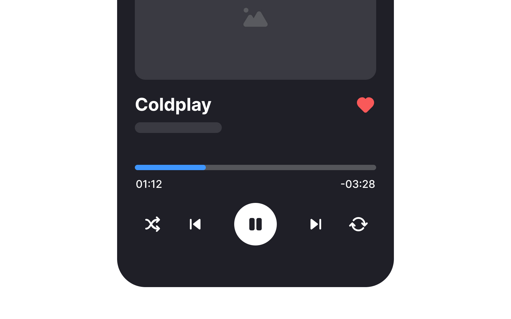
A simple rule of thumb is to use one primary action per screen.[1] Every screen you design for the app should support a single action of real value to the person using it.
For example, Airbnb knows that its users' goal is to book accommodation. The main screen with a search field asks users, "Where to?" without distracting them with other elements. Additional functions like Experiences or Inspirations can be found below the fold, while the top bar offers navigation options.
Good
What can improve navigation?
- Show the name of the current page. To navigate successfully, users should always be able to answer the question "Where am I?"
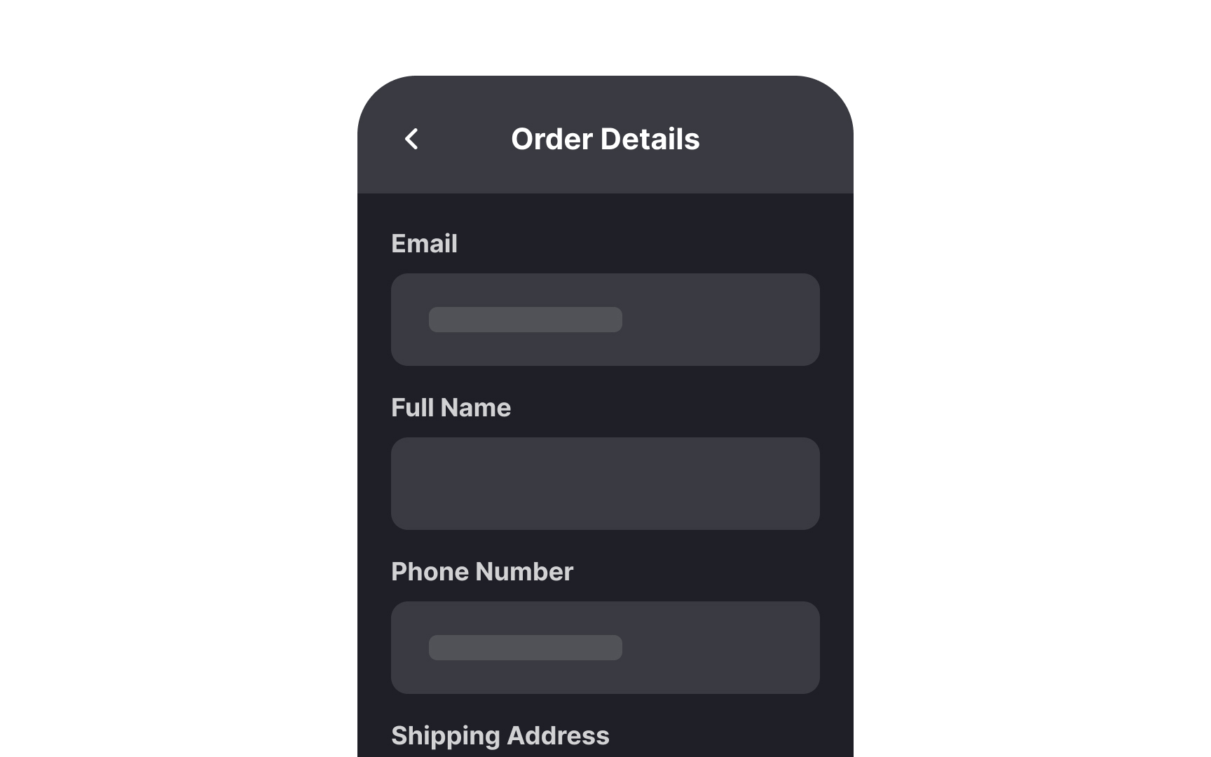
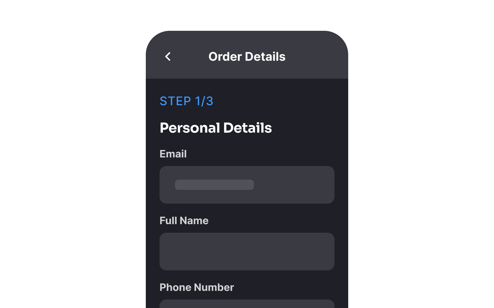
- Break down big tasks into easy steps to minimize the cognitive load. For example, instead of offering a long checkout form, ask users to fill in information over multiple screens: their shipping address, billing information, and order confirmation can each be on separate screens.
- Emphasize important information. You can do so by increasing the font size, adding white space, and ensuring that the element's color contrasts well with the background color.
The key to intuitive
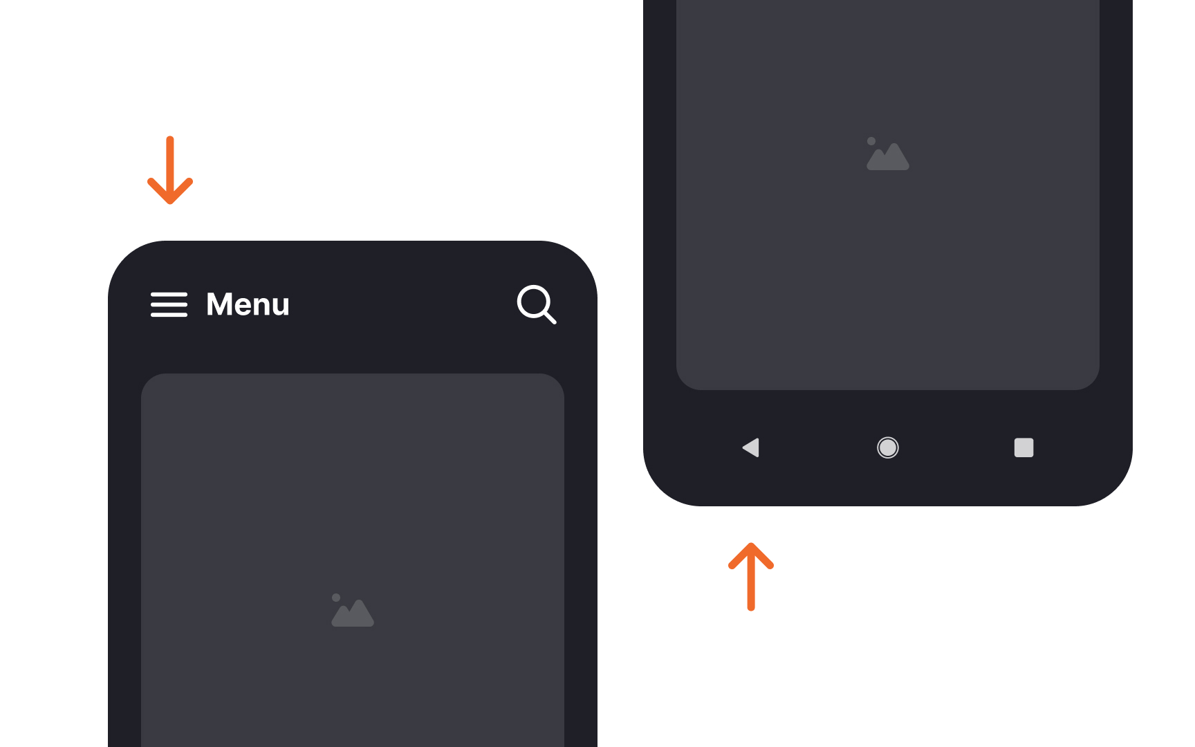
- Use common navigation patterns. For example, users expect the Back
button to return to previous screens and the hamburger menu to reveal navigation options - Avoid altering established symbols. A home icon should always lead to home, and the Back button shouldn't perform any action except returning
- Keep global navigation controls consistent across all app screens
People interact with touch screens using their fingers, most often their thumbs. It's crucial to make the touch targets large enough and allow enough spacing between them.
Comfortably large touch targets are easier to hit, and choosing the wrong action is less likely. It's especially important for
Aim for controls that measure 7-10mm. Apple's iPhone Human Interface Guidelines suggest a minimum tappable area of 44x44pt for all controls.[2] Google's Material Design states that touch targets should be at least 48x48px.[3]
Pro Tip: In responsive designs, it's especially important to make sure buttons and other touch targets resize properly for smaller screens.


The key to mobile typography is readability. If users can't read your
What can improve readability?
- Set body text size to at least 16px (or 11pt) so it's legible at a typical viewing distance without zooming. Smaller text will be harder to read, and larger fonts will result in awkward breaks and hyphenation, increasing the
cognitive load for users. - When it comes to line length on mobile, aim for 30-40 characters per line.
- Increase line height or letter spacing. It will not only increase readability but also make your interface more inviting.
- Avoid using display typefaces as they are hard to read in small sizes
Creating sufficient
While the Web Content Accessibility Guidelines are written mostly with desktops in mind, their color contrast recommendations still work well for mobile. They recommend a contrast ratio of at least 4.5:1 against the background for small text and 3:1 for large text. For


When creating mobile layouts, we should consider how users interact with their devices — especially their hand positions. People use smartphones on the go — when walking, standing, in transport, etc.
Research shows that people hold their phones in many ways while shifting their hold a lot. However, they prefer to view and touch the center of the screen.[4] Another fact is that hands aren't transparent — they can obscure the interface.
What does this mean in terms of
- Primary content placement: Place the primary
content at the center of the screen, put secondary actions along the top and bottom edges, and hide tertiary functions behind menus. - Scrolling: To improve readability and focus, allow users to scroll content to the center of the viewport. You can do this by adding extra space or padding at the bottom of the
page , enabling content to align naturally with the center of the screen. - Touch target size: Touch targets in corners should be larger than those in the screen center. Aim for at least 7mm for central touch targets and 12mm for corner targets.
- Selectable items: Make selectable items large enough to clearly indicate a successful tap. People should be able to see what they're tapping.
- Margin size: Create reasonable margins. Most users gesture at the side to scroll while avoiding obscuring content.
Typing on mobile is a slow and error-prone process. It often requires two hands — data shows that 41% of users hold their phone with both hands and tap using their thumbs when typing.[5]
What can we do to minimize the need for manual input on mobile?
- Keep forms short and simple by removing unnecessary fields or keeping them optional.
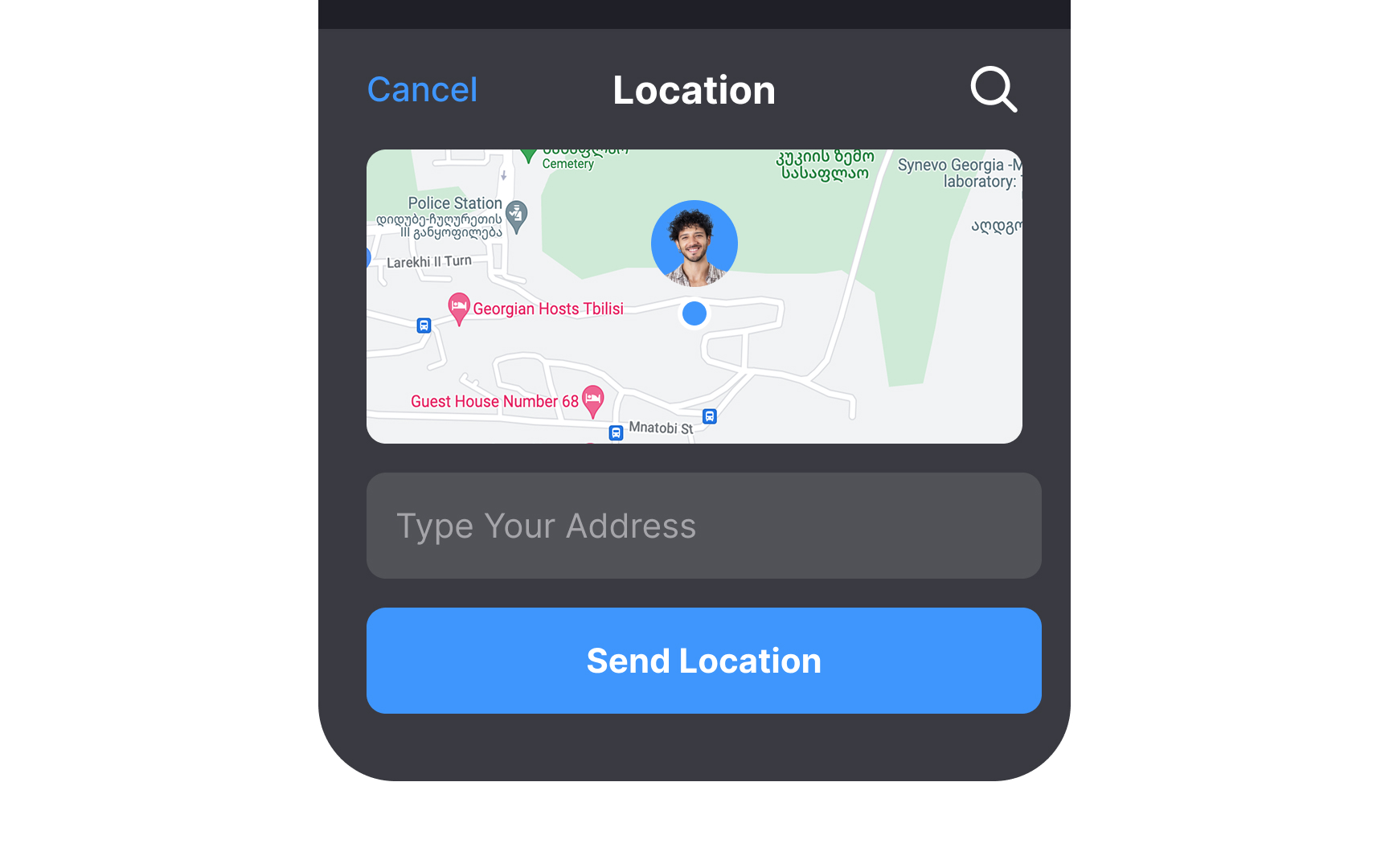
- Use autocomplete and personalized data where appropriate. For example, ask users to share their location instead of typing it in.
- Use the phone's features to fill in the fields automatically. For instance, allow users to add payment information by holding their credit cards in front of the camera.
- Add "Remember me" options for future use.
- Let users try your app before signing up. Ask to sign up and provide credit card information only when it's critical.
- Provide recent
search history. - Display the best keyboard variations for each type of data. For example, provide a numeric keypad for phone numbers.
While mobile and desktop
Keep
Make sure your users can predict most of the time how your app will work and look. Mobile users don't have the advantage of hovering and having a
References
- Mobile UX Design: Key Principles | Medium
- Material Design | Material Design
Top contributors


Topics
From Course

Share


Similar lessons

Designing for Mobile Interfaces

Responsive vs. Adaptive Design
