Common Navigation Patterns
Explore common navigation patterns and best practices for using them in interfaces
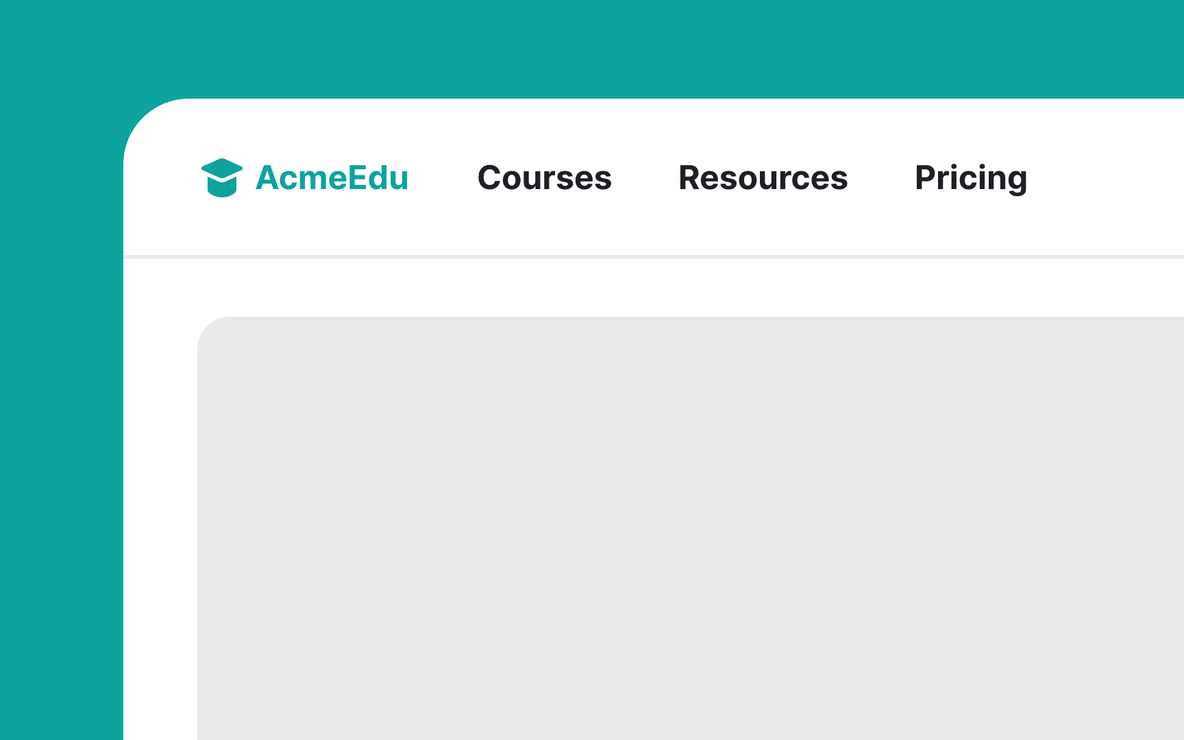
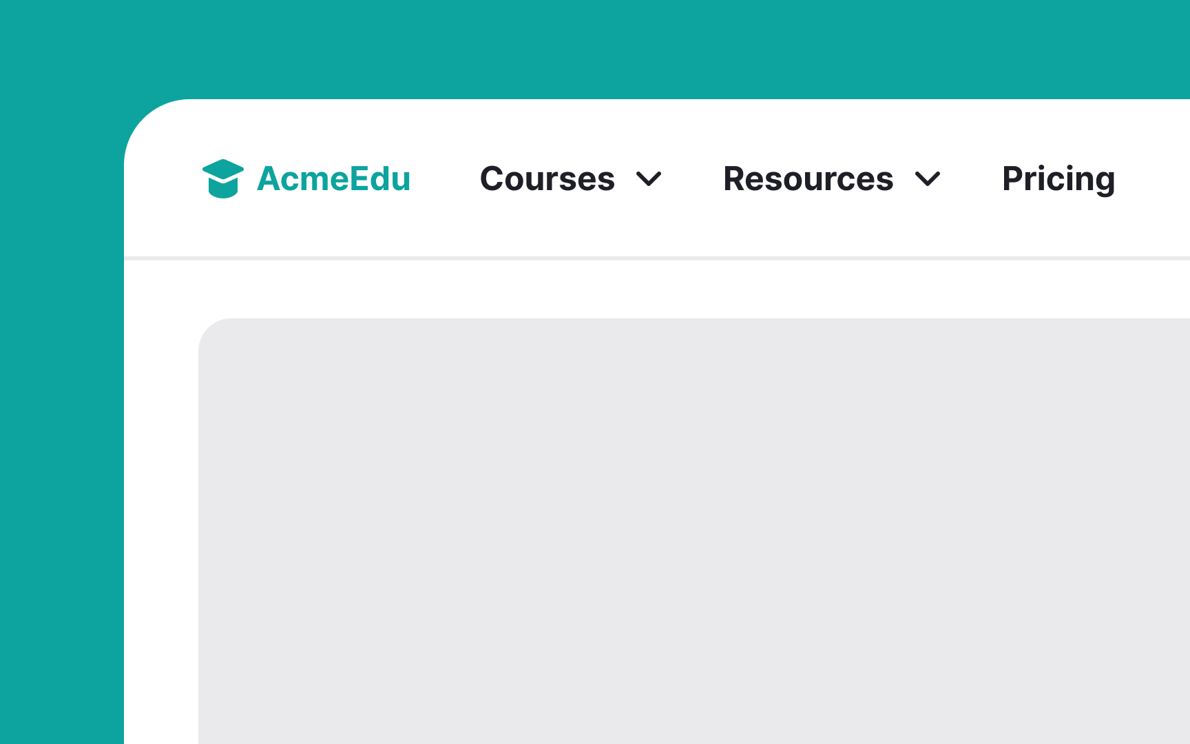
Navigation patterns are essential for guiding users seamlessly through interfaces. For example, a hamburger menu tucks away navigation on mobile screens, keeping the display uncluttered while still accessible. The top navigation bar's consistent visibility lets users easily return to main categories from anywhere on the site, enhancing accessibility and user experience.
Sticky menus that remain visible as the user scrolls provide constant, easy access to navigation, especially useful on content-heavy sites, ensuring that essential links are always within reach. Each of these patterns addresses specific user needs, improving the overall usability and user experience by simplifying access to important areas of the site or app.
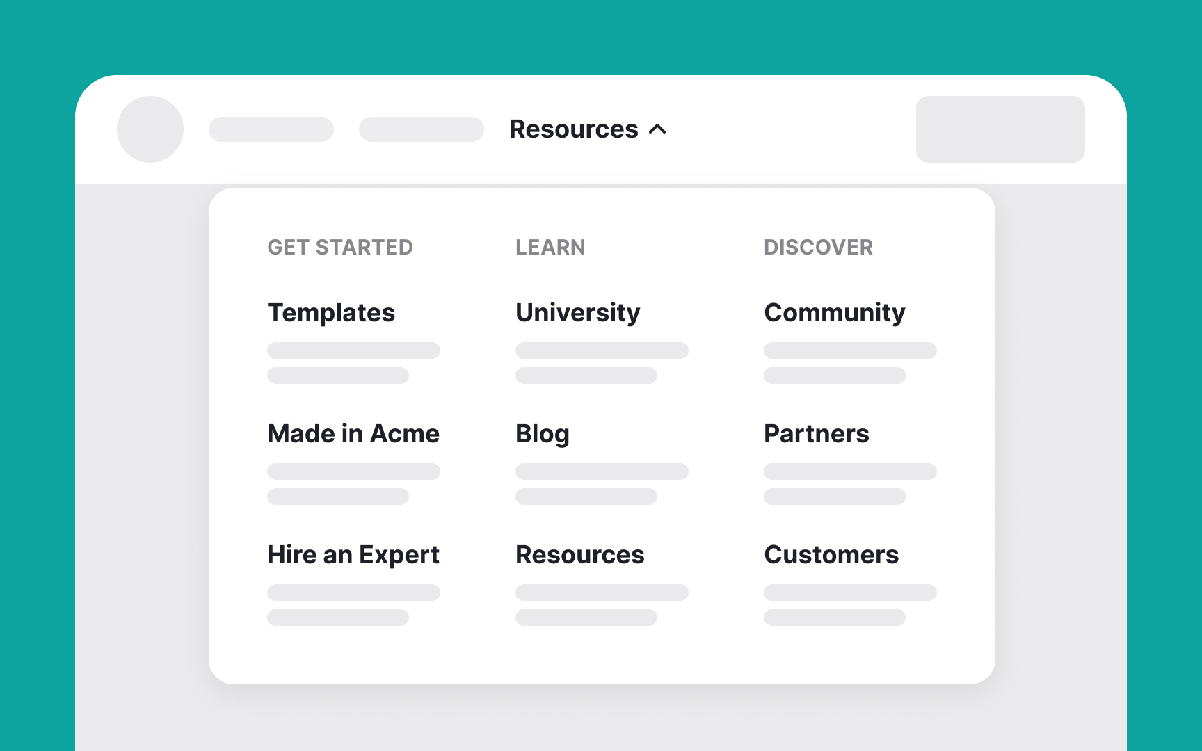
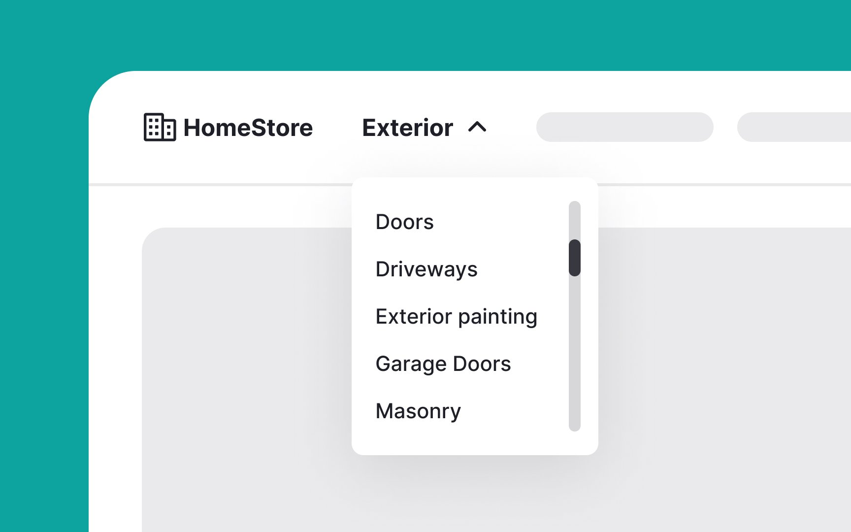
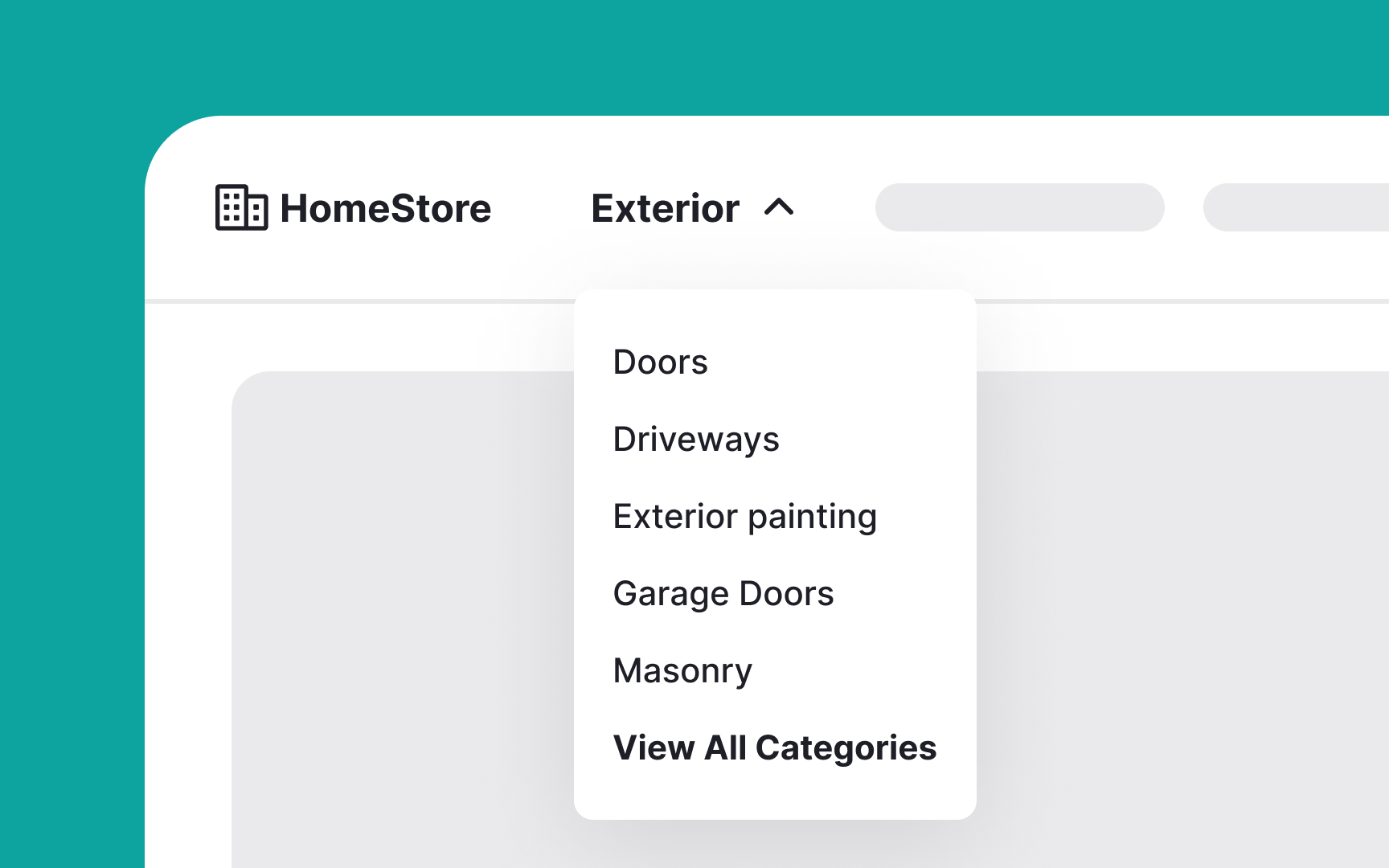
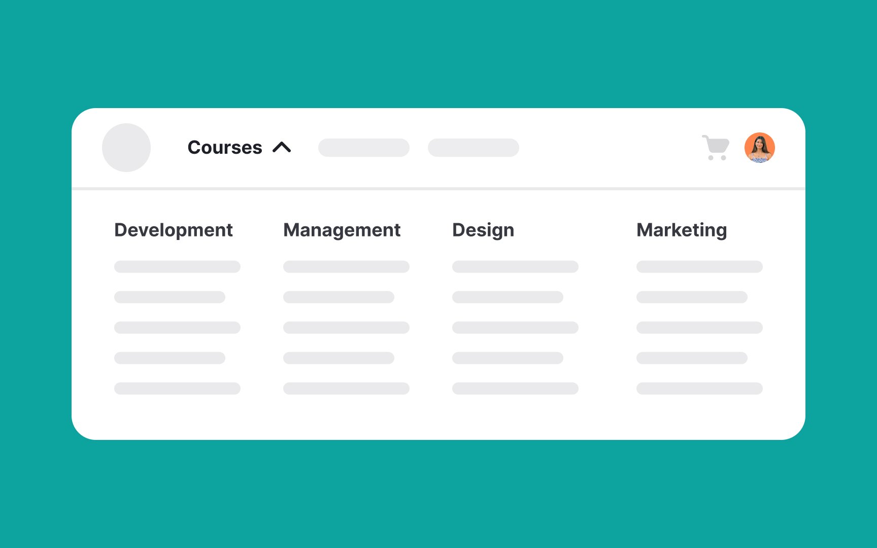
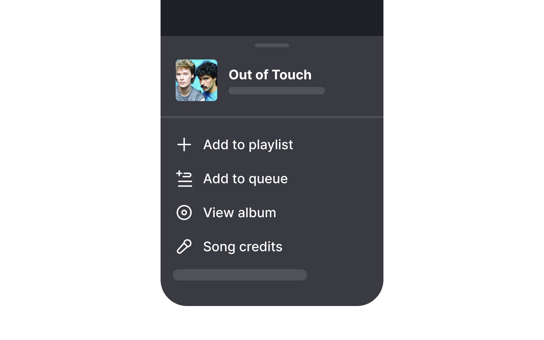
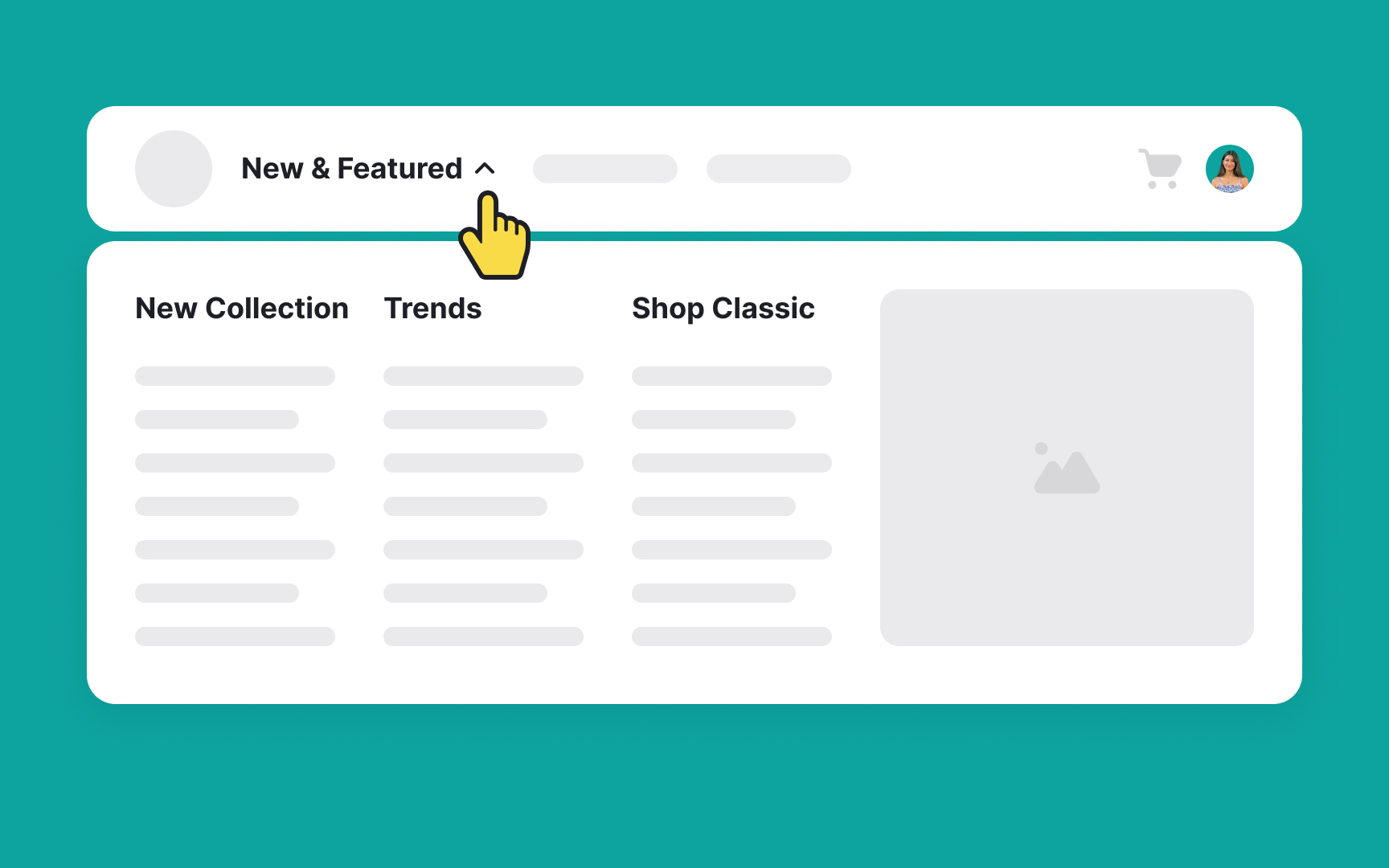
Mega menus are expandable menus that display many choices in a two-dimensional dropdown layout, ideal for sites with extensive options.
Their characteristics include:
- Two-dimensional panels divided into groups of
navigation options - Navigation choices structured through layout, typography, and sometimes icons
- Everything visible at once — no scrolling required
- Vertical or horizontal forms when activated from top navigation bars; from left-hand navigation, they might appear as mega fly-outs
- Menu options revealed on hover, click, or tap
Benefits of mega menus include:
- Comprehensive navigation: They show many options at once, making navigation efficient.
- Organized layout: Their clear structure helps users quickly find what they need.
- Enhanced user experience: They reduce the number of clicks needed to find information, improving overall efficiency.
Here are the key grouping guidelines for mega menus:
- Chunk related options: Group similar items together based on user insights, such as findings from a card sorting study.
- Maintain medium granularity: Avoid both overly large groups that overwhelm users and excessively small groups that clutter the
menu . For example, instead of having a single group for all "Electronics" or splitting it into too many subcategories, find a balance like "Mobile Devices," "Computers," and "Accessories." - Use concise, descriptive labels: For example, use "Home Decor" instead of "Items to Decorate Your Home."
- Order groups logically: Arrange groups in a meaningful order, either by workflow or importance.
- Differentiate labels clearly: Avoid similar-sounding labels that could confuse users. For instance, instead of "Beginner Courses" and "Basic Courses," use "Beginner Courses" and "Introductory Courses."[1]
A
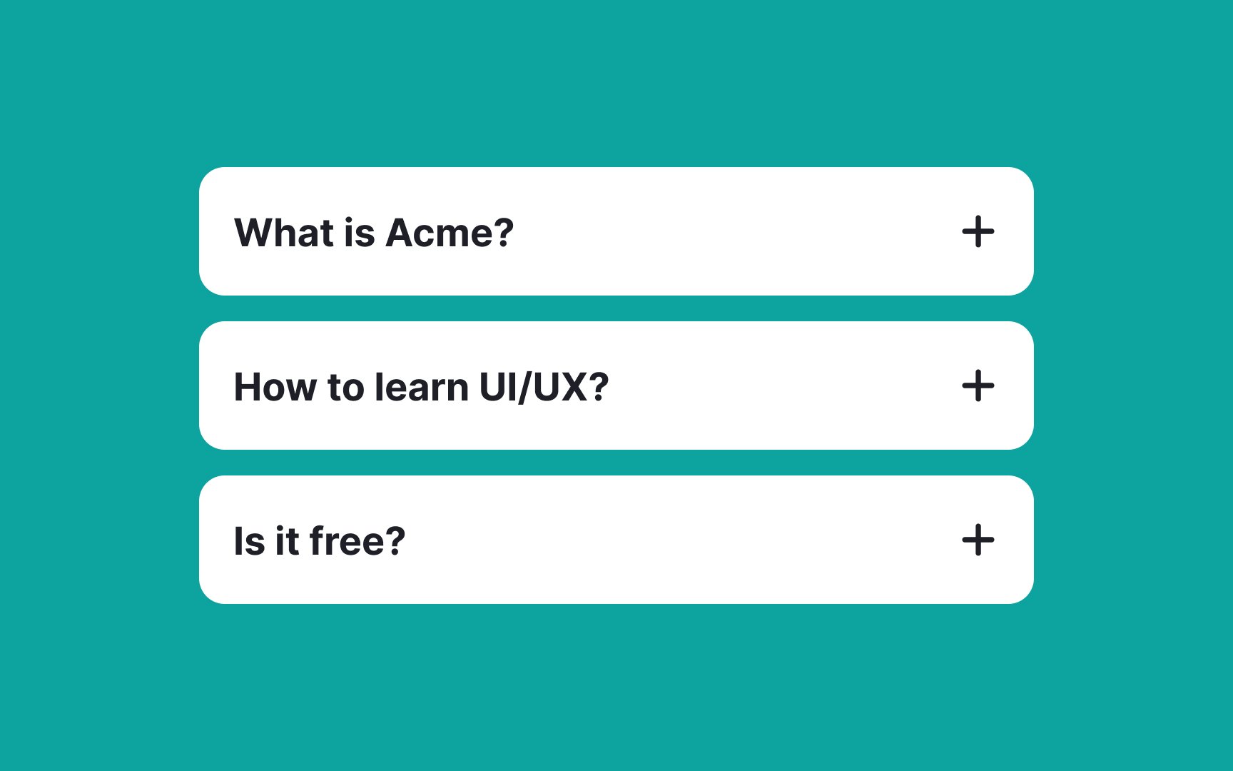
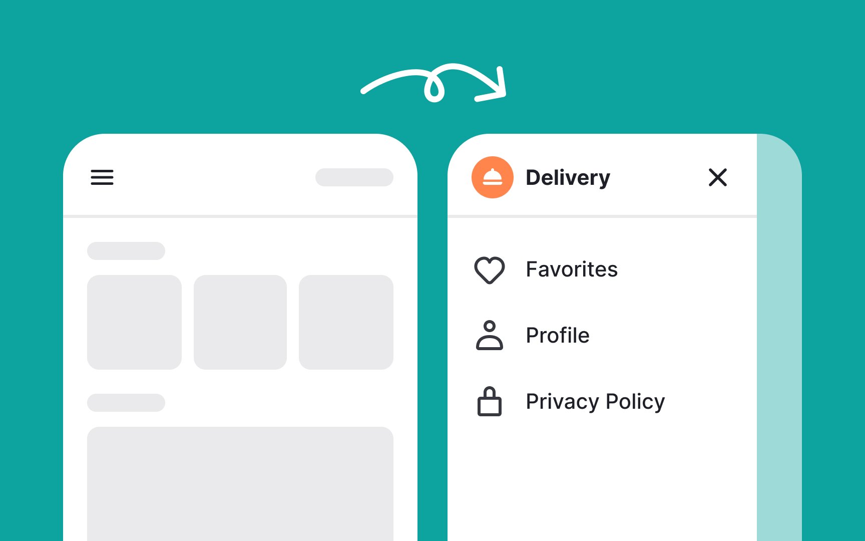
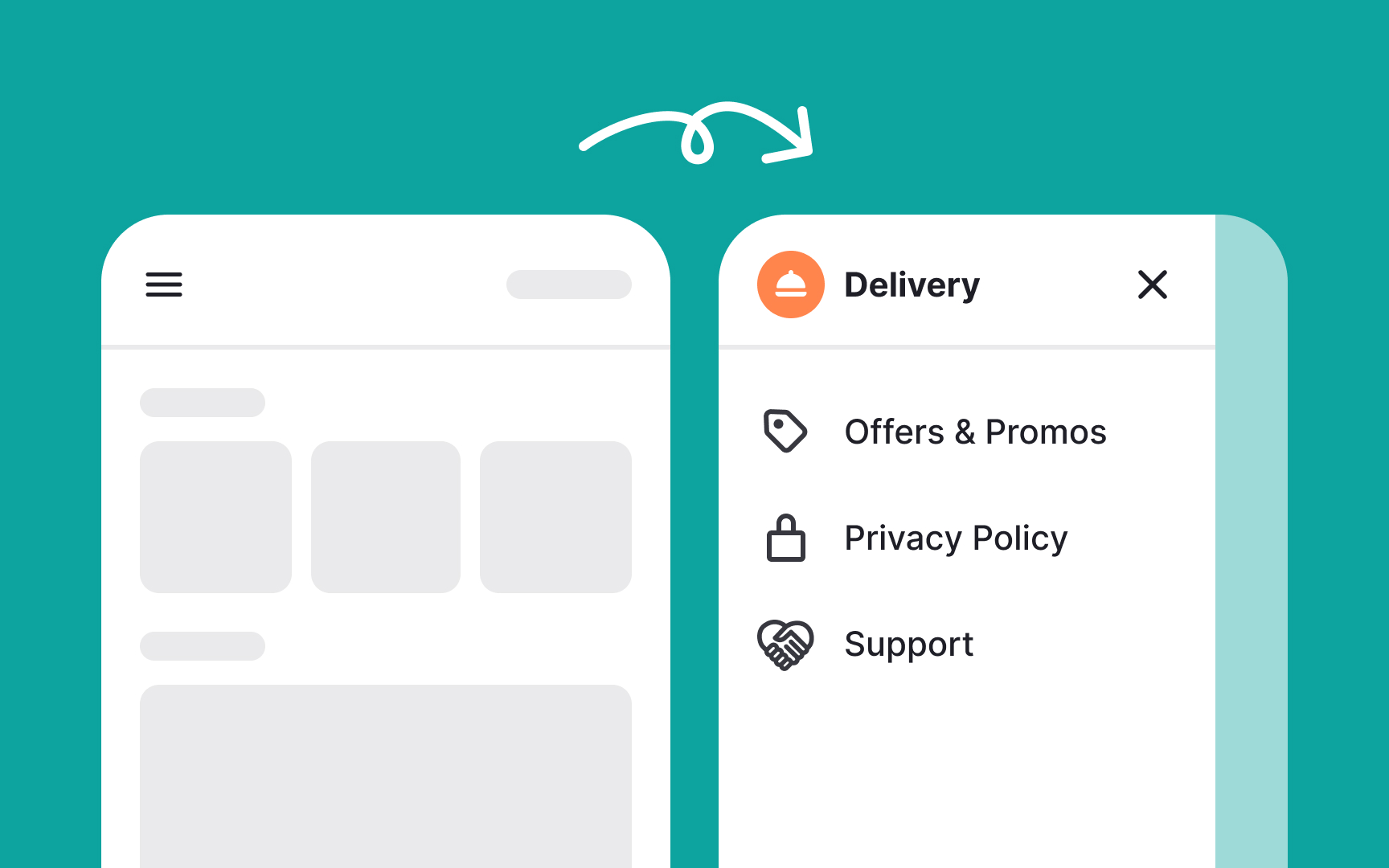
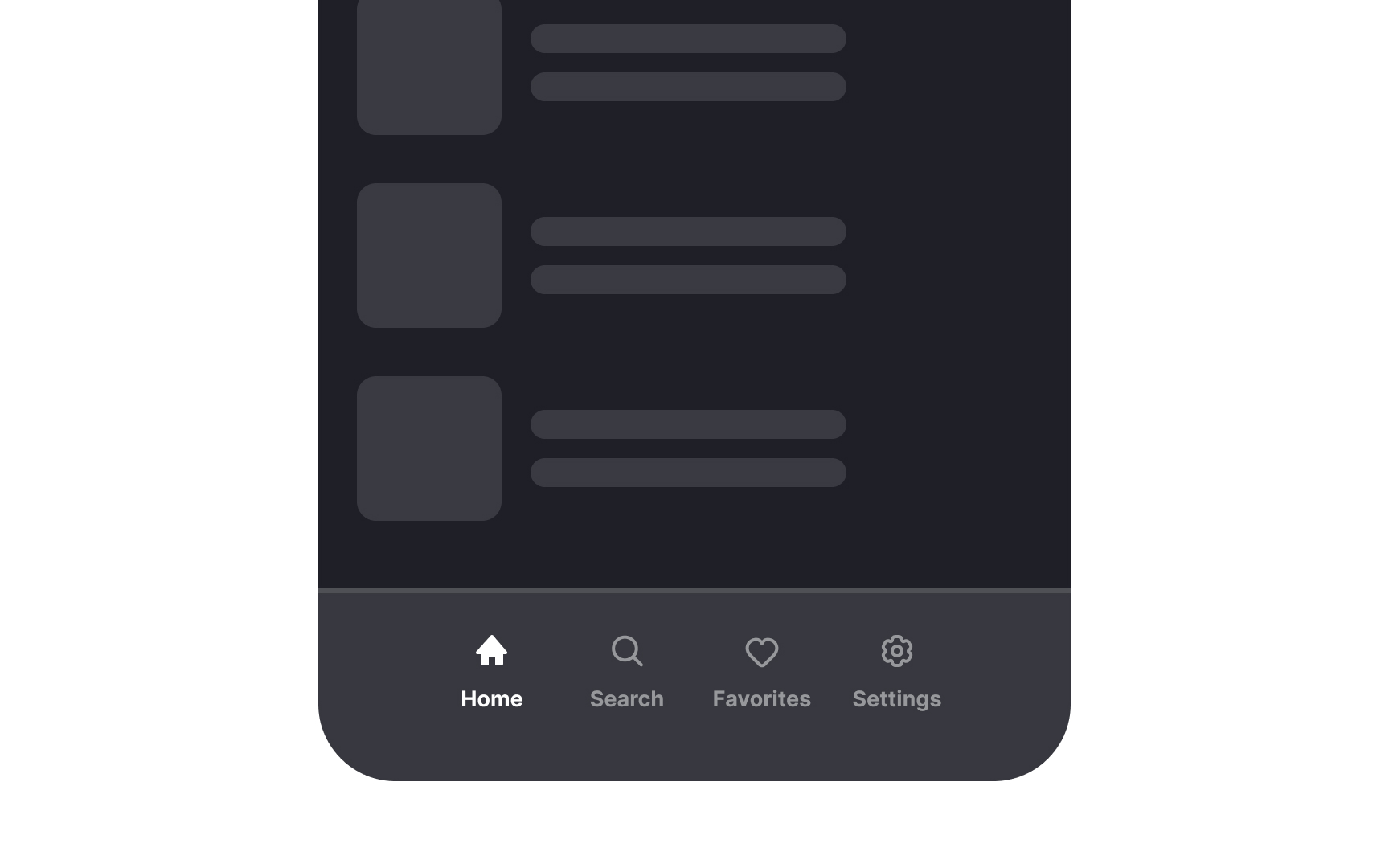
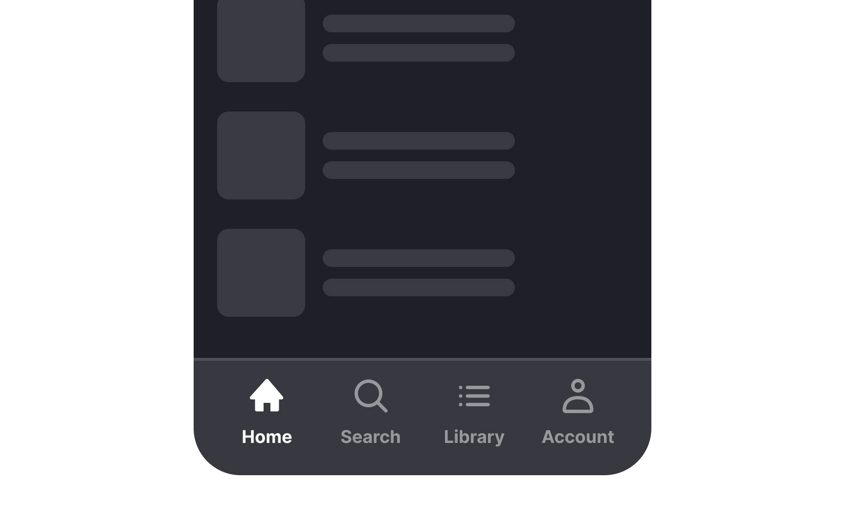
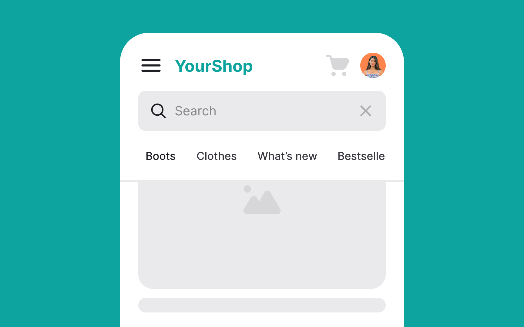
When to use hamburger menus:
- Hiding secondary features: If your website or app's core elements are already visible, and you have secondary options that aren't crucial to user goals, you can hide these behind a hamburger menu.
- Saving screen real estate: Even if there is enough space to display secondary features, you might not want to clutter the screen. A cleaner interface reduces cognitive load on users.
When not to use hamburger menus:
- Hiding core features: Avoid using hamburger menus for options or settings that are central to the
user experience . Important features should be directly accessible, not hidden. For example, on an e-commerce site, categories like "Shop" and "Cart" should be visible rather than tucked away in amenu . - Interaction-heavy websites: If your site already requires multiple interactions, adding a hamburger menu can increase the interaction cost.[2]
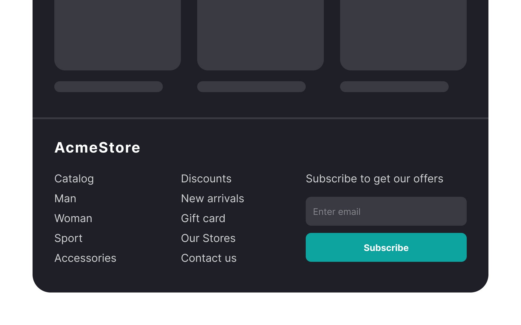
A fat footer is a large, content-rich footer at the bottom of a webpage. Unlike the minimal footers of the past, which often only included a copyright notice and a link to the site designer, fat footers are packed with various types of content. They can include sections like "About," "Contact," and "Subscribe,"
When to use fat footers:
- Enhancing user-friendliness: Fat footers can make a website more user-friendly by suggesting additional content at the end of a page.
- Boosting SEO: Including extra content in a fat footer can help with search engine optimization (SEO) by adding more keywords to the page. Although the impact is modest due to the low ranking of footer content in search algorithms, it can still contribute positively.
- Showcasing creativity: Fat footers offer an opportunity to express creativity. For example, you can include a small illustration highlighting the brand. This adds a personal touch and enhances brand identity.
Keep in mind that adding more content to the footer can increase the page's load time, which may cause visitors to leave if it takes too long. Although fat footers offer value, optimizing them is crucial. Modern techniques like lazy loading can help minimize the impact on performance.
Here are some
- Gray out unavailable options: Keep all options visible, even if some are unavailable. Gray out these options instead of removing them. For extra
user experience points, consider adding a tooltip that appears when users hover over a grayed-out option, explaining why it’s disabled and how to enable it. - Avoid overloading with options: Resist the urge to include too many items in a dropdown menu. If you have many options, consider alternative presentations like mega menus.
- Keep global navigation out of dropdowns on desktop: Top-level navigation categories should be easily accessible. Burying them in dropdown menus can hinder user success.
- Support keyboard input: Ensure dropdown menus support keyboard navigation in addition to mouse input. This improves
accessibility and user experience.[3]
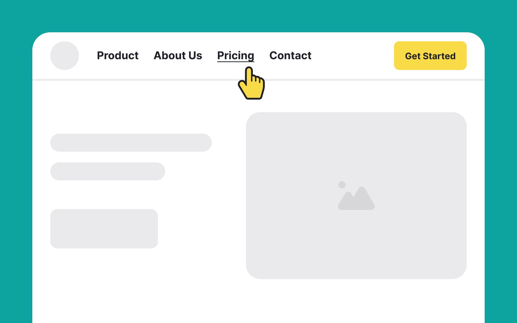
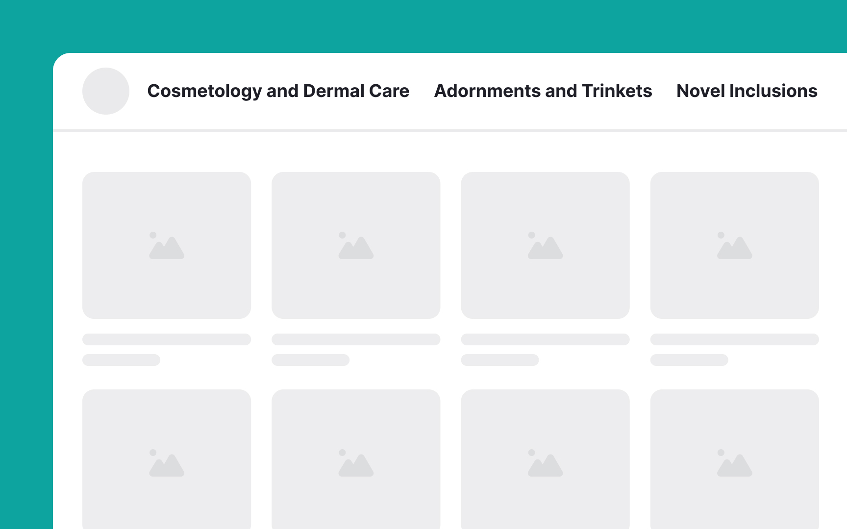
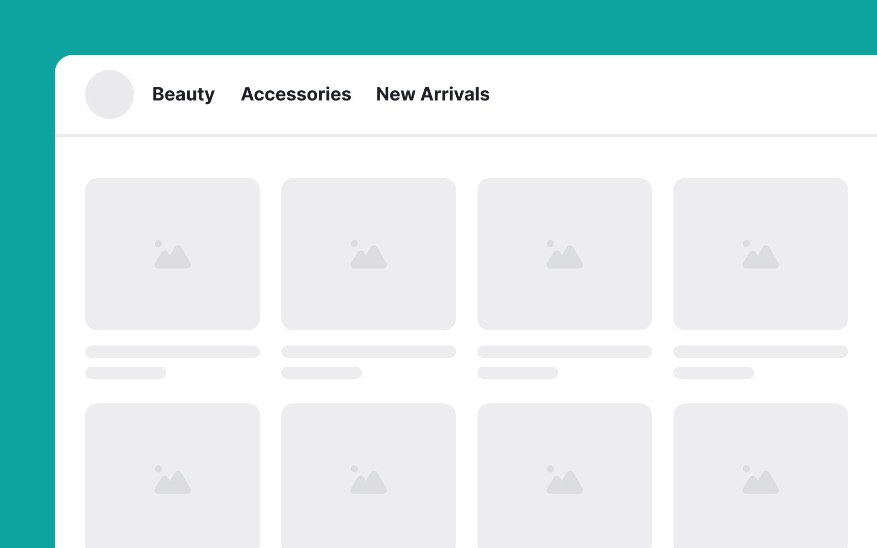
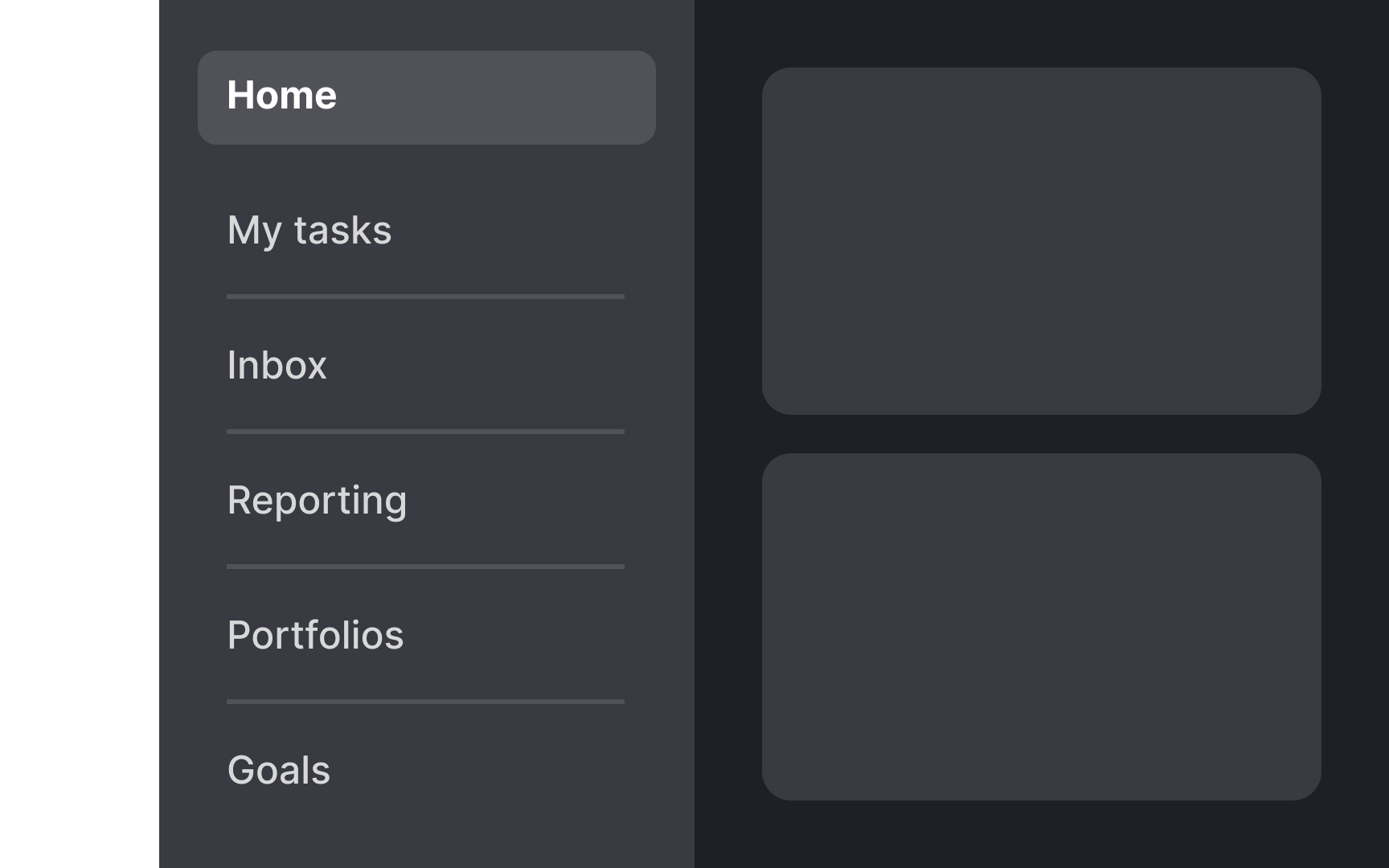
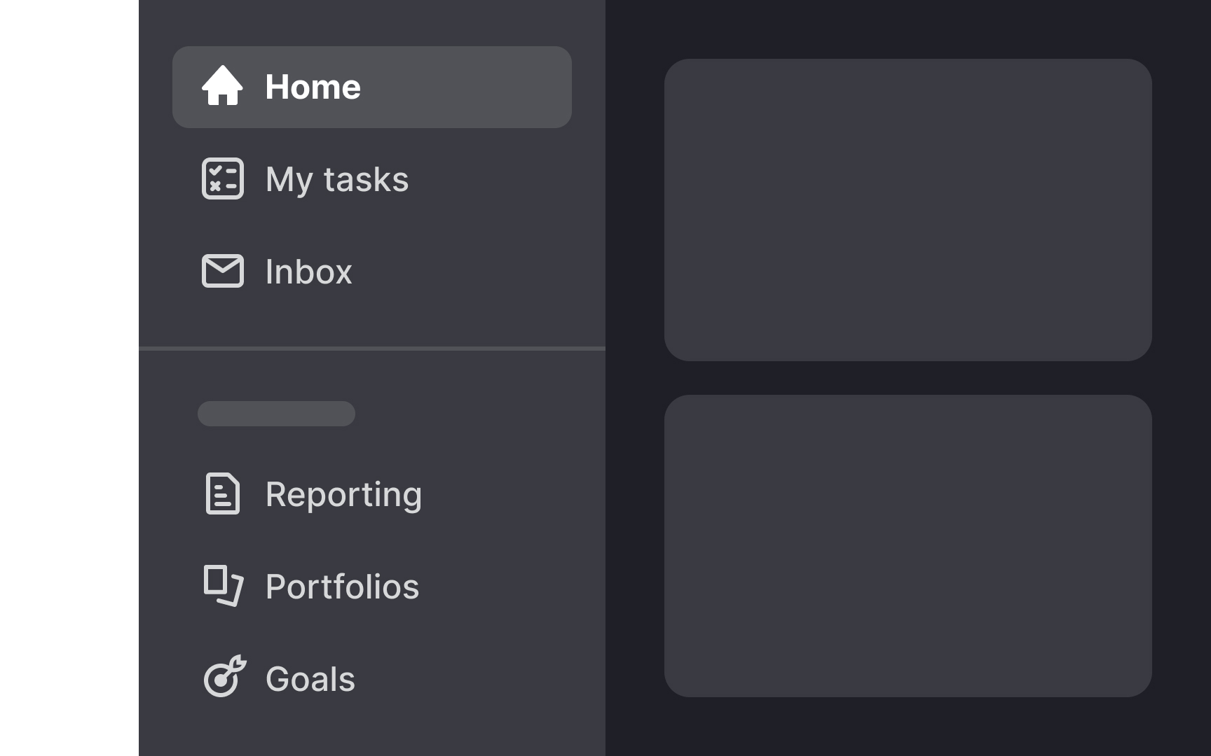
A top
Here’s why they're valuable:
- User familiarity: Most users, regardless of their experience level, are familiar with top navigation bars. This familiarity means users can navigate through the site without needing instructions or attention-grabbing visuals.
- Efficiency: Top navigation bars allow quick access to the most important sections of a site.
- Consistency: The top navigation bar is always in the same position, ensuring users can easily move from one section to another without needing to backtrack.
- Space-saving: Top navigation bars can accommodate up to 12 categories without cluttering the interface. This makes them ideal for websites with stable, well-defined sections that can be represented with short
labels .
A logo is a crucial
Commonly, logos are found in the top left corner. This placement is highly familiar to users, and straying from this pattern can impair the
When designing
Additionally, it's crucial to use a font size that enhances readability and
When designing
However, it's crucial to balance these visual cues with clear text
Using sticky menus on long
However, it's important to ensure that sticky menus do not obscure
When designing menus, particularly mega menus for large screens, it’s important to strike a balance between ensuring visibility and not dominating the screen. Menus should help improve the
This principle holds less on mobile devices, where screen real estate is limited, and full-screen menus are often necessary to provide adequate touch targets. However, on desktops, menus that cover the full screen can disrupt the user experience by temporarily hiding the content users are interacting with.
When optimizing
Using a caret or arrow
This helps prevent confusion and improves user
Activating submenus on click rather than on hover often provides a more user-friendly experience. Hover can be problematic, especially since it isn't accessible on touchscreens and can be challenging for keyboard-only users. Providing a click option ensures that everyone can access the
Click activation also reduces the frustration of accidentally triggering menus, a common issue with hover where menus can appear and disappear too quickly if the mouse passes over them inadvertently. This click method creates a consistent
References
- Mega Menus Work Well for Site Navigation | Nielsen Norman Group
- Dropdowns: Design Guidelines | Nielsen Norman Group
- Centered Logos Hurt Website Navigation | Nielsen Norman Group
- Menu-Design Checklist: 17 UX Guidelines | Nielsen Norman Group
Top contributors


Topics
From Course

Share


Similar lessons

Intro to Information Architecture

How to Design Good Search Experiences in UIs
