Wireframing Examples by Use Case
View real-world demonstrations of how wireframes can be utilized to visualize and structure UIs in different industries
Different industries demand different wireframing approaches. A banking dashboard packed with financial data requires different treatment than a fashion website where visual hierarchy speaks louder than numbers. Understanding industry-specific user needs shapes every wireframing decision, from information density to emotional tone. Financial services prioritize data clarity and security indicators. E-commerce focuses on product discovery and checkout flows. Social platforms emphasize content creation and engagement features. Real-world examples across industries can help adapt your wireframing approach to match user expectations and business goals, creating foundations that resonate with specific audiences rather than generic templates.
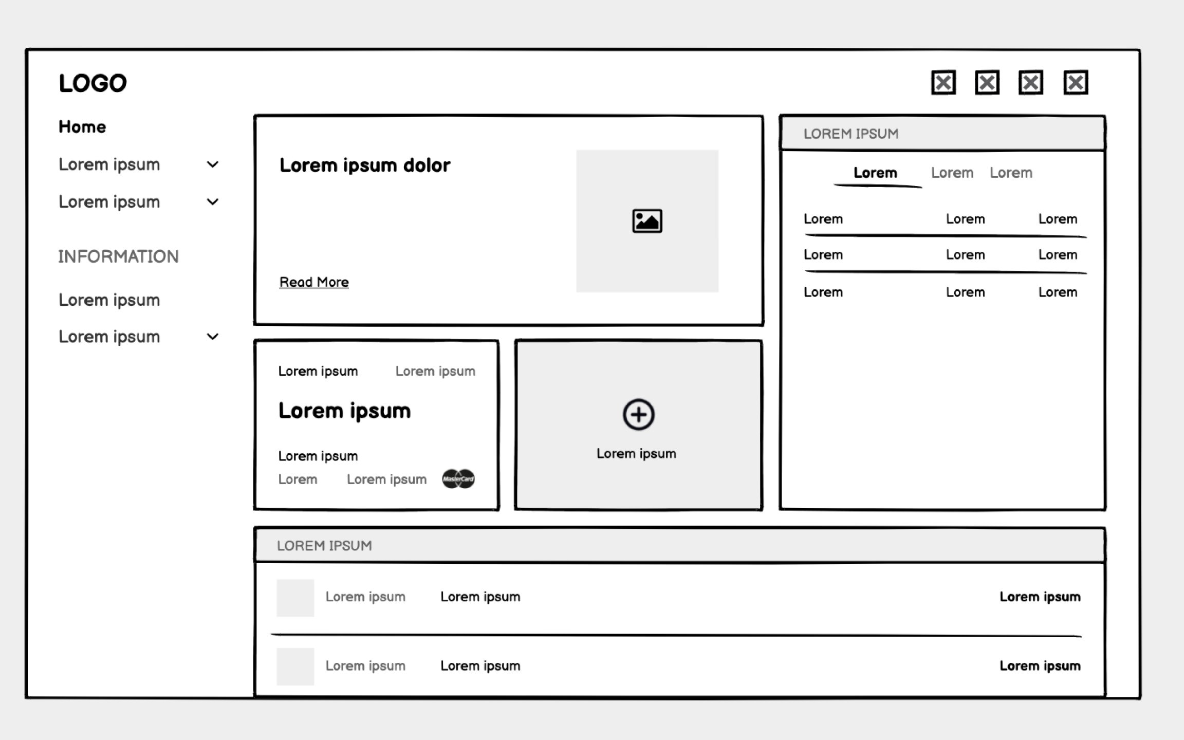
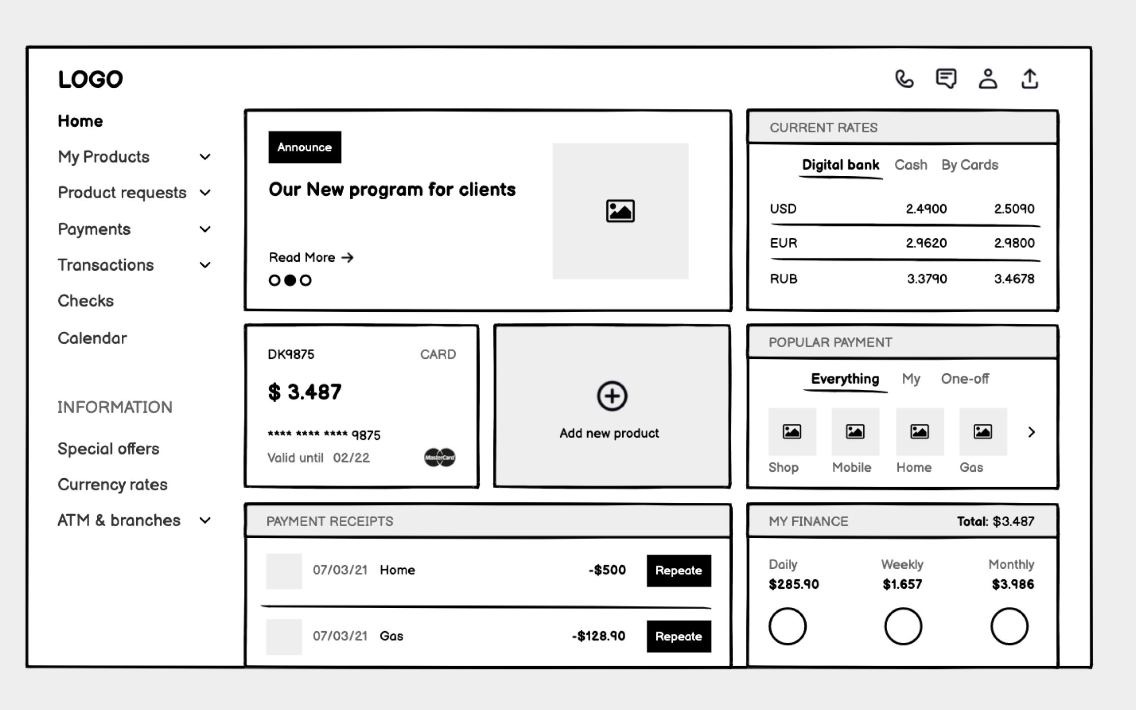
Unlike consumer apps that can hide complexity, banking users need immediate access to balances, transactions, alerts, and tools. Your wireframes must organize dense information without overwhelming users who might be anxious about money.
Start with an information hierarchy based on user priorities. Account balances and urgent alerts demand top placement. Recent transactions need clear formatting that aids scanning. Less frequent actions like transfers or settings can occupy secondary positions. Use consistent data formatting throughout — currency symbols, date formats, and number groupings that match user expectations.
Sample data transforms abstract wireframes into concrete experiences. Include realistic account balances, actual transaction descriptions, and believable merchant names. This reveals whether your layout handles edge cases like negative balances, long merchant names, or multiple currency displays.
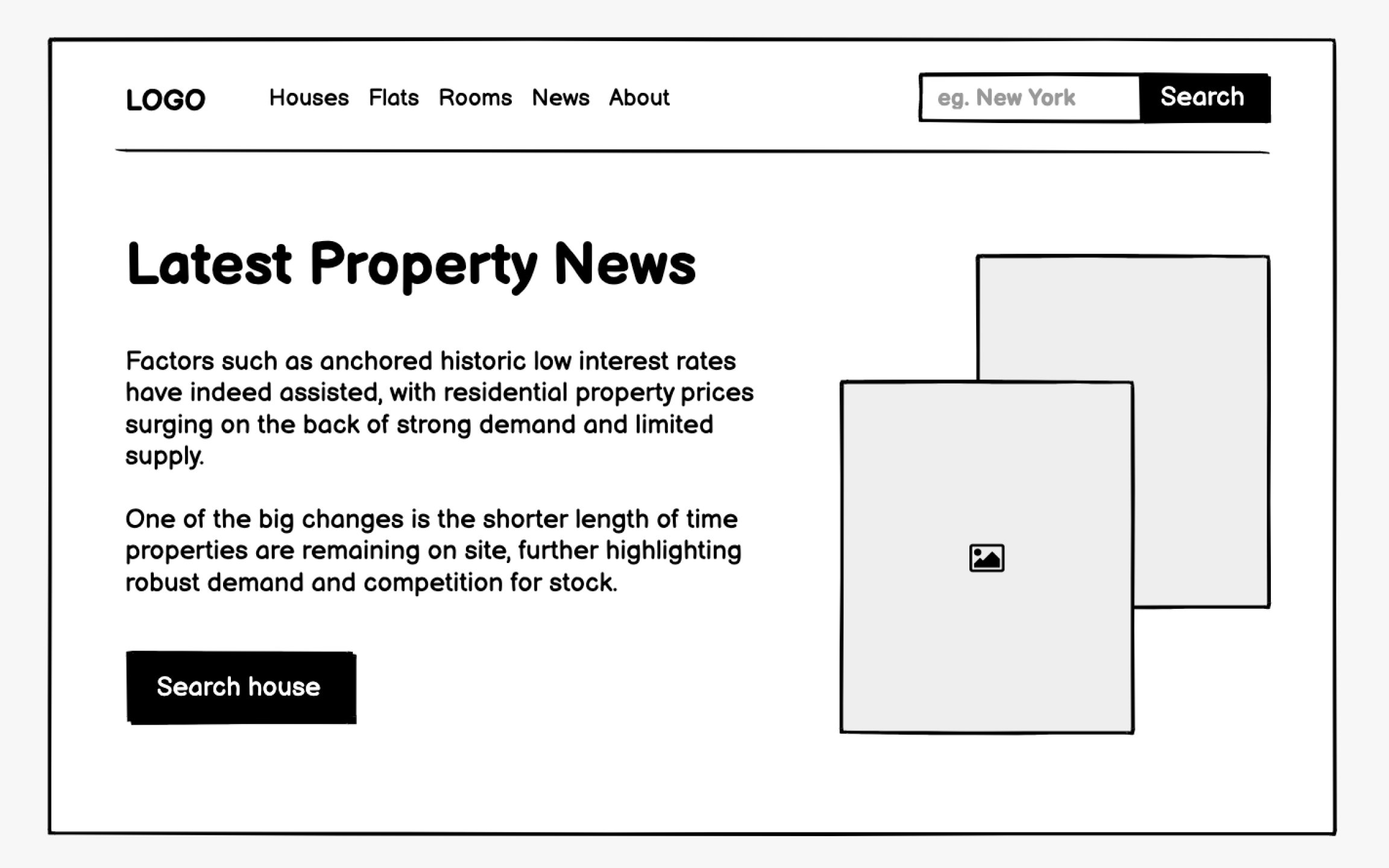
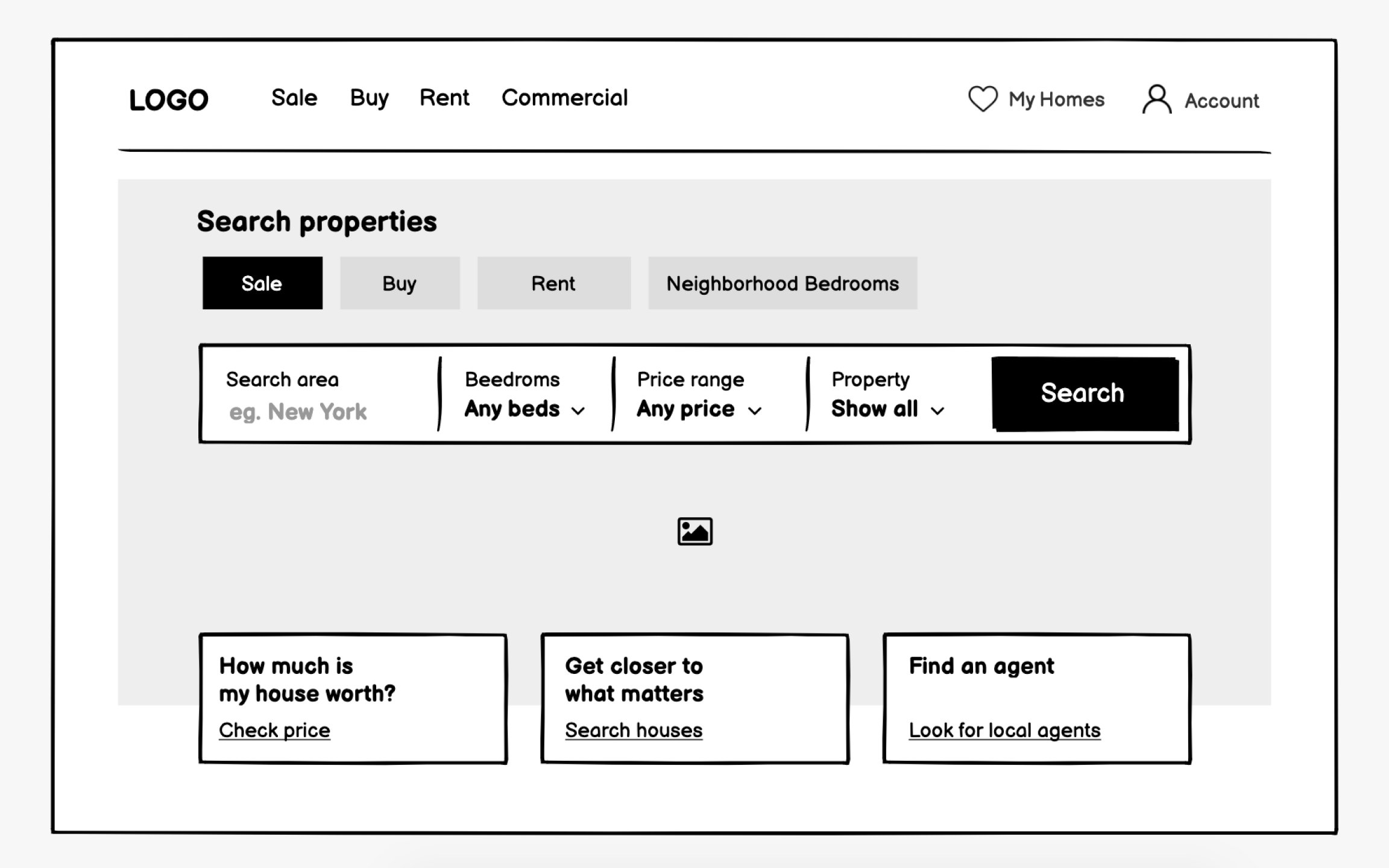
Real estate websites serve two distinct audiences with opposite goals. Buyers want to search properties efficiently, viewing many options quickly. Sellers need convincing that this agency will market their property effectively. Your wireframes must elegantly serve both without confusing either group.
Visual impact matters more here than in most industries. That hero image isn't decoration, it's the emotional hook that keeps users engaged. But beneath that visual layer, functionality rules. Search filters must be sophisticated yet simple. Property cards need to show enough detail for initial decisions without overwhelming the browsing experience.
Agency credibility elements deserve equal
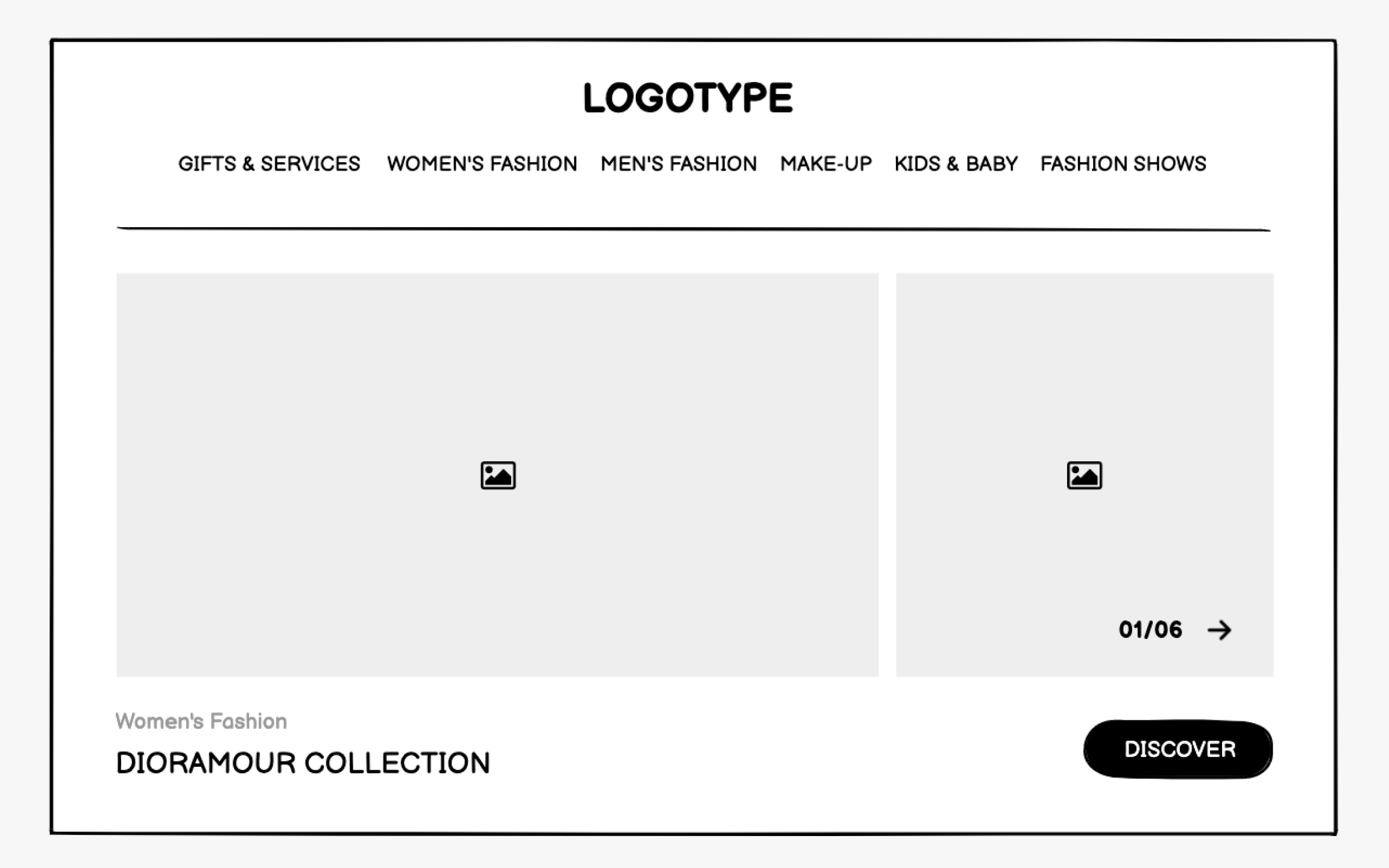
Fashion and beauty wireframes must convey aesthetic sophistication even in grayscale. These industries sell aspiration and identity, not just products. Your structural decisions, including generous whitespace, asymmetrical
Typography hierarchy becomes crucial even at the
Product presentation wireframes need special attention. Fashion sites might show single hero products with extensive details, while beauty sites often feature ingredient lists and application instructions. Your wireframes should indicate where lifestyle imagery dominates versus where product information takes precedence.
E-commerce
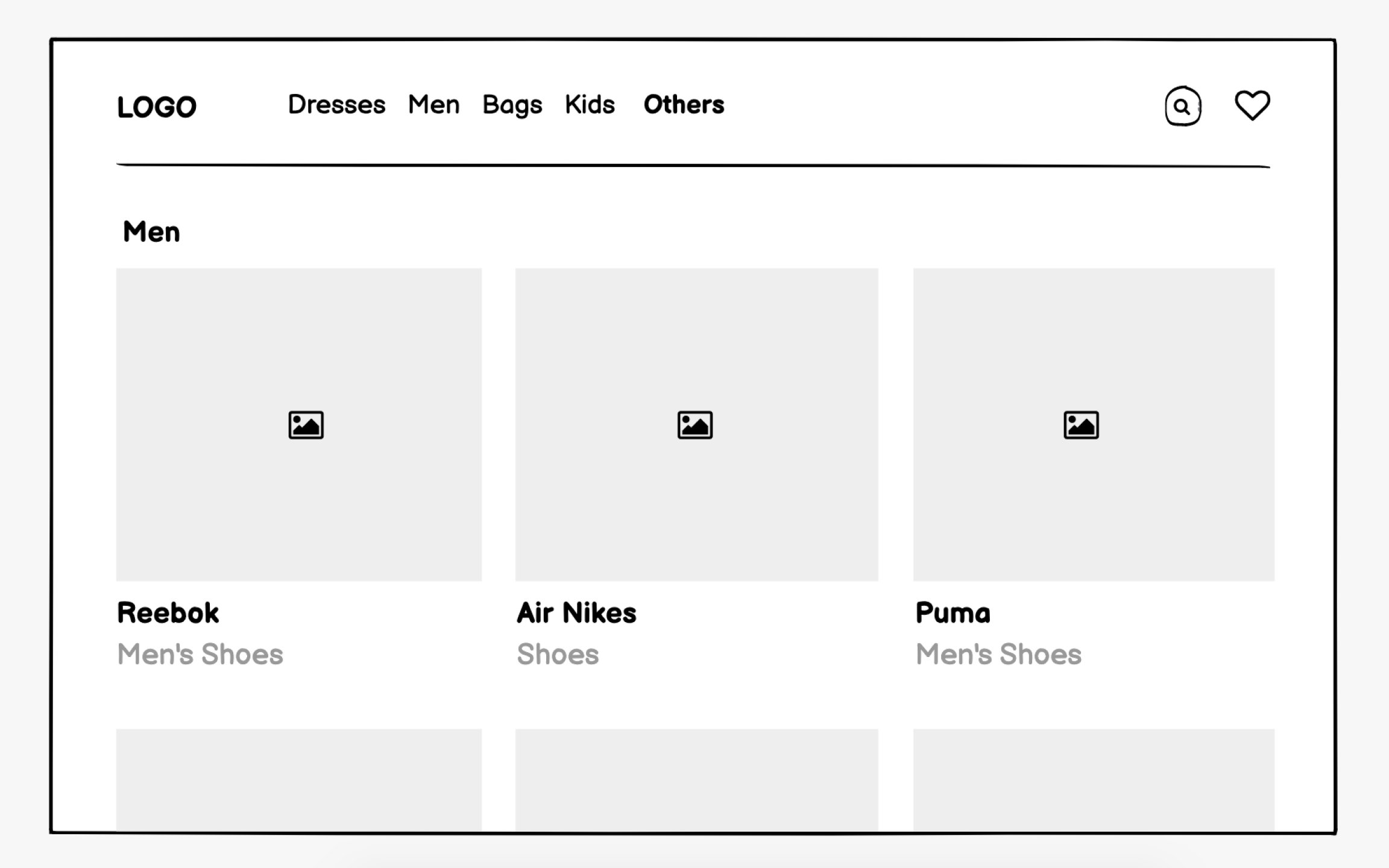
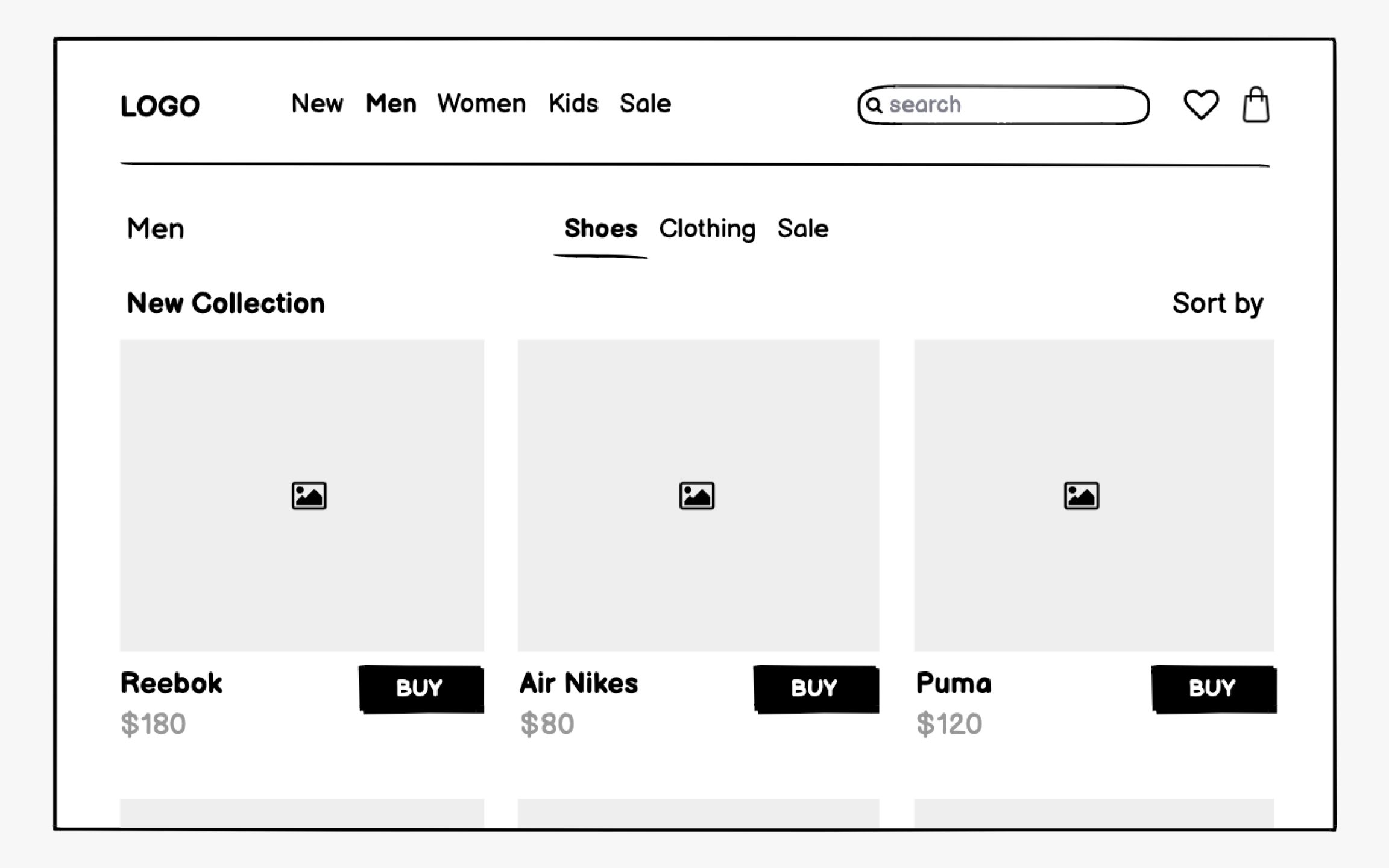
Product listing pages need a careful balance between information density and browsability. Show how
Product detail pages require comprehensive wireframing. Beyond obvious elements like price and add-to-cart buttons, consider reviews, size guides, shipping information, and cross-sells. Mobile wireframes might reorganize these elements dramatically, prioritizing immediate purchase actions over detailed specifications.
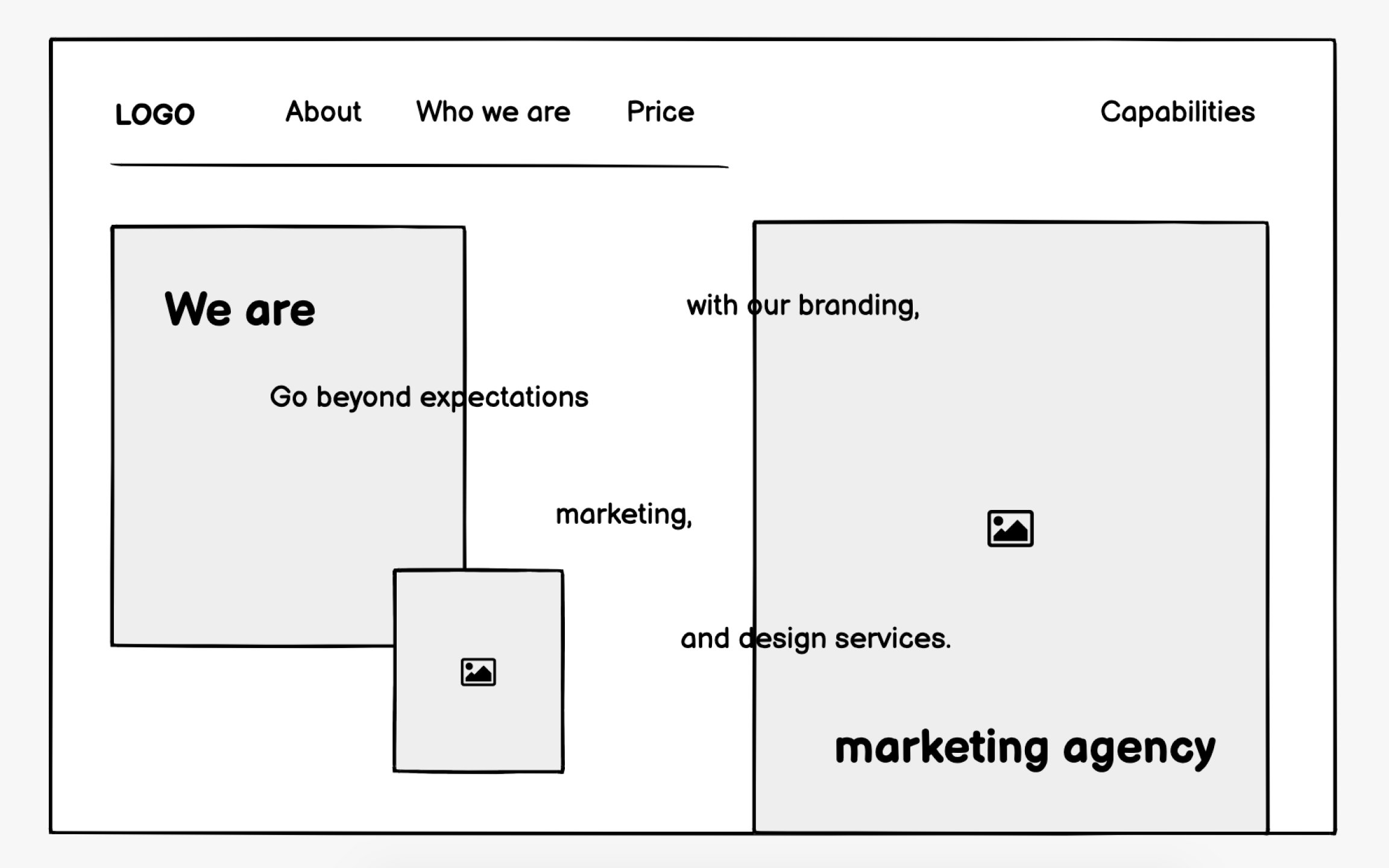
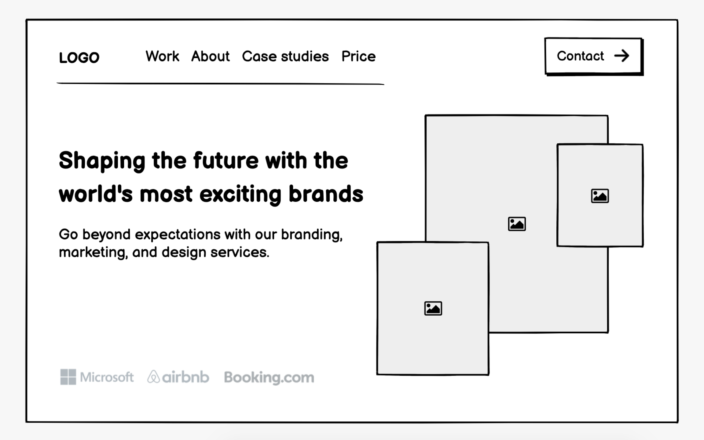
Marketing agency websites must immediately establish credibility while showcasing creative capabilities. Your wireframes need to balance impressive portfolio presentations with clear service descriptions and easy contact methods. Trust signals like client logos, testimonials, case study metrics deserve prominent placement throughout.
Portfolio presentation poses unique wireframing challenges. Agencies need to show diverse work without overwhelming visitors or revealing too much before client conversations. Consider
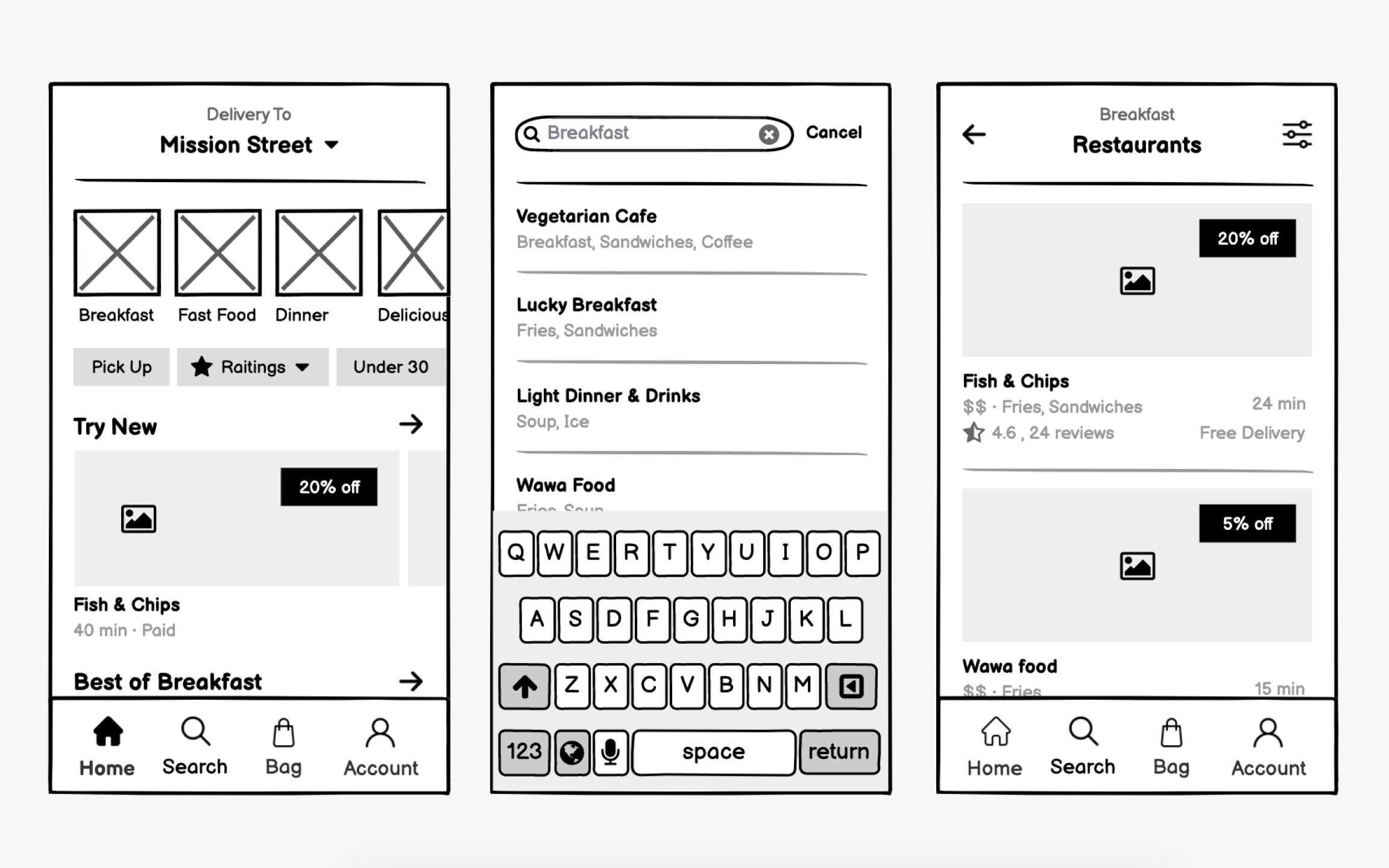
Food delivery apps compete on speed and simplicity. Hungry users have zero patience for complex
Restaurant discovery needs multiple entry points. Some users know exactly what they want, others browse by cuisine or mood.
Menu presentation requires careful hierarchy. Categories, items, customization options, and pricing must coexist without confusion. Your wireframes should show how items expand for details, how modifiers add to
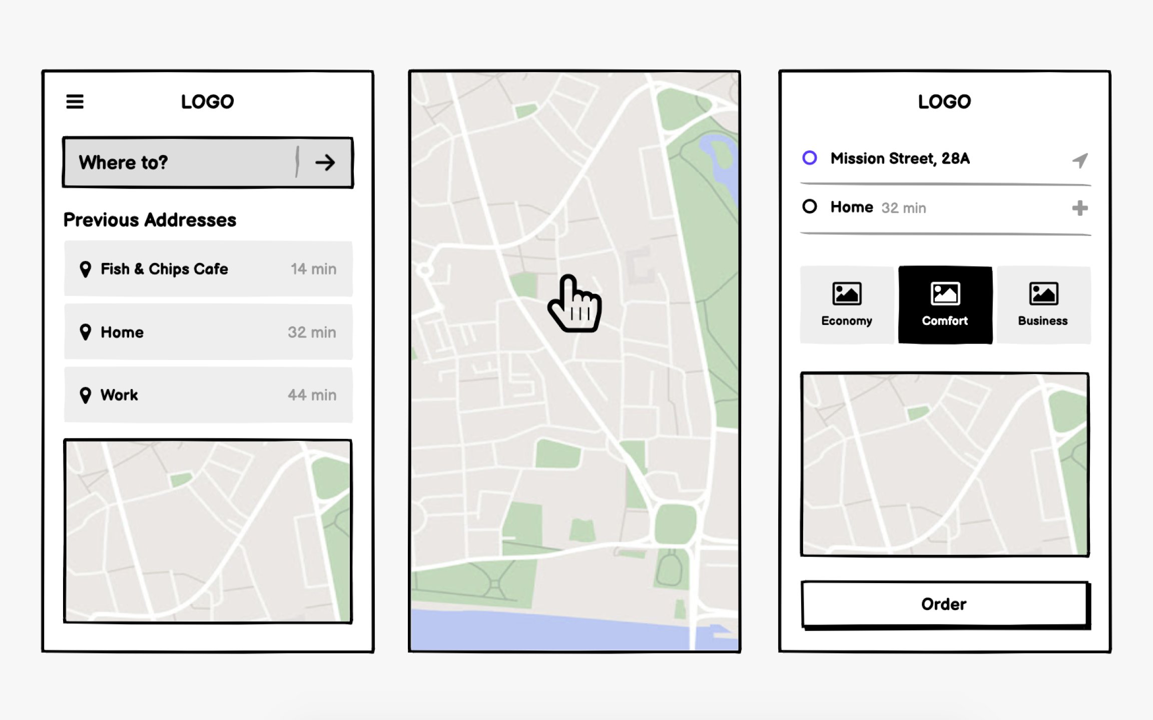
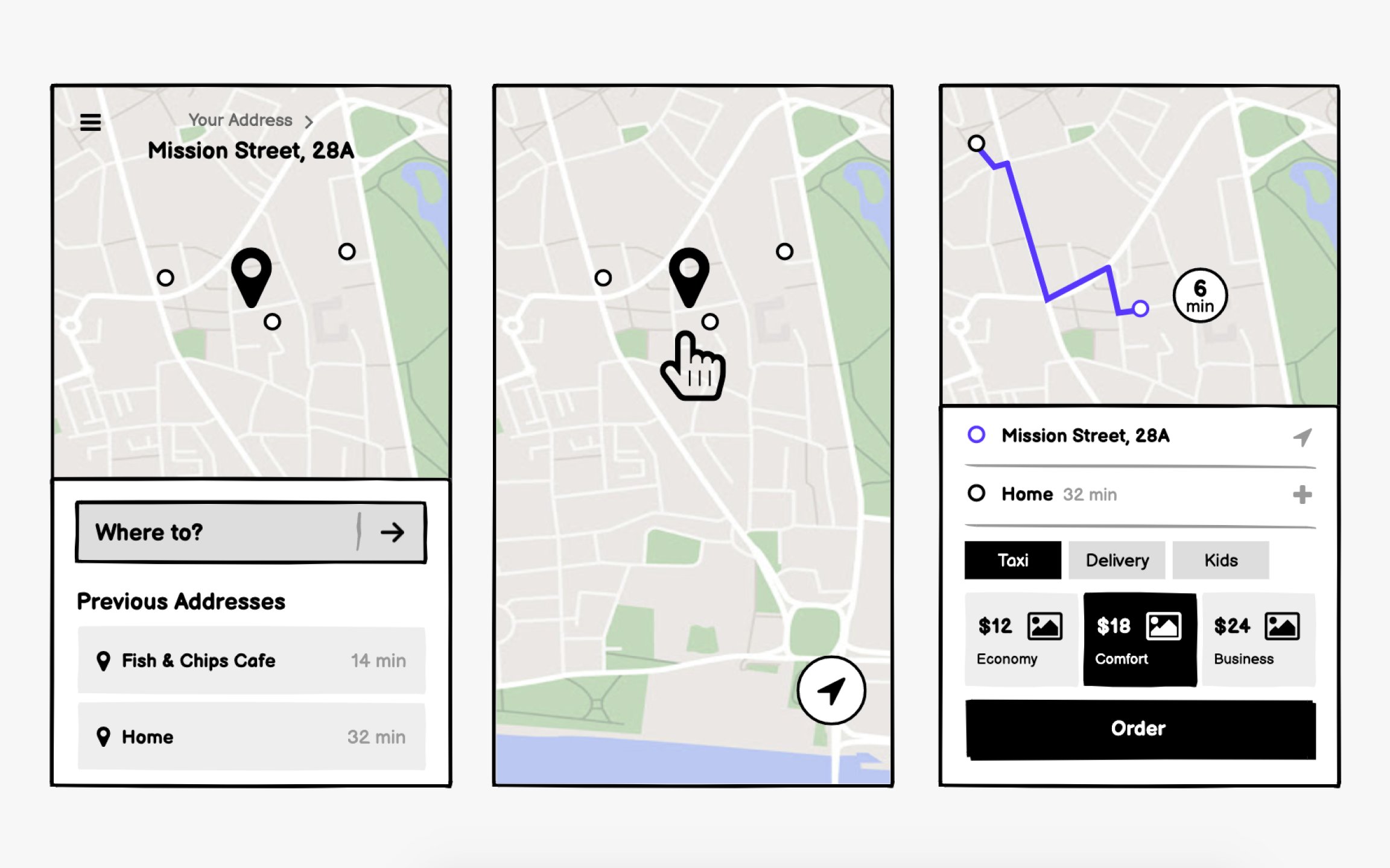
Taxi app wireframes center on the map. Unlike other apps where maps supplement functionality, here the map is the interface. Your wireframes must show how users interact with location pins, view driver positions, and understand trip progress, all while maintaining clarity on small screens.
Location input needs multiple methods. GPS often misplaces pins, so users need text
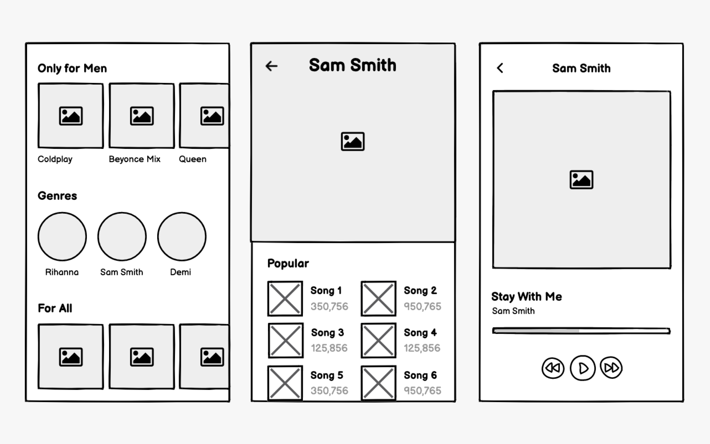
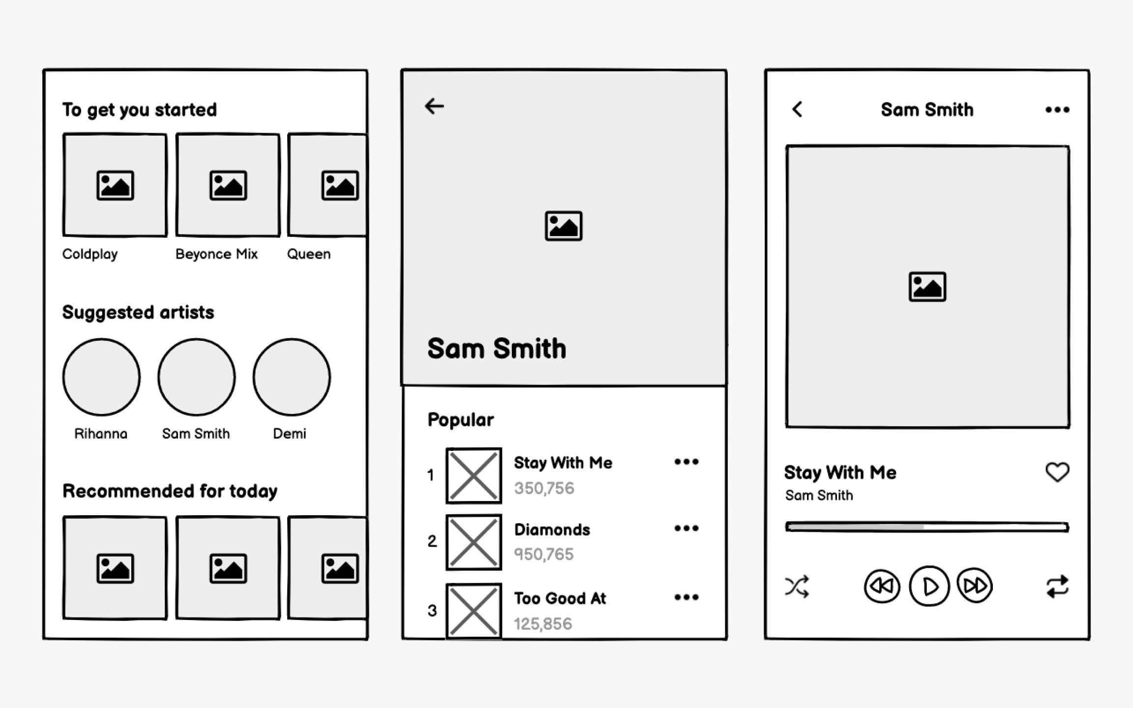
People use music apps in different ways. Some use them to access the music of their favorite artists while others use the same apps to find new music (and, of course, some use them for both).
While the actual music interface should be pretty self-explanatory, with play, pause, and skip or repeat options, you’ll want to pay closer attention to the
Your wireframes should also demonstrate how users can save their favorites, create their own playlists or stations, and customize their experience.
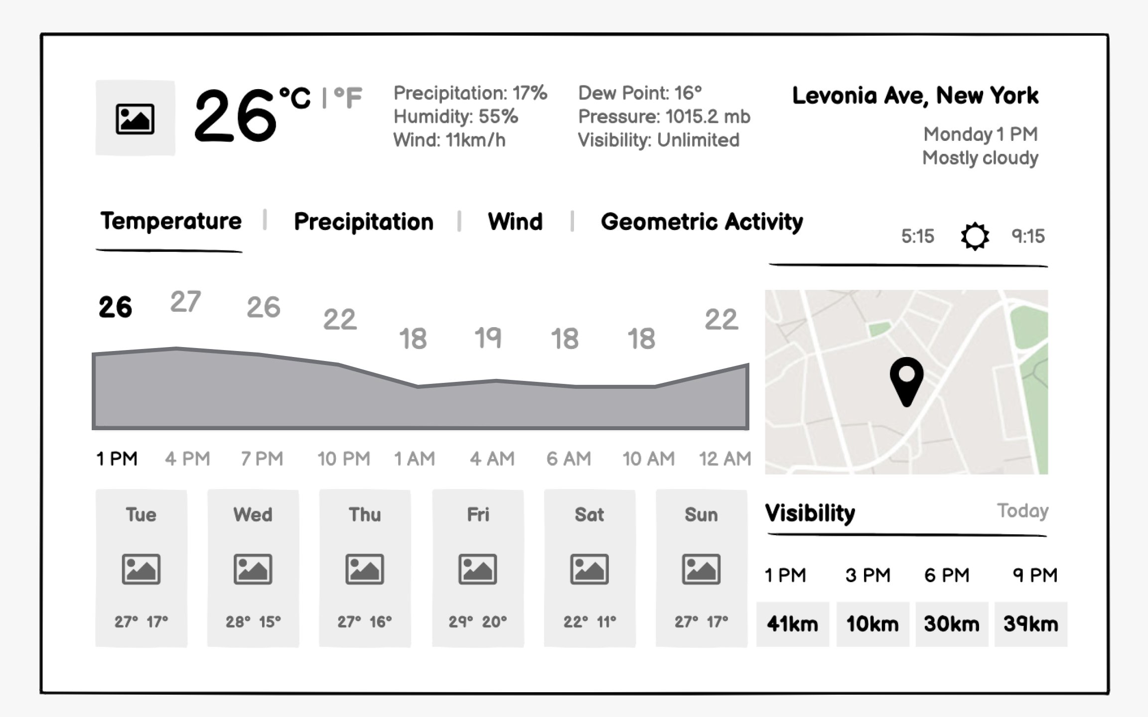
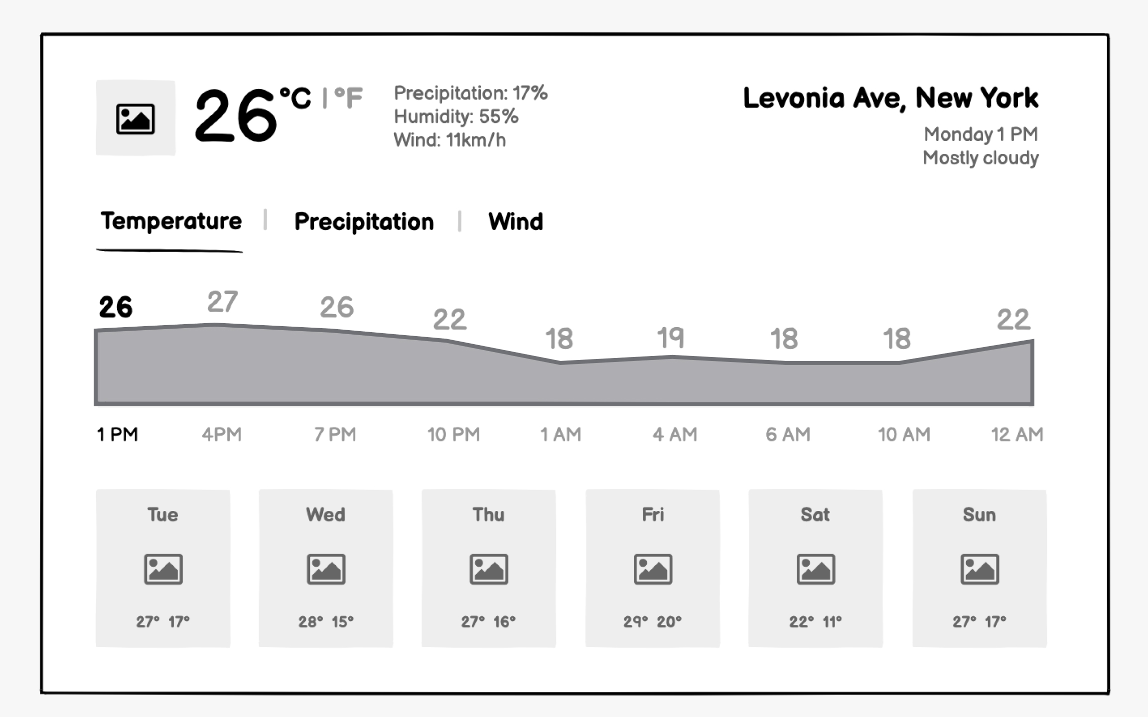
Weather apps succeed through instant clarity. Users check the weather in seconds while getting dressed or planning activities. Your
Forecast presentation needs careful time segmentation. Hourly views help immediate planning, and daily views assist week-ahead preparation. Your wireframes should show how users navigate between timeframes without losing context. Consider how precipitation probability displays differently for snow versus rain.
Top contributors


Topics
From Course

Share


Similar lessons

Intro to Wireframing

Wireframe Fidelity

Social media app wireframing
Social media wireframes must optimize for thumb-friendly mobile interaction and endless scrolling. Unlike websites where users complete tasks and leave, social apps need engaging loops that keep users browsing. Your wireframes should emphasizecontent consumption patterns while making creation equally accessible.
Feed design requires nuanced decisions. How much of each post shows before truncation? Where do interactionbuttons live for easy thumb access? How do sponsored posts integrate without disrupting flow? Your wireframes need to show various content types like text, images , and videos, and how they adapt to available space.
Content creation must feel effortless. The compose button needs permanent, prominent placement.Wireframe the full creation flow: media selection, caption writing, privacy settings , and publishing. Consider how power users with many followers need different features than casual users.