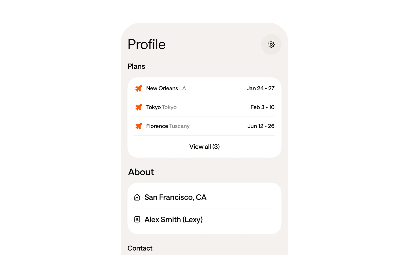
Understanding Design Audit Types
Master different design audit approaches to address specific product challenges.
Design audits come in various forms, each focusing on distinct aspects of product quality. While UI audits examine visual consistency and component usage, UX audits dive deep into user flows and interaction patterns. Brand audits ensure that design aligns with company identity, while accessibility audits verify inclusive experiences.
Each audit type serves as a specialized lens for evaluation, revealing unique insights and improvement opportunities. Mobile audits check platform-specific requirements, microcopy audits assess content clarity, and conversion audits track user journey effectiveness. Understanding these types helps teams choose the right approach for their specific needs.
Different audit types often complement each other, building a complete picture of product health. Combining insights from various audit types helps teams make informed decisions about improvements and maintain high-quality user experiences.
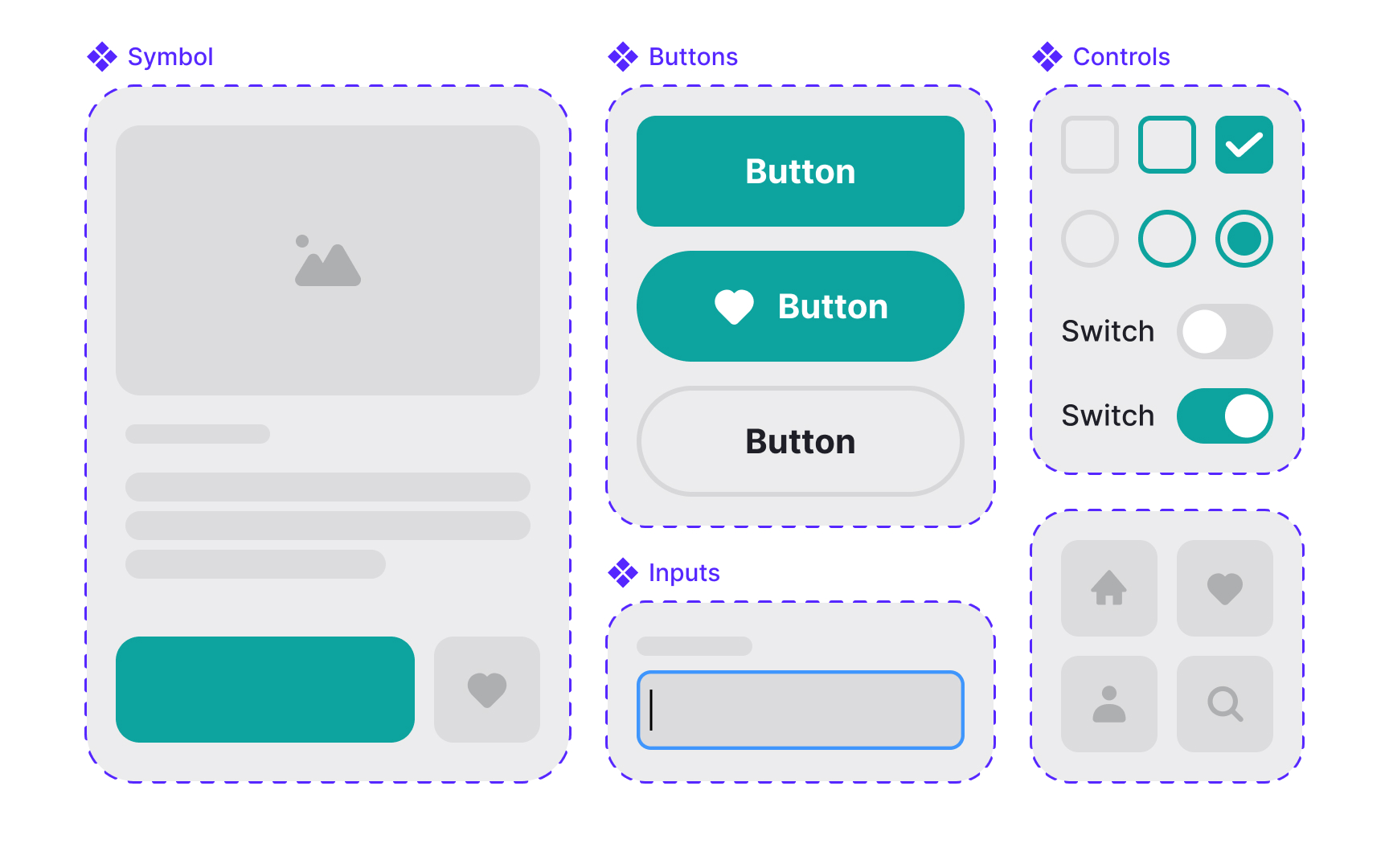
Visual consistency forms the foundation of professional digital products. Like a well-designed building, every element follows specific patterns and rules. Inconsistencies in visual design often signal deeper problems with design systems and component usage.
A thorough visual consistency check examines several key areas:
- Component usage: How consistently
UI elements appear across features - Spacing patterns: Alignment, margins, and padding across screens
- Visual hierarchy: Size relationships between headings, text, and elements
- Interactive states: Consistency of hover, active, and disabled states
- Grid application: Layout consistency across different views
- Design tokens: Proper use of defined colors, shadows, and radius values
Component libraries often grow chaotic over time. Some components become outdated, others exist in multiple versions, and many might be unused or redundant. Like cleaning out a cluttered garage, regular assessment helps maintain a useful, efficient component library.
Key assessment areas include:
- Usage frequency: How often each component appears in the product. Identify unused or overused elements.
- Version conflicts: When the same component exists in different versions due to inconsistent updates.
- Documentation status: Whether component guidelines are clear, up-to-date, and include all necessary implementation details.
- Maintenance history: Records of component updates, bug fixes, and who made the changes.
- Component relationships: How components connect and depend on each other, identifying potential breaking changes.
- Reusability score: Whether components are flexible enough to work across different features and contexts.
- Technical debt: Outdated code, browser compatibility issues, or
accessibility problems in components.
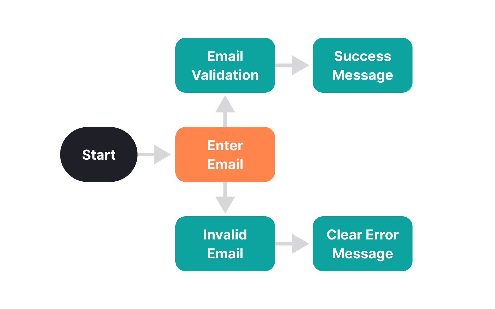
Key areas to examine include:
- Task completion: How easily users accomplish common goals
- Navigation logic: Whether paths to key actions make sense
- Error handling: How flows handle mistakes and edge cases
- State transitions: Clarity of movement between different states
- Input validation: When and how users receive feedback
- Alternative paths: Different ways to achieve the same goal
- Dead ends: Where users might get stuck or confused
Navigation patterns shape how users move through a digital product. Good navigation helps users find their way naturally, while poor patterns create confusion and frustration.
Key navigation aspects to examine:
- Menu structure: Common issues include inconsistent hierarchy depths, mixing different navigation patterns, and unclear relationships between menu levels.
- Wayfinding elements: Review breadcrumbs, progress indicators, and section markers.
- Link placement: Verify visibility of crucial links, especially call-to-action buttons and primary navigation.
- Contextual navigation: Look for clear connections between related
content . Users should see relevant options based on their current context and likely next steps. - Search functionality: Test search box placement, autocomplete behavior, and results relevance.
- Core functions: Ensure critical features like account settings, help, or cart are consistently placed and easily found across all product sections
- Mobile navigation: Test how complex navigation structures adapt to small screens
Pro Tip: Watch how users navigate between key sections. Their paths might differ from your intended routes.
Key brand aspects to evaluate:
- Logo usage: How logos appear across different sections and scales
- Brand colors: Correct
color values and combinations in use - Typography: Proper font families, weights, and sizes
- Visual style: Consistency of illustrations, icons, and images
- Brand voice: Tone in headlines,
buttons , and messages - Design principles: How brand values translate into interface choices
- Cross-platform presence: Brand consistency across devices
Small deviations might seem minor but can weaken brand recognition over time.
Design patterns form the language of user interaction. When products mix different patterns for similar actions, users face unnecessary cognitive load.
Key areas to examine:
- Action patterns: How similar actions work across features
- Layout patterns: Consistent organization of similar
content types - Form patterns: How input and validation work across forms
- Selection patterns: Consistency in how users choose options
- Feedback patterns: How the system communicates outcomes
- Disclosure patterns: Methods for showing additional content
- Filter patterns: Ways users narrow down information
Finding pattern inconsistencies helps reduce user confusion and improves learning curves for new features.
Pro Tip: Start with high-visibility pages. Inconsistencies there have the biggest impact on brand perception.
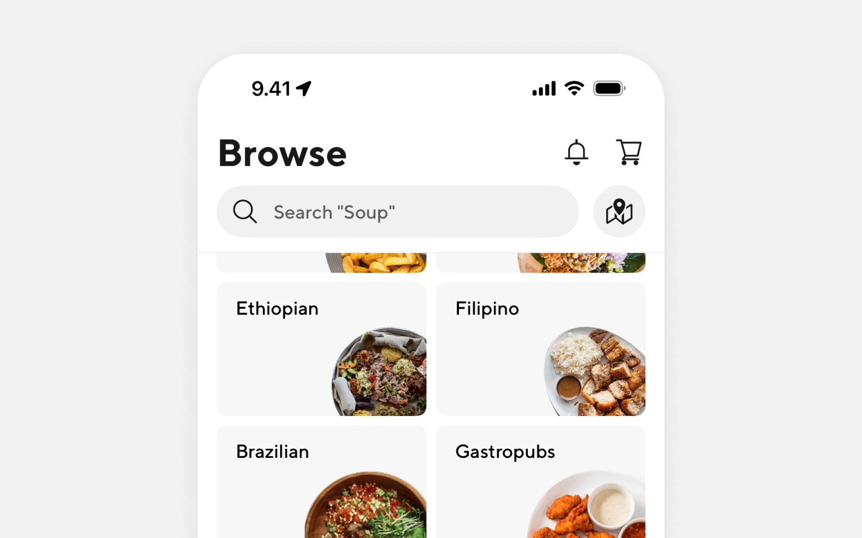
Mobile interfaces demand careful attention to space, touch targets, and
Key areas to evaluate:
- Touch targets: Size and spacing of interactive elements
- Content hierarchy: How information adapts to smaller screens
- Navigation access: Ease of
menu and key function access - Form interactions:
Input fields and keyboard behavior - Gestures: Implementation of swipe and touch actions
- Screen coverage: Content visibility when the keyboard appears
- Loading states: How content loads on slower connections
Finding mobile-specific issues helps maintain usability across devices and prevents frustrated users from abandoning tasks.
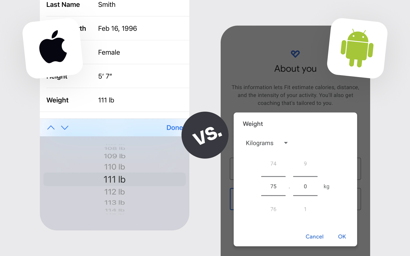
Different platforms come with unique design requirements and user expectations. From iOS to Android to web, each platform has specific patterns, components, and behaviors that users expect. Regular audits ensure designs respect these platform conventions.
Key areas to check:
- Navigation patterns: Platform-specific back
buttons and menus - System components: Native
UI elements and their proper usage - Gestures: Standard platform
interactions and shortcuts - Typography: Platform-recommended
fonts and sizes - Layout guidelines:
Margins ,padding , and safe areas - System features: Integration with platform capabilities
- Visual style: Platform-specific design language
Finding platform guideline violations helps maintain familiar experiences that users expect on each device.[1][2]
Pro Tip: Check against platform guidelines regularly. They update with each major OS release.
Key areas to examine include:
- Screen reader support: Proper labels and
content structure - Keyboard navigation: Focus states and logical tab order
- Color contrast: Text and interactive element visibility
- Content scaling: How interfaces handle text enlargement
- Alternative text:
Image descriptions andicon labels - Dynamic content: How updates are announced to users
- Input assistance: Clear labels and error messages
Finding accessibility issues helps create more inclusive experiences while meeting legal requirements and expanding user reach.
Pro Tip: Test with keyboard only to reveal navigation and interaction issues.
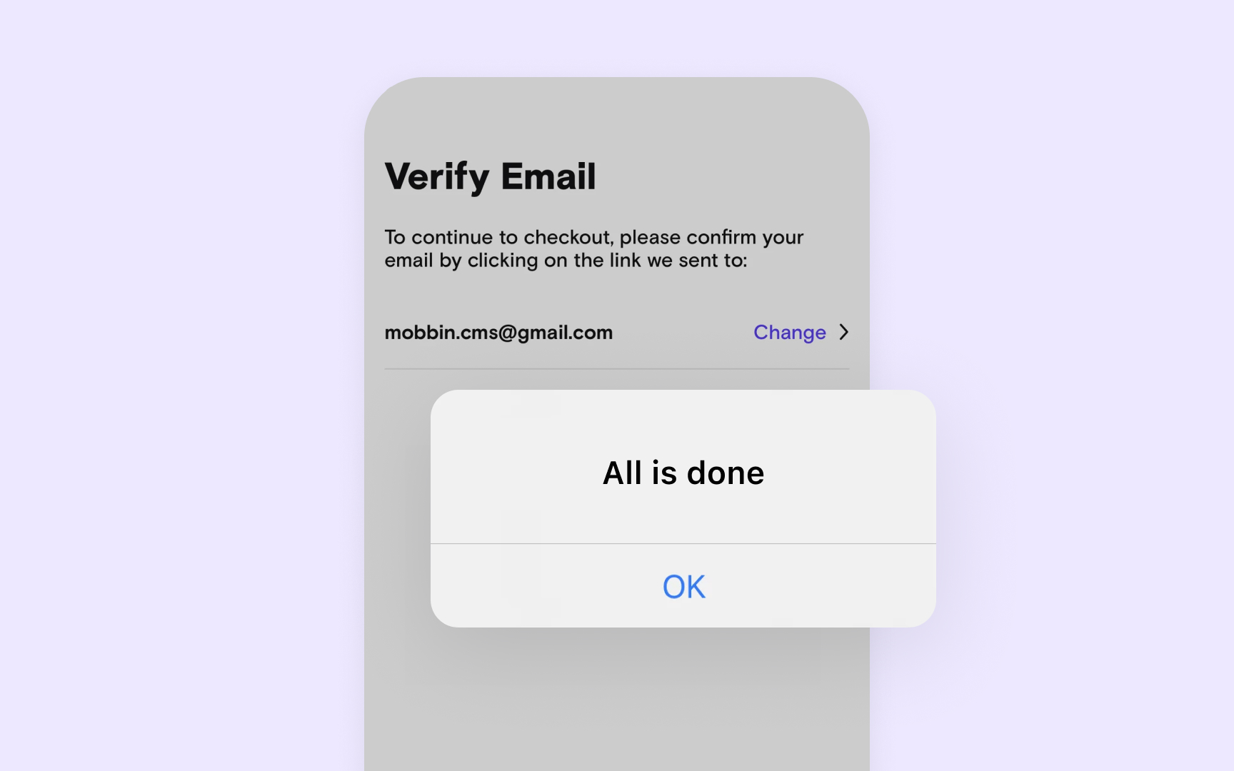
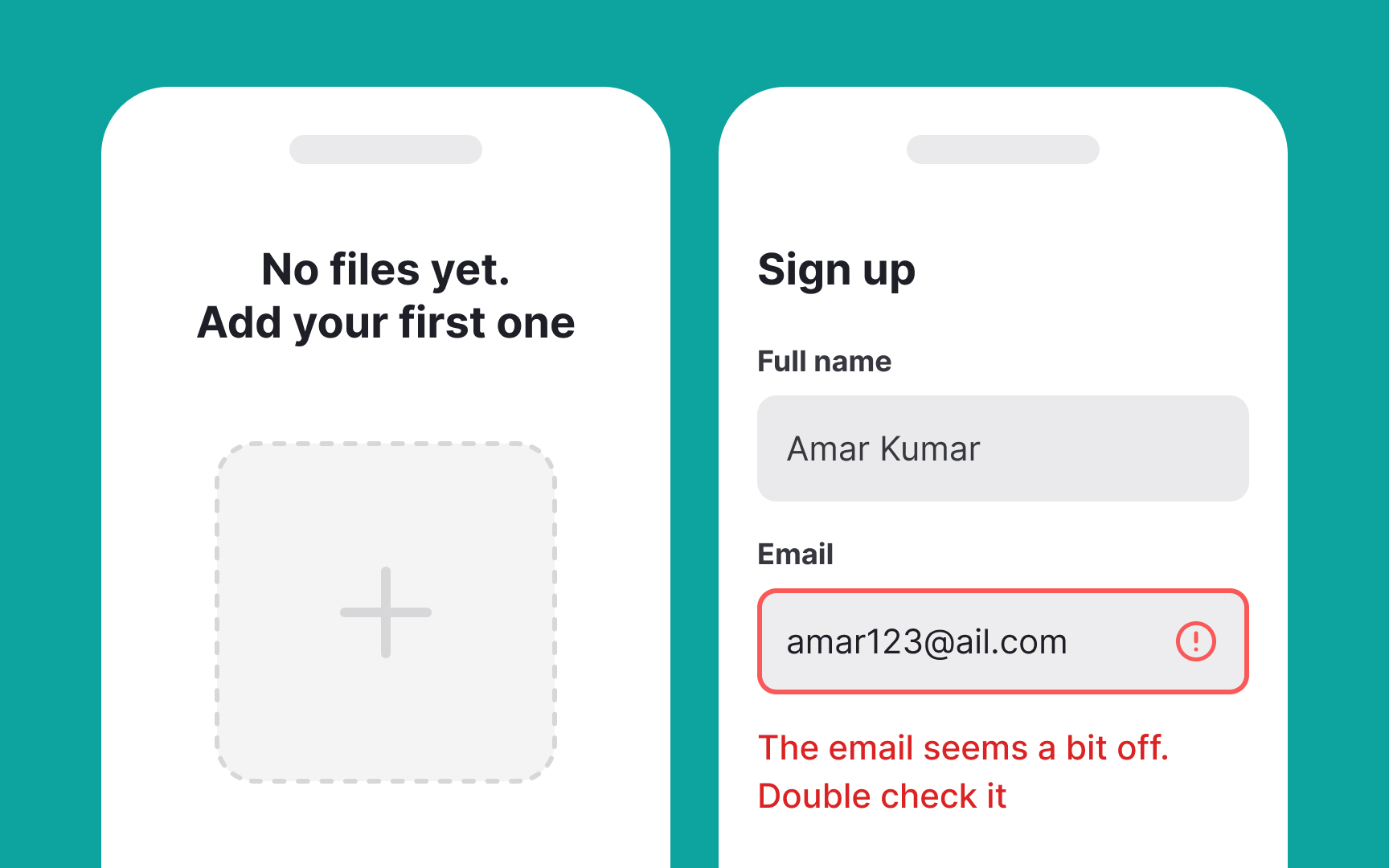
Key areas to evaluate:
- Button labels: Clear action descriptions
- Error messages: Helpful explanations and next steps
- Empty states: Informative and actionable messages
- Feature descriptions: Clear explanation of functionality
- Form labels: Unambiguous field descriptions
- Navigation items: Clear section names
- Confirmation messages: Action verification and outcomes
Finding content issues helps reduce user confusion and support needs while improving task completion rates.
Pro Tip: Review content where users often request help. Unclear wording usually contributes to confusion.
Information architecture shapes how users find and understand
Key areas to evaluate:
- Content grouping: Logical organization of related items
- Menu structure: Clear hierarchy and category names
- Search patterns: How content appears in
search results - Filters: Organization of filtering options
- Related content: Connections between different sections
- Naming patterns: Consistent terminology across sections
- Breadcrumbs: Clear location indicators and paths
Finding IA issues helps improve content findability and reduces the


Similar lessons

Introduction to Design Audits

Assumption Testing
