iOS App Design
Get familiar with the essential Human Interface Guidelines you need to know while building an app for iOS
Modern iOS app design combines intuitive navigation, thoughtful interaction patterns, and Apple's distinctive visual language to create experiences that feel natural on iPhone and iPad devices. The iOS Human Interface Guidelines establish core principles around typography, color usage, and component design — transforming complex functionality into simple, elegant solutions. Dynamic animations, gesture-based interactions, and adaptable layouts work together to deliver apps that respond naturally to user input across different screen sizes.
Success in iOS design requires understanding both fundamental patterns that users expect and opportunities for meaningful innovation within Apple's ecosystem. Careful attention to visual hierarchy, content organization, and accessibility ensures apps feel uniquely at home on iOS while serving diverse user needs.
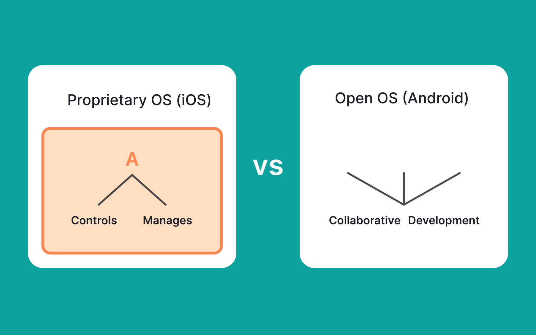
Unlike Android, Apple's
Its free software development kit (SDK) gives developers access to various functions and services of iOS devices. It also features an iPhone simulator that allows app developers to recreate the appearance and feel of the device on their computers when developing an app. The iOS SDK helps developers create iOS apps with officially supported programming languages, including Swift and Objective-C. However, you can also use other programming languages to develop native iOS applications.
Due to the ownership of its ecosystem, iOS is one of the most secure operating systems. Simply put, other companies or developers can't fully access the source code. Additionally, all Apple components, especially open-source ones, are regularly checked for compliance with security requirements. This is one of the reasons developers often struggle to meet Apple's requirements when placing their apps in the Apple store. If something seems suspicious, Apple reserves the right to block apps immediately.
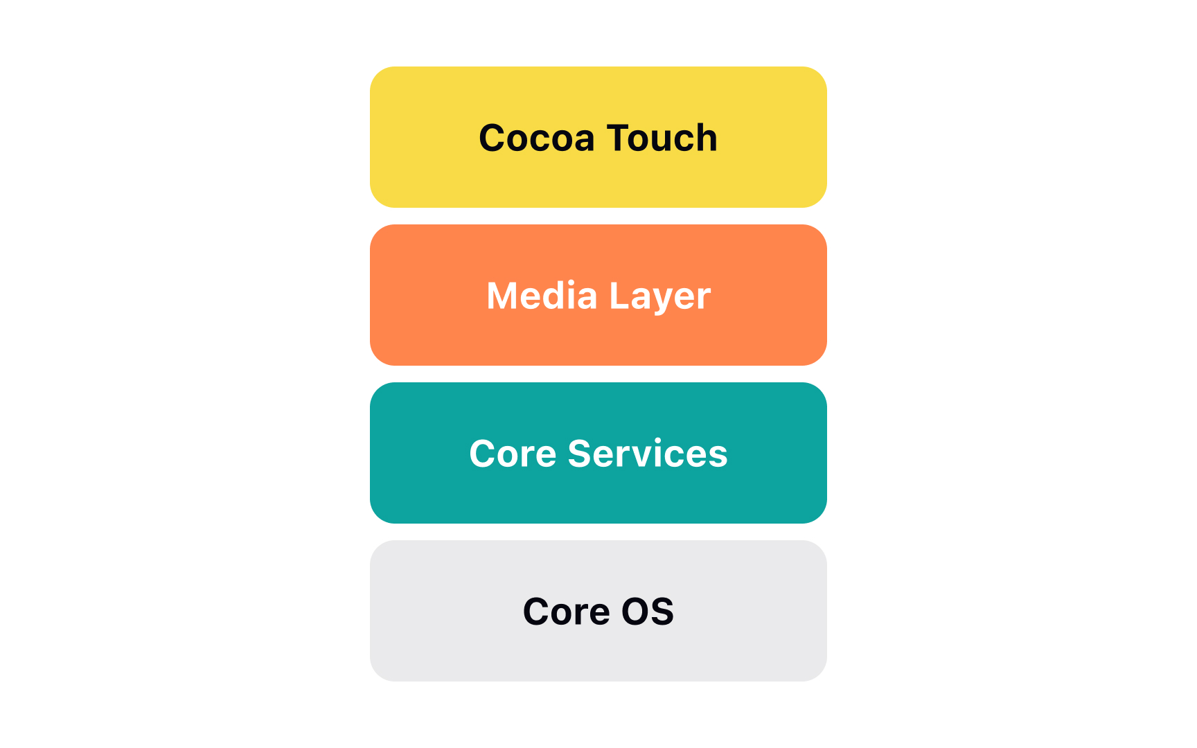
These include:
- The Cocoa Touch layer (or the application layer) is responsible for the application's appearance and how it interacts with users. Plus, it also contains critical iOS components that allow multitasking between applications and using the touchscreen to request commands.
- The Media layer holds all video, audio, and graphic frameworks that allow users to listen to their favorite music or watch movies.
- The Core Services layer contains essential technologies like: the Address book framework, Core Location framework, Social framework, Healthkit framework, and others. These are necessary to support device applications. It doesn't mean your application will need all these components but they are available to be accessed at any time.
- The Core Layer is the closest one to the device hardware. It handles low-level functionalities such as networking, memory, and external accessories.
Due to the layered structure, iOS applications keep functioning effortlessly even if there are certain hardware changes on the device. Plus, the malfunctioning of one layer doesn't affect others, which makes it easier to test and debug each layer.
Unlike
Beyond the home screen, iOS users can customize the Control Center, switch between light and dark modes, set default apps for web browsing and email, manage notifications, set time limits, block specific contacts, and organize app icons and widgets to create custom
One of the most fantastic advantages of Apple products is their continuity — a seamlessly integrated environment between all your devices (iPhone, Apple Watch, AirPods, Mac) using Apple-only features like iCloud, Apple Pay, AirDrop, or Handoff.
Using iOS integration technology, users can:
- Wirelessly send photos, files, websites, and videos to a nearby Apple device
- Start working on one device and then resume their work on a nearby device without any delays
- Copy
content on one Apple device and paste it on another Apple device[1] - Pay with their iPhone or Apple Watch when shopping online on Mac
- Receive phone calls and SMS on their Mac, share an Internet connection between devices, and do many other activities seamlessly[2]
Due to this well-developed integration within the
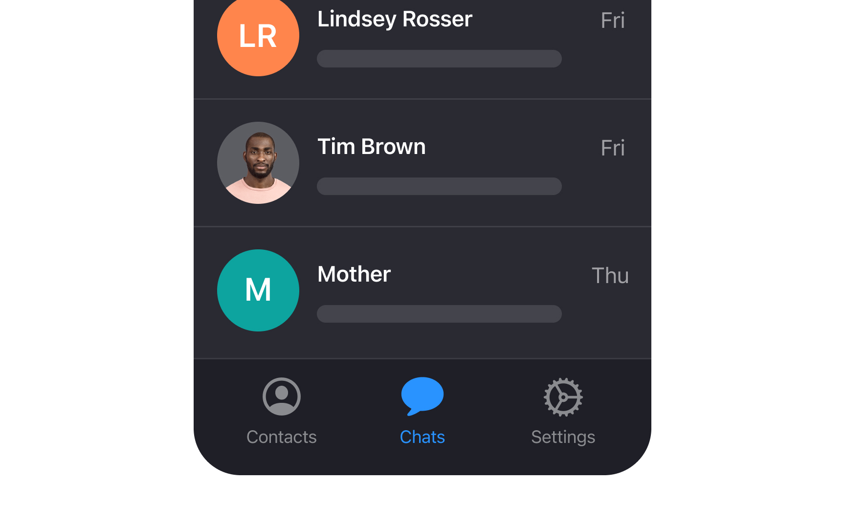
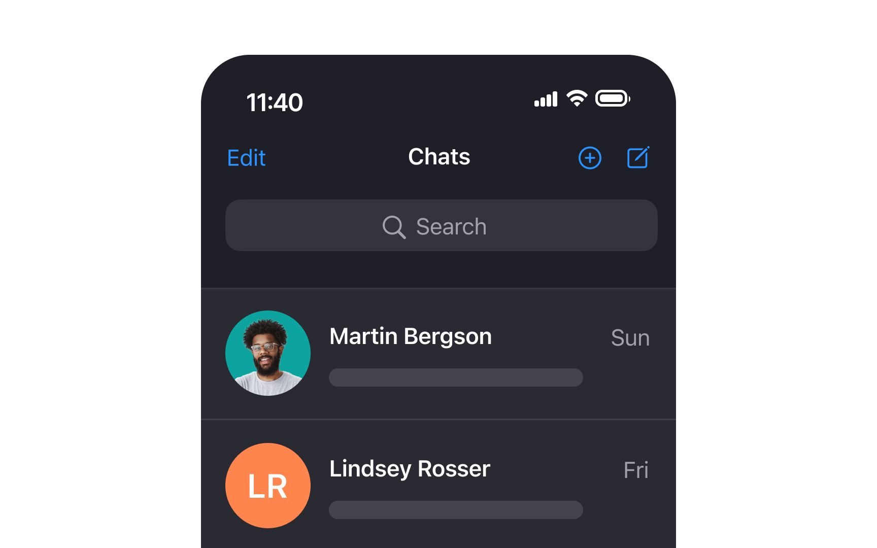
Primary
On iOS, the primary navigation bar is typically placed at the bottom of the screen and contains up to 5 tabs, each with an
Common navigation patterns include Home for main content, Search for discovery, Library or Profile for personal content, and Settings for app configuration. Apps should prioritize these destinations based on user behavior and feature importance rather than following rigid placement rules.
Pro Tip: Icons are supposed to help users recognize the meaning of actions faster. Use labels to prevent confusion about icon meanings and help users find what they're looking for.
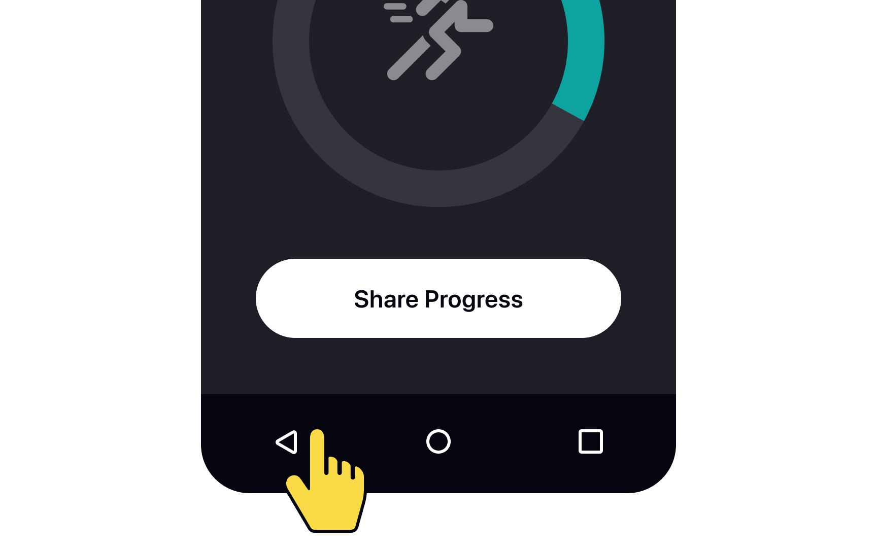
The floating action button (FAB) is a well-known primary action button on
In contrast,
For
This size requirement ensures that users, including those with larger fingers or other
There are 4 different ways to navigate back on iOS applications:
- Tapping the Back
button on the top-left of the screen. It usually contains the name of the previouspage or section and a chevron pointing to the left. - Swiping right from the left edge of the screen. Users can apply this action where the Back button is present.
- Pressing the Done or Cancel button. This is usually placed on the top-right corner of the modal view.
- Swiping down on
content placed within a modal or fullscreen view. Fullscreen views are usually used for displaying photos or videos that take up the entire screen.
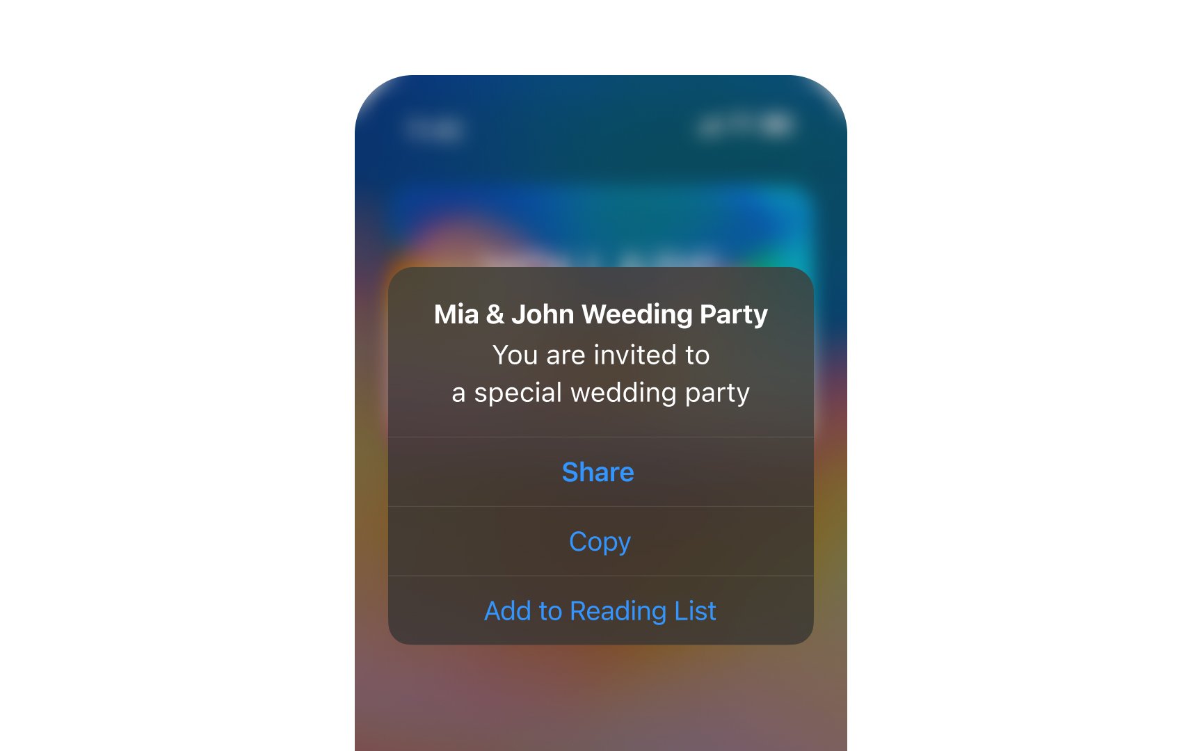
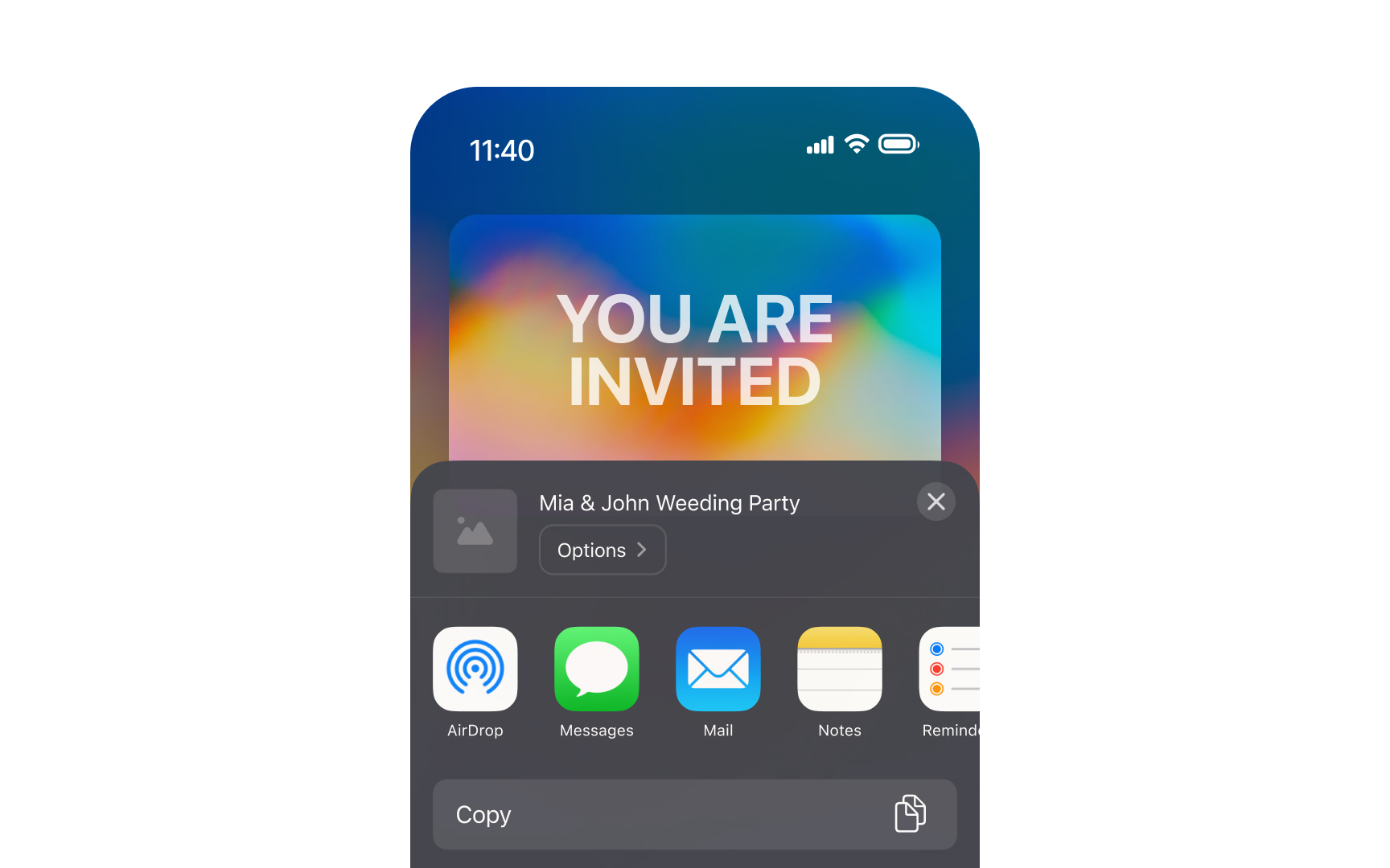
Action menus slide up from the bottom of the screen when users press a
Additionally, there are context menus that appear after long-pressing the element, blurring out the background. The main drawback of context menus is that there's no visual indication of their existence until they're activated.
Mobile developers often experiment with the menus' appearance, placement, and behavior. However, using native action menus is more beneficial for users as they experience less cognitive load and don't need to learn new patterns.
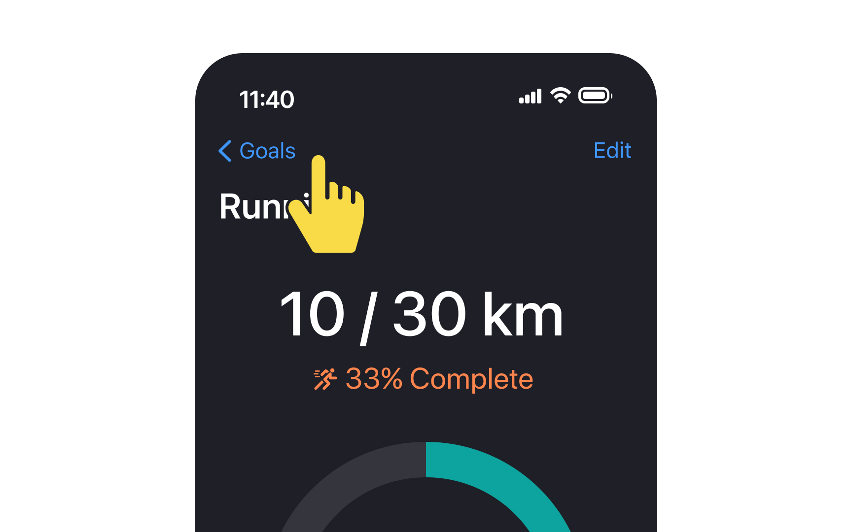
In
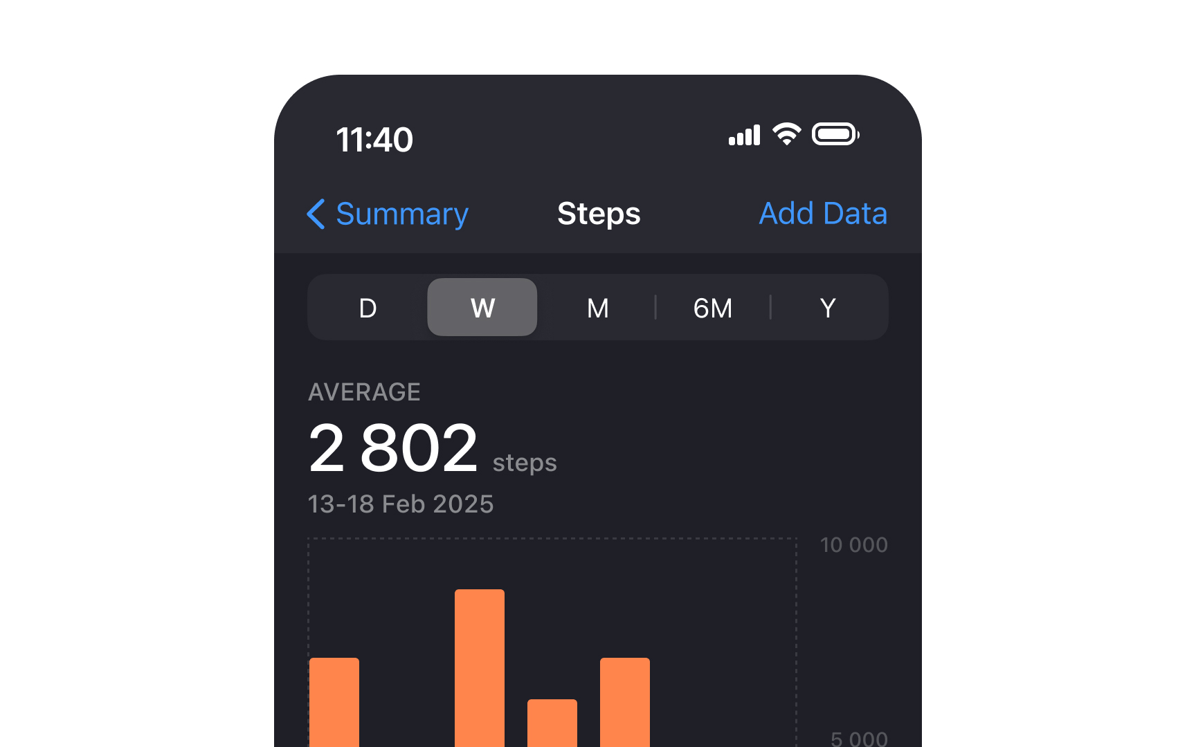
The Health app demonstrates this pattern effectively in its activity tracking views. When viewing daily steps, the segmented control offers views like "Day," "Week," "Month," and "Year" — different presentations of the same step data. Users can switch between these views to analyze their walking patterns over different time periods while staying within the steps-tracking context.
Similarly, heart rate monitoring in the Health app uses segmented controls to switch between views showing "Latest Reading," "Daily Average," and "Heart Rate Variability." These segments represent different aspects of the same heart rate data rather than navigating to unrelated health metrics.
San Francisco and New York are the default typefaces on
Can you apply custom typefaces in your apps when designing for iOS? Certainly, but they should be legible enough and used only if you want to highlight your brand or create a unique gaming experience. iOS guidelines also recommend using custom
Pro Tip: Use fewer typefaces in your app's interface to make it easier to read and to make the typography more appealing.
References
- Copy and paste between your Apple devices | Apple Support
- Buttons | Apple Developer Documentation | Apple Developer Documentation
- Typography | Apple Developer Documentation | Apple Developer Documentation
Top contributors


Topics
From Course

Share


Similar lessons

Designing for Mobile Interfaces

Responsive vs. Adaptive Design
