Forms Accessibility
Discover how to build accessible forms that do not overwhelm or put off users
We've all experienced that moment of frustration when facing a complex form that seems designed to make us fail. Now imagine navigating that same form with a screen reader, motor limitations, or cognitive disability. Forms are conversation-starters between people and digital products, yet they often slam doors shut for those who need access the most. Clear labels, thoughtful instructions, and helpful error messages transform impossible barriers into welcome pathways.
Beyond compliance checkboxes, accessible forms show we care about human experiences across the spectrum of abilities. When someone abandons a form because they can't use it, that's not just a lost conversion; it's a person excluded from services, information, or opportunities they deserve. Accessible forms aren't just nice to have; they're essential bridges to participation in digital life.
People with visual impairments using screen readers, those with motor limitations, and efficiency-focused data entry professionals all rely on keyboard controls rather than a mouse. Make sure every interactive element in your forms can be accessed and operated using only a keyboard. This includes text fields, dropdown menus, radio buttons, Tab, Shift+Tab, Enter, and arrow keys.
Focus indicators are visual outlines that highlight the currently selected element. These visual cues prevent users from getting lost while navigating. While browsers provide default focus indicators, they often lack sufficient contrast. Consider designing custom focus indicators with high contrast colors and distinct styles to ensure clear visibility against any background.
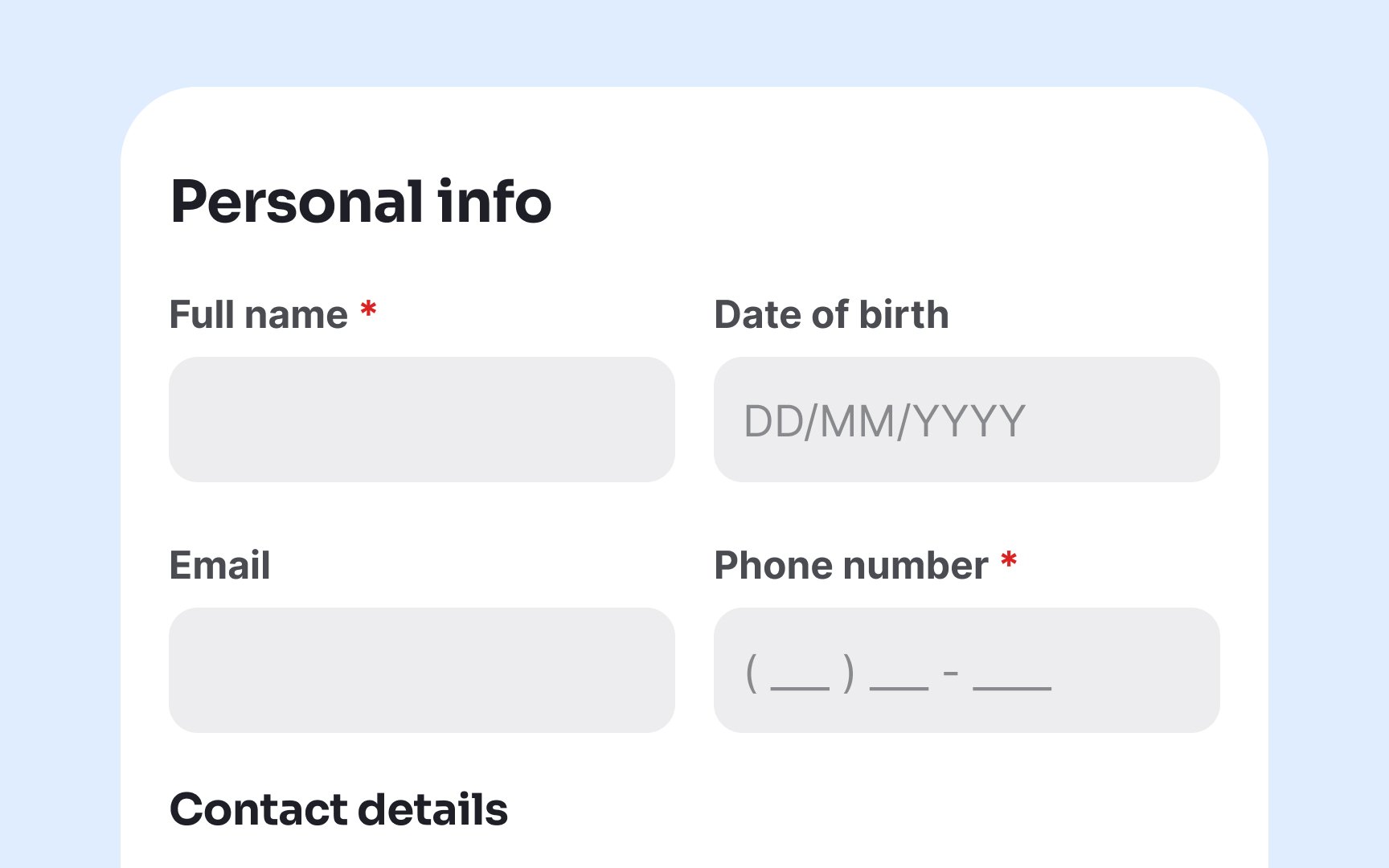
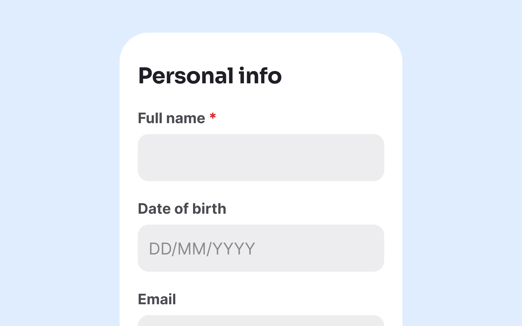
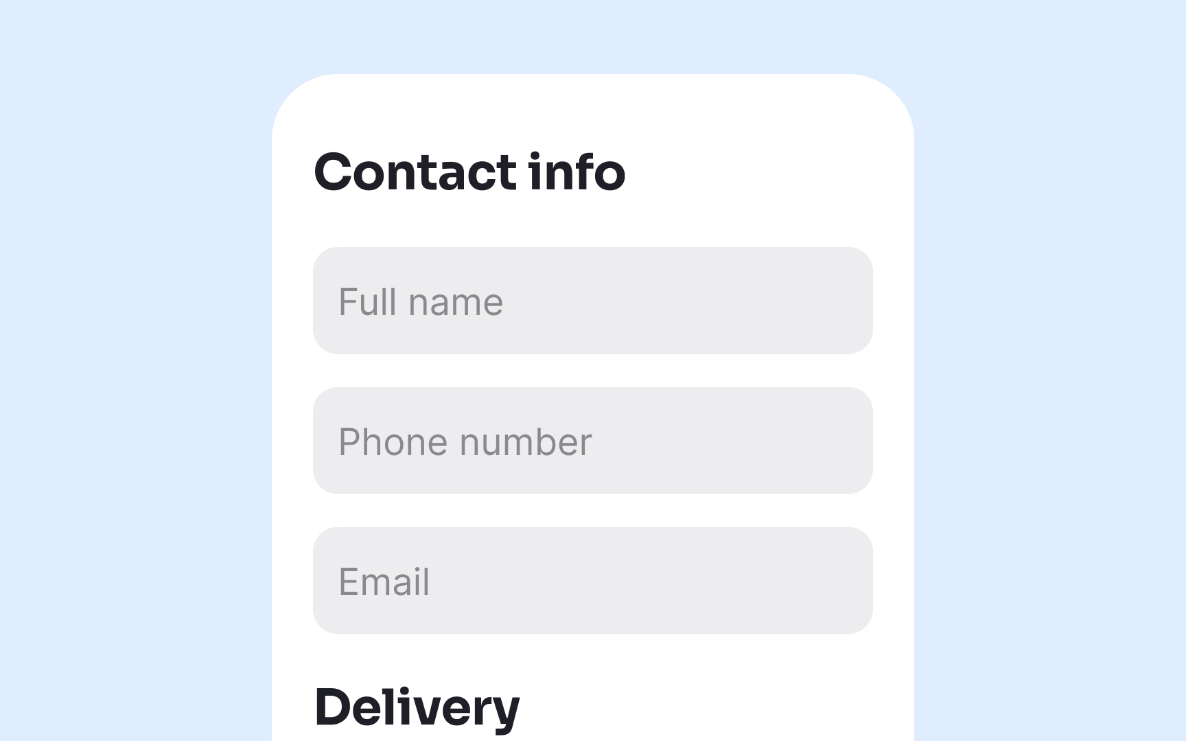
Multiple column layouts in forms create confusion and increase cognitive load for all users. Research consistently shows that people often skip fields, enter information incorrectly, or abandon forms entirely when confronted with complex multi-column designs.[1]
For users with disabilities, the challenges multiply significantly. Screen reader users may navigate in unexpected patterns, while people with cognitive impairments might struggle to follow the intended path through scattered form elements. Single-column layouts create a clear, predictable path that guides all users smoothly through the form completion process.
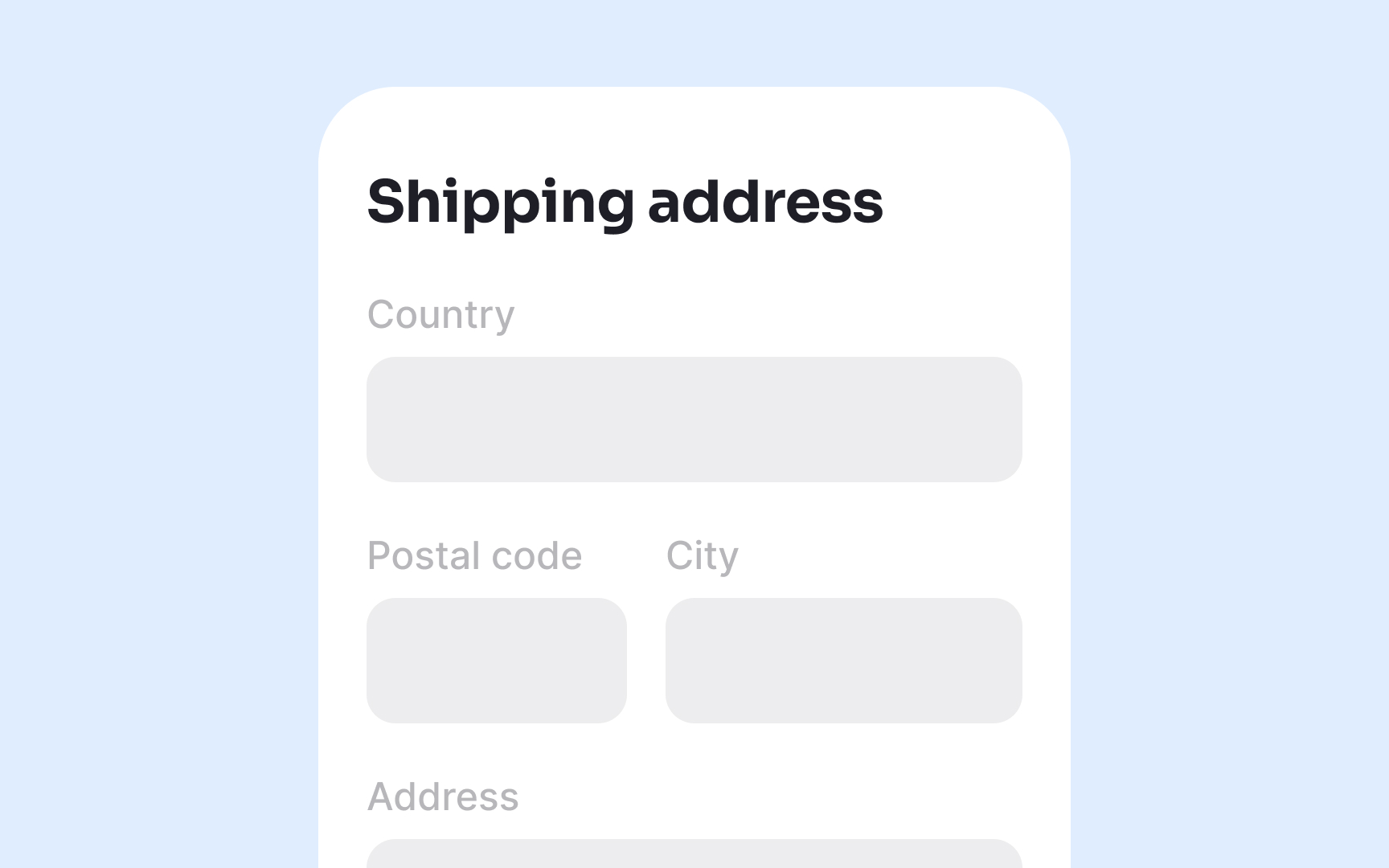
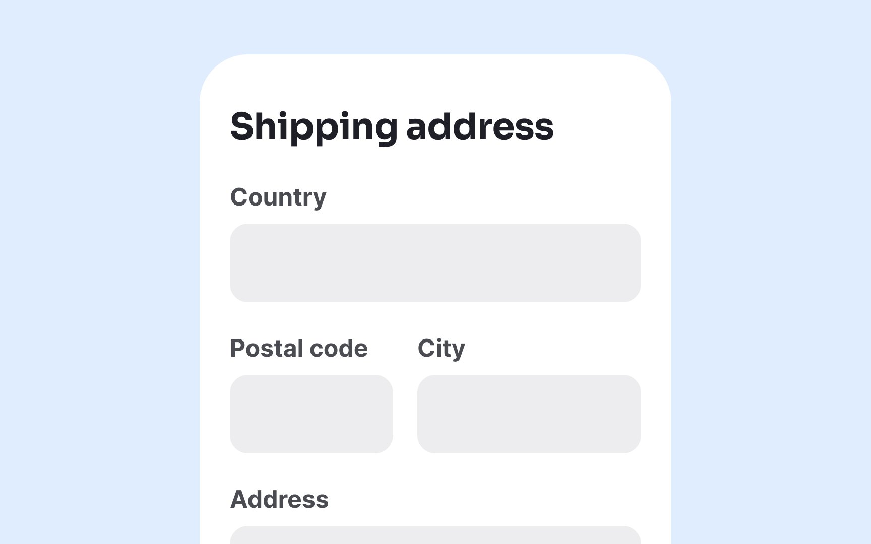
Reserve side-by-side fields only for logically related short inputs that users expect to appear together, such as City, State, and Zip code. This familiar grouping actually reduces cognitive load rather than increasing it. For everything else, maintain a vertical flow to support successful form completion.
While minimalist designs with borderless
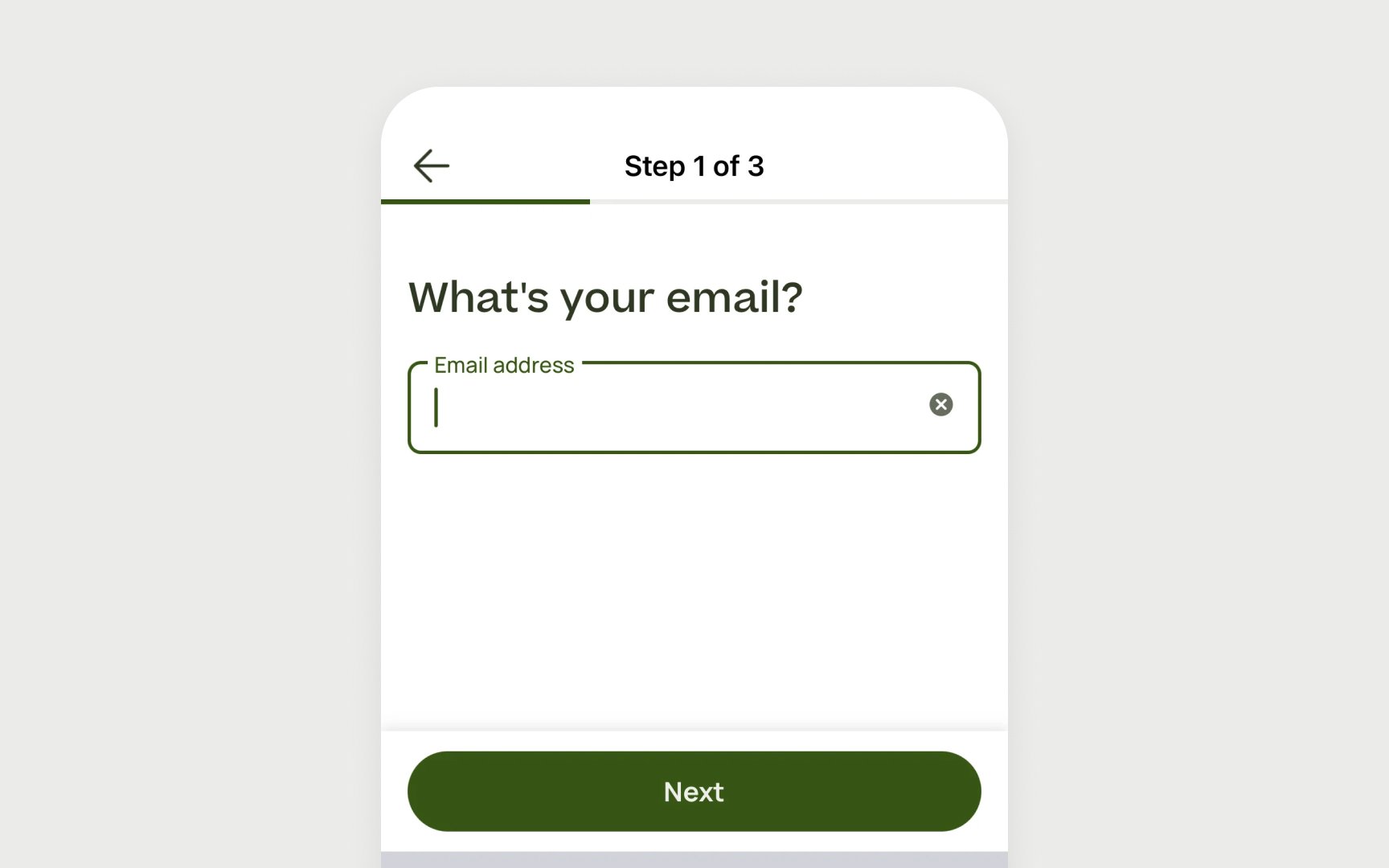
Always design form fields with visible outlines or backgrounds that clearly distinguish them from surrounding content. The
Placing
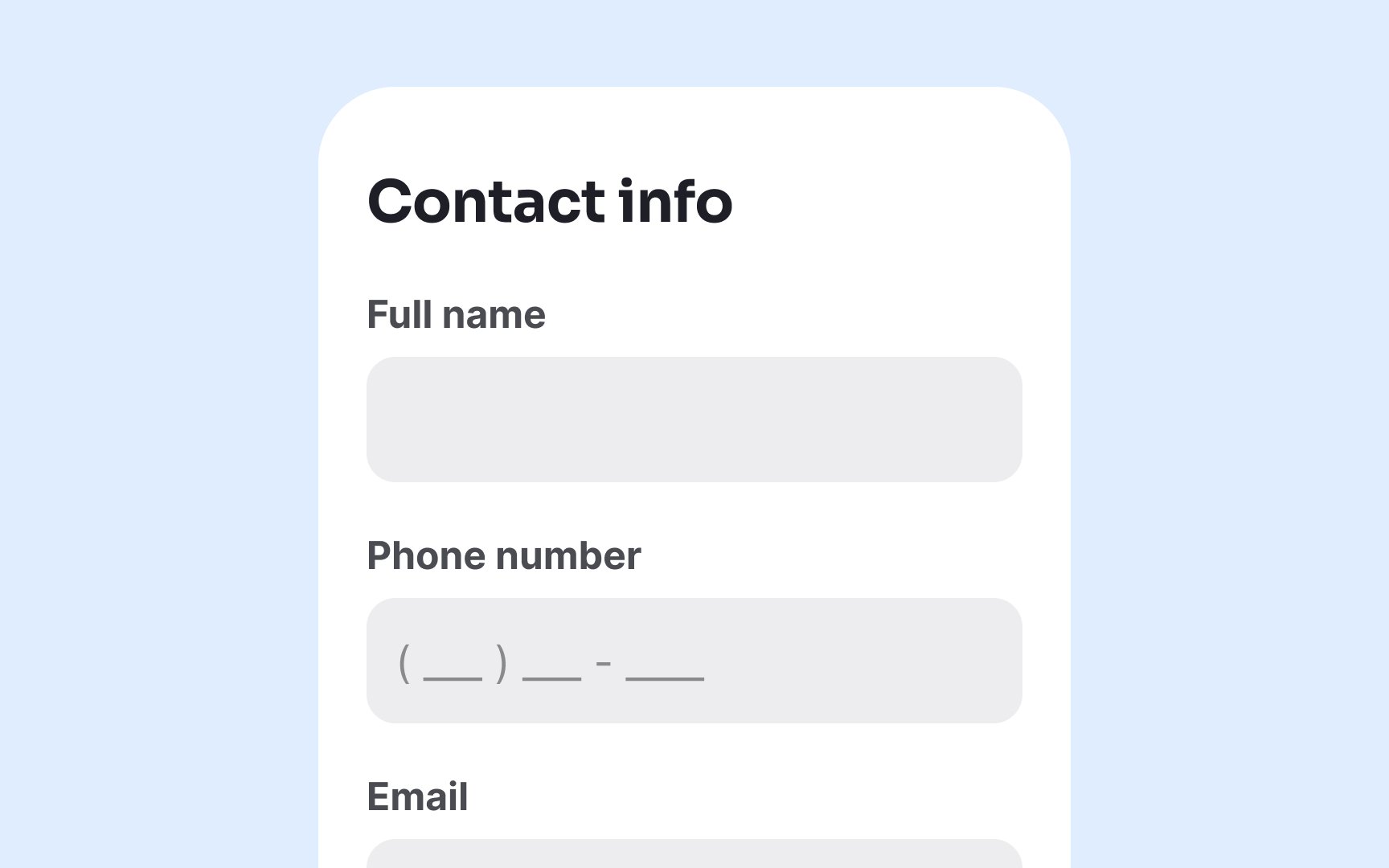
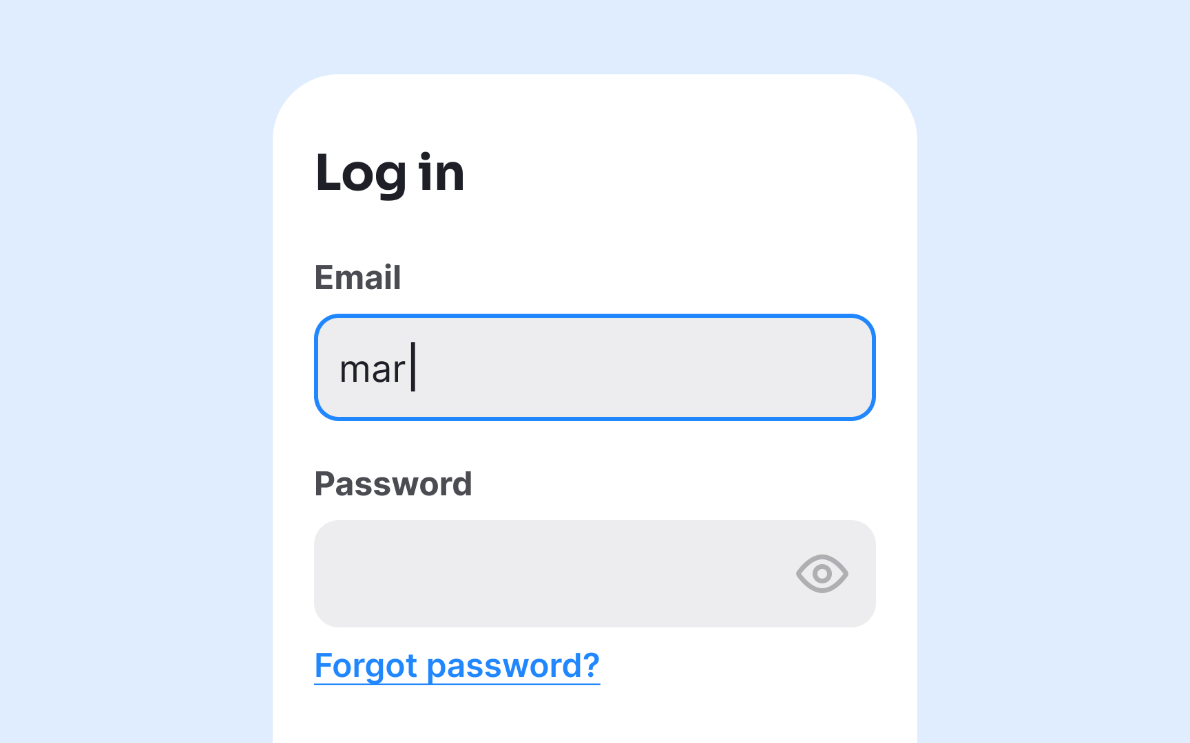
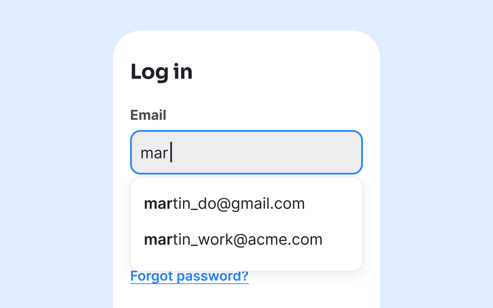
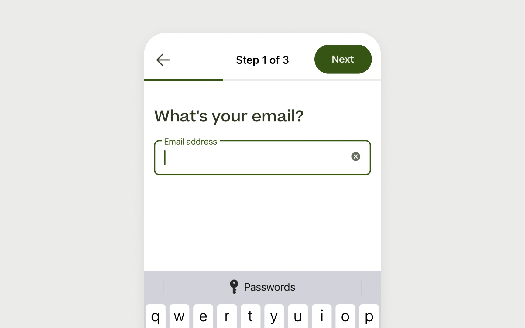
When labels remain visible throughout the interaction, users can easily verify what information belongs in each field without having to delete their entry to see the instructions again. This creates a more efficient and less frustrating experience, particularly for complex forms or those requiring specific data formats.
Plus, external labels offer much better visibility than placeholder text, which typically appears in light gray with poor
When
Maintain a contrast ratio of at least 4.5:1 between label text and background
When users have already provided information to your site, take the extra step to prefill those fields automatically. There's no justification for asking users to reenter data you already have. This approach respects users' time and physical capabilities while reducing
Implement autocomplete for standard information that people enter frequently across websites: names, email addresses, phone numbers, postal addresses, and payment details. Modern browsers support the HTML autocomplete attribute, which lets users choose from previously entered values stored securely in their browser. This simple addition dramatically increases form completion rates.
Pro Tip: Disable autocomplete without authentication for sensitive form inputs like passwords to enhance security.
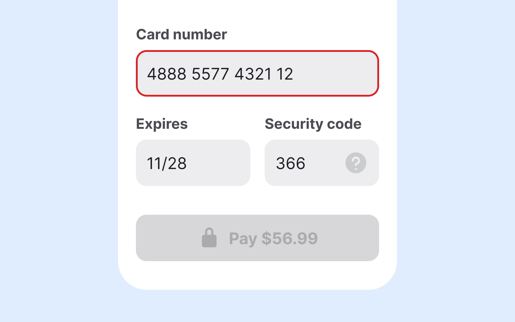
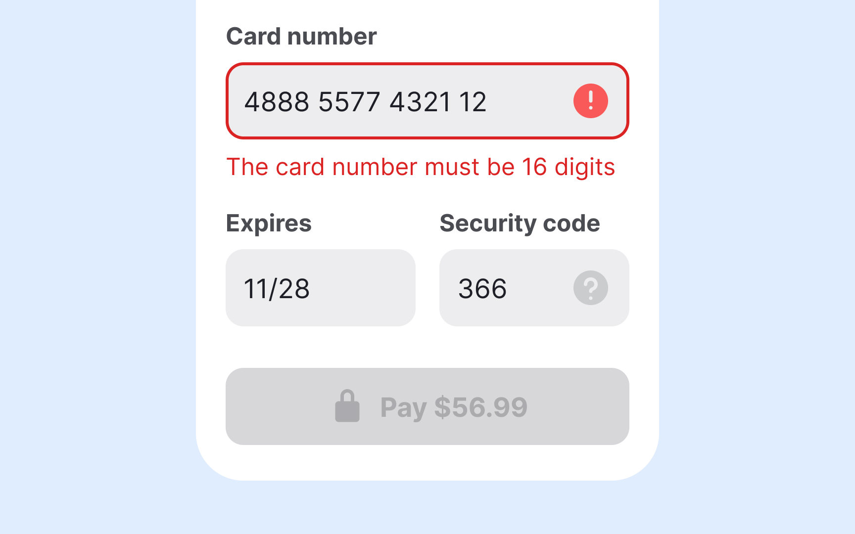
Error messages that don’t clearly indicate which fields need correction create unnecessary friction for everyone, and even more so for users with disabilities, who may need to navigate the form multiple times to locate and resolve issues.
Always communicate
If your app runs on a device that supports haptic feedback, consider adding a brief vibration to signal an error, unless users have disabled this option in their settings.
Use clear, actionable language in your error messages. Instead of vague alerts like “Invalid input,” specify what’s wrong and how to fix it, for example, “Phone number must include area code” or “Password must be at least 8 characters.” This reduces guesswork and helps users recover faster.
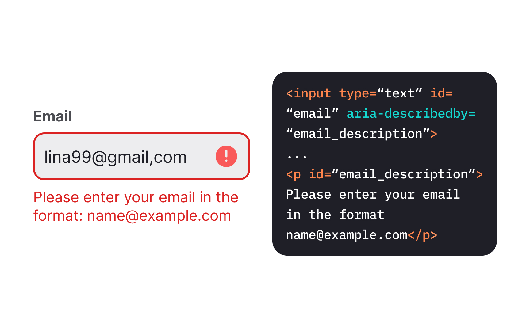
Implement the aria-describedby attribute to create a programmatic link between each form field and its error message. This
This technique especially benefits users of screen magnifiers who may see only a portion of the screen at once. When error messages are properly linked to their
A comprehensive error summary helps users identify all issues preventing successful form submission. This overview plays a crucial role in guiding users through error correction, especially for longer forms.
Place this error summary at the top of the form when validation fails, listing each problem detected.[3]For maximum
This approach particularly benefits screen reader users and people with cognitive disabilities who might otherwise struggle to locate all
Pro Tip: In the error summary, use natural language that matches the exact wording of the inline error messages to avoid confusion when users navigate to the specific field.

Traditional CAPTCHAs that require identifying distorted text or images are particularly problematic for users with visual impairments and cognitive disabilities. Instead, offer accessible alternatives such as
For password-based systems, support copy-paste functionality rather than blocking it for "security reasons." This feature is essential for people using
Filling out forms on mobile is already a challenge. For left-handed users using only one hand, it becomes even harder when
To improve comfort and reduce effort, keep forms vertically aligned and center key actions within the lower-middle zone. Avoid fixed positions on the right edge. Support smart features like
Pro Tip: Try switching to your non-dominant hand and complete a form to spot friction.
References
- Avoid Extensive Multicolumn Layouts – Baymard Institute | Baymard Institute
- 10 Design Guidelines for Reporting Errors in Forms | Nielsen Norman Group
Top contributors


Topics
From Course

Images provided by

Share


Similar lessons

Intro to Accessibility

Inclusive Design Basics
