Intro to Menus in UI
Explore the different types of UI menus and their uses
Menus are an essential element of product navigation and interaction. They are crucial in content-rich products as they help save space or even create a minimalistic look.
Menu design dramatically affects user experience. When creating user-friendly menus, keep in mind things like labels, icons, and different states.
To choose the best menu type for the project, consider its objective. When and where will it appear, and what will it help users achieve? Correctly chosen menus are self-explanatory and easy to find and manipulate.
Basic dropdown menus are UI controls that contain a simple list of options from which users may only select one option at a time. Once users make a selection, the
Pro Tip: If the menu is close to the edge of the screen, align it vertically to keep all menu items visible.
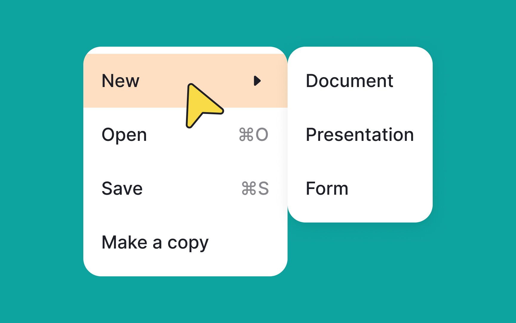
Cascading menus are an excellent choice for categorized content. They include a parent element and its children. The children usually unfold when users select or hover over an option.
This type of
Avoid adding too many options to the children's menus, however. This can make cascading menus cumbersome and overwhelming. If you need to use too many items, consider changing the user flow altogether.
Pro Tip: Cascading menus should never be used on mobile. A full-screen menu could be an alternative, but it depends on the purpose of each menu item and the overall information architecture.
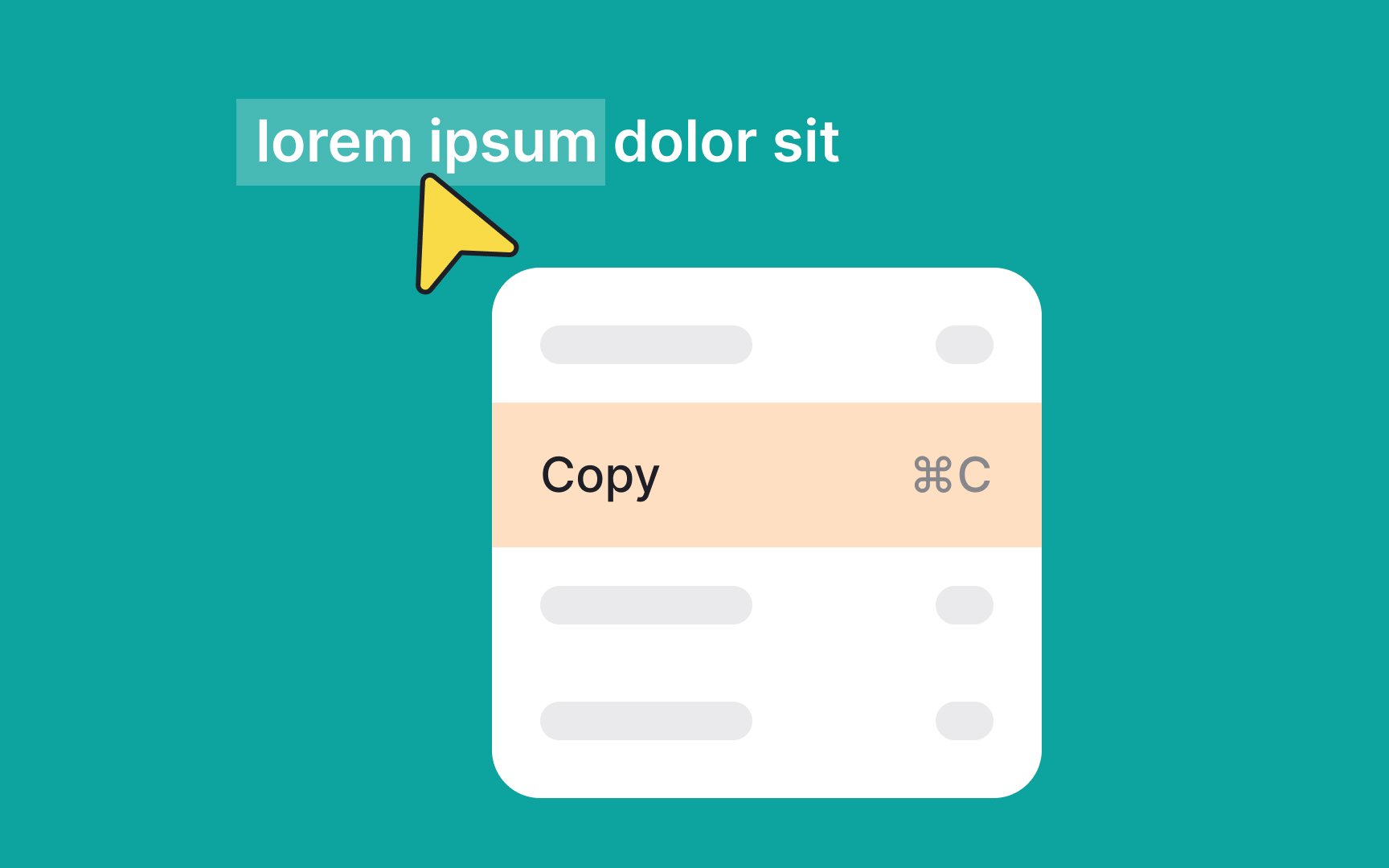
Contextual menus appear when users interact with a specific element. On desktops, they are usually triggered on right-click or with a keyboard shortcut.
Contextual menus appear next to where users click. Their list of options can vary based on the click target — for example, it can be different for text and images.
Usually, contextual menus contain frequently used actions related to the current context. For example, right-clicking on text in Google Docs reveals a contextual
Pro Tip: Contextual menus are hidden by default, and users may not know they exist. That's why it's important to also make these actions accessible from a visible place, like the menu bar.
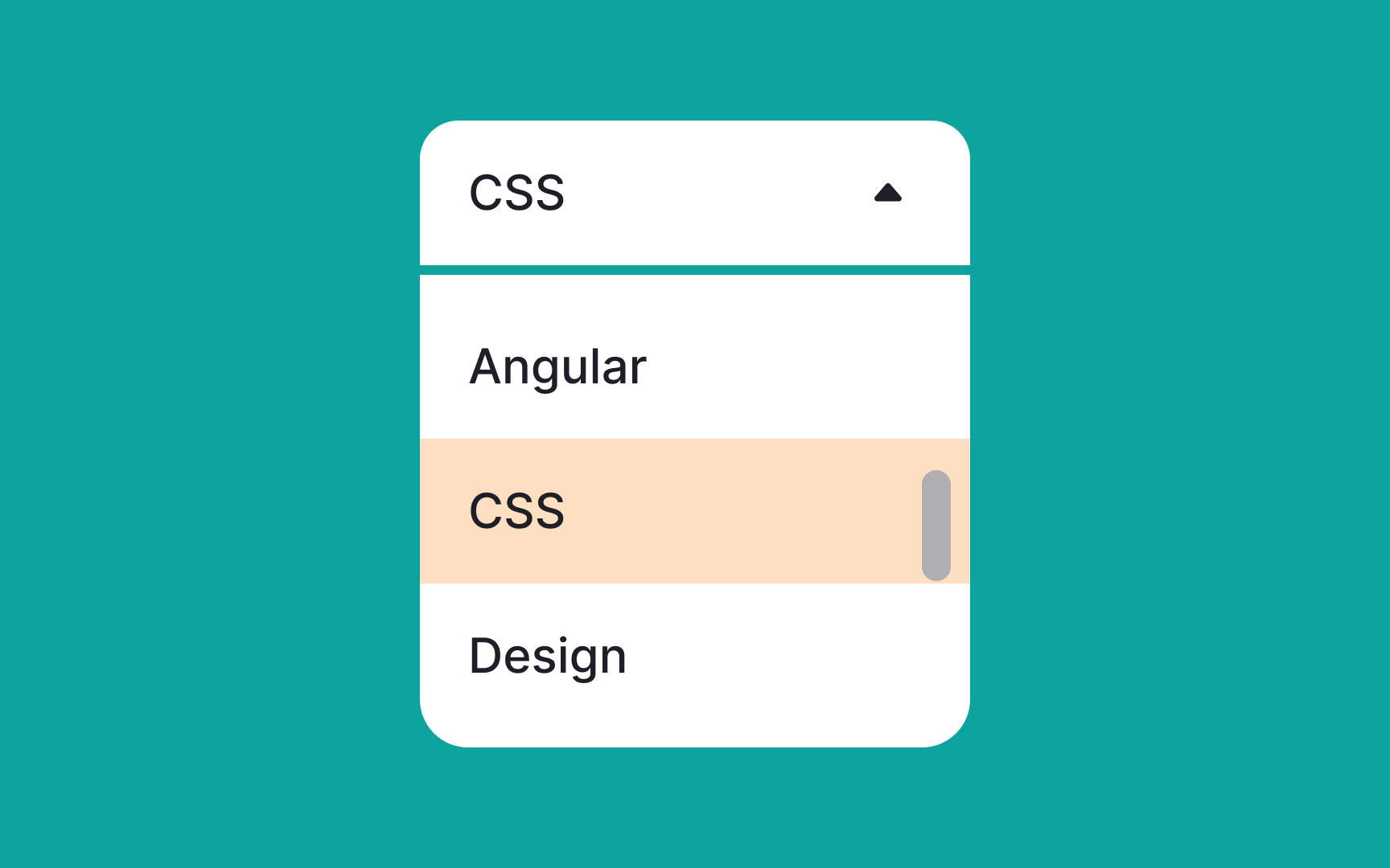
Single-select menus allow users to pick one option from a list. They come in handy when the
Single-select menus need to include a selection indicator to mark the user's choice. Commonly, it's a checkmark, bold text, or color overlay.
Single-select menus are great for selection, especially when filtering. However, avoid using this menu type to activate modal windows, dialog boxes, or dynamic controls.[3]
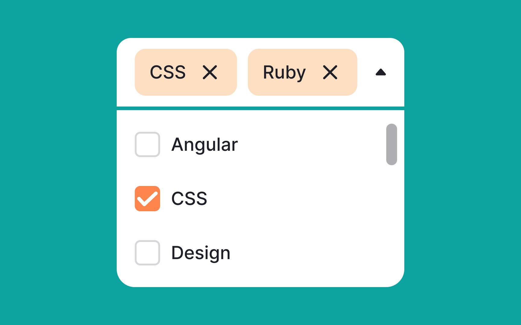
Multiselect menus enable users to select multiple items from a list simultaneously, offering flexibility and enhanced control. Here are common methods for enabling multiselect functionality:
- Utilize hotkeys such as Shift, Command, or Control in conjunction with mouse clicks
- Use checkboxes to mark desired options
- Implement a tagging system, where clicked items appear as tags at the top
To simplify decision-making, make selected items prominently visible, thereby reducing cognitive load. However, it's worth noting that multiselect menus can be challenging to implement effectively on mobile platforms due to space constraints.
Pro Tip: Make sure users have a way to deselect all items if they change their minds.
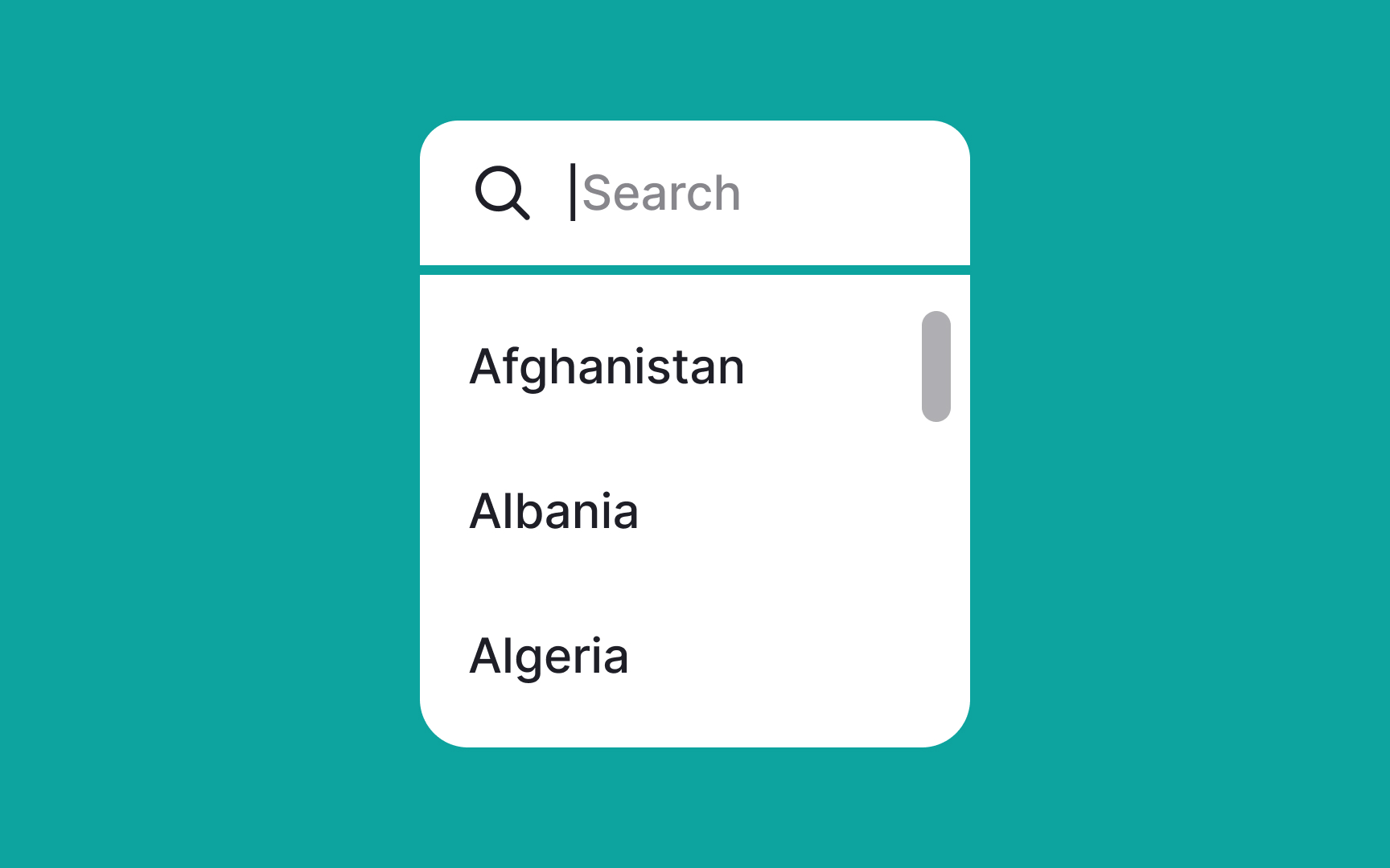
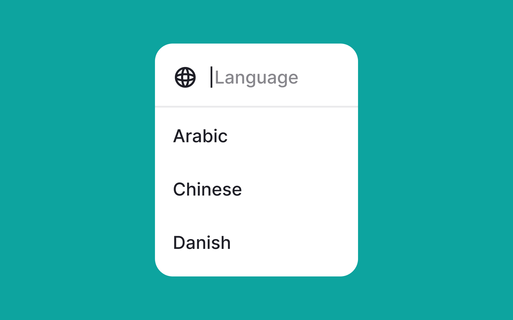
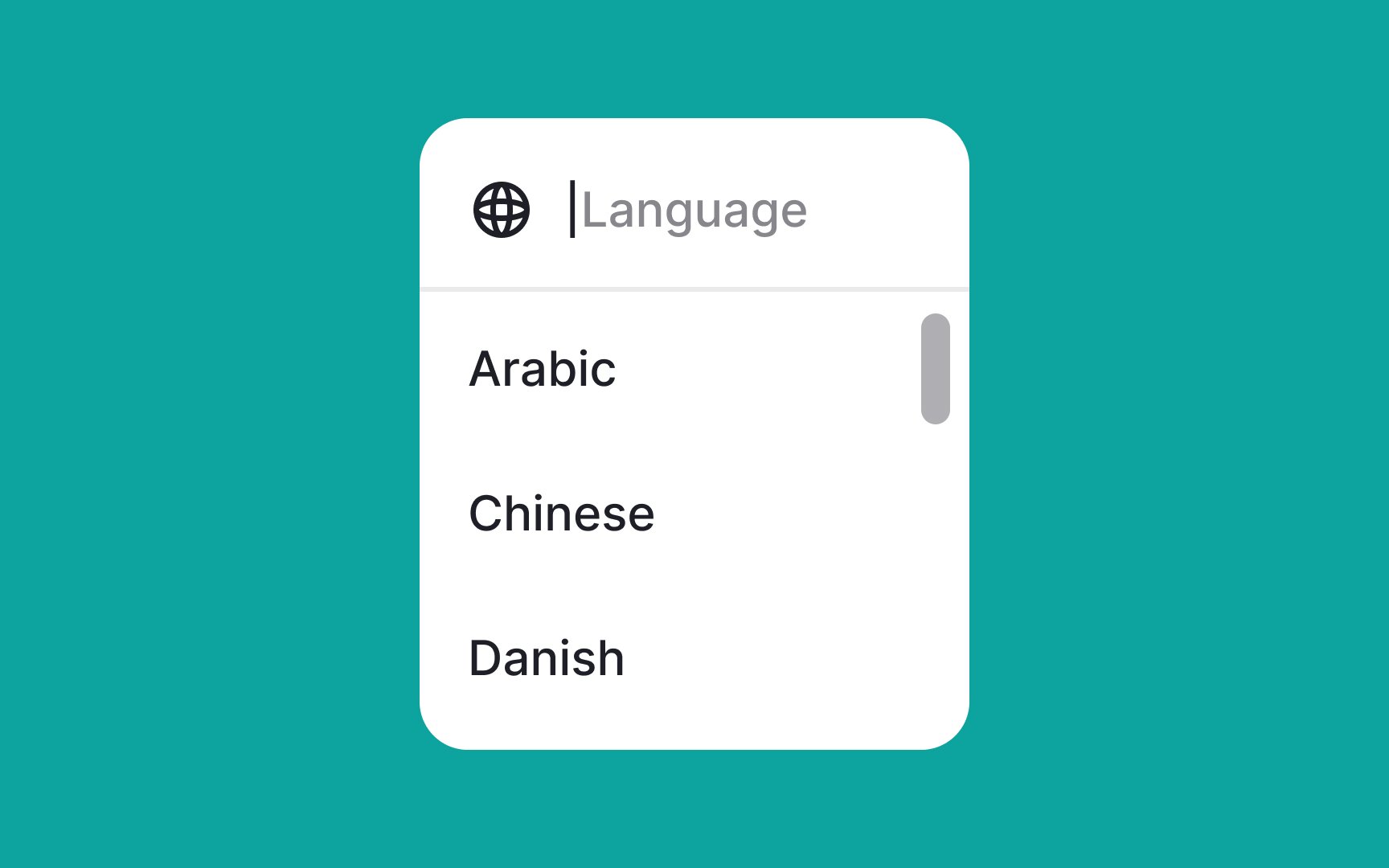
Search menus are specifically designed for handling long lists, such as a list of countries or languages. They improve
By integrating a search function into a lengthy
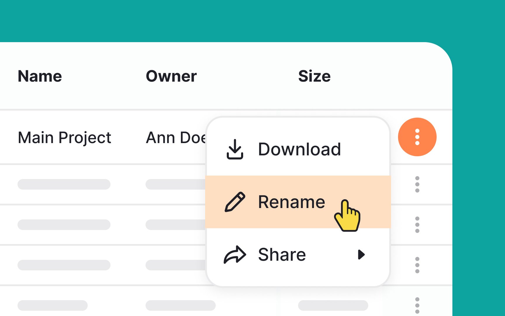
An inline
It lets users take action on that specific item without leaving the table view. For example, if you have a table of users, each row might have an inline menu with options like:
- Edit
- View details
- Delete
- Download
These options often appear as
The size of the screen limits the number of
If the number of options is too big, scrolling can become tedious. In this case, adding
How many options are too many? We say a couple of scroll wheel turns, but use common sense to determine that.
Leading
Place leading icons before the label or to the left in left-to-right writing systems. This way, users see them first while scanning. Use well-known, universally recognized icons to support quick recognition. Unfamiliar or abstract icons can slow users down and make the interface harder to understand.
Some brands place icons after labels. While this may seem counterintuitive, it highlights an important point. Every interface decision should be tested. In some cases, placing icons after the label can improve usability, match brand style, or support a specific
Pro Tip: If you doubt whether icons are self-explanatory enough, test them on your users with open-ended questions like: "What do you think this icon means?"
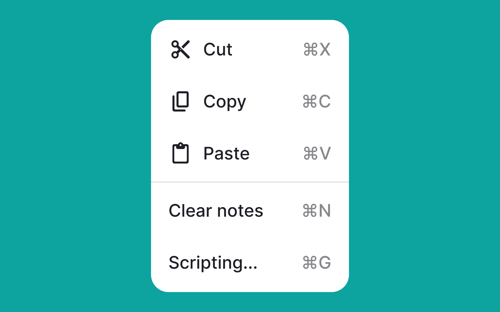
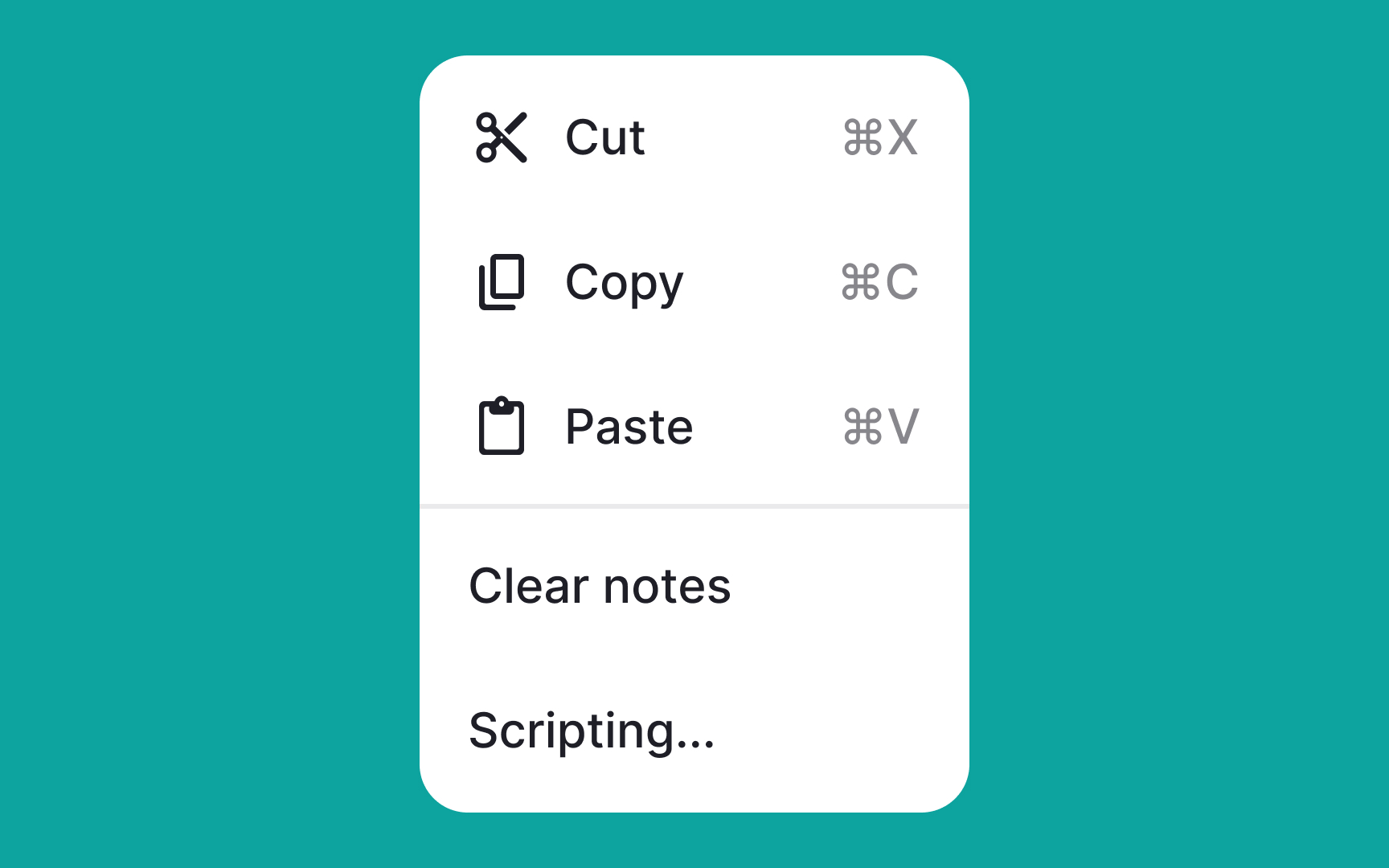
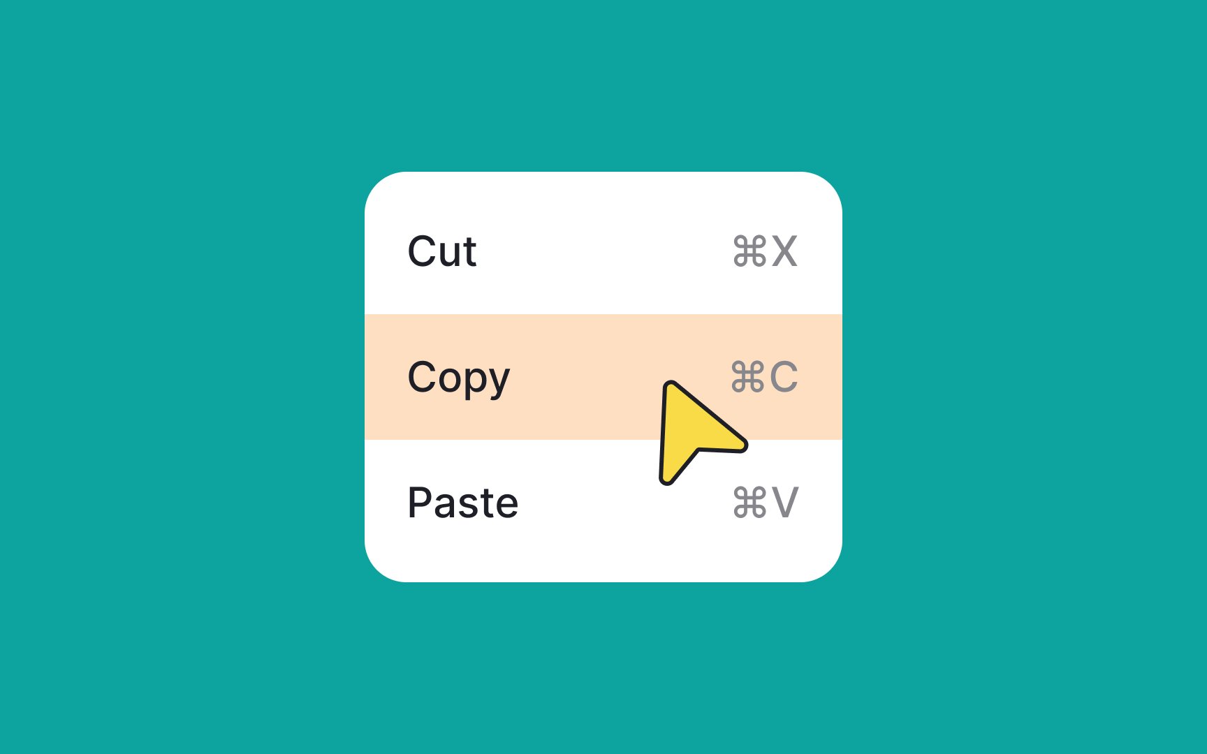
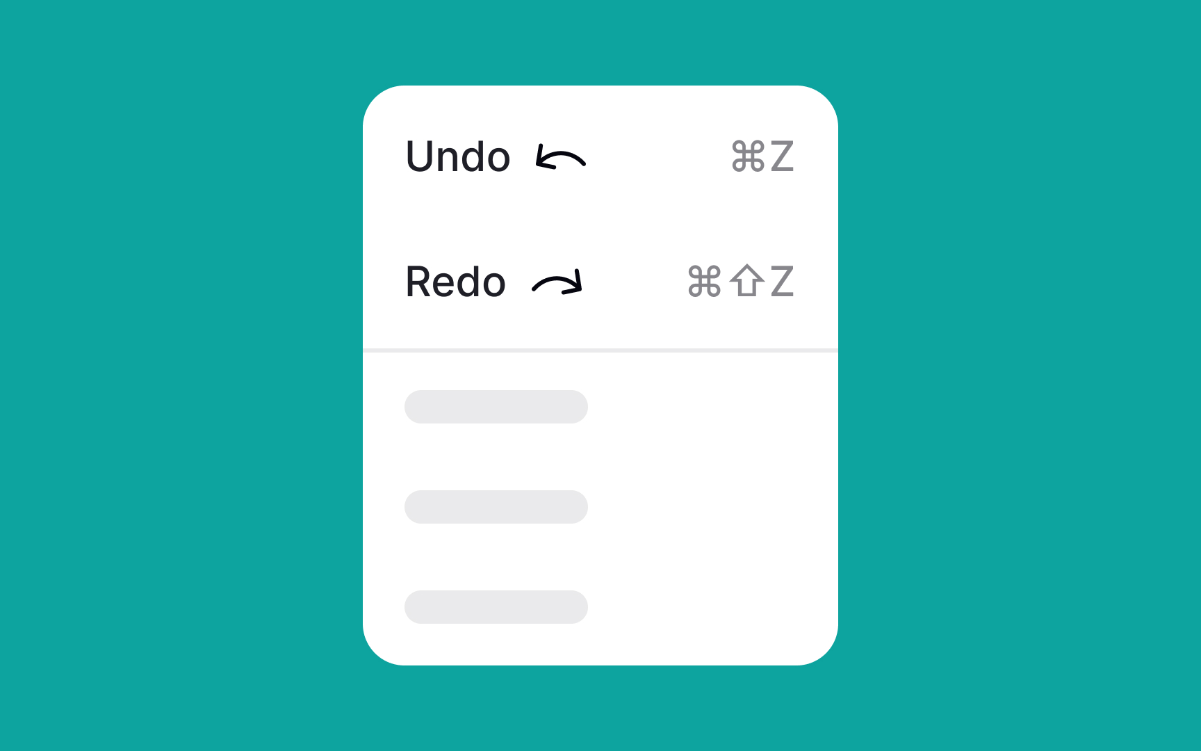
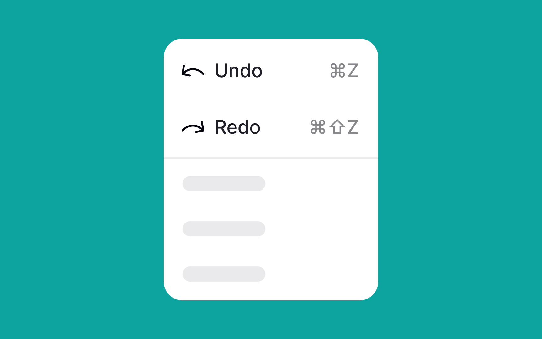
You can include keyboard shortcuts in the
There's no need to create shortcuts for all possible actions and menu items. Add them for the most common actions like copying, cutting, and pasting. Use familiar shortcuts whenever possible, since following established standards helps with adoption and ease of use.
Remember, only advanced users rely heavily on shortcuts, so they should never be the only way to complete a task.
References
- Material Design | Material Design
- Listboxes vs. Dropdown Lists | Nielsen Norman Group
Top contributors


Topics
From Course

Share


Similar lessons

Common UI Component Definitions I

Image Terminology
