Typographic Principles
Delve into the world of typographic principles and explore the essential guidelines for effective typography in design
Typography is one of the most important components of effective design. It consists of multiple aspects that influence how users see text on the web. For example, readability helps arrange the type so that users enjoy reading the content. Principles of emphasis, white space, proximity, and alignment contribute to visual hierarchy, assisting people in navigating and not getting lost while searching for information they need.
Another important aspect is the choice of a typeface that depends on project goals and product identity. Typography is the soul of a project and can sometimes compensate for missing graphics or intricate animations.
When you start working on the typography for your next project, start with a list of questions. Define and write down with your teammates the most important ideas you want your users to see, the mood of a product, and the emotions you want to evoke. Equipped with the principles of typography, you will know where to start and how to achieve those goals.
Everybody knows the conventional wisdom in the design world: you should be exceptionally careful when selecting a
Legibility refers to the typeface's design and the shape of the glyphs and falls under the influence of typographers. In contrast, readability is more about the readers' perception of the text and how easily they can decipher, process, and make meaning of it. Readability is the responsibility of copywriters and UX writers. However, typographical features of the text have a profound impact on the text's fluency and comprehension.
What typographical factors affect readability?
- Type size: The smaller the size, the harder the type is to read. From an accessibility standpoint, it's generally recommended to set body text at no less than 16px.
- Type case: While headlines and short phrases (like captions or subheads) get along with all caps and title cases, you should avoid these cases for body text. Sentence case is the most natural for people — after all, that's how we learned to read and write.
- Line spacing (leading): Line spacing depends on the size of the font. The larger the font is, the bigger the line spacing should be to avoid letters overlapping.
- Line length: Long lines are hard to follow. Short lines are no better. They're too abrupt and wear on users' attention, forcing their eyes to go back and forth too often. The optimal line length is 45-70 characters, including spaces.[1]
- Contrast: Low text-to-background contrast ratio increases eye strain and dramatically affects usability.
According to Nielsen Norman Group research conducted in 1997 on how people read on the web, 79% of participants prefer scanning
Scannability is the principle of arranging content in a way that allows users to scan it quickly, figure out if the page contains the information they need, and understand the main message.
So, what makes text scannable?
- Headings and subheadings
- Bulleted and numbered lists
- Short paragraphs
- Captions
- Bold and italic formatting
- Block quotes and pull quotes
In the 2007's Helvetica documentary, English graphic designer, typographer, and art director Neville Brody stated that the
When they see the text "Buy these jeans" in a grunge
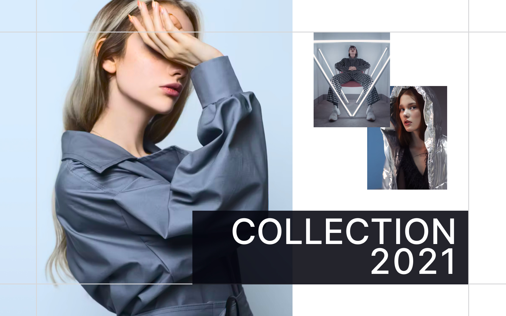
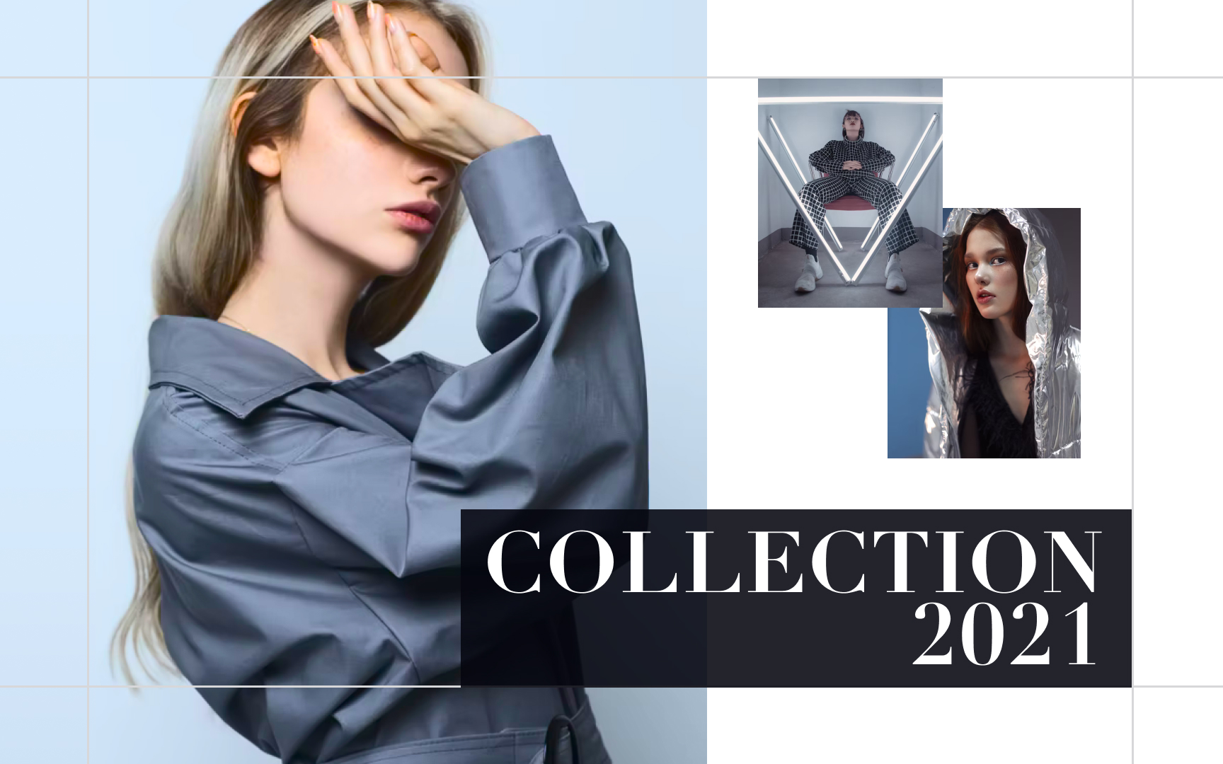
Typefaces help designers set expectations about the product and complement the brand image. Headlines and logos in slab serifs are attention-grabbing and bold; sans serifs appear simple, straightforward, and credible; meanwhile, serifs carry a sense of tradition and experience.
Modern variations of serif typefaces, like Didone, seem like the right fit for luxury products and high fashion and glamour industries. A strong
Before committing to a
The conventional wisdom says that a website, an app, or any other digital product should contain no more than 3 typefaces. Usually, one typeface with a good variety of
When selecting typefaces, make sure they
Pro Tip: Avoid messy, hard-to-read typefaces and always test a typeface's legibility at small sizes.
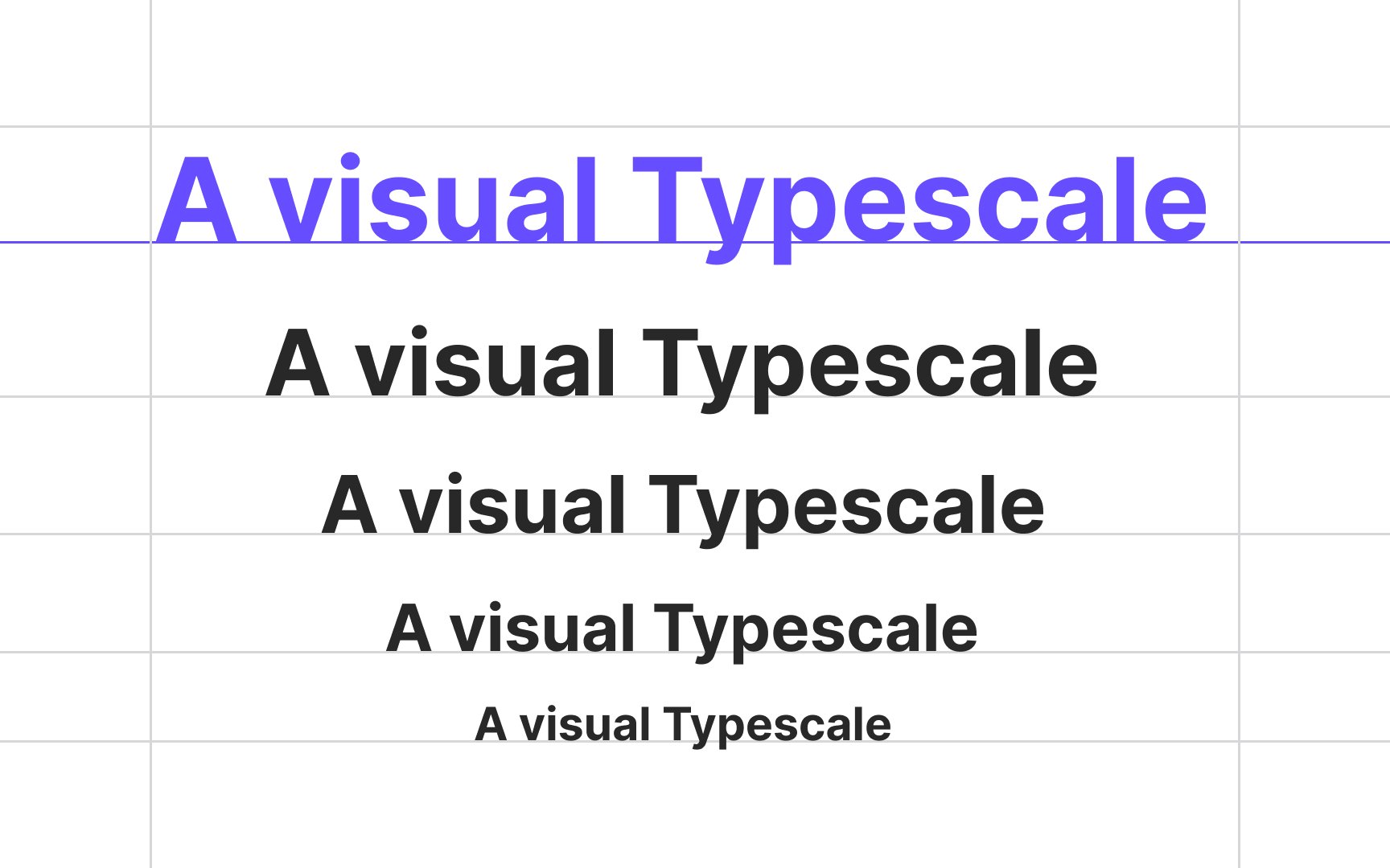
Traditionally, typographic scale refers to the different font sizes used in a design for various types of
According to the Material Design type scale, there are 5 type categories each product should include:
- Headlines: The largest text that spans from a range of 1 through 6. They should use eye-catching, expressive
fonts . - Subtitles (or subheadings): These are smaller than headlines and shouldn't be as prominent.
- Body text: The main text of the content and is usually used for larger sections of writing. Serif and sans serifs are a good fit for this category.
- Captions and overlines: The smallest text and should use simple and legible fonts.
- Button or label text: The text used in buttons, tabs, dialogs, and cards. It usually uses serifs or sans serifs for better
legibility and can be written in all caps.
There's no magic number of type sizes to use in design. As a starting point, you can take a browser default value of 16px and calculate the next font sizes using the golden ratio or another multiplier. As for type styles, rely on your sense of harmony and aesthetics.
Distinct differences between
To pick the right type scale ratio for your design, you can check the Type Scale Calculator.
Good design is far more than just choosing typefaces, placing text on a
Traditionally, in left-to-right languages,
This method allows designers to break from tradition and experiment with positioning text elements such as pull quotes, captions, headings, and body text. In combination with contrasting
Working with
The most common emphasis techniques in Western typography include:
- Italics & obliques: Italics (a slanted type style that uses unique glyph shapes) and obliques (a slanted version of the Roman type style) create the softest emphasis, although the degree depends on the surrounding text. This method of emphasis is commonly used for book titles, words from foreign languages, or internal dialogue.
- Bold: Bold text usually has a stronger effect than italics or obliques, using a heavier weight than the surrounding text.
- All caps: All caps help emphasize subheadings, column headlines, and occasionally for words within running text.
- Type size: Larger type works well for headlines and subheads in digital and printed designs.
- Color: Emphasis using color has a stronger effect when combined with other techniques like font-weight or case alterations.[5]
Methods of emphasis also include variations in letter spacing, underlining, and overlining.
The principle of proximity implies that related elements are placed near each other. In turn, unrelated elements are set at a distance. When arranging text in a
Additionally, proximity is one of the strongest design principles — it can overpower similarity of
Just like human beings can't exist without air, design can't function without
There are two types of white space:
- Micro white space is the space between small elements like letters, text lines, paragraphs, icons, and
buttons . - Macro white space is the space between larger elements like text and
images and also refers to padding and margins.
When done wisely, white space is a vital instrument that helps users identify related groups of text or other elements (for example, an input label and the associated input or sentences in a paragraph) and also contributes to a minimalistic, clean, and aesthetically pleasing design
References
- Legibility and Readability: What’s the Difference? | CreativePro Network | CreativePro Network
- Concise, SCANNABLE, and Objective: How to Write for the Web | Nielsen Norman Group
- Material Design | Material Design
- Proximity Principle in Visual Design | Nielsen Norman Group
Top contributors

Topics
From Course

Share


