Atomic Design & Modular Thinking
Build scalable interfaces by understanding how small, reusable parts form complete systems.
Modern design systems rely on modular thinking — the idea that complex interfaces can be built from smaller, independent pieces that fit together in predictable ways. Instead of designing full pages, teams create reusable components that can be combined to form any layout or product interface.
This shift comes from atomic design, a framework that breaks interfaces into five levels: atoms, molecules, organisms, templates, and pages. Each level adds structure and meaning while keeping the system flexible. Atoms are the smallest elements, such as buttons or labels, while molecules and organisms define how those atoms interact in consistent patterns. Templates and pages show how these patterns behave in real contexts.
By thinking modularly, teams work faster, reduce duplication, and keep design and development aligned. Components evolve without breaking the whole, and every change, like a new color or interaction, flows through the entire system. Atomic design turns interfaces into living ecosystems where creativity and consistency coexist.
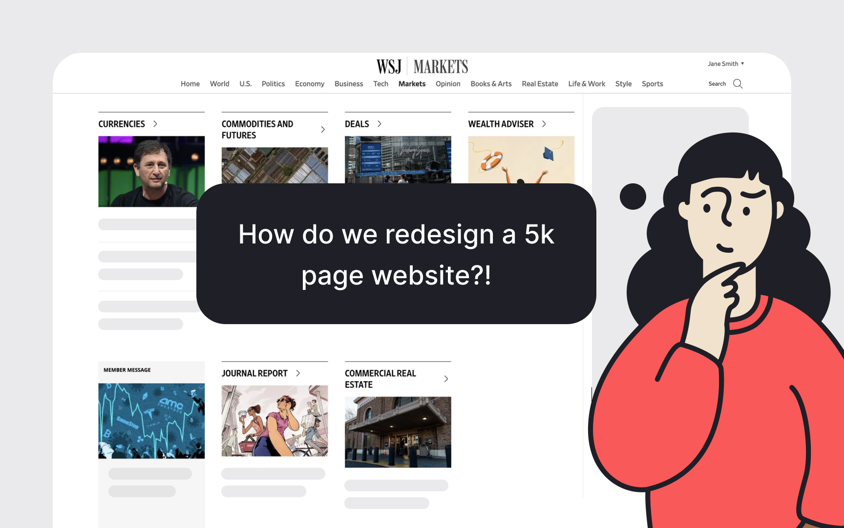
For decades, digital interfaces were seen as
Brad Frost, the author of the
Modularity means creating interfaces from smaller, independent parts that can be combined in many ways. Just like machines are built from interchangeable pieces, digital interfaces rely on reusable components that make work faster and more consistent. This idea has roots in manufacturing and computer science, where breaking complex systems into smaller units proved to improve quality and speed. Applied to design, modularity helps teams manage change and complexity without starting from scratch each time.
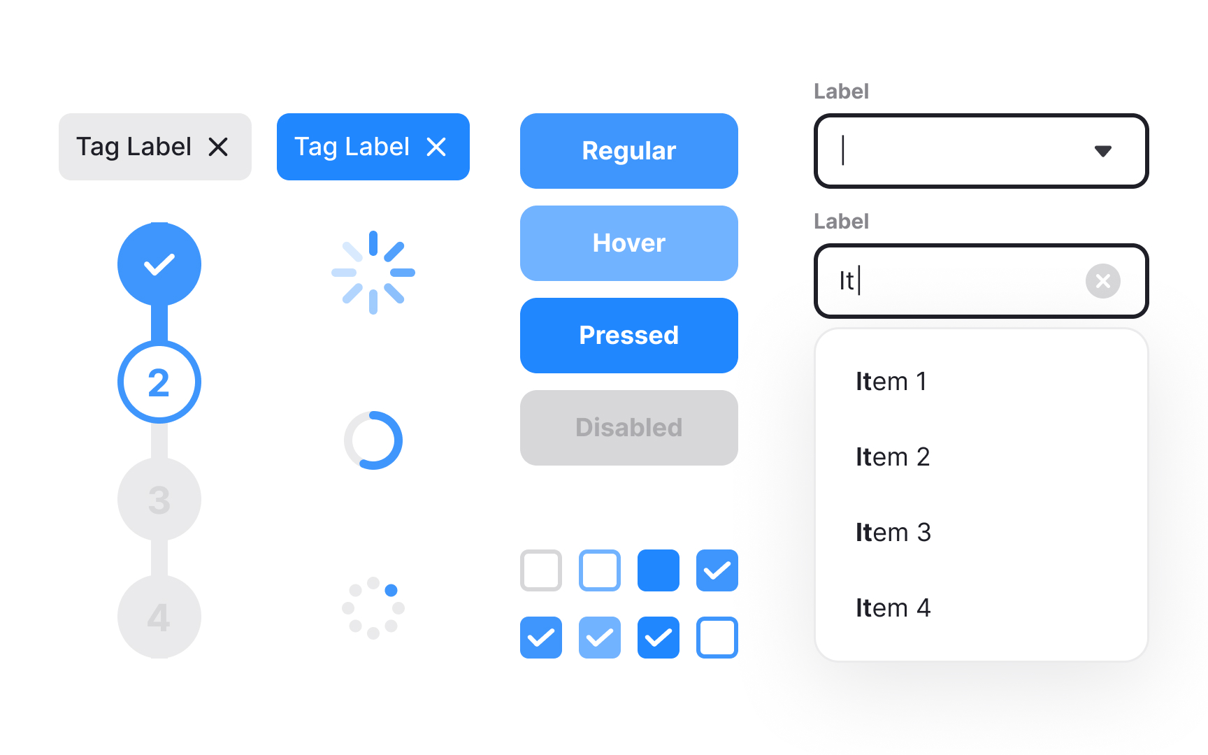
In practice, modular design transforms how teams build interfaces. Instead of crafting every screen individually, they define atoms such as inputs or icons, then group them into molecules like search bars or dropdowns, and later into larger organisms like headers or cards. These building blocks form a consistent structure that can expand as products grow. Each part serves a single purpose and can be updated independently, yet together they create a unified experience for users. Modularity keeps
Pro Tip: Treat each component as a building block. Small, well-defined parts make big systems easier to evolve.

While modular systems create unity, they can also lead to visual monotony if used mechanically. Overreliance on shared frameworks or component kits can make distinct products look identical, just like how every brand using Bootstrap risks the same aesthetic. The goal of a
To avoid this sameness, teams should customize their components intentionally. Foundations like grids, typography, and
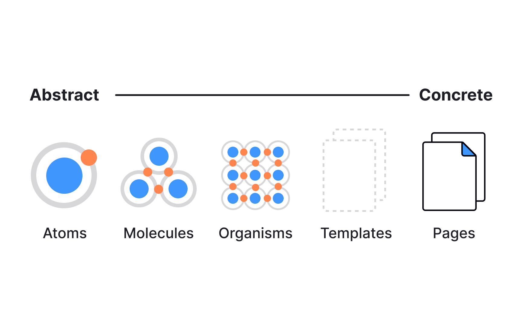
- Atoms are the smallest functional parts, such as
buttons ,inputs ,icons , orlabels . They define the basic visual language. - Molecules are small groups of atoms that work together, like a
search bar made of an input, a button, and an icon. - Organisms are larger, reusable sections such as
headers , cards, or footers. They combine molecules into recognizable regions of alayout . - Templates define structure. They arrange organisms into consistent layouts that guide how content will appear.
- Pages apply real data or copy to templates, allowing teams to test how the system behaves in context.[3]
Reusable patterns are the practical outcome of atomic thinking. They are solutions that appear repeatedly across screens, like cards, modals, alerts, or
Modern interfaces rely on collections of these repeatable solutions, often gathered into pattern libraries, also called UI libraries, or component repositories. When documented with clear rules and examples, patterns help teams design faster and with fewer inconsistencies. A well-structured pattern library also encourages reuse instead of reinvention, saving time while keeping visual and behavioral coherence across all products.
Pro Tip: When you see the same layout or interaction more than twice, it’s no longer a one-off but a reusable pattern.
Every interface is built through layers of hierarchy, where smaller parts form larger structures that, in turn, influence the system itself. This mirrors how molecules form organisms and how those organisms shape templates and
This balance between bottom-up and top-down design makes
A strong
Brad Frost compares this flexibility to Lego bricks: each piece is standardized, yet the number of possible combinations is nearly infinite. The same principle applies to digital design systems. When patterns are well-defined and reusable, teams no longer redesign from scratch. They assemble, adapt, and refine. This modular structure keeps the design process efficient and scalable, ensuring that new ideas fit naturally into the existing system instead of disrupting it.
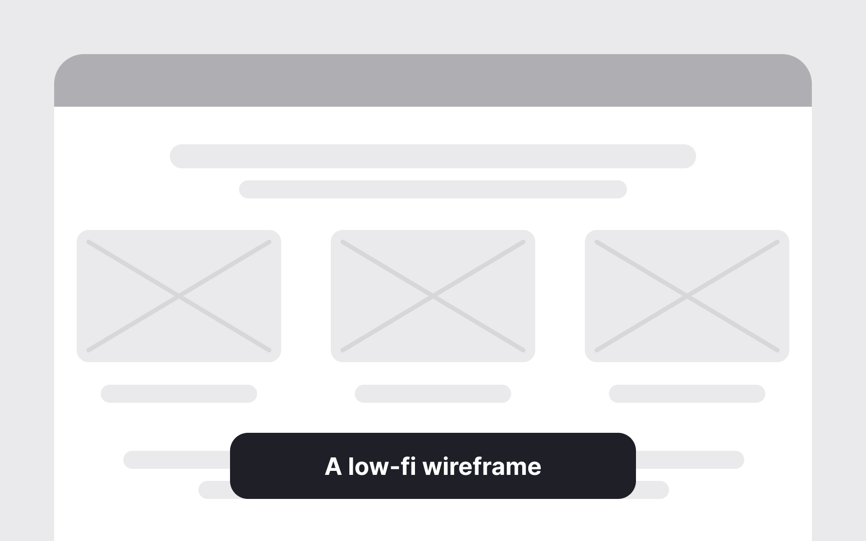
The atomic workflow begins with atoms and molecules, the simplest, context-free parts that define visual language, spacing, and behavior. These early elements are intentionally low in fidelity. Their purpose is not to look finished but to set the foundation, such as
As components evolve into organisms, templates, and finally pages, the level of fidelity increases. Each layer adds context,
Pro Tip: Keep fidelity low at first and refine gradually. Iteration is easier when systems evolve, not restart.
References
Topics
From Course

Images provided by

Share


Similar lessons

Anatomy of UI Components

Atomic Design by Brad Frost
