Design Guidelines for Help Center & Support Pages
Structure help sections that rescue confused users and feedback flows that capture honest input
Help and feedback serve opposite directions but share the same principle: reduce friction or get ignored. Help flows information from product to user. When it works, users solve problems independently and feel capable. When it fails, they contact support frustrated or give up entirely. Feedback flows information from user to product. When it works, you learn what's broken, missing, or confusing. When it fails, problems stay invisible until users leave. Both directions require the same design discipline.
Make the entry point obvious without being intrusive. Keep the path short because every step loses participants. Use language users actually understand. Help that requires hunting doesn't help. Feedback forms that demand too much collect silence instead of insight. The products that improve fastest are the ones where getting help and giving feedback both feel worth the minimal effort required.
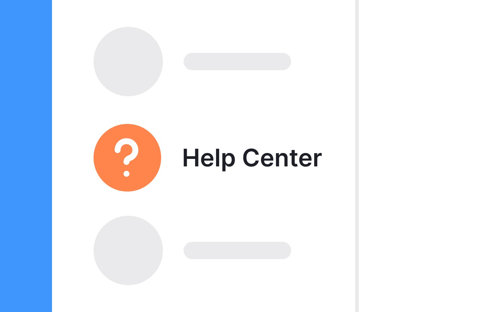
When designing interfaces, the circle containing a question mark has become a universally understood symbol for help. Users can expect this icon to either link them to a help page or start the help feature within the application or website.
It's essential to maintain consistency with these widely recognized icons. Now isn't the moment to strive for uniqueness in design. By keeping the standard, familiar icons, users can navigate your site or application with ease, without the need for additional thought.
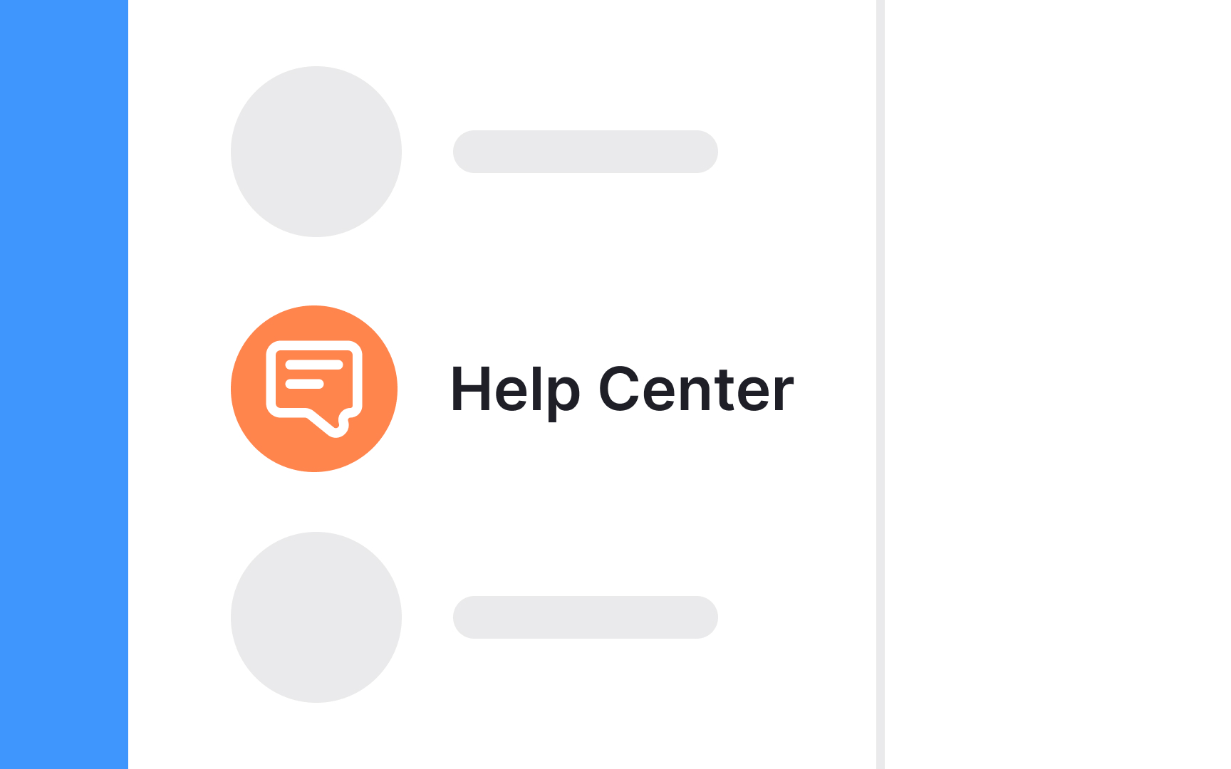
In digital design, while the help function is easily signified by the universally known circle and question mark, the feedback
But what's crucial here is the clarity of the label accompanying the icon. It's important to use direct, unambiguous language that explicitly informs users that this icon is for providing feedback. Avoid jargon or creative terms that might confuse users.
The label should act as a clear signpost, leaving no room for misinterpretation, and guiding users smoothly to share their insights or issues.
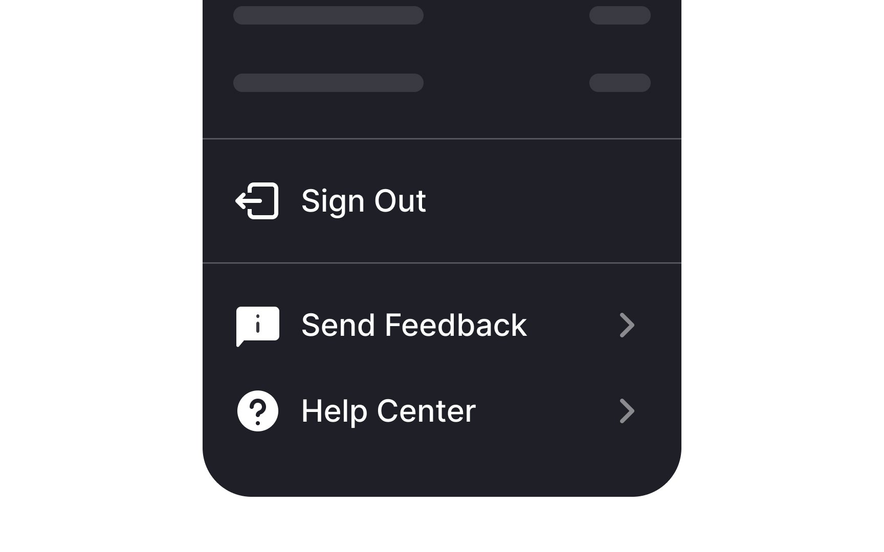
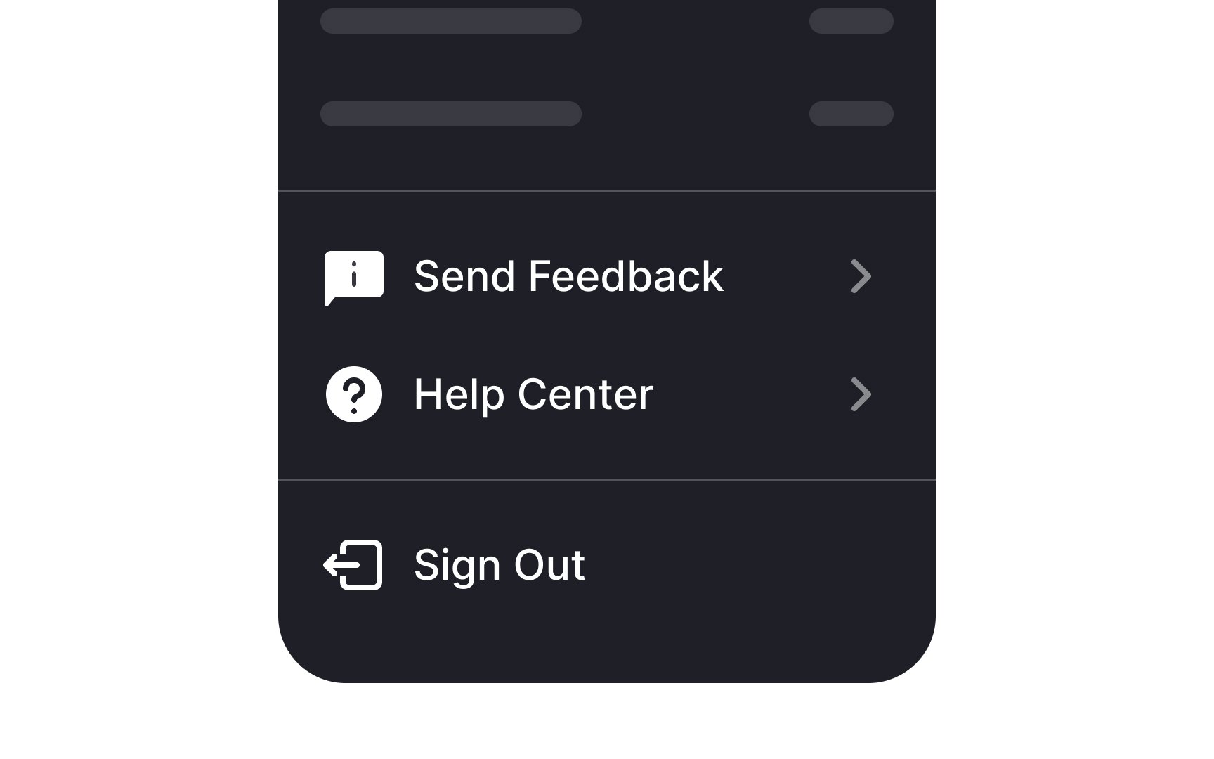
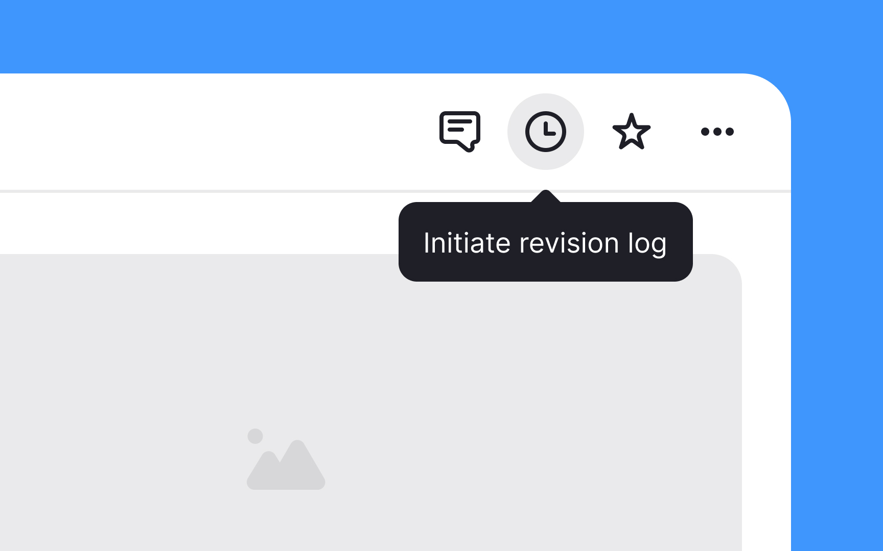
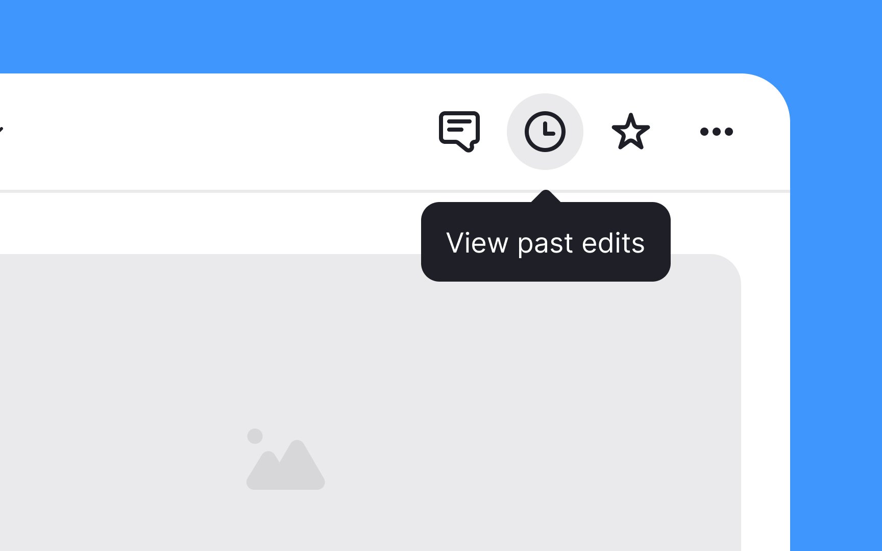
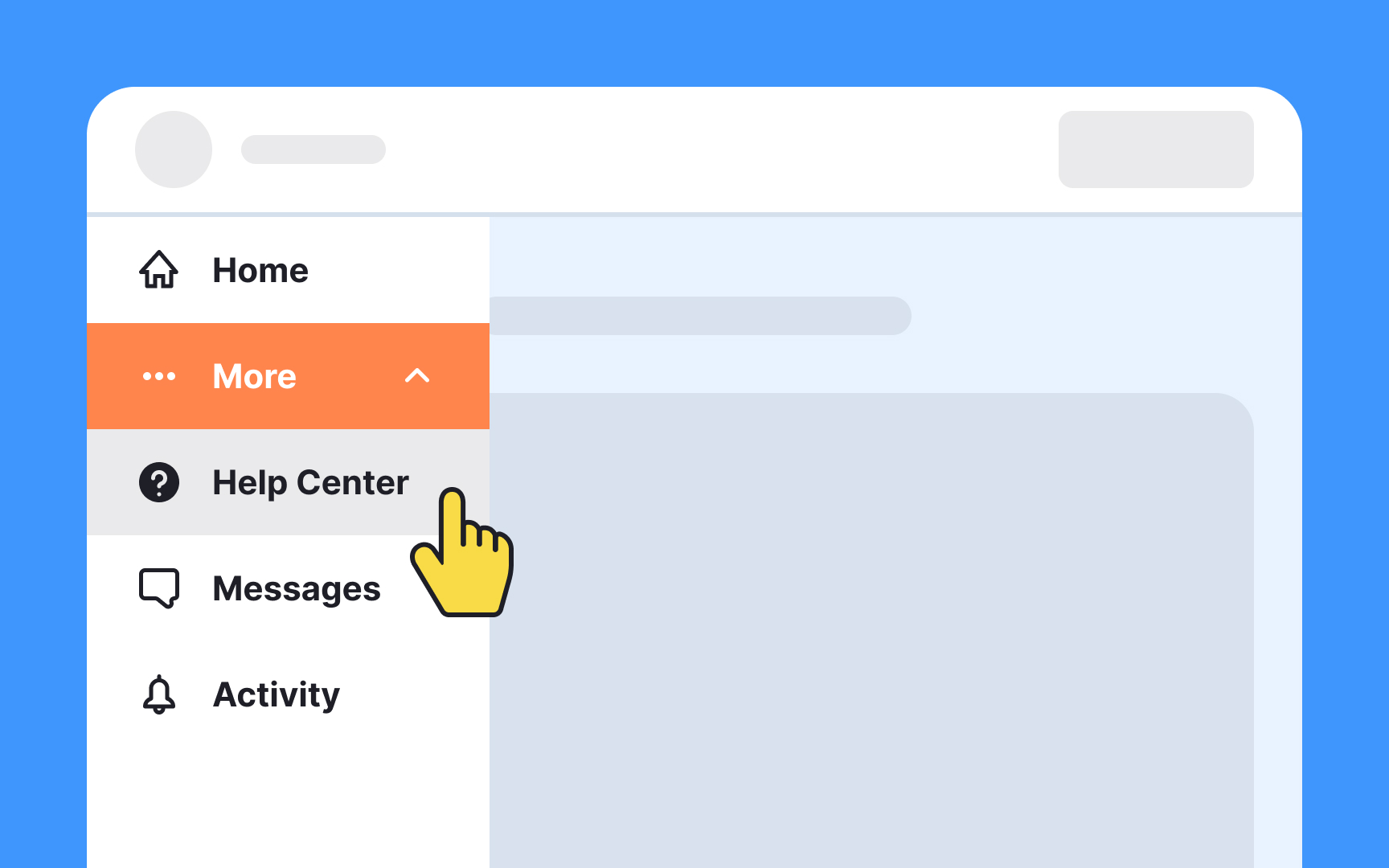
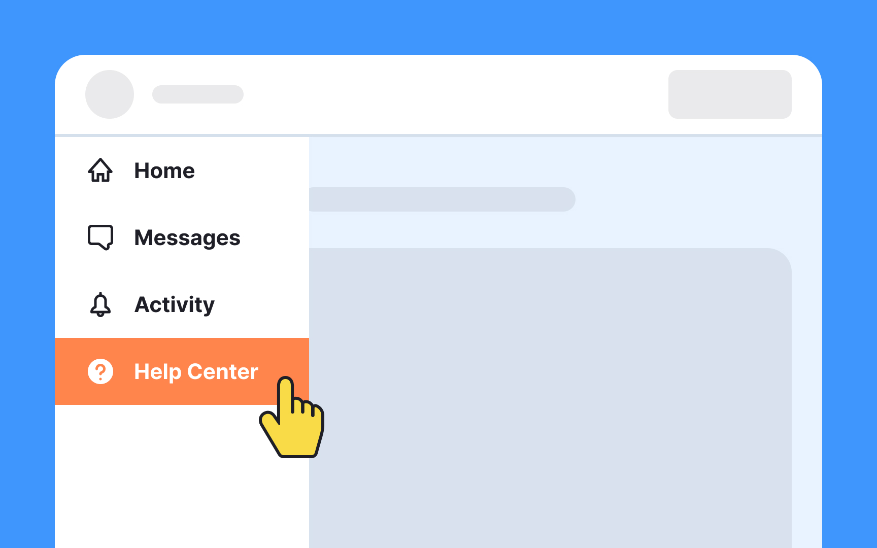
When organizing navigation and overflow menus, it's good practice to position the help and feedback options towards the bottom. Following Material Design guidelines, help should ideally be the final option, with feedback sitting just above. This layout is intuitive for users who often expect to find these options at the end of their menu journey.
However, if your menu includes a sign-out option, this should take the bottom spot. Placing it last helps prevent users from accidentally exiting the application or website, as it's a deliberate action taken less frequently than seeking help or providing feedback. Remember, the goal is to create a seamless and logical flow that users can navigate with ease.[1]
Making the Help
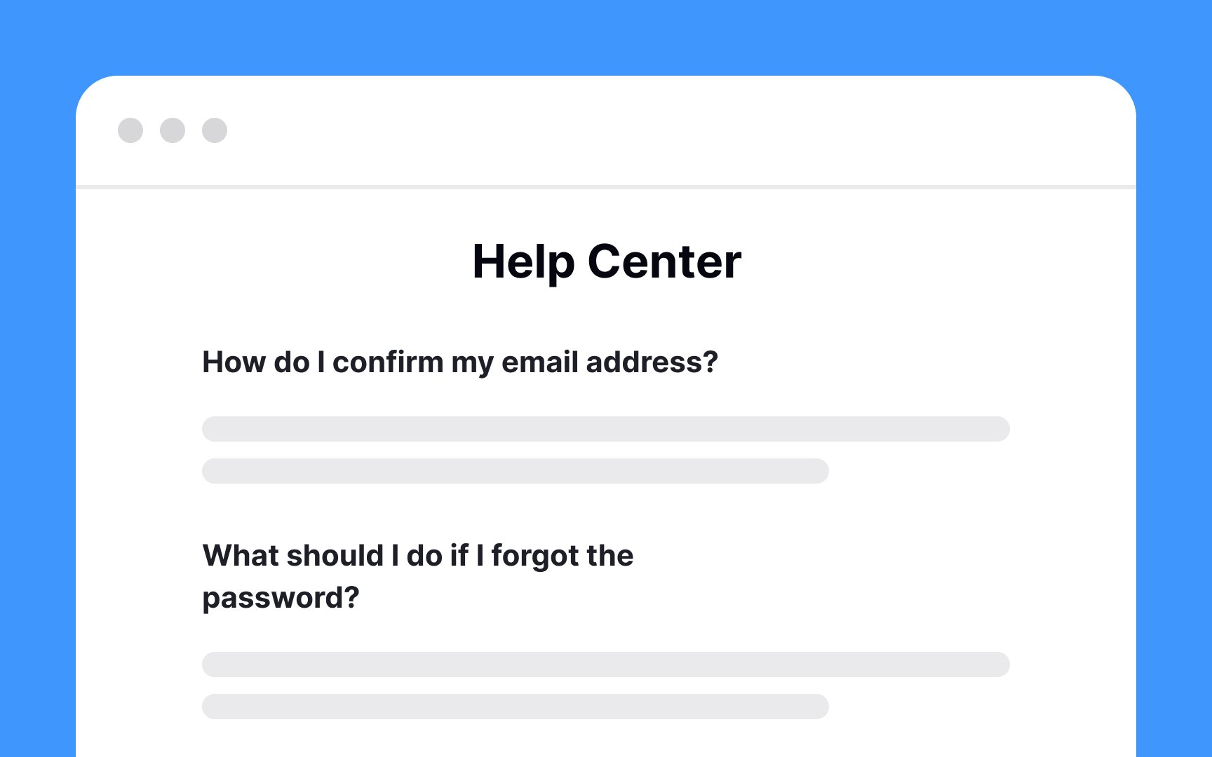
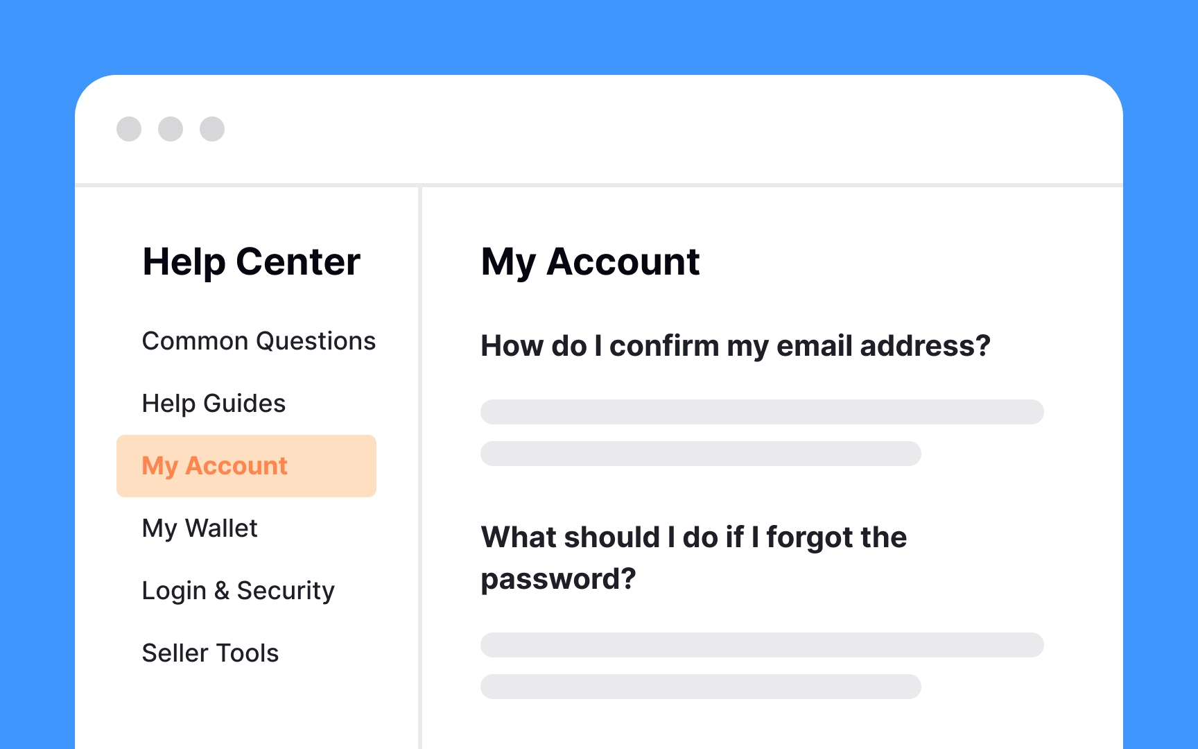
How can you help users quickly scan the text? Here are some ideas:
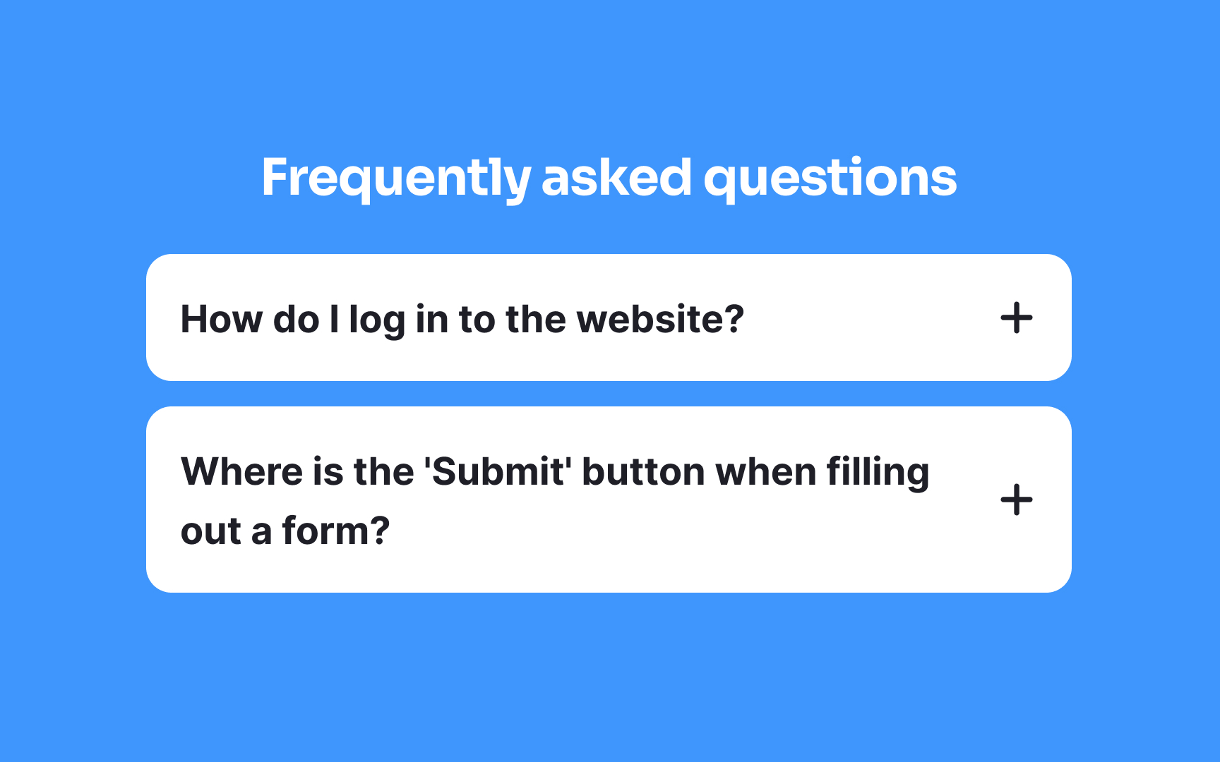
- Highlight frequent questions and problems first
- Organize questions categorically
- Split text into bite-sized paragraphs
- Format text with bold headings and ample spacing
- Create a clear visual hierarchy
- Highlight keywords
- Use bulleted or numbered lists[2]
Pro Tip: Consider adding a search bar to help users quickly find what they're looking for on the Help page.
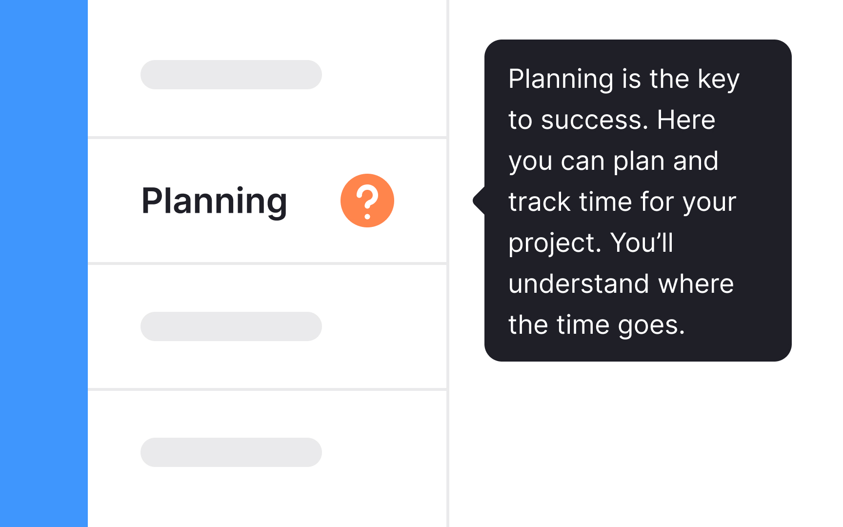
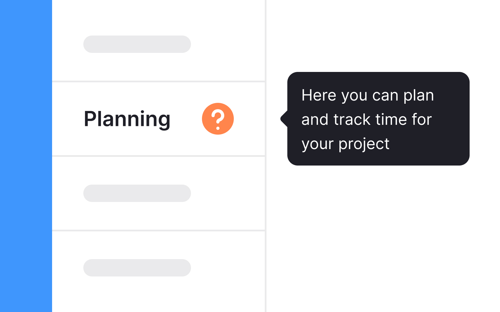
Instead of always sending users to the Help desk, consider providing tooltips. Use them when helpful information is brief and doesn't require an entire
Provide brief and helpful content inside the tooltip. Tooltips are microcontent — short text fragments intended to be self-sufficient. Your copy can be single- or multiple-line long as long as it's relevant and doesn't block related content.[3]
Pro Tip: Keep in mind that a lengthy copy is no longer a 'tip." Analyze your tooltips word-by-word. If something doesn't serve a purpose, cut it out.
Keep your help
To ensure your language stays simple:
- Use common words that are easy to understand
- Break down complex ideas into basic concepts
- Avoid industry jargon unless it's widely understood
- Keep sentences short and to the point
- Use active verbs in tooltips and guiding microcopy to make actions clear and direct
Pro Tip: Here's a great rule of thumb — read text aloud. If something sounds off or unnatural, replace it.
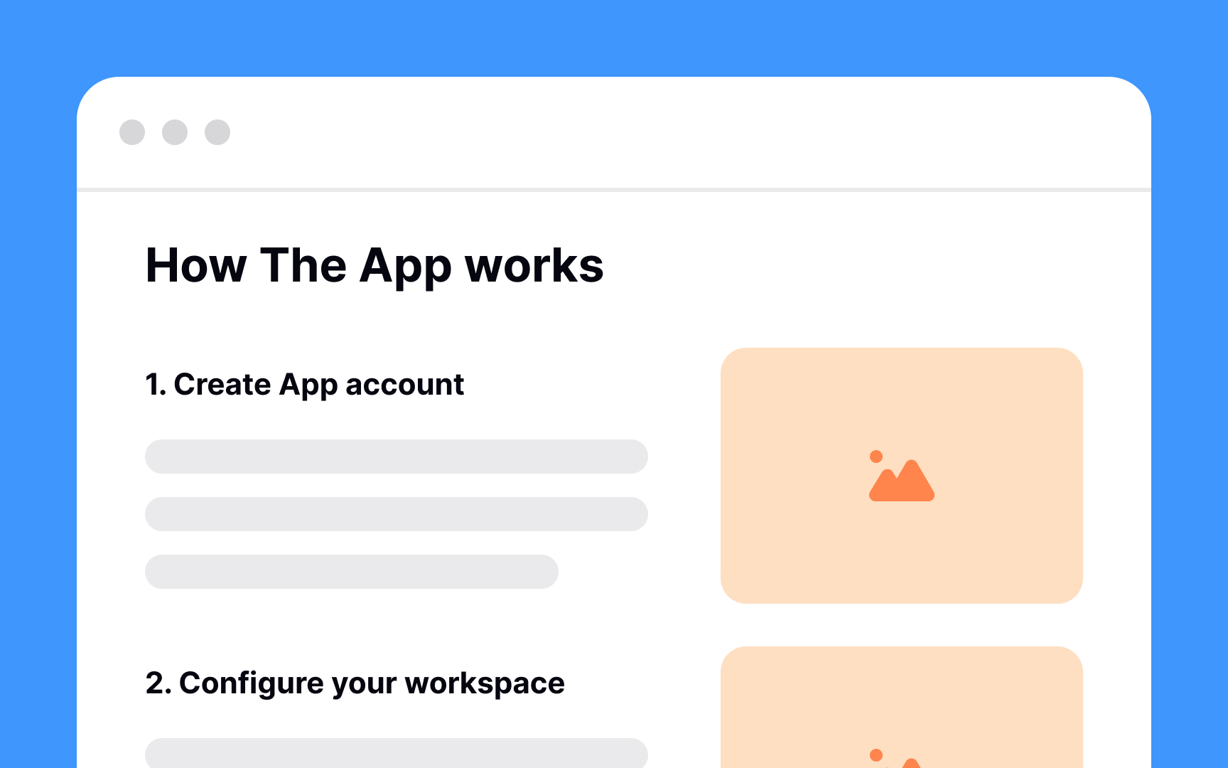
While providing step-by-step guides, accompany them with real-life product screenshots or short videos. Visual methods can help users understand and mimic instructions for complex interactions.[4] Still offer text-based help, as people aren’t always able to or want to watch videos.
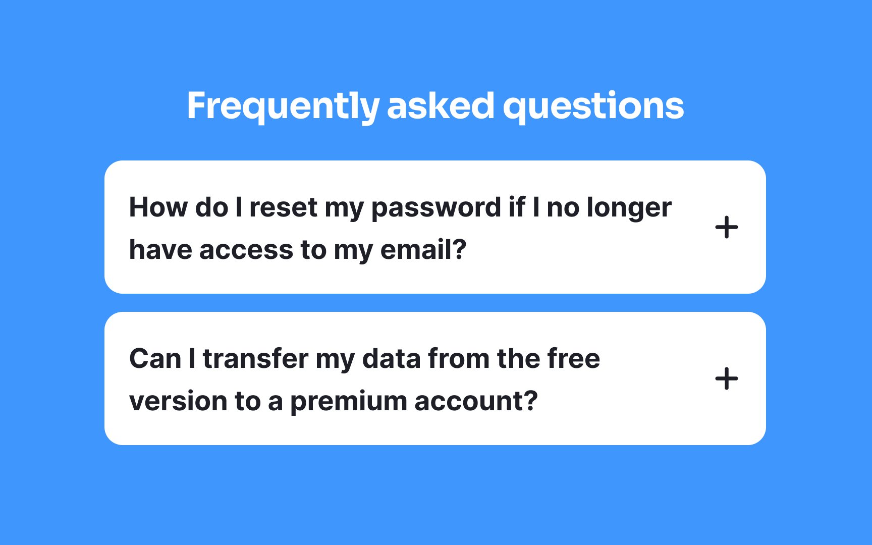
While FAQ pages aren’t always ideal, sometimes they’re useful for quick reference. They should only exist in addition to ensuring users already find answers within your product or documentation. The long-term goal is to reduce the number of “frequently” asked questions by improving clarity and discoverability elsewhere.
An effective FAQ
- Analyze customer support tickets to identify common issues or questions.
- Engage with users through surveys or feedback forms to ask directly what they’d find helpful.
- Monitor social media and forums where users discuss your product for recurring themes.
- Review search query reports if available to see what users are looking for on your site.
By using these methods, you can craft an FAQ section that genuinely resonates with users' needs, clearing up confusion and allowing them to make the most of your product without unnecessary hurdles.[5]
Pro Tip: Don't forget to add popular questions from real users after the product goes live.
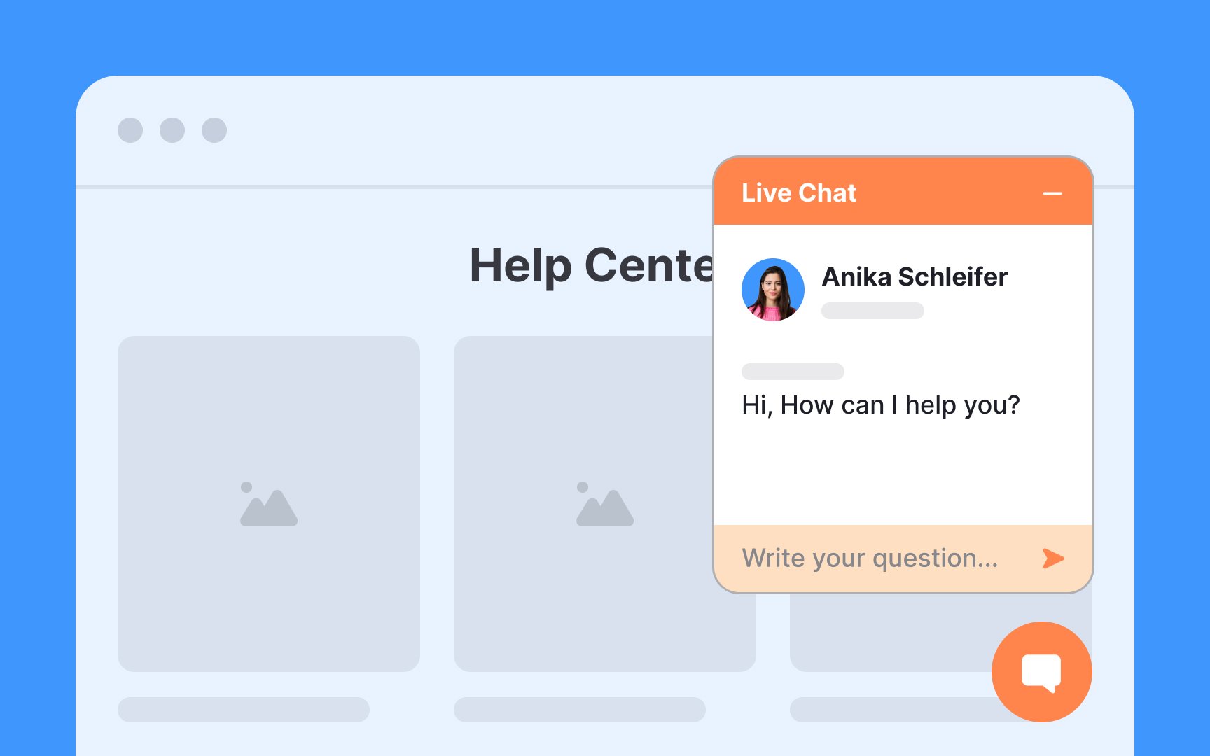
Live chat is a fast and convenient way to interact with businesses for customer service. Users prefer a chat over a help center or a phone call for several reasons.
First, talking to a live representative can help users solve their unique problem, while help articles might miss their exact issues. Compared to a spoken conversation, a chat requires less emotional investment.
Another reason is that there's usually a written trace, and users can refer to it later. Finally, conversing in chats allows people to multitask while waiting for answers.[6]
Pro Tip: There are costs involved with live chat, so make sure it makes sense for your project.
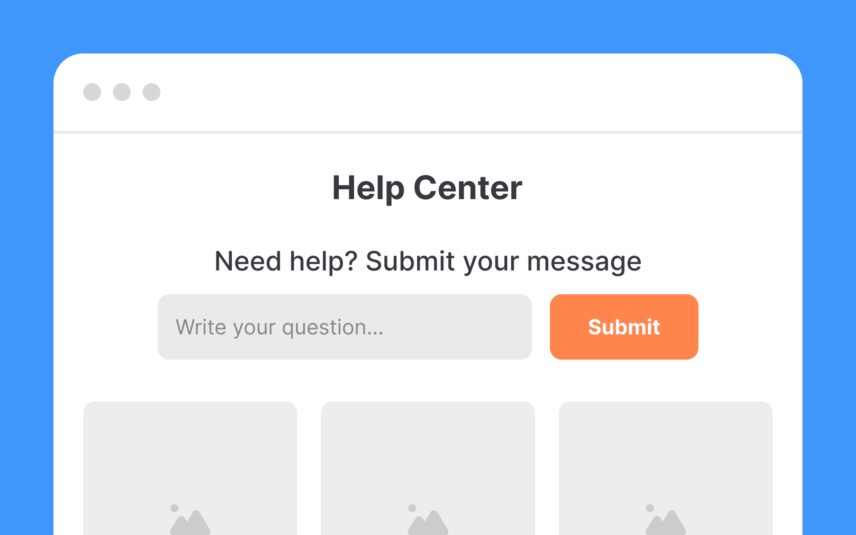
On websites, the placement of the help button should be strategic to ensure it's visible regardless of the complexity of the site.
For a straightforward, user-friendly approach, a floating help button is ideal; it follows users as they scroll, offering constant, easy access. Alternatively, the help button can be found anchored in the website's footer, a common location where users tend to look for support options.
On more complex sites, incorporating the help
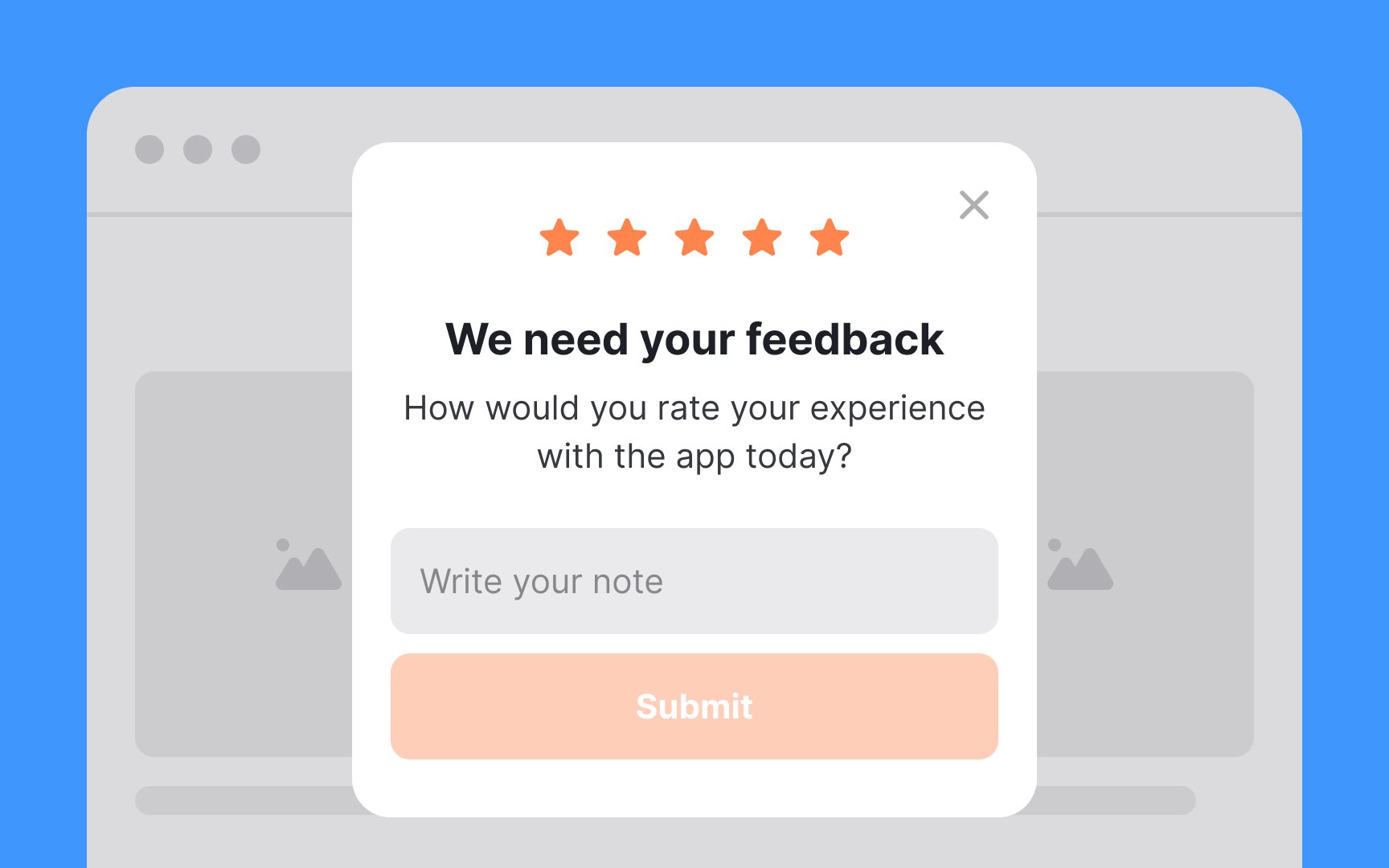
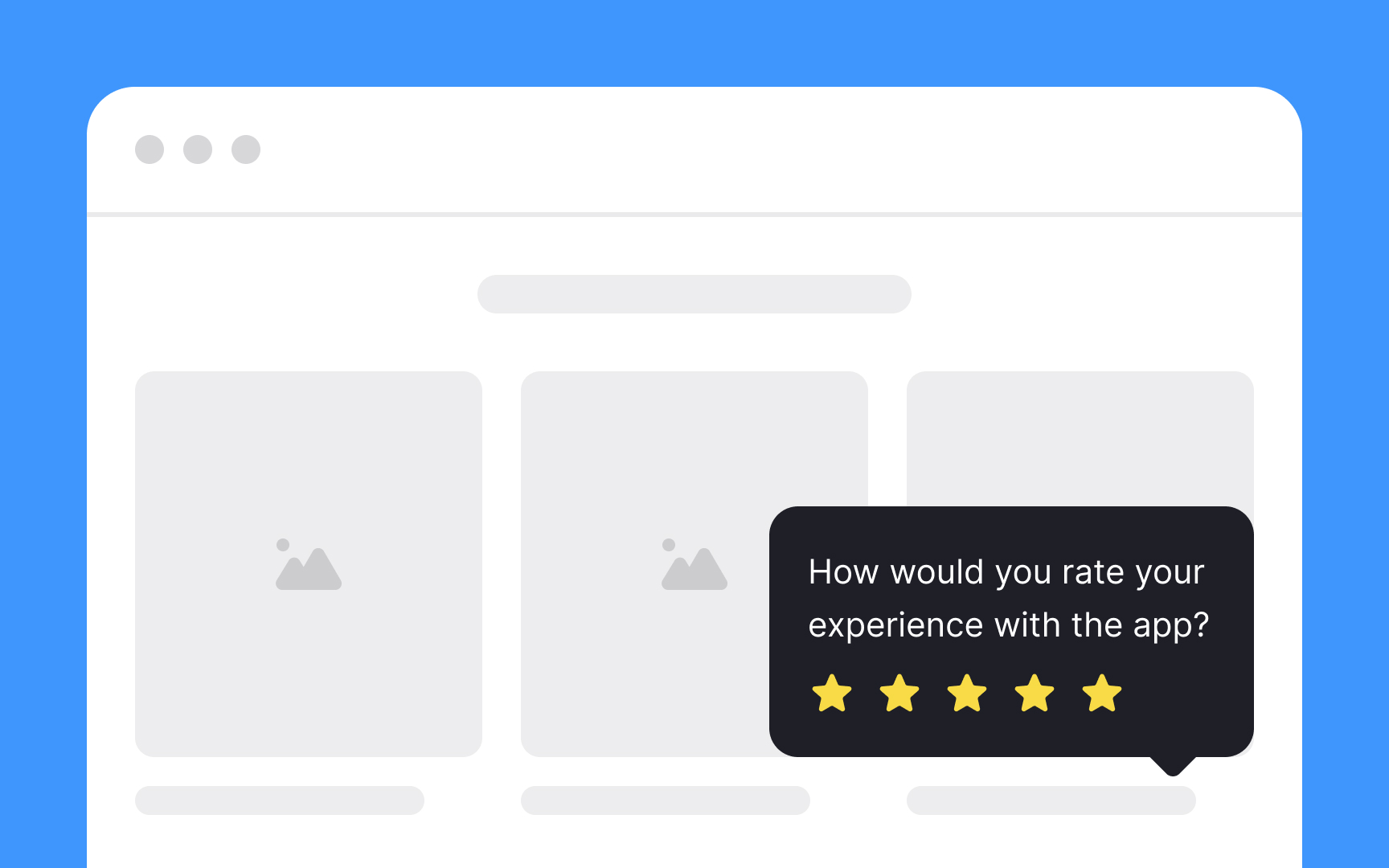
Keep your feedback form brief and to the point. The simpler it is for users to provide feedback, the more likely they will do so. Statistics show a high inclination towards sharing feedback: 85% after positive experiences and 81% after negative ones.[7]
Most users prefer giving a quick rating over writing out their thoughts. If you include a space for written feedback, make it optional. Timing is also crucial—don't interrupt users mid-task with feedback requests. The best moment to ask is after a satisfying
Remember, not everyone wants to leave feedback at any given moment. So, always ask nicely, steer clear of intrusive pop-ups, and never make feedback compulsory. This respectful approach encourages more genuine and helpful responses.
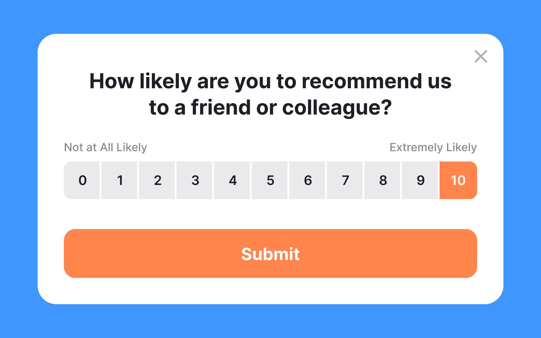
Incorporate the Net Promoter Score (NPS) into your toolkit to measure user satisfaction effectively. This well-established metric evaluates customer experience by asking one simple question: “How likely are you to recommend our product or service to a friend or colleague?” Users respond on a scale from 0 (not at all likely) to 10 (extremely likely). Their ratings are then used to calculate your NPS, which provides a clear benchmark for comparison within your industry.
Measuring NPS is straightforward and doesn't require special equipment—just a survey tool that can collect and analyze the responses. With this data, you’ll gain valuable insights into how your user experience measures up to competitors, identify specific areas for improvement, tailor UX enhancements, and observe loyalty trends over time. NPS is a simple yet potent metric that can help refine your product's user experience and bolster user satisfaction.[8]
Pro Tip: It's best to ask users to provide NPS only after they have completed a particular journey.
References
- Material Design | Material Design
- Tooltip Guidelines | Nielsen Norman Group
- How to Film and Photograph for Usability: UX Details for Videos and Images | Nielsen Norman Group
- The User Experience of Customer-Service Chat: 20 Guidelines | Nielsen Norman Group
Top contributors


Topics
From Course

Share


Similar lessons

Best Practices for Designing Login & Signup Flows

Best Practices for User Onboarding Flow Design
