System Typography & SF Font
Master Apple's SF font system to create perfectly legible and visually balanced interfaces.
Typography defines the reading experience in Apple interfaces. The San Francisco (SF) font family stands at the center of this experience, bringing more to the table than just good looks. Watch SF fonts at work: they shift their forms to stay readable on an Apple Watch screen, create natural rhythm in apps, and look sharp on large displays. The system takes care of complex typography details on its own, from letter spacing to thickness changes. While each SF font has its own distinct feel, they all speak the same visual language across different interfaces.
Understanding SF typography means having the right tools to guide attention and create clear structure in their work. It helps make smart choices about text size relationships, font weights, and spacing that feel natural in Apple's ecosystem. Knowing when to use specific SF fonts helps emphasize the right information and keep text easy to read. This knowledge helps turn complex content into clear, organized interfaces. SF typography shows how careful attention to small details creates better digital experiences that feel distinctly Apple.
The San Francisco (SF) font family powers text display across Apple platforms — from watchOS to macOS. Each font in this family adapts to different screen sizes while maintaining Apple's signature look and excellent readability.
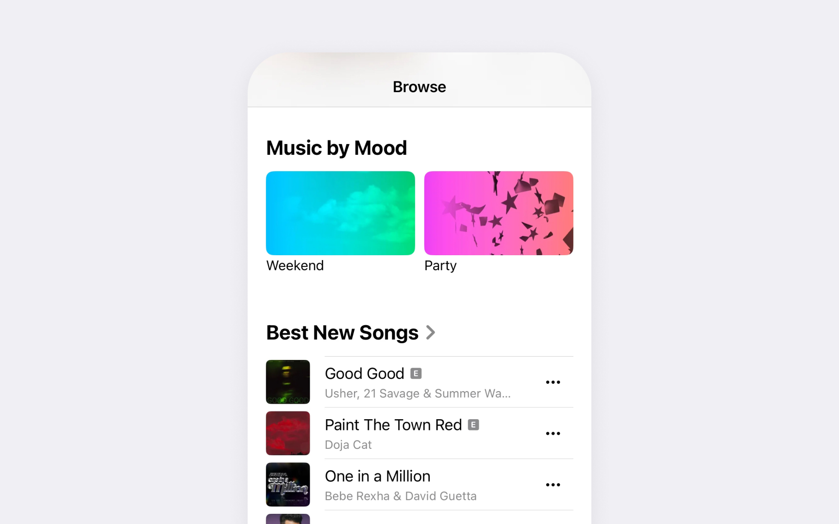
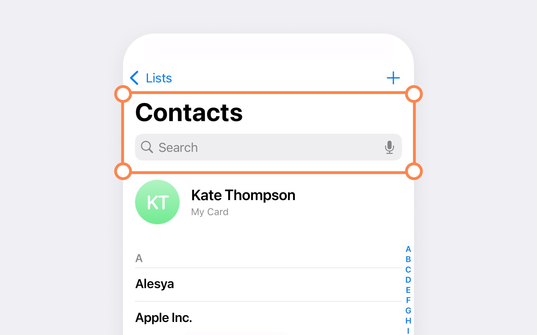
Each platform has its own set of built-in text styles. For iOS and iPadOS, body text defaults to 14pt Regular, while macOS uses 13pt Regular. Text styles range from large titles (31pt in iOS/iPadOS, 26pt in macOS) down to small captions (11pt in iOS/iPadOS, 10pt in macOS).
Text spacing in SF
SF fonts include built-in features that improve text display:
- Rounded corners become slightly sharper at small sizes
- Letter shapes adjust to stay clear and readable
- Numbers align perfectly in
tables and data - Punctuation marks adjust their position based on surrounding characters[1]
SF
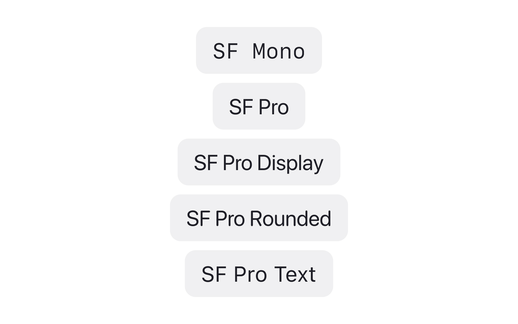
Each variant comes with 9 weights — from Ultralight to Black. This range helps create contrast and hierarchy without switching font families. The weights work consistently across all SF variants, maintaining visual harmony throughout interfaces.
SF Compact adapts the standard SF design for smaller displays. Its condensed letterforms and tighter spacing help fit more
Key attributes of SF variants:
- SF Pro balances neutrality with personality
- SF Compact preserves legibility in tight spaces
- SF Mono aligns numbers and code perfectly
- SF Rounded softens UI without losing clarity
Pro Tip: When mixing SF variants, maintain consistent weights across them — if body text uses Regular weight, use Regular for monospaced code snippets too.
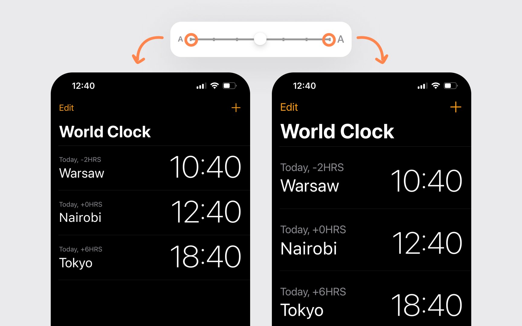
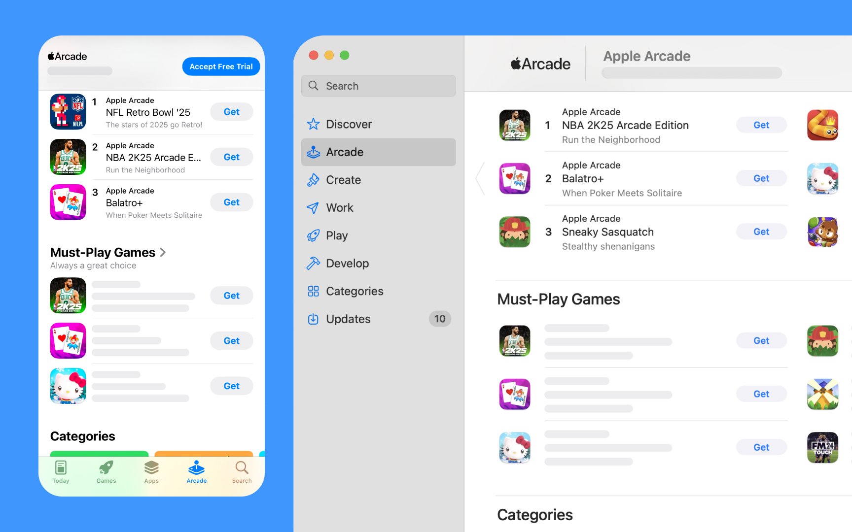
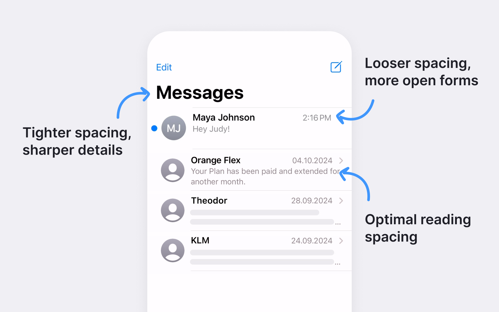
Dynamic Type adjusts text size across Apple interfaces based on users' preferences. This system ensures comfortable reading without breaking layout harmony — from the default size to larger accessibility options.
Dynamic Type affects entire interfaces systematically. When users change their preferred text size:
- Titles and body text scale proportionally
- Line height adjusts to maintain readability
- Spacing between
UI elements adapts automatically - All text styles maintain their relative hierarchy
Most importantly, Dynamic Type preserves the relationship between different text styles. Headlines stay prominent, captions remain smaller than body text, and the overall visual hierarchy stays intact at any size.[2]
Pro Tip: Test layouts with both minimum and maximum Dynamic Type sizes to ensure your interface stays readable and usable at all sizes.
SF
The
- Large Title marks main sections and primary screens
- Headlines (14pt Semibold) introduce content areas
- Body text (14pt Regular) delivers the core information
- Captions (11pt) provide supporting details
The built-in spacing between styles helps content breathe naturally. iOS
Apple platforms provide carefully calibrated styles that work together. Instead of creating custom sizes, using these predefined styles ensures consistent vertical rhythm and helps users recognize familiar patterns across apps.
Pro Tip: When introducing hierarchy, start with system styles before considering custom sizes — they're designed to work together seamlessly.
SF
Two optical size families handle different ranges:
- SF Pro Text optimizes shapes for sizes 19pt and below
- SF Pro Display refines details for 20pt and above
Automatic optical sizing shows in action across interfaces. Compare how SF appears in different contexts:
- Crisp small labels in the Control Center
- Sharp app names on the Home Screen
- Clean
body text in Messages - Bold headlines in the News app
The system handles these adjustments seamlessly. Rounded corners become more pronounced at display sizes, while text sizes maintain clear shapes and consistent stroke
SF
The tracking system follows a precise pattern:
- 12pt text has 0 tracking as a baseline
- 10pt text gets +12 tracking (1/1000 em)
- 13pt text receives -6 tracking
- 17pt text uses -26 tracking
- 28pt text returns to +14 tracking
These adjustments happen automatically in Apple interfaces. For example, notice how footnotes at 10pt get more space between letters for better readability, while headlines at 17pt use tighter spacing to create stronger visual impact.
The tracking system works across SF variants. Whether using SF Pro in Mail or SF Compact on Apple Watch, text maintains proper spacing based on its size. This creates a consistent reading rhythm across all Apple platforms.
SF
Large Title (31pt in
Navigation elements use consistent type styles:
- Back buttons and items: Body (17pt)
- Tab bar
labels : Caption size - Menu items:
Body text - Sidebar items: Regular weight for clear scanning
The system automatically handles text truncation and scaling in navigation. When interface elements need to adapt to different screen sizes or orientations, SF
SF
The system handles text adjustments automatically:
- Margins adapt to screen width
- Line length stays comfortable for reading
- Text styles scale proportionally
- Spacing adjusts to maintain balance
Take the Messages app as an example. Notice how text behaves when switching between portrait and landscape:
- Message bubbles reflow naturally
- Input field text stays legible
- Timestamps maintain their style
- Contact names remain prominent
These automatic adjustments work across Apple platforms.
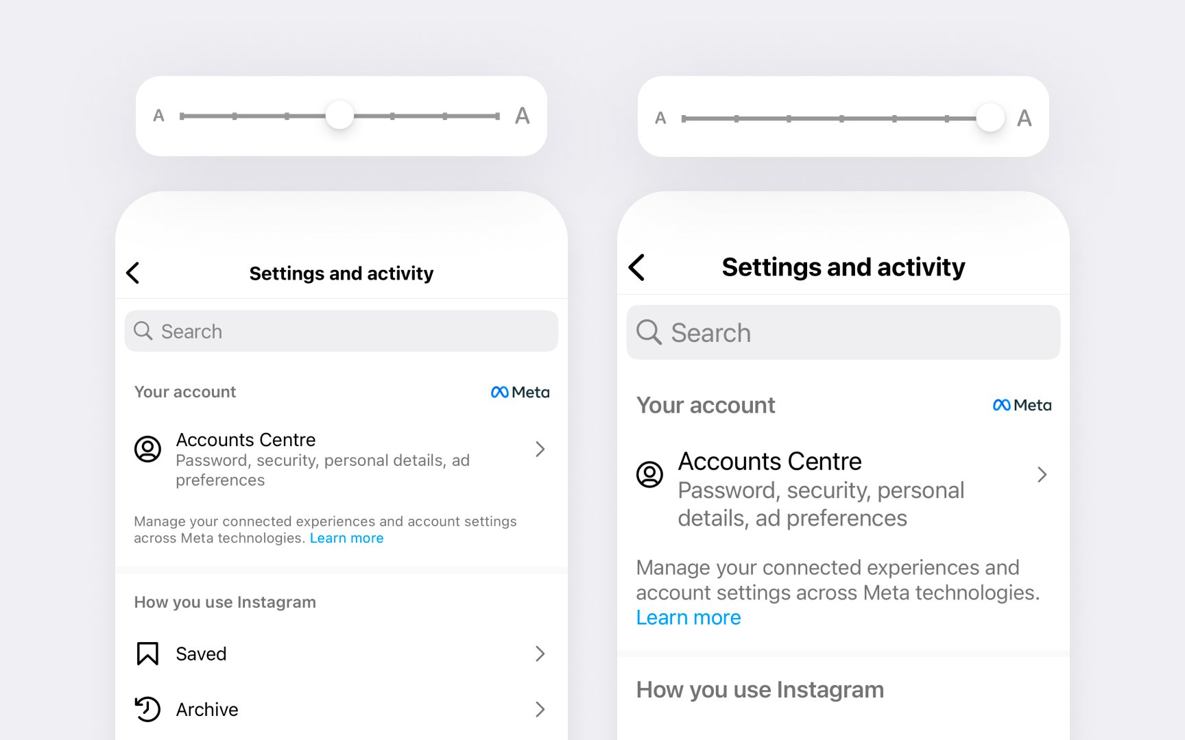
Dynamic Type helps people pick the font size that works for them. When users adjust text size in settings, interfaces should remain readable and well-structured — from standard sizes to larger
Key accessibility considerations for SF typography:
- Prefer Regular to Bold weights — avoid Ultralight, Thin, and Light
- Maintain text hierarchy at all sizes
- Minimize text truncation in scrollable areas
- Consider adjusting
layouts at large sizes to prevent crowding - Ensure sufficient color
contrast for textlegibility
Notice how Twitter (X) app adapts to accessibility needs:
- Tweet text scales smoothly without truncation
- Username and handle stay clear but compact
- Action
buttons remain easily tappable - Media descriptions scale with
content - Timeline preserves readability at any size
Interface icons should scale alongside text. SF Symbols automatically adapt to accessibility text sizes, maintaining clear visual communication at any size.[3]

When implementing custom
Airbnb's Cereal font demonstrates how custom
Custom fonts must support key accessibility features:
- Dynamic Type scaling
- Bold Text enhancement
- Sufficient
contrast ratios - Clear character distinction
- Text size adjustment options
Pro Tip: When designing a custom font, maintain consistent stroke contrast across weights to ensure readability at any size.
Common
- Font weight selection. Avoid Ultralight, Thin, and Light
font weights as they can be difficult to see. Prefer Regular, Medium, Semibold, or Bold weights for better visibility. - Layout adjustments. When
font size increases in constrained spaces, inline items can crowd text. Avoid keeping timestamps oricons inline with text at large sizes — consider stacking elements vertically. - Text truncation. Minimize text truncation as font size increases. Especially in scrollable areas, ensure users can read complete
content either directly or in a separate view.
References
- Typography | Apple Developer Documentation | Apple Developer Documentation
- Typography | Apple Developer Documentation | Apple Developer Documentation
- Accessibility | Apple Developer Documentation | Apple Developer Documentation
Topics
From Course

Images provided by

Share


