Best Practices for Designing Search Functionality
Discover the best practices for designing a search functionality that is usable and helpful
Search design is often underestimated as a quick task involving just an input field, a search button, and a results page. However, neglecting search best practices can lead to increased abandonment rates. Common reasons for ineffective search include a mismatch between the language used by the designer and the users, unhelpful 'No Results' pages, and cluttered, unstructured results pages that are difficult to navigate. These issues, combined with poor search patterns and general usability problems like inadequate visual hierarchy and unclear navigation, can significantly degrade the user experience.
To ensure users can complete tasks effectively and enjoy their interaction with the product, search functionality demands careful design, extensive user testing, and adherence to best practices.


When designing for desktop, keep the
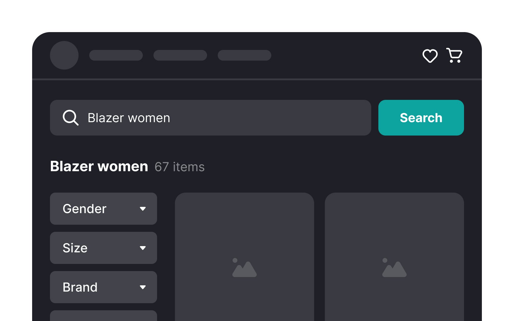
For websites where search is a primary function, the search bar should be prominently displayed. Users typically expect to find it in the top right corner of the screen, making this a natural placement that aligns with user habits. However, placing it in the header is also a viable option. The key is to ensure that the search bar is immediately noticeable and recognizable, minimizing the effort users need to locate it.
Imagine the frustration of having something you're using suddenly taken away — this is how users feel when their
Keeping the search query in view serves a practical purpose. Often, if the first search attempt doesn’t yield the desired results, users may want to tweak their query. Having the original search term still present allows for easy editing.
This design choice spares users the inconvenience of having to retype their entire query from scratch and relieves them from the effort of remembering exactly what they typed initially.
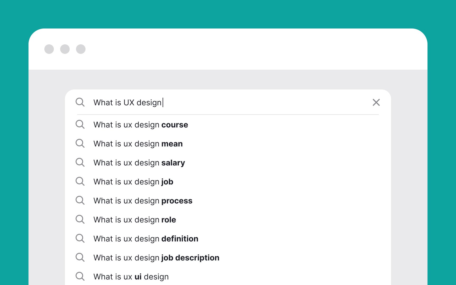
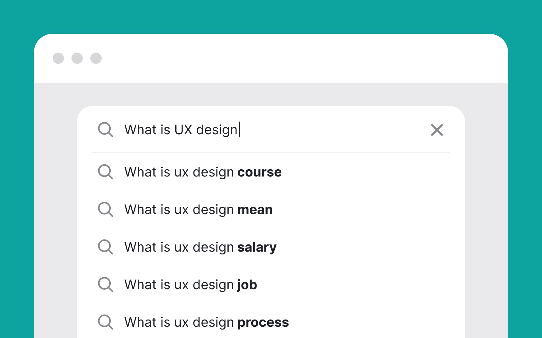
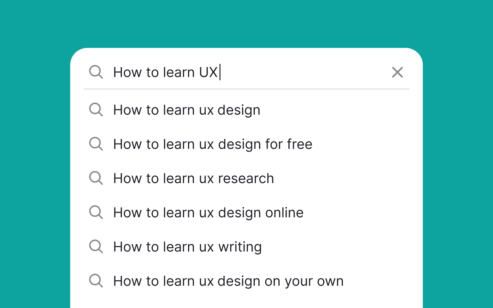
A key principle in designing an effective auto-suggestion menu is to offer a reasonable number of
Overloading the auto-suggestion dropdown with too many entries can also lead to a cluttered and confusing interface. Additionally, avoid incorporating scrolling within the suggestion dropdown as it can disrupt users' decision-making process and detract from the menu's
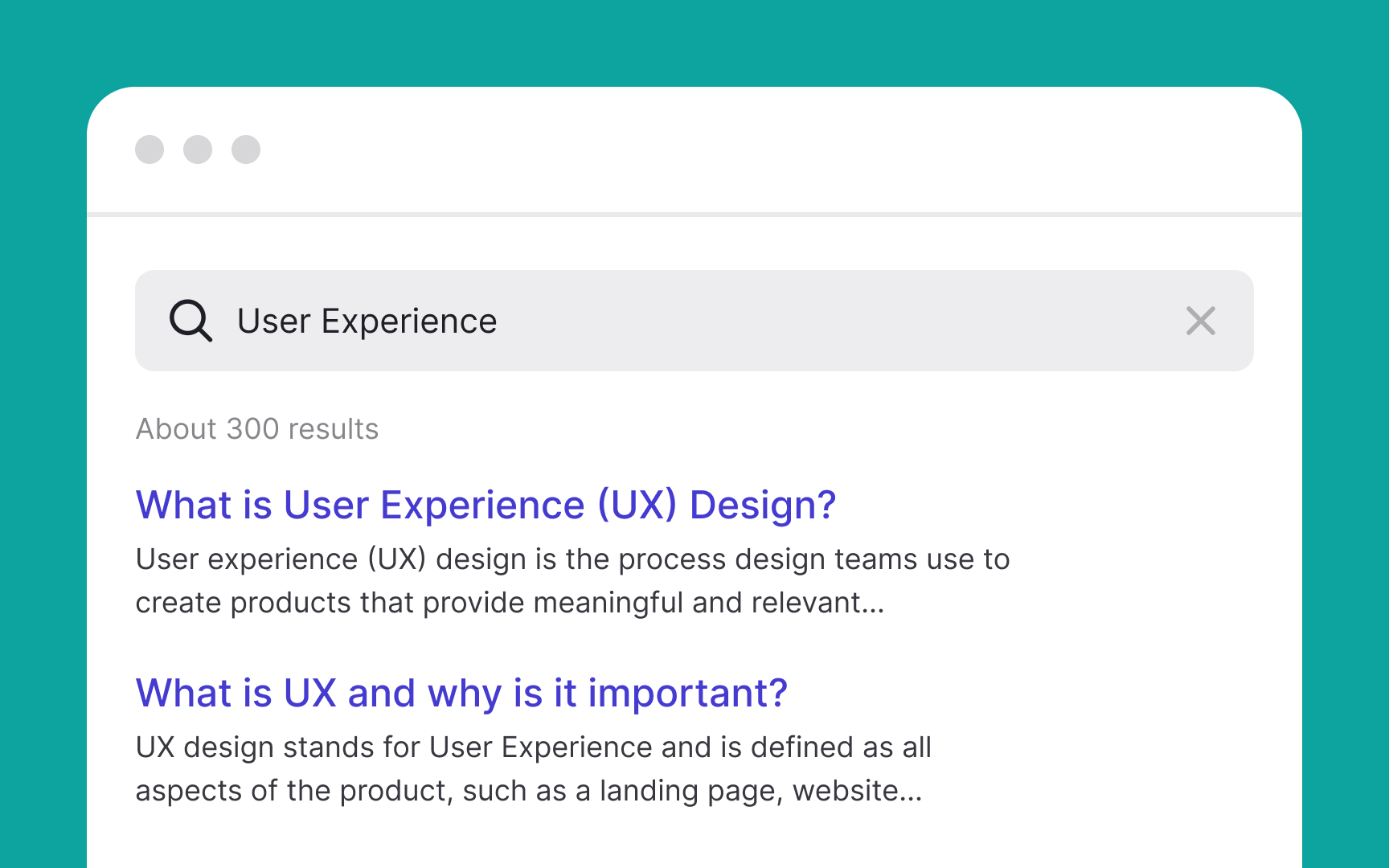
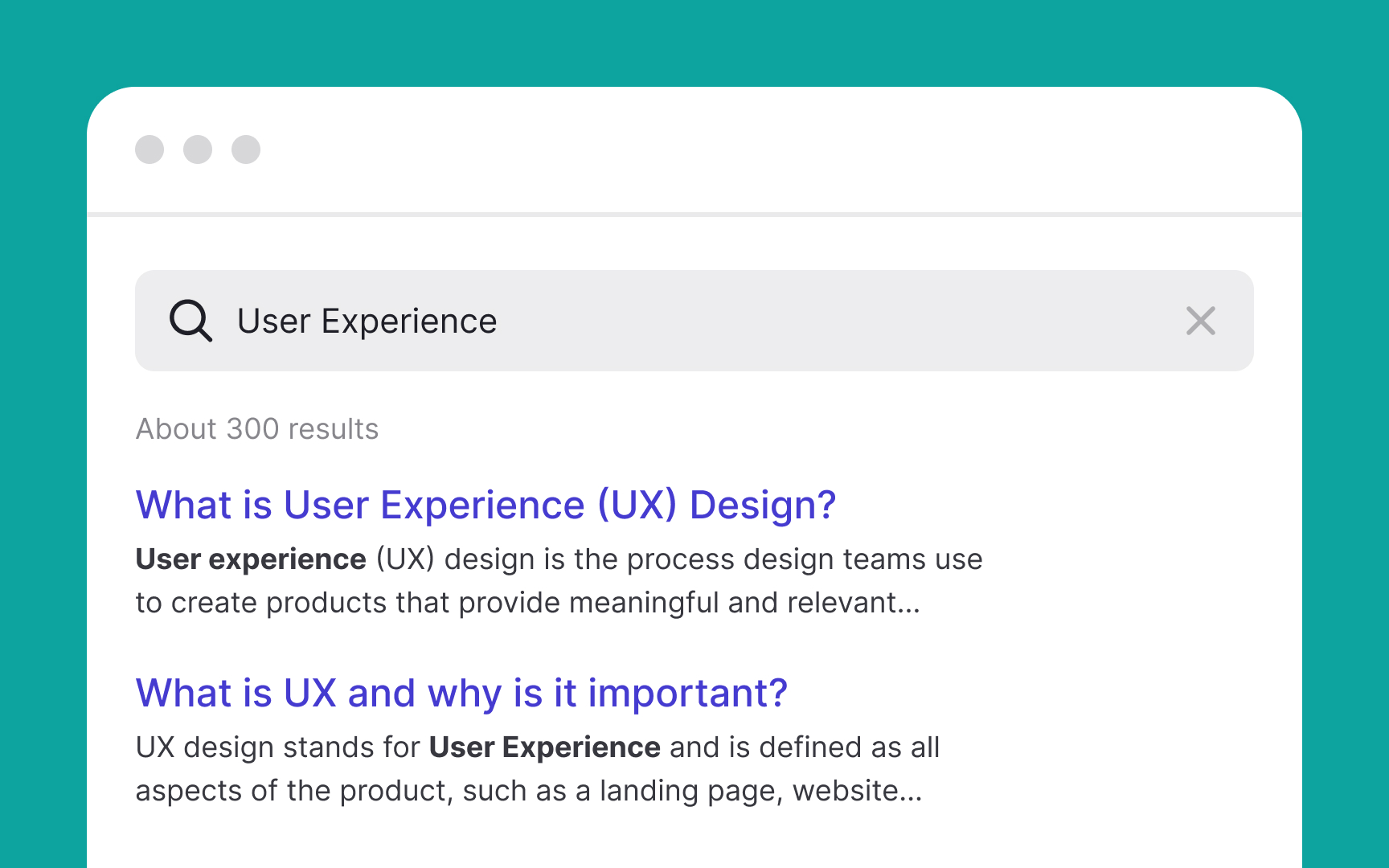
According to studies, only 16% of people actually read the content on a web
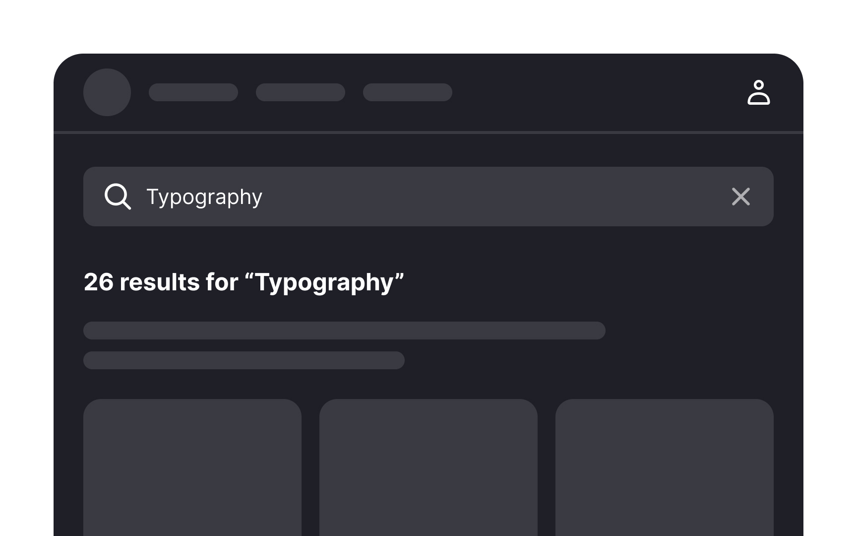
To aid this process, highlighting matching keywords in
Pro Tip: Apply bold styling or another color for matching word parts.
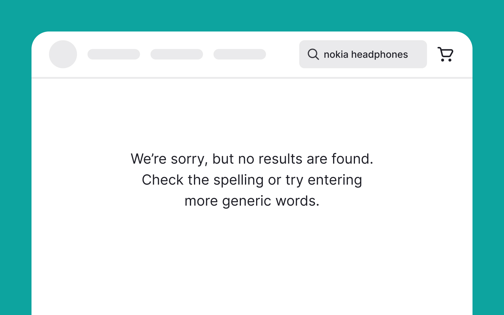
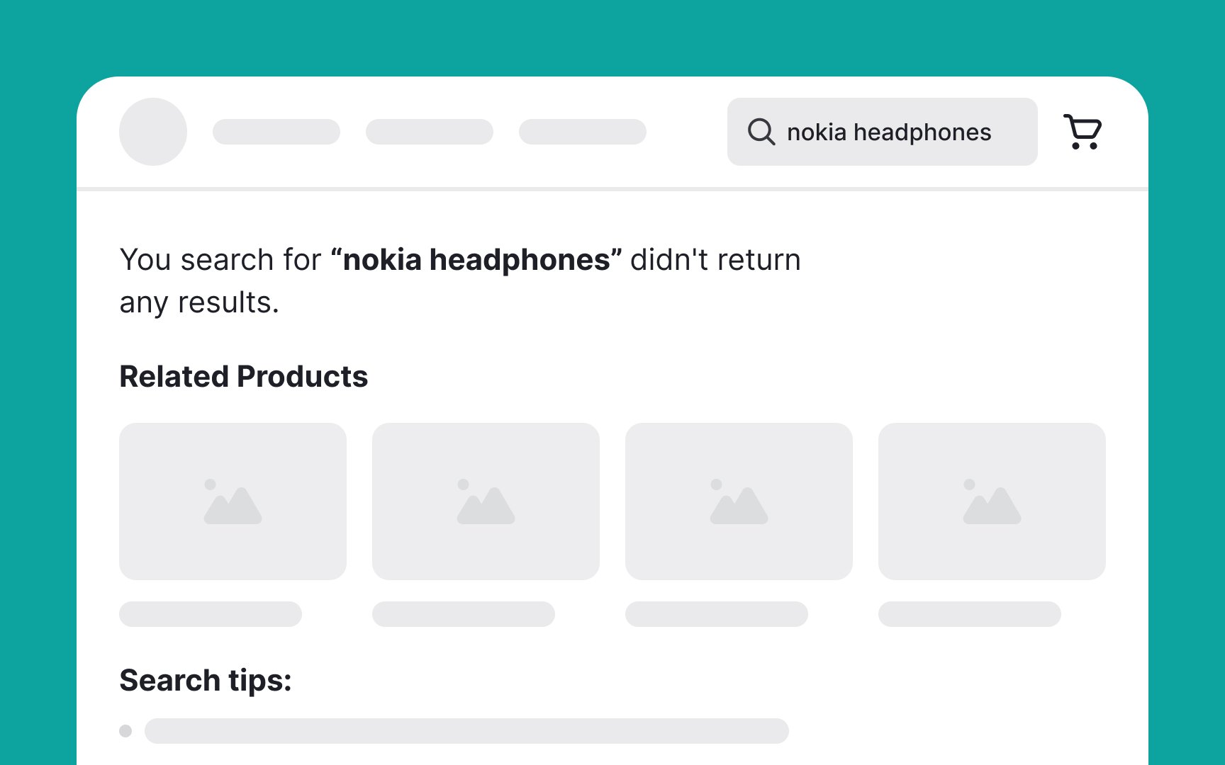
Imagine the frustration of encountering a blank
This can include a brief explanation of why no results were found and suggestions for alternative actions such as:
- Offering alternative
search queries - Providing category suggestions with links
- Suggesting similar items or related categories
- Recommending results based on past searches or popular items
You may also urge users to check their spelling or try different terms but this tends to place an additional burden on them and users generally prefer effortless solutions.[2]
The results
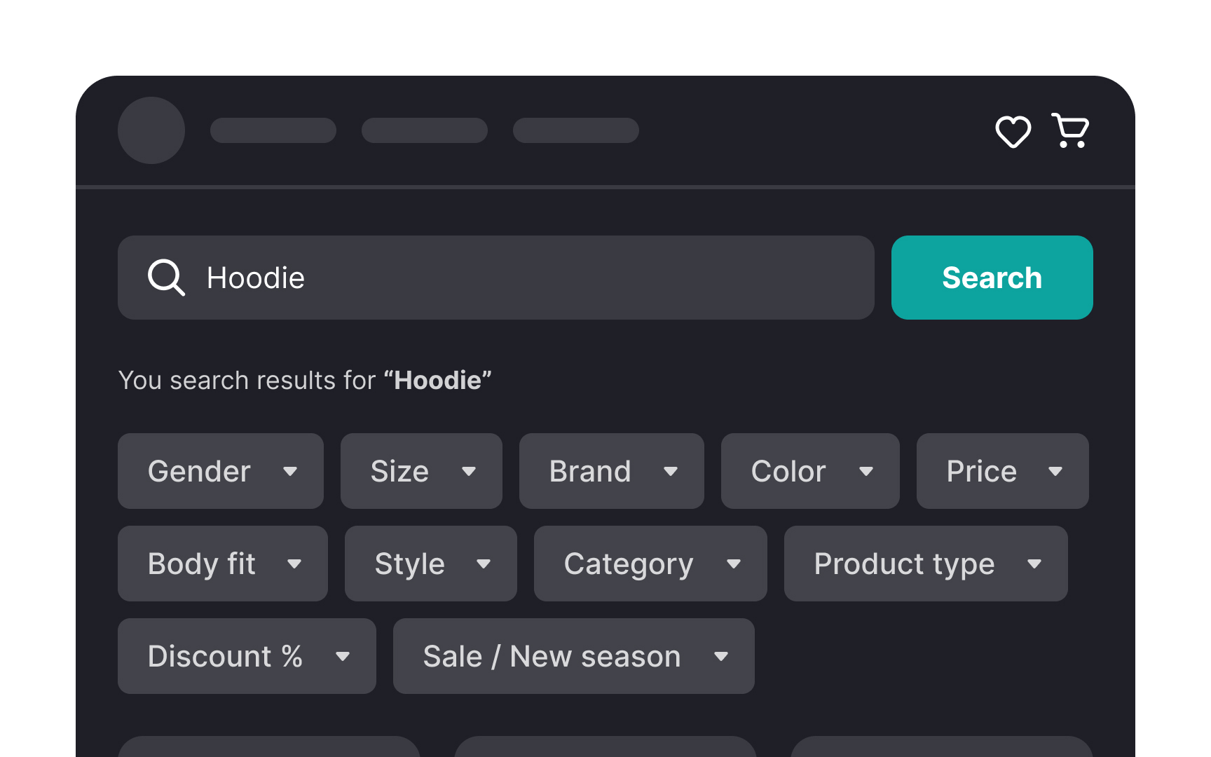
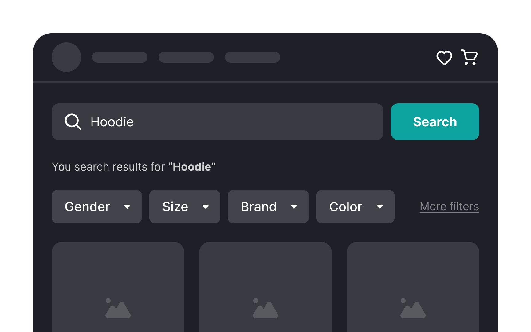
Here a few rules for creating convenient filters:
- Don't intimidate users with too many filter options. Keep 5-7 options visible and hide the rest (if you have more) behind the More Filters
button . - Prioritize filtering options and show the most common filters first.
- Make it visually obvious for users what filters are currently applied and allow them to clear all filters if needed.
Pro Tip: Don’t try to replace filtering with sorting — display both features.
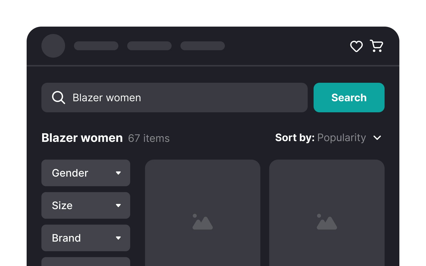
While
Implementing a clear and accessible sorting option allows users to customize how they view the results according to their needs. Position the sorting feature separately from filtering options to avoid confusion, as they serve different purposes.

Pagination is a design technique that divides a long list of items, like
There are 3 main types of pagination:
- Traditional pagination: Users click the Next or Previous
buttons , or jump to a specificpage number. It’s common on desktops but can be seen as slow and might discourage thorough browsing. - Infinite scrolling: This automatically loads more items as users scroll down. It’s convenient as it requires no extra clicks, but can lead to lower focus on individual items and affect decision-making.
- Load More pagination: A Load More button appears at the end of the list, letting users decide if they want to see more items. This method balances the need to browse more products while keeping focused.[3]

An effective
For instance, if users search for a specific term and the results page shows a large number of matches, they might choose to narrow down the search with more specific terms or apply filters like
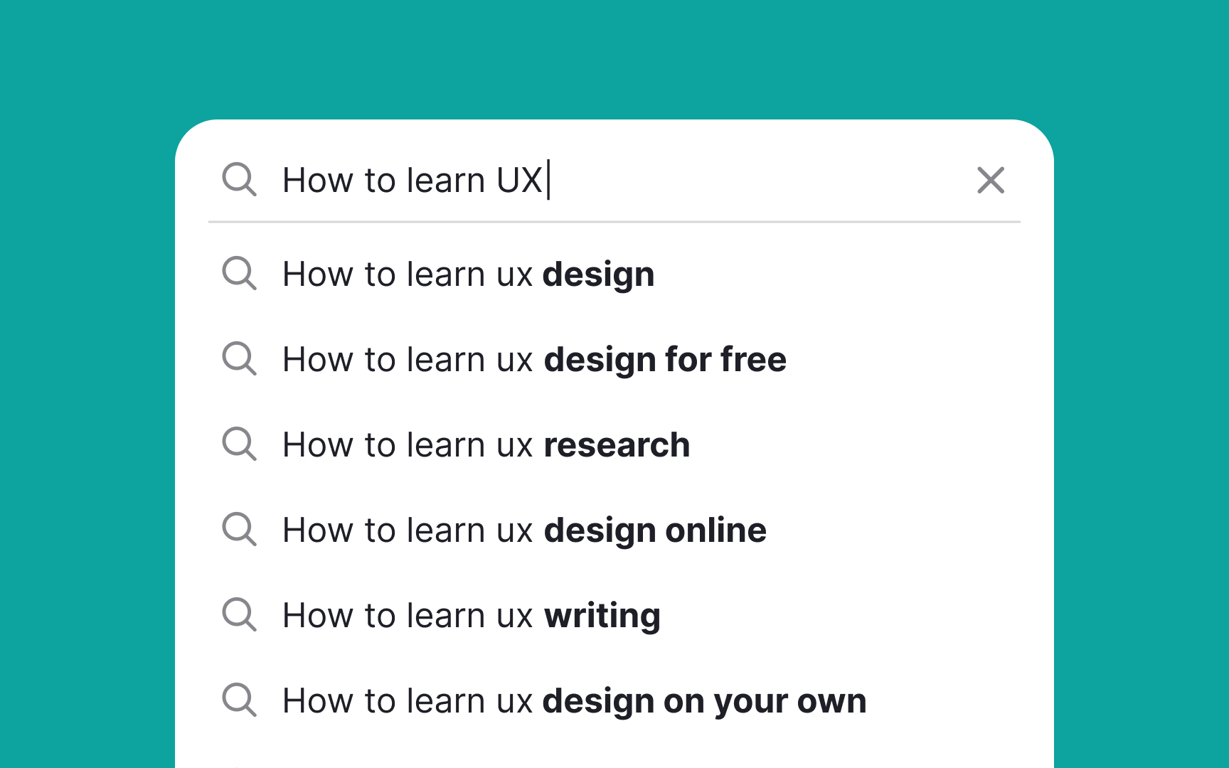
When you offer an auto-suggest
The NN Group offers two approaches to doing this:
- If your system provides suggestions by finishing users' text and appending characters to the end, you should highlight the suggested characters.
- If your system provides the most popular searches that contain users' text anywhere in the query, it makes more sense to highlight the users' characters.[4]
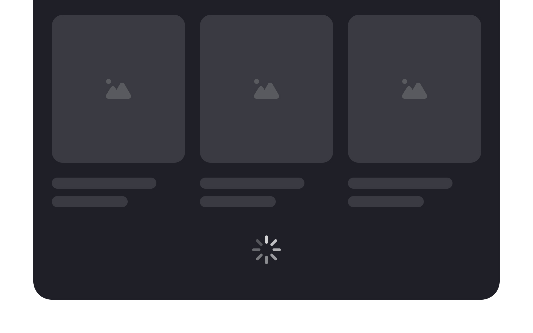
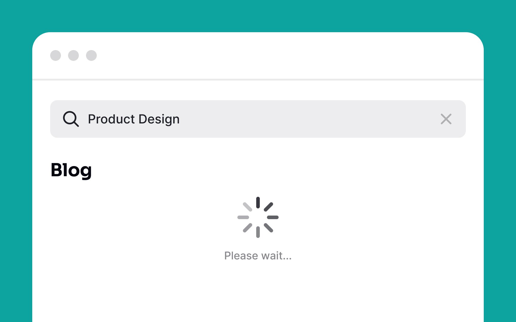
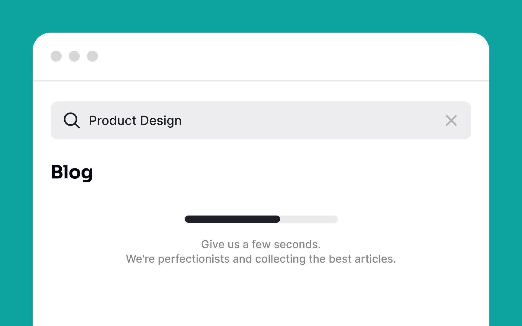
Skeleton screens are an excellent technique to notify users about what's happening in the system right now. Essentially, they look like grey or neutral-toned placeholders that appear in areas, where the actual
This perfectly communicates to users that results may take some time to load when there's a server delay or poor internet connection. Additionally, slight animation on placeholders intensifies users' anticipation and adds a sense of delight to the process.
User research has proven that skeleton screens on mobile are perceived to take less time than spinners or blank pages. It also observed that participants felt happier and less frustrated when they saw skeleton screens during
Ideally,
Use progress bars for this purpose when a
If the loading takes time, use a skeleton loader, and add an
References
- How Users Read on the Web | Nielsen Norman Group
- Search UX: 6 Essential Elements for ‘No Results’ Pages | Baymard Institute
- Site Search Suggestions | Nielsen Norman Group
Top contributors


Topics
From Course

Share


Similar lessons

Intro to Information Architecture

Intro to Search Functionality in UI
