Responsive Design Wireframing
Understand how to create wireframes that adapt to various screen sizes and devices
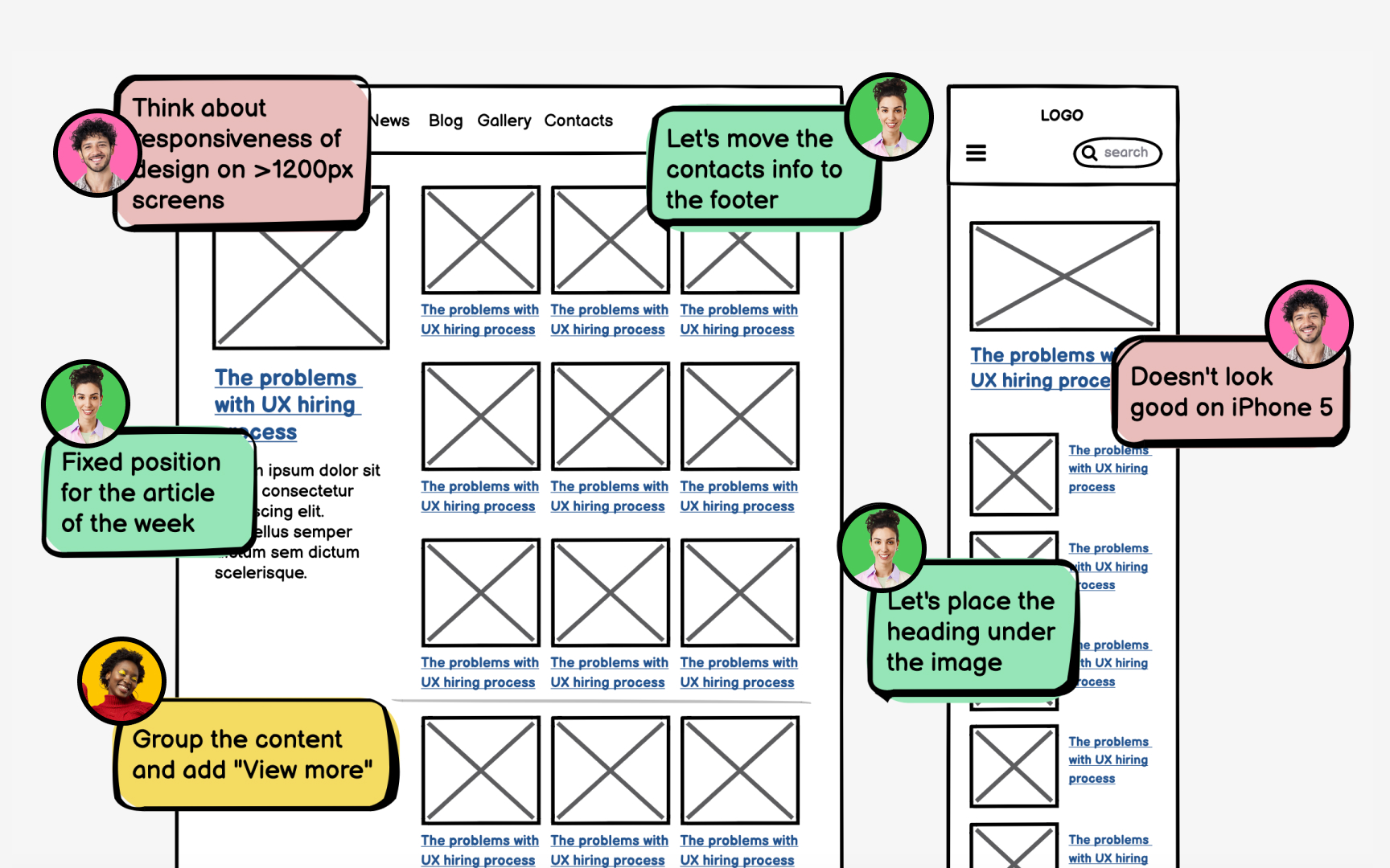
With over half of web traffic coming from mobile devices[1], creating wireframes for just desktop is like building half a house. Responsive wireframes show how content reflows, prioritizes, and reorganizes as screens shrink from desktop to tablet to phone. Through flexible grids, content zones, and breakpoint planning, you'll learn to create wireframe systems that ensure consistent user experiences regardless of device. This systematic approach helps teams visualize layout adaptations, test information hierarchy across screen sizes, and build consensus on content prioritization before costly development begins.
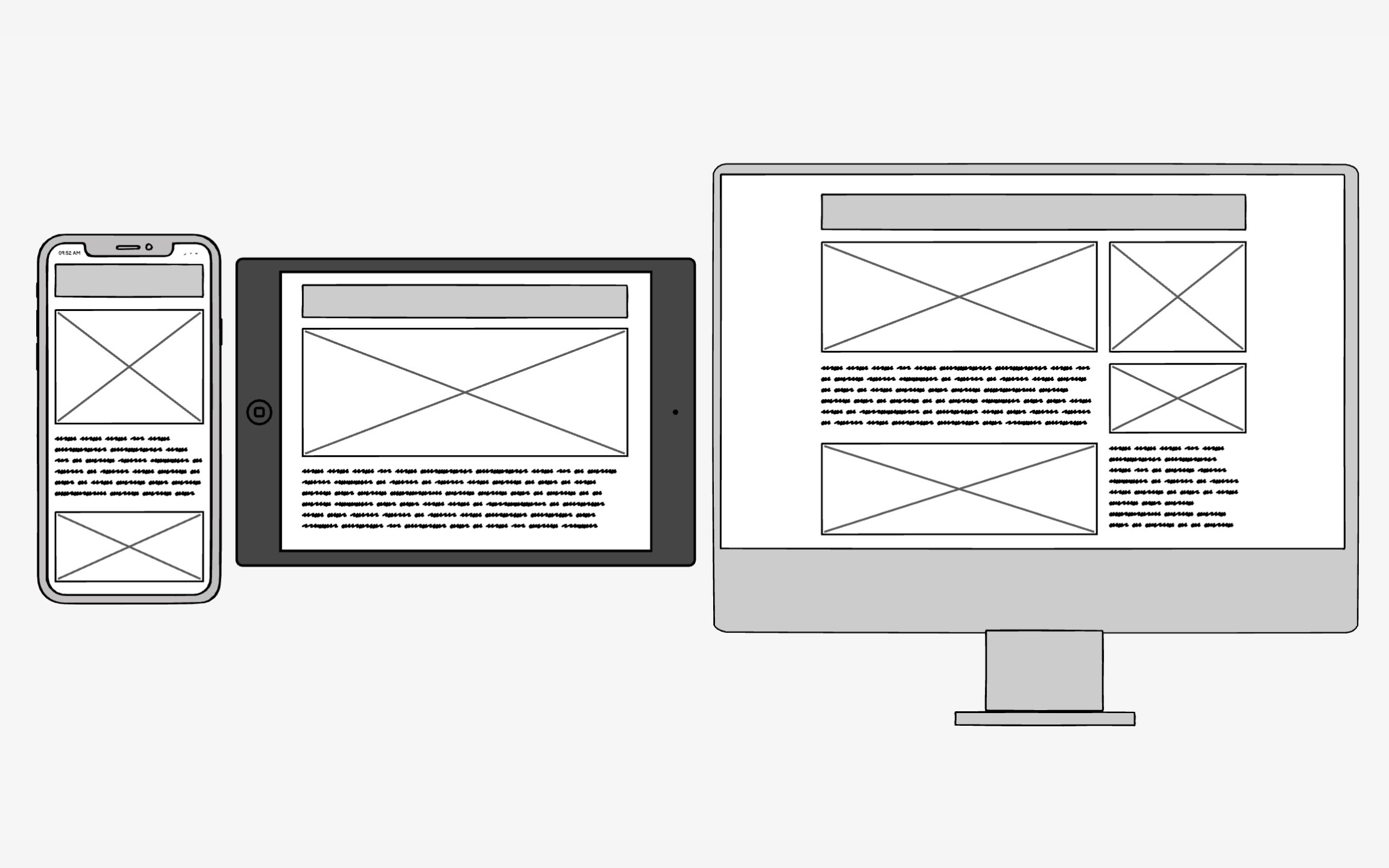
Responsive design solves a modern problem: users expect websites to work perfectly whether they're on a 27-inch desktop or a 5-inch phone. Before smartphones, designers created fixed-width
The magic happens through 3 technical ingredients working together:
- Fluid grids stretch and compress based on screen width
- Flexible images scale without breaking layouts
- Media queries detect screen characteristics and apply appropriate styles
Together, they create one codebase that serves all devices intelligently. This approach beats building separate mobile sites because it maintains consistency while adapting to context. Users get optimal experiences without maintaining multiple codebases. With mobile users now exceeding desktop users globally[2], responsive design has shifted from nice-to-have to an absolute necessity.
Pro Tip: Test your responsive designs on actual devices, not just browser resizers. Real devices reveal touch target issues and performance problems.
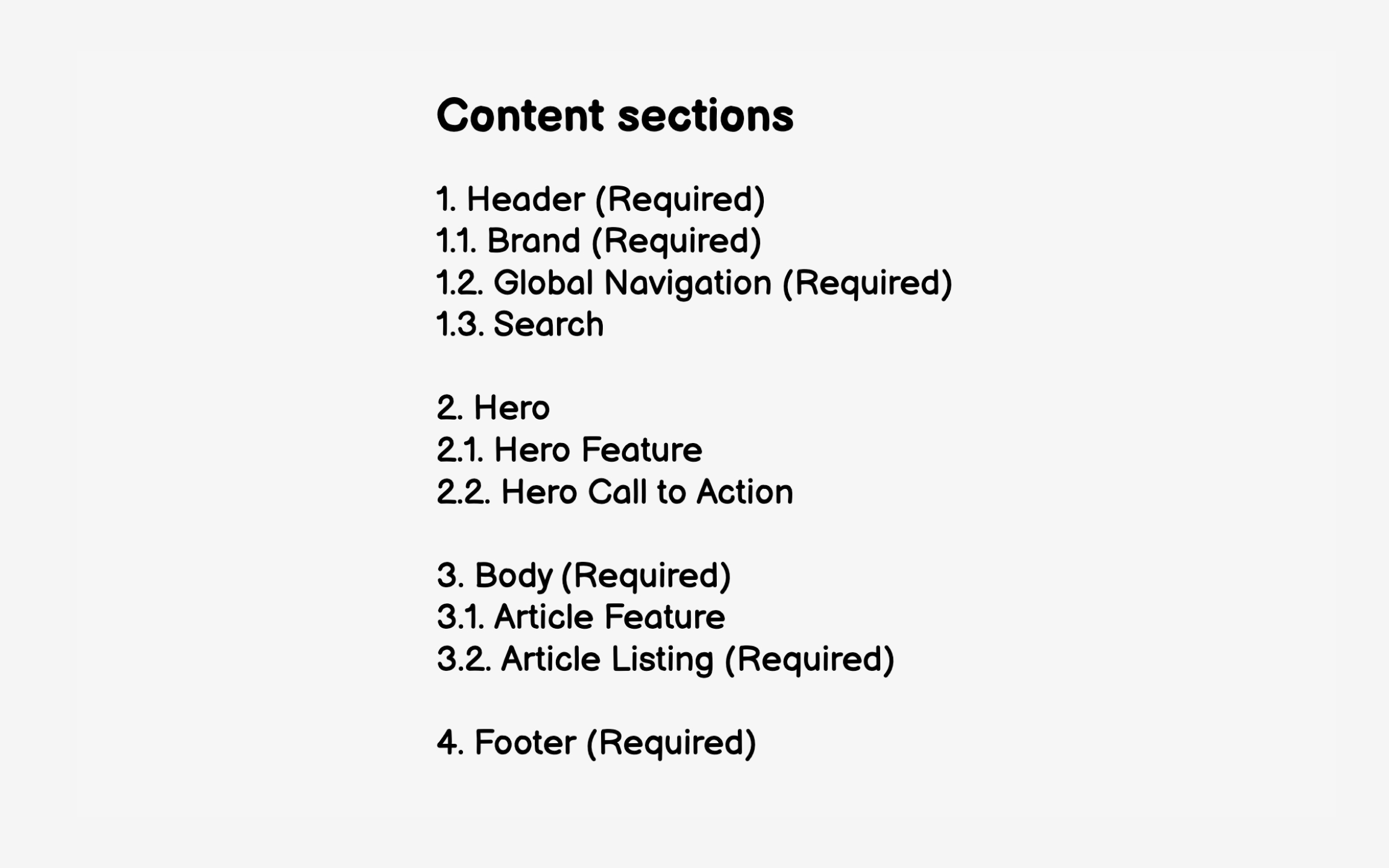
Start by listing all page types your site requires.
For example, if you're designing an e-commerce website, you might need:
- A home page
- Product categories
- A product details page
- A cart page
- An order confirmation page
Each page will have its own content and layout. This systematic approach prevents the common mistake of designing layouts first, then cramming content in later. When you understand your content requirements upfront, you can make informed decisions about what to prioritize on smaller screens and how elements should reflow.
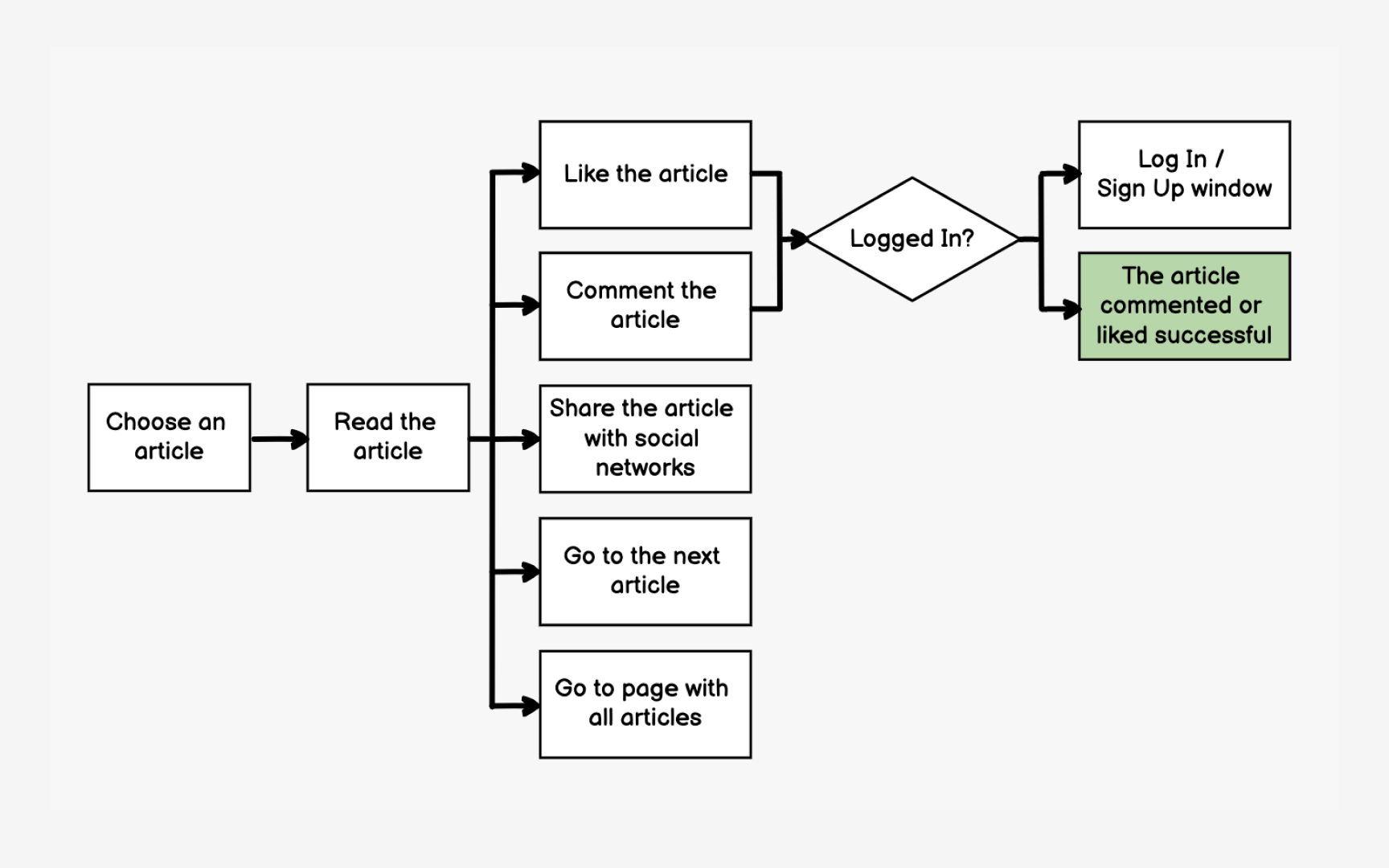
User flows reveal which screens matter most and how they connect. By mapping the paths users take to complete tasks, you identify critical screens that need responsive wireframes and understand how
Start with primary user goals: finding products, making purchases, getting support. Map each step from entry point to goal completion. A purchase flow might include: homepage → category
This flow shows you need 7 responsive
Understanding flows helps prioritize mobile optimization efforts. If analytics show 80% of users complete purchases on mobile, your checkout flow needs flawless responsive behavior. Flows also reveal reusable components like headers, navigation, and footers that appear across multiple screens, saving design and development time.[3]
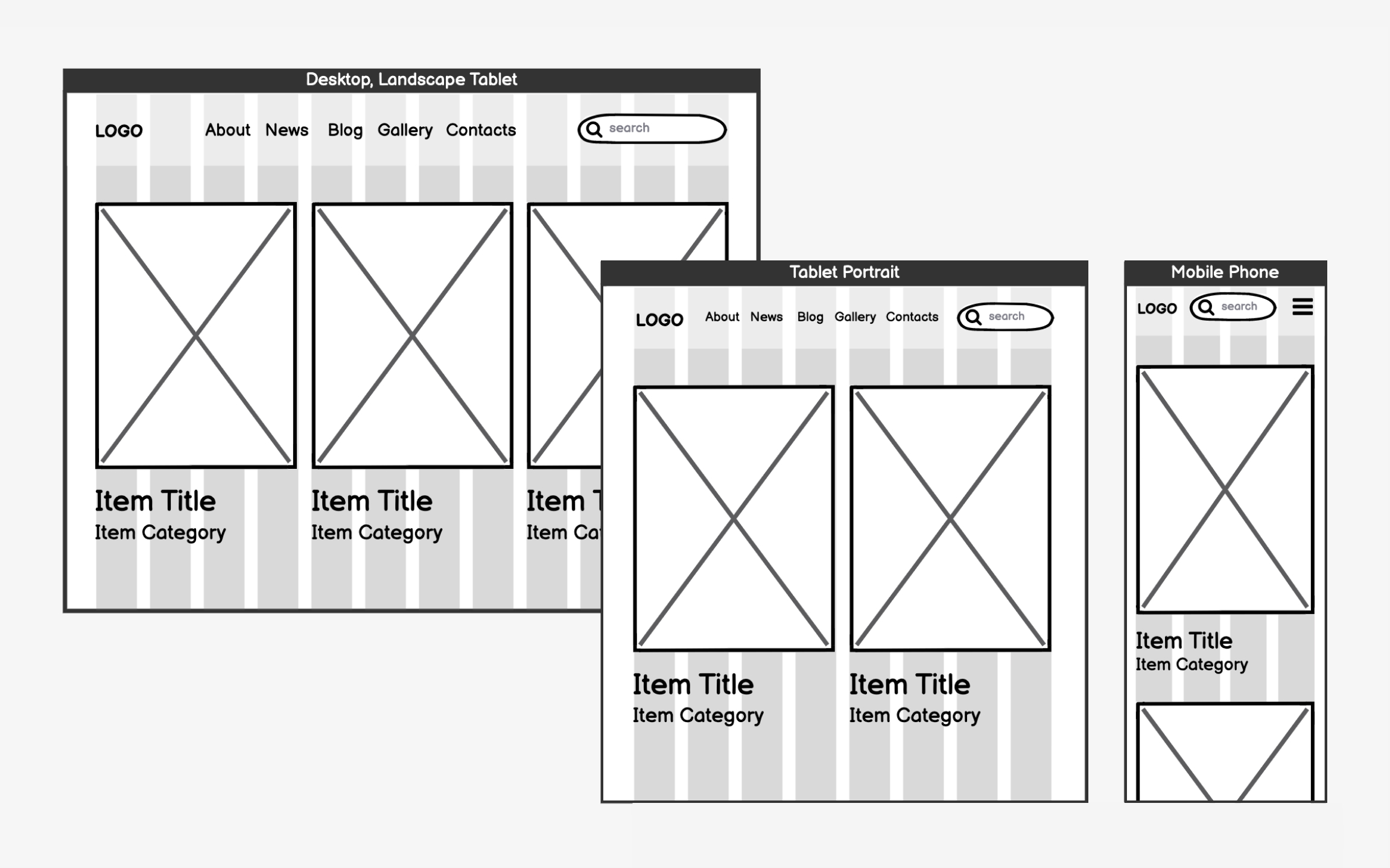
Grids are the invisible structure that keeps your
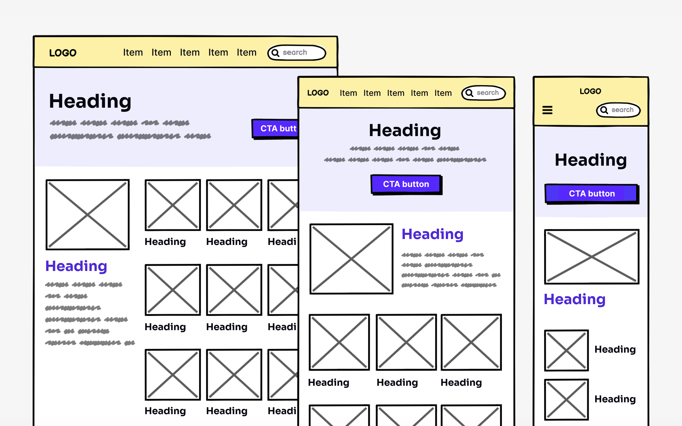
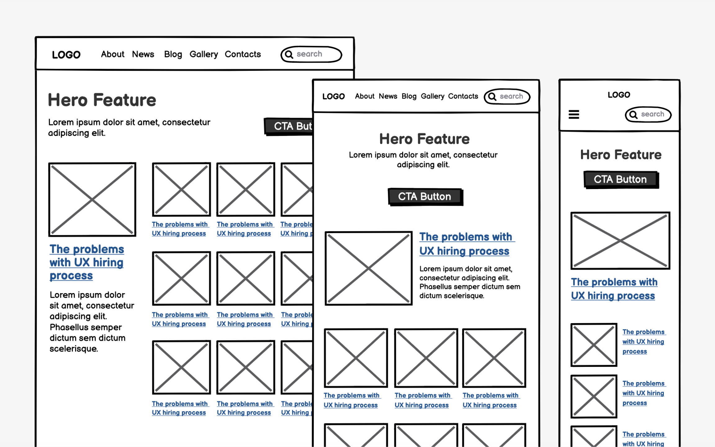
The 12-column grid has become the industry standard because it's mathematically flexible. You can divide 12 evenly by 2, 3, 4, or 6, giving you many
Each column has a set width (usually 60-80 pixels) with gaps between them called gutters. As screens shrink, columns drop off or stack vertically. This creates a predictable system where designers and developers speak the same language about layouts.
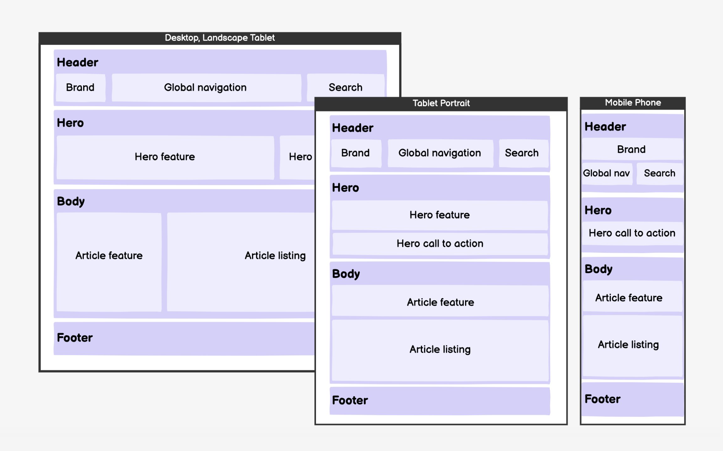
Standard breakpoints have emerged from common device sizes: Desktop (1200+px wide) handles full layouts with multiple
These aren't rigid rules but starting points based on how content naturally needs to reorganize. A data
The next step is to identify
Follow scanning patterns when arranging elements. The F-pattern applies across devices — users scan horizontally across the top, then down the left side, with occasional rightward glances. Place critical elements in these high-attention zones.
On mobile, everything stacks vertically, making order even more crucial. Resist adding visual design during wireframing. Gray boxes and simple typography keep focus on structure and hierarchy. You might discover that planned layouts don't accommodate actual content, requiring zone adjustments. This iterative refinement is exactly why we
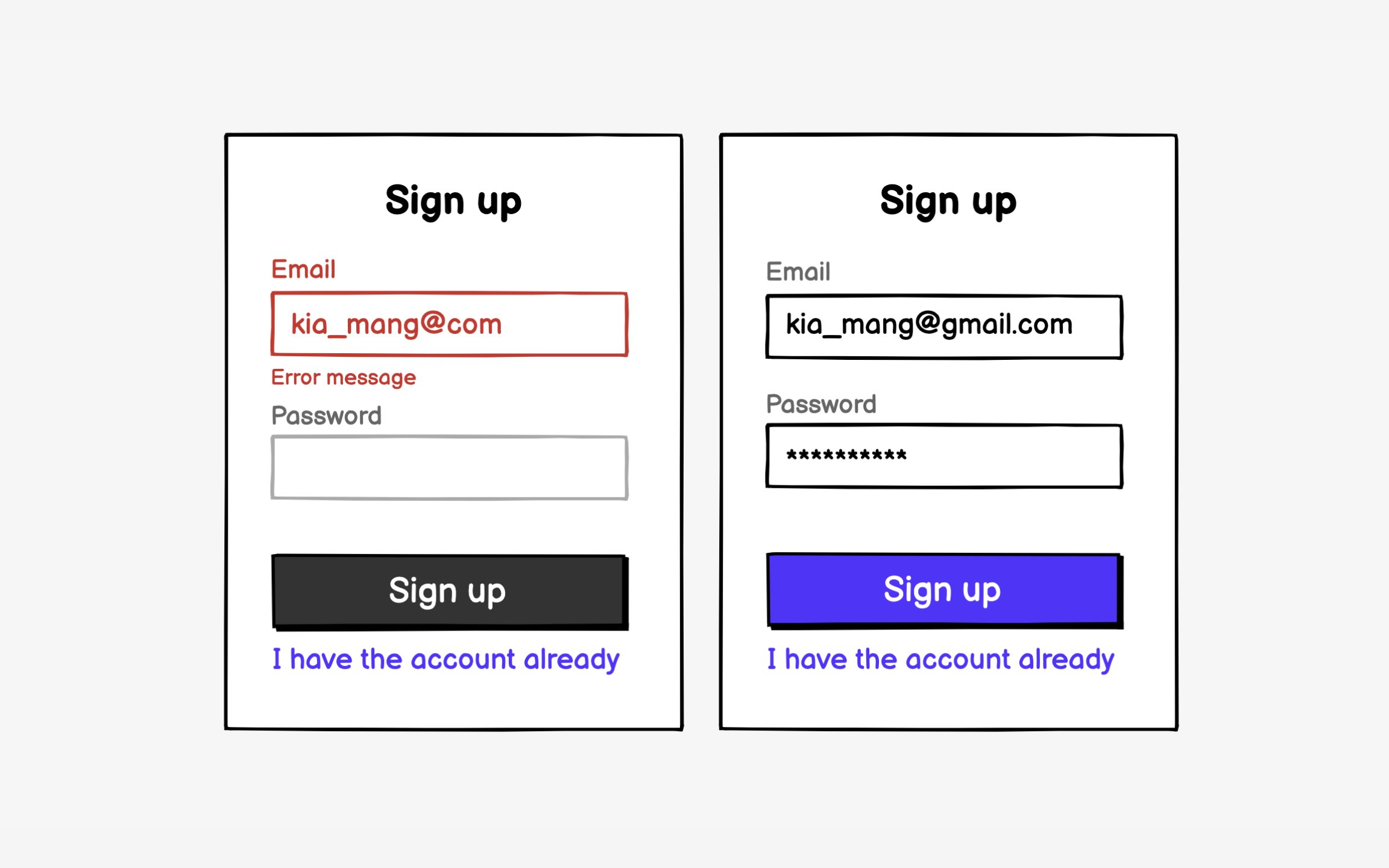
When you're happy with the visual hierarchy, start filling zones with
Avoid adding colors and choosing typefaces at this point. The goal is to see if the
Responsive wireframing multiplies effort — every screen needs versions for each
Identify template patterns that cover multiple pages. A "
This selective approach provides enough detail for development while maintaining momentum. Developers can extrapolate responsive behaviors from key examples. Edge cases can be resolved during build rather than over-documented upfront. The goal is informed decision-making, not comprehensive specification.
Responsive
Developers need responsive wireframes to understand not just what changes, but how transitions happen. Does the
Clients often struggle to visualize
References
- Global mobile traffic 2025| Statista | Statista
- Desktop vs Mobile vs Tablet Market Share Worldwide | Statcounter Global Stats | StatCounter Global Stats
- F-Shaped Pattern of Reading on the Web: Misunderstood, But Still Relevant (Even on Mobile) | Nielsen Norman Group
Top contributors


Topics
From Course

Share


Similar lessons

Intro to Wireframing

Wireframe Fidelity
