Patterns in UX Writing
Learn ways to make the user experience more intuitive and friction-free through common UX writing patterns
Each time you find yourself in an unknown, even stressful environment, your brain searches for familiar patterns to reduce cognitive load and achieve your goals faster and more efficiently. For example, remember the first time you used a digital book? Your brain was leveraging your mental models, trying to find coincidences in your past experience of using a book to understand how to use this new device. Keeping this in mind, designers of digital books sought to eliminate as much friction as possible by leveraging common design patterns and creating an interface similar to a physical book (e.g., the formatting of pages and the sound of turning pages).
In 2000, Jacob Nielsen highlighted that users expect websites to function similarly to those they know, leading to the principle of following design conventions. When too many unfamiliar elements are introduced, users become frustrated and are less likely to complete tasks.[1]
In UX writing, patterns solve this problem. Essentially, patterns refer to the best practices that help users grasp the message and move on with a task. Unfortunately, UX writers and designers aren't users and can't be 100% confident about their copy decisions. Narrowing this gap between mental models can help create a delightful and efficient user experience.
People love patterns in interfaces. Web
From the point of view of a
Keep in mind that like web design patterns, UX writing patterns aren't universal, may not work for specific products, and always require testing with your audience. A subtle change in word choice can be a whole different ball game for user experience. For example, the button label "Join Us" is technically correct, but it may be somewhat confusing for users and make them wonder what happens after they click the button — do they subscribe to a newsletter, join a product's community, or simply sign up?
Should the
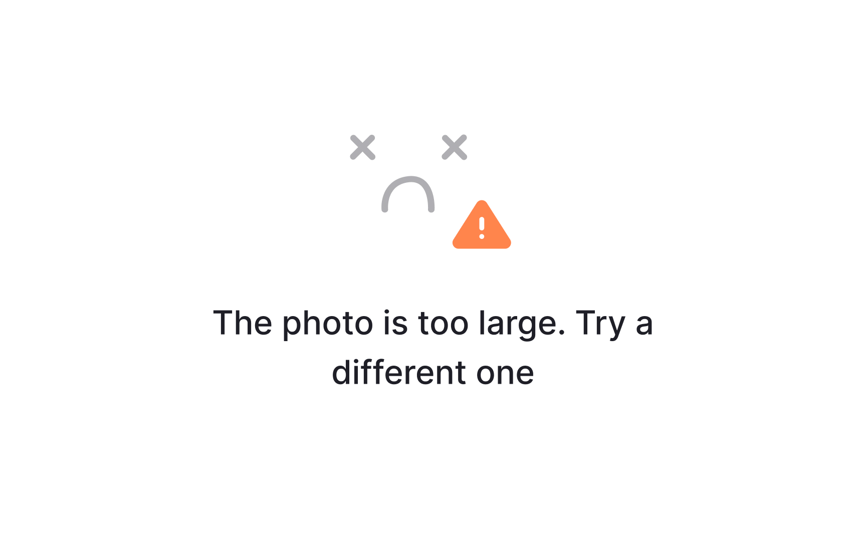
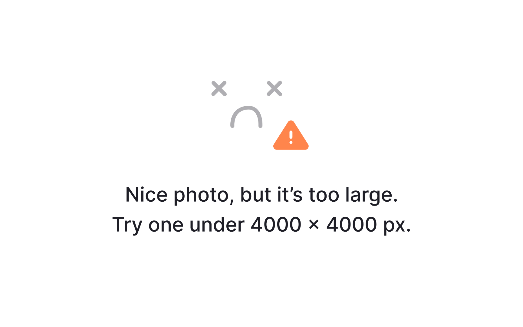
According to the NN Group's guidelines, a good error and alert message should be:
- Explicit: The error message should be concise but informative, explaining clearly what has happened (or will happen if it’s an alert) and providing the solution to fix this problem. As far as possible, the instructions shouldn't ask users to go to another
page , remember some new information, or make an extra effort. - Polite: When an error occurs, the system should never act like it's the users' fault. Take the blame, apologize for the inconvenience, and direct users to the next step.
- Written in human language: Avoid technical jargon, code snippets, or abbreviations that say nothing to your users and scare them bluntly. Investigate different types of errors and talk to developers so you can explain even the hardest problem in a simple way.[2]
Pro Tip: You can use humor in error messages to make users smile and feel less frustrated. Just ensure it matches your brand’s personality and won’t make users feel uneasy.
- Avoid generic words and phrases. Words like “yes,” “no,” “okay,” “start,” “finish,” etc., aren’t explicit enough to describe what happens after users perform this action.
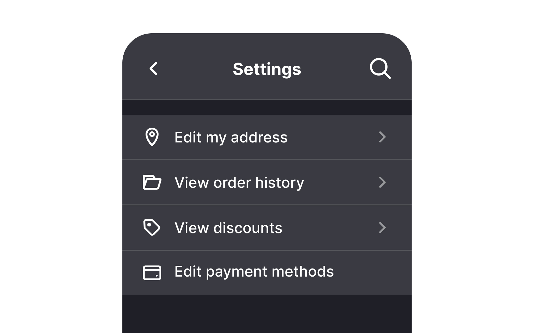
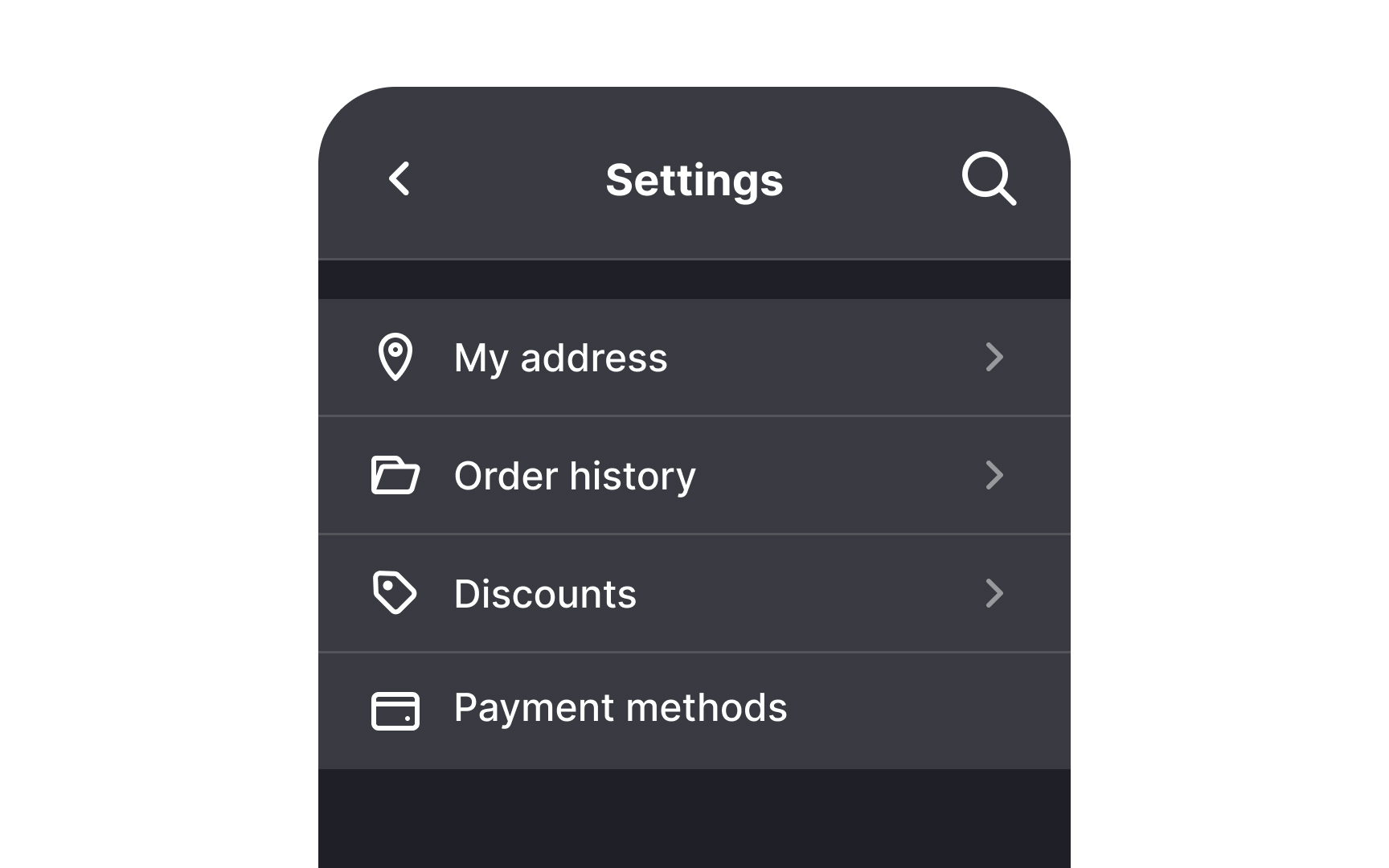
- Use verbs with nouns for context, but not always. While verbs paired with nouns like "Edit profile" or "Delete
page " help clarify actions, you don’t need to add a verb to every noun if the meaning is already clear. For example, labels like "Settings" or "Favorites" are self-explanatory and don’t require additional verbs. Keep it simple when the action is obvious. - Use nouns for actions that take users to other pages. Nouns do a great job indicating actions that occur on a different page — for example, "Addresses," “Favorites,” “Settings,” “Support,” etc. Nouns are also often encountered in labels for text inputs.
- Be short. Set a limit of 3-4 words and try to stick to it. It’s okay to omit articles like “a,” “an”, and “the,” as they make a label longer and sound more complicated.

Notifications can appear at times of anxiety or annoyance and can be exceptionally distracting or even intrusive. Here are some rules to keep in mind while writing notifications to make sure they don't irritate users:
- Keep it useful. Ask yourself, "Why do I need to send users this message? How does this notification help them?" If the notification requires users to take some action, be specific about it.
- Keep it short and simple. Cut any unnecessary words that don't add to the meaning of your text.
- Use a friendly tone. Avoid a patronizing tone — aim to bring on a smile and sound human. Don’t hesitate to use passive voice — it can feel more conversational, especially when focusing on the object or situation.
Forms often deal with confidential and sensitive personal data and payment details and should be as straightforward and informative as possible. However, despite their seriousness, they shouldn't be overwhelming.
Here's how to make forms user-friendly through UX writing:
- Provide precise field
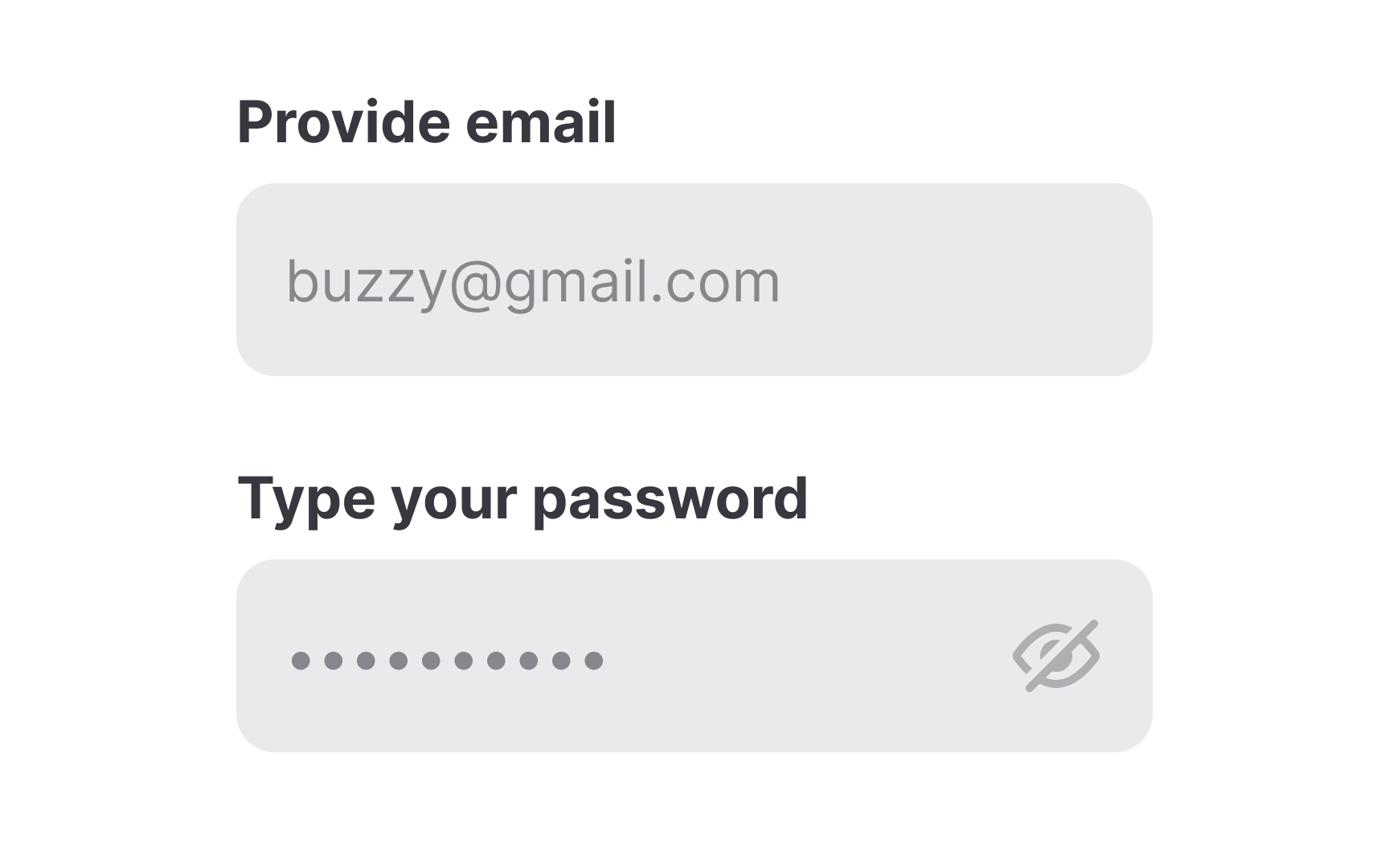
labels . Field labels are responsible for gaining actual data, and users should understand without any confusion what information they need to provide. For example, the billing address and shipping address may differ, so use the correct name for each field. - Include data entry instructions when necessary, especially for fields requiring special formats (e.g., passwords). Keep the instructions short, clear, and easy to scan.
- The tone of the form's
microcopy should be reassuring but persuasive, and humor can be notably helpful here. Witty or playful copy can put users at ease, help them relax, and prevent mistakes they might otherwise make when they're stressed.

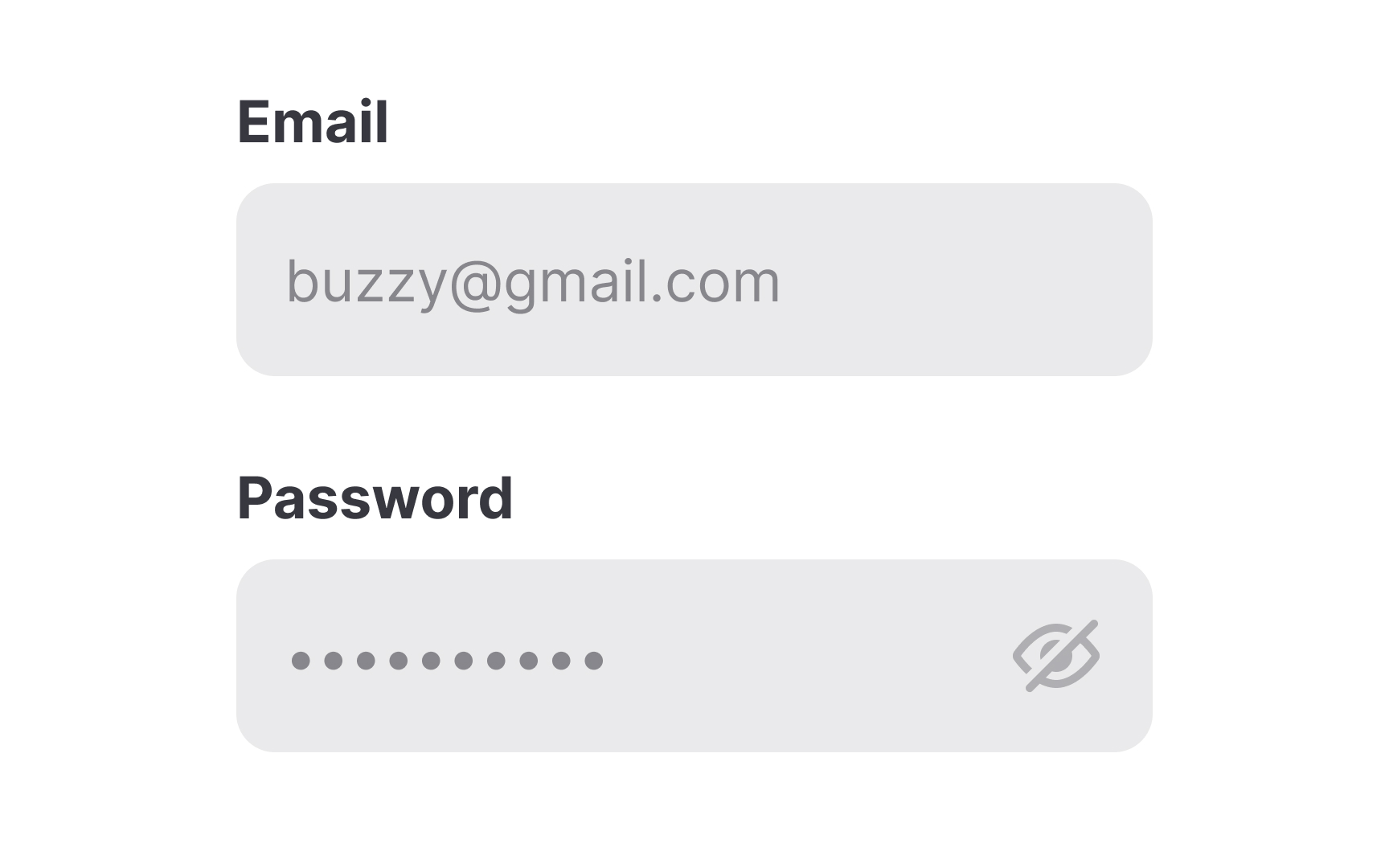
Placeholders are small bits of text that offer hints, descriptions, or examples of what users should enter in a form. However, placeholders can disappear when users click into a field, which may cause confusion or strain short-term memory. To avoid this, don’t use placeholders if the form field
Another issue is that users might mistake placeholders for pre-filled data. To fix this, add “e.g.” or “for example” before the placeholder and keep examples simple, like "[email protected]" for emails and "John Doe" for names.
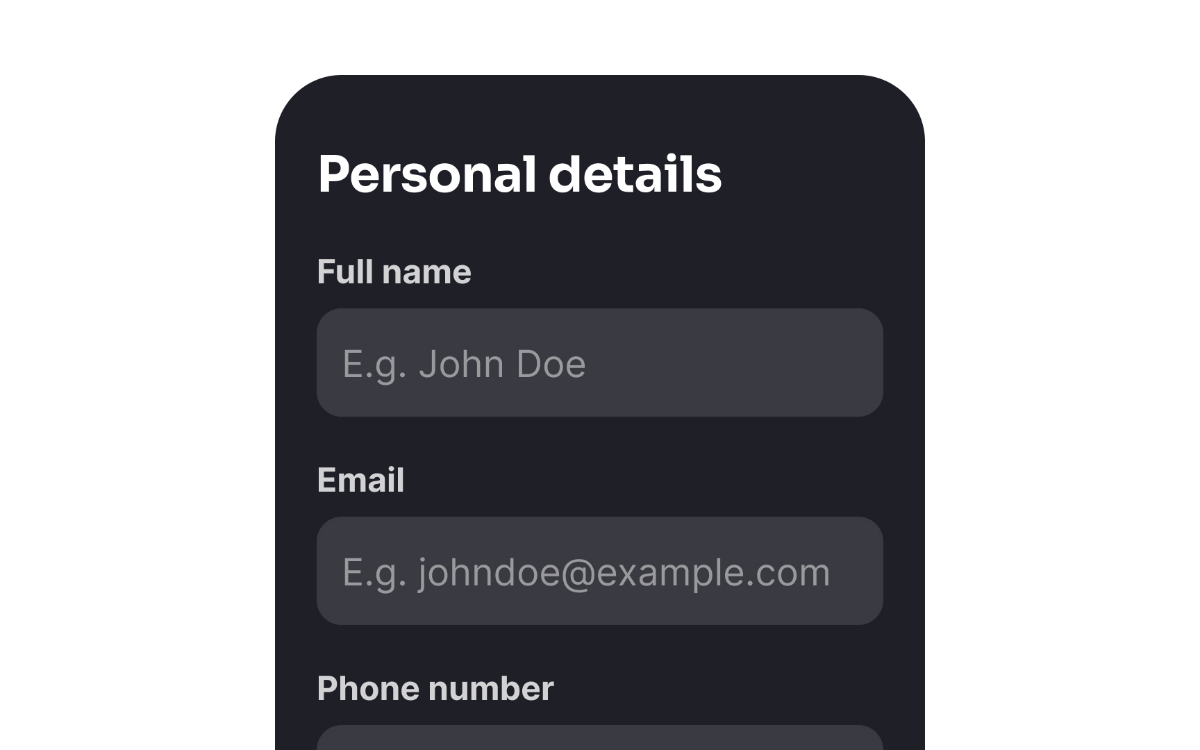
You may also consider using floating labels, where the placeholder moves above the field when users click inside, keeping the guidance visible and accessible.
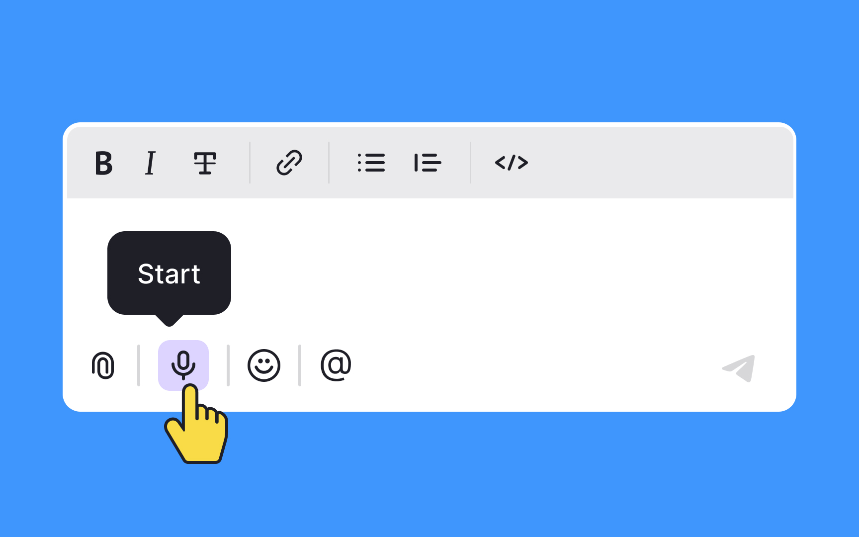
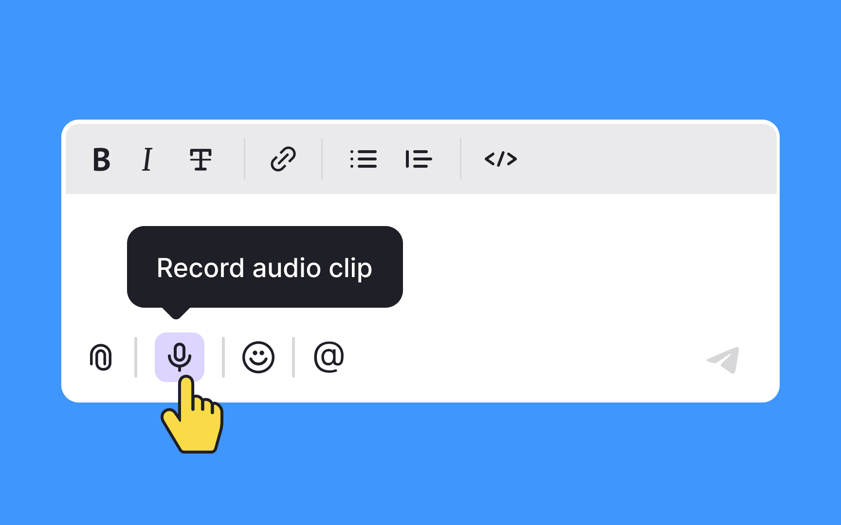
Tooltips provide some extra information about an element or a feature that isn't evident at first sight when users are performing a task. The main difference between a good and bad tooltip is the value it brings to users. If a tooltip confuses users or states the obvious, it's a poor
Here are a few features of good tooltips:
- They don't contain critical information. If users don't find the tooltip or forget what it says, they should still be able to complete the task without it. The tooltip should never contain vital information that users need to refer to frequently.
- They're short. Usually, tooltips are just up to 150 characters long and are remarkably straightforward. Imperative verbs can be very helpful when giving a brief
command on what users should do. - They're helpful. Obvious or redundant tooltips are disappointing for users as they bring no value. If you can't come up with a useful tooltip, don't offer one at all.[3]
Pro Tip: Always accompany unlabeled icons with a tooltip.
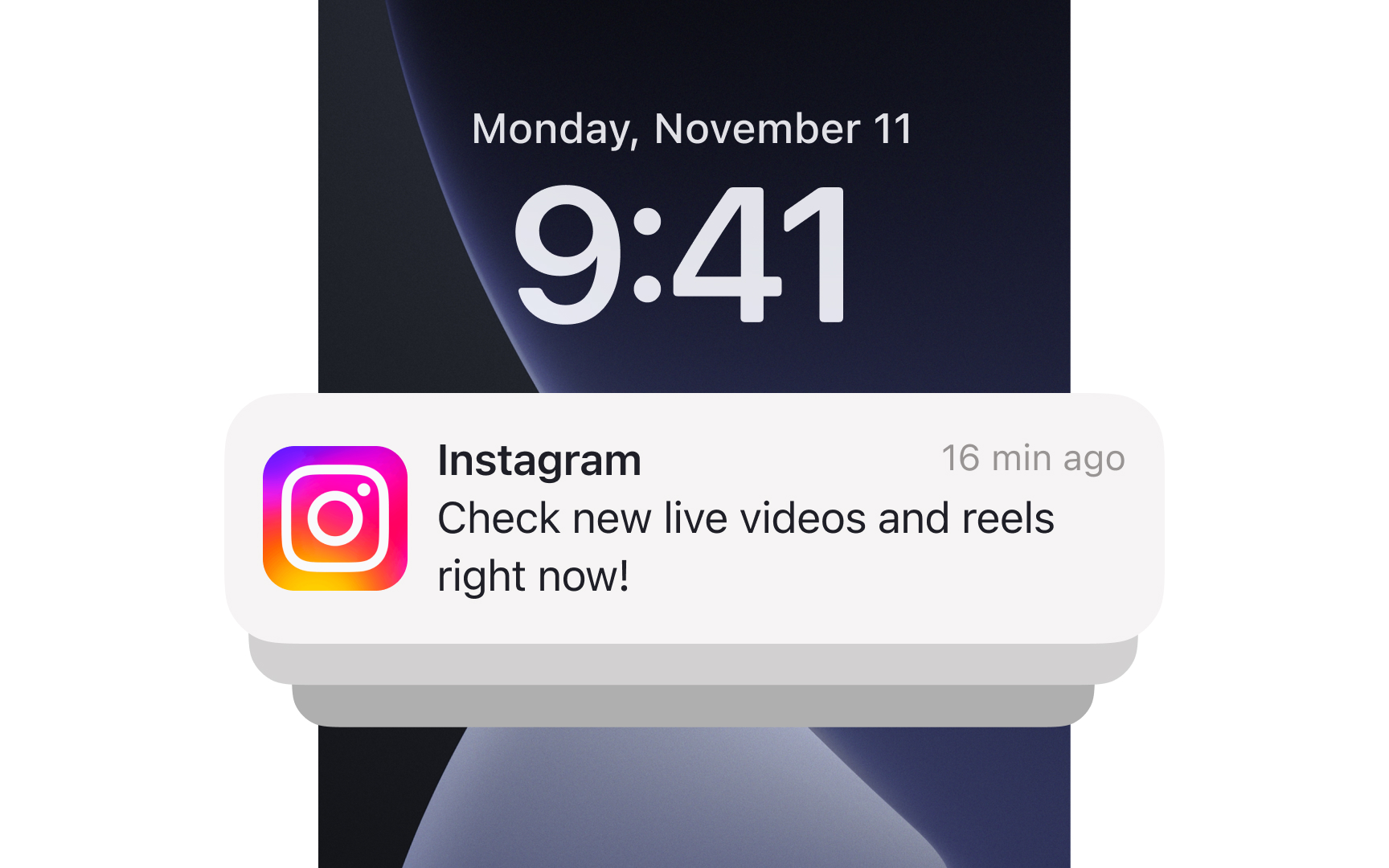
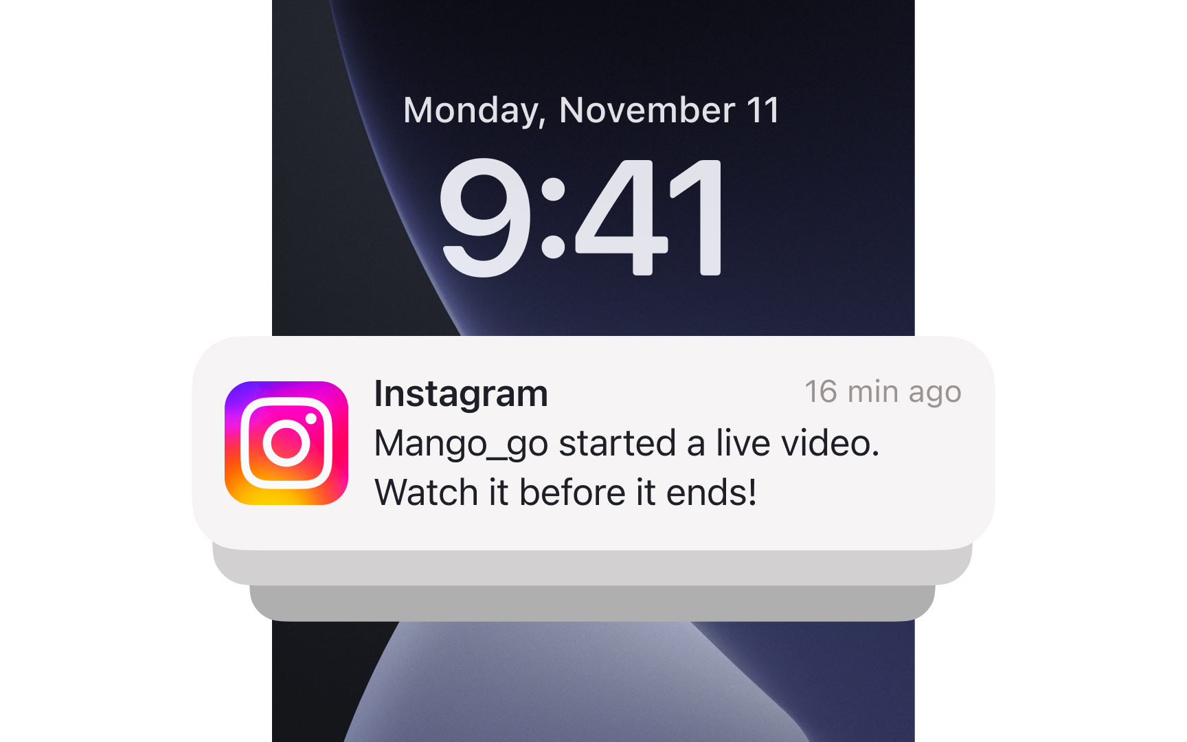
Push notifications are meant to engage users to return to an app and drive action. The stats say that push notifications can increase app engagement and app open rates.[4] The downside of push notifications is that users can ignore them or turn them off completely.
Here's how to engage your audience with push notifications:
- Make it personalized. Push notifications work better when you personalize them by using first names or delivering information that resonates with each individual. For example, Netflix notifies users only about shows they've already watched or those with similar content instead of random updates.
- Be relevant and timely. It's a no-brainer that most users are likely to order food when it's lunchtime than after midnight. Good timing in tandem with a snappy, encouraging copy have more chances of making users tap a
notification and open a food delivery app. - Stay actionable and engaging. Imperative verbs and words like "save," "free," "% discount," "promo code," "new," "last" ignite users' curiosity. Focus on emphasizing things that may trigger users' needs for protection, food, recognition, respect, or accomplishment.
References
- Jakob’s Law | Laws of UX | Laws of UX
- Error Message Guidelines | Nielsen Norman Group
- Tooltip Guidelines | Nielsen Norman Group
- Push Notifications Statistics | Business of Apps
Top contributors


Topics
From Course

Share


Similar lessons

Intro to UX Copy

What is UX Writing?
